Groundbreaking new tools for web typographers
(audience clapping) - Hello.
So I'm gonna talk about groundbreaking tools, new tools for web typographers, web designers, web developers.
That's me on Twitter and that's where the slides are, if you wanna download them later.
So, variable fonts.
Everybody is super excited about variable fonts and the kinds of things that we can do with them. And there've been these really interesting sites popping up that let you try out variable fonts, see what it is they can do, find ones, pick one out perhaps, if you are web developer, or you are a web designer, to find something that you wanna use.
There is a point at which, in the process where, as a designer if you're prototyping, or as a developer if you're implementing the design, you are really the one finishing the design, where you're trying to figure out like what exactly, which weight do I wanna use? Which size do I wanna use? What stretch do I wanna use? What optical sizing do I wanna use? And you can do those things in these tools and you can mess around with them until you get it to be how it is that you think you'd like it to be.
But that process actually reminds me of when I used to use this tool quite a lot, Typecast, where I would use it to find fonts and to pick fonts out and to start working with my typography.
And I would think that I would get things to be just exactly how I wanted, and then I take that code or remnants of that code over to my real code editor with my real website, my real content, and it just didn't look the same.
And I needed to then spend a whole bunch more time, refining my typography and figuring out what it is that I wanted to do. A lot of other folks, other designers, will use something like Photoshop, or they'll use Sketch, especially Photoshop, refine the typography, picking the exact colour, the exact font family, the exact size, the way that all the different parts of type work with each other.
And then you make a PDF and you throw it over some email wall, and the developer gets it, and they make some website, And you look at it, it looks nothing like the Photoshop comp that you made, because Photoshop and browser engines render type very, very, very differently.
Really the place that we need to be in order to figure out those kinds of details about a project, when you're building a production website is, we need to get into real CSS real HTML, real content, real content management system eventually. Maybe you're doing a prototype in the meanwhile, but to actually try your colour palette, your whole design, your brand, all the pieces together, and to see how it is that your choices are working. We have to get into the browser.
And the browser is where we've been designing, designing in the browser for many, many years, where the dev tools themselves give us the opportunity to edit right there, see the results immediately, try a million things, and then once we like what we see, take it over and put it in our code editor and save it. But tools for CSS especially, have not really changed in over a decade.
This is a very early version of Firebug.
We've just had the same thing, when you can just write CSS. And it's worked pretty well when it comes to fonts, level 2, the level 2 specification for CSS. Because you get in there and we've just sort of memorised, those of us who know CSS, you just kind of memorise all the things.
Well, how's the line height look? How's the text align look? How's the font weight look? Font size? Is it text? What is italics again? Text, what's uppercase? Like eventually you memorise them, and then auto-complete helps and you just mess around, mess around, mess around. But things are getting much more complicated. There are much more superpowers that fonts now have and that code editor tool in CSS is really not holding up. OpenType, for example, OpenType features are pretty awesome to be able to do things like old-style numerals or alternative ligatures, alternative styles or ligatures, discretionary ligatures.
And yet most designers don't ask for them.
Most developers don't know that they can use them. And so the question is, "Why?" Maybe it's because browser support sort of is (grunts) at the point right now, but it's only (grunts) if you want to use the proper CSS. If you don't have any problem using the low-level stuff that we're not really supposed to be using, but you can still totally use it anyway, then browser support is pretty good.
So maybe it's that the word hasn't gotten out yet. People just don't know it, but that's happened with other things.
The word isn't out about something like Grid or ClipPath, and then the word does get out.
So why is it that OpenType features haven't taken off? I think it's because it's just too darn hard to understand what it is that is possible.
It's very hard to figure out what a font can do. It's not about the CSS, it's about what's in the font file itself.
Now these tools that are popping up give us the opportunity to figure out what can my font do? You can drop your font file on them and it will expose a lot of information and help you out. But, A, you have to know that these exist, and B, you have to have a font file.
And for those of you who make fonts who are in the audience, you probably think, "Well, of course you have a font file." But for those of us who implement fonts on the web, I think perhaps maybe most of the time, we don't actually have access to the files. You subscribe to some service, you're dropping in a line of JavaScript or maybe you're on a team, somebody else implemented the font.
You don't even really know where they are.
You don't necessarily even have the file.
The other thing that we can do and should do is read the manual.
Fonts come with manuals.
Hopefully, people in this audience who make fonts are taking time to make their manuals, their PDFs, that go with the fonts really awesome.
But also, you know what, I think the first time I ever read a manual for font, was like three weeks ago.
So, most of the time, what you need to know is hidden information. And you need to put a large investment of time in. You have to know that you want to do the thing. You have to know that old-style numerals are out there somewhere, and that you really, really wanna do it, and it's worth two days of time to figure it out, instead of it just being a quick experiment that you can do. If it were easy, I think we would use them much more often. We would just try them out.
So, variable fonts and OpenType features.
And as variable fonts came along, I started to worry a little bit that variable fonts might go the way of OpenType features, that it might just end up being too hard.
It might be too hard to find out which axes of variation are available on one given font, especially if they're custom axes.
And I realised what we really need is tools for playing, experimenting, and exploring, while you're in the process of making a website. Those people who make websites, it needs to be super easy. And then I realised, "Well, you know what, "I work at a place that makes a browser.
"Maybe we can do something about this.
"Maybe we can be building tools into the browser "that really help with not only fonts, variable fonts, "but with CSS Grid and with shapes." The kinds of things that Mandy was showing you. The kinds of things that Jonathan was showing us. So I wanna show you a live demo.
Oh my gosh, live demo, I'm crazy! I'm gonna show you the tools that we've made. So, here I am in this demo, and I'm already making mistake.
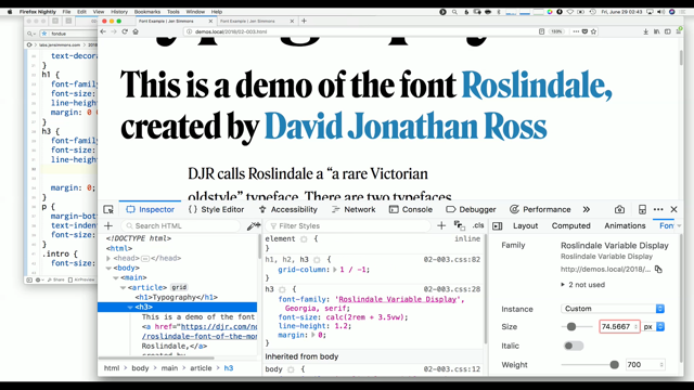
So here I am on this page.
I'm in the process of setting this with this font, courtesy of DJR, thank you very much.
And so I'm gonna get in here, and this is the typical font panel that were used to seeing. You can inspect the element, and we can look at it, and we can change things. We can look and we can say, you know this is, like let's look at this h3.
The line height on this h3 is pretty crappy, because that's how they always are, right? So we're gonna change this to 1.2.
Okay, that looks a lot better.
So let's do that over here.
We'll do line height of 1.2 for our h3.
And that's gonna be a lot better.
But I wanna check out the variable of fonts and the options, because I don't want to type all that code in here. So, in Firefox, and I'm in Firefox Nightly right now, by the way these tools are available in Nightly, I can click that little icon and I can end up with three panels.
And I can click over to the fonts panel, which has been here for a while in Firefox but now it's changed quite a bit.
And we have more options.
And you can see down here that this wait axes is a slider, which is very much what those other sites are doing, all those demo sites.
But the difference here is that I'm in the real webpage with my real content. I can put this in a separate window and I can look at how it's working.
We can look at this h1 and we can mess around and get it to be however it is we want.
We've got size here as well if we decide we wanna try making it bigger. And let's look here at this paragraph.
Now, what you'll notice is that at the moment, if I change around the optical size of this paragraph, it's only changing this one paragraph.
It's not changing any of the other paragraphs, because right now the tool is basically injecting up here, in an inline style, the styles that are being adjusted.
It's sort of a limitation of the tool that we have at the moment.
We know this, and we have big plans and big hopes, to make it so that you can start to adjust sort of all the paragraphs at once, instead of just the one paragraph.
But that's where we are at the moment.
Even that way, it's still incredibly helpful. And it's a fairly simple tool.
If we look here down this last paragraph, it's actually set in Georgia, you can see that we also have weight here.
But it's good to just give us what's possible in CSS 2 instead of what's possible using variable fonts, where it just clicks by the hundreds, where the variation axes is gotta give us a true slider. It also is gotta show us whatever is available. So if there's a width axes that will show up, but there's not on this font, so it doesn't show up. There's an optical size axes on this particular font so it's going to show us optical size.
And also, if you look, so as I'm changing weight, it's written here in the inline styles, font weight, which is in fact the proper way to use these things, to use font weight or font stretch, instead of using font variation settings, especially for the registered axes.
There's five registered axes and really there's four of them that we should be writing and CSS properties like font weight.
So, the tool is trying to do that, trying to give people the proper code so that you can just go ahead and grab this, and paste it and put it in your browser.
Optical sizing is different.
It's really just on-off.
But also, if you want to override it, then you can use the low-level setting with font variation settings.
Or also, if you've got unregistered axes, a custom axes, to the font, that's what you'll be using.
You'll be using font variation settings.
So, let's also, let's add not that yet...
Let's try something else.
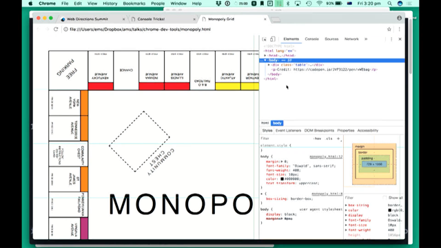
Let's add a bit more content to the page and we can see I've added this published... Oh, except it's not in the place where I want it to be. So, why? Let's look and see.
Well, so this article in fact is laid out with CSS Grid and there's a Grid inspector tool here that I can turn on and use, that will show me my Grid. It will show me the numbers of the lines in Grid, and it will show me if I have named areas.
I can turn the numbers on and off.
And if I had named areas, which this example doesn't, but if I did, I could turn them on and off. You can also extend the lines infinitely if you wanna try to line up something at the top of the page and the bottom of the page.
And what I can see quickly here is that, oh, because, let's see, oh, this is in Grid column line five.
So it's starting the numbers missing, but this is line five and it's starting, I don't want it to start with line five.
I really want to start over here with line two, so I can change this to a two, and now it's moved over to where it is that I want it to be. So the green inspector tool can be really helpful for you to understand.
Especially if you're just learning Grid frequently, you can't really tell whether, if you have a bug, the bug is on your Grid container or whether it's on a particular Grid item.
And being able to see the Grid helps you understand what's gone wrong and fix it more quickly.
So then, let's also come over here and add a bit more content to my website.
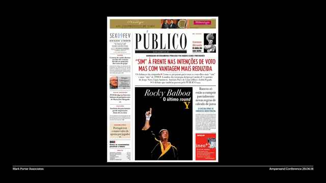
And I've got here this photograph.
This is a bio for DJR.
This is a photo of DJ (chuckles).
But you know what, I'm really bored with boxes and rectangles.
This is really getting out of control.
Everything looks so much the same.
So I'm gonna come in here and I'm gonna instead use ClipPath like Mandy was talking about before.
And I'm gonna say, "Clip path, circle." And now I've got a circle.
And you can see also right here, this little icon showed up, this little dots, and you can click on it, and now I've got a tool, to be able to adjust this right here in the browser and move it around and make it however I want. Maybe I decide that I kind of like this kind of a crop. And I can grab this code and I can paste it into my CSS. And where does it go? Goes right here.
And cool! Oh, didn't work, didn't work.
Oh, didn't work, crap.
Live demos.
Oh yeah, I totally forgot clip path.
Let's type the words clip path.
Thank you front row.
No, it didn't work.
It's harder to do this when your hands are shaking. There we go.
So then also the other thing I'd like to do is use CSS shapes here.
So I'm going to say, "Float left." And that's gonna float the content around the shape that I've got going.
But then I'd like to do shape outside.
And I'm gonna do this same circle, and it's gonna float the text around in a circle. And I can apply that same exact tool to the shape, the way that the content is gonna flow until I get that to work the way that I want it to. The clip path is on the image and the shape outside code is shaping flow in the way that the content flows.
Over here, I've tried it with polygon.
And I'll show you how the tool works with a polygon. Click path polygon.
And I can move my points around until it's whatever I want. I can double-click and add a point or double click on a point to remove it.
I can also hit the command key and click on this icon and it sort of switches the mode of the tool, and I can click and drag it, or click and spin it, until, however, I get it to where I want it to be. And the same thing is true on the shape outside property. I can move this around until however it is that I want it to be.
So how do you get your hands on these tools today? The Grid inspector is out right now.
You can use the Grid inspector to edit CSS Grid in Firefox, the regular version of Firefox right now.
In Firefox 62, which comes out on September 5th, we're gonna be adding the shape path editor, CSS shapes, support for CSS shapes, and all the variable fonts to Firefox regular release edition.
And then the Firefox font editor, maybe we'll come out in 63.
It's not gonna make it for 62, we're hoping for 63. We don't know yet for sure, we'll have to wait and see if the make that deadline. But if it comes out, then it will come out in October. If it doesn't make that deadline, it will come out in December.
Well, that's kind of a bummer.
I like to wait that long.
Well, really, there are two versions of Firefox. There's sort of two worlds that you can live in in Firefox. And one of them is the version of Firefox that your users have.
If you're a person who makes a website, the people who go to your website in Firefox are gonna use the regular release version of Firefox. But of course you could use a pre-release version of Firefox and I recommend using Firefox Nightly.
You can use Firefox Nightly today, though, all the demos that I just did are in Firefox Nightly.
And you can get your hands on these tools right now. You might be familiar with Firefox and know that there's also a beta and a developer edition. Beta and developer edition, are one release ahead of regular Firefox, and Nightly is two releases ahead of Firefox, which gives you four Firefoxes to choose from. I try to just keep it simple.
I use either release or Nightly, 'cause I really wanna be two versions in the future or more actually much of the time.
You can get Nightly by going to nightly.mozilla.org, and downloading it from there.
And really, in Nightly, there's two different kinds of things that exist in Nightly. One of them is stuff that just exists.
You open up Nightly and it works.
The other is the stuff that's kind of not really stable yet. Maybe it breaks, you know, I don't know, six days before you're supposed to stand on stage and do a whole demo and it's broken for three days and you can't use it (audience laughing).
That kind of stuff.
It's like the dev server.
That's usually okay, but you kind of don't want to tell your client the URL for the dev server 'cause it might go down and you don't want them to freak out.
So if you wanna turn on those more less polished, the less polished stuff, you can type about:config into your URL bar, as if it were a URL, and you go to this super secret, you get to the super secret door which tries to scare you away with scariness and you go, "I'm not scared." And you get this long page of all the things that are half built or a quarter built, or barely built in Firefox.
And you can search and find it.
And if you type fonts in there, it's gonna narrow it down to all the things, all the flags, that have the word font in them.
If you type font editor, it narrows it down to font editor. You can actually just explore and be like, "Huh, I wonder what happens if I type flexbox in here. "I wonder if there's, "hmm, something is under construction for flexbox." If you would like to turn that on and try it out. And there's this funny user interface there, where basically you just double click on the line that you care about and if it's a boolean, and it's false by default, which means that that particular thing is off, like the font editor is off right now by default, you can double click on it and it will turn it into true. Great.
Instead of a checkbox.
I mean, why would you want a checkbox even really. Of course, double-clicking on just text is definitely the interface that we should have. It's an extra super-secret door.
You have to actually know what you're doing to get through the door.
But it means that you can turn on things in your version of Firefox Nightly.
It's just your personal version, right? It's extra hidden from say users of a website. But it gives you a chance to go ahead and use it now. If you see bugs we'd love for you to report them at Bugzilla and there's plenty of documentation about these tools. There's a whole page on the Grid inspector. And you can check out like exactly the things that are there and how to use them.
There's a whole page on the shape path editor, the shape path editor, that works both on click path and on CSS shapes, because the underlying technology is the same. Maybe someday it will work on SVG too.
I don't know, it doesn't yet, but maybe.
The Firefox font editor documentation isn't finished yet because the editor is still changing too much for us to document it quite yet, but it's under way. I also want to let you know that I have a whole bunch of videos up at YouTube, the channel called LayoutLand, including a video where I explained the shape path editor in great detail as well.
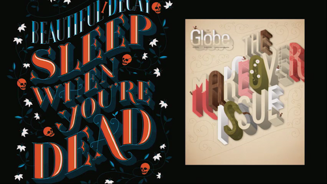
And I just want to mention as many of you are familiar with my work, I've been talking about layout for the last four years. And this year, I'm really focusing on intrinsic web design. I think that things have changed so much, so drastically, with Grid, with shapes, with variable fonts, that we are really in a new era for graphic design. Mandy was talking about this, like we really can change what's possible.
And I feel like we need a word for it.
We've we used to call things flexible web design, or fluid web design and we did fix with web design. We have responsive web design.
This is really quite significantly different from responsive, and so I'm proposing that we call it intrinsic web design because it gives us the ability, all of our new tools, give us the ability to do things like this, and like this, neither of which have any breakpoints in them at all. No breakpoints.
The flexibility in the way we morph and move things around. This, there's multiple stages of flexibility. Say in columns, where one column can be fixed, while those others like the second and fourth column are squishing while the third column stays the same. And then when the second and fourth column stops squishing, then the third column starts squishing.
It's a really new day where we can programme whitespace. We can use overlap.
We can have stages of flexibility.
We can change how it is that we use the Viewport, especially in the vertical direction.
I have a whole bunch of demos up at labs.jennsimmons.com. The page itself is a demo.
I'm really fascinated with taking canonic 20th century graphic design and figuring out what it means to make it flexible or intrinsic in the way that it's laid out. So please come say hi.
Please come ask me questions, I'd love to talk to you. Thank you very much.
(audience applause)