Designing extreme fonts for the web
(audience applauding) - Hi, I am very excited to be here to talk about fonts that go to the extreme. I also designed text typefaces and normal usable stuff, but today is about turning up those dials of with or weight or size with the goal of doing something that has an explosive effect one might hope. So as Rich alluded to, today is actually supposed to be the last day of my honeymoon.
My wife right now is in Italy without me, (audience laughing) but I was like, "Dear, we have a lifetime together, Ampersand is only one day", and when that didn't work I was like, I need to meet Rich Rutter because I am at his site all the time for many reasons, but not the least of which is when Wikipedia removed all of the, like the list of pangrams, because they thought it wasn't relevant.
You were the one who put it back up, so thank you very much for that, this is like a type designer resource, like best it gets.
So I mean my wife, so she understood that for whatever reason and she's actually cool with it, because I mean to be honest, like many type designers, I'm a pain the ass to travel with, because I'm constantly taking pictures of weird signs that I see.
These are all from the past couple weeks in Italy. I see something like an A and it looks like a backwards R, and I'm like, "Dang, how did they pull that off?" You know, it it looks good and it looks really distinct. And like this where it's like the letters just fit that sign so nicely and I mean you really get a sense of time and place from these sign, and that's something that's really hard to do in fonts, and I think that so far it's been the theme of today is how do we get that really specific, a distinctive look, like how do we make ourselves look different with fonts which are kind of designed to do the same thing over and over again, and the most versatile fonts tend to be the most boring fonts.
So yeah and as many mentioned, text as opposed to images on the web, it's fast, it's accessible, it reflows, and it helps with automatic translation, SCO, whatever, but how do you do this stuff and still keep that. So to me that's like a central tension of typography today like we we wanna make these flexible systems, but we want, and any of our users might only see one aspect of that multi dimensional system, but we want that one thing that they see to feel specific to make us look distinct, and to just be a special typographic moment for them. So I'm interested in making fonts that lead designers towards these choices, and because of all the technological development that's happening right now Grid, variable fonts, whatever, colour fonts as well, we have unprecedented tools at our disposal for making type fit to a specific context, and not all of these technologies are quite ready for production work maybe like support just isn't there, and browsers or whatever but that makes it for me at least, a perfect time to mess around with them, because the stakes are relatively low, and the excitement is relatively high, so it's like now is the time to do weird stuff, which makes me excited.
With variable fonts specifically, Bianca showed the digital version from The New York Times, this is the original metal version, and this is one of the first type superfamilies. Actually if you read the subhead, it says the Cheltenham Family is beyond all doubt the most popular and most distinctive gathering of relative typefaces that the world has ever seen. I wish I can market my type like that.
I mean the way that we've been framing variable fonts a lot is that we take a family, a group of related on fonts, that are supposed to work together, and make them more efficient, and so we can present them as one file, but the experiments that I've been doing over the past year and a half or so on have been taking a slightly different approach, and I'm not, actually haven't been focusing on making, like taking the regular and taking the bold and putting together, I'm knot thinking about families as much as I'm thinking about fonts with additional capabilities, so it's like this is a font and it has the super power of getting very wide or it has the super power of getting very thin, and because variable fonts offer each and every gradation in between the light and the bold, I've been trying to explore ways that you can use that super power, and one of the ways I've been doing that is I started this thing last year called Font of the Month Club, I know there are some club members in the audience, so you were awesome, thank you.
So I as the name implies, I send out a font each month and it's been, I try to give designers a chance to challenge themselves, and find new and unexpected ways to use type in their work and at the same time designers give me A, money and B, just an opportunity to set aside time to work on little small scale experiences and especially variable fonts.
You can see I've done, you know to me variable fonts are, they're not the cake, it's the icing on the cake. Yeah, I mean it's been really fun to experiment, and just send out variable fonts, I just send these out through email, so it's not like a real font release, it doesn't have to be production ready, it's just like, "Hey, here's a font, try it out, "let me know what you think", because It's the 29th today, I actually have to release a new one while I'm here in the UK, not stressed about that at all, but this whole thing actually start with a typeface that called Fit, and as Mandy just showed us, you can use a background clip to make a little more epic. There's the code, I'll just skip that.
Yeah so the whole concept with Fit is designed to fit just about any text, and just about any space, so it's just a font that fill space as much as humanly possible.
So if I'm allowed to get meta for a moment, right now this projector I'm giving a talk to you, projector has an aspect ratio of 16 by nine. So if I were to give this talk at a four by three aspect ratio, the font would theoretically just change with it, without re flowing, it's just the actual letter forms are changing to respond to that space.
Filling space is, I mean essentially what we all do as typographers is just fill space with text, but there's like a natural almost instinct to wanna just stretch out type to occupy space, and this goes back to as early as type was made big, people were just filling posters with that. Today of course with scalable vector outlines, any type face can be manipulated to fill space, I will pass it to you that some type cases are better at that at it than others.
Actually doing this is like a little bit trendy right now in that right but wrong sort of way, but I mean I think even the best designers out there have cheated a little and just scrooched the font a little bit to make it work somewhere, and if you kinda know what you're doing, you can get away with that.
Filling space goes back a long ways.
There are little examples like Hebrew has a tradition of extending letterforms to just reach the end of the line, like you can see there, to big examples like the Arab Kufic style, where words are kind of put into a maze to create these dense walls of type, lettering actually.
A favourite example of mine was shared with me by type designer, Toshi Omigari, this is a Japanese Banzuke which is a ranking chart of sumo wrestlers from the Edo period, and as he explained it to me, the belief is the more dense the layout, the more packed the auditorium, and I'm like okay, cool. More recent examples and also more western examples the psychedelic posters of the '60s and '70s, this image was provided to me by the Letterform Archive in San Francisco, if you ever are there, check it out be, and they gave me these super high res images, so I just want to share with you these drool worthy zooms of this image, I mean to me, this is the gold standard of what I wanna do with my fonts but can't, because lettering; you know this is a person drawing for a specific size, a specific block of text, and with Type, Type is boring, we got these boxes I gotta draw in, and so it's just one box after another, I have to take a different approach.
So before I see my approach, I should show you a few other Superbowl approaches that I really like for filling space, and what you get is you get fonts that carve out like you can see the block here right, and then the white shapes just curved out out of that block in a contemporary version of it.
That was, I'm sorry, Motter Ombra, and this is a contemporary kind of successor I think to it, called Blenny from Dalton Maag.
And you can do really cool stuff with really small white spaces.
This is a type of text Klimax, and you can even remove those white spaces completely to get super duper bold, this is called Pufff, that is spelled with three F's, there is a triple F ligature in the typeface, and that boxing glove that you see is actually the Unicode pointing fist.
This font is like, I shouldn't include this slide, but I have to.
This one has a full array of OpenType features, fractions, historical forms, anything you would expect from a normal textface, but totally not.
So I mean this is kind of as far as you can go in terms of weight right, but what I kind of realised in developing my typeface Fit is that weight and width are are really two sides of the same coin.
As things get heavier, they get wider, and as things get wider, they get heavier, and this is true in conventional typefaces, this is Titling Gothic by my colleague David Berlow, and you can see in in the I on the left, the red I on the left side, these are all called Narrow ostensibly, but the actual letter form gets wider as it gets heavier and the flip is true.
We're now looking at all of these are called Bold, but in order to make them feel appropriately dense to be a bold, you have to actually add weight as it gets wider to fill that extra space, and this is, I found this to be true, I designed a monospace font called Input, free for use in your code if you would like. But yeah, and when you have a fixed width, when you have, when every letter is the same as every other letter, you kinda have to make compensations. So if you look at the stem of the R for example, it's not heavy and the M, because it's a more complex letter being squeezed into the same space, the stem actually gets ever so slightly lighter, this is like typical type designer talk slide of like, "Do you see the difference between "those two circles, they're so different", but what you'll find as Input gets bolder, that difference and gets more extreme, so you can see now the R has that stem weight, and the M has that stem weight.
I mean as it gets bolder, you kinda have to push things further.
So what this kind of brings us to is that a design like Pufff and a design like this, this is Druk XX Condensed Super, are kind of the same, you know they're doing the same thing, which is just like being as dense as possible, and you can see like in the lowercase G of Druk, how it just curves all the way up to just fill that space so much, it's awesome.
And people actually experimented with what if rather than making typefaces narrower, we think of making them taller, this a Cinderblock, that kind of plays with that idea, so it starts with a normal design and then just grows it, grows it, grows it to ridiculous extreme.
I should be clear, these are not my fonts I'm showing you, these are other people's fonts, I just love them, and this is what I was looking at when I was making Fit. Yeah, so this gets pretty intense, I'll give you a second on this one, take a sip of water. Yeah.
So Toshi Omagari, who I mentioned earlier, developed this typeface called Cowhand, which is super interesting to me, because I love reverse stress type, and it also includes an open type feature, where it actually has narrower versions of every letter in the same font, and as you type, it can sub out wide letters for narrower letters, so here's how that works. So this is not a variable font, this is pre-variable fonts, but just by swapping out different letters, you got kind of a cool effect, and I thought this was a really cool example. Another recent font that I absolutely love is a Calcula by Shiva Nallaperumal, and what it does is rather than adhering to the blocks that make up type, it allows some letters to intrude on other letters, so you can see how that L kind of dips and dives below that C, and the way he was able to accomplish this is with hundreds if not thousands I think of ligatures in the font, so this is maybe not your web font that you want to use and load all those clips, but a cool example nonetheless that you can type and as you type, it intelligently figures out the best arrangement of the letters.
So for me, my goal in filling space or my strategy for filling spaces I should say is trying to use variable fonts, and because of that my approach was very different than Shiva's, you can see how my, it is just a good text.
Type designers are always writing inappropriate things and not realising it, I did realise this, but after I typed, I was like, no, I'll leave it. So I mean my strategy is take each block and fill it as much as possible, where Shiva was able to kind of make compromises, like his L doesn't have that extra weird serif, like my L is like almost a U, just like a little bit missing, and to me, one of the other things I try to do is just if like the T is such a problem character, so I just use the lowercase form, because it filled the space better.
So the concept of Fit goes back to that monospace typeface, so remember how you have a difference between the simple and complex shape and how that difference became more exaggerated as the font got bolder? So just take this screen and say this is our space and that's the letter I from Fit.
There's the stem weight in case you couldn't see it, and then same concept, just take the R.
now here's the stem weight.
So now instead of being roughly the whole screen, it's now just roughly half the screen.
Take the cap M and now the stem is about a third of the screen.
So it's essentially a monospaceish typeface, the difference being that rather than stopping at just monospacing the letters, Fit monospaces words, so you just continue to lighten the stem, and further, and further, until it gets some pretty unreadable, like I don't know at what point you stop trying to read this, but yeah, I was like, "Well we're kind of approaching the limits of legibility", but I was like, "Wouldn't it be cool if the stem weight "could be the same as the counter from weight", and so I was like, "Okay, well almost there, almost there" and yeah.
Sorry, I got a little, so the whole thing that makes this work is that the counter forms, no matter what the stem weight is the counter forms always stay the same.
So what this means is it's kind of like the singularity where weight and width meet, because this literally cannot get heavier, without getting wider and it literally cannot get wider without getting heavier, right? It's like being at light speed and the rules of physics start to break down, this is like where we are in this type face.
And not only the letters do this of course, I had to get pretty funky with the numbers, you can see like the the waist of the six goes way up to fill the space, waist of the seven goes way down to fill the space.
The symbols, I still don't know how I feel about that percent sign, but it's just like you gotta do what you gotta do. Accents, also I figured these should just occupy that space, so the ledges dipped down to accommodate the accents on top, but I got nervous that people will get mad at me for that, so I did alternate versions.
This is especially cool in the Vietnamese accents, where you have accents stacked on top of accents, so the letters really has to dip, just to accommodate that.
Also alternates, and then I was like, well, this is kind of a cool constructivist style design, surrealic would be cool, so I got advice from a Russian typeface designer, Mas Torelli, and I'm pretty happy with it, the way that this turned out, and you can tell me if this is okay, but I also drew it Greek, and the latest edition is not drawn by me, but an Isreali type designer Oded Ezer asked me if he could draw the Hebrew, and I was like sure, so here is the Hebrew. There you go.
So yeah, the way this works, I'll show you a little code, but I don't wanna get too, I just wanna show you how this is very achievable with fairly simple tools.
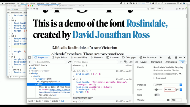
So rather than taking text and transforming it, where you get the distortions between the thicks and the thins or it gets changed, it's gonna use a proper width axis, so you can see that now that low contrast design in this example, what remains constant across the width axis but it's destroyed when the font is transformed.
So the idea is I wanted to make a website where in the browser depending on the width of the container the font will just fill that width.
So we have all of these different options given to us in the variable font, but what we realise is only three mattered for this particular design.
This is the default.
So what we do is we have a piece of Javascript that just calculates the width of any given text at the default, the narrowest, and then the last.
So we have those three values, and then is just linear interpolation to figure out which width access will deliver us the text that we need to fill that space.
So here's the website you can see as the, this is pretty subtle but the D in dump and the T in trash are slightly different weights, but you can see that it's not a, it's a transformation, right, 'cause the counter forms always stay the same. And then you can take those, and you can drag just like you would squishing a typeface just like we are all taught not to do, but you're doing it with a proper font and it looks very nice.
Yes, so to do this we were on using the width axis with font variation settings, but hopefully soon, I think we can switch to front stretch which will be kind of a more high level approach to that, and to me it's still awesome that we could do all that with a single file.
Of course we released this in January 2017 when no browser supported variable fonts, so we had to have a fall back, on our fall back was this. (audience laughing) It was pretty rough.
So this kind of leads us to an unrealistic, but still fun apples to apples file size comparison between the static and variable font versions, so we have 20 megs of woff2 files, no big deal performance versus a 34 K variable.
So I'm like dang, it's pretty good.
Don't expect that from, I can't emphasise this enough if you want to come talk to me after I did do some app like more realistic file size comparisons if you care, but it's important to remember that this piece of Javascript that we wrote was specific to Fit.
It found, it knew that family.
it knew it had three pressure points, and it could calculate based on those pressure points, but very recently Laurence Penney, who's in the audience, released this awesome tool called to Fit To Width, and it essentially does that same thing, just take text and fit it we can do it to any font, and he said it uses a binary search algorithm, so it's checking various settings before choosing an axis setting that has within one pixel of the desired width, if you wanna know what that means, ask him.
But yeah, here's the demo using Fit.
Here is with the text before the demo.
Boom.
That's it, and just yesterday, it's always exciting to include very fresh stuff in a talk, he released a version that not only changes width, but will also change ligatures.
So if a font has discretionary ligatures, it will actually implement those in order to let the font become narrower, I should also say that this is super advanced and you can also have it manipulate letter spacing and word spacing as well, so it's a lot more than what I did with Fit, but I think it's really cool.
Yeah, so I guess the last thing I'll share about Fit is the best piece of feedback I've ever received on any of my typefaces.
But I think this person got though, 'cause right, this is meant to be an experiment like I didn't wanna release the text face that did this, because it couldn't be properly implemented so I think an experimental font requires an experimental design.
So I kinda with Font of the Month Club, I've kind of tried to take that idea, and push it further, Output Sans Hairlines, this was March Font on the Month, so what it does is it kind of does the similar thing to Fit where it's taking up space, but it's doing without filling it with ink, quote unquote ink, so the idea with this typeface is that as the typeface grows, normally you would just take that same outline and scale it up, right, you couldn't maintain a point, so I can say for this typeface that at that size and at that size, I want that stroke to be one point, because just as weight and width are the two sides of the same coin, optical size and weight are also two sides of the same coin.
If you push things far, they all kind of meet in weird and funky ways.
And this is pretty easy to implement, you essentially just say I would like my optical size value of my optical size axis to be the same as the point size, and it works, of course size is very weird on the web, so it doesn't, is maybe not quite as straightforward, but the same thing applies where even if it's not one point, no matter what size you set this typeface at, the stroke will always have the same weight. Yeah, and just quickie CSS 72 point font variation settings of size 72.
What I didn't realise until the last minute of this design is that in order to make that math work, it's not exactly a straight line, it's actually a curve to match, as something scales up and as it grows, so that was like a last minute panic on February 28th before releasing this font on March first.
So what I was able to do as a stopgap solution is put five masters in that font to kind of approximate that curve.
But what variable fonts can actually do, which is very cool, is use an axis variation table which is like an additional table, where you can actually do axis manipulations rather than having an axis be a straight line, you can actually make it be a curve without adding data. So that was cool to find out, and I haven't implemented this one quite yet, but I think it should work.
Yeah.
So.
Manny said you're looking for a colour or variable typeface or a layered variable typeface. There you go.
This is Extraordinaire and so the idea with this is that I would have one font for the main letters, and then I would have one font for the shadow, so it's still loading two fonts, not perfect, but the idea is you can layer the same variable font over itself to create kind of cool effects. This typeface is based on lettering I saw when I was in Sao Paulo, the downtown there has this awesome art deco building like historic area and it's really amazing all the signs, so I figured a monoline typeface should have a monoline shade, so it has a weight axis, just like you'd expect, but then it has this shade distance axis, so it's actually, the line gets further from the letter, and parts of it kind of subtract from itself, as it does, so it's like kinda getting hidden behind the theoretical letter there, so the way this works in a desktop app is you just copy and paste a version of it, you mess around with it, get it to be the weight you want, and then you can do the same thing again, give me a second, I always record the stuff too slow. Yeah, maybe change the weight, change the distance. Keep going, keep going.
I suck, sorry about this, and then this is what I wanna show you, copy it again, change that distance one more time, and boom, you have a second shadow using the same exact font.
On the web, using the, just a normal h1 for the basic thing, and then the before and after psuedo class as many showed us.
I embarrassingly said you could add that with Javascript, forgetting about the data attributes, I'm sorry, I'm not a developer.
I was like during your talk, I was like I need to change that, and I like reached for my computer, and I realised it was already on the podium. (audience laughing) So I mean like these are still separate fonts, this is not a true colour font with colour data, you apply the colour yourself, but it's definitely in the direction of colour fonts, and just to define colour fonts, just like your emoji, your emoji font, you have a glyph in the background, and then that's covered by an image on Apple, Iris, I should, this is one strategy, on Apple, you see a PNG image just over-layed over the basic glyph in your font.
There's also SVG, an open type which is great, and that's been supported for a long time in Firefox and Adobe apps, which is great.
I guess I should be more specific, Photoshop, and Illustrator, thank you.
So you're just taking image data embedding in the font and smacking it over the glyph.
There's a second kind of colour font where you actually assemble layers like you were showing, but from other glyphs in the font, so I can have my default glyph, a colour glyph on top of that and then a colour glyph on top of that, and again this is not happening different divs, this all happening with in the font.
So you get to a question, can there be a variable colour font? The answer is kind of.
Actually our Roel Nieskins, a Dutch developer, had me draw him a poop emoji.
I guess he wanted to try to figure out whether you can actually make a variable colour font, so what I was able to do is just draw each element of the poop emoji in separate alternate glyphs and then he did the technical wizardry of combining it into Mister Poo, who has a variable cap.
(audience laughing) I apologise.
I know I'm sorry.
But I was like, so at the time browser support was not very good, now browser support has improved, because now we're dealing with two emergent technologies so you need support of colour fonts, and also variable fonts, so a lot of situations this only still half works, sorry his eyes creep me out, I need to move to the next slide. Anyway so the Font of the Month for this month which is June is Merit Badge, and what makes Merit Badge distinct is that it is a fully typeable non-piece of shit variable colour font.
So the way it works is you have, you have different alternate forms coexisting within the font and then there's special tables in the font that will tell, that will instruct it to say layer these forms in this way and assign them to these colours. So that means that you can take, you can take what was this, and make it that, which is cool, but then because each of these glyphs are variable, they have a weight axis, and there's actually also a seraph axis which will remove those silly slab serifs.
Because each of these is variable, you can using the same font, do funky stuff like this, and in addition to the colour data that's already in the font you can also do what we just showed you which is taking the same font and layering it on top of each other to get even more inline effects.
And because it's colour and it's variable and it's fun, you can also animate it like that.
And this is like really simple, this is CSS key frames each letter is in its own span, and then just setting up an animation and watching or reading Val Head's newsletter, I try to have it with a little bounce back, so you know rather than just going from this to this, it overshoots, and it goes to the end of the variable axis and then pulls back and then I use SASS for this, 'cause it is easy to just loop through and give each span a slightly longer time delay, and that's why you get that cascade effect. So yeah it's not super complicated and not too shabby support.
At least what you get is you get some browsers that would render the colour font, but not the variable font like Firefox right now, but that will change, and then you get situations like in Illustrator and Photoshop, which will give you the variable font but not the colour font.
So it's a fun font to play around with.
Yeah and the other thing is, so I'm telling you how you can manipulate the variations, but what about the colour? There is in the latest as CSS fonts working draught. a font palette property, this is not supported yet, also no apps allow you to access, I mean I actually, in Merit Badge, in the font, I have stored many colour palettes for you to choose from, but there's no way for you to get to them yet, so in the meantime I contacting my colleague Chris Lewis who also wrote my Fit to Width thing, and we came up with this where you can actually take the font file, drag it onto the website, manipulate the colours, and download your own version of the font file, this is hacky, it's not perfect, but it is what it is, again I just take too long, I'm like sitting there, "Oo, I wanna get "the perfect colour", it'd like, no it's a demo for a talk, do it right, and do it fast if you want to eat lunch.
Anyway so you download the font.
La, la, la, open it up and magically it is a colour font, but with your customised colours, and fun little Easter eggs this will actually work on not only Merit Badge but also other colours fonts, so you can take this as my typeface, Bungee, stick it up there, download your custom version, cool. So this leads us to I think the big question about these weird experiments I've been doing, are they actually useful? And I mean this is something that I think I've been struggling with a lot and just thinking about how my approach to how I wanna approach variable fonts 'cause I think variable fonts are great, but I also think that we need to kind of like be level headed and try to think about applications that people can actually use, and so, a variable font I think is only as good as its default style, so I mean just because it's a variable font, doesn't make it great, and there are plenty of non-variable fonts that are great, you know I can juggle, but that doesn't make me a good person, it's like having the capability and being a good something, are different things, and so I mean I think what we're gonna see a lot of is font marketing like this where it's like variable fonts are cool, because they are cool, this is cool, right, but it's like let's not let it distract us from actual letterforms good, because our users aren't gonna see this most the time, they're gonna see one instance or they're gonna at least one instance at a time, they resize their browser, whatever, they get a different one, but the idea is most of the time for them not to notice, so this might be flashy, but I don't want it to like don't let the pretty moving letters distract you too much, and not every font needs to be a variable font. I think some, and not every, not every great use of like display type on the web needs to be fitty or whatever, one of the other things I was taking pictures of besides lettering is pictures of one of my favourite fonts, Astro by Aldo Novarese designed in 1961 which I believe is pre-variable font.
But it's just such a distinct typeface, right, it has this unusual horizontal stress, it has this kind of hand written balance to it, and it has such a unique flavour, it's kind of all you need to set yourself apart is making that choice to use that weird font. And I guess this is kind of where this talk is going and maybe where earlier talks today have gone is that we don't make these weirdo display fonts just for ourselves.
This is asked by the the publisher of Calcula, which I showed you earlier, "Is this a type designer's type design?" Are we just looking at our own belly buttons, not thinking about our users, and I don't think we are, 'cause I think we are trying to challenge ourselves, we're also trying to challenge type users to I guess push the envelope a little bit, we want to give you tools to to do that.
So as I wrap things up, I'll show you a few examples of Fit in use, this might be one of my favourite examples of Fit in use, it's a book designed to be a way for you to take sneaky pictures of people as there's a hole in the back. (audience laughing)
Yeah so again experimental stuff, experimental fonts, this is super creepy.
But I mean I think that's what these fonts have to offer is this instant graphic design, just add content.
I mean these fonts are so loud and do something so weird and off putting, that it's like you don't really need to do much else to put together a piece of work. And I get that most typographic decisions need to be boring ones, I mean that's that's how it has to be and you should really play it safe for your client or for your reader, but there's that one percent of time where you have an opportunity to do something, to really go extreme and because, I mean just I don't know, I don't know if you're doing a poster, a birthday card for your own birthday, whatever, it's like if you have a chance to use a weird font, that could be a moment that's really special, and can truly set your work apart, and in my own work, I find it always makes sense to go a little bit further than I need to and then kind of step it back, so if I'm going to draw a bold, right, I'll actually draw the black and then interpolate back to the bold that I think is right, because if I don't go further then I won't know what's there and so I really encourage you to go, to do the same thing, you know, choose a riskier font, just try it, before walking back to the safer one. You know we like to laugh at Comic Sans, if it's used on a grave stone or whatever, but I find it more tragic to have an opportunity to use something cool and to settle for something boring, so like Michael showed us our project with Helvetica for Cambridge it's like, as long as you try another font first, I think that's awesome, right.
Were it's like try that weird thing before scaling it back to the boring thing, because I think extremes are always worth exploring. Thank you so much. (audience applauding)