Typographic Revolution?
- All right, there we go.
Thanks Michael for the great introduction.
I'm gonna talk about voices as well.
Not so much about branding though.
I'm a communication designer and type designer by education but right now I'm working at Dalton Maag as the Head of Skills and Process which is kind of not saying much.
But what we are doing in my team is look at processes and software for developers that are working at Dalton Maag making typefaces, making their life easier. And the other part of my team is taking care of in-house training of these people.
But overall, you can say that in one way or another I always gravitated around the idea of helping people to communicate their ideas.
And we could start by looking at what I mean by written communication.
So on the one hand you have an author who produces content.
They usually have a very rich picture in their heads and they try to transmit their thoughts through text so that the reader on the other side can reconstruct the picture that the author had in the head as precisely as possible.
Sometimes that goes right.
Sometimes it's not as clear.
So we can always try to support the text and the ideas that the author wrote down with images or we can add illustrations.
We can add photos and graphics.
And less obvious, but in my opinion, equally powerful is typography.
Thomas James Cobden-Sanderson wrote that the whole duty of Typography is to communicate to the imagination the thought or image intended to be communicated by the Author.
And Cyrus Highsmith said that the detail, that typography is a detail and presentation of a story.
It represents the voice of an atmosphere, or historical setting of some kind and it can do a lot of things.
And I think he's just right there.
Typography is not as obvious as images.
You can say, oh my idea is a duck and then put a picture of a duck right next to it. It's just very immediate supporting the text. But typography is a little bit more subtle than that. It's a little bit like colours if you want. It contributes to how the reader perceives the content, not how it actually reads it. So that definitely happens on a very subconscious level if you want.
And it's less obvious than processing other visual information.
There are very smart people out there like Kevin Larson, Dr. Alessia Nicotra, and Bruno Maag who are actually researching this kind of connection between typography or type and emotions.
So they're trying to find out if you are subconsciously reacting in a different way depending on the typeface you're using. I will it to them to explain exactly the results of their research and how important the visual appearance of text is.
But I would like to use this opportunity for a little detour.
I was asking myself why do we make certain typographic decisions.
And I came up with three words that I think might be important.
It's content, context, and functionality.
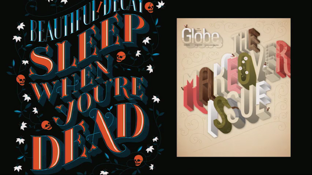
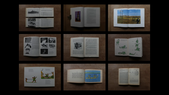
I'm gonna give you some examples by what I mean by those by looking at book typography.
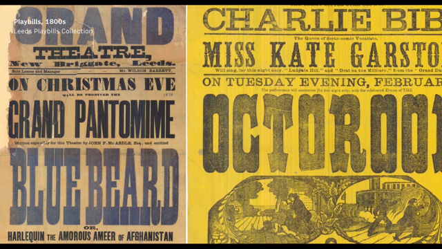
If you design a printed book you want to think about what is the genre for example? Are we designing typography for nature guides? Does it look like this? Or do we produce guides on how to produce printing paper? Is it a travel guide? Could it look like that? Could it be a bit more free in the typography that it's using? A bit more playful with additional elements like illustrations? Is it a play? Does it need to be very very structured so everyone can understand who is speaking at what point? Or it is a collection of songs? Which just needs it's very own kind of typography to support the actual notes and text? What is the style of the language? If you have read Dracula you know that it's basically just a compilation of journal entries. So this designer went ahead and gave every writer of the journal entries a different typeface. Is it a playful examination of different types of languages like this book, which I would recommend everyone to read, it's very very funny.
He's basically taking the same text and giving it a different kind of language, a different kind of treatment.
Is it a very factual book about German surface vessels of the second World War? Does it have to be long because boats are long? What do we do with the text if we have these kind of books? Is it a prayer book or the common worship? What does it look like inside? Is there a lot of hierarchy? How do we guide people to find the places we want them in the church? Again, the style of language depends on is it poetry or play? It just looks different.
It needs to play a different role to the reader. Is it an instruction manual on how to get a teenage boy and keep him? (laughter) Do you have to think about tables that need to be implemented that give you exact details on how to get your boy? (laughter) Is it something like this? If you're not a native English speaker maybe you want to have this in your pocket all the time because it's really difficult to understand how some English words are written.
Because they all sound the same somehow.
Is it a tiny little travel guide to Berlin, and then how do you treat the information in there? Is it in a completely different place? We all have different cultural backgrounds and experiences that might effect our perception of type in one way or another. So do you consider the time and the place where it's being distributed? And then, also look at the audience.
Who are you designing for? Are they able to afford only paperbacks like this sweet Madame Bovary book.
Or can they have glossy versions of the same text with pretty images inside that's difficult to handle? Are they taking it on a train or are they reading it in a big chair at home? Are you designing catalogues? Who will be buying it? Who is going to the exhibitions? What has to be inside? Also, are you designing for students and scholars? Can they afford the books that you are trying to make them buy? And is there a culture for literature of that kind in the country the book will be distributed in? So, obviously I'm German, and these are the kind of books that we grew up with.
They are classic literature that is in an affordable way produced.
So those are really cheap.
It just costs a euro or two I guess now.
I don't know.
I'm too old for that.
But they're very easily produced and this is the kind of books that people would expect in Germany to buy.
If you have to read certain literature at school you wouldn't think that you would have to pay ten pounds on a glossy and nicely designed one. And editorial practises.
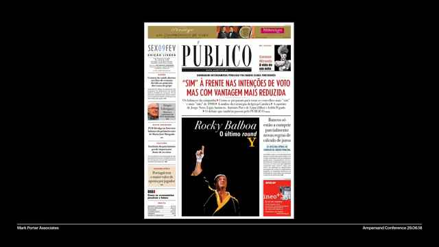
What are the conventions in the area you are designing for? So this is the same book.
It's Franz Kafka's The Trial.
And on the right-hand side you have the German version, on the left-hand side you have the English version.
They were both produced around the same time. This is the inside of the German version and this is the inside of the English version. If you put them side by side you see that the German version on the right-hand side has way more ink on there.
The lines are tighter spaced.
The line length is longer.
And there's just not as much white space on the page.
And I can only speak for myself, but I think after a decade of almost exclusively reading English text now I still find myself drawn to books with more ink on the paper.
I think this is just something I grew up with and I kind of believe in this saying that you read best where you read most.
I think this is just something we are used to so if you give me a book with a lot of white space I will find my eyes wandering around the page and not finding my way through the text anymore.
Someone should really research that.
Are you designing for dictionaries? Are they easy to use? In my opinion, this one absolutely isn't.
Do your readers have special requirements? For example, are they kids? What kind of typography are they expecting? This kind of typography, something like this one which was designed by (foreign word). Or is this one more appropriate? This one is actually the best book I have in my whole library.
I mean, look at this octopus.
Silly.
So yeah, no, this is not an exhaustive list of considerations that should define typographic choices but I think they can give you an idea of the care that often goes into making books.
But what they all have in common is the reader. The person we are designing for.
So our typographic choices should really be informed by the audience.
By bird watchers and cinema goers, and travellers and boat enthusiasts, and people who like to get more boyfriends. At the end of the day we are all designing for people who buy these books.
Except we are not because people don't read that many books anymore.
We used to read way more books.
I would say seven or eight years ago I started studying type design, where is Jerry when you need him, 2010.
I think it was 2010, 11.
And Harold Unger, one of the lecturers was standing in front of us telling us that books are over and we are going to design for digital and like reading on screens. And I was like, no bullshit.
That's not ever going to happen.
I love books too much and there are way many of us that do too.
So that's not gonna happen.
But he was right obviously because he's a very smart man.
So yeah, we are not reading that many books anymore and all our typefaces go on screens these days.
But a lot of us are still preferring to read on paper.
If you are anything like me you miss, if you're reading on screen, you miss the tactile experience and it's kind of difficult to navigate through long texts if you don't have a book in front of you.
That's definitely me anyway.
I also really find it satisfying to put the book aside in the evening just before you fall asleep and just double-check your progress that you made by looking where the bookmark is in your text.
You just can't do that on the Kindle.
Also, studies suggest that if you compare reading on screen versus reading on paper you are just way slower and you read less accurately and less comprehensively.
So that's really bad news for reading comprehension. Reading on screens also drains more of your mental resources and makes it harder to remember what we read.
The attitude to reading on screen is also a little bit different I think.
We all approach computers and tablets not necessarily with a state of mind of learning what we are reading.
It's more like a quick intake of information rather than reading through long texts I guess. And then, my pet peeve when reading on screens is notifications from my really good friends I have.
I actually like the notifications but they are very distracting.
And popups and flashy advertising is just not something that you need while you're reading.
Also, by the way, Medium, there's one sure way to drive me away from your website is when you are interrupting my reading to tell me that you like that I'm reading.
So getting away from multipurpose screens sure improves concentration.
Producers of e-readers support intensive reading by creating something like close to a distraction free space I would say.
But what they all have in common is that they simulate reading on paper.
So basically they are trying to imitate books. And I'm wondering why.
Are we writing using a completely different ancient medium like the book as an example for what reading on screens should look like? I'm not sure about that.
Maybe we can try to find ways to evolve screen based reading into something else entirely. In the forward to the book, The Work of (foreign word) Stanley Morrision wrote that he doesn't think that typography will continue to look the way it did back when he wrote this in the beginning of the 20th Century.
And he goes on to predict that letterforms and typographic arrangements change depending on the medium and how it is produced, and who will read it.
And he was right of course.
We have different means to communicate on screen. We have videos instead of just images.
We have audio which wasn't there in books really. We have animations, the content can be interactive. You can preview some content and you can link to further information and relevant sections. And most importantly, it's easily searchable and shareable.
Screens can assist the author in transmitting their ideas in ways paper just can't.
By using these kind of assistance.
When it comes to intensively reading long pieces of text paper and ink still has an advantage though.
So I wonder, what about typography? What's our excuse for ignoring such a powerful tool when we are trying to convey our ideas? Like why are we not just making more use out of this tool? We shouldn't really have that many excuses. We have pretty capable browsers.
Many of us have access to high resolution screens. And there are really good guides out there like, where's Bram.
Bram is sitting right there.
He wrote this really good ebook.
It's the Webfont Handbook and it just tells you exactly how to load web fonts ideally on your website.
Richard gave a workshop yesterday so eight people in this room definitely know how to do responsive web typography.
He also write the Web Typography Handbook.
So definitely we should not have any excuses anymore to be lazy about putting our texts on website and making them readable and enjoyable for the reader. So what can be the excuse? Maybe it is convenience.
Why would I worry about font loading strategies if I can just publish my ideas on publishing platforms like Medium for example? Macin was here in 2015 I think.
He spoke at Ampersand and he is I think a designer/developer at Medium.
And he talked about the HEX he had to come up with to control micro typography on Medium.
It was a really fascinating talk and I have huge respect for his and his teams work.
The only problem with Medium is that everything will look the same.
So if you put your travel guide on there or if you put a children's text, or a text that should be read by children on there, it's definitely looking exactly the same.
And it doesn't support the text itself.
So maybe the lack of advancement when it comes to web typography is down to performance considerations.
Obviously the more fonts you're trying to load on your website the slower it's going to be and you're going to lose people.
This is Zach Letherman's website and he has a little demo on there so you can switch on two different ways of loading of like bridging the gap until the web font is loaded.
So this is how it should look like.
This is how it looks like when you use the flash of unstyled text.
So basically the fonts are replaced by system fonts and it's not how he wants them to look like.
But once the webfont is loaded it's going to switch back and this is what it looks like when there's a flash of invisible text.
So you don't have the content for a millisecond or so at all and it just pops up once the font is loaded.
So you could say that probably the conclusion is to use the least font styles as possible. I think that's fine.
If you're a small fish, this is from my website, the content is simple, you don't have that much to say.
You don't need hierarchy that much.
You can get away with a regular and bold, maybe italics and probably a smart font loading strategy, and your website is going to be fine.
I just marked the fonts I used there.
Three different ones.
Actually, the headline font is done by DJR who is going to speak later.
So yeah, I'm just using a few, very few font styles and my website is loading fine I think. For most of us anyway.
But I looked as well at the New York Times website and I starting wondering like how many fonts do they use? Because they need to put all sorts of information on the website.
There's navigation and it leads to further information.
So this one actually uses 10 fonts.
The big yellow blog is Georgia.
So that means it's a system font that's always gonna be there for you.
So you're not gonna miss the content.
But apart form that they are using nine other fonts and that just is heavy.
And it takes time to load.
A bunch of really smart people set together to try to find out what they can come up with help people load their websites faster.
This is did at, it doesn't really matter.
These people are from, it doesn't matter if I use their names or not.
But these people are from Google, Microsoft, Apple, and Adobe.
And they and a bunch of independent type makers and other relevant people built a working group and they came up with the idea of variable fonts.
Which is an old idea, but I think somebody else will talk about this later today.
It already came up ten years ago but it was ahead of it's time back then.
But they are making it work now.
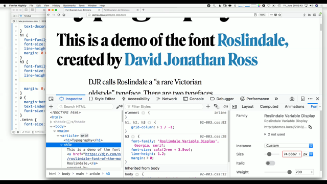
And the idea about variable fonts is that one variable font file can contain the equivalent of multiple individual fonts. The way it works, in a very simplified way, is that if you for example, have two fonts on your website, you have a very thin one, this is your uppercase T and it comes with coordinates to define the outline.
And these coordinates need to be stored in the font file.
And the information for just the outline looks a little bit like that.
And then you also have a bold style that you want to use on the website and it comes with its own set of coordinates and outline data which also needs to be stored.
Obviously there is like loads of other stuff that needs to be stored in a font file but let's just look only at the outline data. A variable font differs in the way that it only stores the information of one outline and then you define the design space behind it.
And say like this is the maximum I want these points to travel.
And you give instructions to the font saying like okay, this is the font I want this point to travel and this is as far as it goes.
And the user can access any instance in between. So instead of having a light, and a regular, and a medium, a bold, an extra bold, and heavyweight you just have one set of outlines and then the possibility to reach any instance in this design space without problems. So for New York Times that would mean that instead of using those eight fonts, should have been nine, these eight fonts but you can replace them by two variable fonts. You might wonder what about the extra condensed we have here on the second to the last. It doesn't really fit into my idea of the weight being accessible.
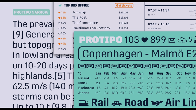
But you can have different axis in the font. And this is the website of Oliver Schoöndorfer who's taking it to the extremes.
He's also using a font from DJR, Output Sans, which has two x's.
The weight axis and the obliqueness axis.
So you can slant characters in different angles or you can define it in your CSS.
And this is only one fragment of the page.
But it uses 13 instances of DJR's Output Sans and it, the only font he needs to load for that is one variable font at 57, yeah 57kb.
So that's pretty impressive.
So you're basically saying you can have a variable font and load only that one and achieve some kind of hierarchy that you couldn't really have before only that you can.
You can have hierarchy in printed books.
I'm wondering like can we push this a little bit further? If we're saying that screens can assist the content in ways paper can't, can it also do the same for typography? So instead of having just images, but also animations, can we have static typography but also responsive typography? So beyond file size savings can variable fonts actually help us improve the reading experience on the web? I would say that the technology is still very new.
So it was introduced in September 2016 at HFI in Poland.
And since then browsers are really eager on implementing it and they're doing a really good job.
People like DJR and other people are developing fonts that you can try as well. They're doing some fun experiments about like what is possible.
Pushing the boundaries a little bit.
But there are some notable experiments as well on how to improve digital typography. And I come back to Bram Stein now.
He gave a talk at Robothon in the Hague in March.
It was about line breaking, justification, and variable fonts.
So he basically was, please just shut me up if I say something wrong, but he was rightly upset about browsers neglecting justified text.
And here you can see the boundaries of justified text on website.
And this is a left aligned text and basically it breaks the word if the next one does not fit in the line.
So basically day, the word day, doesn't fit into the line that says an apple a, so it just moves to the next line.
The red part you see is just left over space that is just there.
So it looks like this when it's left aligned. Looks like that when it's right aligned.
And the space is kind of divided on both sides if the text is centred.
Now, if you have justified text the space is divided by the number of word spaces on the line.
So basically, in the first line you see that you have two spaces, two word spaces, between an apple and apple a.
And the left over space is kind of divided and then attached to those word spaces.
In the next two lines you only have one word space so the spaces is just tucked behind that.
And the last line, away, is just handled like left aligned text.
This is called the Greedy Algorithm and it's used by all major browsers.
And it would just break the line at the first opportunity.
So what Bram came up with was a comparison of different algorithms that could improve how we are setting justified text.
I'm not saying that we should set our text justified, but you know, if you ever find yourself in the situation that you have to it should rather look good. So here you can see the same thing.
This is the Greedy Algorithm that I just talked about.
On the right-hand side next to the text you see the left over space in the columns. Or bars.
If you allow the text to hyphenate words it improves the score a little bit.
So there's a score on top of that which is a sum of all the space that is left over in the whole paragraph.
And so if you allow hyphenation the words can be broken down into syllables which adds breaking points so the score is a little bit better.
You can see that in the word astonished which is hyphenated there and it makes the line a little bit better.
Big word spaces and rivers in text can be avoided by also contracting or expanding word spaces.
This is something I can still see a lot of designers for print do manually.
Unfortunately.
But basically what it does is they're looking at the whole paragraph and try to find out where to break ideally and how does it effect the following lines? And the beauty of it is basically that it takes the whole paragraph into account. And this is used in things like tech and InDesign, and it was developed by Donald Kneuff and Michael Plass.
But it's unfortunately not used by any browsers.
But you can see the score went down.
The bars are a little bit better.
So reading is a little bit better than in the previous example.
But, what Bram did was that he took the Kneuff and Plass algorithm and he tried it out with variable fonts.
So this one uses Venn by Dalton Maag.
So Venn has a width axis and a weight axis so you can access any instance between a very light and very bold font.
But also very compressed font or very expanded font.
So in this example he's using Venn very carefully because he doesn't want the reader to actually notice what he's doing there.
So he's using the Knuth and Plass algorithm and then when there are lines that are still having big word spaces he's kind of like expanding the type, the variable font like a little bit.
It's almost unnoticeable if you just read the text.
If you try to concentrate on it you will find the characters that are actually expanded. But he's using it only very carefully if you will.
I think only plus minus 5%.
Yeah, he's nodding.
So yeah, side by side it looks like this.
So you can see this one paragraph just develops from Greedy.
Hyphenation is helping a little bit.
The Knuth and Plass algorithm is even better. And the variable fonts actually make it almost pleasant to read justified text.
If you compared the notes, sorry the scores, you could see that this is actually quite impressive. The hyphenation alone already helps reduce the left over space by 35%.
41% if you use Knuth and Michael Plass' algorithm and if you use variable fonts you reduce the left over space by 63%.
So, I'm wondering if we can prove that an improved, sorry, if we can prove that an improved reading experience keeps visitors on websites for longer time maybe people who are implementing these kinds of things are getting a little bit more interested and would throw resources on improving typography on the web.
Because I think it's just basically down to that there are people like us on the one side who care about typography and think it's valuable to put money on.
But then, the people who actually have to invest in this might have different kind of interests, mostly business.
I have another example of what variable fonts can do for you.
Let's have a little demo.
So this one, the font is again Venn by Dalton Maag.
This is me, the Queen.
And it kind of looks at my face and knows how far or close I am to the camera.
If I move closer the type is changing.
It's gonna be a bit lighter and more compressed. If I move really far away it goes wide and black so I can still read it from afar. Another interesting demo is this one which takes the light situation in the room into account.
So there's a little sensor right next to my camera on the laptop who knows exactly how the light is in the cinema.
And if I cover the sensor it will think it's darker so the type changes.
If I close it completely it just you can see what it does.
So the font changes depending on how light it is in the room.
But if you do that you can see that the lines are actually changing.
So if the font is rather on the narrow side and relatively light, more words fit into the line so the text reflows all the time.
It's the same with this one.
So there are more words, there are less words on the line now than there are now.
So what that means is that the text reflows based on the situation the reader is in. And there are different ways to get around this.
This is an old principle.
It's called optical compensation.
There are two kinds which I'm quickly gonna explain. This is optical sizes.
So basically it's the metal version of Century Expanded and it was printed and then scanned and then blow up to the same physical size so we can compare the differences between each size. And you can see that on the left-hand side you have very delicate features so they are meant for big display typography and on the right-hand side it's just much sturdier.
So if you print it, first of all it doesn't break. And you can still read and identify the thinner bits of the letter.
This is the digital version of this just in comparison again.
You have higher contrast in the display sizes. Bigger x height in the low sizes and the letters just run wider and shorter s centres and d centres, and loser spacing. So you invite more white space inside to be able to identify the letters a little bit better. Obviously the ones in bigger sizes are used for headlines.
And this way typography, the one in the medium sizes are for like long text reading and the very small sizes are mostly for captions. So those are optical sizes and there is another way of optical compensation which are grades.
And the only thing really that changes for grades is the contrast between the thick and the thin strokes of the letter.
So the advanced width of the letter themselves doesn't change if you overlay them.
It's just on the left-hand side the contrast is different than on the right-hand side, it's a little bit more sturdy. So if you set lines of text in those different sizes you see that the text runs the same way. That will solve my problem of reflowing the text if I go closer to the camera.
It would just not reflow, but it would just make the character a little bit more legible if I'm further away.
And CJ Dunn developed a typeface called Louvette. I think it's still unreleased.
But he did this nice demo for the performance artist (foreign word).
And you can see what I mean by the grades in use there.
It's a little bit better in this demo.
So you can see if you look in the e in Metres for example, you can see that the thin strokes get a little bit more heavy if you're further away but if you're close you can still see them when they're a little bit more delicate. So you can see how the contrast of the typeface changes but the text doesn't wiggle around in a weird way.
Andrew Johnson who did these experiments together with CJ Dunn also had a look at other fonts.
This is again Venn by Dalton Maag.
And he had a look at how can we improve reading in AR when things are on an angle.
Like would it help if we had wider width? Wider letters.
Does it help? This in use actually.
You can see on the top the letters stay the same but at an angle they are difficult to read.
Where on the bottom he's using the variations so they go a little bit wider.
So if their angle is steeper you can still read the text.
So those are just like a handful of experiments that are going on or in the early stages of variable font implementation. And I think they're really exciting.
And this is a quote from Beatrice Warde which I came across the internet I think last week. Nia Stressinger was talking about this.
But basically at the end of the day as designers and developer and typographers we should ask ourselves, are we exhausting the possibilities to improve the reading experience on the web.
And I think we are just about getting started to think outside the box.
We still have a long way to go to implement it in a nice way.
And to bring typography to the same standard as we brought images and illustrations to support text.
So I think we can improve the typography and yes, to answer my own question, I think variable fonts have the potential to help us improve digital typography and I think we are gonna see a lot of that in the future.
But it is a mistake to think that you can solve any major problems just with potatoes.
And so, thanks for your attention.
(applause)