Dancing around the design space
(audience applauds) - Okay, that's the one.
Animate, moves.
So, hello Ampersand.
As Richard said, my name is Irini Vlakhu.
It's extremely difficult to pronounce, I'm pretty sure, so this is the best I can do in phonetics.
So you have to learn phonetics now, so, anyway, I'm a type designer, and I came to talk to you about variable fonts again, which are, of course, fun, and thanks to Bianca and everybody before me explaining what variable fonts are, because I cannot do that, so I'll tell you just break up a few fonts. So with variable fonts, we know already that we have here files, so this Protipo family, the regular, static font has 50 weight, 50 single files, and the variable one has just three.
These files are smaller, also, so it is really good for your web stuff, and this is the size comparison.
So, 50 fonts, or as 4.9 megabytes, and that ends up to be, with the variable WOFF2 fonts to 284 kilobytes, so that's a save.
I graphed this to make it even more amazing, but an interesting thing about the variable fonts is that they're also versatile, so, apart from doing a weight and a width axis or an optical axis, they can do fun stuff.
So this is a 10 axis font that I did last summer as an experiment with just these four characters about how Greek style can change from one to another, so for me that was an exercise, actually, an idea that maybe could be good as an educational tool or even to show a client that, look, this can go like that, this can go like that. Which one do you want? Which one in between? So, yeah, yippee, you know, variable fonts are here, and everybody's happy and excited, and it was in Poland in 2016 that the variable font format was announced, so everybody got excited.
I got excited, so on my way back to Greece, I said, "Yes, my life is getting much better, "and I'm going to try to make them." And then, while I was thinking about it, I realised that this is, hasn't actually changed my life at all.
I still have to draw everything, so, you know, same as before, more or less. I still interpolate everything, and this time, it's even worse because I need to be extremely, extremely careful with interpolation, not like before, and I even check my tools, that they weren't really ready for it, so I had to go hack my way into variable fonts and try to do stuff.
And then I realised that it was even weirder than before. We lost control of the use of our typefaces. I mean, we never actually had control.
You make a typeface, you sell it, you give it to someone to sell it, or whatever, and its beautiful text size, and everybody's it in 3000 point size, you know, and it does screw up everything.
But, at least, you know, it was there.
With the variable fonts, people just, you know, you can use for animations.
They are transitional.
They're not static anymore.
They can do weird stuff, and also the customer can see the dark sides of our design space that before was available only to us. Now, no one else knew exactly what we were doing. They would see our paid, chosen, static fonts and would be, "Oh, that's a lovely design," but now they can see everything, which is not really nice, and between me and you, it's kind of really soon to validate them, so, I mean, maybe I talk just about myself, but the variable fonts that we make, they're nice, but maybe they just shut down the whole system. Maybe they just break your laptop.
I have no idea what they can do.
But the truth is, they're too nice and too fun, too much fun to wait, so, yay, I convinced TypeTogether, that I work for part time, to make one of our coming projects into a variable font, so we chose Protipo typeface.
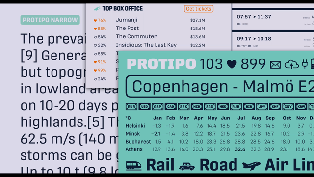
It was a sans-serif typeface, mainly to be used for information design and tables and data and stuff, and halfway through our design process, we decided to turn it into, whoops, a variable thing.
That should play.
Yay.
Should do that.
So, to take you through that, Protipo has display sizes, text sizes, and icons.
So that was the moment of truth, to decide how is this variable font is going to be planted. This is my whole family, so am I going to make one typeface that is going to contain everything? We decided not to, because as you can see, there is a gap on the text styles for the hairline and thin. That was an action design choice.
We didn't want to give the user the choice, actually, to choose to use a hairline, narrow text weight because he shouldn't, she shouldn't, do it, no. That's a no zone, nothing.
So we decided to make one typeface, one variable font for, just for the display weights, styles, and one for the texts for upright and one for italic, so three in just one.
So let's see how that was planned.
So this is the instances that you get when you buy Protipo TIFF, the upright, so there, how many more are they? Ten to one? Three, yes.
Ten to one weights, which from these, to be completely honest with you, we have designed just nine, the red ones.
So haven't designed any of the black ones.
We have designed the red ones, which you can see they go further down, more condensed than ours, so we have actual condensed weights.
The hairline, and the regular, and the wide, and then the black ones.
And then something we need just for the sake of controlling better the interpolation.
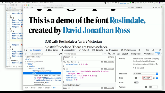
So this is a map of our upright Typefaces.
We use many applications, depending on the project.
For this one, my favourite choice was Superpolator because I could map this thing much better than any other thing.
There was my favourite visualisation of the design space. So, see again, these nine red masters being here as dots. So, the master files are the ones that have the little cross inside, and this is that name.
And then this is my design space, with securities in system with weight and width axes, so all the heaviness goes like that, and all the narrows or widens go up.
And these are my named instances, and these ones, I can see them here, with the other dots, the dots with the dot inside, not with a cross. So this is what the design space is, so everybody would see just the dots, not the distance, not the travel between those two dots. Now, the variable fonts, you can kind of see everything, which is a bit scary.
So, this is how these things work.
So, you move your cursor in Superpolator, and you can see this thing animating on the bottom, and you can more or less choose which ones look nice to you and call them black italic, call them regular, call them book, whatever you want. This is how we choose which typefaces are going to stay in the font, but as good type designers, we make choices sometimes, and we have characters that have become really bold and really narrow, so we have to decide to simply some shapes. So, in our typeface, we had these three, six, eight characters that they would change that would be totally simplified in the bolder weights.
The good thing about that, and this is how these weights are, so I have selected the named instances they wanted that you would get if buy the normal Protipo, and this is how the dollar sign changes from one to another.
And, sorry, and this is, in the design space, where these things sit.
The problem with that, as you see, it creates a small tooth on the bottom, so it's not just the alternative shape of dollar happens in the heavy weights, it happens over in the really narrow weight, so the regular narrow, you would have the simplified version then. When it goes up to a wider version, it's going to have back again the cross bars, so this is a design choice.
The problem with that is that in a variable font, you see everything between, so you see, you will have access between a really narrow and and a wider one when the design actually flips.
So, my choice now, it's just to where is this flipping point going to be, because if it be, if it just before it's there, let's say the regular weight, the regular width, maybe it's already too dark before, so this is what I did.
So, I just move my cursor around to see where is the best place to change, and this dotted white lines, it was where I chose to have the scouts.
So this is what we, calling internally the dancing the design space.
You know, dancing around to find your safe areas, the good jumping points, the ones that are not going to freak out the user, and the smoothest result.
And we decided to separate our nine characters. How many were they? Eight characters, in three groups, because it worked better with a specific design. So, the first jump was happening at 400 weight, and the 440 was three more characters joining the first group, and all of them changed after 600.
The good thing is that variable fonts actually allow that, allow glyph switching automatically.
It doesn't have to be, it is a proper substitution, but it's a substitution that has conditions about the weight of the typeface or the width or whatever is that.
This happening through the RVRN table, which is in the form of an OpenType feature, the basic ligature thinking.
I mean, one of them, but that works with the specific sub-table that's called FeatureVariations Table, and there's where our conditions are about these changes, these switches, which characters, under which conditions, do they go to a different design.
The problem, again, is that we have to design everything again, so now we kind of design duplicate characters. Interpolation is linear, and these things need to be interterpolatable, compatibly, between them, even if you're never going to use them or see them. I mean, we do use them, but you will never see them. So, the first dollar on top, it was the one that we used. The second one, that was correct too, and then, for the black one, we would go to the one without the cross bar, but that doesn't interpolate with the other two, so we have to make an ugly one to allow this interpolation happening, and then turn to the bottom one.
The good thing with variable fonts is that interpolation, that these characters, they don't have to be interpolatable between them, compatibly between them.
So, I just need to make duplicates in some cases, and then I'd do that, and I have designed that, and I have added my OpenType feature in my font, and everything is fine.
But until now, there is no tools that is going to implement these jumps by pressing the button of the software, so my design software doesn't support that. So what I do is I'm doing this crazy stuff, TTX. TTX is this beautiful utility, it's terminal-based thing.
Just van Rossum wrote it years ago, and it what it does, it makes my beautiful font OpenType, TTF, whatever is that, into a human readable XML thingy.
So, you know, it's XML, it's not the worst thing you can happen to use, so you can kind of read it. Even I can read it, so it's fine.
And, to that, try to, I find the GSUB table, which is the one table that contains all the data in a font about OpenType features, substitutions, and funny things like that, and I added by hand, I'm afraid, this new feature variation thing, table.
It's not complicated.
This one, just a short explanation, has two conditions. One condition is where it says "AxisIndex value='0'." That's my first axis.
I am guessing that it was my weight, and the other one, AxisIndex value="1", it was my second axis, so it was my width axis. So, this says that in the first axis, the value zero, which is my weight, you're going to have a jump between the 0.12 to 0.24. These numbers are actually expressing the scale of my axis, from of my weight axis, which in the font, or, whatever is, it has to be from one to... Was it 1999, or something? Like one to 1000? But this is transformed to a canonical scale, so this needs a bit of simple math to say what is the scale transform into minus one to one, with default always to zero, even if it's not in the middle, you have to calculate it with the default to zero. So you do all these things, and then you have another small sub-table, which says, "So when do I do that? "Where do I find this information about that?" And it says, "Look, you find it in FeatureIndex value 14, "Which is your RVRN, wherever that sits, "and you're going to apply that to your lookup value 57," which is a lookup, which is a group of the letters that I have included in my font.
And you do all that, and you have designed everything, and you have to figure out the way to do all this kind of crap, and then the font doesn't work.
Again.
And you're like, "Okay, I'm going to have a breakdown," and then you open the Adobe's font, the prototype Adobe was so lovely to release, so people can look at it and see what the fuck is happening inside there. So I open my code, and I open, and next to that I have Miguel's code, and I'm trying to go line by line, the whole GUSB, which was like, I don't know, thousands of lines, to find the mistake.
And after two weeks, I did.
Can you see it on the screen? All right, I'm happy that you don't because it really took me two weeks.
So, the mistake in that is that.
In the beginning of the GSUB, there is a different version, which is not written in the manual, no one talks about it.
It's like the biggest secret of the industry, apparently. So this one bit that really, really, really ruin your life because there's nothing out there that says how to do these things, so you kind of ask, go around, hack things, and people started, at the end, complaining about that to the fonttool guys, which is, fonttools is this library thing that creates all these programmes that we kind of code and make the variable fonts, and I don't think they agreed, but anyway, now at least, they are going to flag it as a mistake. In case of the font house, a feature variation, meaning a dump, it's going to update it automatically, the GSUB, to the right version with 001.
And so, yes, and then the font works, and then you try it at home, you know, on your own, and just to really see if that works, and yes, that's fine.
That's perfectly nice, and then you try the jumps, and they do work, exactly in the numbers that you set the font. Perfect.
And then you send it to your colleague in the company, and he goes wild does that animation done in DrawBot, which is a free software, kind of learning Python in that. Honka, my colleague, went mad with that, and he made really, really crazy stuff like that. Then, before, when the typeface was released, we, accompanied by an article that I wrote about, you know, it's a TypeTogether foundry, it's a small foundry, medium sized, it's our first commercial release of a variable font. We kind of had to have an opinion about it and say why we did it and how fun it was.
The first place that we posted it and people did try it was AxisPraxis.
We just played there, with the sliders, and that was actually the first place that this typeface stayed up for two months before our own website came along, and we'd see, whoops, sorry for the size, you know, it's all built with the Protipo variable fonts, and you can try them on.
It has live feed, so the text reflows and changes the weight and the width according to the number of information, and because this went well, we have future plans. We're fine.
My company hasn't fired me yet, and they let me do Portada variable, which is a text typeface, a serif one, that also had these crazy jumps with some ligatures, and this one has weight and optical size, so the optical size, in theory, works automatically, so if someone tries to use our font, or at 36 point, it's going to jump into display style, so no more fun, people, and this is the italic, which, again, I don't know, sorry, it's chopped off.
So, what I want you to remember is that none of that, which, I know, it's not necessarily great, but none of that could have happened without people sharing information about these new technologies.
We're not lazy, our staff of designers, we're just designers, so we don't necessarily know code, and we don't necessarily want to get into these things, but we want the fun, so particularly nice sharing from the beginning. That it was a GitHub article that Travis Kochel wrote, I've never met him in my life, at least a month after the announcement.
It was really simple instructions.
of how to generate these font files, so, you know, everybody could just go run, make one. Laurence made AxisPraxis really fast after that, like in a month or so, which was the first place that you could actually try your own stuff because, fair enough, I made a variable font, what did I do with it? I don't even know if it works.
And LettError, great supporters of multiple master variable fonts, and general, for thousands of years now, they released, a year later, a whole typeface mutator math that would be a perfect case study for you to take, so it has all the .ufo files and all the design files, the design space, every information that you want and that you need to create a variable font, so that was kind of just trying your basic coding with everything ready, because are thousands of things to go wrong. And, of course, yes, Adobe with a prototype, Miguel, perfect work, really, really helped. It was the first, actually, as far as I know, variable font that had the glyph substitution and that it was open there, available for people to take, read, get advice for, and of course that fonttools guys, that they're there, they're up to date, they're updating all these databases and all the tools for us to create them.
They're really good in debugging stuff.
I think they don't really sleep.
And, of course, everybody from you people that do think, share, code, and you can actually showcase her fonts.
Free tools like the fit-to-width that people said before, by Lawrence, and even type centres, that they go a bit further, a step further, like Sahad, when she's actually tried the thesis-like proposal about new variable font axes that should be developed for non-Latin scripts, because it's not, I mean, weight and width, fair enough, okay, we've done with that, and it's fun, it's nice, but it's not extremely interesting. So, if you can use variable fonts to support a non-Latin script, you do something funny, something amazing, something that you couldn't do with a proper keyboard, with a normal keyboard. This is amazing.
Language support.
So, my thank you to the world for all the sharing is an article that I uploaded on Github a couple of days ago and it's about step-by-step automatic process about building this variable font with jumps. It's kind of an analogue process, a manual process. There's not much coding in that, I mean, not much automation, but I think for a normal rate, human-level type designer, it's pretty cool, and I have a bug report of things that went wrong with my font files, and thanks to them, not really, people don't talk about because they're too embarrassed. And another thing is that TypeTogether was really happy about that, so we offer, from this moment, I think, these two variable font families, Protipo and Portada. You can sign up in our website.
These are the links.
Download the fonts, play them, play around. Please tell us how they behave.
Hopefully they behave fine.
And I guess that's it for me.
Thank you.
(audience applauds)