Opening title So I advertise the next session as the CSS death match. I know someone, it may be on Twitter or something, kind of observed that that's what it was.
But basically what we've done is we brought together two I think very sophisticated, powerful aspects of CSS that I think are all under-utilized, particularly in the case of Flexbox, which we'll talk about after in the second session, is very very usable til today, if today.
And the with Grid, which is very much coming align. Now sometimes in our world of, and I've been doing web stuff for 20 plus years and over time we've had this sort of, at times everyone does everything and then we kind of specialize and I think at the moment there's a bit of JavaScripts folks to some extent over here, obviously I'm stereotyping, but you know there's a focus around there and maybe more of the traditional web stack of html and CSS and so on over here.
And so CSS is often put in this kinda ah it's easy that's over there, that's kind of a fonts and colors and a bit of animation and all the razzle dazzle. But the truth is, I think that we're going to get a whole new class of kinda layouts and page architectures enabled by these technology. So it's two really solid hours and it was great when we had it in Sydney, lots of thoughtful questions and I'm really looking forward to is as well. So all the way from the United Kingdom is Rachel Andrew. So Rachel, actually, she wrote books for the likes of sidepoints going way back in the day so I've known her and known of her, so I've known her online and for well over a decade, probably kind of 15 years or so.
Now, when we ran a conference in the UK some years back, we got her to come and speak and because I'd seen so many articles and books she'd written I naturally assumed that she'd actually spoken lots of times, and it turned out she'd never really spoken before. So we sort of we sort of inveigeled her on stage and now, if you know, she's literally around the world talking about these things, I think she said to me, from now until Christmas, she's got three weeks off, she speaks at a lot of events, apart events and lots of other events around the world. So it's a great privilege to have her here and she's also in the CSS working group as an invited expert so she's contributing to these standards as well.
So she's currently making and has for many years made huge contributions to the web that we probably don't know about.
But as do lots of folks.
So this is a sort of shout out to all those people who make those sort of contributions, and you know they often don't know who they are but there are amazing folks doing lots of things to make the web a better place.
And Rachel's definitely one of them.
So tell us all about grids in CSS and the amazing things they can do, please welcome, Rachel Andrew.
(audience applause) - 'Kay hello, it's nice to be here and I'm feeling slightly less jetlagged on this stage than I was on the last one, so we'll see how this goes.
So I've been working on the web since about 1996, which means that I am old enough to remember when we were arguing about whether to use CSS at all or whether we should continue to use font tags to style text.
And I was using CSS for layout way back when Netscape Four was a thing, now do I have anyone in the room who had to develop for Netscape Four? Ooh I think there might be more old people at Sydney. (laughs) That's cool.
So some of you have suffered through that with me. I was a Web Standards project member and I came into the Web Standards project to help with essentially with making Dreamweaver. Standards compliance, we were the Dream Weaver task force, like the worst kind of super hero ever (laughter) trying to make Dream Weaver standards compliant. So I've got a lot of interest in layout, I've always been interested in layout for the web and so the stuff I'm talking about at the moment with grid really goes right back to that time when I was battling with Netscape Four and battling with Dreamweaver.
I mean how do we do layout on the web? Because the web and CSS, it has moved on, hugely since those early times when, you know, really it was just can we change the color of our fonts? We can do all this really cool stuff, we can do animations, and there's some examples here from code pen. We've come a very very long way with the things that we can do with CSS, but with layout, we kind of seem to get stuck in 2006. And we're using tools for layout, you know floats and inline blocks and so on, that would never design layout complex webpages and applications.
You know they've come from a time when the web was about, you know, laying out a document, an academic document, and floating an image at the top left.
And we're having to use these things to do complex grid-based layout and it really doesn't work that well and makes layout very complex.
But there is hope, and that hope really comes in this group of modules. There's Flexbox, which I'm sure a lot of people have started to use already. There's CSS grid layout, and there's the box alignment module, which kind of brings them together.
And I'm gonna be talking about grid and a little bit of box alignment today.
I will talk a bit about browser support at the end but just so I don't really disappoint anybody, all of this grid stuff is not live in browsers yet, it is behind a browser flag.
And there's a ton of code in all of my slides, I've got links to codes so you can later on download the slides and go and have a look at those examples.
You'll need to enable a flag in your browser to see them working.
But I'll explain a bit more about that later on. So I'll start by explaining a few things about grid layout. The first thing we need to do, if we want to use grid layout, is we need to define a grid.
And we're doing that with a new value of the display property that's grid, you can also use inline grid.
And this is just the same as Flexbox, once you say display grid all of the direct children become grid items.
We then create tracks on our grid, using the grid template columns and grid template rows properties.
So here I'm creating a three column three row grid. And the items there, you can see they're starting to take on a grid layout.
We haven't positioned anything, but they're just going to start laying themselves out because they're grid items.
If I want to space them out, I can use grid gap. This is a short term for grid column gap and grid row gap and we get spacing between the items. It's pretty much like the column gap in multi-column layout.
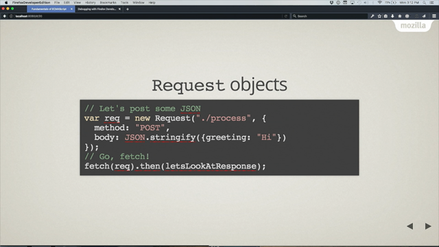
Now there I was creating a fixed width tracks with pixels but grid brings a new unit for us, and this is a fraction unit, the FR unit.
It works similarly to flex basis and so on and Flexbox, so here I'm creating three one FR tracks, so each of those tracks has one fraction unit of the total available space in the grid container, they'll grow and shrink if that container grows and shrinks. If we want to change the proportions, we assign different fractions to different tracks. So here I've got two one fraction unit tracks and one two fraction unit tracks, I divide the entire area of the container into four, I assign one part each to the first two tracks and two parts to the third.
Because that fraction unit is used to assign some of the available space, we can mix in absolute units.
So I can have this 500 pixel fixed width track and then the remaining space, where one part of it is going to go the middle track and two parts to the outer and those two would stretch if that's where the container got bigger.
But the fixed pixel width one would stay the same. We can create a repeating pattern of tracks, so here I'm saying repeat three tracks of one fraction unit so it's exactly the same as writing out one FR, one FR, one FR.
It's bound to get a very complex grid.
You can repeat these sections within the grid, rather than having to write them all out longhand. We don't actually need to declare tracks, once you've got things that are on a grid, if you place something outside of the grid you've declared, grid will create these implicit lines to hold it, implicit tracks.
So here I'm just creating my columns, but I'm allowing the rows just to be defined as we need space for things, and they'll be auto-sized by default.
You can actually specify a size, if you want them to be a certain size you can use grid auto-rows, grid auto-columns to create the size of those implicitly created tracks. And I showed you the repeat syntax before, specifying a fixed number of repeating tracks. But you can also ask grid to add as many tracks of a certain size as will fit into the container. For instance, the view port.
So here I'm saying auto-fill tracks that are 200 pixels wide.
We can go a step further and we can create flexible tracks of many at a certain size.
I'm using here this min-max.
So I'm saying a minimum size of 200 pixels and maximum size of one fraction unit.
And that basically gives us as many tracks of, no smaller than 200 pixels and then the remaining space is just distributed equally so we get these flexible tracks.
So that's creating a grid.
All of those things happened on the container, on the parent element, and the children just laid themselves out.
I think where it gets really exciting is when we can start to use that grid and place things where we want them on the grid. To do this it's useful to know some terminology. So I've talked a bit about tracks.
The track is the space between any two grid-lines. They can be horizontal or vertical.
Once you've defined tracks by setting a size you get your lines.
A grid with three column tracks has four lines, because you have on on the end as well.
These are numbered, starting with line one, and they can be named.
And they relate to writing mode.
So if you're in a left to right language, then line one is going to be on the left-hand side. If you're in a right to left language, it's gonna be on the right-hand side.
And then we have grid cells.
Conceptually just like a table cell, it's the smallest unit that you can have on your grid. And if you join a bunch of cells together, you get a grid area.
So this grid area is between row-lines one and three, column-lines two and four.
So let's have a look at positioning things on our grids. So I'm using here the repeat syntax, and I'm creating again a three column, one fraction unit track-grid. I'm using grid-auto rows, so with no placement, our block's just layout, one per grid cell, just as we did before.
But I can then position things on the grid. So I'm saying here this is the first of those cards, I'm starting it on column-line two, ending on four, it's starting on grid-row one, ending on three.
So that's the large block on the right.
Rather than write them out individually, we can use shorthands So, grid column start and grid-column end, can become grid-column.
The value before the forward slash is the start line and the value after is the end.
And that's an even shorter shorthand, using grid area. Now I'm specifying all of the line numbers in one line of CSS.
The order of these values is grid-row start grid-column start, grid-row end, grid-column end which is the opposite way round to how we specify margins and padding in CSS.
And it's to do with logical advisements, I mentioned we start, because it works with, starting on the first line if you're in the left-right language, and on the far line if you're in a right to left. Someone's gonna have it backwards, basically, so decisions made it this is the way round it's gonna go for specifying these things.
So we've seen line numbers, it's also possible to name the lines and then refer to them by name rather than by number. Which makes life an awful lot easier, if you don't have to remember where certain lines are on the grid.
If you want to name your lines, you do that in square brackets before the track. So you're actually dealing with the line then you've got the value which is the size of that track and then you have another line and you can pop it on the end as well if you want. You don't need to name all of your lines, you can just name the ones that are useful for your layout, so you might want to have, you know, content start or what have you, that's where you're gonna put things.
And then you position items just using those names rather than the line numbers.
There's various bits of magic hidden away in this, if you create lines named something start and something end, you actually get a grid area that you can position into, and we'll look a bit more at grid areas coming up. So by naming your things something start and something end you get this sort of implicitly named area which can be useful.
And here you can create these areas as well and we'll have a look at a proper example of this later. And then use them for positioning.
So I'm naming my cards here and then instead of doing line based positioning I use the grid template areas property, and then sort of describe the layout as the value of that property.
So there is much magic in this spec, it is a huge huge spec.
And I've tried to run through some of the basics of it to give this thing really to look back at later. But I'm now going to go through a few kind of works examples some simple layouts but realistic layouts, things that you might be building.
And to see how grid would work with those.
And we'll start with this line-based placement, so positioning things on our lines.
And I've got a layout that looks a bit like this. So very very simple layout, and one that you could create using pretty much any method that we have today.
And here's the html.
So I've got a parent, it's got a class of wrapper. And inside I've got these three elements, I've got a header, a panel and some content. And without any CSS for layout, it just lays out like this, inline.
So I start by creating a grid.
And so I've said display grid and I've created some columns.
And I've got a two fraction unit column and a four fraction unit column, which means that the available space in my container's going to be divide into six and two parts to that first column and four to the other.
We've also got column and row gaps for some spacing between the areas.
So I've declared a grid, I've not done any positioning but grid will start trying to lay things out. And it will try and lay things out in a way that doesn't cause any overlaps, keeping it reasonable. So that's what it's done here, it's basically just put each of the items into a cell of the grid.
But instead I'd rather position these things, I want to have some control over this layout. So, this is my layout.
I would like the main header to span across the grid from column line one to column line three, it starts at row line one.
The panel is a sidebar starting at the far left column line one ending at column line two, it starts at grid row two.
The content area sits next to the panel in the same row starting at column line one. That's all we need to do to create the layout, and it looks like this.
And that there is the lines of the grid overlaid, the reason they're fat lines is because we've got a gap and a gap acts essentially just like your line has become wider, you can't place anything into it. So then you might be able to see on the screen there, the gray background on the side bar extends all the way to the bottom of the layout, it doesn't sit up underneath the text as it would if we were floating because the sidebar knows it's in the same row as the content and so it takes on full height. And it's this kind of ability for things in the grid layout to react to other things, the content is taller and so that's defining that row, and so the two are as tall as each other.
It's that ability for things to have relationship that makes a real difference with grid and with Flexbox, you know, the things know they're part of an overall layout and they can react to each other, and so we don't get problems of overlaps and we can have things that are the same heights of each other. You'll find that code there.
So perhaps I'd like to put a footer on my layouts or add it to the markup.
And then I position it, from grid column one to three and in grid row three.
And then we've now got a footer on the layout. I don't have to worry about clearing it because it's in its own row on the grid, there's no way that that can pop up and sit over the rest of the text, it doesn't matter which column above is the longest, it's got its own row.
I mentioned before we have this idea of the implicit grid and rows being created or columns, if you position things outside of the grid you've declared, so for most layouts, as with this one, we don't need to create rows, because generally you just need as many rows as you've got stuff to put in them.
You're gonna want to dictate your columns, 'cause that's kind of your layout.
And then you'll just be creating rows as you need them, and this is what we're doing here.
And they say those rows will be auto-sized by default so they'll just expand to whatever you put in them. Anyone who put their hand up earlier and said they had worked with Netscape Four probably comes from a time when you used tables for layout and I did too.
When I think about grid, and certainly when I first came to grid layout, I thought, you know, this is very like using tables for layout.
And in my head I'm still thinking, I guess in a little way, that way.
But of course grid doesn't rely on you having your content in a particular order, the problem with tables for layout is you had to fragment your content throughout the table cells to get it to work.
And you don't need to do that with grid layout. I notice that because your grid is entirely in the CSS, you can redefine it at any point.
For instance using media queries.
So if we started with that same html, perhaps if I wanted to work mobile first I might declare a grid.
And basically just create a single column grid with my items laid out in it, and that's what I'm doing here for my narrow screen widths. So I get something like this, now that's a grid layout, it's just a very simple one, with one column.
But I might be doing some re-ordering perhaps, you know, switching something that I think would better towards the top.
Using grid.
And you can see that here.
And then I add some media queries, I've got it at 550 pixels, I've decided that right at this point, I'm gonna go to two columns.
And I redefine the grid to be a two column grid and then I do my layout for that width.
So it makes it very very easy to redefine the grid or redefine where things sit on a grid at various breakpoints.
And you could become as fine grained as you like with that. So instead of using those numbers, which could get confusing if you've got several different breakpoints going on, you're gonna have to keep track of how many lines you've got on the grid, if you decide to redefine your grid.
So it might be useful here to name the lines. So again if we stay with that same layout.
Here I'm defining my grid, this is just my single column grid, again.
But I'm creating rows this time, so that I can name them, so I can have a row that's the head of start, row content start, panel start, footer start, then right in the end I say row footer end. So here I'm naming the lines, which means that instead of doing this, where I've got the numbers, I can do this.
So if you're setting up a responsive design, the sort of neat thing to do would be to fairly carefully name the lines where you know certain key elements are gonna have to go after maybe you're naming the line, not the area in this case.
So it's going to be the line where things start, the line where things end.
Which could make it a lot easier for team members to be able to put things in the right place if they know, oh that just needs to go after this particular named line.
But there's also this other really neat way to position things on the grid.
And this is named areas, using the grid template. Areas property that I showed you very briefly earlier. So if we stay with that same markup and the same underlying design, we position this this time using these named template areas. So the first thing we need to do is give these things a name so I'm saying the main header has grid area header. Content at content.
I'm gonna do this outside of any media query, so that any of my different breakpoints can use those names.
And we're using the grid area property for this, that's the same property used for the very short shorthand, where we just defined all the lines in one line of CSS. So then I set up my grid for the mobile width layout. So that's my single column grid with a row gap 10 pixel gap separating the areas.
And then I just stack up those names, so I want the header, then I want the content, then I want the sidebar, then I want the footer. And that's it, that's layout done.
So here's the layout.
And there's the named areas overlaid.
And then we go to our wider layout, so we've got our media queries, we're now setting up our two column layout there, and then we say grid template areas, I want the header to span right across the top, so I repeat that header header.
Then we've got the side bar, with the content sat next to it and then we've got the footer, which we repeat because we want that to span all the way across the bottom, again there's the layout, just in that, essentially one line of CSS.
So we have this layout.
And there's the name template areas overlaid. I've been using this for ages to prototype layout, obviously at the moment this doesn't work in production browsers so I can't have it out there on the web, really nice way though to learn how to use this stuff is to use it in prototyping, which is very very easy to move things around using this method.
You can try out your designs, you can find out how it's gonna behave responsively. At the moment you then have to suck it up and go and rebuild it in something that's gonna work for the current browsers that we have, but it's a nice way to start to learn something is to use it in prototyping.
And this works really nicely.
A couple of things to note about this method. When you repeat a name that causes obviously to span over those cells.
You have to create a rectangle, you can't create funny shaped areas at the moment. Nor can you have something in two places by sort of duplicating the header at the bottom or anything like that, that's not gonna work. That's a little bit outside what CSS does.
So if you can create a rectangle though with the cells, then that content will fill that area.
You can also have multiple white space characters in between essentially just so you can line up your ASCII art. (laughter) This has been referred to as the ASCII art method of layout.
You see a complex one you'll see why, because obviously you've got lots and lots of areas and if you use extra white space that can help you to line things up.
If you want to leave a cell empty, just use a full stop, a period character or multiple characters, again, for the purposes of lining up ASCII art you can, you know, have several dots so that things line up neatly.
So here I've put a full stop and then I've got the footer, which means that the footer will now just sit under the content and it leaves that gap underneath the sidebar.
So it's a really really nice way to work, especially for simple layout, it's gonna be great for working with you know, the people and the team just saying, you know, we've got it all set up, if you wanna put something in that area of the page, then you just need to use this name essentially in the CSS. Very very simple to use.
So that was some simple examples, but I think that generally when you talk about grid layout people, they're not thinking of just two column layouts, they're thinking of the 12 or 16 column based grid systems that we're used to from things like Bootstrap, for example. Or Foundation, or the grid frameworks that we use. They've become very popular and a lot of people are building designs based on them.
So here's some code, this is from Bootstrap, I think a previous version of Bootstrap actually, but it is Bootstrap code and all of these things are pretty much the same and they certainly help developers sort of avoid all the maths that you have to do to do layouts at the moment, to do complex layouts. And I used them, as do many people.
But conceptually, these things are very very heavy. Whether you care or don't care about stuffing classes in your markup, there's only so far you can go with this.
You know, the more and more breakpoints you add, you can't really keep on describing these things in your markup and you have to get back into your markup to add more of them if you want to do that. So conceptually, they're a pretty hefty way to be doing layout by describing layout in markup. And as you've seen with grid layout, we describe our layout in the CSS.
And we can redefine that description at any break point, meaning that we can add new ways of doing layout, new break points, you know, if some other device comes out that's really popular and you think, actually, we'd really like to tailor the experience for that device.
You can just do it in the CSS, you never have to get back in to the markup to do that. And it means that when we look at replacing something like Bootstrap with CSS grid layout, we kind of need to think in a different way if we just try and think about it in the same way as we would if we were using Bootstrap then we're gonna sort of get a way from a lot of the power of grid layout.
So I thought I'd have a little experiment and create something myself and turn one of these kind of layout frameworks into grid layout and see how that went.
And the framework I'm working with is something called Skeleton, 'cause it's slightly lighter weight than Bootstrap as it makes better demo in a presentation, because it's a bit simpler.
It's a light weight CSS framework that includes a grid, very similar to Bootstrap, you have to add rows and then add classes to say how big your columns are.
And before we look at how we do this in grid layout, there's a couple of things that I'd like to show you. If you start creating a large multi-column grid, you're going to have a very verbose set of tracks that you're gonna create, so the repeat syntax is really useful.
So here I'm saying I'd like four lots of 200 pixel and 100 pixel tracks, you can have multiple tracks or just a single track in that repeat.
But then if you start naming lines, you're going to end up with multiple lines of the same name if you're using repeat, because you're gonna say, well here I'm repeating four, I've got a line called colA then a 200 pixel track then a line called colB and a 100 pixel track but that means I'm gonna get four lines named colA and four lines named colB.
But that's quite useful because I can do things like I can say start my content on the line that's called colA but the second line that's called colA. You can also do things like span two, just say span two lines, it don't matter which, just span two.
I don't need to know where I am, or you can say span colB two, as in span two lines called colB.
So we can use these multiple named lines to our advantage, and you'll see how that works as we get on to a proper example.
So that there is the markup for a Skeleton grid demo, it's basically the demo that's on their site. As you can see, we've got these divs with a class of row, we've then got divs that say things like four columns, eight columns.
They're very similar to how all of these things work and what we end up that's their little demo. So you get a bunch of little boxes and that's just using the default Skeleton grid. So to do this with grid layout, I can first remove the row divs, I don't need those, 'cause I can define my rows in CSS.
I also don't need to describe my layout in the content here, so here because this isn't semantic, there's nothing, no semantics to this layout, I've just called them box one to box 11.
But obviously the could be classes named anything that you like.
The key thing is, I've removed any description of how my grid works from my markup.
I then create a grid.
So I'm using this repeat syntax, and I'm saying repeat 12 times, a line named col and then a one fraction unit track.
I'm also creating some rows so that I can name them row, and we've got some gaps there.
And then we just start placing these items on the grid. So I've got box one, and I'm saying start on col, that'd be the first line named col and span four. And start on the first line named row.
If we go and find box eight, we'd say grid column, col7, the seventh line named col and span three and put in grid row three.
And we go through and we place all these and I'll give you a link to the example so you can have a look at this later, but we end up with something like this, so essentially a replica of the Skeleton version, using CSS grid layout, so that's pretty cool But with grid layout, we can go a step further, we can do something that's actually very hard to do with our existing layout methods and that's that we can control the rows as well as the columns we can work in two dimensions.
So we span our rows in exactly the same way we span columns, so here I'm setting up a couple of my boxes to span two and three rows, as well as spanning columns, which gives us the bottom example.
So the heights go to the gutter and no matter how much content's in the block they're actually spanning across those rows and taking up the full space.
That's something that is very very difficult to do with our existing layout methods and is trivially easy with grid layout.
And you can have a look later and play around with those examples with that URL. So that's great, so how do we use this sort of idea to layout a proper layout? Well we do it like this.
So this is the same markup and the same content that I had my earlier examples, but here I'm using our flexible 12 column grid to do my layout.
So the main header starts at the first column named col and spans 12 lines, grid row, first row.
The footer then goes the first line and column spans the first layout again, and in between those two, we've got the content and the panel sitting side by side on row two and you can see how those are laid out on the grid spanning the number of lines that they take up, eight and four.
Which gives us this, back to our layout again. And again you can have a play around with that. So it makes it very easy to mess about with layout, we don't have to worry about, well will this thing be cleared, or if I move this, you know, is it then going to pop up with something else, or is the height not gonna run down to the bottom of the page anymore? Because everything is in a sort of predictable place on the grid.
Here I'm gonna change how our footer works, I'm gonna change the panel grid row end to span two lines and the main footer to start at col5 and span eight lines just like the content. Which means that our panel will extend to the foot of the page, like this.
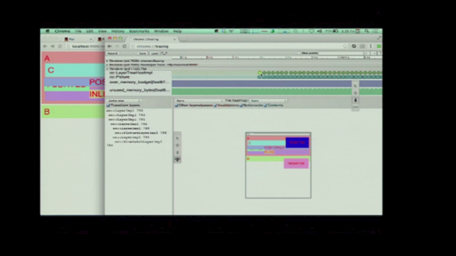
So we're just playing around with the layout, very easily. And rather than needing to worry about, will this clear, will this be tall enough? So right back at the start of this talk, I was showing examples of grid layout and I was showing examples of just creating grids and those little images I had were just sitting on the grid going into nice little grid of items.
Grid will place your things on itself.
The minute you've set display grid, the items become grid items, just as with Flexbox, they become flex items. And they'll start to position themselves, and they do this with something called the grid item placement algorithm which is the thing in grid layout that helps the browser to understand where it should put things if you've not explicitly said put this after row line two and column line four. So there's a big chunk of stuff in the spec, if you go and read it it looks very complicated. And it explains how grid actually works with this and how it stops things overlapping each other. And we have this very simple example here where we've created this grid, we've got four cells on this grid and grid has said, right, well I'll put the first thing in that one and the second one there, and the third one here, it's all readable, it's not the ideal layout we wanted, but someone could read that content.
But we can use this automatic placement to do some quite interesting things because we can create rules for certain types of content and then let grid position the rest for us. So here I've got a list with a bunch of images in it, it's a UL with a class of wrapper, which I will make into a grid.
I say display grid and I create a four track grid, and because we've got some items in there, they're gonna lay out like this.
Which is fine, we can see them all.
But obviously some of those are portrait and some are landscape, and so obviously what happens is the portrait images look bigger because they can take up the full row there, the landscape ones look smaller because the proportions aren't so great.
What would be really nice would be for those landscape ones to take up two tracks.
'Cause that would make it all proportionately work, so I've added some classes to the landscape ones. And when I come across a landscape image it says grid column end, span two.
So all I'm saying to grid is if you find something with a class of landscape make it span two tracks.
And so we get this, so the grid item placement algorithm is going a long, it's laying out our items, it says, right, this one has one track, this next one, oh that's got a class of landscape, so it's spanning two tracks.
And then the next item is also used to span two tracks, well there's not space for it.
So grid moves on to the next line and leaves a gap, which is kind of what you'd expect.
Grid progresses forward and it leaves a space if it can't fit the item in, it doesn't overlap it, it doesn't poke it out the side of the grid.
However, if I had a property of grid auto-flow with a value of dense.
Grid will back-fill the gaps, it moves through the content, it encounters an image that doesn't fit so it goes on to the next line, the next image it comes across, which is in this case I've numbered four, it's like oh that will fill in that hole that I've left, picks it up, takes it out of dumb order and pops it into the gap.
Which is magical.
But might not be such a great idea in some scenarios, now it's nice for your image gallery when it doesn't matter actually where these things layout, probably not so good for form. (laughter) Which is why the default is sparse, the default is sparse which is leave those gaps please, don't go picking things up and jumbling the order up. There's also obviously some implications of jumbling up the order of your content which I will come back to.
But first, we mentioned the CSS specifications death match, this is because people keep asking me, is grid a competing specification to Flexbox? As if the CSS working group have started creating two specs to do the same thing and they're gonna have them fight out to the death to see which one wins, that isn't what's going on. Grid is essentially part of a sort of a new set of frameworks for doing layout.
A new system for layout, this includes Flexbox, and the two of them are brought together by something called the box alignment module.
So grid uses the alignment properties to the part of the CSS box alignment module level three, which essentially is just all the cool alignment stuff that is part of Flexbox, you've not come across, you'll see in the next presentation.
Moved out into a separate specification, so that it can be used in other layout methods. So all the nice alignment stuff like they have to do vertical centering and so on is gonna be available to other types of layout, including grid layout.
So here we are with a flex example, we say display flex and those items become flex items. And create the same kind of layout in grid, we're saying display grid, and we're creating a four column grid.
In both cases the default alignment is stretched so items would stretch to the height of the tallest unless you start to use these values to find in box alignment.
So for Flexbox, the second item there is centered in the space with aligned self-center.
The third one there is aligned self-flex start and then we have aligned self-flex end.
So the flex container is defined by the height of the tallest thing that's stretching it out, and we're just aligning the items against that. And the same is true there for grid, so we have aligned self-center and here we have aligned self-start and then aligned self-end.
In that case we're aligning things in the area. So, I've just shown you an example where they pretty much look the same.
You could've used either grid or Flexbox for that example.
The difference between the two.
Flexbox is for one dimensional layout, if you're laying things out as a column or as a row. The row might wrap, but when you wrap a flex container the next row becomes its own flex container. And all the space distribution of things just happens across that row.
If you want to control both columns and rows, that's when you need grid layout.
And here's the sort of simplest example of that. Here I'm wrapping a set of items using Flexbox, and display flex, flex wrap.
And then we've got some items laying out, because they're wrapping, when they wrap, the top row, I've got five items, the top row has got three and so they nicely lay out as three items.
On the bottom row I've only got two, so they split the difference because they've been allowed to grow and so they end up taking up the full space, each having an equal amount of space.
And the first thing people say is, oh well I'd like it if card four and five could line up under card one and two, that's actually very difficult to do with Flexbox, because it's not designed to do that.
That's where you need grid layout because you want to control the columns and the rows at once. So with grid layout we'd come up with this. We say repeat auto-filters as many as I can get in with a minimum size of 200 pixels a maximum of one fraction unit.
And there we're controlling the rows and the columns at once if we wanted say card five to span over two tracks, we'd have to explicitly say that.
Another way of thinking about is that Flexbox kind of works from the content out. You've got a bunch of things and you want them to kind of distribute themselves nicely across a row or across a column, that's what Flexbox is good for.
You want to define an overall grid, that's what grid layout is good for.
And then the items are just placed on to that grid. Now very quickly, before I finish, as I've already mentioned, grid allows you to reorder stuff very very easily.
I've letting it reorder it with the grid item placement algorithm or reordering things yourself just saying, oh I think I'd quite like my footer to appear right at the top, or I'd like, you know, this item to move around at a different break point. It's gonna make it very easy to do that, which is good in one way, but could also be very very bad.
We could create very poor experiences with people. Now hopefully we're gonna use these things to create the most accessible source document. And then use grid and Flexbox to get the optimal, most accessible display for each device.
What would be bad, would be saying, hay well I can do anything I like now, and it doesn't matter what the document looks like, 'cause I just drag things around.
Even worse, I think because things only become a grid item if they are a direct child of the container, they would be a great temptation to strip out semantic elements, flattening out markup, in order to be able to use grid more easily, either by individuals doing that, orphan tools, or perhaps things like JavaScript frameworks. And the spec obviously warns against doing this, it's not a good idea, but that doesn't mean that people won't just because the spec has said they shouldn't. There's a lot of discussion about this, about grid and Flexbox and source, so here are some examples from Adriennne Versalli about how tabbing around a document works, you can imagine it should be easy to make a document where if you're using a keyboard to navigate, you start at the top and suddenly, voom, you jump right down the bottom, because you've re-ordered all that stuff.
This is gonna be stuff we have to talk about. There is something in the spec, unimplemented as yet, which might help with this sort of flattening out of markup situation.
It's perfectly valid to nest grids, so you can have a nested grid, here I'm nesting three items inside box D.
I position the outer boxes, including box D. But the nested items aren't gonna be positioned, they're not gonna be part of the grid, because they're one level deep, they're nested inside, so they just lay out inline as you'd expect. I could create a grid on box D, allowing me to use grid layout but that grid is completely independent from the outer grid It's not gonna line up with the same lines and things it's just a nested grid, just like you can nest the flex items.
So you get something like this, which is obviously useful, it's useful to be able to nest these structures. But what you can't do is say line up E F and G with the grid that's hard to find on the outer, unless we get sub-grids implemented.
It's currently part of the level one spec, but none of the browsers who are doing implementations have really broken any ground on it.
So in that case, this is the layout we looked at before with our nested grid, this is D, where we're creating our new grid.
And instead of setting up columns and rows, we could just say, display sub-grid.
And now if you positioned items that are inside D, they would use the outer grid rather than anything defined on D, which would be very useful, it would mean we could create an overall grid and line up items on it, even if they were nested into the structure, and hopefully would stop this flattening out of markup. However, with the sub-grid spec as it stands, you'd have to make sure you had enough space on the outer for your inner items, so it's kind of not gonna be as good for just pouring content in that you don't really know how much you have.
And unfortunately, this is marked as at risk in the spec and is unimplemented in browsers and I'm very worried that we're not going to get sub-grid in our implementations.
And the reason I'm worried about that is based at this accessibility issue.
I think that it will give a way to say to people, no do not strip markup, use this, we've got a way of dealing with this.
Rather than this flattening out of markup scenario. Elliot Meyer has written a really good post about sub-grid, based on the previous specification, but the ideas are still are still the same. And why there's quite a few of us now saying, we don't think grid should be out there without sub-grid. And that really brings me to this part, is that I want to see more people involved with developing specifications.
All of this stuff, and I'll show you my browser support slide in a minute.
But all of this stuff is currently hidden behind a browser flag.
Which is the time when you get to feedback. It's not finished, the spec's not finished, the implementations aren't finished, if something is wrong, there's a chance to change it. Once these things are shipped in browsers, once we're using them, that chance is gone, it's very very difficult to change something that's in the CSS spec once people are using it.
Because, you know, people relying on that in their production website, if it's suddenly changed, they're websites are going to break, they're going to blame the browsers.
They're gonna say, hey that browser broke my code, and we saw this a lot with Flexbox, because that spec was developed sort of in public view, and people started using it kind of before it was ready. So do have a look at new stuff that's coming through when you see it and comment on it, it's really valuable and it's just a got a lot easier, the CSS working group, all of the spec issues are now on Github, so you can go and you can read issues against specs, you can raise your own issues on the specs. And that's an awful lot easier than the old method which was to post to this sort of mailing list from, I don't know, the early 90s.
And to sort of (chuckle) try and deal with this enormous torrent of stuff by every CSS spec ever if you wanted to follow along.
Here's the browser support, all of my examples were in Chrome on Prefix, you need to enable experimental web platform features flag, Mozilla are doing a great job implementing grid in Firefox, you need to enable a flag there, if you're not using a nightly.
You can also use WebKit nightly and Safari developer preview.
The work in Blink and WebKit is actually being done by Igalia, sponsored by Bloomberg, which is quite interesting in itself.
And you'll find that if you go to "Can I Use?" and say can I use grid layout, you'll find that IE 10 and up is the only browser with support, that's because this spec came from Microsoft, the initial version was implemented by them, it's actually an outdated implementation now, but they've said that they're going to update the Edge version to the new spec, it's marked as high priority. So you can actually look at this stuff in lots of browsers right now.
And to help with that there's lots and lots of code that I've been putting together on gridbyexample.com, you can go and play around and see how grid layout actually works.
I'd really encourage you to do so, I'd love to hear what you think about it.
And thank you very much, you'll find my slides on all of the code links from this URL, thank you.
(audience applause) - Thank you so much Rachel, now Steph..
Was here, she's here! We'll get Steph set up, in the mean time we've got time for a question or two for Rachel.
Oh, hands up straight away! - Hi I just wanted to ask about the grid gap, is that being applied to the lines, when when they're full there'll be a gap at the start and the end of the grid? Or is that just purely between the tracks? - The gap is between the tracks, when essentially it makes your line like a fat line, so it's exactly the same really as column gap in multi-column layout, so it's a gap that you don't really have any other control of other than the spacing between the things. It basically just makes your line, gives your line more width, essentially.
So that would be taking away the size of that, the browser would need to take that away from the total width of the container, before doing any space distribution.
Which means you can have absolute units, you can have like a 20 pixel gap.
And any of that would be then taken away before the space distribution of anything flexible worked out.