Flexing Your Layout Muscles – A Pragmatic Look at Flexbox

Opening title So next up we have someone that I have had the good fortune to know for many many years. She's made enormous contributions similarly to Rachel and many of our other speakers, to the web.
She too was on the Web Standards project Dreamweaver task force back in the day when we were...
You know lots of people built websites with Dreamweaver, right? And as a consequence whatever Dreamweaver produced as code was what a lot of the web got, I mean, I don't think, you know, and funny enough it's analogous to these days to Bootstrap or React or Angular and those sorts of frameworks and approaches that whatever the code produced and the dom produced by those tool kits and so on is really a lot of what the web looks like and so getting things like accessibility and standards into the tools back then was fundamentally important.
Steph's written books and contributed to the web in so many different ways.
And more recently she's been in cell's force, working on a kind of design systems and CSS there at massive scale.
So if that's something of interest to you, come talk to her as well, she's got a ton of experience of CSS at a really large scale and design systems and component systems.
But today she's here to talk about the kind of, the other major innovation in CSS, particularly around layout, which is Flexbox, so to learn all about that, what it does for us, how it's different from grid, how it's similar and how they kinda work together, please welcome Stephanie Ruis. (audience applause) - Thank you, John.
It's good to see all of you Melbournites here, I would love to know, before I get going and introduce myself, kind of who you are? How many of you come from the JavaScript side of things? Don't really have to do much with CSS? Cool, how many of you are big CSSers? How many of you have to do everything on the front end? Back end? Alright, good, great mix.
Are any of you using Flexbox now? Progressive enhancement or just straight on full out? Straight on full out? Good, you could probably go, probably. (laughs) Maybe we'll talk later, you'll share some things with bugs you found.
But I'm Stephanie Ruis and I've been a front end developer for about 17 years, starting with my own business, working into, working a lot for agencies, and then went with a startup for a while, and now I'm, like John said, at sales force, I'm the principle developer for the UI framework and our design system.
And I've always been really into CSS and I'm very into sort of, object oriented or I suppose you could call it atomic, if you wanna use Brad Frost's words, I like breaking things down into tiny little micropatterns and building from there.
And when, when I got the opportunity to go to sales force to handle this big framework, it was a really exciting role for me.
I think my favorite thing I've ever done, hope I never leave.
We had to make some pretty big decisions when we started. And you know because it is such a large infrastructure, we don't just have our platform and internal developers, we also have this huge ecosystem of external developers that use all of your framework that we're building. And so when you make a decision, you're kinda stuck with it (laughs) although we have come up with a few deprecation ideas that we do with sass that I'm not gonna talk about today. So one of the things that we were looking at is what kind of methods should we use for building the components? And you know the problem with layout is that we've been using methods that were never actually made for layout, Rachel talked about this a little bit as well. They've all got their own little frustrations, when I started in '99 a common thing to use was tables, got to be a real good expert at col span and row span, I even used frame sets, very exciting things like that. And then along came CSS layout and I remember venturing in and absolute positioning seemed awesome, right? I mean you could make sure your left nav was stuck to the left always.
Nothing on the page knew where it was but it was always stuck to the left.
And, kind of funny story, my husband Greg that you saw, I like to call him my roadie very lovingly, he was working for Adobe at the time, we didn't know each other, and he did all the web tools Dev Evangelism for Adobe, so one of his tools that he taught about was Dreamweaver and during this time, many many years ago, they had come out with drawing layers, did anyone draw layers with Dreamweaver, do you remember that, are you old enough? No you people are young.
A couple of you, youngins.
Dreamweaver came out with this way of drawing layers which was essentially drawing absolutely positioned divs on your page.
I hated it. (laughs) But Greg, being you know, the Dev Evangelist was showing all the new features and he was obligated to show this feature and I had a really good friend, he did a lot of Flash stuff in the day, and his wife was going to have to handle the library she worked at's website, and so he went to this seminar that Greg was giving on all these new features in Dreamweaver and he sees this drawing layers thing and he gets so excited.
And he IMs me and he's like Stephanie, oh my god oh my god, Christine's not gonna have to learn anything about web design because I just drew a header, three columns, everything's gorgeous, I'm like whoa whoa whoa Robert, are these layers absolutely positioned, he's like I don't know I don't know, this is just great, she doesn't have to worry about anything.
And I go, what's gonna happen to the footer Robert, and he didn't care.
So, jump forward about six weeks, he's built a website for a small regional airline and he gets to the end of building it and decides to put the footer in.
And you know they're launching in like two days, and he pings an IM and he's like, oh my god, look at this, tell me what's wrong. And of course, guess, who can tell me where his header, or his footer was? - Top - On the top of a header, of course it was. And he's freaking out, he doesn't wanna do it, and of course on IM I typed code here, put this here, put this here, and what did we do? We floated it, right? We moved him into the floating world that we were doing back in you know 2004.
And at least with floating, we kind of know where things are as long as we're clearing properly, right? Little funky rule, sometimes we're using pseudo elements for that clearing that we need for other things. Floating is good for certain things, but not necessarily great for overall layout. And then along came display inline block.
And that was pretty cool to have, you know we started using that for some grids and things. It was really cool to have those box model properties for inline level elements.
Cause we got some usually decent vertical alignment, it sometimes didn't work the way we expected, but you know we built navigation with it, some grids with it, and it came along with this super awesome feature called white space, you know about inline block white space right? That's not a bug, it's a feature and we had lots of ways we tried to work around it. But inline block wasn't really meant for layout. And then browsers progressed, and we started looking at display table.
And that was pretty cool, and we got to IE eight where we could actually use display table, Rachel wrote a whole book about that. And it definitely did solve some things there for a while. We could get equal heights and alignment.
But it still leaves us with single rows in a specific order.
And no ability to wrap at different widths, so we still weren't there.
And that's when, in my view, we go to the flexible box model.
It can be responsive at any width, you can have perfect vertical alignment.
The order can be changed, white space isn't a problem, you can control the way items react to each other. How much space they occupy, so what's not to love, right? Like any new technology, the question becomes, can we use Flexbox now? Now clearly some of you believe we can use Flexbox now, and of course there are fall backs if you want to use Flexbox as a progressive enhancement idea.
But what browsers you're required to support, will depend on how you deal with it.
As you can see, the support is pretty darn good right now. At sale's force, we're only required to deal with IE 11, Edge, and all the current whatever version the other browsers we're at.
But you can definitely use progressive enhancement if you have to support IE below 10.
However, let's look at what Microsoft has to say about IE. Support as of January, for older versions of Internet Explorer has ended, so no more security patches for anything outside IE 11. How many of your customers do you think will upgrade when they realize they get no more support? Do you all have to support IE eight? Anybody? Are they influenced by things like this? They're government or banking right? (laughs) IE nine? IE nine kind of is that browser that got skipped, isn't it? XP, anybody that can't get off of XP gets stuck on IE eight. But once Microsoft started rolling these auto-upgrades, we're finding in our stats of our classic product that we really don't have a lot nine and 10, because most people are getting upgraded.
So let's just hope that these older versions slot die quick rather than slow death.
Make sure you use a tool lie auto-prefixer to keep up with the prefixes that you do need. It's silly to try to remember what you need to put on and remember when to take it off.
And it leads to code bloat.
So, let's say you do have to support those older versions even though I don't.
These are several resources that are very helpful, this firs tone is Kenan Yousef, he's written a wonderful cheat sheetesque guide on backwards compatible alternative Flexbox properties. Which are very very cool and he's very exhaustive. And then if you use modernizer with Flexbox, the second one is a link to an article Zoe Gillenwater wrote anything Zoe writes about Flexbox you should read if you're not in to Flexbox yet.
She writes a lot about fall backs and basically if you use modernizer you can put the fall back in first and then use a Flexbox class to give new modern browsers all of the wonderful Flexbox goodness and you won't have any problem. There is a polyfill for eight and nine, I'm not a huge polyfill fan, I probably, if I had to support that, would go for the fall backs with modernizer, but you can try that.
Basically we have, we're going to look at some of the Flexbox properties very quickly and then I'm gonna show you some of the abilities that we have.
There're two pieces to Flexbox, you have a container and you have Flexbox items. In the properties that we can set on the container, we have the display property and that is just set to either flex or inline flex. We'll go into more detail on these in a minute. We have flex direction, so it can be set into a row or a column, and both of them can be reversed.
We have flex wrap, and with flex wrap you can set all the items to be in a single row or you can let them wrap when they run out of room. And then we have flex flow, this is a shorthand notation for flex direction and flex wrap.
And then there are three remaining properties for the Flexbox container that I want to go into a lot more detail on, so we'll do that next. Now of these three remaining properties, all of them have the flex start and flex end and center, which relate to either the main or cross-axis. And I want to visually kind of talk about the main and cross axis because it changes based on the direction.
So, this is our main axis, we're in a row direction. So our main axis is horizontal.
And when we put anything on the cross-axis, which we'll see in a moment, that is vertical, and then each of these has a start and end. They are based on whether you are dealing with right-to-left or left-to-right, so if you're working in left-to-right you're main axis start is on the left side, if you're working in RTL your main axis start would be on this side, which makes for great globalization internationalization or globalization (laughs) internationalization localization, works really really well for that.
So, we have justify content, which affects the alignment along the main axis, in this case it's horizontal, we have align items, which affects it on the cross axis.
Align content, which affects the space when you have more than one row.
And, when you move to a column container, so you see our flex direction here is column, everything changes.
Our main axis is now vertical and our cross axis is now horizontal.
We still have the start and end just like we did before. And the interesting thing is, it's a little bit tricky to get your head around because it will take justify content, which is on the main axis, and that'll now be up and down.
And the align items will now be horizontal, so this is something that I didn't quite pick up at first and was like making my head hurt. But if you just think about the axis rather than horizontal versus vertical, it helps you to sort all that out when you're applying your properties.
Another important thing to remember is every direct child node of a flex parent becomes a flex child, it requires no property to make that happen.
So it's just rather like magic.
So let's look at these flex items, and what properties we have for them.
Flex grow controls how much the item will grow relative to other items to fill the available space. If you set one to grow zero, grow one, and another to grow three, they're not gonna break up, and it's not gonna be three times as big, it's gonna take three times as much of the extra space. We have flex shrink, and that controls how much items shrink relative to each other.
And in the same way, it's shrinking relative to the extra space on the axis. And then flex basis is kind of essentially the default width for your flex items, it's the basis, it can be percentage, pixels, rems, ems whatever you wanna set it in. And then flex itself is shorthand for flex grow, flex shrink and flax basis.
In that order.
We have an order property that allows us to re-order in literally any way we want to.
I personally don't love the order property, and you won't see me talk much more about it. Right now Chrome and Firefox are doing different things with it.
It can be really cool to set your dom in one order for mobile, the way you want it to be in mobile. And then re-arrange it on the desktop.
And we had thought for accessibility it could be a really cool thing.
But what we learned is, Chrome reads the dom order and Firefox reads the CSS ordering, which it really shouldn't do.
So until they get all that sorted out, our accessibility guide for our framework is really just don't re-order things and that's kind of how we're sticking with it. But you can do it.
And then we have align self.
Remember the align items property on the parent, align self will override that for a single child item, so these are the properties that you can put on the items inside.
Now if this was your first exposure to Flexbox, this is a lot, so we're gonna go in to some examples, so don't worry, I think it will get kind of clear as we go. So what can we do with Flexbox? I wanna look at inline Flex, this is something you don't really hear a lot about, you hear basically about Flex.
Inline Flex causes an element to generate an inline level Flex container.
And it uses only the necessary space, just like inline block essentially does.
When you put inline flex on the parent container, everything inside becomes a flex item of course. Unless other properties are set, the default for Flex items is to stretch to be the same height, all of them.
So that's the default, so we've used it for say like our button groups, and our check box and radio groups, it makes sure that everything's the same, even if we have an icon in something.
Everything will stretch and be the same and be very uniform. So many things that you could use inline block for you can now use inline Flex for very safely. So let's look at what we can do with the actual Flex property.
Setting the container to display Flex rather than inline Flex allows it to generate a box that's the width of the parent, just like display block does, so it's essentially the same as that but stretchier. Every child inside becomes a Flex item and when I used to code for agencies it seemed like every comp I got there was a version of equal height boxes, have any of you ever designed something with equal height boxes? Or been given equal height boxes to code? Yes, or else you have designers that were sweeter than mine were.
And there are times when that design pattern can be challenging.
So I'm really against equal height boxes with absolute pixel heights, in fact I'm pretty much against absolute pixel heights for anything.
I will use rems if I must or I'll use a min height but for localization and accessibility reasons, pixels for height are really negative.
Does anybody remember feaux column technique? Did anyone ever use that? Ah, see the ancient people like me.
It was a technique we used to fake equal height boxes with background images.
Display table was also useful, but now it's super easy.
So I mentioned that by adding display flex, the default item is stretch, we don't have to make anything happen, it just happens by default.
So, if I put these three boxes on the same row, notice they're all the same height.
But without setting any other properties, the item with the most content takes up the most room, because that's what Flex is about.
And I'm pretty sure that my designers in the room, if they asked for equal height boxes, would not really go for this crazy width, it's equal because yeah we spread it all out. I lovingly call my designers control freaks, it's a loving term, especially if they came from the print world, right? How many of you came from print? And you know, suddenly you're putting things on the web, going, I wanna stick it here, I don't want widows I don''t want orphans, I want these heights.
So let's say we want equal widths with our equal heights. We can add the Flex shorthand property, and in this case, I've set the grow to zero, the shrink to one, and I've given it a width of 32 pixels, mainly to illustrate to you what happens when we put them in a row.
32 pixels times three is not a hundred percent, so we end up with a little extra space, and the way it happens is it starts at Flex start and wherever it runs out of, you know I've given it a specific width, wherever it runs out it just leaves it on the right side. So let's redistribute that space.
We've got the justify content property, which remember was on our main axis.
And this controls the way items are distributed. I can choose here between space around or space between. Space around will put equal space all the around the item, on the horizontal axis.
And space between will just put it between, it won't put it on the ends of them, just between everything.
So I want equal spacing, I've chosen space around, and now you can see that whatever space is left will go in between, if I had put 20 percent on, I would have a lot larger amount of space in between. As another aside, Flexbox is awesome if you're working on a web application or site where you don't have control about over the amount of tax, you're using a CMS and it's pouring stuff in and you don't know how much it's gonna be.
Or where localization is happening, and you've got German, Italian, Russian, you know some language that's going to make the amount of text a lot larger.
It will allow the boxes to grow, yet they will all remain the same height, so it's pretty awesome.
Now, though the default value of align items is stretch, which is good for equal height boxes and button groups, there are other values as well.
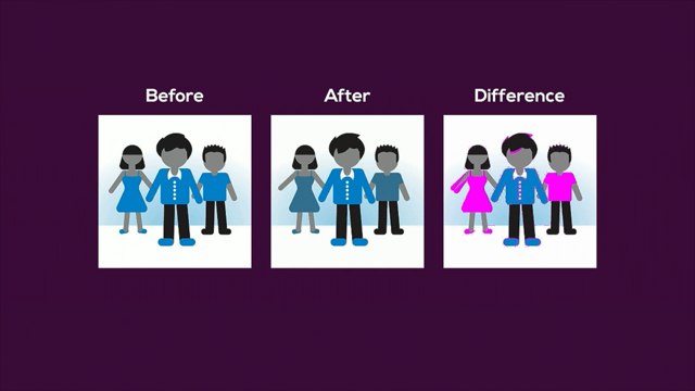
We can align flex items to the bottom of their parent container, could be useful for a sticky footer or other patterns like charts, in this case I'm assigning a value of Flex end to the align items property, so that's the cross-axis. And I'm making everything start at the bottom of the container.
So, if I wanted to create the look of a bar chart, let's say.
Each flex item would be given a different height, but no further properties are needed for the flex items, everything is being controlled by the parent. So the align items property is great when you want the all aligned the same, all the items aligned the same.
But what if you want one or more to have a different alignment? If we're going to set one Flex item differently than the rest, we can still control the rest of the items with the property on the parent.
So in this case we've got Flex start happening there, that means they will be at the top.
And notice they're no longer stretched with Flex start, they're all at the top of the parent container. If I wanna leave the two outer boxes at the top and the change the alignment of the middle box only, I've got a class here that aligns self to center.
So this is a Flex item property and it overrides for that one box.
So notice I've placed it on the middle box and it's now lined in the middle differently than the others.
What are you noticing here that's super exciting? Where is this aligned? Vertically.
How many of you love vertically centering things? Dang there's not a hand up.
How many of you get given designs (chuckles) that want vertically centered things? Yes lots of us.
So this brings me to one of the CSS holy grails. Until now, our vertical centering options range from negative margins to display table cell to sad hacks involving full height pseudo elements and all kinds of crazy stuff, right? And these techniques, depending on what you're doing, can get the job done.
But they don't work in every situation, you have to know which one to use where.
Flexbox allows you to absolutely center an item of unknown dimensions.
So imagine pouring an indeterminate amount from your CMS into a container and having it stay centered no matter what's in there, how little or how much. And the secret lies in two little values, we just saw how line self could align vertically a single item.
We can use align items center on the parent, and that will vertically center all the items on the cross axis.
And we can add justify content center and that will align things on the main axis, whether it's one item or many.
So if we're doing one item, it will be one item in the main center.
If we're doing a group of items, we can group them in the center.
You have to have at least minimum height on your overall container because what does a container naturally do? It is the size of the kids inside, right? Whatever dom elements are inside that's the size. So you'll need a min height on the container at least to actually vertically center, so let's look at an example.
So whether I have a small amount of text or large amount it will remain vertically centered. And I just wanna know like, do you love this? This was the thing that got me starting to get into Flexbox to begin with just as progressive enhancement. This vertical centering is such a wonderful thing. So let's use this new tool to freshen some old patterns as well.
How many of you are familiar with the media object? Nicole Sullivan kind of coined that term in object-oriented CSS yes.
Essentially it's an extremely common pattern in web applications.
But you've got an image, an icon, a video, whatever, sitting next to text.
Happens all the time.
And typically we've done that by floating elements. But with Flexbox we can do it without any floating, we can keep the dominates original logical order, and it works very nicely with localization as well. So in a media object we have a container, and then we have a media figure, in this case we've set it to Flex shrink zero, to keep its integrity, so we don't let it get squished. And then the media body gets Flex one so it takes up all the remaining space.
I won't go into a lot of detail about the min width, but since the default is auto for flex base, this min width helps us, we sometimes nest a media object in a media object or grids in a media object, once you start nesting some flexy things, many times the parent needs that min width zero if you're truncating so that it won't just say, yeah I've got this stuff that's all this big, and instead it says no, and it lets the child control the truncation and it doesn't grow around it.
So that's just something very exciting and fun that you can play with and make your head go what? Notice that with the media block, the text lines to the top of the figure, so that's what it does by default.
Now in object-oriented CSS or in in weed or one of these object-oriented CSS frameworks, we have another object that we use a lot called a flag object, and it basically is used when you want to align text vertically.
Typically we have used display table, so we have completely different CSS for this object to get vertical alignment, with line item center, we can just place it on the container and everything is aligned in the center, so we just add one class, we don't have to have a whole different CSS or a whole different dom or class names.
We can also have a reversed and double version of the media object.
So when you're creating a media object with a figure on both sides of it, with the floated version, you've got to put both figures ahead of the text or the body because they're floated and it's not, right? So that's just how floating works.
With Flexbox we can use the proper dom order and the media figure that is on the right can be in the dom on the right which is really an accessibility advantage, keeping your dom in the order that you want it. The only thing required for this is an additional modifier class, we call it media figure reverse, and you put that on the right side figure.
So this sales force activity timeline uses nested media objects and inline lists and grids and all kinds of stuff and when we were first doing it, I was basically not, when you move to doing a lot of Flexbox it's really sometimes easy to sometimes keep your brain in the old mode of how you did things, so I was first changing the order of the media object instead of just putting the dom in the order it could be in and our accessibility guide did not want this stuff over by the icon because this is the action on this timeline, and that should be read after the timeline, or body of the item.
So, we changed our code, it was great, and my brain went, yeah why didn't I do that to begin with? 'Cause you get stuck in old thinking right? You've gotta bring yourself up.
So for accessibility reasons this is very very exciting. We use horizontal lists here, so let's look at new implementation for that pattern. Lists are of course great for semantics, we've had a wide variety ways to create them and make them do all kinds of things, and with flex box we get a little more control. So in this example, I've created the list horizontal class on my UL, I've used the justify content property with space between. And that gives us natural even spacing.
So this is an example of pagination, I've put a background color on the UL just so you can see where the UL is, you can see that space between is only putting the space between, I just kinda cut it out around. Can you see that? Yeah kinda.
Yeah I'm gonna have to work on my demos, and make them bright and different.
But you'll notice I created a class for list item as well.
And I have set the flex items, which are the list items, to also be flex parents.
So they've got display Flex on them and then they've got these two properties that absolutely center the anchors that are inside of them. No matter how much is inside, this Flex item can be a Flex parent and it can control what's inside of it, and that's perfectly legal, to be a Flex item and a Flex parent.
Of course the same principles can be applied for lists when you're using them for navigation. So I removed the justify content property from the UL, I've added Flex grow one on the list items themselves. And essentially now we have no space, the longer words, or longer items get more space and stretch.
If you didn't want that affect, let's say you want all of the items in your navigation to be the same width, you can put absolute sizing on them, and they will still stretch to the full width. It works really great for regular navigation. But for a moment let's return to the pagination because there's something really cool we can do with margins with Flexbox.
Now we've all kind of set margin-auto on our horizontal sides to center a box element, right? Something we do commonly.
But we can do something pretty cool with Flexbox. In our original pagination example, all the items are evenly spaced, but let's say we want the next and the previous buttons to be depending on the width of the page like out to the edges and the rest grouped in the middle.
In our SLDS framework we have four utility classes that we've created for these margin auto properties. When you add margin auto to any side we have it for all four, the element will move as far in the opposite direction as it can, so let me illustrate what that means. Essentially, this adding the left margin auto on the next and the right margin auto class on the previous moves them as far in that direction, it cancels out the justify content, so I've added a wee bit of margin to keep them apart, otherwise all those items in the middle would be just sitting as closely as they could. And then this, it wouldn't matter how wide our page was or how narrow our page was, all the extra space goes where that margin auto is, so it's a pretty handy trick.
Be aware that when you add margin or padding to Flex items, and I believe Rachel said also to grid, if you use percentages, you can get different results in different browsers, it's not really sorted out in the spec yet, so don't use yet percentages for margins or padding there. Now this auto alignment can also work vertically, if we are working in a Flex direction column. And the columns main axis is now running vertically, we can align the items to the center, and the class we'll use to bump the separation down will be a margin auto-top.
We've added that to this box, you can see we've got three divs here, they're set Flex column and the top part, or the information box is set with the top auto, margin top auto.
That means everything below it, if there were 20 things below it, would move down as far is they could in the container. And just like our absolute centering example, you'll need at least a min height on that container or there won't be extra space, right? It will just collapse around its kids.
So, since we now have looked at this auto margin, what might we be able to do to our absolute center example? Maybe we can simplify that in some cases.
Previously we used the justify content and align items properties both set to the center value.
But another option as long as we're centering only one item is to remove those and only give a margin auto-declaration to the child and don't even worry about having anything on the parent. So margin-auto for all directions will automatically center it in its parent. Now as you know with all things CSS, there's always five ways to do it, right? So this is just another way, you may, for whatever case of what you're doing want to do it in one of the other couple of ways. You know it's important I feel like as a developer to understand all the different ways we can do things. So we know, in context, what to use when, it's all about having a good arsenal.
So now let's pull all of this Flexbox stuff together and look at how these principles can apply to a grid system.
Since, as Rachel has shown us, grid will be coming to actually create amazing grid systems, can't use it yet in our context, so we've gone with Flexbox for now.
Now in order to show you this, I'm gonna need to tell you a sort of personal story and you have to promise not to spread it around, okay, it's really embarrassing.
Of course they're taping me this time, no body tell anybody what I'm about to say. After we got the media objects and the horizontal lists and all the other small little components working using Flexbox, I decided it was time to tackle Flexbox grids, and I hadn't at that time seen any Flexbox grids. So I was feeling really brave and I worked on 'em for a week and in the end, as my husband can attest, they were a complete failure, it was a crushing blow and what I realized was I was just like the original media object, you know with things on two sides, I was thinking in an old paradigm, I was thinking in grids as I'd always known them, where I want to put all the things on the grid. Flexbox has so many options for so many things that doesn't work at all.
So I got way too much complexity, and I threw them out completely and I rethought about it and I thought the core of a flex grid needs to be super simple.
And then we can add these different kinds of, you know, make classes for these different kinds of alignment and such that we can add to this grid.
And so I took a deep breath I was ready to start from scratch and lucky for me, we were in the process of hiring my co-partner in crime Brandon Farua, you might guess what I gave him as his first assignment. The grids.
Brandon, I blew this stuff up, do it this way, it was awesome, I got to have a break and he got to have some really fun stuff to start with. So, where we arrived is a flexible mobile flirst device agnostic scaffolding system we use a lot everywhere. The base of it is really simple, we have a grid class, placed on a container, it can go on any container, it can be a div, a UL, a span, it doesn't matter. It can be on anything.
And because every direct child is a child of the grid or a grid item, you don't have to do anything else.
If you just left this on a parent, you would take up a default row of items, they would take up only the space they needed and they would not wrap, that would just happen automatically.
But we've provided this other class, we call call. Which in hindsight I think we would call unit or something now.
As you'll see in a moment why.
But the call class can be placed on Flex items in the grid, and if you use it it provides what we call automatic sizing.
It sets the grow to one, the shrink to one and the sizing or flex bases to auto, so notice this column that has more content in it, just takes up more room and they fit across the entire parent.
We have a variety of utility classes, then, that we use to extend these grids, they're not built into our base grid.
For example the flex direction classes allow us to change the behavior of the grid container, which is row by default.
We can reverse the row.
We can create a column, or we can create a column which is reversed. All of those are just a single class on the parent. And by default the Flex row is in single line, but the single will start from the left if you're in left to right, if there's a few items, it will end, if there's a lot of items, they will squish. And if you add widths to the items and the widths make them wider than the parent container, I don't know if you can see it but my parent container, I have a little background on it, it ends between five and six.
But because these items are set to 20 percent, no they're not set to 20 percent, sorry, 10 rem, and my container ism't more narrow than that, they will just keep going on and on forever and burst out of their parent.
You can use the SLDS wrap class to keep this from happening so that when they get to the end, they simply wrap back and make another row, and this is why I really dislike the fact that we used call for our unit names because Flex grids are not rows, like we do now. Like right now we have a row.
And we put columns inside for basically any grid system, right? In this case, we have one parent, it's not even a row it's a whatever.
And it has items in it that can wrap to a myriad of rows, so they're not essentially rows and columns, right. Okay, live and learn.
I'd have to deprecate it to change it, so they're columns.
So, we allow this wrap class to take up the space, run to the next line.
In this example, we've got Flex spaces set to 20 percent, if the container gets smaller, these'll simply shrink, but they'll always be five in a row.
What happens though if we've set absolute values? So if I've set a min width on my items of 10 rem. And I've used the call class so that they grow and shrink. And this lets them be automatically sized, let's see what happens when we change the container size. In this case I've got a 60 rem Flex container. I've got six items on the first row because they won't get any smaller than their 10 rem min width.
And the other four wrap to the next row, but notice that they're wider than the ones on the row before.
This is because with automatic sizing they will grow one and shrink one, whatever they need to do.
So they're going to fill up the rest of that space. If I put 'em in a 30 rem container, you can say I've got three in a row but this 10th one that's sitting here all by itself is gonna take up the entire, you know, make it all even.
This, depending on what you're doing, might be fabulous.
However, you might not want to use the automatic sizing or you might wanna set Flex shrink to zero for all of these or grow to zero for all of these, so that item number 10 lines right up under item number seven.
And just depends on what you're doing, you have a variety of choices based on the affect you want. Several of our examples we've looked at the justify content property.
We provide several utility classes to control the way spacing is handled on the main axis. Flex start is of course the default.
As we saw beginning at the beginning, and if you're in left to right, these examples are alL if you're in left to right, they would reverse otherwise.
So we created a class for centering, for space around, for space between, and for Flex end.
And though we haven't talked about Flex end and an example, essentially what you're doing is you're lining all of the items to the end and leaving the extra space at the beginning. In the same way we have a utility class, a couple of utility classes for cross-axis alignment. Stretch of course is the default, but we have one that will center and one that will set it to Flex end, there are further properties, more properties than this, we haven't needed them so we tend to build things as we need them to keep things light.
If we find that we need the other properties we'll add those utilities in but we haven't. Notice that we have the aligned content property along with the aligned items property.
This affects the alignment of multiple rows and how they're spaced vertically in relation to each other, and if there's only one row, it doesn't do anything it doesn't change anything. So it's a very safe thing to have in there. So, so far we've mainly discussed automatic sizing, but we have sizing utility helpers that we can use anywhere within the framework, not just for sizing the grid, we can size anything with it. Support for two, three, four, five, six, eight and 12 column units.
We use an x of y style for these classes, so let's take a little look, oh yay.
The projector in Sydney was probably about like this one and so I went through and you know keynote, I found this thing keynote can do with enhance on your images, so my colors are really weird but at least you can see them now.
The formula for these sizing classes is just SLDS, everything in our framework starts with SLDS to keep it from fighting with someone mixing it with Bootstrap, Bootstrap or their own bespoke CSS.
And then we have size, since we use Bim, it's dash dash x of y.
So if I wanted 50 percent, I could use size one of two, size three of six, size, you know, six of 12, doesn't matter, just depends on how I wanna break it up and what makes sense, they're all gonna be 50 percent.
So unless you've been living under a rock or you've been in the web industry for like a month, you know about responsive design.
So we've not only embraced responsive design but we've embraced MobileFirst and that means that all of our media queries are written in, pardon me, ems wow.
Take a deep breath.
12 based grid, and our media queries are written in em units.
We essentially have broken them up into four sizes, extra small, small, medium and large.
Now, that's very arbitrary, it works for what our product needs.
It's very hard to decide on sizes, and sometimes it's very hard to decide on anything. And I don't know how many of you work on a team where you have to like, make your point, and you know you're passionate about something, and you're like, no I think these widths should be this. And the other person's like I think the widths should be this.
And you each make your point very passionately and then in the end, you haven't convinced each other. What do you do? Well you can play the trump card, whoever's in charge the most.
Or you can say Cat Watkin's Sliding Scale.
Does anyone use that? Awesome thing, look it up on Medium, he wrote a great article called the sliding scale of giving a...
Fig we'll call it.
It's a different f word (laughs) and so when we get to this impasse right, we all go okay great, well we've all argued, there's three or four of us arguing, how many figs do you give? And the person that was arguing so vehemently might be like dude I'm just a three on this. And then you're like well I'm a seven.
Now we're very honest, you don't get to just win, you don't get to just trump your co-worker, but in the end we literally find that we make the best decisions by arguing and if we can convince the other people, that's great, and if we can't, the person with the highest figs wins and we do their method, because they're probably got some experience from something that makes them so passionate about why it should be done this way, right? So that's how we do it, so even though you may need tweak points, and these may be arbitrary, this is what product needed. And we basically are using responsive sizing for these different break points.
So since our media queries are written in min width all of our responsive classes are additive. The only thing required really is this default class that doesn't have a size in it.
This size one of one which is probably what you're gonna wanna do a lot of times with mobile. And that will be the default until and unless you add a break point.
So if you want a change to happen at the large break point, or in this case the medium.
Whatever your default is will render until you put, let's say large size one of four and now once you hit that view port size, it will magically change into four instead of one. So you are not required to do this but you have the opportunity to do this.
We also created responsive wrap and no wrap classes so that maybe when it's small you're wrapping, when it's large you're not wrapping and you can control that as well.
So let's take a quick look at an example.
This is in our small size, and you'll notice that a lot of these are set to one of one in this context.
The top three are set to automatically size. And so you have three across, in the medium view you can see that some of them are starting to divide up, those that do not have a medium size are staying the same. But the three at the top are still automatically sized. And we can do this all the way up to the large desktop view. And everything will break up the way you want it to, and I've got a code pin example so when you get these slides, if you wanna play with this and see how it works, you can click in there and fork it and look around. I'm gonna leave you with some resources that I found to be very helpful.
CSS trick's a complete guide to Flexbox, if you're not into Flexbox yet this is the greatest, you know, example, of just listing things out, what applies to the container, what applies to the items. Phil Walton has a really good known bugs and work arounds for Flexbox.
As I said there's always more than one way to do things and so sometimes if you've gotta support a version of IE that has a bug one way, you can do it a different way.
And he keeps track of that.
I want to encourage anyone that has not played Flexbox Froggie to do it, seemed like the dumbest thing I'd ever heard of, I saw people tweeting and I was like oh my god really, and then I plaid it and it was so awesome.
Have any of you plaid Flexbox Froggie? A few of you, it's a really fabulous learning tool with a cute little frog.
Like I said anything by Zoe Gillenwater talks a lot about progressive enhancement, always good. There's a Flexbox tester so you can understand how Flex items relate to each other and take up space. Almost complete guide to Flexbox without Flexboxes, that fall back side I talked about. You've got visual affect, Flexbox builder for web flow. The spec from the W3C, and this is a link to our grids, if you wanna see how we did it.
And then Smashing Magazine has a great Flexbox reading list. And with that, I'll be around for questions later, thank you very much.
(audience applause) - Thanks so much Steph and right on time for lunch. As I mentioned, the very intense information rich two sessions are an important part of CSS for layout. And I'm looking forward to what people are gonna do with these and already are doing with them.
We will take a break for lunch now.
We've got about an hour.
Grab some great food, connect with various people, have a little walk outside, it seems to have stopped raining.
And we'll be back at about 1:30 for another really fantastic session.
Thanks a lot both again to Steph and Rachel, for their fantastic session, thanks guys.
(audience applause) (upbeat music)
A funny thing happened on the way to building a modern CSS Framework — one where IE8 and IE9 were no longer pulling on our coattails. Suddenly positioning, float left and right, and display table and inline-block weren’t our only layout options. We realized we had entered a world where we could solve some of our usual challenges in a more modern way. Enter flexbox, with it’s combination of simplicity, complexity, joy, and frustration.
Drawing from real-world examples, we’ll examine some of the more common layout challenges that flexbox simplifies, as well as some real-world gotchas we’ve experienced.
In 1999, tables were the common thing to use, and then along came CSS and absolute positioning, Dreamweaver’s layers, floats and display:inline-block.
By that stage we had decent vertical alignment, which let us build menus and some grids although we had to deal with whitespace – but inline-block wasn’t meant for layout, and by IE8 we’d moved on to display:table .
We have arrived at the flexible box model, which is responsive and gives us control and gives us perfect vertical alignment as well as a lot of control over our elements.
There are two parts to Flexbox: the Flexbox Container and Flexbox Items.
Flexbox Container properties:
- display (set to either flex or inline-flex)
- flex-direction (row or column)
- flex-wrap (single row or wrap)
- flex-flow (shorthand for flex-direction and flex-wrap)
- justify-content (main axis alignment)
- align-items (cross axis alignment)
- align-content (space in multiple rows)
The last three of those properties relate specifically to the Main axis or the Cross axis of the Flexbox.
If flex-direction is set to row, then the Main axis will be horizontal, starting on the left and ending on the right, while the Cross axis will be vertical, starting at the top and ending at the bottom.
If flex-direction is set to column, then the Main axis will be vertical, starting at the top and ending at the bottom, while the Cross axis will be perpendicular to the Main axis, starting on the left and ending on the right.
Note that these can be reversed when working with right-to-left languages.
Flexbox Item properties:
- flex-grow (how much items grow, relative to other items, to fill the available space)
- flex-shrink (how much items shrink, relative to each other)
- flex-basis (the default width for flex items, expressed in percentage, pixels, rems, ems)
- flex (shorthand for flex-grow, flex-shrink and flex-basis, in that order)
- order (set the order in which items are displayed)
- align-self (override the parent’s align-items property for a single child item)
Setting appropriate values to these properties, Flexbox can be used to:
- give items equal height
- give items equal width
- lay items out evenly spaced
- align items to top or bottom
- grow item boxes according to content while retaining equal height, width and/or spacing
- align one item box differently to its neighbours
- achieve one of the holy grails of CSS: vertical centring
- align text alongside media objects
- create evenly spaced horizontal lists
- centre items absolutely
- create and control grids (handy until CSS Grid Layout is widely supported)
- size items responsively
There are more resources for further exploration on the final slide.