Life in type
(audience clapping) - Hello.
I was trying to go for the biggest type in the conference but I'm afraid DJR beat me to it, earlier in the day. Yeah, like Michael, I'm the other interloper. I'm not a developer, I'm not a typographer, I'm not even really a web designer, I'm not even sure I'm a graphic designer, actually. But, I'm gonna tell you a story about working with typography over my career, which has been going for quite a long time now. I started out in magazines.
I've been doing magazines for about 30 years. Then I got involved in newspapers.
I've been doing newspapers for about 20 years. Then I started working with digital media, which I've been doing for 12, 13 years, and in the last few years, we've started working with television broadcast graphics and motion. But the one thread that ties all those things together is a need for great typography.
So, today I'm gonna tell you the story of my life in 10 typefaces.
Number one, Century Old Style.
Designed by Morris Fuller Benton for American Type Founders in 1908.
American Type Founders was the biggest type foundry in the U.S.
in the early 20th century.
It's a reminder of why we call type foundries, foundries, because they used to make things out of metal. They used to be enormous factories producing precision engineering.
They weren't design companies, they were engineering companies.
And Morris Fuller Benton was the lead designer for American Type Founders for most of his life. So I encountered Century Old Style on my very first job in the design business. I had quite an unorthodox introduction to design. I studied modern languages at Trinity College, Oxford, and when I left university, I had no idea what I wanted to do, really.
I'd always loved magazines, and I did the school magazine, and college magazines, but it never occurred to me that anyone would pay me to do a magazine.
But I needed to earn some money, so I took a job in the advertising department of a very small, independent wine magazine, called Decanter.
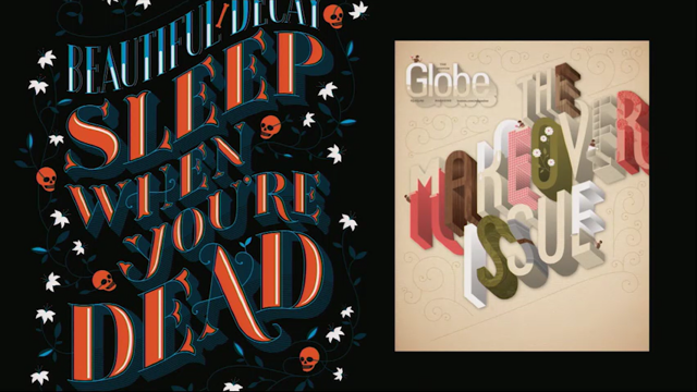
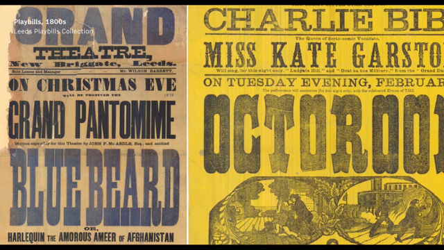
I don't know how clearly you can see the type here. This was from 1984, this magazine, and all the type is in ITC Benguiat, which is the most 1970s typeface in existence. So even though we were in the mid-80s, the typographic spirit of that magazine was at least 10 years out of date.
Even though I was only in the advertising department, I was passionate type and magazines, and I could see that they could do better.
Obviously, as a young magazine designer, I was into what Neville Brody was doing at The Face and stuff, but that was irrelevant to the magazine I was working on.
But there was also this magazine, which I really loved at the time.
It was one of the very first customer magazines in the U.K. for people with American Express cards, called Expression.
It was done by a brilliant art director called Mike Lackersteen.
The headlines were in Torino, but all the mid-range typography, the text and the cover lines were in Century Old Style. I just loved how it looked.
Seemed so kind of crisp and sophisticated.
So, even though I was in the advertising department, I redesigned my magazine in my own time, pitched it to the editors, and bizarrely, they accepted it.
Being young and ignorant, I just tried to rip off Expression as much as I could so my cover lines went into Century Old Style, too. And it's kind of embarrassing, looking at this now, how bad it is.
The word spacing is awful.
The vertical spacing is awful.
That widow with wines, I just kind of can't look at any more.
Even though I was young and stupid, I kind of got the flavour right.
It was the right sort of tone of voice for this magazine. That enabled me to go on and get a proper job with a proper art director, which ironically turned out to be on Expression. So I went and worked on the magazine that I tried to rip off and imitate.
Now, looking round the room, I think there probably are not many people who can remember how we used to do magazines. So I'm gonna give you a little quick history lesson. In those days, working on a magazine you started with the typescript.
So the text would come in on a piece of paper, typed on a typewriter.
You had to count the number of characters and work out how much space it was gonna take up. You might do a little sketch layout on tracing paper to make sure it was all gonna fit.
Then you had to write all your type specifications all over it, and send it off to your typesetter. I missed the cold metal days.
These were the photosetting days.
So your typesetter would have been working at a machine something like this.
They'd put it all together for you, send it back to you on a courier, and it came in the form of what we used to call a galley or a bromide, a long piece of photographic paper with the typesetting on it, which you would then run through a machine like this, which had a bath of hot wax, kept at a certain temperature, so it was always melted and liquid.
So you'd get a layer of liquid wax on the back of the typesetting, which then, when you rubbed it down on your artwork would cool down and solidify to keep it in position.
Headlines were done on a special machine called the Phototypositor, and they used to come on a long roll, as you can see, coming off the machine.
The typositor gave you much finer control over kerning and letter spacing, and it was much more high resolution.
So you would do the headlines on that, and the text on the normal machine.
And then it all came together in a process like this where you actually made physical artwork, cut out all the typesetting, stick it down on a board, roll it with a roller, and of course, with the ever-present danger of scalpel accidents, because everything was done with a scalpel. I've still got scars from my early days in the design business.
And it was a kind of manual artisanal process doing graphic design.
Having the idea about what it was gonna look like was the least of it.
You actually had to be able to physically put it together too.
So, I finished at Expression and moved on to meet my second typeface, Franklin Gothic, also designed by Morris Fuller Benton for American Type Founders, this time in 1902.
And again, in those days, we're so used now to having thousands and thousands of fonts at our disposal. But in those days, you pretty much had to work with the fonts that your typesetter had.
As Michael was saying earlier, getting a custom font was outrageously expensive, but even just buying in a new font was pretty expensive, so you worked with what was available.
In a big typesetter like this you might have 100 fonts, a little local typesetter might only have five fonts. So it wasn't really about choosing the right font so much, it was about what you did with it.
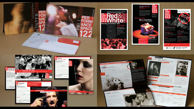
So I moved on to work on this magazine, which was an advertising and design magazine called Direction.
It was Franklin Gothic when I arrived, and I didn't try to change it, but I tried to find ways of using Franklin Gothic that were interesting.
I was very heavily influenced by a couple of people, one of whom was actually in the same building as me. The creative director of his publishing company, Haymarket, was an amazing Swiss guy called Roland Schenk, who's hardly known, and he really deserves to be celebrated, because he was a brilliant designer. And he was doing this business magazine called Management Today.
Incredibly powerful imagery in it.
This is a story about Airbus and Boeing, a business story but why not illustrate it with a massive mid-air plane crash? One of the things that Roland did was he pushed letter spacing as tight as it was physically possible to do it. This is Franklin Gothic Extra Condensed.
You can't get the characters closer than this. Even the typositor couldn't get them close enough for Roland, so what he used to do was do all the headlines in Lettraset, and he found that if you look at the Franklin Gothic Extra Condensed E, the spurs have different widths, but of course that creates space when you put the characters together.
So Roland made his designers get out the scalpel, chop off all the edges, so that he could do headlines that looked like this, with the tiniest of little hairline spaces. The other guy who was doing amazing things with Franklin Gothic was Fabien Baron, who's now maybe the most famous fashion art director in the world.
He was doing Italian Vogue at the time.
He almost single-handedly invented this style of the big sculptural headline on one page, facing a full page image on the other page, which you now find in 75% of all magazines. So of course, I was still young, I was still imitating people, trying to kind of do a Fabien.
Up to this stage, it was all still the paste-up, the waxing machine, the scalpel, and then one day, this landed: The Macintosh, which changed absolutely everything. In those days, we were using QuarkXPress 2.1, which as a design tool was kind of where the web was a few years ago.
You couldn't do type bigger than 200 point or something. It had to be horizontal.
The kerning controls were incredibly limited, but it was enough to make a magazine with.
So almost overnight, all those incredibly skilled people who use to operate the typesetting machines were out of a job, and we took on the typesetting ourselves.
I moved on to do ES Magazine, the magazine of the Evening Standard newspaper in London, which again was in Franklin Gothic when I arrived. I continued working with Franklin Gothic, trying to explore the sculptural properties of it but maybe a bit less, in a less derivative way from what I was doing at Directions.
And then, for reasons which I won't explain, 'cause it would take too long, I fell out with the management there, and I had to leave, and I went freelance for a bit. I needed a Mac, so I bought myself a Macintosh 2CI, four megabytes of RAM, 40 megabyte hard disc.
I had to borrow 6,000 pounds from my father, to buy it, which in today's money is about 14-and-a-half thousand pounds, but I had a Macintosh in my own house.
It was incredible excitement.
But I didn't end up using it for very long because I soon moved on to Rome and Italy, to meet my next typeface, Avenir.
Designed by Adrian Frutiger for Linotype in 1988. So the first typeface we've seen which actually post-dated the Macintosh.
This was being used on a magazine called COLOURS, edited by a brilliant guy who Michael mentioned this morning, Tibor Kalman, who did that (mumbles) logo.
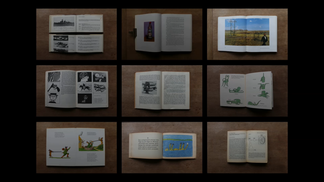
Tibor sadly died much too young, an incredibly inspiring leader who was nominally the editor of the magazine, although effectively he was the art director, too. COLOURS was a multilingual magazine, published all over the world by the Benetton company, and it was really committed to visual communication, principally by photography.
Every essay, every issue would start off with a photo essay like this, with found images from all around the world, and this is pre-internet, so there was no social media, there was no YouTube, there was no Flickr.
If you wanted to see what was going on in other parts of the world, you could only really either see it on TV, or in a magazine.
It's also pre-digital images, so these were all physical slides that had to be sent around the world.
We had pictorial editors in New York, Paris, and Rome. We had about 10,000 physical slides in for every issue, and we would put together these visual stories with available pictures, but also researching objects. So we had correspondents all over the world who would find these fascinating objects and send them in to us.
This was a helicopter made out of old Coke cans in Vietnam. They would send it to Rome, we would photograph it and put it into the story. The thing that made COLOURS very different from any other magazine I've ever worked on was the workflow, because it was visual from the very beginning.
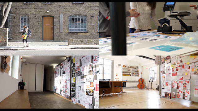
Every story would start as a little, rough sketch, which generally Tibor would do, and then they'd all go up on the wall of this office which was completely lined with cork, just ignore my colleagues there.
So that was a whole issue on the wall there, about sports, and if you look in that top left hand corner, you see a layout.
It started with a rough sketch and then when all the objects and the images would arrive, I would do a more precise sketch.
Then we'd take all the objects down to the studio and shoot them, and it would end up coming together in a page like this, and only then would the writers get involved. On most magazines, the editor commissioned a story, comes in as a piece of text, and then the art department has to work out how to visualise it, but on COLOURS, it was visuals first and text later. Because of that, we didn't really have any templates. It was a very free, fluid magazine.
All there really was, was a style sheet for the Avenir text.
Little bits of Franklin Gothic again, for emphasis. And that was it, really.
Everything was kind of invented according to the images and the visual impetus of the story.
So I ended up doing four issues of COLOURS, I spent a year in Rome, working in an unairconditioned office in the heat, working for a crazy Type-A New Yorker in Tibor, and by the end, it drove me a little bit bonkers. So I decided to come back to London, where I met Neue Haas Grotesk, designed by Max Miedinger and Eduard Hoffmann, for the Haas type foundry in Switzerland, 1957, but you may know it better as Helvetica.
It was renamed in 1960 to be more appealing to a wider audience.
Now, it's weird that Miediger and Hoffmann set out to design a neutral typeface that had no kind of personality, and yet it's the most famous typeface in the world. It's the only typeface that's got a biography. It's the only typeface that's got a movie.
It's the only typeface that had a special Google joke of its own.
On April Fools' Day in 2011, if you typed Helvetica into Google, you'd get your answers in Comic Sans.
I started working with Helvetica at The Guardian, where David Hillman had done this very iconic redesign in 1988, using bold Helvetica headlines.
In those days, newspapers were made up usually on this system, which was called Atex, which is a really clunky and complex computer system. It wasn't WYSIWYG, so you couldn't see any of the sort of layout tools.
You couldn't see what you were making, and if you wanted to change the design or get a new format made, you had to sketch it out, specify it, send it out to a developer who would then come back and it wouldn't look anything like what you asked for. So, no change there, really.
(audience chuckles) But the magazine was done on Mac.
So I started on the magazine, I did a redesign of the magazine, and I art-directed it for a bit.
And then I became creative director at the paper. I redesigned all the sections, taking the Helvetica about as far as we could take it. Probably the high point of my relationship with Helvetica at The Guardian was this, the early edition we published on September 10th, 2011, after the attack on the world trade centre. And it was sort of the end of the large format broadsheet Helvetica Guardian, because there were a lot of changes happening in the newspaper industry in the U.K. and in Europe. Most of the big papers were shrinking down to tabloids. The Times and The Independent had already done it. So we did a tabloid dummy, initially using a typeface called Gulliver, from Harald Unger, which was beautiful but it researched incredibly badly.
Everybody hated it because it was just too much change, so we decided, if we were gonna make a change and go tabloid, we have to stick to Helvetica, but I wanted to make sure that we had the best Helvetica we possibly could.
So I spoke to my friend Paul Barnes who was a sort of typographic consultant to The Guardian, and he suggested we get in touch with the brilliant type designer Christian Schwartz in New York, and Christian sourced an original 1968 sample of Helvetica, and went about re-digitizing it, trying to get it as close as possible to the original. He delivered us a whole range of weights.
The original Helvetica weights, headline versions and text versions, and we put together this version of The Guardian which researched brilliantly, everybody loved it. We were on the point of launching it, but in the end, Alan Rusbridger, the editor of The Guardian, decided he wanted to go down a different route. So, we'd put all this energy into developing this beautiful revival of Helvetica and we didn't have anywhere to use it.
But it's gone on to have a great life.
It was used very effectively in Bloomberg Businessweek and other magazines. I actually went back to it a bit later, when we did this digital magazine for a charity called Nesta.
That was the only time I've actually used it on a real-world project.
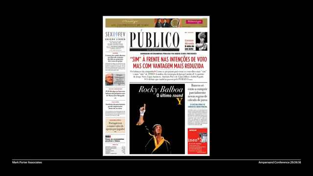
But the story of The Guardian typography wasn't over, because having rejected the tabloid format, we wanted to do something different, and that led to Guardian Egyptian, designed by Paul Barnes and Christian Schwartz, released by Commercial Type in 2005.
So, the editor had felt that the problem with the bold Helvetica was it could only shout.
So you take two papers, the one on the left is a really important news day, the beginning of the Iraq war, the one on the right is a really boring day where there's no real news, and yet the volume of the typography was the same. So we had to try and find a way of doing something that had more flexibility. Paul Barnes had been working on a few prototypes of fresh-looking, contemporary serif typefaces, and we actually decided that we liked best, I think the third one down, and we started developing that, making some dummies out of it.
We didn't have a full character set, as you can see, and we were still using the Haas Grotesk in a supporting way, but we got quite far with it.
We developed a range of weights and Italics, text versions, it was coming together really well, but in the end, I felt that the Hillman design in 1988 had been so radical and such a big change that somehow a conventional serif typeface like this, no matter how fresh and modern it looked, just wasn't enough for The Guardian.
So we decided to try some different routes and Paul had remembered how many of the original sans serif typefaces were created by taking what we called Egyptian typeface, these that had big slabby serifs, and chopping the serifs off.
So he thought, "Well, why don't we try and do that?" He made an Egyptian version of the serif typeface we were using, and chopped the serifs off and pitched this to us. But as soon as I saw it, I realised that, actually, I didn't like this, but I did like the Egyptian. So we went on to develop that.
These were Paul's first sketches.
Again, they delivered the full range of weights, headline and text versions, the text version has slightly longer ascenders and descenders.
It's got a little spur on the a and a few other alternate characters to make text reading easier; wider spacing. And then we went and rolled out a sans serif version of it and what we call an Agate version of it, with flatter sides and ink traps, and slightly condensed, and this was for use at small sizes on tabular data, like sports results and stock market tables. It actually performed really well when badly printed onto cheap paper.
So in the end, having continued to ask them for more and more fonts, we ended up with a font family that had over 200 different fonts in it.
The rest is history.
Sound? (steel guitar rock music) - [Narrator] The Guardian has changed.
- But what was particularly interesting about developing that typeface and that design was we did it for a print project, for a newspaper, but pretty soon, we had a lot of other media that The Guardian was publishing in, and we were able to implement the typeface first of all in an iPad app, later on it was rolled out onto The Guardian website, and one of the most interesting things I found was how that Agate version, which was developed for bad printing conditions, actually worked very well when it was pixelated too, and that's the only sans serif they're still currently using for screen use. But not only that, the typeface ended up forming the basis of a whole visual language and that was used in advertising campaigns by Wieden+Kennedy, it was used in an environmental redesign when The Guardian moved into a new building, and even for other kinds of products like this coffee shop, which they opened in East London. So as Michael was saying this morning, it became the voice of the brand, this typeface. But of course, nothing lasts forever.
Hillman's design lasted about 18 years before I redesigned it.
Mine lasted about 13 years before Alex Brewer at The Guardian and his team redesigned it earlier this year, although not quite so radically.
They made some changes to the typeface too, mainly about introducing more contrast, which on the lighter weights is barely visible, but on the bolder weights, you can see more clearly. The original typeface lives on.
It's used in newspapers all over the world from Mexico to Malaysia.
I found this in my local news agent the other day. Guardian Egyptian again, it's used for cultural branding and it's also used for large scale corporate branding. So it's strange how you can design a typeface for one specific purpose, for a newspaper, and it can end up being used by UPS as their corporate typeface.
The next typeface I had to learn to work with was Georgia, designed by Matthew Carter for Microsoft in 1996.
Now, just a little digression about Matthew Carter. If you don't know who Matthew Carter is, hopefully you do, he's the grand old man of type design in England and worldwide, really.
He started out learning to be a punch cutter with metal type in the Netherlands.
He worked in the photo-setting era.
He was there at the beginning of digital fonts, one of the founders of Bitstream, and then with web fonts, creating Verdana and Georgia for Microsoft. So the original commission was Verdana, which Microsoft wanted for Windows 95, I think. And of course, they had problems with font licencing. They needed a font that they completely owned that they could give away to people for free. So Verdana was the first one, and then they were looking for a serif which could replace Times Roman.
Matthew had been spending a lot of time looking at a style of type called Scotch Roman, which was particularly associated with Scottish type foundries in the 19th century, and in the end, he took those letter forms and created Georgia, which we all know intimately. So I found myself at The Guardian with a beautiful new newspaper design, and a website design that was completely unrelated, so as part of a digital project to rebuild the website, we also took on a redesign. The R2 Project, redesign and rebuild.
Took two-and-a-half years.
I had a design team of two-and-a-half people working with me, and there were about 50 developers on it, and that was my baptism of fire with digital media, really, beginning to understand that design no longer runs the show, and you have to work alongside tech people. It was my first experience of Agile methodologies, which not a particularly happy one, and I went through a strange sort of process of going into it full of excitement, thinking "Great, I'm gonna learn something new here." Very high morale, but I knew nothing.
Then as my knowledge increased, my kind of spirit started to sag.
Until it got to the stage where I was just completely despairing.
I thought, "I'm gonna have to forget everything I know "about design in order to get on with this, "and work on the web." But slowly, as I began to understand a bit better and understand the constraints and how to work with them, I accepted it and eventually got to the stage where I thought, "Okay, it's not what I'm used to, "but I still think the design skills "I've spent the last 15, 20 years learning "are relevant here." This was the website that we released in 2007, I think? Obviously looking pretty dated now.
But it was quite popular in China, amongst other places. The problem with Georgia was that everybody was using it, and again, as Michael was saying this morning, we think about the design that we do as enabling our clients to stand out, but the problem was, this was the default serif typeface. So these are snapshots from The Guardian, The Times, The Telegraph, and El Pais at the time. Everybody was using blue for links, everybody's using Georgia, everybody looks exactly the same, and it was almost as if the clock had been turned back to what newspapers were like in the 1960s, when they were so constrained by the cold metal, hot metal technology, that everybody kind of looked the same.
So in print, we were able to create a visual language through typography for brands, but in those days, we really couldn't on the web. We launched that redesign and it was up just in time for the election in the U.S. in 2008, which had a slightly happier result that the most recent one.
When the iPhone landed, it was still Georgia in those days, so the first Guardian iPhone app was still using Georgia headlines.
And of course, it's still with us.
It's still the default text font on Google-accelerated mobile pages and I don't think it'll ever quite go away. But the next typeface I had the privilege of helping to develop, again with Paula and Christian was Publico. Paul Barnes and Christian Schwartz, 2009.
So, after doing The Guardian I got a lot of commissions from other clients looking for newspaper designs, and I was asked to redesign this newspaper in Lisbon, in Portugal.
We wanted to have custom typeface, but they really didn't have the money to start from scratch, so in the old technique that Michael mentioned, we opened the bottom drawer and dug out that early serif that we developed for The Guardian, and Paul worked it up into a new typeface called Publico, delivered a range of weights, including some really beautiful big bold ones, and one special one for the magazine, and some of the sections that had higher contrast. So this was the original design of the paper with the Publico typeface.
A few years later, they went back to us and asked us to make it smaller, save a bit of money on paper.
We delivered a format that was very flexible front page, they could do a lot of different things with, and we particularly enjoyed playing with some of these bold weights and the Italics. This is the culture section, and this was the travel section, where I got Commercial Type to help me indulge my nostalgia for the 1970s, designing this completely bonkers section header. And Publico actually has gone on to be even more successful than Guardian Egyptian as a font. It's in newspapers all over the world.
It's been in magazines all over the world.
It's still the default text font on the Bloomberg website. And it's being used for corporate branding, too. The whole branding programme of this international insurance company is in a typeface which we commissioned for a newspaper in Portugal.
It's bizarre how you make decisions and then see them roll out years later.
I did something with Publico which I very rarely do. I went back and used it on another project when we redesigned The Sunday Times last year, because they wanted a very fast turnaround on this project.
We wanted custom typography, but we didn't really have time. They didn't really have the budget.
So Publico came back to the U.K..
After that project, I met Lyon, designed by Kai Bernau for Commercial Type in 2005. We used this on a magazine project in Italy. Again, they're based in Rome.
It's a brilliant magazine called Internazionale, which is a weekly news magazine with a passionate young audience, mainly 18 to 34. The editor has become a friend now, Giovanni De Mauro, and they had a pretty limited budget so we did most of it remotely.
Most of it was done in email exchanges.
He briefed us, we delivered our first version, which looked like this.
Giovanni came back saying, "Thank you for the redesign pages.
"They are good!" Okay, "But not the direction I want Internazionale to go." Oh, okay.
"They're too magazine style, "while I'm looking for a newspaper style." Okay, well that's reasonable feedback from a client. So we went on to version two.
This is using Freight, and I've forgotten the name of that blobby bold font from, who did Freight? Anyway...
Giovanni said, "I like it! "This is what I was looking for.
"Sober, clean, professional, but not boring or gloomy. "As for the fonts, what do you think of Publico and Stag? "I like them, and I think they could work well "in Internazionale." So I suppose it's a sign of maturity that I didn't just throw a hissy fit and resign the project and tell him to get lost, because I chose the typefaces in that design because I thought they were the right typefaces for the job.
But I like Giovanni, and I thought, "It doesn't do us any harm to try it out." So we did try it out.
Actually, it looked pretty good, so, you know, I didn't really want to use Publico again, but if that was what they wanted, then fair enough. Giovanni came back and said, "I like it very much! "It's fresher and more surprising.
"It's the newspaper touch I was looking for." So it wasn't really the typographic decision I wanted, but I thought, "Okay," and then I read down the email and he said, "Internazionale should be "more like a newspaper and less like a magazine." "The Economist and the New Yorker are more like a newspaper than a magazine.
So we dug out all our copies of the Economist and the New Yorker, had another look at it, and tried to understand what gave it those properties. And even though the client didn't ask for it, we went back and did another version, using Lyon. And the we got the email we'd been waiting for for about the last six months.
"Yes!" So out came the Champagne.
(audience chuckling) And one of the things that I like about this design is that it's all in one typeface.
There isn't even a headline version and a text version, it's all in Lyon text, but we did ask Kai to make a stencil slightly condensed stencil version, which is use for branding and for communications outside the magazine.
So this was the design that they ended up publishing. As you can see, it's pretty dense, it's got that kind of Econimisty, New Yorkery quality. But there is some space for more display, bigger images, and powerful photography.
We've had a lot of fun doing the covers with them. We still do covers for them every now and then. And then the next project was to design their website, again using Lyon, and the first version was based on the idea of a chronological feed, so it was a bit more like a Facebook timeline or something, rather than the editor's deciding, "this is the most important story of the day," just every new story would come in at the top, and they thought this was really cool, because it was different from everybody else, but actually the metrics and the data showed that people didn't really want that.
What they wanted was the long reads and the big articles from the magazine.
So we actually went on to redesign this pretty swiftly, into a much more conventional magazine style website which is curated and edited rather than based on any kind of feed principle. And of course, because they've got a young audience most people are seeing it on mobile now, and the Lyon looks absolutely beautiful on high resolution retina screens.
And as part of their putting more energy into the web, they also started doing more video, and they needed a little bit of motion branding for that. So we delivered this film for them.
(jazzy music) There were various different cuts and variations on this, but what was lovely about this was that it was actually back to physical materials. We were laser-cutting the characters of Lyon Stencil out of big pieces of coloured Perspex and putting them together to make the film. And we went on to design little products and swag and stuff for them.
They have an annual conference, which we did the branding for.
We're doing a bunch of special magazines for them now, which they publish every few months.
So, Internazionale ended up being not just a magazine design but a multi-dimensional, multi-platform project, long term relationship with a client all really cemented just by that beautiful typeface Lyon. So the next type face I fell in love with, and I'm still kind of in love with, is Graphik by Christian Schwartz, again Commercial Type, you'll see a theme emerging.
I got very close to Paul and Christian, and I don't use their stuff exclusively, but we have a great relationship and I do use it a lot.
So Christian originally designed Graphik for his own branding, and he felt that Helvetica and Futura were overused and brought a lot of historical baggage with them. So he wanted to create a new grotesk based around some of the less well known early 20th century grotesks.
The result was Graphik, which is a lovely grotesk typeface with a slightly warm kind of feel, and it became very useful to us, when we embarked upon this project, a rebrand of the biggest TV news network in the Netherlands, RTL Nieuws.
This is what it looked like before we did it, and in the briefing they kept using this word, this Dutch word, gezellig.
I don't know if anybody speaks Dutch here, but this is famously an untranslatable word. It's kind of it's a bit like that Danish word hugge, which was all over the interior design magazines a year or two ago.
It's got all sorts of implications about warmth and cosiness and friendship, and that was the kind of relationship they thought they had with their viewers.
But we were designing a news channel that had very hard news on it, so trying to find a typographic voice that could be warm and friendly but was still tough enough for hard news was quite challenging.
So I thought of Graphik because I remembered Christian talking about how he feels that these grotesk typefaces were intrinsically quite friendly, because they have a very large x-height, the rounded characters have really kind of nice rounded shapes, and he'd gone to some effort to make it even friendlier by doing things like replacing the square dots on the Is, with round dots on the Is.
There were also alternate characters in the typeface which give a really big difference to the flavour, I think. If you use the single story A and the T without the tail, again, it's just another step towards being a bit warm, and a bit friendly.
So that was the version which we got from Commercial Type and delivered to RTL.
So we approached this project kind of like we would a magazine project or a newspaper project, similar kind of grid, and then we built our typographic system around the grid, with all the different typographic hierarchy taking up different spaces, and then when you put this stuff on live action, this is what you get.
And information graphics were particularly important. Most TV information graphics are absolutely terrible. They don't convey the information at all, so we wanted to make sure that we developed an infographic style that was clean and modernistic and very much information based.
The Graphik typeface worked really well in that context. But of course, there's more to designing a TV station than just typography.
We had to design and build a real physical studio. So they ended up with these enormous screens in the studio on which the graphic typeface is displayed, really large sometimes, and the infographic style. We also delivered a series of title sequences for the news at different times of day.
(digitised music) And not to forget, of course, a responsive website, again, using the Graphik typeface. So we put it all together, and this was the result. (digitised music) (speaking in foreign language) - So we really felt that we'd managed to raise the bar of TV news typography on this project and Graphik was a great help in that.
I still love Graphik.
We use it for our own branding.
We use it on our website, and you may have noticed that I also use it for presentations and conference talks.
But just to bring things up to date, my latest typographic romance is with Forma, which was designed by a whole bunch of people. Aldo Novarese, Franco Grignani, Giancarlo Iliprandi, Bruno Munari, Ilio Negri, Till Neuberg, Luigi Oriani and Pino Tovaglia, for the Societa Nebiolo type foundry in Torino, Italy, in 1968.
There's a really interesting story behind Forma. Nebiolo were best known for their kind of more expressive typefaces, being an Italian foundry.
David was showing us Estro earlier on.
They also created Eurostile, and their lead designer, Aldo Novarese, was responsible for both of these.
But even though they had a lot of cool kind of wacky typefaces, they discovered, in the 1960s, that all the top graphic designers in Milan just wanted to use Helvetica and Akzidenz-Grotesk. So they decided that they needed to develop a neutral grotesk too, and the result was Forma. And that's why they had so many people involved. They formed a committee of all the top graphic designers in Milan and everybody consulted on this project.
This is what they ended up with.
Again, it's got alternate characters, a bit like Graphik.
It's got the Swiss versions, which are like Helvetica of the G, the lower case A and the R, but it's also got these other versions of the single story A and so on.
And actually, I am gonna show you the biggest piece of type in the whole conference. What's really interesting about Forma is unlike a lot of grotesks, it's got a bit of flair to it.
It's got those rounded corners, the verticals are not vertical, they have a little bit of a curve to them, and I felt that being Italian and being Nebiolo, they'd set out to create a kind of neutral Swiss grotesk but in the end they created something really beautiful with Italian style, and it is wasn't a neutral grotesk at all.
And at this stage I should point out that this massively complex digitization and revival project was done by David Jonathan Ross, who we've heard from earlier.
He was able to get one step closer to the source, even than Christian did with his type samples because they sourced the original metal font. Of course, metal always reads backwards so that's what it says.
We decided we were gonna use this font on a project for this magazine, Domus, which was founded by the great Italian architect, Gio Ponti, in 1928, and it has an amazing design history.
Some of the most influential designers in the history of graphic design and environmental design have been involved with it.
In the 1980s, the art director was Ettore Sottsass. He was followed by Italo Lupi, who was one of the most brilliant Italian graphic designers ever, and the amazing Alan Fletcher did it in the 1990s. So, a remarkable design tradition that we had to follow. So the first thing that we did for them was the web redesign.
We started looking at architecture magazines on the web, and we found that they all kind of looked the same, really. They were all very monochromatic, black type white backgrounds, because obviously they'd felt that the typography shouldn't interfere with the images.
They all had these very geometrical grids and there's a sort of strange affinity between Swiss graphic design and architecture that somehow people feel that as soon as you do an architecture project, it all has to be very Swiss and geometrical. In fact, Domus had really avoided those traditions in the past, and for me, the golden age of Domus was the 1980s, the sort of Memphis era, when they were doing incredibly wacky things with shapes and colours and stuff. We wanted to get a little bit of that spirit into the design.
So we went through the archive, spent a long time in the Domus archive, looking for things that we could use.
One of the things we liked was the way that they'd often use the vertical logo.
That was something that we thought you don't often see on the web.
We thought we'd try that.
The other thing, really, was the colour, the way they'd always used colour throughout history. Really powerful vibrant colour.
So this was the design that we delivered, with the vertical logo, the beautiful Forma typeface, and also, you can't really see on this screen, it's got a bit of a tone on the background to away from that monochromatic thing.
There's colour all the way through, and trying to avoid this sort of very grid-based geometrical feel, breaking the lines, and also some interventions with big coloured elements on these hero panels, that represent the different parts of the site. Staggering the type so that not too many elements lined up with each other, and every time a colour block comes in, it wipes across the logo.
So after that, they asked us to do the print magazine too, which, in a way, was even scarier.
We went back to the archive again, but we also had what we'd done for the web project as inspiration.
We knew we wanted to keep working with Forma, but to that we added a new font which David was in the process of digitising called Dattilo, which is a slab serif version of Forma, which Nebiolo had released.
So David very quickly finished off a few weights of that for us, and we also used his typeface Gimlet because we felt the Forma and the Dattilo were maybe a little bit too hard-edged, and we wanted a little bit of that kind of wacky 1980s post-modern flavour.
We felt the Gimlet brought that.
We made a very rich colour palette for this, so that we could have lots of opportunities to play with the type.
And this is the magazine which they published in January this year.
And the cover punching out that Forma in a really powerful way.
It had a beautiful gate fold.
And this image which we developed with the editor, Michele de Lucchi, who's an architect, we'd been looking at these weird illustrations of insects and Michele wanted to try and do something with that on the cover.
But what he did was, he made a building out of it. So it's actually a kind of architecturally viable building in the shape of a ladybird, and all the covers since then have been based on these fantastical buildings. I love these, 'cause they remind me a bit, I'm showing my age, of prog rock album covers from the 1970s.
Don't know if you know the work of people like Hypnosis, who did the Pink Floyd covers.
They really seem to have that kind of vibe to me. So, it's been um...
Oh yes, we also, for the end of that project, they had a launch in a big theatre in Milan, and we delivered these motion graphics to go on a big screen like this.
I really love how the Forma looks here on these colour fields in the strong colour palette that we developed.
It's just really, really beautiful and powerful, but also stylish.
So Domus ended up being another of those multi-dimensional projects where there was a print component, a digital component, a motion graphics component, all stitched together, a bit by a colour system but more just a beautiful, beautiful typeface. So it's been quite a ride in the last 30 years. I've been playing with a lot of typefaces.
Learning a lot of new stuff, I had to reinvent myself several times to embrace new media, getting into digital, getting into television, but in the end, it's still all about the typography, really. Trying to use the best type you can for a project, create a typographic voice for your clients. But it's become clear, even today, that the learning process is not over, and that's what I love about this business. I've spent my whole career learning new stuff, and after what I've heard today, I know I'm just about to have to learn a whole lot of other new stuff too, but I'm hoping that the next project at least brings me another typeface to fall in love with. Thank you.
(audience clapping)