Branding for accessibility: an inclusive approach to identity
Thank you everyone.
So what is a brand?
It's more than just your logo.
It's more than your visual identity.
I think of brand as people's perception.
People's perception of you, your company, or your product.
And as product designers and brand designers, we need to ensure that everyone can perceive our brand.
And this is where accessibility comes into branding, because 15% of your customers have a permanent disability.
I personally don't have a permanent disability, but I do have poor eyesight, and I'm not alone in that.
Pretty much everyone over the age of 50, right?
As it turns out, 75% of adults have some form of visual impairment.
Now, we don't think of that as a disability, and there's a reason for that because we solved that problem.
We've got glasses.
Put those back on so I can see my notes.
So, you know, it's not a problem because of technology.
We, have a means of solving it, and this is part of the social definition of disability.
If we can solve the problem for people, then it's no longer a disability for them.
But as designers, it's something to really consider, particularly when it comes to brand, because so much of branding is visual.
And it's so easy to make bad decisions as a brand designer just on your choice of colors, your choice of fonts, and so particularly when you're early in your career, and you've probably got 2020 vision, it's easy to lose sight of this, so to speak.
So, today's talk is short, and I'm going to begin just by talking a little bit about "ThoughtWorks" because, this is about the ThoughtWorks brand.
So, we rebranded last year, and to explain the rebrand, I have to tell you a little bit.
The company that I work for, and I'm going to explain some of the problems that we had around inclusivity and also how we're going about solving this problem because we're not done yet.
We'll probably never be done because it's an ongoing challenge, and we make mistakes every day.
We're constantly trying to improve.
But just to begin with a little bit about ThoughtWorks, so we're a global technology company; we do everything from strategy design through to delivery, and we're a consultancy practice with 19 countries.
We've got over 12,000 people and if you use the World Health Organization's statistic on the prevalence of people with disabilities, that is 2,700 people with disabilities, it's actually more than that.
So, the reason why this was a problem for us is the biggest users of our brand, the daily users, are the people who work for ThoughtWorks.
They're the ones who are using our templates and seeing our logo every single day.
So, in important audience, and that doesn't include our external users, which is all of our clients and external markets.
So, a little bit more about ThoughtWorks, we have five strategic goals.
Two of them that I wanna talk about here, relate directly to inclusivity.
So the first one is, we "foster a vibrant community of diverse and passionate technologists," and I highlight that word "diverse" because diversity is something we really try hard at in terms of recruitment, and the reason for this is we really do believe that diverse teams are more effective.
Diverse teams bring in a lot more perspective and a lot more psychological safety because they feel comfortable to bring their whole selves to work, and as part of this, as part of our diversity program, we hire for racial diversity, gender diversity, but we also have targets around people with disabilities.
Just this last year alone in Brazil, we hired 30 people with permanent disabilities.
So this is an important audience for us, and accessibility is a key requirement for our own people.
But it's also important for, external customers and users, and the people that we design products for.
So, and this touches on this second strategic goal, which is to "amplify social change and advocate for an equitable tech future." And by equitable, this is really about giving equal access to the technology that we built.
Now adding months ago, we joined the valuable 500, which is a group of over 500 companies, including companies like Apple, Microsoft, Google, and they're all committed to disability inclusion.
So we made this announcement on our website, and some of our own people pointed out to us, that, you know, the website's not very accessible, so that was a bit of a concern.
So we thought we were planning to do a visual identity refresh, and as part of that, we were going to completely rebuild our website anyway and move on to AEM onto Adobe, so kind of good timing to tackle this really important problem because this was definitely not aligned with where we wanted to be with accessibility, and so we decided to start off as part of the research and discovery phase for our rebrand.
We decided to just speak to our own people with disabilities, and so we conducted 30 interviews with people in ThoughtWorks who have different disabilities.
This is Matthew, who was born deaf, and we really wanted to know what their experience of using our brand, our products, various digital touchpoints.
We're pretty much entirely digital; you don't see the logo much in print anymore, and when we spoke to these people, they talked about their experiences and some of the really common issues, and some of the common ones were, was when information is shared in an image rather than in text.
That's really inaccessible.
You can't translate an image into another language, you can't increase the point size of the text, and if you can't see that image, then it's not gonna work on a screen reader either.
So other things, when people forget to turn on close captions at the start of a video call, things like: we have a lot of people with different types of neurodiversity, and for people who are autistic, it's really distracting having videos playing our animation on our website, and a lot of our marketing team weren't happy to hear that, but, you know, all of these things are fixable, right?
For me personally, probably the biggest takeaway from talking to people with disabilities was the realization that people with disabilities, they're incredibly resilient; you know, they do all the hard work here.
They do the heavy lift lifting when it comes to engaging with your products and services, and they don't ask much of us.
As product designers and brand designers, they really just ask that we include them, that we include them in the design, and that we test the designs with them.
So how do we include people with disabilities in our research and design?
Now, a common mistake that designers make is that, in our research phase, we focus in on what we call the "average user, the typical user." We think about our personas and our segments, and we focus in on them as our primary users of our product.
The problem with this approach is the more people that you talk to, the more you realize there is no average user; everyone is unique in their own way.
So sure, you can still do your personas target in on your typical segments, your accountant, but the inclusive design approach is to understand that the accountant you are designing for could be bad.
They might be deaf, they might have a cognitive impairment.
So designed for that.
Designed for the stress cases, because these are the people that are really going to test the usability and the accessibility of your product.
Another thing I mentioned before, our brand is a digital brand, and in thinking about making it accessible, we know how to do this.
We, have the bible of accessibility, and it's not new; it's been around for decades.
In fact, Tim Burners Lee set up the Web accessibility initiative back in the 19's so none of this stuff is new.
We know how to do it; we just lose sight of it, and it's easy to blame the web guidelines themselves because they're big and bloated and no one's gonna read that.
In fact, we went and did our own checklist of things that we need to do to ensure that all of our digital touchpoints are accessible.
But this is a solved problem, and there's, at the end of the day, there's really no excuse for not getting right if you've got a digital product or service.
So we decided with our digital touchpoints that we were gonna aim for AA accessibility, and luckily, apart from the guidelines, there's also a whole lot of tools that are available to help you get this right.
So we're, I'm just gonna have a look at one of these tools that we use.
Now, this is our old website from before the rebrand.
You can see the old logo there.
Lovely Franklin Gothic designed in the 19's.
And, so, we used a tool called "Lighthouse." It's fantastic, it's free, and it's just an automated accessibility test, really super useful.
And you can see here the score 81 now; that's average for accessibility.
If you have a look at your own digital products and services or the sites that you use a lot, probably a lot of them sorts of hover around this.
It's not terrible, but it's certainly not where we want it to be, given inclusive design goals.
So I'm just gonna run through some really typical problems, and these accessibility problems are actually shared by a lot of other different brands and products as well.
So the first one is just " low contrast text," and this is a particularly bad example, but on our old site we used photos a lot in our banners, and we would just put the H1 on top.
And the problem with that is that, you know, a photo can have varying levels of contrast, and what you really need is super high contrast and a really solid color if you're gonna have white text.
So, really common problem, easily fixed.
The next one was just around "legibility." Now, we were using Open Sans, which is a Web font.
We chose that font 10 years ago and we loved it at the time because it's got this really big font family.
The lightest weight is actually quite subtle and nice.
And we were overusing it, we were using it for body copy, completely illegible, particularly if you're over 50.
So that we had a big point size, we were using 16 points in our body copy, but still difficult to read, not a great choice.
The other problem, from a branding perspective, is everyone uses Open Sans.
It's just impossible to differentiate your brand if you are using the same font that everyone uses, so that was a problem as well.
One last thing: you can see the button color up there, that bubble gum pink color.
That was actually in our old color palette.
That was our primary accent color; we liked it; we liked pink.
It's, the problem with the color is it's, it just doesn't meet the contrast levels that you need in a button that fails.
There's a whole lot of automated tests and tools available, and it would fail every time.
So we knew that we had to fix that.
It didn't work with black or white text.
Now, the third problem I wanna talk about with our brand, is not a visual problem.
It's a language problem, and it's shared by a lot of people who work in technology.
We just talk in jargon all the time.
We use APIs; we just sprinkle them into the conversation.
It was in all of our content, and the problem with that is that cognitively, they're like throwing little grenades into the conversation.
It's just really hard to process lots of acronyms; even if you don't have any, you know, cognitive problems, it's still not a very inclusive way to talk to your audience.
And, another problem is with screen readers, because screen readers don't even know it's an acronym, so they'll often encounter an acronym and read it out as if it's a word, so API becomes APY.
So we knew that we had to spell out the acronyms, we knew that we had to explain the jargon a little bit better and remove some of that intellectual arrogance that comes along with the tech industry.
So this was, once again, it less easily addressed, but we did go back to our writing guidelines and educate all of our marketers and content creators.
So now I'm just going to talk about some of the solutions that, and some of the design decisions that we made.
The first one, just the logo itself.
We got rid of the old Franklin Gothic logo that we'd had for 25 years, and we chose Veta Canoe because it's just a classic, lovely, very legible font.
But of course, this is about brand, so we created what we call the flamingo oblique, which is that pink mark at the start; that angle, 27 degrees, is the number of years that we'd been in business.
So there was a marking point for the rebrand, and then we just introduced that angle in a subtle way into the typography to make it our own.
With the color palette, our old color palette, I'm not sure what we were thinking 10 years ago.
Have a look at it; 18 colors, some of those colors never got used.
But the problem with the color palette, apart from being just so big and bloated, is a lot of the colors were very hard to work with in terms of color contrast when you introduce them into typography Plus, with a little bit young, and we wanted to mature that color palette a little bit, particularly for our more exec audiences.
So we reduced it down to eight colors, and you can see here that we just darkened all of the colors a bit.
And I'm just going to show you our design system "Impact X." This is where this, you can see we've tested each and every color.
We spent a lot of time identifying the exact point size where those, that text will work on either white or black background.
And for most of the colors, they only ever get used in display texts like headlines, but at least we know in our design system, we know how we can use these colors so that they will pass a color contrast test.
Now, the pink accent color that you can see of Flamingo, as we call it, we wanted to keep that as our primary accent color for the brand, but it was a problematic color.
Previously we'd used it on buttons and on text links in our old brand, but we just knew that it wasn't, it didn't have the contrast that we really wanted to, it wasn't black and white, but we're not a black and white brand.
So, what to do with the flamingo?
We spent so much time going back and forth just picking at it like a scab, and eventually we just realized we need two colors.
And so we introduced a "dark flamingo," and this one, it actually gets it meets AAA; it's at a certain point size.
This is the color now that we use if we have text links, buttons; it took a while to get there, but that's our accent color.
Everything else pretty much in text and body copy is just black and white.
Now, just a little bit around the font.
So I spoke about open sans wasn't really working for us from either a branding or a legibility perspective.
We decided to choose two fonts.
Partly because, choosing one font on its own, you've got a lot of hard work to differentiate when you've only got one font.
So we chose two variable fonts, Web fonts, a bit of bold for the headings, and the bitter bold.
Everyone in ThoughtWorks was just so excited when they finally got a serif font they hadn't had a serif font in decades, so they're allowed to use bitter, bold.
It's really just in H1s, everything else is "Inter." And into being a variable font.
We have infinite control over the contrast, but we pretty much just use the mid-weight for body copy and a bit of bold.
And we also pumped up the point size, and if you have a look at our website, it's pretty big; everything's pretty big on it.
So we increased it to 18 points, it's very legible.
People my age love it, works really well on mobile.
And then, lastly, we introduced "illustration," and this was another real crowd pleaser for ThoughtWorks.
They hadn't had illustration in their visual identity for about 10 years, and the illustration, we've probably got a thousand illustrations now that we've, created and customized in our brand colors over the last year or so.
And you can see here the Lighthouse score 100.
That was exciting the day that happened.
However, this is an automated test, so it's not completely accurate.
You must do manual tests; you can't just rely on tools alone.
And the other thing I'd say about that is, probably the following day after, you know, we upload content multiple times a day.
Probably wasn't a hundred, the following day it changes.
This is just an ongoing challenge, you know?
Well, it's a process and a journey.
One thing about illustrations, and we use photography a lot as well, but a lot of them are purely abstract, they're just decorative, and that's challenging if you're a content creator and you've been told you have to use alt text because there's really no point, it's a bit, it's a waste of time trying to write meaningful alt text for purely decorative image.
So what we did in AEM was we just created this little check box in the CMS that would allow a hundred odd content creators to just indicate that image is decorative, and that results in a "null alt text." So we don't waste their time and we don't waste audience's time because no one wants to read a pointless alt text describing a decorative image, so that was a small win.
Now these are mostly designe decisions that we made, but to achieve an accessible website, you need a whole lot on that.
So we needed to look at educating our people, changing our process, and using new tools.
So I'm just going to run through the things that we did here.
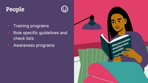
So firstly on "people," and I mentioned before, we have over a hundred marketers and content creators, each and every one of them needed to be educated about accessibility.
So we delivered training to around the world, to all of them, and we created a handbook on accessibility for them.
And we're in the process now of creating guidelines and handbooks for other roles as well; for front -end developers, for designers, and we are slowly rolling this out across the entire business so that we can improve not just all of our internal products and platforms, but the products that we're building for clients and just lifting that capability.
We also took those videos that we created right at the start of this process, and we created in our learning management system an accessibility channel with all of those 30 videos just to raise awareness of what it's like for thousands of Thought workers who are living with permanent disabilities.
And, you know, I haven't even touched on the temporary disabilities or the situational disabilities that we all experience.
You know, like intermittent Wi-Fi you know, the, when the images are gonna be the last thing to load when you've got a problem with your Wi-Fi.
So, the next thing is around "process," and I think the thing to really remember here is to include people with disabilities, to design with them, they need to be part of your research phase, you need to test with them, you need access to people with disabilities.
In a large company, they're already there.
We had easy access.
You need to do a combination of automated testing and manual testing.
The automated tests are pretty good, but they won't tell you if you've got rubbish text in your old tags, eventually, they probably will, but they're not that smart yet.
And lastly we introduced accessibility checkpoints into the content management workflow on AEM.
So now nothing gets published until someone trained in accessibility, goes in, has a lock at the content, checks the alt tags, and then approves them.
And I just wanna finish up with some of the tools because there's just so many available to you; these are tools that we've used and most of these are free apart from "AXE," so that's DQ.
They have a whole set of developer tools, and DQ came in and did some training with our team as well.
So they're a fabulous resource, and totally recommend DQ.
But these other tools, they're free.
A lot of them are just browser plugins.
There's, we use Lighthouse on the website regularly.
"Wave," there's a whole lot of tools that just come packaged up with your devices, and some of us might have used, if you are "Max Apple voiceover," you just go into your accessibility settings and turn it on.
And if you're a product designer or brand designer, I would really encourage you to see what your own product help performs using a tool like that.
And the one that I use all the time is "Tota11y (by Khan Academy).
Once again, it's a Chrome plugin, super usable, really handy, fast.
It can check any published site as well as content that's internal, so use the tools, but also remember to do the manual testing as well.
Lastly, what can you do today to start thinking more about accessibility?
You know, as brand and product designers, we just have so much influence here.
There's so much that we can do to improve the experience, not just for people with disabilities, but for everyone.
And, the first thing I would say, if you are uploading images into social media, into LinkedIn or Instagram, use the alt text field.
It's so easy, it will force you to slow down; it'll force you to stop and think, "Why am I sharing this image?
What do I want people to understand when I put this image up?" But that's actually quite a nice process to give you pause and to make you think about the content that you're uploading, and secondly, install a free browser-based tool and have a look at your own product to see how it's performing.
All of this is quite timely because we are in the week of International Day for people with disabilities.
So let's keep that front of mind and let's change the whole conversation into, you know, less about, oh, how onerous it is to deliver accessible content into what an amazing opportunity this really is to extend your audience and to include everyone in access to your products and services.
Thanks, Kate.
A round of applause for Kate.
A brand is more than a logo or a visual identity system. Brand is reputation. It is how people perceive and engage with a business. At Thoughtworks we actively seek engagement with the world. We want everyone to have equal access to our ideas, our insights and our software. Our commitment to diversity and inclusivity is a driver of business strategy.
So when it came to refreshing our global brand, we took an inclusive approach to the design. Starting with the choice of colour palette and fonts we then addressed the many things getting in the way of accessibility. This included changing our tools and ways of working across the organisation. In this talk, I’ll share how we approached the redesign of Thoughtworks to achieve accessibility and usability across all our digital channels.
