ARIA Spec for the Uninitiated
Thank you so much, Sara.
And hello, Web Directions.
Welcome to ARIA spec for the uninitiated.
I know you could have chosen to be anywhere else at this time.
So I'm grateful you chose to be here for this presentation.
This presentation is mostly for new users of ARIA, and I'm basically going to be walking through documentation and showing a few examples.
But even if you've been using ARIA for a while, you might learn a few things.
So here's my agenda for today.
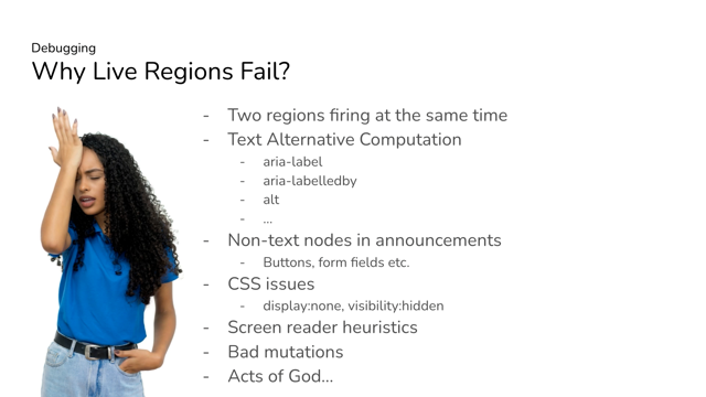
I'll start off first with the warning about the dangers of ARIA.
From there, I'll do an introduction of the official ARIA standard pointing out important sections, and then I'll get to the five rules of ARIA.
The last important resource I'll go over are the ARIA authoring practices.
And I want to discuss their purpose and proper use.
At that point, you should be pretty well introduced to ARIA and better equipped to create custom components.
So I want to talk about the dangers of ARIA and why it's important to know and use it right.
ARIA is very powerful and essential to providing the level of dynamics available in today's web.
Using ARIA incorrectly can cause some serious barriers for users of assistive technologies.
ARIA should be a last resort, a way to fill in the gaps that HTML has.
So why is ARIA so troublesome?
Well, besides people not taking the time to learn it properly, I'd say one main reason is because ARIA support varies.
There are a lot of hands in the pot by the time it reaches an assistive technology user.
Unfortunately, ARIA is not always completely supported by both browsers and assistive technologies the same way.
And with the ARIA that is supported, sometimes there are bugs in the implementation.
What's frustrating is that this is different across all browser and assistive technology combinations.
Something may work great in one combination, but not implemented or function properly in another.
Sometimes the implementations may break after originally working properly.
It's the same you'd expect with any of the other web technologies.
Unfortunately, there are just no media queries you can use to query for support with like CSS.
Or the ability to test for support with JavaScript to provide a polyfill.
The only thing you can do is test your work and provide work arounds, but you have to know what you're doing.
Throwing ARIA at a problem is not always the solution.
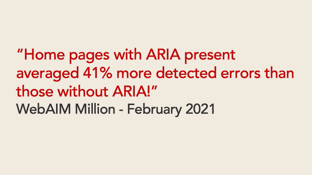
To prove that point a survey of 1 million home pages by WebAIM in February of 2021 stated that "homepages with ARIA present average 41% more errors than pages without ARIA".
So the more that ARIA is used, the more errors were found on the page.
So not only is throwing ARIA at a problem, not a proper solution.
It could be making things worse.
ARIA should be used only when necessary to fill in gaps that HTML does not provide.
That's why there's a very popular sentiment in the community that no ARIA is better than bad ARIA.
The point here is that if you don't know how to really use ARIA, it's just better to leave it off.
Thankfully you're here today and hopefully you'll learn enough to not contribute to making things worse.
So if ARIA is so dangerous, why am I here to talk to you about it?
Personally I think that ARIA has a bad rap and that might be controversial statement to some, but I think it's excessively vilified, and I can certainly understand why.
A lot of the negative sentiment is definitely warranted.
I won't deny that.
It can be easily misunderstood and abused and can do some serious damage to an assistive technology user's experience.
But I think it's just much easier to say "don't use it" than it is to properly explain it and learn it.
But that's not going to help anyone.
Just like anything else, it's not perfect by any means, but you shouldn't be overly afraid of it and you shouldn't avoid it.
You definitely need to respect ARIA.
And I recommend you take the time to learn it and understand it.
With that being said, let's get into the documentation.
So this is the very first resource I want to expose you to-the official ARIA standard.
Now, normally visiting the official standard or spec for any kind of web technology is usually reserved for the extremely academic types.
Most of you have probably never read the official ECMAScript standard, but I want you to treat the official ARIA standard as an API guide to get the most up-to-date information on available options.
If you want to know what something means, I urge you to come here first.
You can always get to the latest version of the standard by going to www.w3.org /TR/wai-aria, which I have on the screen now.
And the first thing you'll learn here is that ARIA actually stands for "accessible rich internet applications".
As of today, the latest version of the ARIA standard is 1.1 And make sure to bookmark this.
If you want to do ARIA, right you will reference this a lot.
I don't expect you to read the whole thing, but there are a couple of sections that I want to point out to you right now that will serve as the basis for everything you will do related to ARIA from now on.
The first section I want to point out on the screen is section 5.3 For the categorization of roles.
This section lists the available roles that ARIA provides.
What are roles?
Well, roles are how you provide semantics to elements and semantics are extremely important to accessbility.
So what exactly are semantics?
Semantics basically express what something is.
Once you know what something is, then you know how to use it, and what the expected result will be.
For example, if I hand you an object and tell you it's a fork, you most likely will know what it is and how it is to be used.
ARIA roles provide semantics and the ARIA 1.1 Standard provides 70 usable roles.
That's the total list you can not make up your own roles.
Let me repeat that: you can not make your own roles.
So of these 70 rolls in version 1.1 Only 29 of them are interactive widget rules.
And I'm going to focus on those right now.
These interactive roles are defined in section 5.3.2 for widget roles, and can be broken down into two groups-standalone and composite.
First standalone widgets, either operate on their own or exist to be a part of a composite widget.
There are 20 standalone widget roles that I am highlighting on the screen now.
Some of which may be familiar to you already, like button, checkbox or link.
Again, when it comes to standalone widget roles, this is the complete set-you cannot make your own.
The next group are composite widget roles, and these are essentially parent roles or containers for other standalone widget roles.
There is a very strict hierarchy when it comes to composite widgets.
And these have to be composed with very specific standalone roles and often in a very particular order.
In most cases, you can not pick and choose which roles are used to compose a widget.
Since some standalone roles can only exist as a child or nested, in one of these nine composite widget roles highlighted on the screen now.
Let me repeat that.
There are very strict parent child relationships between certain roles.
So some roles can only be used as a child of a specific composite role.
This is extremely important to understand, especially with how easy certain UI libraries make it to reuse components and render wherever necessary.
Be very careful about how you nest components and roles, because you can be breaking your well-intended accessibility if you don't respect the parent child relationships with roles.
Detailed information on how to use roles and apply standalone versus composite roles can be found in the definitions for each role.
Now diving into the definition for roles.
They all follow the same format.
On the screen now I'm going to use the button role definition as an example.
Each role provides a definition and information on usage.
In this case, for example, a button is defined as an input that allows for user triggered actions when clicked or pressed.
In addition to the description, helpful usage guidelines are also included.
For button this information I'm highlighting describes how buttons suppor aria-pressed to create toggle buttons.
Take the time to read this because it always provides additional information that may not be gleaned from the general templates for definitions.
After the definition, each role will have a table of characteristics that will further help you in determining what you need to include or what is supported when using a particular role.
The first section I'll point out is the base concept section.
Not all roles will have this, but this is your first clue that the semantics provided by this role can be provided by an equivalent HTML element.
For the ARIA role of button, the base concept is an HTML button.
When you see this, I highly recommend that you move on to using the HTML equivalent that is listed here instead of the ARIA role.
After the base concept is the finite list of supported and inherited states and properties.
I'll go over states and properties in a little bit.
But the important thing to remember here is that these are the only states and properties that can be used for.
For button, there are only two explicitly supported states, aria-expanded and aria-pressed.
After the explicit list of supported states and properties is the inherited states and properties.
These are also supported by the role, but they are as described, inherited from a superclass role.
So this collection of supported and inherited states and properties are the only states and properties that this role supports.
If you apply a state or property that is not on the list of supported states and properties, you are breaking accessibility.
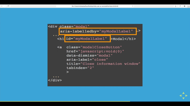
The next set of information has to do with the accessible name, letting me know if an accessible name is required and where that accessible name is calculated from.
Accessible names for interactive controls, especially, are extremely important because they identify a widget.
This is how assistive technology users know that what they're interacting with in the case of a button, the accessible name comes from the contents of it.
Speaking of the contents pay attention to the last item here, children, presentational.
This is another clue to let you know what you're allowed to nest inside the element.
If this is true, it basically means that the contents inside will be stripped of any semantics.
So if you're nesting links inside of buttons or headings, like I recently did, you're breaking accessibility.
Now, a few more important sections I want to point out related to specific composite roles.
If you remember when talking about composite roles, I told you the composite roles have a very specific parent child hierarchy.
The role definitions give you this information and it's listed in the required own elements section of the characteristics table.
Essentially these are required child role elements for this role.
Now not all roles will have this section.
In this case, I'm displaying the menu role definition.
The required own elements here, let you know that the menu role will require at least one instance of an element with one of these roles.
Again, these are children that are expected for this role.
If you're missing any of the elements listed in the required own elements, you're breaking accessibility.
On the flipside, you also get information on the required parent role for a particular element.
And this is documented in the required context rule section in the table of characteristics.
On the screen I'm showing the menuitem role definition as an example, and the required parent role for the menu item is one of group, menu or menubar.
If you're using the menuitem role, and it's not nested in one of these roles, you are breaking accessibility.
So this is a very high level overview of how the spec defines roles and how you can use this information when specifying roles for your ARIA components.
One thing I want to make you aware of when using roles, roles do not provide interaction.
They simply just describe what something is, but do not provide the expected behavior.
And once you tell someone what something is, they'll know how to use it.
You need to provide the expected interaction.
It's important to know that certain roles can change Input modes for various assistive technologies.
So specific interactions are expected.
For example, a specific role may change what is expected of the arrow keys.
And you need to provide that.
When you don't provide those interactions, then you're breaking the contract established by the role.
So along with providing semantics by way of roles, ARIA also provides states and properties to further describe interfaces to assistive technologies.
And as of ARIA 1.1, there are a total of 48 states and properties.
So let's take a look at available states and properties.
Back to the official ARIA standard at section 6.6, which is the definition of states and properties.
All the available states and properties with their available values are listed here.
And just like the roles you can not make up your own states or properties or provide your own values.
Along with not being able to make up your own there are rules about which states and properties you can apply to specific roles.
Some states and properties are required on certain roles and some states under properties are not supported or allowed on others roles.
Looking at aria-expanded on the screen as an example of definitions for a state or property, you'll see that the format is the same as role definitions.
It starts off with a description and some usage guidelines.
Just like roles each state and property definition includes a table of characteristics.
Here in the used in role section we see all the roles that support this particular state.
As confirmation, I see that button is listed.
And that matches the supported states we saw for button earlier.
So if you use the state on a role, that's not listed here, then you are breaking accessibility.
After the characteristics table, you have a table documenting the available values for the state.
For example, aria-expanded, accepts true or false.
Where true means it's expanded and false means it's collapsed.
These are the only values that you can use for the state.
If you use something other than the values listed here, you're breaking accessibility.
So understanding roles, states and properties, understanding the relationships between them, knowing when and where to apply them is everything for your proper ARIA usage.
What I have shown you here is how to use the specs when creating your custom components.
Again, this documentation is replete with everything you need to understand how things work together.
And that's a big part of understanding ARIA.
But there's still a few more resources that I want to go over that will complete your initiation into ARIA.
When it comes to ARIA, there are five very well-established rules that you need to be aware of.
These high level rules will always guide you in making the right decision when you're developing your own ARIA widgets.
The first rule of ARIA might as well be the only rule of ARIA because it's repeated so often.
If you've already started on your journey in ARIA, you may have heard this one already.
The first rule is don't use ARIA.
Now, this may remind you of some sort of fight club rule, and ARIA can be the cause of a lot of fights.
But if you're confused by this rule, it's because it's not totally accurate.
This is actually an incomplete rule.
The entire rule is "don't use ARIA if you can use HTML instead".
The second part is almost always left off, but it is really important.
As I've mentioned in the overview of the ARIA standard, ARIA is used to describe widget role semantics and state.
And a lot of this is covered by existing HTML elements and properties.
So on the screen here, I have a couple examples.
Instead of a div with role equals banner, you should use the header tag.
Instead of using a div with role equals complimentary use the aside tag.
Role of form is the same as the form tag, as is role of main, the same as the main tag.
Role of navigation is the same as the nav tag.
And role of region is the same as the section tag with an accessible name.
Without an accessible name, the section tag itself is not recognized.
We'll talk more about what accessible names are with the fifth rule of ARIA.
Lastly, role of contentinfo is the same as the footer tag.
Now the search landmark does not have a corresponding HTML element.
As I mentioned earlier, if there is an HTML equivalent to an ARIA role, you should always prioritize using HTML.
And if you can use the HTML counterpart first, and it's supported by browsers and assistive technologies, then you're better off just using the HTML as it will provide all the same properties as ARIA, while providing a more stable experience.
Simply by using the right HTML element, you get semantics, the focusability and interaction already built in.
It's less work for you, less code and less of a surface area for bugs in the experience.
This is exactly why accessibility professionals stress learning HTML so much.
It does a lot of the heavy lifting for you.
And I know it's easier than it sounds since there are a lot of HTML elements to choose from.
It can be hard to know when to use HTML versus ARIA.
So I'm currently working on a periodic table of semantics.
This periodic table of semantics lists every HTML element available and matches it to an ARIA role.
So if you need to provide semantics, you can easily find out if there's an HTML element you can use.
And if it's not, then you can fill in the gap using ARIA.
I'm still working on this, but the data is all there with links to each of the official specs.
You can find this periodic table of semantics at HTTP colon forward slash bit dot L Y four it's slash the number two lowercase, L as in Larry upper case, M as in Mary Opera case, K as in king, the number one Laura Case K as in king and lower case o as in Oscar [https://bit.ly/2IMK1ko].
The second rule of aria is don't change native semantics.
If you're being responsible and using HTML first, you have to make sure that you don't use ARIA to replace the semantics that the native element has.
You see when you use an ARIA role, you are explicitly setting the semantics of that element.
The ARIA role takes precedence over the HTML.
So let me show you an example.
Let's say your site or application has a collapsed menu and you're using a link because it's easy to style, and it also natively provides focusability, which you heard was good for accessibility.
You provide a click handler to prevent the default behavior of making the page jump when this link is used, and then you display your menu.
At some point, you learn that links are meant for navigation, and you should really use a button for this, but you don't want to have to modify your markup or CSS.
You also just learned about ARIA roles and how they provide semantics.
So you decided to add the role of button.
Now, this menu is communicated as a button and you're happy.
So what's the problem with adding the role in this way?
Well, as you may have already learned, roles specify semantics and semantics are a contract.
The element needs to behave as expected for the role, but links don't act the same as buttons.
You see links are activated using the enter key and buttons are activated using the space key.
You've told the user that this is a button and they will try to use the space key, but nothing will happen.
You have broken the contract.
So to fix this, you decide to add additional JavaScript to restore the contract.
Now, technically an assistive technology might smooth over the usage of space versus enter, but that really shouldn't change the guidance here.
At this point, considering all the work you had to do, hopefully you realize that would have been easier for you to just use a button.
Again, if you use HTML as intended, the platform will provide a lot for you, including semantics and interaction.
You then use ARIA to fill in the gaps as necessry.
Hopefully the third rule of ARIA should be familiar to you already.
Basically all interactive roles need to be operable by a keyboard.
If functionality is provided via a mouse, touch or any other method of input, it also needs to be available by keyboard.
This is important in fulfilling the contract of semantics.
Keyboard support is absolutely fundamental for accessibility support.
Ensuring keyboard support will get you a very long way with other input modalities as well.
Like game controllers for example.
The fourth rule of ARIA is don't use role equals presentation or aria-hidden equals true on visible focusable elements.
The role of presentation is a very special role.
It basically removes the semantics of an element.
If you do this to an interactive or a focusable element, then an assistive technology user will not know what it is or how to use it.
And this could create a serious barrier.
aria-hidden is an ARIA state that effectively hides that element from an assistive technology user.
ARIA just describes things.
It does not affect appearance or functionality the way HTML attributes might.
When you use aria-hidden equals true on an element it's still rendered and visible on the screen.
Doing this on a visible interactive element hides that element from assistive technologies, which can again, create a serious barrier to your users.
Proper ways to hide elements is a separate conversation altogether.
But for now, just know that role equals presentation and aria-hidden equals true can be very dangerous if not fully understood and used properly.
The fifth and last rule of ARIA is that all interactive elements must have an accessible name.
Why is that important?
Well, if semantics or roles give you the type, then the accessible name tells you the what.
And not only is it important for screen reader and braille users.
It's also important for voice recognition users to be able to identify and interact with controls on a page.
So make sure that all interactive elements have an accessible name.
The five rules of ARIA are documented here on the W3 site at https colon slash slash www dot w3c.org.
forward slash T as in Tom, R as in Robert forward slash aria dash N dash HTML [https://www.w3.org/TR/aria-in-html/].
And you can read up on more information and examples.
There's some other really good information documented on this page, and I encourage you to check it out, to learn more.
So up until this point, I've gone over a lot of documentation and principles.
Now it's time to get into some examples of implementing ARIA.
When it comes to creating custom components, you don't always have to start from scratch.
There are some established examples that you can use to start off with.
Another important resource that I want to discuss are the official ARIA authoring practices.
And this resource is often referred to as an example of proper ARIA implementation for various widgets.
The authoring practices are available at HTTPS colon forward slash forward slash www dot W3 dot org forward slash capital T as in Tom capital R as in Robert forward slash wai that's w as in William, a as in Adam, I, as in India, dash aria dash practices [https://www.w3.org/TR/wai-aria-practices/], and they demonstrate about 27 different widget roles and patterns.
Some are essentially ARIA recreations of HTML elements, like button and checkbox, but some of them are interactive widgets only available via ARIA, like tabs.
I'm going to use the accordion example because I actually wrote the sample code for this pattern, so I'm most familiar with it.
Now, each pattern starts with some information about general purpose and usage, which can include variations on the pattern.
I'm going to skip over the example right now and go over the keyboard interaction section.
Included with each pattern is the expected keyboard interaction, which describes each interactive element with the expected keys to implement and the expected result of activating those keys.
For example, with the accordion, when focus is on the accordion header, enter or space should essentially toggle whether or not the accordion is expanded.
Expectations for tab and shift plus tab, as well as the optional controls like up or down arrows and home or end are also included.
After the keyboard support section is a section that lists all the necessary ARIA roles, states, and properties for the pattern.
Everything you need to know in terms of implementing this pattern is listed here.
Now to experience this in real life, let's go back to the example that is provided .here . All of the examples follow the same outline.
They start off with some links at the top, a brief introduction on the example being demonstrated and how the pattern is being implemented.
I'll get back to these links in a bit.
After those links is a live working implementation of the pattern that you can play with and test.
After the example is usually a description or explanation of various accessibility features that are implemented.
While not always specific to ARIA it's general good guidance to follow.
This guidance here explains the focus indication and how it helps let users know that enhanced keyboard navigation is provided.
Following that as the keyboard support that is implemented.
And again, this breaks down all the expected keys that are implemented and the expected interactions.
And then a more detailed description of the role, states and properties as well as tab index that's used in the example.
This is like a mapping of HTML elements to ARIA roles and the attributes used in the example.
To round out the example are links to the CSS and JavaScript files and then the markup being used.
So maybe you're thinking about skipping the rest of this presentation and just copying the examples here since everything's already done.
Well, not so fast.
These authoring practices are often used in a way that they were not originally intended and often used incorrectly.
Let me point out some important notices in the documentation.
In the very beginning, I talked about these links that the top.
And I want to point out some things mentioned in the browser and assistive technology support page.
It says testing assistive technology interoperability is essential before using code from this guide in production, because the purpose of this guide is to illustrate appropriate use of ARIA 1.1, as defined in the ARIA specification.
The design patterns, reference examples and sample code intentionally do not describe and implement coding techniques for working around problems caused by gaps in support for ARIA 1.1 In browsers and assistive technologies.
It is thus advisable to test implementations thoroughly with each browser and assistive technology combination that is relevant within a target audience.
It goes on to say, except in cases where the ARIA working group and other contributors have overlooked an error, examples in this guide do not function well in a particular browser or with a specific assistive technology are demonstrating browser or assistive technology, bugs, browser and assistive technology developers can thus utilize code in this guide to help assess the quality of their support for ARIA 1.1.
And this is from the ARIA authoring practices document, section 2.2 Browser and assistive technology support with some added emphasis by me.
So what does this all mean?
Well, in plain English, what this is saying is that they don't provide any guidance as to how to work around bugs in browsers or assistive technologies.
And these guides provide the state at which they would like things to be supported.
It's a testing tool, basically for browsers and assistive technology vendors to help beef up support if something is not working.
The truth of the matter is that aria is only a spec.
There is no guarantee that browser vendors and assistive technologies are going to support all the roles, states and properties, just the same way building codes don't always guarantee that something is built properly into code.
Because of this, they advise testing everything before using.
One more note that I want to point out here.
Currently, this guide does not indicate which examples are compatible with mobile browsers or touch interfaces.
While some of the examples include specific features that enhance mobile and touch support.
Some ARIA features are not supported in any mobile browser.
In addition, there's not yet a standardized approach for providing touch interactions that work across mobile browsers.
And that is from the ARIA authoring practices document, section 2.3 Mobile and touch support.
And this is basically an acknowledgement that these patterns and the ARIA used to build them may not be supported by mobile browsers.
In fact, the design patterns do not even really take mobile and touch into consideration.
This is future work to be done.
I see a lot of component libraries advertise that they are accessible because they implement the ARIA authoring practices.
Just be aware that that does not always guarantee accessibility.
Things need to be tested.
So what do you do?
I'm not telling you that you can use these patterns.
You can certainly use them as a basis for your widgets, but you shouldn't use them as is.
The point of all this is to test, test, test.
Everything that you do and not just on your own.
Hopefully with real users, you'll discover some inconsistencies and you'll be expected to fill in those gaps.
That is why it's important to know and understand ARIA and not just copy and paste these patterns.
The ARIA spec calls this out explicitly in the testing practices and tools section by saying "the accessibility of interactive content cannot be confirmed by static checks, alone.
Developers of interactive content should test for device independent access to widgets and applications, and should verify accessibility API access to all content and changes during user interaction".
And this is from the ARIA authoring practices document, section 1.5.2 For testing practices and tools.
So just another prompt to make sure that you're actually testing with assistive technologies and not just relying on the inclusion of ARIA to ensure accessibility.
Another thing that I want to mention is that since this is basically an ARIA testbed, a lot of times they will excessively use aria roles and properties that are perfectly available via HTML.
This is not a suggestion to always use ARIA instead of HTML, but obviously in order to test ARIA, they have to use all ARIA.
And again, I'm not saying that you shouldn't use this resource.
I'm just emphasizing that you need to test everything yourself.
You should definitely follow the keyboard interaction and start with the roles and properties demonstrated, but experiment with falling back to using HTML first, and then make sure you test everything with assistive technologies.
So here's the summary.
ARIA is dangerous, if you don't know what you're doing.
Remember no ARIA is better than bad ARIA, but at least, you know how to use the spec to understand how everything works together.
ARIA is finite.
There are only 70 rolls and 48 states and properties.
You cannot make up your own.
There are also strict rules around parent child relationships for roles.
Again, use the standard to understand these relationships.
Another important point to remember-ARIA only describes content via roles and states or properties.
It does not magically add functionality.
That's up to you to do.
Keep in mind that adding ARIA roles may change assistive technology input modes, and usage of certain keys will be expected.
You need to provide that interaction.
That's why it's best to learn HTML and prioritize it whenever possible.
Using HTML over ARIA will almost always give you a more reliable experience.
I also showed you the ARIA authoring practices with the caveat that they're not meant to be copy and pasted.
The primary purpose of these examples are to provide a test bed to browser and assistive technology vendors to better provide aria support.
They're still a good reference as a start, but not as an end.
Ultimately, you need to test everything for proper support and functionality.
Test everything for support and functionality.
Ultimately, don't be afraid of ARIA.
Familiarize with the specs.
Learn how to use them properly.
Use only what is needed to fill in HTML gaps.
Mastering ARIA is not just about how to use it, but more importantly, when not to use it.
At this point, you can consider yourself initiated, but this is only the beginning.
Before I go I wanted to take this opportunity to quickly let you know that I do have some accessibility courses available on the Pluralsight learning platform, which are part of the developing websites for accessibility path.
Those courses include meeting web accessibility guidelines, introduction to develop custom components with ARIA and accessibility testing and screenreader use.
If you're interested in learning more from me, you can check these out over at Pluralsight.
And with that I say thank you for attending and thank you to Web Directions for allowing me to speak to you today.
I hope you all feel more comfortable about ARIA.
The slides are available at HTTP colon forward slash forward slash bit dot L Y, forward slash the number two capital Z.
Lower case y, the number six capital T as in Tom capital, D as in David lowercase case F as in Frank [https://bit.ly/2Zc6TDf].
And if you have any questions, comments, or feedback, you can always reach me at Twitter at Gerard K Cohen.
Have a great rest of the day, everyone.
Thank you.
Specs are usually not very fun, but I have learned that reading the ARIA specs is important to fully understand all the various options that are available. In this presentation, I will walk you through the ARIA spec and show you how to make the most out of it to create custom components with ARIA.