(electronic music) - Hi everyone.
How's everyone doing this morning? Good, yeah? Excited? It's kind of rainy outside, but it's nice and cool and warm in here.
So, today I'm gonna be talking with you all about The Great Accessibility Bake Off.
Quickly a little bit about me.
My name's Cordelia.
I am Cordelia Dillon on the internet.
And I work at Dropbox on design systems, specifically on web accessibility.
And today, we're gonna be talking about accessibility. One thing that I have loved so much about this conference, is I think almost every single talk mentions accessibility. Yesterday there was one full talk by Adam on accessibility. But I'm pretty sure every single other talk at least talked about accessibility or how accessibility concerns and when, is in the projects that they were talking about. So that's super awesome.
What is accessibility? I'm sure you all have a general understanding of it. The way that I like to talk about accessibility, the definition that I really like is this one. Accessibility is about making products, services, and spaces that everyone can use and enjoy in all contexts, regardless of their abilities.
So this is super important in that accessibility is not just about disability. It's definitely about disability, but I think a lot times we tend to think as creators there are people who are disabled and people who are not disabled.
But in fact, everyone has a disability as some point in their life.
Everyone has an impairment, temporary or permanent in any situation.
So accessibility is really about creating flexible systems that work for people in whatever context they're in.
So we tend to think about it in four different overlapping dimensions when we talk about accessibility on the web. The first being, visual.
Visual accessibility is really important on the web. We're talking here about a variety of experience such as colour blindness or being blind, having low vision, but also things that are situational impairments such as device brightness.
If your phone has really low battery, you might turn down the brightness on your phone and then suddenly you can't see things as well. So it's both permanent and temporary conditions there. Next is motor related accessibility.
So that really comes down to what sort of input device is a user using to navigate your UIs.
Are they using a keyboard, a mouse, or are they using a switch, which is a single button that they press to access a whole suite of rich interactions on your site.
Or are they using speech recognition? Because perhaps they don't have fine motor control. Perhaps doing precise actions with a mouse is hard. Perhaps they're multi-tasking.
Maybe they don't have both hands available for a task. So thinking about how you can make things really flexible for people who are coming at it with all sorts of different motor conditions.
Next is auditory, such as deafness, being hard of hearing being in loud surroundings, or maybe someone sent you a really cool, funny video, but you forgot your headphones and you're like embarrassed to listen to it at work. So you wanna watch the captions.
There are all these things that are both situational and more permanent.
And then finally cognitive, which is actually a pretty big area.
And I really like that Rachel talked a little bit about how animation can help reduce cognitive load yesterday. So cognitive encompasses all sorts of things from dyslexia and autism to even in some ways internationalisation. Does your user actually understand the words in your interface.
Do they understand the iconography or if you have someone who is unfamiliar with the system context, for example, an older user who's looking at a hamburger icon and not knowing what that means, that's a cognitive accessibility issue.
So really accessibility is about creating these flexible systems that meet people where they're at.
And do that from the very start, without tacking on-accommodations.
And related to this tacked on accommodations we get to the theme of this talk, which is baking. Some of you probably have heard the expression, baking accessibility in.
I think that we should do that from the very start. When I worked on the Lightning Design System at Salesforce, we really cared about baking accessibility into every single component that we were putting into that system. Same thing at Dropbox, and hopefully that's something that you all are doing today, or maybe will do after this talk.
So the best metaphor I can think of for baking accessibility in, is a muffin.
Imagine that you are going to your niece's birthday party and she loves muffins and you promise that you're gonna bake all these delicious muffins for her birthday brunch.
And you bake these, and they are fresh out of the oven, absolutely gorgeous looking, delicious.
You put them all in a container, you're ready to go out the door, and then you remember, she loves blueberry muffins and you promised that you would make blueberry muffins and you forgot to put the blueberries in.
So you have these perfectly fine muffins, but they're missing the blueberries.
And you start freaking out and you start jamming all the blueberries in with your fingers.
And you end up with this really gross crumbled mess. Which is technically a blueberry muffin.
It's a muffin, it has blueberries in it, but it's not really a blueberry muffin.
If we're being real here, it doesn't have the ooziness and deliciousness of baking the blueberry in from the very beginning.
It looks weird, I really should have drawn juices scattered everywhere.
So you didn't really succeed in making a blueberry muffin. And this is what happens all the time in web development and design when we consider accessibility after the fact. I think a very common example is, I see this everywhere on the internet.
I have been guilty of this in the past, and maybe some of you have been too, of, here's a button that I've coded as a div. So I've got this div element, I've added an on click event to it, and when I click on it, it will set a timer because this is a baking theme talk. So that's cool, it works with a mouse, it looks like a button, great.
But if I tried to navigate this UI with the keyboard, I soon find, oh I can't actually get to this with my keyboard.
Cool, so I'll add a tabindex next to it.
So now I can get to this element with my keyboard. Now I press enter on it and nothing happens. Well all right, okay.
Onclick events aren't triggered when I press enter on a div.
So I guess I'll add an onkeydown and I'll call the same set, timer event, and I'll check if the key on that event is a space or an enter and if that happens I'll set the timer.
So now I've got this, this is the muffin with the blueberries stuck in with your fingers, right.
It works with a mouse and a keyboard, but it's still missing something for a screen reader user, because nothing about this, aside from the visuals, say that it's a button.
If I were a screen reader user and I were navigating say, with the quick key of pressing B to jump from button to button on the page, I'd totally miss this. So I can add role=button, and now this thing looks like a button, it functions like a button, and it identifies as a button.
But that's an awful lot of extra code, especially the onkeydown I've had to write.
I didn't write it here, but it would be a lot of JavaScript to get that thing to work, when really I could've just used a button to begin with, and added an onclick event, and automatically this thing is keyboard accessible. Automatically the onclick event will be triggered with my enter key and my space key. And yeah, buttons are kind of ugly and harder to style than divs, but they're not that much harder to style. I can just write a little bit of extra CSS and get all of that needed semantics for free.
So this is kind of the state of the web right now. It's very easy to make inaccessible UIs and then throw a bunch of extra attributes on.
When you can do something pretty simple.
So I was thinking about this baking metaphor and figuring out how can I roll with this metaphor and really make something interesting for this talk. And I wound up at the Great British Bake Off. Has anyone seen this show? Yes, one hand, two hands, many hands.
Has anyone seen the Australia version of it? I don't know if it's a very popular thing here. Apparently not really.
So the Great British Bake Off, arrived on American Netflix somewhat recently, and I've watched most of the seasons that are available, which are three.
And I love it.
So I decided to structure this whole talk around it. So for those who haven't seen the show, basically it's a reality competition show where a bunch of amateur bakers, so here are the amateur bakers from a recent season. A bunch of amateur bakers compete every week in three separate challenges.
A signature challenge, a technical challenge, and showstopper challenge.
And it is the most delightful show that you will ever see. Everyone is so charming and so nice to each other. And they're baking and it's like high stress, but they're not competitive against each other, they're competitive against themselves.
They're really trying to make the best, and tastiest and best looking bakes they can.
So in those three different challenges, they're judged by these two fine, incredible bakers, Paul Hollywood and Mary Berry.
And I'm rambling on about this show because I believe that every day as web creators, whether we signed up for it or not, we are competing in The Great Accessibility Bake Off.
We're constantly undertaking accessibility challenges in every single interface that we build and design. And we're all, to some extent, we're all amateurs at it. Accessibility and the web, as we've been seeing, is a huge field, we're all just trying to do the best we can.
So, I have decided that today we're going to go through The Great Accessibility Bake Off challenge. And I think one thing to really stress is that we all can make great accessible UIs.
You don't have to be an accessibility expert just to make something that is accessible and good. And we're gonna be talking about that a little bit more. But we are all amateurs bakers in this challenge. You just have to be really comfortable with the basic techniques, which we'll go over. And then be comfortable stepping a little out of your comfort zone when necessary.
So today, we are going to go through an imaginary episode of The Great British, no, The Great Accessibility Bake Off.
And instead of all of these folks being contestants, look how excited they are.
You all are contestants and I'll be a contestant here as well.
And instead of these two charming British bakers judging what we make, our users, or as Rebecca said yesterday, our guests, are going to be out judges. Here I've got six different sample users with all different input devices.
We've got a mouse, a touchscreen, a refreshable braille display, speech recognition, multi-tasking person, and someone using a switch with their head, which is actually a very common way to navigate UIs. Again, instead of having professional bakers judge us we have our users judging us.
And instead of the contestants, instead of ourselves winning and losing, really at the end of the day, the users are who win or lose.
Because the users are the folks who are going to be experiencing the pain of inaccessible UIs.
But they're also gonna be the people who are experiencing extreme joy of using an interface that just is intuitive and feels right for them.
And yes, technically we also are winners and losers, because if we build something inaccessible, someone might go to a competitor.
But at the end of the day, that's not what it's about. It's not about building the best accessible UI so that people on use your stuff and not someone else's. It's about creating these really great experiences for users and making them feel appreciated. Before we start the show, let us do some prep work.
Once I pause here.
Okay, is it on well? Is it lumping strangely? It's good? Okay.
So let's do some prep work and just make sure that we're familiar with the key main ingredients for web accessibility.
So even amateur bakers are probably familiar with all of these.
These shouldn't be too unfamiliar for you.
So we will need today, and we're gonna look at each of these.
Semantic HTML, a dash of ARIA, Alt attributes for images, names for all interactive items, sufficient text contrast, and again, we'll go through these.
And mouse-keyboard parity.
And there's actually a tonne of other stuff that we probably need.
The Web Content Accessibility Guidelines have a whole long list of what it means for a UI to be accessible.
But these are some really big buckets that I think we can achieve today.
So let's talk for a second about semantic HTML. It is the core ingredient of accessible web UIs. So here, I've got an example of some semantic HTML element.
These are elements that carry meaning just in their name alone.
They tell the user both their role, and help you navigate through the page.
So divs and spans, and anchors should really, anchors without href should never be used unless you have no sort of alternative.
Always whenever you're adding something to a UI, think about, what is the purpose of this thing. Do I wanna use a div that has a quick event, or could I use a button? Is this going to be, is this like a whole set of divs that are all kind of similar to each other? Maybe that should be an unordered list of elements. If I have some large text, maybe that should be a heading. So really, semantic HTML is about making sure that you're identifying the proper roles of each element and putting them in your UI nicely, versus div and span and anchor, they don't really tell the user anything about what they are.
And I did make a distinction here between an anchor with an href and an anchor without.
Because an anchor with an href is actually keyboard accessible, it is a hyperlink to somewhere. An anchor without one is kind of just an arbitrary element on the page at this point.
Because we've kind of moved away from using anchors as identifiers in the page.
So use semantic HTML as much as you can.
As we move from websites to web apps though, we start to see that sometimes HTLML doesn't really cut it. Sometimes we need to spice that up with ARIA. And this is really, have people used ARIA before? Show of hands.
Okay, cool.
We've got like a third of the room using ARIA. So ARIA stands for, Accessible Rich Internet Applications. There's a whole long spec that I think Adam recently mentioned.
And basically ARIA is a set of HTML attributes that can be used to communicate elements' roles, state, and properties to assistive technology when semantic HTML won't suffice.
So this is super useful for interactive elements that no one really though about when we were inventing the web, so like yeah, a button, or a link to go to a place. But what about a complex, dropdown menu that has all these interactions that are really common in software but weren't initially thought about on the web. So ARIA can be really useful for communicating these complex interactions that you can't just build in HTML all by itself.
But a word of caution about ARIA, and I think Adam might've mentioned this yesterday, is you should really only use ARIA when you need to use ARIA.
The first rule of ARIA is actually, don't use ARIA if you can use semantic HTML. I like to compare it to cinnamon.
Cinnamon is great, but you don't want to eat a whole spoonful of cinnamon because your mouths gets all gross.
So ARIA's basically cinnamon, you can use it very wisely, and we'll talk about a few examples later. But you shouldn't be using it unless it really, really adds something that semantic HTML can't do alone. Next up we have using alternative text to make sure that images' meaning comes through.
There are basically two different types of images on the internet.
The first is informational images.
So here I've got this cupcake and I have added alt="cupcake" to let you know, hey, it's a cupcake. And this is for people, particularly for screen reader users who can't see it.
If you don't include an alt attribute at all, what happens is many screen readers will read the actual image source.
So if I hadn't included an alt attribute, if I were a screen reader user, I might get to this and hear, icon final final dot png.
Which is not super helpful.
And of course informational images are contextual. So while in this case, the alt might just be, hey, it's a cupcake.
Here, I have two cupcakes next to each other and so I probably want to specify something unique about each of them.
So the one on the left is cupcake with cherries on top. the one on the right, is cupcake with sprinkles. But then the second type of images is redundant or decorative images.
They don't provide any other information that isn't on the page already.
And for this for example here, I've got this cupcake icon in front of the word cupcakes.
Maybe this will be in a navigation menu.
If I were to write cupcake as my alt text for that icon, as a screen reader user, I'd get to it and hear cupcake cupcakes, which is just too many times. So I can add alt equals empty string.
And when I add alt equals empty string, that tells the screen reader, hey there's an image here, but it's not really important, so you can skip over it. And that's very distinct from not having an alt attribute at all, where the screen reader is like, I don't know what this is, so I'm gonna read out the source just in case that gives me information.
There are a lot of other ways to communicate that an image is decorative.
Another really good use of ARIA actually is to use this ARIA hidden attribute, that'll basically just say, hey, screen reader, ignore this thing.
So here, if I were using SVGs for instance, I could say aria-hidden="true".
We can ignore this icon.
The next core ingredient is good text contrast. If you're familiar with WCAG, which is the link I shared a little bit earlier.
The Web Content Accessibility Guidelines, they have recommended contrast ratios for text against background.
4.5:1 for regular text.
3:1 for large text.
This doesn't really mean anything on its own, so I encourage you to check out a contrast checker online.
There's this contrast ratio one and then the wave tool has a great contrast checker.
And we can just walkthrough an example here. Here's a bunch of text.
What is the lowest line that you can read on this projector screen? Anyone wanna shout it out? - [Audience Member] Do you like chocolate? - Do you like chocolate? Okay, cool.
There's actually a line of text below it that says, I actually can't see it.
It says, shout cupcakes, if you can read this, but no one shouted cupcakes, so you can't see it. So if I apply the WCAG standards to this in terms of what text is appropriate to use on the web, actually only the top three.
These bottom ones don't always show up very well for people who have low vision, for people who have non-retina screens.
So actually the projector test, which is just plugging your UI into a projector, is a great way to get a gut check on if something is a good contrast or not.
So here, stick to the top three.
We've talked about a few things.
We're gonna talk about more of the key ingredients later on.
But let's talk about the judging criteria.
So our users again, are gonna be the judges of us in this show that we're gonna start in a few minutes. So, what are they gonna be judging us on? Well in the actual bake off TV shows, they judge on does it look amazing, does it taste amazing, and is it well-baked? Like has it risen enough? Obviously taste and well-baked aren't really applicable in the web context, but we've still got, does it look amazing.
I think there's a myth, there's a really common misconception that accessible UIs have to be ugly and I think that is totally wrong.
You can actually make gorgeous, gorgeous UIs that are super accessible.
So yes, does it look amazing.
Does it function as we expected it to? And did you over or under engineer it? And I think a great example of that is the fake button made with 7 million attributes on the div, when you could've just used a button.
When you are making sure that you're delivering the best bake you can, you wanna make sure that you're testing everything you make.
Yes with a mouse, but also with a keyboard because there are a lot of users who navigate with the keyboard. And then with a screen reader.
And hopefully multiple screen readers because every screen reader browser combination is a little bit different. The ones that I typically test with are NVDA and Firefox. JAWS and IE 11, and VoiceOver and Safari.
These are three really common screen reader browser combinations.
But really, one of the best things to do is look at your grayscale mode.
And second is test with your real users.
If you are running a shop where your product is mostly used by people using Internet Explorer, you probably want to test really heavily with JAWS. You wanna kind of make sure that you're testing with what is most useful for your users.
Then I'll say you wanna test with grayscale mode. And that's a really great way to just quickly check, is my contrast good, am I using colour combinations that would be challenging for someone who's colour blind to see.
And in terms of colour blindness, I think the stat is one in 11 men is colour blind. So that's pretty common, right.
So you don't wanna use for example, reds and greens to connote meaning if people can't differentiate those. Then yeah, test with real users.
You can test as much as you want as yourself, but it really helps to talk with people who are different than you in all sorts of different dimensions. And this is true not just for accessibility but UX in general.
So let's actually get into the challenges.
I'm gonna get ready here (chuckles).
So we're gonna start with the signature challenge. So the signature challenge in the Bake Off, is a challenge that tests, I'm gonna quote directly from The Great British Bake Off website, it tests the baker's personality, creative flair and baking ability. The main challenge here is to produce something cute, rustic and all together homemade looking.
It's in this test that the bakers get to show off their tried and tested hand-cooked bites.
So the signature challenge, which we're gonna go through, is something that you should already be fairly familiar with and that is really easy to make accessible. And a great example of that is a form.
Half of the web is forms, the other half is tables. So let's walk through what are the ingredients that we'll need for an accessible form.
The first is the fields themselves.
So here I'm gonna be creating a form for subscribing to updates on The Great Accessible Bake Off. I keep wanting to say, The Great British Bake Off. But that's not true.
So, we've put our fields here, that's pretty straightforward, right? The next thing we need are associated, visible labels. So I've added actual label elements, not spans right in front of it, but label elements.
And I've made sure to associate them using the for attribute.
And this is super important.
I think a lot of times on the web, sometimes we forget to add a for attribute for our labels, so we just have a label and input, a label and input. For a screen reader user for instance, if you have a series of labels and inputs in a row, you might not know which one is related to which.
So if you use a for attribute, it associates them together. And an added benefit of that is when I click on a label, I actually activate the field.
This is super important for check boxes and radios when it's such a small little click target that can be really hard for people to click on.
It would be hard for me to click on just that little check box, but I can click on this whole paragraph and it will check that.
And that's because I've associated the input and label fields together.
You never want to use placeholders as labels. If I use placeholders as labels, there are a few different issues here, the first is colour contrast of, hey, it's a little bit hard to see that the name and email in those fields, if I make the colour contrast greater, if I make these labels darker, then it looks like it's filled in text.
So that's one of the accessibility issues with placeholders. But the other is, as soon as I put something in the field. I now have lost context.
I don't know what I'm supposed to stick in there and that's a really big issue with cognitive load. I work with a lot of senior citizens and a lot of times log in forms are particularly hard because if you start typing in and you forget were you supposed to type your email address or your user name, does it matter? So you really wanna put that outside of the form field so that people know exactly what they're entering at all times.
The third ingredient is visible focus indicators. This is all over the web, :focus {outline: none;}, because I think as designers, we often think that the default focus halo on the web is ugly.
Who thinks the default one is ugly? Yeah, Yeah, I do too.
It's pretty ugly.
So a lot of times we'll go through and we'll remove that outline because we just don't wanna see it. But then, how do we know where we are on this page? Yes, when I go into one of these text input fields, I'll get a little blinking cursor, but how would I know if I tabbed to this checkbox that that was where I had my focus.
So if you are removing outline: none; make sure to replace it with something else.
I really like using box shadow for this.
You can do something that's related to your brand colours. So here, I've just added a purple box shadow to this checkbox and pretty easy.
It'll show up when the user tabs to it.
The next thing that we'll need for an accessible form is associated errors.
So, say you have a little red error message that shows up under the field.
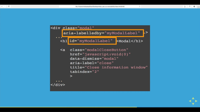
Again, having them be next to each other in the code, is great, but we want to associate them even more. So we're gonna use this handy little ARIA described by attribute.
So this is a great use of a little sprinkle of ARIA to really enhance the accessibility of an interface. So for this email field, I have a span with class error it has an id and I've written an error message there. And I just realised my code doesn't line up with that. But that's okay.
So I have my error message and I use an ARIA described by attribute on my input field to say, hey, this input field is described by this error message.
So now, if I'm a screen reader user and I tab to this input field, I'm probably gonna hear, it varies from one screen reader to another, but I'll probably hear, email, text edit field, slight delay, and then I'll hear, email address must include an at sign.
So it is telling me all of that contextual information when I have focus on the input field.
Related to this, we wanna make sure that there's no colour reliance.
So if I just look at the same rely in grayscale mode, it might be hard for me to tell that that's actually an error message because it's just kind of hanging out under that field.
So I can just add say, a little icon and that really helps so now I'm in grayscale mode.
Whoa, I have an exclamation point icon, there must be something wrong with this field.
Yesterday Brett, I was so excited to see he did a little SVG example of replacing default check boxes and radio buttons with his own super cool, animated hand drawn check marks.
And what I loved about his example, was that he didn't just replace the default input field with just the SVG, he kept the input field there and he hid it offscreen, which meant that it was still accessible to people.
So if you're ever creating custom check boxes or radio buttons, because frankly they're pretty ugly to begin with and they're hard to style.
You should definitely talk to him about it 'cause his example is great.
Or check out this really great SitePoint article on replacing radio buttons without replacing radio buttons. This is by Hayden Pickering and it basically tells you how to create totally custom styled check boxes and radio buttons without removing the input fields. So for a screen reader user, they're still gonna interact with the native semantic element, but you're using CSS to style it to look really cool.
So I won't get into that too much now, but that's a great technique.
Now that we've talked about the signature challenge we're gonna move into the technical challenge. And this one is where it gets a little bit hectic so I'm gonna put on this apron and hope that it doesn't mess up my mic.
Yes. Hello, can everyone still hear me? Yeah, okay.
So the technical challenge is my favourite one in The Great British Bake Off.
Basically what happens in the technical challenge is that the bakers get a recipe that they've never seen before for some sort of dish.
And they have to figure out how to make this thing, but the recipe is missing certain parts.
So maybe it'll tell you all the ingredients but it won't tell you how long to bake this item. Maybe it'll tell you, just like whip up a some weird French word for a very extreme baked good.
And you're like, I have no idea what that is. I don't know how to just whip it up.
So the technical challenge is really there to give you this high pressure scenario where yes, you have most of a list of how to do things, but you need to rely on your technical knowhow. So I think a good example of this that we're going to be doing for our technical challenge is accessible tree views.
So on the web we have a lot of tree views.
This is for instance, Dropbox's tree view.
So this is something where I have a file list. I can click on each folder to expand and collapse. I can select.
Actually, this is a great contrast example. An example of bad contrast is more stuff right now is highlighted.
And you can tell because the text is changed to black but it also has a blue background.
So we can't see that on this screen, but that's okay. So today we're going to be looking at how to make this accessible.
Obviously you can imagine that you can click to toggle each of these things open and close.
And click to select a node.
But you probably also want keyboard accessibility. And definitely also wanna make sure that it's screen reader accessible.
And this is something that doesn't exist in native semantic HTML.
Like you can create kind of a nested set of unordered lists, but that doesn't have that the rich interactivity of being able to expand, collapse, and select elements. So we're not gonna be able to just use semantic HTML. It's not sufficient.
So while the signature challenge tests our tried-and-true semantic HTML of labels and input fields, we're not gonna be able to do that now.
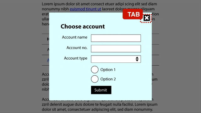
So I think we're going to lookup an ARIA recipe. So I can got to the ARIA spec.
Here I'm using the ARIA Authoring Practises 1.1. Yesterday Adam was using 1.0, so 1.0 is better supported, but 1.1 is the one that they keep pushing you towards. So we're gonna look at 1.1.
So it's a huge document.
There's a lot of stuff there, but as you can see on the side, it's got all these different types of interactive widgets from a menu to tabs to toolbar. I think if we scroll a little bit up, we'll see the combo box pattern that Adam was talking about yesterday. So let's click on tree view.
And we get this great document that outlines here's what a tree view is.
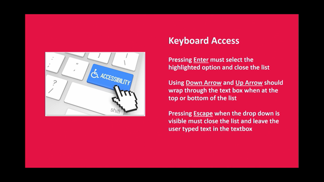
Here are all of the keyboard interactions that are expected for this.
And here are all of the ARIA attributes that we're gonna be using for it.
For example, we're going to give everything a role. Give the entire thing a role of tree.
We're gonna give each item a tree item role and then we're going to use various attributes like ARIA expanded, to let the user know if they're expanded or collapsed.
So we have a recipe here.
It seems very long and thorough and great.
I should also mention that they have a lot of examples there, which is fantastic. But as we start to implement this we may notice that we come across bugs.
And a lot of times when we're implementing ARIA patterns like this, it can be really hard to tell what the source of the bug is, what is the origin. Because you have your code, but your code in interacting with the browser and your code is interacting with a screen reader.
And it can be really challenging because that's three different layers to figure out, is it my bug, or is it a bug with the screen reader.
What is happening.
For example, when we were coding up our tree view at Dropbox, we kept running into an issue where it worked when I was using the arrow keys to navigate up and down thought the UIs, through the list, it worked really great in NVDA and Firefox, which is a common screen reader browser combination.
It worked really great in JAWS and IE, but then in voiceover in Safari, which is pretty much one of the only combinations you can use on OS X. It wasn't reading out the elements that I reaped So as I went up and down through the list I couldn't tell, Is it my fault? Am I missing an ARIA attribute? I've looked a the whole spec, what's going on? Is it the screen reader's fault? Well Apple notoriously doesn't really post their bugs, so I'm not really sure.
Or is it an issue with Safari? Which again, hmm Apple.
So it can be really challenging.
And this is the crux of the technical challenge. So when I run into these situations after I've read the ARIA docs, I first start by double checking the ARIA spec and making sure that yes, I've followed every single element there, every single thing on the list. And then double checking my code to make sure it's all there.
Then googling it.
None of this should be surprising.
This is pretty much how we debug everything. And I do a lot of googling.
And there is a really cool website called, whoseline.a11yideas.com/bugs.html.
Which I'll share these slides later on Twitter if you wanna see this.
But you can check for known bugs in browsers and screen readers because sometimes there are known bugs. So if Safari and VoiceOver don't play well with this tree view for this reason.
So someone in the accessibility community went through and outlined, here are all the places where you can log bugs for screen readers and browsers and find out what bugs are logged.
So you can check for those things and ask around. There's a web accessibility slack group called Web a11y, which you can join where people are super generous. And the thing is, at the end of the day, if there's a bug in a browser in an implementation that your users are going to be interacting with it almost doesn't matter if it's the browser's bug or the screen reader's bug, 'cause you need to figure out an answer.
You need to deliver this thing that works well for folks. So in my explorations I came across this website called this blog post of (Not So) Simple ARIA Tree Views And Screen Readers, where someone had actually outlined all of the different issues, the cross browsers, cross screen readers issues with trees.
And I ultimately, after reading this and experimenting, figured out that we need to add an ARIA label to each individual tree item.
So this is just a long story of sometimes when you follow the ARIA docs you're still left with questions. So I would encourage you to check out the accessibility resources here, 'cause these folks are really, really helpful.
In the end, we ended up with this code here. So here is my accessible tree view, I've added all the ARIA attributes from the specs.
So I've said this thing has a rule of tree, it has a tabindex of zero, it has an ARIA active descendant property, which I think Adam talked about yesterday, that points out.
Here is the currently selected node in this list. And then within it I have each element has a rule of tree item or it's labelled as false and I've added this ARIA label attribute so that when I'm navigating up and down with a screen reader, it's going to read out each element's name. And you can't see the highlighting here, but you should hopefully be able to see that this is me arrow keying up and down through this tree and using my left and right arrow keys to open and close different nodes.
You can see that the ARIA activedescendant attribute is updating to show me what node I'm currently interacting with.
And various ARIA expanded and ARIA selected attributes are changing on the tree itself.
So this I got pretty much all the way through by just reading the ARIA spec and following it word for word. But then I had to do a lot of googling to get it to actually work.
That is how the technical challenge usually goes. So for our final challenge, the showstopper challenge, Let's see what I've got here.
I have a tiny spoon (laughs).
For the showstopper challenge, thanks Mike, I really love the description of this from the BBC. The oven gloves are off in this final challenge where the bakers are able to showcase their depth of skill and talent.
The complexities of this task call for professional standard in taste and appearance.
Are they up for it? The judges will be looking for the most impressive and elaborate creations that better taste first class too. In the showstopper challenge in the bake off, people have to go all out.
These are amateur bakers who are doing the most extraordinary things.
They're building enormous sculptures out of bread. It's really, really intense.
And so I was trying to think, what is the accessibility equivalent of this? And I came across drag and drop.
Drag and drop is becoming an increasingly common pattern on the web as the web becomes more and more appy and less site-y.
We've got drag and drop, but drag and drop has a lot of inherent accessibility challenges. For instance, is it easy to use for someone who has a dexterity impairment.
It can be really challenging to press and hold to drag something.
It can also be challenging to have the precision to drop something into a tiny place.
Native drag and drop doesn't really have good keyboard support or screen reader support.
You have to add that in.
So a lot of times people have asked me, accessible drag and drop, that just can't be done. You're crazy.
And it actually can be done because when we think about drag and drop, we can think about it's not really about drag and drop in the end.
Drag and drop is a method.
But the real outcome is moving something from one place to another.
So drag and drop is one way to do that.
What are the different forms of drag and drop? We have putting things into buckets.
I don't know if Rachel is here and I hope she isn't because I have really bad animations.
So putting things into buckets, rearranging lists of things.
So here I'm moving this cupcake to the top of the dessert ranking list.
And moving items on a canvas.
These are kind of the three different main types of drag and drop that exist today.
So if we think about these things we can try and find accessible alternatives to them.
So it's not necessarily getting rid of drag and drop, it's just making sure that we're able to do all these different types of actions without actually dragging and dropping.
One example of putting things into buckets, and I'm gonna use SalesForce because I worked on this. SalesForce has a Kanban board and there are a lot of Kanban boards online.
So basically I've got this Kanban board of all of my opportunities.
I can drag them around to show what state they're in. And it's a really nice drag and drop UI.
Where I've picked up this one called Grand Hotels Kitchen, and as I move it around, I get these nice little dot, dot, dot boxes to show me where I can actually drop it. It's a really lovely drag and drop UI.
But what if I don't wanna drag and drop? Or what if, as you can see, there's a horizontal scroll bar, what if it's very challenging to drag something to a place that's currently not visible in the viewport.
SalesForce has implemented a really nice focused state for this.
So on this same element, I can tab to this card, of the Grand Hotels kitchen card and press the space bar and a menu pops up of all the different buckets that I can drop these things into.
And since it's a menu, I have a lot of handy keyboard shortcuts.
I can use my arrow keys to go up and down through this list.
But I can also, say I wanna drop it into the qualification bucket over there.
Just press the Q key, and it'll automatically jump to qualification in this list.
So I arrow key through or press keyboard shortcuts to select where I wanna drop it and then I just press the enter key and it's moved.
I think that this is probably showing, yeah, this is having qualifications outlined with colour contrast.
So that's a pretty simple UI.
Press space on an item to open up a menu of all the different buckets I can drop it into.
I press the arrow keys to select a bucket in that list and then I press the enter key to actually move the item. And additionally for screen reader users, there's hidden text inside of this card here. There's hidden text that says, hey, press space bar to select a move.
Arguably that text could be visible everywhere because this is something that could really be beneficial for everyone.
I think a lot about Kanban boards because the ones that I'm using, not at SalesForce, but I'm using some other UIs right now that have really cumbersome drag and drop and I kind of wish that I had this nice little keyboard shortcut for moving something. So you may be wondering, what about ARIA.
Because I was mentioning earlier that ARIA is really useful for adding in information about interactivity that isn't part of semantic HTML. So yeah, ARIA does have some specifications around drag and drop.
In ARIA 1.1, there's a whole list of authoring suggestions of hey, when you're implementing drag and drop, here's the keyword functionality you should be thinking about.
And they also have two different attributes specifically around drag and drop.
There's one called aria-grabbed, that is a Boolean to let you know, hey, this thing has been picked up. And then there's an aria-dropeffect attribute that you can use on a container or on some other element to indicate on an element you're moving to let you know when you drop this thing you're either gonna move it or copy it to a place because sometimes drag and drop has different effects when you drop it.
And that's why it's called aria-dropeffect. In ARIA 1.0, which is the latest spec for ARIA, there are actually suspiciously no authoring suggestions around drag and drop.
It's just completely removed from the spec. And these two attributes have actually been deprecated. Which was like whoa, what do we do without ARIA guidance on how to make this thing accessible? I wouldn't worry too much about this.
You can still rely on ARIA 1.1.
They are currently recommending that folks use the HTML 5 drag and drop library, and hoping that that will magically have accessibility support.
But it's gonna be a while.
So you can use these ARIA attributes and again kind of like SalesForce, use additional hidden text or visible text to guide the user around what keyboard interactions they can expect.
SitePoint, which is one of my favourite websites for information about accessibility and everything else. SitePoint has a really great accessible drag and drop tutorial which is just sitepoint.com/accessible-drag-drop. That actually goes through the ARIA way of drag and drop. It's very similar to the SalesForce way.
If you press Space on an item to select it. You can optionally use Ctrl + Space to select other elements.
And then you Tab.
Instead of getting a list all of the items you wanna drop it into, you tab to wherever you wanna drop it.
And then press Enter or CTRL + M to drop it there. And there's a lot of information in the old ARIA spec about that and in SitePoint about how to do this effectively.
Another example of drag and drop on the web. I will use Dropbox now as an example, is Dropbox's file viewer.
So here I have selected the testing accessible UIs folder and I'm dragging it around to move it into another folder.
And you may be able to see that the one that I'm currently hovered over, Switch folder, has a green outline to indicate that it is a drop zone. So I can easily move things around with drag and drop, but again, what if I don't wanna drag and drop or what if I can't? Well there's a little move button in the right corner here. And when I press the move button, I get that accessible tree view that we just made in the last challenge. And I can then use this tree view to quickly navigate up and down with my arrow keys and select where I wanna drop it.
So there are a bunch of different ways that you can move things into new buckets just with using a keyboard.
And again, a lot of times this is more efficient than dragging and dropping.
So it's not just making it possible for people who can't use a mouse, but for people who don't wanna use a mouse for whatever reason.
And there are lots of other different ways that you can move elements.
You can press the delete key to move elements into a trashcan.
You can use cut, copy, and paste.
At SalesForce I worked on a very complex WYSIWYG site editor and we used cut, copy, paste to make it easy to cut out whole components from a page and move them elsewhere on the page.
When drag and drop is cumbersome or hard for one to do. And for positioning on a canvas.
I think Rachel talked about how, I loved in Rachel's talk yesterday she was showing her friend pulling at that wall and interacting with it and moving things around. Then she mentioned like, this is a much better experience than just typing in the coordinates.
But sometimes you do wanna type in the coordinates if you're thinking about pixel perfect design in like Photoshop, sometimes you do just wanna have an input field where you can plop in, yes, I want this thing at exactly 100 pixels by 42 pixels.
Or maybe we don't wanna be using pixels anymore. There are a lot of different ways to move an element. So what I wanna take away from this showstopper challenge is that yes, drag and drop is a very complex, rich interaction, but we can pretty easily add on additional interactions to it to make it possible for everyone to do.
And oftentimes, depending on user context again, oftentimes the sort of bare bones, fill-it-in in an input field is gonna be better for the user depending on their scenario.
Arrow keys as well offers the ability to be very precise without having to have fine motor control.
So really this is about giving users choice and flexibility.
This is all about accessibility in general, but it's a good UX principle of give the user the opportunity, especially in the drag and drop scenario of being able to move it with their mouse, move it with their keyboard, maybe do a mix of both. Like in Photoshop, I will move something with my mouse and then adjust it with the keyboard to get it just so. So give users choice and flexibility and they will choose which methods are best for them. So kind of wrapping up our challenge here.
We were talking about The Great Accessibility Bake Off and my question is, how do we know if it's great? How do we know if we've actually created something that is useful for users beyond just kind of saying, yeah it works with a keyboard, yeah it works with a screen reader great, I'm done.
Really we have to go to our judges, go to our users, our guests and see how they like it.
See if they feel that it is an intuitive, good useful experience for them.
So hopefully with semantic HTML and ARIA only when needed, great colour palettes and creative interaction design like multiple ways to move an element, you can get to this state where all of your judges, users, guests, customers, (chuckles) whatever you wanna call them, are super happy and delighted with your product.
And I think that's it.
So thank you all so much.
It's been a pleasure to stand upstage and ramble at you all while waving props.
So thanks.
(audience applauds) (electronic music)