(swoosh) - [Voiceover] Now if you've been doing web stuff, for any reasonable period of time, but certainly if you've been doing it around a decade or more, if you cast your mind back into the kinda, kinda 2003, 4, 5 time frame, one of the things we took very seriously and was integral to our work was the idea of the web being the world wide web and those two first w's are often overlooked, but they're fundamentally important. Tim Berners-Lee had this idea that web was you know, for everyone, the very famous scene at the London Olympics where this one, this is for everyone he tweeted on a closed platform, that only people who sign up to Twitter can get, but you know there are ironies that teachers as Kevin said, uh but, you know this falls into the extent of the technologies, but also extends into you know, what we try to do with this technology and one of the things has always been at the heart of the web has been accessibility to people regardless of ability, physical, uh you know what we often call disabilities.
So back then this was really central to the work that we did and fundamentally important and I think a lot of people like me who took a, you know saw this as very important for a long time sorta took for granted that in fact that's what everyone had kinda been doing and it's all about a best practise and it sort of shocked me in the last three or four years to realise uh-uh it's actually not the case at all.
In fact accessibility is sorta being kinda shunned to one side and we pay lip service to it and governments in particular and other organisations tend to kinda make a show at least of saying it's important, but actually I think we've dropped the ball on this. And a lot of the excuses are around, oh we're doing web apps now and web apps are really hard and accessibility is hard in web apps, uh but I think we've gotta do better around this. So someone who's actually being very passionate about accessibility for many years and probably through that sheer passion for the w w in the world wide web, uh I met, and who is in no small part responsible for, in fact responded today because we started a conference together many many years ago and it's a long story there if you can come for a drink later we'll, one of us will tell you, both of us would be lying. But, uh Russ Weakley has been a great publisher of words, within we used to do workshops and teach them together and so on over the years and it's wonderful to have him back on our stage, for the first time in far too long Russ, as I said has made accessibility a core part of what he's done with his life.
He's taught so many people through his fantastic articles at Max Design, some wonderful, learn-able insight point courses, and he's really been a champion for this in major organisations, in governments in the wider web community.
So he's gonna come and talk about basically how we make our web applications in these more sophisticated, complex things we're increasingly building more accessible in a way that's probably a lot easier than a lot of you realise.
So it's a really great pleasure and a privilege to welcome to the stage, to tell us all about this Russ Weakley. (applause)
- [Russ] Um, so we're gonna be talking about pain and tears and all that sort of thing, but I thought I'd start with a bunch of questions for you guys cause I wanna see you guys suffer.
So I'm gonna start with four questions for you all and you have to answer honestly, cause we have monitors and we can see whether you're lying.
So my first question for you all is: Have you ever tried to use your application or web site using keyboard only? So I'm gonna ask you to put up your hand, have you ever tried to not use your mouse? That's to tab around, and did anyone cry when they tried to use it? Oh, you don't have it.
So what's that? Ha oh all the time.
So the next question is: Were you able to perform all the tasks when you were tabbing around? So as you were tabbing around, keep your hands if you could do everything with the keyboard only, that means that if there was a little share button, you could actually use it, if there was a movie you could play it, and keeping in mind that until recently a lot of these iframes were like black holes, so if you went into a share icon and tabbed in there you would never come out.
For a couple of years, until quite recently, if you went into an iframe that was Youtube, you would never come out, you'd get stuck in this loop. So could you do everything on your site with keyboard only? Anyone still left, oh a few still left.
Okay, question number three: As you navigated round the website, could you see everything that was in focus? Now I'm gonna be, as I did in Sydney, very judgmental about the designers, I call them bastards, (audience laughter) but that's primarily because they use this thing where they turn off focus, I don't know where you work with designers that do this, that think allowing people to see what is in focus is evil and so they turn it off. So if you're a keyboard owner/user you have no idea where you are on a page, so my third question is, let's see if there's, a couple people still have their hands in the air, could you still see everything that was in focus? Oh my God, three of you still, no oh you've dropped out of the race have you? A conflict? What's that mean? It's a yes or no answer, binary.
(laughter) Well you're half in the running, okay and the last question is: Was the tab order still logical? So another thing that CSS in all it's great joy can do is say well I'm gonna put this column over here and I can float this over to the left and right and of course if you're a keyboard owner/user you wanna be able to move through the page and not oh, where the fuck did that go? Oh it's over there.
So you wanna be able to see exactly where you are on a page, so my fourth question is, for those with their hands still in the air, could you see, was it in a logical tab order? Four, four still, well that deserves a prize, now I tried this in Sydney, and I have to say that I end up getting about four people in the eye, so throughout the session today I'm gonna be throwing chocolates at you all.
And you gotta be facing me cause it will get you in the eye. I've already failed there, where is that one? Holy shit. (laughter)
You gotta pay attention guys.
Dude, you can keep that for such a good catch. You can fight it out amongst yourselves.
So now I'm gonna talk about, now that I've thrown chocolates at you all, I'm gonna talk about this myth of "Full stack" developers.
Has anyone heard this term, "Full stack"? "Full stack", my God, um there's another term which you may have heard called Stackoverflow developers, has anyone heard of that? (laughter) So I used to, I do a lot of work, um, lots of different places, but part of my job has been to contracting, working in very major banking applications where I sit beside developers and I give them advice on, so I'm sitting there with screen readers and testing, even advice on how to make their sites more accessible.
And one of the things I found fascinating is this new breed of developers that I hadn't seen before whose retention seems to be at five minutes, but what they could do is they have two screens open, they're just developing and they're Stackoverflowing and it's like copy, paste, copy, paste, quite amazing skill really. (laughter)
I don't know about you guys, but I think if you're doing interviews these days it should involve how well you can read and copy from Stackoverflow.
Anyway, so I don't know whether you guys have seen it, but I think, I've noticed a major change over the last five years in this area and while people are much more fluent with all these different things, react and know it and all these sort of things, that one of the problems is we're noticing is that there's a, the core principles seem to be being forgotten.
I don't know whether anyone else has noticed this. So we're talking about, I've noticed that a lot of people don't have a basic understanding about HTML, and CSS, and accessibility and I've, even basic principles like progressive enhancement. Does that make sense? So here's a question for you all, and this is worth a chocolate, who knows what progressive enhancement is? No you can't, it's gotta be someone to the front so I don't throw it and hit someone.
Oh here you go, fire away.
And by the way it's gotta be good, otherwise no chocolate, just sayin.
(muffled audience member answering) What do we reckon? Worth a chocolate? Well, okay.
Done, look at that on the money.
Okay so progressive enhancement, the next thing I came across when working with developers, they'd ask questions like this: Why can't I wrap a span around a div? So I was gonna ask the question, but I'm sure you guys all know, do you know? Why can't you wrap span around a div? Oh okay it's worth another chocolate then, hands up, you're far too far at the back.
Someone over here, fire away.
(muffled audience member answering) That's okay, what about the A element? Oh that's worth a chocolate, sure.
Can the A element wrap around, I deliberately did that short so you'd have to lean in, um can the A element wrap around anything? Yeah? So the A element, is one of the only elements that you can wrap around a block-level element, it's broken the foundations of the web, but there might be a reason why.
Why do you think the WC3 in all it's glory decided to allow us to wrap an A element, an inline element, around block-level elements? There's an accessibility reason.
This is worth a chocolate, okay come on.
That's your second chocolate though.
Fire away.
(muffled audience member answering) Ah, perfect answer, did anyone hear that? No, you didn't hear it.
So one of the key things when you've got a screen reader open and you're tabbing through a page is that you don't wanna hear the same link twice, yeah, so it can be confusing and what they A element allows you to do is to wrap it around a block-level element, including things like, a good example would be, you're on a news site and there's a thumbnail and a heading and they're both going off to the same place. You want your people to be able to click on the thumbnail image and on the link, so both of them have to be wrapped inside an A element.
Well with HTML5 we can now wrap an A right around the whole container.
I'm going through chocolates far too fast.
Okay, right so here the basic premise we should all start with, web accessibility begins with semantic markup, do we agree with that? Yeah? Okay, now let's talk about why you should care, cause I can see some of you sitting there, you've already given up, you're just like I don't care, I'm not getting any chocolate.
One, you've gotta believe. (laughter)
You've gotta believe that you will.
So one of the core premises is that if we're building websites that should be available to everyone, yeah, and that includes of course everyone including people with disabilities like vision, auditory, motor skill and cognitive, but it also means we gotta deal then with all assistive technologies associated with them. So we've got input and output devices.
So input devices are all those devices where you need to input like forms etc., so that can include things like accessible keyboards, track pads, head wands, puffers, all these sort of things, and outputs are all things that are outputting back to the user, screen readers, magnifiers etc. A lot of people, when working at the bank, a lot of people just assumed that all we have to focus on is screen readers, but you'll see that most of the stuff I'm talking about today is keyboard because that includes screen readers.
So if you work for keyboard you're actually gonna help almost all users that have got disabilities anyway, so it's more than just screen readers. But I suppose one of the first things that people start to do as soon as you talk about all these different technologies is just immediately go in a melt down and this is all too hard, but it doesn't have to be. While it sounds really costly and lots of stuff, I'm gonna talk about a bunch of quick things we can do, you could literally do at your desk now. So you can open up your site right now with me and we'll code along.
And the aim here is that I'm gonna talk about some of the things that present major barriers to assistive technologies.
The other thing just before we go on is, I've got a, because I worked at the bank, I would sit there month after month doing all these tests with all these different browsers with different screen readers and if you're really bored you can pop that link open and see the results of how a lot of these different screen readers operate. But here's another question for you, and yes this is worth a chocolate, but it has to be a really good answer: What would WAI ARIA stand for? Anyone wanna have a crack at that? My God, how about two chocolates? No, oh you know, you've already done, you've done your dash.
(laughing) Well it stands for WAI: for web accessibility initiative, and ARIA: accessible rich internet applications. Now it's important you learn this, and I'll give you a reason.
Imagine you're walking through a dark alley in Melbourne late at night, you've just gone out to some trendy Melbourne night club and then someone comes up to you and says tell me what ARIA is or I'll stab you to death. (laughter) It could happen. And so what you end up having to do is quickly just remember back to this slide, so it's important you remember these sort of things. So ARIA is really about advanced JavaScripting, it's trying to make advanced applications more accessible, as you'll see as we go through and it does it through three things.
We're talking, we're gonna talk about roles, states, and properties.
So the first one is role, and that's really defined the role of specific HTML elements, so we can say to them this element here is a menu or it's gonna be a navigation item, or it's gonna be a search box, so we can actually define for assistive technologies what that element is.
So here's two examples, we can say role equals menu or role equals main.
The next one is states and we can define what state that element is in at the present time. So we could do aria disabled true or false, aria checked etc., so we can actually define what the state for those assistive technologies. And the third one is properties and we can describe a lot of information about elements, and WC3 by the way they call them widgets, so obsessed with side widgets, don't know why. But here's two examples, so working at the bank, I noticed that a lot of people assume that blind users will operate in exactly the same way as everyone else, that they have all of the associated information at their fingertips and often they don't so there's a close button there and they're sitting there thinking, close what? So what you can do is leave the close button there, but you could add aria label and provide a bit more information so you could say, close and do something else. So that's a quick example of how we're adding a property, we're giving it, making it a bit richer and the same thing for link, you could have something that just says purchase, purchase what? Now for a sighted user we've got all that context around that link, we can see what it's related to, but for a screen reader user that may not be possible and in fact what you'll often see or hear as you're moving through a site, is something like purchase, purchase, purchase as you click through links because people haven't provided extra meaning. So we could use aria described by and point off to a different location and provide them with extra meaning so that when they hit that purchase it will say something like purchase x.
So fundamentally, ARIA allows us to make specific HTML elements more meaningful to assistive technologies. So now let's talk about dynamic content and let's take a very simple example like this, so you've made this amazing website, a web application, and a user interacts with it and then it just injects a piece of information at the top of the page, so it might be something like well done, this is a dynamic piece of content. So the problem with that is, adding dynamic content after the page is loaded can present all sorts of issues and the two main ones have to do with screen readers.
The first one is this idea of buffering, so when a screen reader hits a page, it buffers the page, and if you inject content after that buffer then the screen reader may not hear it.
Now the second one is to do with the location, if you're on a screen reader, you may be focusing down towards the bottom of the page, hearing something be announced and something gets injected a the top of the page they may not hear it at all either.
So how do we address, both of them have this amazing simple solution and it's called aria-live. Who's heard of aria-live? Anyone, yeah? Some of you, okay.
So what it does is allow us to notify screen readers of something that's changed in the document, and the great thing is we can apply to any HTML element. And it's like a watching device, it's actually saying I'm here to keep an eye on this and see if anything changes. So you can use aria-live polite, and there's three different options we could put in here, I'll talk about in a second, and fundamentally if you use JavaScript or magic to inject something into that element change the node in any way, then screen readers will be informed of that change.
Very simple.
So basically it'll update anything that's gone into that. Now we could use it for pretty well anything, now generally speaking you don't wanna go over the top with this, you don't wanna be announcing every single change on the page, but anything that you think is meaningful.
So it could be things like alert messages, if you wanted to stock information, and I've often used it for things like table sorts, so if you click on the top of a sort-able table and the whole table resorts, we could put aria-live on the table body and suddenly the screen reader will redraw that buffer and we'll hear it in this new order, make sense? There's a lot of ways we can do it, to really help assistive technologies.
So now let's talk about the three possible values we could use and they're off, polite, and assertive. The first one is off and a lot of people mistakenly assume that this is actually turning it off, but all it's talking about is how it interacts with you, the screen reader user.
So with this one, with aria-live off, it should not be announced, but it should be when you come into focus, so I'll explain what that means. Let's say you've gone down a page and then you've triggered some event, or some event is by timing is being triggered and it suddenly injects something at the top of the page.
With aria-live off, you're not informed about that at that time, however if you go back up or back down through that area of the page, you will suddenly hear it, yeah? So you do know about the changes, but you just don't get told about it immediately. So that's the most, the most low level version of it, but it's still really effective.
So this should be used for things that people don't need to know about immediately.
The next one is called aria-live polite, and with this one, it should be announced at the next graceful opportunity, so that means at the end of a sentence when there's a pause, bizarrely a pause could be if you're not doing anything. So if you had imagined a message time to pop in at a certain time, if the screen reader was actually doing nothing it would announce on the spot, but if the screen reader is actively reading the page then the pause that would then announce, make sense? So that's our second option, and this is for you know the second tier of stuff like warning notifications and that's the last one is aria-live assertive and this one is supposedly announcing immediately. So over the top of whatever is being done, it should announce that a change has happened and as you can imagine, that should really be useful for things that are absolutely critical, things like error messages, like if you're gonna delete something or you know something really critical like that should be allowed to pop up and say hey are you sure you wanna do that, you idiot? Now unfortunately, I've done a lot of testing in these sort of things and unfortunately aria-live assertive, it actually has a range of little bugs and if you're bored you can click on that link and see them in detail, but fundamentally in testing we found that polite is a much better option than assertive and ironically the WC3 recommends using polite much more than assertive anyway so generally speaking you could probably just use polite for everything and you're pretty well done.
Now the last one I wanna talk about before we move off this idea of dynamic content is role equals alert.
So this defines a piece of important information and it's similar to aria-live in some ways. You can write role equals alert onto a container and it operates in a very similar way.
Now this is normally used just for alerts, so you couldn't use this for table sorts and things like that, but if you have error messages and things like this you could put aria, uh role equals alert there and it actually has the implicit value if aria-live assertive.
Sadly it also has the problems attached to it, so aria-live assertive and role equals alert both have the same sort of problems.
So you'll see later on that I actually put role equals alert on something and then I put as a backup aria-live equals polite.
So you can back em up together.
So aria-live, the simple take away from this is you can do this now, you don't need developers, you don't need all this amazing high tech wizardry, you can literally go and tack that onto any element and it will work, so it's incredibly easy to apply and has major benefits.
Onward, let's go onto the next one: Accessible Errors. So I talked briefly about two screen reader modes and the reason why I wanna talk about them is it's important to understand them whenever you're dealing with forms, and the two modes are read mode and forms mode.
Has anyone dealt with this before? Now you, in the old days these used to be very manual and you'll see in a second when we talk about this, but the read mode is just when they're able to read through the page and forms mode is when they're actually interacting with forms and if you move in and out of these modes there's actually a little sound effect that tells you that you moved between the different modes. Now, in the old days they used to be very manual, a user would have to read through a form, and then change the mode and then interact with the form and when they finished change back out.
Whereas nowadays as soon as you hit tab, and it jumps into a form control it'll change modes and you're in forms mode and when you move out, like you move past a submit button, it'll automatically move out, so it is a lot more friendly, but there are still problems.
So why do these modes matter? Well the simplest way to show you is something like this, if you have this little error message here and you're in forms mode, you will never hear that error message.
So what we have here is a little element, like we've got a label and then we've got input, so this is, what's happening is someone's tabbing down to an email input, now let's say that you're a blind user and you fill that in incorrectly, and you tab on out, that's now considered invalid. So as a good developer you add in the error message that now gets injected on the page, but now you'll see it's put inside a paragraph element, yeah? So it's not programmatically associated with either the label or the input.
So the key point about when you're in forms mode, is that it's only picking up things related to forms. So you'll never hear that error message, make sense? What'll happen is, you'll hear email input, and then when you tab on you'll hear the rest of the stuff. Now I'll talk about how to solve that in a second, but that's one of the key problems when you go into forms mode that it's literally only hearing form information.
The other thing, just before we talk about validating, is these two types, so the two types I'm going to be talking about are actually on the form control itself and then across the whole form.
So when I'm talking about a form control, I'm talking about an input or select or something like that and when we're talking about the form, we're talking about on-submit so that's if a user's actually clicked on the form and you've high jacked it before it goes to the server and then you've got to display the error message in some way.
So let's talk through the problems, the first problem is that when a user moves outside of a form control, they don't know that that message has an error, so a quick example again, let's go back to our email, so you tab into it and it says email input and you fill in your email address and then you move out and for sighted users up comes a red box around it and a little message saying, you know this, that's didn't work it's invalid, but if I'm a screen reader user I'm now past that, so directly after that's occurred I don't know that there's been an error.
So it's something that's important, that we need to know to address, as we'll see soon. The second one is that when a user fills in a form, an entire form and then submit, often they're not informed about the changes at all.
Now the worst cases I've seen, and this is on real sites, there's a whole form that I've filled in and obviously when testing the form you dilliberitly make it file, you go through the whole form and you try and hit submit and focus stays on the submit button, so I'm listening as a screen reader user and it says submit, you click it and you don't hear anything at all. So they have no idea that there's all these errors and they think there's just some problem trying to submit the form.
So let's talk solutions, when you're on an input and it's considered invalid, so if a user types in email and they forget their at symbol and they move out we need to flag that and we need to flag it so that it's not used for colour alone.
Now why would we care that it's colour alone? Who said that? It's worth a chocolate.
Oh dude, oh God that was a shit shot.
Okay, so do we all understand that? Colour alone shouldn't be used for anything critical so if you put a red box around your input just to show that it's invalid someone that's colour blind might not see it.
So we've gotta make sure that if we are flagging it should be colour, uh not colour dependent. Now the error message should be displayed in close proximity to the error or to the form, so something like this, so if you've got phone then the error message should appear as close as possible to the input, and a lot of people forget they use just the same wrote messages for every time there's an error, but really the error message should be informative, ideally they should explain what the problem is and the most important thing is they should be programmatically associated with that form control.
So the way we can do that, and there are lots of different ways we can do it, but what we wanna do is have it announce when the input is fired and the quickest way we can do that is changing what we did before, and putting the input, this little error message inside the label, yeah? Now there are many, many ways that you can do it and I've tested all sorts of different variations. So you could do aria label by and describe by, there's ways that we can tie these two bits of information together programmatically, but this is by far the simplest.
So what's happening is, this label wraps around the label content, the input, and the error message. So when I tab back into this, and the error message is injected, it'll actually say email input and then your error message, it'll all be read out as part of that input.
Incredibly easy to do and the most robust solution. Now let's talk about the actual overall forms, so if there's an error on the overall form, what should happen is an error should be put at the top of the page, an error message and the most important thing is the focus should be sent up to the top of the form.
So as soon as a user hits submit, especially if you're a screen reader user, focus should then go up to that form itself so they know where they are and then that error message should list all those errors and those errors should also be as a list of links.
So this is a quick example of an error message which has meaning, so what happens is when they try to submit the form, we send them to the top of the form, they've arrived at a little container, we can announce what's happened, and we can provide links to them so they jump down anywhere to solve the problems, make sense? And you can if you want, you know have them hide and show. So let's talk about how you'd markup something like that, the first thing is this little container can sit there, a lot of developers I've worked with they leave that error message container there all the time, and they just use JavaScript to change some attributes. So the first thing is we could set up with a little container with in this case we got a class of error message container, but we've got role equals alert so that's ready now in case something gets injected in here, make sense? And optionally we could add something with, like aria-live polite, as I said before if you're worried about role equals alert not being accepted.
Now the next thing I'm going to ask you is, we could set it so that we couldn't get tab index on this container at this point, there's another attribute we can use which means that it won't receive tab index, anyone wanna have stab at it? It's worth a chocolate.
Fire away.
(muffled audience member answers) Yeah, but what, what would the value be? (multiple muffled audience members answer) Don't help her out here! (laughter) Negative one, so that's a better answer, where are you? Hands in the air, and by the way these chocolates are worth like .5 cents on the black market, so if you don't want them feel free to sell them on, I won't be offended.
Yeah, so we could use tab index minus one and what that means is that element won't receive focus, now that's important if you're a screen reader or keyboard owner/user, we don't wanna send them to this container at this stage until we wanna put something of value in there.
Now we can change that by going as soon as this form error message is now useful we can change that to tab index zero.
We can also inject a label there, so we could do aria label form errors or something like that.
So what happens now is if I submit the button, it'll take me up and focus will go on that element, but it'll actually now read it out, that label. So not only am I being sent to the right place, but a bit of information's being provided about what's just occurred, yeah? Again very simple stuff.
So this stuff is incredibly easy to do, again like aria-live stuff you could do yourselves, timed at a JavaScript native, but it's really not rocket science.
The next one to talk about is much more painful, we're gonna talk about modals and I presume you all know what a modal is? The bane of our existence.
So what are the problems here? So for keyboard only users, one of the worst things you can do is allow them to tab outside the modal and I've actually watched them do this, so what'll happen is a modal will fire up and a user can start tabbing through the modal, but then they can continue tabbing out into the page below.
Now you start to see the problem here when they're tabbing though the page, the modal's still sitting at the top and they come to something they wanna interact with and they're trying now to click on a link and suddenly they're getting this weird buzzing sound that's telling them they can't do it, they don't realise that there's an error message sitting up at the top of the page.
I was talking to Sydney group about this, one of the frustrating things about watching screen reader users operate is that they are not aware of some of the things that we take for granted and I've actually watched a screen reader user and a system message came up and said do you wanna update, you know Windows X? And that message sat above the screen and because it was passive, they didn't know it was there and we had to keep on going please could you just shut that off so can see what you're doing, but for a screen reader they don't even know that modal is up there.
Now most web modals, you can't do anything else, but ideally you wanna track the keyboard inside that modal. Sometimes when they go to fire a modal or close a modal, the information's not provided, so they don't know what's gonna occur when the modal's happening. The other thing is that they don't often know the purpose of it, so I've worked on, you know, full on banking applications where there's an assumption that a blind user will know that if they click this link, it's gonna pop up a modal and that'll allow them to change information, you know all about their banking details or something.
So we need to provide richer information for them. Now this is the other one that I've noticed, and it's a very lazy developer process, what'll happen is when you close off the modal, they'll just fire the focus back to the top of the page. Now I used to sit in banking applications for eight hours a day testing with screen readers, there's nothing worse than if you've just finished a modal, and it sends you right through this application back up to the top of the page and you have to tab your way down to get to where you were when the modal fired and that can be like 80 tabs, 80 tabs strokes to get right back down to where you're done originally. So if nothing else, we'll see in a minute, we need to work out exactly where that focus goes once you've closed the modal.
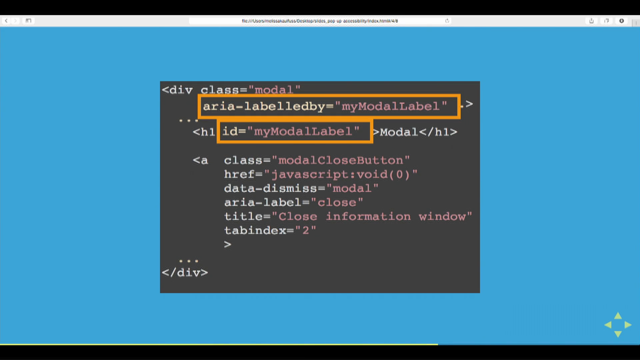
So let's talk some solutions, so the first thing is we need to talk about when it's not being used and when it is being used. So we can start with that whole container being set to display none, that's a no brainer. So at this stage, the modal's closed, and so it sets display none and when we wanna change that we can set to display block, but we can also hide the rest of the page from assistive technologies and all the other content on the page can be given aria-hidden true, that means it will never be announced, it's now hidden from all these assistive technologies. The next thing we need to do is to work out where the focus should go and a lot of people send the focus straight onto the first input. So what'll happen is, if I'm being asked to change bank details or something like that, what'll happen is I'll click on a link and suddenly it'll go input and read out account number. So there's no context, I don't know what's really going on. So what we wanna do is not allow the focus to go straight into that, we need to work out where we can put it. So ideally, we wanna set the initial focus on the modal itself cause then we can attach labels to it. Now if we don't then the label will never be heard so that we're gonna, I'll show you in a minute, we're gonna attach a label to it, but if we don't put focus on that element itself it'll bypass the label.
So we're gonna start with role equals dialogue and that's now explained into this assistive technologies there's this dialogue box and the next thing we can do is aria label by and what that allows us to do is to now label it. So then we can attach it to the h1 if there's one there or we can put a hidden label if we don't, but what happens is now what'll happen is it'll, when it fires up, it'll say dialogue, so they know what it is and then it will say choose an account, or choose account.
So straight away we've given rich information to them without, you know much additional markup. Now there are times when you wanna provide more information and you can do that by aria describe by. So what you could do here is write a whole description if you wanted to, if it was a very complex modal, you could write aria describe by and point that down to another element using the same id values. Now what you could then is, if you wanted to, you could hide that off screen, do whatever you wanted. If you didn't want that to be seen by sighted users, do whatever you need, but fundamentally now you've got two things, you can describe it first with a label and then if you wanted with a detailed description and now what's happening is when the modal fires up, with a little bit of extra effort, you're explaining to them what it is and if need be the purpose of it.
Now I'm gonna talk about key strokes and a lot of this seems really dumb, but I actually worked on a banking app and I was talking to some developers and I said you need to trap keystrokes inside the modal window and so they went away and trapped it all to tab so all you could do inside there was tab, which presents some weird issues.
So I had to do this quick little demo of all the things you can do inside a modal. First of all you shouldn't be able to tab outside the modal, but when you're inside the modal you should be able to tab through the modal and it also should cycle, so it should go back to the top.
You don't wanna bleed out and go to the outside of the page, now there is one small argument for allowing them to do one extra tab stroke out to the address bar, but fundamentally we wanna have it in a cycle.
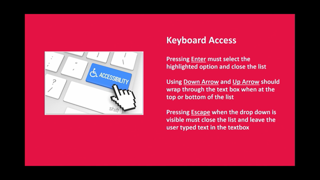
So when they're tabbing you should only be able to tab inside the modal and the same goes for shift tab, that should do the opposite, if they hit shift tab, you should be able to cycle the opposite way. So the user can move effectively around inside the modal. And you're probably thinking, that's all you need to do? Well no, you've got to do a lot more, the other thing is that they need to be able to hit enter and space key, so the enter key can be used for triggering the submits and closes, as can the space bar and then there's this other thing they'll need to use arrows.
So if I tab onto this radio button here, if I wanna move to the other one, the way I do it is using the arrow key and that'll move it down or back up.
So we need to be able to let them use the arrow keys as well and it's also important when we're talking about submits, if I tab onto a submit button, I need to be able to use the arrow keys to move up and down between the submits, yeah? And the last one is escape, you should be able to hit escape and allow them to get out of that modal completely. Now a lot of that seems very obvious, but it's really important that we understand how keyboard users interact with these and we try and make it as effective and easy to use as possible, but the most important thing is we track that interactivity inside the modal, we don't let them get out past there cause it can cause tears and pain for all of us. Let's talk about now adding some extra meaning, so the first thing is what happens if we want to get them to close down the modal.
So the first thing we need to do is take em back to the parent page and then we need to explain what's happened with the data.
So rather than just hit something like submit what you can do is attach labels to this that tells em what's gonna go on.
So you could, and this one's very verbose, but you could tell them a little bit about what's gonna happen when you close that button. So when you close this really what's gonna happen is, your information's gonna be put down here.
You just wanna give them some context of what's going on. Keeping in mind, that for us as sighted users, we can see this is a modal and when it closes we can sort of see what goes on, but of course blind users have none of that context at all and the other thing is that when you close it, you wanna tell them exactly what's going on. So if I hit close, you wanna tell them that you leave the banking form and you go to x or something. So you're just providing a bit of information and again we can do that with aria label.
Now after the modal closes you also wanna do a bit of activity there and this becomes really important. The first thing is that you wanna send the focus back to a particular part of the page.
So you wanna send them either back to, uh op ten minutes left, you wanna send them back to where we're triggered, uh what's ever triggered them, but you don't wanna send them back to the top of the page.
So if we hit enter we wanna send them to the thing that's triggered it like this link here, but in some cases even that's not good enough, because if I send them back here, imagine if you're a blind user and you go add my banking details, so up comes the modal, you fill in the information, you send em back down, and then when they hit tab again it goes add your banking details.
So in some cases they'd have no idea that you've injected a bit of information right beside it.
In some cases it's better to send them back to the point where the information's changed. So on that banking information or something like that, but fundamentally you should either send them back to the thing that triggered it or the thing that's changed, but never back to the top of the page. So they're pretty painful, but a few steps you can make em a but less painful.
Last one is tabs, so we all know what in-page tabs are where you can tab around little chunks of the page, they might be vertical ones or horizontal ones. These can present major nightmares for both keyboard and for screen reader users and the first one is that, and it's a really important one to get a handle on, screen reader users often don't understand the relationship between the tab and the panel.
Now a lot of people when they used to do this sort of thing, they would actually have it so you can go tab, tab, tab, and then into the panel. So you would go across all the tabs, using the tab key, and then into the panel and the problem was, imagine if there's four or five tabs and then the panel, you don't know which tab relates to the panel. So the method I'm gonna show you is all about trying to establish a relationship between the tabs and the panels. The other thing is that I've seen them, that were just completely keyboard inaccessible, so when a user comes to it they either can't interact with it at all, and a classic example is to put a span for the tab key, for this first tab.
So with JavaScript we can attach an event to it, but if you don't also put tab index zero or something like that which forces it to accept keyboard focus, then a keyboard user may not ever get to it.
So some solutions, so the preferred method is called a tab and arrow key method and so if you're doing a straight through pass you should get something like this, tab to the panel itself, I'll talk about that in a second, straight through.
So it's a straight though pass, now in most systems you'll see in the older way, you'll go tab, tab 2, tab 3, and then a panel, but the problem with that as I said the relationship is not direct.
So it's a bit easy to see when you look at the other method. This is the same thing, but this is now if you wanna move across the tabs, in order to do this you use arrow keys so now we move across the tabs.
Now for people that are used to using web interfaces this seems really counter intuitive, but there's been a shift in accessibility community to this model for two big reasons, the first is it follows a model outside of web, in software this is the model that's used so it's a para-dime that's much more readily understood by screen reader users, but the most important thing is that there's a direct relationship between the tab and the panel and you can see that if I move backwards you'll see that the panel's actually changing. So if move to tab 3 and then I hit tab key, the tab that's announced is directly after the one I've worked on, does that make sense? So if I'm on tab 2 and hit tab, the tab key, it would jump down to the panel that's directly related to those tab keys, so the whole point here is, this method allows us to tie the tabs and the panels together.
Cool? The other thing is that we should put focus on the panel itself and you've probably gathered by now everything we wanna do is to label something so what that means is we can actually label the panel so there's a relationship for assistive technologies between these two items.
So we'd send the focus to the panel and then if you need to outside the panel.
So let's briefly talk about the markup, so we can start with a basic list and then some divs below and then what we can do is put a bunch of roles on here. So we can say tab list and then we can say role equals presentation.
Now what presentation allows us to do is to turn off things that are being announced that we don't want, so if you hit a list in a screen reader it'll say list three items. So as soon as you do presentation, we're turning off these values.
So they're not gonna be announced at all because what we wanna focus on is inside them and that's the A elements and then I have a role of tab.
So what we're doing is even though we're using a list, a semantic rich list we're turning off some things that we don't need to be announced and then the panels can be given a role if tab panel, now these are not things I've made up, these are you know, proper aria attributes. Next thing we need to do is to set a relationship between these two things.
So we've got aria-controls as the value and what we can do is tie it between the tab which is the control down to the panel.
So now we're actually defining their relationships and we can also do the same by describing it. Now this is even more important in a way, what we're doing is we're using Apple to describe the panel and what that means is when you tab onto that panel, it'll say Apple because it's been tied together. Now the other thing we can do is we can flip between aria-selected true and false if we want. So when the tab is in focus, we can say aria true and when it's not in focus we can say aria-selected false. So if they are hearing it they know which one's in focus.
The other thing we can do is set it on the panels themselves so the panel that's in focus can be set to aria-hidden false and the one that's not in focus can be set to aria-hidden true and the last thing we need to do is tab index zero on the tabs that are in focus and the other ones we wanna set to minus one because we don't want them to be out of tab across them. Now this is the way that we avoid, there's three links there, if we didn't have this what would happen is you would automatically tab across those three links, but as soon as we put our tab index minus one on the two non active ones it allows us to jump the next focus-able item which is down a panel and of course JavaScript does it all.
So a quick breakdown, we've got the A element and then we've got the two events we need to focus on is aria-selected true at tab index zero and if we swap it they change to false and minus one, and for the panel we've got a aria-hidden true, uh false, and expanded true, and for the inactive ones hidden true and expanded false.
So that's pretty intense, yeah? It's a lot of work for that one, so some of this stuff is incredibly easy to do, aria-live etc., this one takes a bit more work, but you don't have to do all of that.
So just to wrap up moving forward, the basic thing here is you don't have to be overwhelmed by it all and you'd be surprised how much you can do yourselves quickly and easily, you know without a lot of work.
So here's the first of four little tips, the first one is test with keyboard only, it's the most important thing you could do and actually make sure you can see it.
So avoid stuff like this, this is, you know, designers from hell that have turned off focus. The next thing you can do is to use one of many accessibility tools, I'm sure you've all got your favourites if you've worked in the area, but there are a whole bunch of them, complete slides will be all online.
And the next thing is just test with any screen reader user, if you're on the Mac system you can use voiceover, on Windows NVDA is free, plus there's numerous in browser ones as well, as well as ones on the phone.
So there's a whole range of tests you can do and it's so good because you learn everything, I mean I was a bastard before I had no idea and it's only when you sit and see the pain of working through some of this stuff that you suddenly realise how important it is to fix. The one thing you need to be aware of is this is the sort of test I'd have to do, if you're gonna test in a screen reader like NVDA, you may think that you have to do one test, the problem is that NVDA operates completely differently in IE11, IE8, Chrome, and Firefox, as an example.
So each of them operate in a weird and different way. So if you do get into testing in a bit more than just running through screen readers, not only do you have to learn how screen readers operate, but you also have to realise that there are some weird and funny differences between how the screen reader operates with each browser.
And then of course, nothing beats getting a proper accessibility audit if you can afford it. The last thing I'm gonna very quickly talk about is when to do accessibility, now a lot of people do it like a month before launch, or a month after launch, and that's like the most painful time on Earth to do it. A lot of my role, when I'm not weighing accessibility is building CSS Sass based frameworks, so that's coming into your big framework for people and the way I do it, a lot are probably doing this as well, is with atomic web design, that idea of you building tiny little modules and building up.
So what you wanna do is build tiny little Lego blocks that are then put into components that are then put into pages.
The best time to build your accessibility is on those tiny modules, if you build a tiny, little form control that's accessible and that gets put up into a log in screen for example, and then that's accessible then wherever that's applied, anywhere in the application will be accessible.
So the lower down and the earlier you can start when you're building the core functions and those core little Lego blocks that's the time to build in your accessibility and of course you get an audit later on, but if you can do all that work right then that's the best time to do it.
Get busy, have fun, I'm done. (applause)
- [Kevin] Thanks so much Russ, so while we're setting up for Matthew, someone got a quick question who wants to wants to dodge, have you got any left? Russ is gonna bribe you with some .5 cent chocloate frogs, oh straight ahead, right here.
- [Russ] Where? - Uh, oh, aw! That was a pretty good shot, it was a rubbish catch though. - You notice I'm getting slightly better? - You are.
- Considering I hit the roof.
- He did hit the roof at one point, it was a relatively low ceiling.
- Okay far away.
- [Man In Audience] Oh I don't think I need to now, I've got the frogs. (laughter)
- Give the frog back, come one! - [Man In Audience] I had a couple of questions. Um, with aria labelled by, um you can apply a label to an element for screen readers so it's great, um in the past we've used methods like writing subtext in your mock up and then hiding it with um, - Which is even more fantastic.
- Yeah? - In that link I sent to all those tests, I test five variations on standard text, on links, and on buttons, and they all have slightly different cases, but the most stable across any of them is to hide a bit of text off screen. It's the best of everything, but aria label is you know, also really well supported now and much sexier so, but yes good solution.
- [Man In Audience] But you wouldn't wanna do both because I'm guessing that's - Uh, no cause then you, one of the things that some people do is the opposite like they go down the other road and they become too verbose. I worked on a banking application where they were so obsessed with helping that they ended up being counter productive, so every single element had just like, massive descriptions, so yeah there's a fine balance. Either aria label or something in there that's hidden off screen.
Either one all good.
- [Man In Audience] Um, I had another question, - [Russ] That's worth two chocolates.
(laughter) - We do have a couple of minutes for questions, so Matthew, we've got about five minutes before Matthew's due so, - [Russ] Well there's four chocolates left. - four chocolates left, so we're right on the, so anyway continue.
- [Man In Audience] With the tabs, um, - [Russ] Who is talking? - [Man In Audience] Yeah, me again, the one with two chocolates, um tabs, uh when you get to the tabs, I saw that you needed to know to use the arrow key - [Man In Audience] to move - [Russ] Yes. - [Man In Audience] across to select a different tab, how does the user know what the tabs are and that they're even looking at tabs and they should be pressing the across button. - Yes, that's a beautiful question, and weirdly enough you can use aria describe by or aria label by to actually inform them and it's weird you should bring that up because it's a commonly asked question and something we're just about to start testing now is some sort of mechanism because it's this weird split, there are some users who expect it to be arrows and they're surprised when it's not and there are some that still who more in the web para-dime that expect to be tabs and they're surprised when it does not work. You know, like it's a 50/50 problem, so yeah putting some description that's hidden, that's not too verbose, that will inform people about how this little panel works, you know could be useful, but that's a good question that one.
(man mumbles) - [Russ] Sorry? - [Man In Audience] So we don't just assume they'll know? - No, no you can never assume, I'm a total idiot and I use them and I get confused all the time using them so you know, God help yourself if you're blind on a massively rich application, so you wanna do what you can, but with not being too verbose.
- [Man In Audience] Thanks a lot.
- It's all an honour.
- Alright Mel.
- [Russ] You've already had so many chocolates. (laughter) - With testers, um I find that some of them expect earlier solutions and if you do a newer one then you've failed, uh I was just wondering what you set up for testers in terms of things like their expectations with testing, or perhaps in particular, um for testers uh I find I have a problem with testers who expect uh, cause there are often many solutions now for accessibility and they expect often and earlier solution that they, perhaps the aria one that you've used, um uh I was wondering whether you have a particular handling or documentation for testers or whether you apply multiple solutions in your pages.
- [Russ] Well it depends on, I've worked in banks where they have huge testing teams and some it's off shore in India and some it's you know in, it depends on the place, if you're doing it yourself, one you could follow the wiki guideline and stuff like that, but you can write little, I have my own mini test suites that I run, which I'm happy to share with you, but it's a hard question to answer because each team have their own sort of tests that they like to preform and yes if something changes you should then re-test that component again.
What is it, regression testing? Someone help me out here.
Regression testing. (sighs)
- [Woman In Audience] Thank you.
- I don't know whether I answered the question. - [Kevin] Alright time for one or two more. Some one way, oh Russ there you go, - [Russ] Who are you talking about? - Right down in the back there, Mel's going around, you reckon you can make that? - [Russ] No, the guy in front caught it last time really well.
- Thank you that's makes it two.
Kevin thanks for the talk it was great, just a quick question um, have you ever achieved triple A level conformance? - [Russ] No, never it's a myth.
- Right.
- [Russ] Unicorns, it doesn't exist.
- Right.
- [Russ] If you took ten accessibility experts, and by the way I wouldn't classify myself with any of these imaginary experts here, one they would get in a punch up within two seconds, cause they're quite violent I've noticed, but they're particularly passionate, - They're passionate, - They've wildly different beliefs on it, I mean I'm on accessibility mail lists and they have massive fights, have with some tiny recommendations so the first problem is that it's all personal, fundamentally despite the fact that it's supposed to be machine testable there's so much personal opinion so while you might get one person to say yes your site is fully accessible, if you've got another web expert they might say not, so I wouldn't worry about this mythical perfection, I'd just go for, you know to get it to pass and be empathetic and try and do the best you can, does that help at all? I think we should finish off with a group hug. (laughter) We're done. - You're done, well done, thanks very much to Russ.