- Want to kick off with a fantastic session that's really close to my heart.
Those who might have known me for an extended period of time probably now I have had a lot to do with CSS, going back for basically 20 years now since it more or less emerged in the mid '90s. And I've developed software to help people develop style sheets.
I'm that guy who read all the specs all the time. I actually implemented a parser for CSS 2 in 1998. CSS 2 if you don't know never actually got finalised and changed, they're not bad anyway.
But I'm a great and passionate believer in CSS but compared to those early days, the level of sophistication and the things we can do with CSS are quite astonishing. One area that has come up quite a few times yesterday and I think is very important to work we do is how we layout pages and applications and components. Over the last 20 years we worked out a lot of ways to use or maybe misuse or maybe abuse CSS.
You know, the debate Simon talked about whether or not where are these things hacks or not? I mean, certainly when they work and they're robust and widely supported I think they move from being a hack to a patent, right? Maybe a patent is just a hack that's been formalised, I don't know.
But it's certainly an area that we've always wanted a lot of capability for our browsers and CSS, and you know, who of us who use table layouts, right? Come on, anyone, anyone old enough, right? And one of the things why I think it was hard to give up table layouts is because CSS didn't necessarily give us all the things we wanted to do with those layouts.
For all the really bad aspects of table-based layouts and they were many, there were certainly things we could do like vertical alignment and so on that certainly have long been a lot harder with CSS. Well, all that not only is changing, it has changed but you may or may not be entirely aware of that.
What our next session is all about is the capabilities in our modern browsers and in CSS that you can really use today to do the sorts of layouts and sophisticated kind of page design that we've longed, really longed for in the web. And to tell us all about, we're very privileged to have Jen Simmons.
Jen has been around and influencing the web for a better part of a decade after long involvement in the arts and the creative world before that.
She currently is a design advocate at Mozilla. She might say a couple of words about what that means but certainly she's, she champions all of these these technologies within and outside of Mozilla.
She's also on the CSS working group as an expert there and so if you have some thoughts about how CSS should work, she's a great person to talk to.
To kick off this morning and tell us all about these amazing capabilities in our browsers that we really should be using right now, would you please welcome Jen Simmons.
(clapping) - Thank you.
Good morning.
Yeah, I'm gonna talk about Real Art Direction on the Web which is a fairly bold title.
It's a topic that comes up every once in a while. Someone says, "Hey, we can finally do "real art direction on the web.
"We should do real art direction on the web." And then we never hear anything about it again. I think things are actually changing though. I think finally we're gonna get the tools that we need to be able to do art direction on the web.
But what is art direction? And I have a confession to make.
For the longest time, I didn't really know what art direction is.
I mean, of course it's directing the art.
It's being in charge of making sure everything looks really good.
Maybe wearing a suit to important meetings and being, managing the designers or not a suit because it's a creative job so jeans and cool shoes.
Something with advertising maybe, something with making sure everybody gets money. I mean what really? Is it or this word brand? I think the word brand gets kicked around a lot in certain pieces of our industry.
We overlap with advertising or marketing but for many of us, what the word brand really means, I had a good design and then you all came over here and you crapped all over it with your brand guidelines making sure that I stay within the brand and (mutters), right? Or we end up, a lot of us talking in the tech industry about brand as if it's some sort of a bad word, brand.
Art direction and brand, I've been a designer for a long time, well over two decades and I get design, I know what design is.
But brand and art direction, I feel like I really didn't know until I was working on this project and somehow it clicked for me.
And finally I understood that really it's about being in a conversation.
It's about participating in a conversation deliberately and a conversation that's bigger than your project, bigger than what you're working on.
If you look at these four slides, right, I set this in Helvetica with a dorky light bulb.
What does this evoke for you? Early in the morning without even saying anything about it I evoked things like modern art because Helvetica means modern art and modern art means Helvetica.
If you go next door to the art museum I guarantee you there's stuff in the shop set, typeset in Helvetica, right? The tote bags, the umbrellas, they've got Helvetica on them.
The colour yellow and black, right? I just picked yellow because of a light bulb. That's a dorky reason to choose to use yellow but I evoke something about construction signs and about, I don't know, maybe government or alerts because that's what yellow and black mean.
Way, totally have nothing to do with me but the moment I make these decisions, I'm evoking in you those subconscious thoughts. You're not thinking about those things but those things are sort of rumbling underneath what you're doing.
I hate Helvetica actually.
This is much more up my alley.
Personally I like things like this building. I took a photo of this building just because it was gorgeous.
I like handcrafted, I like rough, I like dark, natural colours.
What kind of slide should I make for this presentation? Well maybe I pick this from the keynote themes that keynote comes with.
Right, this is much more sort of similar to the kinds of things that I like personally but this doesn't convey what I want to convey today about art direction. This actually would if I set my whole deck in this theme, it's gonna make things sort of weak and kind of not what I intend.
This is a much better choice about visually the type, the line on the bottom.
I'm not even getting into layout yet but layout is a big part of art direction.
This is what art direction is.
Making a deliberate choice and saying, "Hey, this is what I want to convey." Usually subconsciously, usually without explaining it. And I think of the tech industry, we really don't understand this.
We don't know what art direction is and we sort of freak out about things when we see sometimes other companies doing art direction. Right before the Apple Watch was announced, when the rumour blogs were still guessing that a watch exists, Apple started building this structure next to the venue, next to the theatre where they were gonna have their big announcement. And the big, like all the tech blogs were freaking out. They were like what is going on? There's this mysterious white box getting built, this white cube.
What is happening? Is Apple building a permanent building next to this theatre? The theatre is letting them do this? What is going on? When the logo came out, my first reaction was they don't have anybody who knows to who turn a T and a C together over there? (laughing) Like this logo felt so weird to me, it felt wrong. This is what tech logos look like.
We know what tech logos like.
They had a 2.0 phase and now they're in a web 2.0, now they've revised themselves into some other phases.
Why didn't they make it look, this is what they were doing.
They were making a logo that fits into this world, this conversation, the fashion logos.
And so having the letters not match iPad, iPhone, and having them be a little bit off better matched the neighbourhood that they wanted to place themselves into.
And that mysterious white cube it's called a tent.
The fashion industry builds them all the time. They usually look like this.
Apple made a square cube one because they're Apple and it had a beautiful lighting.
So when all the people who went to the event walked in to see the watches for the first time, they were lit in this gorgeous space.
Apple knew what thy were doing by building a tent. They knew that they were placing themselves inside a conversation with the fashion industry. Very deliberate decisions.
Positioning themselves to be able to do things like this. That's art direction.
Art direction, we could be doing that much more on the web. Editorial design is another great phrase to learn. It's used usually when people are talking about designing a newspaper or designing, like redesigning The Guardian or redesigning The New York Times, the paper edition. Or designing a magazine.
But I think editorial design and the field of editorial design has a lot to offer and a lot to teach us even if what you're doing is designing an application. You're designing one of those fancy web apps that everybody keeps talking about.
You're gonna create the new competitor to Google Docs. There's actually a lot for you in the world of editorial design that could help you figure out what you want to do and how to make decisions about how things look and how things are laid out. Cath Caldwell and Yolanda Zappaterra wrote a book called Editorial Design which I really love. And they said in it, "The vast majority of editorial "has at its heart the idea of communicating "an idea of a story "through the organisation and presentation of words, "arranged into display and body text, and visuals." Text, art, graphics, all kinds of visuals, video placed on the page in order to communicate an idea of a story. You're making sure that it's usable and you're making sure that it's present but you're also simultaneously communicating the idea of the story of the work that you're presenting. In the book they have lots of screens, you know, lots of examples.
This is one from this architecture magazine and you can see, you can start to guess what the story is about without even reading it. What is this author writing? What is the person who took these photos and the people who decided that they would use these photos and place them in the space. They're communicating an idea about the story, they're communicating something about architecture and what's happening and trends, and you can feel what that is already without even reading this.
And then here's the same exact article on the web. None of that comes through.
None of that idea of the story comes through. What I get from this is, hey, this is on a website.
That's the main feeling you get from this because we're all using the same shape over and over and over.
Or this shape, we are unique.
Find our how unique.
This is the bit where you talk about how unique you are as a business and that you're different to all your competitors, your website looks the same though.
You always have three columns with icons, right? We're stuck in a rut.
Or this tweet went around and it blew up.
John Gold said, "Which one of these two possible websites "are you currently designing?" We're so bored right now.
Steven Weller put this in a presentation he did at EnhanceConf for he was just ranting about how bored he is as a designer with everything that's happening on the web. I tried to trace back, where does this come from? Where did we start to get so boring? Where did we all start doing the same thing and I feel like some of it came from, a big part of it came from this place, 960 Grid. How many people have used 960 Grid on your projects, right? There's some really good reasons to have used it back in the day.
It's fixed widths so we've sort of abandoned it as we've switched to responsive but it helped in making your team, everybody sort of line up along the same set of constraints.
It helps to have constraints.
It helps to not just let everyone who's designing a wire frame do anything they want. It helps to have a system.
And here, it was a 12 column grid system where the math worked out.
If you took 960 which was smaller than 980 which was smaller than a 1024, yeah 1024 size screen, and you wanted to divide up 960.
Well, you know, 120 pixel wide columns worked out well in these gutters of 20 pixels.
And if you had 12 columns you could divide that by two, you could divide it by three, you could divide it by four, you could do all kinds of things with this. I feel like we were infants getting our feet, just startIng to figure out web design, and we needed some structures, we needed some help and this was a great one. It also solved this problem that we had with code. For anyone who tried to hand code floats using CSS, CSS layout was the hardest part of CSS to learn and for many of us, you do this great, you'd work on a Mac, you do this great layout and it'd be fine.
And then you'd open up Internet Explorer and it all be broken, right? And a lot of what would happen, a lot of times what happened was you would say to the computer through your CSS, hey, I want you to make a box that's 400 pixels wide and then oh, by the way, I'm gonna put some padding, my padding's 20 pixels or 25 pixels.
All the other browsers except for Internet Explorer would say great. 400 plus 25 plus 25 is 450.
I'm gonna make you a box that's 450 pixels wide. It was like you said you wanted a box of 400 pixels, well I made you a box 400 pixels and you have some padding, okay, no big deal. You changed the padding? Okay, no big deal. Your box is still gonna be 400 pixels wide. But everybody else you change the padding they would change the size of the box too, right? The fact that IE did it differently than everybody else, we blamed IE as if IE was doing it the wrong way but actually IE was doing it the way that's good, and it was everybody else who was doing it this weird way. But the inconsistency, we create all these bugs. You build the site in whatever, Firefox I guess at the time and then you'd go to QA and you get this big pile of bugs about how it was broken in IE.
We don't have that problem anymore, we haven't had that problem since 2012 because there's this thing called box sizing border box where you can just right up at the top of the document put a star, put box sizing border box, and then every element on the page, every item on the page will handle the box model in the way that IE handles it by default.
Which is if you say you want your box to be 400 pixels wide or however wide in percent or ems or anything, it will stay that size.
It won't get adjusted when there's padding added to the box.
But meanwhile, we have this legacy of this 12 column grid system, always using 12 columns, maybe 16 but it's an even number either way and every column is the same way as every other column and then we get obsessed about these columns. When we switch to responsive web design we just kind of, a lot of these frameworks started up of like responsive 960 grid.
Okay, it's not 960 anymore because it's not fixed width but it's a responsive 12 column grid, a responsive 16 column grid.
And this Bootstrap is kind of the classic, right? Everybody seems to be using, a lot of people are using Bootstrap these days and it comes with a grid system in it, and it comes with a lot of different things. For one it helps organise the code which again is a great thing.
If you have a big project with a lot of people working on it, you wan tot have a way to organise your code. Bootstrap provides a starter kit for typography but a lot of sites don't keep the Bootstrap typography. Bootstrap comes with typography that's interesting and better than maybe what the browser defaults are, but frequently you just immediately override it. But we aren't doing that with layout.
We kind of just stick with the Bootstrap layouts. Microsoft recently announced that they have a big data crawler crawling the web now, scarping, figuring out what people are doing, how often they use a CSS property, or what kinds of hubs sites are employing.
And they said that 12.3% of the web, 12.3% of the web is using Bootstrap.
I mean, no wonder why all the sites look the same. It's like we're all using WordPress, we're all using the same WordPress theme and we're not allowing ourselves to do anything else. Bootstrap comes with these layouts and frequently what ends up happening is layout becomes this multiple choice question, which one of these layouts do you want to use? I don't think layout should be a multiple choice question. I think it should be something that we actually design. You design a layout for your project based on your content, based on your art direction, based on your audience.
And I think we really need to separate the tooling needs, the very real tooling needs that make some of these solutions a good choice.
Separate that from the design process and design something for your project, and then figure out how best to implement that using the tools that you want to use.
I worry a bit about this whole 12 column grid thing because I feel like it's, we're just not shaking it off.
Here comes Flexbox.
You can do some amazing things with Flexbox and what are people doing? They're building 12 column grid frameworks that handle columns and only columns and there's 12 of them or maybe 16, and they're evenly spaced, they're all the same size as each other.
It's taking this powerful tool and then limiting it to make into something that's basically what we already have. Why not just use Bootstrap or Foundation or 960 Grid? Why use Flexbox at all if you're just gonna limit what it can do to what we've already been doing? Let's talk about layout.
What are we gonna do for layout if we stop using other people's designs, we stopped using multiple choice choices? And I've been looking a lot outside of the web industry. I feel like if we only look at each other and what we've been doing inside the web industry, there's not a lot of inspiration there or a lot to help us.
But there are a tonne of books out there about graphic design, about editorial design, about anything from posters to sculpture, to filmmaking, to cinematography that can really help inspire us and to figure out what it is that the web is, and the medium of the web, what can we do for layouts on the web? Here's one book, Best Practises for Graphic Designers Grids and Page Layouts.
And in it, there's just page after page of tips and examples, here's one.
Negative space as a map.
That you can use the negative space on a page to guide people's eyes to really use it as a map to walk them through what they are doing there. Here's another book.
Layout Essentials.
100 Design Principles for Using Grids.
Guide your reader and in this example, the article starts fairly far down the page. It doesn't start in the upper left hand corner. The headline is way over on the right and that big mark O marks where the article starts, the drop cap anchors people's eyes and shows them, hey, this is where the article starts. We're so used on the web having everything have to be up on the top, on the left and right, in left or right languages and it's partly because of the way that floats operate, right? Floats, everything sort of floats up to the top of the page. All the contents is jammed up against the top of the page.
But that's gonna change.
Communicate using space.
Space communicates volumes.
Although a grid must be strong and clear enough to hold rafts of information, it is not necessary to fill every part of it. Space sets off the message giving appropriate for reading and understanding text. White space.
If you are publishing a magazine or a newspaper and you want to use a lot of white space on the page, you have to actually buy the paper and not use it. It's very hard to justify that expense.
There's a lot of pressure to just push everything, make it smaller and smaller and fit more and more into the page because more pages literally cost money.
On the web, you can have as many pages as you want for the same price.
You can use as much of that scroll as you want for the same price.
We can afford to leave big chunks of white space because it doesn't cost extra money, and yet we don't do it, right? We're just cramming everything to the top of the page. Create an oasis.
The web is so crowded and busy and half the time you don't even know what website you're on.
You just click the link, you read the article, you get out.
Imagine intentionally creating a chance for people to take a breath, to enjoy what they're reading, to notice what's going on around them.
Avoid overcrowding.
Get off the straight and narrow.
Things don't have to be boxes and rows.
They can be diagonal lines, they can be circles. There's an amazing future coming.
Here's the official timeline of the evolution of webpage layout.
We got the no-layout layout, the table-based layout where we did all kinds of punk rock, crazy things including circles. We got the float-based layouts and now we have an amazing future coming with a puppy running a unicorn.
And I'm gonna show you a lot of those, some of those things today.
You can right now go to labs.jensimmons.com and all the examples I'm gonna show you are online there. There's links to code pens for some of them, I'll be adding the rest of them soon and you can also inspect the code.
The code, that whole site is a repo and Github as well. You can read the code there to dig in to more detail, more technical detail than I'll have time to get into today.
There's big pieces and there's little pieces. People are thinking a lot about the big pieces right now but I think the little pieces, the little tools are just as powerful.
Those are the ones we can actually, some of the ones that are easier to start using today.
Here's one, it's called Initial Letter.
Remember this drop cap here? Wouldn't it be great to do drop caps on the web. We keep trying to do it.
You can isolate the first letter using this first letter pseudo class so you don't have it to wrap it in a span.
You can easily isolate the first letter in a content management system, that's awesome. People were like, "Yay, now we can do drop caps," when initial letter came along or first letter, first letter pseudo class came along.
But the problem is that okay, well, I can target that N and now what do I do with it? Well, I change the colour, the change the font and I made it bigger or how much bigger? Okay, well I go into the web inspector and I'll figure out exactly how many, how much, okay it needs to be 147%, no 226%, 227%.
And I make it look perfect in one browser and then I go open it in the other browser and it looks all crazy, broken.
Because each browser doesn't render text in exactly the same way.
It doesn't give exactly the same amount of space for each line, it's a little bit different. You end up with a lot of drop caps on the web that looks like this where they should have broken or sort of not really lined up properly.
Which is why we don't see a lot of drop caps because I think teams say, "Yeah, let's do a drop. "Ah, it's broken. All right don't do it." Well, there's a new CSS property coming along. We're gonna use first letter to isolate the letter, the pseudo class and then we're gonna use this new property called initial letter. And I put here the value of four and what that does is it very simply says, hey, I got a letter, I want you to make it the height of four lines of the rest of the paragraph. And then if we change the font, we change the line height, the font doesn't download.
The user the size of the font, we change the size of the font later in a redesign. We don't have to redo this.
Always it's just four lines.
It always just lines up with the fourth line of text. Very simple.
Or here you can do initial letter four, space and a second value, and the second value is how many lines of text do you want to overlap.
By default, if we say we want it to be four, it's gonna overlap with four lines of text in the paragraph.
But we can say we only want it to overlap with one line of text which gives you a raised cap, or we could say two or three or whatever we want. We can play around with that.
There's a bug right now.
This is only implemented in web kit.
You have to use the prefix for now and it only works in Safari, and there's really annoying bug where the very first line sticks out beyond the rest of the paragraph.
It shifts over instead of wrapping like it should. The fix is on its way.
The fix has already been made.
It's in the Safari technical preview.
I don't know when it's gonna ship into the proper version of Safari.
And so I've been thinking for the last, I don't know, if you follow me on Twitter you know I've been obsessed with this.
And I've been thinking that means we can't use it but I actually realised we can.
I'll explain that in a minute but let me also show you here this other thing. If we isolate the first letter and we change the colour to something light or to another font, and then we don't get the initial letter property then we'll end up with like a little tiny first letter that's the wrong colour.
Maybe it has a margin on it now and we don't want that.
What we want to do is if a browser supports initial letter then we want it to apply all the things like changing the font, changing the colour. And if doesn't support initial letter then we wanted to skip all over that information and not do any of that CSS.
There's this property called at this @support statement.
It's a feature query and it's a conditional statement. The syntax is a lot like an at media statement for a media query.
It works in the same way and the browser will then say okay, well, if, this is basically saying hey, if you understand initial letter or if you understand web kit initial letter because there's this prefix in play, then I want you to do all these things.
If you don't understand this property then I want you to skip and do none of those things. And oh, you know, if you're an older browser like IE, whatever and you don't understand what @support means, like IE 11 doesn't know what this means, then it just skips the whole thing completely as well. Even though it doesn't work in the IE it's fine because IE will just ignore all of this text. Feature queries, very, very, very powerful. I think they're gonna be our new best friends. You can have a bunch of CSS, whatever it is, supports, property value and you put a bunch of CSS in.
For example, if you support display grid which I'll talk about in a little bit then here's all the layout for grid and this is what we want to do for grid.
I didn't add the slides about how you can, the hack for initial letter so I'll just explain it to you.
You can use initial letter today because of this, right? What I realised is this bug that makes it not possible to use initial letter only is a bug on the very first line.
If you put initial letter four space three, then it will let you, then that first line doesn't show up, right? Because it's like this, it's like the four, one except they'll have three letters, like erased cap of one line basically.
You could have erased cap of one line and then everything else is gonna be fine.
I realised this like yesterday.
When I was looking at this again, I was like oh my gosh.
It totally works if you do a raised cap of one line. I'm gonna go add this to all my websites now even though there's only 12% support in Safari. And the reason that it works even though there's only 12% support is because I can use this @support statement. And if, I don't know, maybe it's only 5% of my users will see a drop cap, the other 95% won't but that's fine with me. And then slowly as initial letter becomes more and more supported, more and more people will see it because of the feature queries.
Viewport units.
Let's talk about viewport units.
There we talked about some yesterday in a session. I am in love with viewport units.
I think they actually change the nature of what a webpage is and they let us do things that literally we could never do before.
Or maybe you could do with JavaScript but JavaScript is a bad idea for layout.
Here I've got two properties going on.
I put a height on my header.
I have a header in an h1, and the header has this background of this, the photo of the dirt and then the h1 is that actual line of text that's in white.
For the header itself I put a height of 100vh on it which means no matter how tall the browser window is, no matter what size the device is, when the page loads, the entire viewport is filled with this photo of dirt. And then when the person wants to scroll and find the article, when they scroll the article is right under that edge. Right under the fold, oh my gosh, the fold. Using viewport height units in a layout allows us to control where the fold is.
It allows us to actually size things to be above the fold or below the fold.
And I've also used here a little bit of flex box. I put a display flex on the header and a margin auto on the h1.
Flex box redefines what margin auto does and it means that margin auto will now centre things vertically as well as horizontally. That text is centred right in the middle of the page. It makes it nice like cover to an article.
Any place, any place at all that you might use an em, a rem, rems do work, a percent or a pixel you can instead use viewport height, viewport width, viewport min or viewport max.
Any place, fonts is one of them, that's the one that gets talked about the most but I've been using it a lot in layout.
You can like position absolutes, something or set up things and then use viewport units to actually position them in relationship to the all four edges of the viewport. We've seen a lot of experiments, a lot of forward motion in journalism.
A lot of editorial design and ideas about how to present journalism in the 21st century on the web.
And a lot of giant photos, right? A lot of giant data visualisations.
This particular page, the very first thing on the page is sized in such a way that it adjusts to the viewport but none of the rest of the things on page do. There's room here, there's room to say yes, we want this data visualisation to fill the whole space but if the user screen is smaller then we want it to shrink down to fit so that you can see everything at once.
Or no, over here we're gonna go ahead and we're gonna let it be twice the height of the viewport.
All right, there's a way in which you can size things according to the viewport which I think is pretty powerful.
Object fit.
As we start to mess around and we start to size things according to the viewport, there's problem with images, right? Images by default they just stay the same size, that's how that we always did them.
Here's what happens with the response of web design. We start adjusting the size of the image according to the width of the space using percent units.
And then the top and the bottom get bigger as well but what if you wan tot cap the height of a photo and then have the browser crop it because you've specified all four sizes, all four sides of the container? Well, there's a property, a new property called object fit that you can use to say a lot like background fit.
Background cover.
Object fit cover you can say, hey, I just want you to crop the photo and not change the aspect ratio of it.
Here's the code for that.
Width 100, 50%.
It just happened on this example I used width of 50%, height of 400 pixels and object fit cover.
Pretty amazing.
I think it's gonna be key.
Last year I did a talk about layouts and this was an example.
I was pulling from magazines and saying what kinds of things can we take from magazines and put them on the web, and I made this example.
Again showing viewport heights in the cover page and... But the photo was all squished, right? Because that's all I knew how to do last year. Well, this year I redid that example so that now the photo is not squished at all. And so the top half of the screen, this thing is being displayed is kind of the intro to this article.
And then when you scroll and look there's my G with the bug and everything.
But if I just knock that first line off it won't have a bug.
I made a demo of object fit property again at labs.jensimmons.com that shows you sort of, you can do object fit fill.
There's a whole bunch of different values for this CSS property contained.
Cover is the one that I'm in love with but there's might be good reasons to use the other ones.
I made this demo to sort of show you the differences between the two and it depends on whether the photo was bigger than the container or smaller than the container.
You can check that out later and play around and see what it is that it does. Clip path.
Clip paths we just talked about a little yesterday. Do you know about the Blue Note jazz album covers? There was this record label called Blue Note back in the day that made these gorgeous album covers, and there's this thing now.
There's books of album covers from Blue Note or you can just search online, Blue Note album covers and do an image search and you'll just see all these amazing works of art. Not everything was always square, not everything was always perfectly straight. In fact, nothing was ever perfectly straight because it had to be placed by hand.
There are a lot of diagonal objects and things that are like not squares or not rectangles. Part of why we're so bored on the web is because everything is this perfect rectangle. Down to the fraction of an inch, down to the atom, it's perfect.
What if we just took a little bit of that off, right? There's the perfect boring, here just like chop some edges off, make it a little bit more of a trapezoid.
Here's the code for that clip-path polygon. It's being defined just this four points on a polygon. Or here I've added some more points and created a little bit more of a strange shape. You can do all kinds of things.
You cannot just do photos but you could take like a headline and put a big box behind the headline with some colour and then put some lines on that, and have a trapezoid or have it be a little bit crooked. Or you could do big hero area on the page but instead of having it be a straight line going down to the next page, you can cut a diagonal on that line so that as the people scroll the page, things are not really square.
They're like all kinds of different shapes. And as was mentioned yesterday, Sarah mentioned clip paths, they can do circles and ellipses and things, and then they could do polygons with straight lines. But not curved paths but you can use SPG for that as well.
You could use clip path in combination with SPG to do something a little bit more curved.
And there's a proposal.
We might be adding something to CSS to let you do curves eventually.
CSS shapes is another way to get away from the squares and the rectangles. If we've got an object or a photo or something that we've now, maybe it's PO quote with a background colour and we've put a, we've put like a hexagon on it, right? But maybe now the flow content that goes around, if you floated something and then you flow content going around it like the text here going around this tomato, maybe you don't want that to be in a square. You can use this thing called shape-outside, another property which is pretty amazing.
You can do ellipses with shape-outside, you can do polygons with shape-outside.
Here's a more complicated polygon to go around these grapes.
And all these are responsive, every single thing I've showed you today is responsive, I don't know, actually don't know how to do fix with stuff anymore, you probably don't either.
And what about that math on that polygon, it's kind of crazy, right? Like where in the world are you gonna get those numbers from? Like I don't want to go into Illustrator and have to try to figure out how to transfer the math. Well, there's this tool where it can click this word shapes.
This is add-on that's been put into Chrome and then it gets you this little arrow and then it turns this into a dotted line with points on it.
And you can grab the dots, you can grab the lines, you can move them around, you can add more points. You can start out with a very simple polygon and then use this inspector tool to make whatever polygon you need.
Pretty amazing.
Works great for as I spoke one off.
You make it a one off thing, custom.
If you want to do contact management system it might make sense to use shapes with URL, and you might have your content management system just to create masks for each image as it goes along, let the robots do the work. And then in the CSS just point to the mask that's available and not need polygon math, but this is one way to do it.
There's the tool, CSS Shapes Editor.
It was created by Razvan Caliman.
We're working on a version for Firefox as well. Of the little things I've just showed you, we've got drop and raised caps, we've got non-rectangular shapes, we've got images that we can specify in both dimensions and we've got sizing based on edges.
And if you get away a little bit from the specifics of the code and you just think about these things, we can do a lot with these things.
We can do all kinds of crazy stuff with these things. And all the CSS I've showed you today if you know how to use progressive enhancement and good fall backs, you can start using these things today.
And you don't have to change the whole page layout, you could just use them in small places as is possible with your team, or you could redo the whole page.
Let's look at some of the big pieces.
Flexbox, Grid, Alignment.
Grid Layout and Alignment are three giant specs that are gonna completely change our lives. Flexbox is already here, Grid Layout is on its way and Alignment is actually like in, if you've started to learn Flexbox you've started to learn a lot of new words like justify content, align self, start, end, all that terminology which is a little bit overwhelming when you first start learning it.
That was born in the Flexbox spec but it's also gonna get repeated in the Grid Layout spec and all the words are gonna mean exactly the same things, they're not gonna mean different things.
Rather than, it's bad to have two different specs with two different definition of the same words so all of that terminology has been pulled out and put into a spec called the alignment spec. It's no longer officially part of Flexbox, it's part of Alignment, and eventually the idea is that Alignment and all that stuff around, justify content, align self will end up, you'll be able to use that with display block, you'll be able to use that anywhere you want on the page and not only inside Flexbox or in Grid Layouts. Let's look at some images.
This is a typical, what are some of the typical things we do on the web? For one, we like to make galleries of objects, of images, of cards, of teasers, right? Let's rethink how we could do that layout.
Here I've got a whole bunch of images, they're all different sizes and they're very different aspect ratios, and I put a little bit of CSS on them to force them all to be the same width but that's the only layout they have.
There they are, they're just on the page.
Let's make a layout.
Let's float them all, we'll float each of them left and this is what starts to happen, right? This is the first one, second one, third one, fourth time, fifth one.
The fifth one, I want it over here but instead of, oh, because it got stuck onto the edge, ever got caught on the edge of a sink in a bathroom or something and like rip your pants? Like that's what happened right here and then this one it should be maybe here.
If we could put that one there magically and put this one here but this is like after that one but not over here because it floats.
We hate floats.
And it's like this all the way down the page. This is float drop problem.
It's so annoying that we just stopped even trying to do layouts of objects that are different aspect ratios.
What have been doing for the last 10 years? We just make everything a square.
Or maybe a rectangle but all the rectangles have the same height, the same aspect ratio, right? It's not because squares are better.
It's not because squares somehow naturally convey the meaning of the content that this is the correct art direction for you. It's because of float drops.
Like why do float drops get to decide what our layout should be, that's annoying. Let's see what else we can do now that we've gotten new tools.
Here we go, this is Flexbox.
Basically what I've done is I've said I want you Flexbox to lay everything out in a row, I'm gonna tell you what height to make it and you figure out what width you think should be. And then when you run out of space, start the next row, when you run out of space start the next row. And then I'm using object fit to crop each of the images into the space that's available so the aspect ratios don't get constrained. And so you can see, they're like jumping unto different rows since there's more or less space.
It's sort of realigning and reassessing what's possible but meanwhile each row is the full width of the space that's available.
This is the kind of thing that Flexbox loves to do and it's thinking about this as one long, wide row. But let's see, Flexbox you can go the other direction so let's see, what if we switch the columns and we do this in Flexbox columns? Well if I say hey, just make a column, Flexbox is just gonna ahead and just make, use all the space that's available which is gonna be the whole webpage, right? Because it will just let us scroll but I want to trigger multiple columns.
With Flexbox I said, okay, well, let's cap the height of the page at a 100vh, just made it up.
And then Flexbox said okay, so I made a column that's a height of 100vh and then we're gonna switch, we're gonna do another column and another column and another column and another column.
Which then triggers the sideways scrolling thing which is in so far on the web, sideways scrolling is bad, never sideways scroll. But I don't know, maybe it's a good experiment to just try this out.
It's sort of the same thing going in the other direction, it's resizing everything into the space that's available and then it's triggering the sideways scroll. But what I really want is for the computer to come along and say, I get what you mean, we're gonna make as many columns as we need to fill the space that's available and then we're gonna take each amount, we take the content and we're gonna chop it. We got five columns here, we'll take 1/5 and put it in the first column and another fifth of the content put it in the second column.
Flexbox isn't gonna be able to do that.
The right spec for that is multi column layout. Here I've done this with multi column layout so that the number of columns is changing.
I've said, hey, I want each column to be about this many pixels, about 250 pixels or something.
Then the computer is calculating, well, how much space do I have? How many columns should I make? Okay, I'll make two columns here, I'll make four columns here.
Just another way to change what's going on and we get this layout, again, with absolutely no JavaScript at all. Not using any JavaScript.
But let's say what I really want to do is control things in both dimensions.
I kind of want to tell it what I want both in rows and columns at the same time.
I don't really want it calculate things in one dimension and let the other one flap around.
Then I'm gonna use Grid Layout and here I've defined a simple grid.
Both in columns and in rows because the grid specification let's you define rows which we've never had before. And I've said, hey, I want each of my...
I'm gonna make a bunch of cells, each of those cells is gonna be one fraction wide and one fraction tall.
Actually I think here I did it according to the viewport. I think I said 15 viewport units wide and 15 viewports units tall.
And then particular pieces of content like this piece of content with an nth tug class that Ethan was talking about, I want this to be two cells wide and two cells tall. This piece of content I want it to be two cells tall and this piece of content I want it to be two cells wide. And then the browser is actually laying things out like one, two, three, four, five.
But then if it doesn't have enough space to fit one of the bigger things, it will skip over to this where it has enough space to fit that item. And then rather than leaving empty spaces it will take items that are further down in the dam and move them up in the dam to fill in the holes.
This is called a dense layout.
It's reordering the content in order to fill in the spaces that are available.
Again, something that you've not been able to do at all or maybe you could do it with JavaScript.
But usually when you use JavaScript for things like this, it really slows down the page and that's when you end up with very jenky, really horrible experiences.
Or here I redid that layout.
Instead of specifying specific squares, I really want to let the aspect ratio change depending on the space that's available and I'm using some properties, some auto flow properties that haven't actually been implemented yet.
And this is Firefox Nightly, they haven't been implemented yet in the browser so that's why there's all this white space. But once the folks who were the engineers who were building the browser finish adding grid to the browser then those will fill the spaces that are available. The photos they'll blow up the way that they're supposed to be blown up. Flexbox versus Grid.
I feel like this is a time to really play around and see what's possible and just open up our minds because there's all kinds of layouts that were not possible before that are going to be possible.
And you may be sitting there going, I don't quite understand this yet.
I'm standing up here going, "I don't quite understand this yet." Like this is so new and so different, it takes just getting our hands on it and messing around with it to see what's possible. But let me give you a little bit, this question comes up a lot.
When do I use Flexbox and when do I use Grid and what is the difference between the two of them? Like I said, Flexbox likes to lay things out into a one dimensional row.
And then if it runs out of space it will start wrapping the row.
Or it lays things out in a one dimensional column and if it runs out of space it starts wrapping things in a column.
That's how Flexbox thinks of the world.
It likes to think about things like all the buttons on the top of your Google Docs knock off or you get little buttons in your application, that's the idea, or you got a bunch of navigation items.
Flexbox is gonna do a really good job with those items and when there's not enough space it's gonna start wrapping them.
Grid thinks about the world as a grid, as a two-dimensional grid.
It think about things in squares and rectangles and cells and columns and rows, but it's thinking about things in two dimensions. CSS Grid Layout is the name of that specification. And so I did an experiment.
I thought well, let me see if I could take four boxes and float them into a space and use grid on one example and use Flexbox on another example, and see if I can really compare the two and get them to, you know, which code is better, which code is easier to use? My experience was that, this is the grid example. My experience is that the grid example worked really well and the Flexbox example did not really work very well. And you can dig in at labs.jensimmons.com.
You can compare the two and you can see which is which but this is the grid example.
And here's the code for that example.
I said I want the height of this pane to be 100 viewport units.
You don't have to use viewport units with all of these, I just happened to be a little obsessed with them so I keep trying things with viewport units. Display grid and then I defined grid template rows and grid template columns, and I'm saying there I want you to repeat six times 20vh, I want you to repeat six times 20vw. And then I take each of those items then I say, okay, take the nth child of one and put it grid row two to three, in grid column two to three, which means go from line two to line three. And you notice up into the grid template rows and grid template columns, repeat six, it's not repeat five.
I have five columns and I have five rows but I said repeat six because grid doesn't, it's totally different the 960 Grid, it's totally different than these systems that we've been using, and we really have to change our thinking.
You're defining lines, you're not defining cells, you're defining lines.
You know something, I want six lines in one direction, six lines in the other direction and then I want you to go this first box right here, I want you to go from the second line and the second line to the third line and the third line.
Over here I want you to go from this is the fourth line and that's the fifth line, the fourth line and the fifth line, and there's the code to tell it where to go. It's very simple code actually.
It's actually easier than using something like 960 Grid and it doesn't require putting classes and carpool over your markup.
Here's the two.
All right, so here I am trying to accomplish the same thing in Flexbox and having a much harder time getting the space to appropriately line up. Grid is gonna let us do stuff like this, right? It's gonna let us have white space on the page, it's gonna let us...
I mean, I don't know what this would look like on a web. This is a cassette cover, right, unfolded.
I don't know what a translation of this to go on the web would be but I'm having fun just trying it out.
Like what does it mean to do something just literally transfer it over, and then if I really wanted to do some sort of an album cover of a web, like a webpage to go with this album, how might the cover art from the album translate onto a webpage about the album? I don't know yet.
Grid gets really, really complicated.
This is a test page that someone who's, one of the engineers who's implementing grid in browsers created to test whether or not things line up properly. For one, Grid, we're used to with systems that are children, you know, cousins of 960 Grid, we're used to defining grid like I want 12 columns. And then well, you get 12 columns.
You said you want 12, you get 12.
With CSS grid layout, you could say something like I want a bunch of columns, make as many as you need depending on the amount of content we have. You might not really know how many columns or rows. You might say I want a couple rows at the top, I want them to be this size, this size and this size, I'm gonna use those for my header. And then I'm gonna need a bunch of rows for the content but it depends on how much content there is and then I want some rows that are gonna go into the footer.
And then you might say, okay I've got something I need to put into the footer but I have no idea how many rows down that is. Rather than saying, well, maybe it's 14 over here, maybe it's 15 over there, you can say negative one which is gonna start counting from the bottom of the grid.
And you could say I want you to put that into row negative, I want you to start on line row negative one and go to line row negative five, which starts counting at the bottom.
Or there's this idea of the explicit grid which is the grid that you define and in this diagram it's shown with black dotted lines. But if you say, hey, I want eight rows and I have stuff to put in them and then you actually have 12 things to put in it, it will go, yeah, you said you wanted eight rows but actually you needed 12 so I made you four more.
And it will start adding, it will start.
And if it adds them outside, like here you could say, you could end up with like stuff, it's complicated. It's complicated.
We really do need to like drop our old mental models and be willing to see what happens and do not just assume this is 960 in CSS finally because it kind of is totally not.
Like I said I've been using these books, looking at these books a lot.
There's tonnes of them.
In one of those books there's this poster, right? Like, wow, that poster's cool.
What would that look like in grid? I built it.
I built a webpage copying that layout exactly. It makes no sense because you wouldn't want the logo to be on the bottom.
I just want to see if it was possible.
And look the title to this webpage is not at the very top of the page and it works just fine.
No problem understanding that this is Jazz at Lincoln Centre even though that's not in the kind of header that we normally put it in.
You can try these things out in Firefox Nightly. That's one of the easiest ways to try out grid. Like this example is on labs.jensimmons.com, if you go to it right now you'll see a fallback layout if you're in a typical browser.
But you've two options if you want to see it with grid. One is to simply download Firefox Nightly.
It's the bleeding edge version of Firefox.
It's buggy, it could easily be broken at any time, whatever, it's the bleeding edge copy but grid just works in Nightly right now.
It just works straight out of the box.
The other option that you have is to use the current version of Firefox or Firefox Developer edition, or the current version of Chrome or Chrome Canary or Safari.
TP, what's it called? Technical Preview.
Chrome and Firefox you turn on grid by turning on a flag.
There's little settings, if you've ever turned on flags you know what I'm talking about.
You find the setting and you turn on grid.
With Safari Technical Preview it's working with prefixes because Safari is still stuck on prefix world. If you put prefixes on everything then you can try things out in Safari TP.
It also works in IE, old versions of IE and Edge with Microsoft prefixes.
It's an earlier implementation of the spec so it works slightly differently, the syntax is different.
But it was in IE first before any other browser. This is the fallback layout that I created because you know, not every...
Well, let's see, 0% of regular people have access to a browser with grid.
If this were gonna be some sort of a regular website I need to create a layout that everybody would see and in this case I just hand created it with floats. I feel like it's gonna be way too overwhelming to use something like Bootstrap with all of its systems and over, everything that's going on.
And then override Bootstrap with your own custom grid layout, I think that's just too crazy.
I don't think we're gonna be able to do that. I think it's dead, the better solution is don't use Bootstraps grid, don't use a crazy, complicated layout framework that you barely understand.
Hand code your own float-based or inline table-based or whatever you want to use CSS that your users do have layout, and then override in that in with the grid layout that you've wrapped inside of a feature query. Here's the HTML for this same page, right? Because you need to pay attention to the experience for people who have no CSS.
And you might think well, who has no CSS? None of my users turn off CSS in their browser, that's not even an option in most browsers anymore. What are you talking about? Well, a lot of people use the web without CSS. Anybody who pushes that button that says reader mode or reading, you know, right, to make things cleaner.
Anybody who uses a screen reader and can't actually see the page, a lot of people use screen readers and they can see the page.
It's a smaller subset of people who use screen readers and cannot see the page, right? But the screen reader itself is using the HTML to create the experience.
All of the search engine robots are going through your website without CSS. They can't see a CSS.
Someday Cortana, Siri, Alexa, those things might wake up one day and be like, "Hello, would you like me to read the web to you?" And then suddenly the whole world might be using screen readers.
Driving in your car, clicking on Twitter links and reading Twitter articles, wouldn't that be cool? You can like go through all your Twitter feeds and hear everything that everybody is talking about while you're driving to work.
Good HTML is really important.
It's the key to everything.
Paying attention, getting your semantics right, grid and framework, Flexbox let you do this. Using these new layout technologies really separate the visual presentation from the structural semantics.
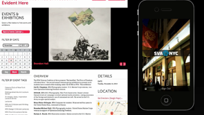
For example, I added here this line, schedule of events.
We've got that logo and the name of the festival and the date and the schedule of events and here are all of the events.
This word, this word schedule of events never appeared visually on the page.
I've hidden them with CSS and made this invisible but I added because otherwise this would make no sense.
This would be like I don't know what all this stuff is to anybody using a screen reader or to a search engine, and I want, you know, it's a schedule of events, I want that information in there semantically. This is how I feel about grid. (laughs) It's pretty exciting.
It's not here yet like I said but it's coming. It's coming.
Grid is not gonna be the end of things.
There are other specs being worked on, there's other ideas about layouts.
Like I said, grid is very much cells and rows and columns. There's a spec called round that the folks at LG have been working on for the last, maybe almost a year.
They're into it because it does things like what if the viewport isn't a square? What if the viewport is a circle because you're using a watch? You might want to be able to reformat your webpage to fit the round screen.
The part that really excites me is this, polar positioning where you can, and this syntax will probably change because that's usually what happens.
There's a draught.
There's a lot of discussion and debate, ideas get kicked around and then eventually things get started that put into browser.
It's way too early, it's not being put in the browsers yet.
It's way too early, the syntax could totally change but right now, you absolutely position something and then you say hey, there's my angle and here's my distance.
You can lay things out on a radius which is what we need to lay this out. (laughs) Finally, we might be able to do this properly without like some crazy hacks, and responsibly. Process.
What are we gonna do if your process is not choose from multiple choice? This is the process that I use.
It may or may not work for you but I honestly wouldn't know how else to do this work.
First, the first step I do and sometimes the order is different, sometimes it's out of order but I'm gonna pretend like it's always in the same order. One is organise the content, right? Everything about great content strategy, everything that Karen McGrane talks about in her amazing talks, everything about actually having real content types defined and having fields for those content types.
You have an event going into the system, you've got the date going into one field, you've got the name of the artist going into another field, you've got the location of that event and with the address.
And the address is actually translated into map coordinates.
Like there's real data and real fields, not the thing that a lot of content management systems unfortunately still have which comes, like WordPress used to have always, every WordPress site used to have which is like a title field and a big blob of we don't know what that is. We hope it's the correct thing, we told people to use h4's on event titles, they may or may not have done it the way we told them to, right? That's not gonna work.
You need real content because you need to be able to control the mark up so that you can do a layout.
If you're gonna put the date of the concert over here and the artist and the photo for the band over there and it's just in a blob where maybe they put the correct HTML on it and maybe they didn't.
You can't do a layout.
If you've got controlled markup then you can. You need content, you need content, I need content to do a layout.
I can't design that poster in print if I don't have any layout whatsoever.
I need the content.
Two, create an HTML file and set the source order. I use this process in a way to help me refine the content as well on projects where I'm defining the content and maybe I'm building the whole site out.
Figuring out the proper HTML, source order frequently will make me want to go change the content a little bit. It also gets me ready to really understand what I'm designing for, what's really going on. Is this a definition list or is this an (mumbles) list? Is this a paragraph or is this a footer? Like those are interesting questions and I get myself an HTML file with the content in it.
Then I sketch ideas for page layout and frequently this happens first, right? On a napkin, in Photoshop, in sketch, in some sort of dynamic interactive prototyping environment, in keynote.
Like I do not care.
Use the right tool for the job, use the tool that works well for your team. Use a whole bunch of tools.
Have conversation, show each other stuff.
You can sketch in whatever way you want.
I suggest never doing final design approval signature on a sketch.
Photoshop, PDFs are not the real environment. You can do stages of design approval on Photoshop PDFs but I, it drives me nuts if I'm stuck on a project where the design is locked as a PDF.
Because there's especially when we get into using grid and some of these more dynamic layouts, how many Photoshop drawings are you gonna do of every single solitary different different possibility. You don't have time for that.
You do a couple in Photoshop to just get your ideas out and make sure and communicate and get some sign off, and then put it in real HTML and get the real final sign off on a prototype. Here's a step that we don't really do.
We tend to do some sketches and then we tend to go build it but we don't design a custom grid.
Design a custom grid.
You can do all kinds of things.
You can have a bunch of columns that are instead of evenly spaced, they're based on a golden ratio.
Rather than having an even number of columns, you can have an odd number of columns.
Here's an example from a book of a food company, a company that's designing, that put together you know the packaging for frozen food packaging.
And they said, "A large part of our initial project time "was spent examining, organising "and considering the entire line as a whole. "We adjusted, nudged, pushed "and fussed over our grid "until it worked for every single contingency." They designed a custom grid, it probably wasn't terribly complicated for all their food packaging.
They didn't go get Bootstrap. (laughs) They didn't just divide by 12 and put all their letters and their photos and their words on that, right? They figured out, well, we need a system here, let's design a system.
We're doing a great job of that with style guides and figuring out how to systematise and create a system for things like typography, for things like buttons, for things like widgets and how things work as a... We should start applying that thinking to grid systems as well.
Or here, this case study.
"We are pleased with the result "and we can't stress enough the use of an odd "rather than an even number of columns.
"The small detail made all the difference." Like maybe 11 instead of 12.
Tiny adjustments.
I've discovered in the work that I've been doing. Little tiny changes actually have a huge impact. You don't have to do all the things I talked about all at once, you're not gonna be able to, no one can.
But if you pick one of them and add it to a project it could actually have a pretty big impact. And then in the process I get to the place where I'm applying CSS.
Start with the content, I create those HTML file, I have somewhere along the line I've sketched a bunch of ideas for a layout. Designed a custom grid and then write vanilla CSS.
Write a bunch of messy CSS, discover things as I go, figure out, work out my design ideas as I go.
And then end up with a real prototype that's got the layouts.
You can test it on a gazillion different devices, a gazillion different browsers, a bunch of different sizes, a bunch of different contexts. How are we gonna do this now even though IE still exists, right? That's the other question that always comes up. Gosh, that was a great presentation.
I loved all those ideas, that's so cool.
Too bad I can't use any of that.
We have to support IE 8 where I work or IE 6 or IE 9 or IE 11, right? That I live in a real world.
I think the resistance, this idea that we can't use any of these new stuff because of IE is based on this idea that things either work or they don't work.
And I can't control whether they work or they don't work on each browser, but I can control whether I use it or I don't use it. That's my choice, either use it or I don't use it. I get this matrix, right.
Here I got four choices.
It works or it doesn't work, I can use it or I can't use it.
I want to use it and I want it to work because that's where this unicorn with a pony on its back is running around, but IE. I could use it when it doesn't work and get fired or get covered in bugs.
I don't want that, I got a mortgage to pay. This is my choice, I'm not gonna use it because it doesn't work.
I got to wait five years until IE 11 goes away. The problem is not IE, the problem is this matrix. This is not actually the matrix of choices, this is our matrix of choices.
It works and it doesn't work at the same time and you can use it and not use it at the same time or you can choose to not use it.
The unicorn with the pony is running around in this box and I'm hoping to convince you to let go of the idea that you have to wait two, three, five years before you can start using new things.
What do I mean it works and it doesn't work at the same time? This is the nature of CSS and progressive enhancement. If I use CSS shapes for example right now, shape-outside, shape-outside is supported in 57% of browser globally according to Kenny. The stats that run behind can I use.
But what happens in the browsers that don't support shape-outside? Well, this happens, it's just a square.
It didn't explode the user's browser, it just looks like a square.
Why hold everyone hostage and zero people get this because everyone has to get this? No, 57% of people can get this and the other you know, 43% can get that.
Or here, the example I showed you earlier, if a browser has viewport units in Flexbox they get the experience on the left.
If they don't, they get the experience on the right. Or this with initial letter, I explained before, the people who have support for initial letter and support for feature queries get the experience on the bottom and everybody else gets to experience on the top. You can use it and not use it at the same time. This is a real webpage on the web right now. 0% of people get to see what's on the right unless you have a special browser, half of 1%. Everybody else gets the experience on the left. I did a talk about this where I spent the whole time explaining these principles and exactly how to write CSS in this way.
It's called Progressing our Layouts and it was at EnhanceConf, and you can look this video up.
I'm also gonna give this talk tomorrow night at the Respond mega meetup if you want to come and see it and check out the details of exactly how to do progressive laying CSS.
For more, if you want more information you can go to jensimmons.com, I just relaunched that website.
It totally is broken on tiny screens but as soon as I get on a 27-hour flight back to the US, I'll fix it.
Labs.jensimmons.com, also buggy.
Lots of people are tweeting me, right now people are tweeting me about bugs on these websites but whatever.
Jensimmons.com, on Twitter, you can follow me on Twitter. This is what the labs page looks like with all the examples I just showed you.
And also at the very top there's links here to this talk and the other talks I've given recently. This is one of the modern layouts getting out of a rut.
This is the talk I gave in 2014 and 2015 about layout. There's a lot more information in here about where I think we're headed and some other CSS properties.
In general, this transition's gonna happen slowly. This is not something you're gonna...
You can go back to the office next week and take out your icon fonts and replace them as SPG because Sarah just showed you how to do that and that you should.
You're not gonna run back to the office and rip out all your layouts and replace them with grid layouts next week, right? Like you're gonna go back to the office and you're gonna use Bootstrap and I'm gonna tell you it's okay.
It's okay, of course, right? We've got to ship real website with real budgets. This is gonna be a long transition, it's gonna be slow but I think it's pretty significant.
I think this is actually maybe more significant than responsive web design.
We'll see, ask me in three years.
But I think this is a lot like the transition from table-based layouts to CSS-based layouts. This is a time to experiment right now especially with grid.
You're not gonna ship anything in a production using grid.
It's gonna take a while.
It might be a year even before all the browsers have it. But this is the time to start experimenting with grid. It's very, very complicated.
Anyone who takes the time to start learning it now is gonna be ahead of the curve later.
You want a job, you want some job security, you want the ability to quit your thumb job and get another better job.
If you're a person who knows grid and while everybody else is like what? You're gonna be in demand.
It's gonna take months to learn it, too.
It's not gonna be overnight.
It's much harder to learn than something like border radius.
Start playing around now, start experimenting now, start seeing what's possible now.
I think especially because it is a big shift in our mindset.
It's not just a shift in our code.
And if you're interested in joining in a project that I'm working on that I'm about to, well, I started working on the website for this on the plane here.
You can go to layout.land and sign up for email list and I'll let you know when it's ready.
I have told no one about this yet so you're the first people.
The first time, when I was Sydney it wasn't even, this was not, I built this this weekend. Layout Land, it's gonna be a place to play around, to experiment, to show other people what you've done to talk to other people about what's going on and to get a lot of great ideas from looking at other people's, what they've done. A gallery of layouts.
Sign up and join me in figuring out what we can do. Thanks.