- So for the longest time when we talked about web design we talked about pages, we talked a lot about pages, but obviously there's been something of a revolution. Ideas like atomic web design, the whole approach of patterns, and the idea of become more componentized in what we do. But when we talk about responsive design, and break points, and media queries, we're still thinking at the page level.
So for years now we've desired this idea of an element query, some way in which we can say that characteristics of the element itself should determine aspects of its style. And the many various false starts of this particular idea of an element query, and we're gonna learn now a bit more about why that is harder than it might look, and what we can do to get this sort of functionality today. So Chris Wright works at Campaign Monitor, works on their rather sophisticated, spiffy templating tools, creating responsive emails, a harder problem than it looks.
It's something that we've had a lot of requests for sessions on and I think in the future we'll definitely have that.
He's spoken at our events before and at many other events, most recently at Smashing Conference at Oxford, so it was great to see yet another Australian getting out there and influencing people all around the world.
To tell us all about where we are at with element queries, would you please welcome Chris Wright.
(applause) - Before we start, let's put our hands together for the Web Directions team for putting on an amazing conference.
(applause) So yes, I am Chris Wright.
I actually really love to experiment with CSS and find little things that we don't expect to behave in certain ways.
I also work for a company called Campaign Monitor, as John said, and as he also said I work on something called the email builder, which is like a WYSIWYG for email.
But I'm not here to talk to you about that today, today I'm gonna talk to you about how components fit to spaces.
And it came about for us with the media query, which really helped us achieve this by adapting across different screens, resolutions, and devices.
It fundamentally changed how we build and consume for the web.
But when we first started, we understood things in pages. And so it was only natural that the way in which we approached this is we made fixed points, tablet, phone, desktop, mobile.
But as the technology matured, the relevance of these fixed points diminished. The explosion of devices made it so that we were pushing things into these breakpoints. So we adapted.
And we began to create content-based breakpoints, where we corrected the content over the different screen sizes.
And the main thing to this was letting the content determine the breakpoints. And this was fantastic because it respected the content, but it came at a cost, and the cost was that it made it difficult to change things. Because as we added these media queries to these components, we might be in a situation where you might have, say, five different media queries for a component, and then you want to move that component somewhere else to a new space, and then you need to add more media queries. So we essentially started facing this rising complexity. Now to research the rising complexity, I looked at responsive websites that we hold in high esteem. Sites like Netflix, WWF, Airbnb, Great Discontent, Virgin America.
I looked at over 50 websites, it was a pretty boring day. (laughs) I looked at the output of the CSS of these. What I found was on average there were over 264 media queries across these sites. Now more shockingly, I found one that had 905 media queries on it. I couldn't even find a register of device screen sizes that went as high as 905, I think the highest I found was about 600.
Now if you think you can escape this with the McDonald's of frameworks, think again. Before you've even written a single line of code, you're already starting at 54 media queries, and Foundation's at 68.
So it seems that whatever way we go we're trapped by this same problem.
And that is that media queries are limited to screens. They fit to pages, but nowadays we tend to think more in terms of modular design and design systems, breaking our applications into smaller pieces that are composed together.
And our components are built to exist in many contexts, such as the Salesforce Lightning Design System, we look at this example of a form that can exist in different sizes, and thanks to the contrast you can't see that. And this is really an example here where if you were to grab this same component and drag it to somewhere else where we've split it 50% based on the screen size, you'd see it breaks when it gets a new context. So enter the element query.
Good mate of modular systems.
Now the element query really works like this, you put it like a media query on the end of a selector, and you can give it some kind of control based on a condition.
So you could say this item, when it's a bit wider make it purple.
And you get something that looks pink, doesn't match what I wrote.
And this actually causes the circular dependency problem because if you can control this and you can query this, there exists a condition in CSS where you could potentially be styling an element based on its own width, and then causing it to meet a different condition because the content pushes it out, basically causing the browser to crash.
We don't want that.
So with that the element queries essentially died, but the need for element queries still remains. Enter the container query, successor.
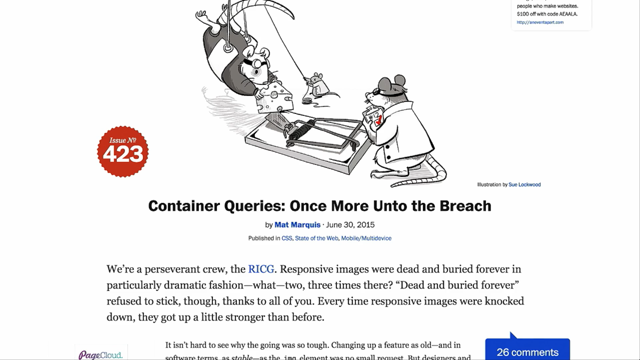
And this great article by Mat Marquis really sums up the continuous need for this type of query. One thing that really stuck with me in what he was saying was, "this still needs to be solved, and now we know "how not to solve it: elements can't be restyled "based on their own properties." So the concept of the element query is that we now, sorry, the container query, is that we now style the parent element and then we see how the parent element behaves, its container width, and then style its children. So you could have something like The Guardian website, and you look at maybe we have a component here that's the default component for a news story, and then how it behaves when it has 30 ems available to it. Now this doesn't completely avoid the circularity problem, which I'll talk about a bit later.
Let's start thinking about how things could be if we had a world of container queries.
How things fit to different spaces.
What powers would that give us? What would we be able to achieve? And what can we achieve today with these same ideas? Well on my personal wishlist is this thing mentioned by, and I'm gonna butcher this guy's name, Viljamis Salminen, about molten leading.
And that is that we know that typography, the line length, the leading is determined by the line length. So if we have this viewport-based typography, what happens when we then move that inside a container. It no longer has the same relationship, and it no longer has the same relevance.
So what I would love is if we could style the line height of a font based on its container width.
And there is a JavaScript plugin that he's made to essentially do that.
And it's an interesting prototype.
Another one is Fitter Happier Text, which is based on the case where you might have a headline, so you don't want to wrap over two lines.
And so the font size adjusts based on that container width. Now the reason why we can't do this right now is that font-size: 100% is related to its parent font size. So what we really need is maybe a unit for the font size based on the container.
This isn't real CSS, but imagine if we had something like the ctw unit, where we could then base font size or line height on that. That would be something that would be really useful for these two use cases.
Another thing and probably the most primary use case for container queries or element queries, is to choose how elements adapt in different spaces. On Dan Mall's content display patterns article, he talks about how he styles different things based on their context.
Well the context here is space, so if you look at the item on the left it's actually not so different from these two items on the right, but it has more space, it gets more priority. So if we could style that, we'd have amazing powers when we're making a component.
We wouldn't have to sit there and micromanage things with media queries across screens.
Another case is very similar to that, is one by someone called Lincolnloop on GitHub, I don't know their actual real name, and it's a similar thing, they have these article components all in different cases, one without an image, one with a smaller image, and a bit more content.
Similarly if you had something like a subscribe form, a subscribe form could exist in many different places, and so you'd wanna be able to adapt to different places. Or something like an author bio, or comment. That kinda gives me the idea of element flow, and that's basing on CSS properties which automatically adapt to space.
So to achieve this, we use flexbox.
CSS's I'm feeling lucky button.
Now we use flex wrap and we define two fixed widths, which seems counterintuitive, but what actually happens with flexbox is that we can make those fluid.
So if we then put 20 rems on the first thing and then 30 rems on the second thing, our breakpoint actually becomes 50 rems.
So if we've got less than 50 rems available, it wraps and becomes a single column module. Now with flex-grow we can be able to behave fluidly. So what if we wanted to go wider? Well then we can use another property, CSS columns, which you've heard about today. And CSS columns will allow us to automatically create a new column at whatever number we give it, so in this case 20 rems.
If we make it 90, then we get another column. Now we could put max width if we didn't want it to go any further than this, but it really starts to get you thinking about all the different ways in which you could create these conditions, you could adapt to these situations. So here's another example using that same example from before, but this time now you see you can drag this and move this component anywhere you like on the screen, and it doesn't actually matter about the media query. And you can use the same technique to the forms I showed you before.
This is using no media queries at all.
You can just simply wrap something and let it adapt in the way that it needs to. Similar for that bio thing that I showed you before. You can make it adapt in any way you like.
The same thing you could even do for the entire page layout. Now flexbox also has flex strings, which if you have a number of items in a component and you want those items to adapt based on how many there are, you can shrink to fit more in and equal the space. Now if you're worried about flexbox, which some people are, if you're worried about using it in your projects because there's crazy bugs, such as if you look at the Flexbugs repository, it can be pretty scary and pretty overwhelming. There's a few techniques in which you can make your life a bit easier.
One is, first of all, recognise that nine out of the 13 bugs are Internet Explorer 10 and 11, so if you don't pre-fix flex bugs, you'll cut Internet Explorer 10 out and give them the floated layouts.
I'm assuming you're all going to be using progressive enhancement here.
So you'd be giving them the floated layouts. Also old flexbox is terrible.
It's slow.
So don't use old flexbox.
But my personal favourite is the fact that flexbox has more support than @supports. So if you use this little snippet of code that just called enhance-flex, and you can have all your flexbox properties outside of this @supports query.
This bit will just switch it over when a non-Internet Explorer browser hits this piece of code.
Now that does include Edge, Edge will be part of it, so fantastic, it's like this query, @supports is like having an is this an evergreen browser query.
And similar to all those techniques I was showing you, grid will have its own way of managing space as well, but I'm not going to go into that today.
So how could we make that technique work better? The first one is, if you look at the CSS columns spec, there's actually more stuff in there.
There's actually the column breaks and if you've ever tried to play with column breaks across browsers, it's a nightmare.
The browsers haven't implemented column breaks yet, which crazy because columns has been in browsers since 2011. The other one is column-fill and column-span, similarly don't exist in Firefox.
I could be corrected on that, but as far as I know they don't exist in Firefox, and they could actually allow us to define how those columns are actually filled when they go across the space.
Which is fantastic, if we could use that.
Column break also means that we don't have to just have text, as you saw in this example. You could do it on anything and decide don't chop this thing halfway through the component, which is important.
So another one on the wishlist is container sized source ordering.
In this example I'm just using a page media query, but to give you some idea, imagine if you had an advertisement and you wanted that advertisement to move based on how much space was there, or you wanted to move that advertisement around. Or even if you had something like a figure and you wanted to move the figure around based on the available space.
You could do that by just simply moving that around. Now there's an experimental feature at the moment called display: contents.
The thing with flexbox is, flexbox is a parent-child relationship.
And the problem with that is if you've got a grandchild element, you can't order the grandchild element.
So what display: contents does is it lets you grab right inside and just collapse the box. So if I wanted to grab item 3 and order that item 1, just without display: contents, I couldn't do that. But with display: contents, I can easily, when it gets less space I can collapse that box and grab 3 and 2 from inside of that box, which is really amazing.
Now it's worth saying that ordering can be problematic for keyboard access, we saw a amazing talk about accessibility.
It's worth thinking about this.
Whenever you use flexbox or grid, think about what you're doing and think about the implications of that on keyboard access. Now there's an amazing article by Leonie Watson about that that I highly recommend reading about.
And the spec itself says that authors must use order only for visual, not logical, reordering of content. Because it matters the impact our decisions have on people. We can make obvious things completely useless, completely unusable.
So what could make source ordering work better? If we had a context element that allowed us to use the media query inside, that would actually help us immensely.
Another one is if we had a way of flagging alternate source order in the markup, then we could really indicate what was actually going to move around, and that would help similar to how the ARIA stuff works. And if the spec or the browsers matched how Firefox do it, 'cause Firefox actually matches the keyboard order. So what about picture element? We just heard about the picture element, and the picture element's limitation is that it's based on the screen size.
But what if we were able to do that based on the size of a component? SVG can have its own document context.
You could say inside an SVG, be teal if you're at a minimum width of 30 ems. And so based on the actual size of the element it will be teal, which is amazing.
It's an amazing feature in SVG.
Well it turns out that SVG has a element called the foreignObject element, and with that foreignObject element you can embed HTML inside the SVG.
Sarah actually mentioned it yesterday.
So what if we put the picture element inside the SVG, using the document context of the SVG, and we use that foreignObject I mentioned? We could actually make a container-based picture element, which is fantastic, these will independently change what source image they're using based upon how much space they have available.
This is incredibly powerful.
And if you're worried about the support of foreignObject, you can wrap that in a switch statement and put an image just below that.
You could even put that SVG in a picture element, let's not do that, that's like Inception stuff going on there. So how could we avoid having to do this hack? Well if we had picture element, had a flag that could give it a different context like an iFrame or an SVG, then we wouldn't have to do something like that. It would be an amazing solution that I would definitely love to see.
The other problem that I often run into with responsive related stuff is container-based responsive tables.
This is just an example of a responsive table, but it gives you an idea about what we might be able to achieve, what we'd love to achieve, that if that table was dropped into a smaller space it would adapt to that. But actually, David Bushell has an example of how this works with a very simple thing, which is just overflow auto.
And I love it because it's such a simple solution, you can achieve this table and get it working perfectly just with something that we've had for ages. Now we don't have real container queries yet. But we're being encouraged to create libraries to experiment.
Think what the picture fill JavaScript library by Scott Jehl was to the picture element.
And we need this natively in browsers.
It doesn't matter if whatever plugin for whatever framework does it.
What matters is it's gonna mean that you're gonna write less code and you're gonna have faster performance.
If it's implemented natively in the browser, because those things are still going to use that API. Now currently there's a container queries prollyfill, which is done by one of the community members of the RICG, and that's probably the closest thing at the moment to the discussion.
And there's a bunch of libraries that you could check out that are based on the earlier original element query that are worth checking out and just experimenting with. This isn't a solved problem yet, but maybe the solution is many solutions because we got responsive images in four parts. We got source set, image set, picture, and sizes. And maybe that's what we need here.
I encourage anyone who's interested in this discussion or wants to see this to join the RICG.
Go to the website, join up, be part of the mailing list, enter the discussion. Because the more people we have talking about this and trying to work through these problems, the more likely we are to get this.
Hopefully I've encouraged you to think about this and try and get up some hope for this.
Because the more we experiment and the more we understand this problem, the better it will be for all of us.
Thank you.
(applause) - Thanks so much Chris.
Alright, we do have time for a couple of questions before we break for our final cup of coffee or other beverage.
If you're following along on Twitter, Sarah Swidan, where is she, I butchered her name again. She had her very first she said, she was going on and on, she'd never had a cup of coffee in her life, she's had her first cup of coffee and she loved it. So that's another first for Web Directions. Very good to know.
So if you see someone bouncing off the walls out there, that'd be Sarah I suspect.
Alright, have we got any questions for Chris on that before we break? I know it's sometimes very hard to know where to start, there's so much in it and unless you see a specific point, a jumping off point for your own work, it can be difficult to drill into some questions. Have we got any questions out there? I think rivers are getting filled up.
Oh, Kevin! Kevin, reliable go-to man Kevin, please.
- Are any of the cool sort of almost techniques that you showed in use at Campaign Monitor? - No, not currently.
I pretty much invented some, like one of them I invented like a week ago. (laughs) And the other one, actually no, the other one, the one with flexbox actually is. I use that in a lot of places.
- [John] So are you guys using flexbox much in Campaign Monitor? - [Chris] I've kinda been the person driving that. And yeah we've started using that a lot more for things, even for things like grids.
- Right, so around that we've seen quite a bit around flexbox, and I guess there's still this sense where a lot of people, "well it's not supported everywhere. "How do I go about using it?" Has your approach been to take something that already is laid, you've got all the design and everything, and kind of re-do that in flexbox with a fallback to those older, might be float-based techniques, or? - So the great thing is that with @supports or with any progressive enhancement technique, is you can start with a floated layout of how you do a grid, and then you can just simply layer on the pieces. And it's actually quite simple to do once you get used to flexbox.
I'm a bit apprehensive to say it's simple, because you have to understand flexbox, and I've been doing it for like 3 years of messing with flexbox and I still get tripped up every now and then. So, okay, it's not that simple.
But you start with your floated layout or your inline-block layout and you just layer on top of that.
- And you are using @supports to sort of turn on flexbox when it's supported, that's your mechanism? - That's kind of my main way of doing it these days, before I was using Modernizr, but I've just found that even just using the older pre-fix flexbox is a bad idea.
I'm more about modern flexbox.
It's just a lot easier if you're dealing with a team of people and you don't want to explain the 50 billion things you have to do to get IE to work properly with flexbox, so just chuck @supports on. You don't have to worry about how IE deals with flexbox, you just have to worry about how Safari deals with it. - You're essentially trying to recreate the existing layout. More or less, you want it to look exactly the same at the moment? - It's the same layout with a few extra features, so you can use grow, you can use wrap, you can use a bunch of different things.
If you need to reverse something, you can do that. For internationalisation, you can reverse, go right to left. Or whatever you like really.
You can't do that with floats without great pain. - Right, but the starting point you use is essentially recreate your existing layout and then add additional capability to that layout. - Yes.
- Right, and are you doing any instrumentation to get a sense of what percentage of browsers that your userbase, which I think would be pretty broad userbase, is not all the latest browser users.
Where are you starting to look at in terms of support amongst the things you're looking at? - Well, if we looked at it based on purely our userbase, I wouldn't even touch IE 10, or IE 9, but y'know we provide something that works, and then-- - So you're finding actually quite a sizable percentage of your users are now using browsers that support modern flex box? - Yeah, yeah.
- Right, okay, and I wouldn't have thought that your audience was entirely all the most up to date, a broad range of people use your products, right? - Yeah.
- They are really interesting data points I think, on top of everything we've learnt so far.
I guess a proved point that a lot of what been talking about through the day is one of our guiding principles of Web Directions, we're not saying, "hi, in the future we'll have jetpacks "and there's awesome stuff," it's like these things you really should be starting to work with or think about at the very least. And a lot of it you should be starting to work with today. So that's some great proved points there.