(air whooshes) (audience applause) - [Voiceover] So next up we have Jessica Edwards. She's a creative developer, who spends her life trying to make the most compelling interactive mobile, well let's just say advertising for want of a better word. - [Voiceover] Sorry.
- But, you know they're very measurable job where you know, your standard for the basis of how likely that someone will actually engage in your work.
So day in day out and that's pretty much a mobile only company really.
So day in day out that's what she does and she's learned a lot about how to create compelling experiences and she's particularly enamoured of a lot of features of CSS that you might think are really either experimental or you haven't heard of them yet but they're actually usable today.
Sarah referred to a few of them but Jessica's gonna go into great more detail about some of these features.
So to talk about some of the things we used to do in Photoshop we don't have to do anymore because we can do it live in the browser with CSS, please welcome, Jessica Edwards.
(applause) - So I guess you're wondering why, why would I want to move everything that I was doing in Photoshop or other image editing software to CSS, I mean, we heard earlier that CSS is just a series of hacks, why would I want to complicate my process.
The first thing is, I'm not a designer.
I hate Photoshop, I have no idea what I'm doing when I'm there so I feel most comfortable when I'm coding, and also even if I delegate that to say a designer for any changes to images, that's another step in a development workflow that you know, media is crunch time is daily, I have hour and week-long projects, not months and months so, things need to happen quickly. I guess the first thing is gradients.
It's a function that returns an image, not very exciting but it actually, the best network request is the one that you don't have to make and gradients make that super simple so to start off with we just have a really simple hero with a linear gradient that's going across.
That's pretty easy, you just specify which direction you want it to go, add a couple of colours. And that direction you could also write zero degrees, 90 degrees, but CSS is a decorative language so I think it's really great if you can read something and go hey, my gradient's going to the right.
So I tend to try and write it that way.
Now a bit more sort of subtle is a user interface, so we actually have really subtle white overlay for our gradient that slowly goes to transparent. You might be wondering why I did that why not just have one blue go to another blue.
It means, we were talking earlier about being a lazy developer and this means I can easily change colours just on the fly so I don't have to worry about having to pick the right green or the right red. Instead I can just change one variable and the cascade takes care of that.
Easy.
If you're changing your prototype, you're in that first stage, very easy to change your colours that way. Radial gradient so.
I like cats by the way if you can't tell.
There's more coming, don't worry.
Here I have a circle and then I've specified a colour and then I've given and length, so what that means is I want it to be red up until the 30% mark and it wants to be transparent by the 50% mark.
This one's a bit more interesting.
We have another radial gradient, going down to yellow but we've also got a tiny radial gradient there that's a white dot. It's just one, I don't have to worry about making a separate tile in another image editing software. And that means I can easily change, hey, I want it to be actually five pixels, my dot. I can easily change that just on the fly.
Now we have the repeating gradients.
You might be wondering, I didn't even know we had gradients and now we have repeating gradients. Yes, I'm not really sure what to do with the radial gradient I haven't really found any use cases for it. But the linear gradient is a lot of fun, you can do things like panels, horizontal stripes, vertical stripes, checkerboards.
Really great for that use case.
You might notice, ideally this is my wood panel but it's still a little bit flat.
That's what the beauty of say adding in blend modes and actual image overlays can do.
I've just used a really tiny image for this one. Suddenly it's a small image that repeats, but because I have a gradient behind it and I've used a blend suddenly it looks like a really textured background and that costs me less than five kilobytes.
Easy, and also another benefit of using code is, this came up as black earlier when we were doing the testing, because it's code I changed the colour value, now you can see it, so great if you're developing slides as well.
You might be wondering, can I use these.
Yeah you can.
Almost to 90% support.
Internet Explorer, lower than 11 you can't, and Opera Mini, you can't really do anything with Opera Mini unfortunately.
You can actually just set a fall back with your background colour attributes and then once you set your background.
Because of the cascade, so your background will just reset that and ignore your background colour, but if the browser doesn't understand it the background color's still in place.
Blend modes, this is a bit more interesting. The basic premise is you have one pixel plus another pixel and you get a new one back. One pixel isn't very interesting but you scale that to a whole image and a whole site and suddenly you get some really interesting effects.
Here's another cat, this is FiFi.
She's my favourite, don't tell the other ones. There's 16 different modes.
One of them's normal but we have lightening ones, darken, hard light, colour burn. You can only apply one of these to an element at once. Great for just playing around with.
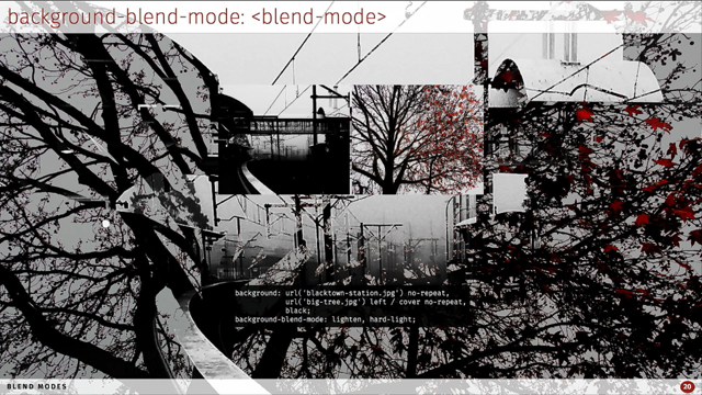
What can I actually do with that, how do I use it? This first one, what I've done is just taken a predominantly dark, dark image.
I've lightened it up on top of this tree image. So the blacks have taken the tree from behind it. I also have a black colour that's underneath. The lighten is repeated for each element, but of course you can't, the black's just not gonna show through because obviously that's darker than everything else. What we can do with background blend mode is actually specify different blends for each layer of our image.
So now we're actually taking into account that black because I've said instead of lightening my big tree, I don't know I call it that but anyway, it isn't lightening the black but it's using a hard light blend.
Now mix-blend-mode is unlike background-blend-mode which is encapsulated just to that one element, mix-blend-mode works across all elements.
You can also use 'em with an SPG.
It basically says anything below my element blend that.
Here we just have our different elements that we're applying difference to our article, it's actually pink and black but as you can see, it basically takes the difference between those elements.
I also have a blend on my footer but because it's taking in the white of the white background you're not actually getting anything so what we can do in those cases is actually set isolation, to isolate our footer. That means then you can see what's happening because it's ignoring that white background. So this is just another example.
Just as you isolate it.
It'll just ignore that layer.
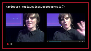
Another fun one is say we have, say you want a consistent CTA.
Now so you can see Justin Bieber's shirt is white which is kind of annoying for my CTA.
But instead what we can do is actually say call exclusion and then we make sure that you can always see that no matter the background and because the video's just like any other HTML element you can also call any of the mix blend modes here. You didn't have to open up Adobe Premier, you didn't have to, I don't know how to do this at all in Adobe Premier so basically you're just really moving beyond just static image manipulation and moving into really fun topics.
I think the most practical use case for me personally is that I always get lots and lots of Photoshop prototypes and the amount of times that the designer is using their multiply, blend modes, and I go to export it and, I get this, I get a logo with the double fin, which isn't what I wanted, I actually wanted that to blend with my background.
It's a separate layer, call multiply on that and then I get the exact same effect.
And I didn't have to go back to another designer and be like hey can we modify the design, which would take hours and in the case of external clients days.
That's time that we just don't have.
Support is not as good as gradients but still up there. The issues again are Internet Explorer, Opera Mini and also Edge.
What we can do is we should really make sure that we test in case our blends do not work.
It's really imperative because the issues of accessibility, if you say your text is behind an element that we assume that the blend mode applies then we have issues because what if it doesn't? It's just a very sort of simple issue but also just issues of contrast especially. You have to make sure that you just test across all situations.
Filters.
Quite fun.
This is another cat obviously.
This is Pepper.
The best things is about filters means that we can easily animate as well.
We can also apply multiple at the same time so any of these in any order.
It's actually a function so say for brightness, you give it a value of say two, it'll brighten it by two times.
Versus say drop shadow which takes in four parameters. One for five pixels, the x and y offset.
Three pixels for the distance and the colour. Now there's also opacity now there is a CSS attribute called opacity.
You might be wondering why would I wanna filter that, by using opacity as a filter we ensure that it's hardware accelerated.
Just basically tells the browser that hey this is a different layer.
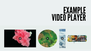
And also we can apply a URL so for really complex filters where'd you have a SVG you can parse it in there. I get a lot of carousels in my line of work. One of the major annoying things is making these drop shadows.
Not only do I have to open up Photoshop to do them but you always have to change the values slightly, it's always slightly different colour. It's just a pain.
You can do that in CSS.
Instead now I easily have a drop shadow.
I can change it if the client doesn't like it. As you can see you can also animate it as well. We take in as I said earlier the x offset y offset and the blur radius.
There is also another fourth optional parameter of spread radius but unfortunately it's not very well supported amongst browsers.
If you do parse that in there could end up you have no drop shadow.
Which is unfortunate.
And another use case is say hue rotate.
Hue rotate is quite a fun one, I'll show you a more dramatic example here. It just takes everything in the colour wheel and just turns it slightly.
That's cool jazz but I've got some programming to do. Obviously more carousels.
Featuring different products but what I can do, is actually call hue rotate on that image.
That's a perfect 20 degree rotation and that's also a different, it happens to be one of the products that we had to show.
I saved myself one image request there.
If you have really simple products, changing colours. If you have products of really rich sorta high quality and high kilobyte and white you might not wanna compromise that but you could maybe compromise the colour slightly.
Support is much better so it's around 80%.
You'll have to use the webcat extension prefix. That'll get you quite along the way, we still have the same issues as well with accessibility.
You do have to just test as always, you have to assume that your filter does not work. At the same time we can also use say, our contrast, actually increase contrast for those people, so that's another thing that you could look in favour of accessibility.
Say you have an entire document where you want to up the contrast for certain people and that's possible. Also in the future there'll be a filter function that you can apply directly to images say, in your backgrounds.
As it is these are just images that I'm calling. Fortunately we can't apply those filters directly to just a background, in the future that will be possible. As well as backdrop filter which is another fun one, what it will do is say anything that's behind our image I want to apply a filter so things like blurring behind elements would be quite useful. But unfortunately that's only available in Safari at the moment.
Behind an experimental flag in Chrome but it's looking bright I think there's so much out there that we still haven't quite nailed in terms of replicating Photoshop but, it's only a matter of time before we can really say farewell Photoshop.
Yeah, so that's all guys.
Thank you very much.
Here's our benefits.
(applause) - Thank you so much Jess.
We've got these great tools in our browsers and I think there's sort of this sense to some extent, we've got apparently Javascript fatigue fatigue and there's probably to some extent web design development fatigue fatigue generally.
On the one hand I feel that there's this general vibe that we've kind of had all this change and we're all digesting it, but the fact is that a great capacities in the web platform that can because all our browsers including almost Safaris these days, our Evergreen, we're seeing these features that sometimes took months if not years to filter from experimental through into the main browser platform, happening in months or even weeks.
So it's great to get a sense of what's capable now and what's being used by people today so hopefully that's given you some more food for thought to create even cooler stuff on the web.