(electronic vibrations) - Craig almost certainly doesn't really need an introduction.
He has written a number of books and extensively for the likes of SidePoint and elsewhere.
Up in Sydney he founded and continues to maintain Syd JS, which along with Melb JS and some other made ups, fantastic places, fantastic vibrant communities that if you're not part of, I'll call out a couple now. So, Be Responsive.
Who's heard of Be Responsive? Right.
Who goes? Right.
If you haven't, it's a great community.
It meets around once a month.
Zindi who's up at the front helping us out there founded that and runs it.
Have a look out for it.
Get along, great presentations every month on web design and all things responsive.
And, of course, Melb JS, who we've worked with over many years, and Melb CSS, and Michael Mifsud, who's speaking tomorrow has founded that and runs that out of the 99 Designs office over in Richmond, really fantastic office, nice ambiance.
I recommend you get along to any and all of those events. But up in Sydney, one of the great ones is Syd JS, and Craig is the founder and continues to maintain that. He's gonna talk about, another set of CSS features that are much overlooked, and I use extensively, and I think are incredibly valuable that in one sense we can think of in topographical terms but are far more useful than that.
So, to finish off these very as I mentioned intense but fantastic session this afternoon, please welcome Craig Sharkie.
(audience applause) - Thank, John.
Welcome everybody.
Today, we're gonna be looking at vw + vh is absolutely equal to very nice.
Am I bit echoey? I am? Can someone make me less echoey? Echo, echo, echo, echo, echo.
No, I'm good now? That's great.
Vw + vh is absolutely equal to very nice.
Now, we've mixed some JavaScript, some CSS, a little bit of math in there, and a bit more text speak than I'm comfortable putting into print, but there you go.
And it set us up with the fact that we've got our viewport units for discussion this afternoon. So, we've got our vws, our vhs, vmins, and vmaxs. Each of them together is a proportional unit, and they're relative to the people.
So, it doesn't matter what size screen you're on. If it's on this size screen, it still takes the size of the viewport itself.
We'll come back to that in a second.
It is a very new technology.
We know that it's very new because there's been an article out this year which told us that this is very new.
Last year, in 2015, there was an article saying it was very new.
In 2014, we had an article saying it was very new. And we go back, of course, to 2013, where SitePoint told us it was very new, and they would just pick to the post by Chris Coyer, who told us also that in 2012 it was very new.
(audience chuckles) He was right.
He was actually as close as he could get to the money. If you go back any further than that on the internet and you'll end up back in the spec, which I'm sure you guys spend hours and hours pouring over. And well, you should because you're following the following features are at risk and may be dropped during the CR period.
So, the Candidate Recommendation period, vh, vw, vm. We have actually lost vms, but we've got the other two. And we know that because when we skip forward to today to the candidate recommendation, no more red ticks. We're good to go.
We're so good that we can go into our can I use everyone knows about, can I use here, of course.
If we do some Apple pluses 'cause anyone here got a Windows machine? That's what I thought.
Apple pluses, and we'll zoom in.
We'll zoom in. We'll zoom in.
Whoop, now, we'll have to scroll up a bit.
And we'll zoom in a bit further, up and across. Right. Oh.
Okay.
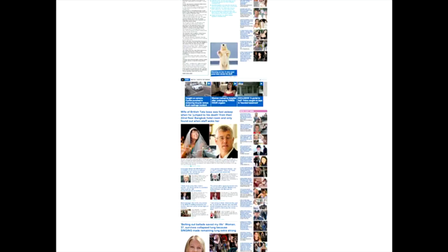
Apparently, the website that is telling us that we can use viewport units isn't using viewport units.
Otherwise it would fit onto the page, which, of course, looks quite a bit like this.
I think, like whenever anyone serves that to me, I actually agree with them.
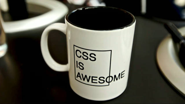
I think CSS is actually awesome.
It should break out of that box.
It shouldn't make the words be CSS is awes ome. It doesn't make any sense.
This, CSS is awesome.
We need to take that to heart.
Now, let's go back to our mathematics.
We've got 96% coverage.
So, we've seen before that there's some experimental techniques.
This stuff works out of the box for 96% of the people who are using it across the four different sizes. No browser extensions or anything.
It just works. It's just lovely.
If we take 10% off that number, we get down to the percentage of acceptance of flicks.
Now, everyone's trying to get flicks in the browsers. And they're having a hard time because of support. We've already got much better support for viewport units. There's no reason to not use it.
And even better, if we take out the viewmax and the viewmin, 100% of browsers is in the latest browser or two versions lower supports viewport units. No one's got an excuse to not use it.
It makes your life so much easier.
You can just drop it in once and forget about it and focus on the really interesting stuff you do in your job. And then we get, if we took out the vmin and the vmax, that stuff on the left hand side would be bright green as well.
So, since IE8, we've been able to, I'm sorry that's IE9 we've been able to use it.
And as Jessica pointed out, upper mini, I don't know why it's still there.
But it is.
Let's take it back a notch.
Let's have a little bit of a brief interlude. And we'll return to our CSS is awesome.
CSS is awesome when people use it as an attack against what we do with their language is a thing called a Contextomy.
You take something completely out of context, and it changes the value of what you're talking about.
Now, I've got another couple examples for this. Has anybody heard of a contextomy, by the way? Anyone who heard my presentation last week can see it doesn't count.
Thank you very much.
Emily Pankhurst, Mahatma Ghandi, Albert Einstein, the sorts of people you'd expect to see at a CSS conference. These people I think you'll agree can easily be labelled great minds.
I think you'll easily agree that every other person in the room has added the next part to that and have gotten great minds.
Great minds reminds me of the fact that great minds think alike.
This is a contextomy.
We use it when we want to have an association between us and someone else who has the same idea.
So, we say great minds think alike.
Everyone's heard of great minds think alike? Maybe it's a Sydney thing.
(audience chuckles) It's a contextomy.
A contextomy is taking a misquote of a saying and twisting it to your purpose.
So, for example, a movie critic says "The whole thing was a terrific bore, I laughed out loud at the ineptitude of the actors." The PR person does what? I see the word terrific, and I laughed out loud. And this becomes the blurb in the bottom of the movie poster.
And that's why you're going to see Batman versus Superman. (audience laughs) It's a contextomy.
It's talking part of what someone actually said and only focusing on the bit that suits you best, contextomy. So, great minds think alike.
The second part of the saying with great minds think alike is "fools seldom differ." So, we've gone through using it as a saying to help us join together because we're having a great idea to potentially saying, well, we had an idea, but I've got no way to qualify whether or not you're as smart as I am, or I'm as smart as you are, or actually great minds at all. It's just a thing.
Let's move on.
But no one's heard of that have they? Let's move on.
Great minds.
So, we had Miss Pankhurst, Mr. Gandhi, Mr. Einstein. These are the great minds.
If we add the second part of the process though, we've got some fools.
Now, these people may fall into that sort of category potentially.
And, of course, well, how can we forget, but let's try to. If we don't take the entire solution as a way to understand it.
If we just focus on one piece of information, we might find out that this person starts running the United States of America.
So, understanding a contextomy and understanding how it can affect what we do is very important.
But let's bring our contextomy back to the internet, back to the web with our browsers.
Everybody has an understanding of what browser market share looks like.
There's a whole bunch for Chrome.
Quite a big bit for Safari I'm sure.
Little bits or hopefully less and less and less and less and less and less and less and less and less and less and less and less bits of Internet Explorer.
But we all understand it.
In January this year, the nice folks at SitePoint told me that's what the browser market share looked like. I was surprised.
I didn't realise that Chrome was anywhere near as advanced as it was.
Because the market share, I didn't realise that Safari had gotten down to such a low point.
But if it was Internet Explorer, we'd just get rid of it. But we need, that's what I'm saying.
We need to look into more deeply.
When we're saying to our boss we don't want to support Internet Explorer, but it's got as much market share as Firefox, and far more than Safari.
We need to have a better understanding about the environment.
And this is what the browser might look like if we're using some nice proportional imagery on it, not proportional SVG unfortunately, just some PNGs. Again, with the browsers, IE6 was a good target for people that didn't really like browsers.
IE5 was worse.
But those two browsers together, join together to make a period of time of great stability on the internet. It wasn't necessarily a time that all the developers loved working through, but it was really stable. And it gave us a chance to bring the internet to where it is today.
So, the ubiquity that we have with browsers being in every device and everything we look at, internet and things.
It all came on the back of these two browsers. And these two browsers, we have to remember was where Ajax came from.
So, if you were to take it out of context, we'd just think Internet Explorer wasn't very good to us.
But if you bring the context back into place, we find that Internet Explorer gave us the technology that launched the internet into everyone's home and everyone's hearts and minds.
And, of course, we got a product named after a cleaning product.
There was some garfuffle with the way that Microsoft did it.
And we still have, but if we look deeper, we find that they gave us the potential to make the internet the wondrous thing that it is today.
And there's another picture of our browser market share. And our last browser condition, of course, is Safari. So, who has heard of the Picture element? The picture element was a wondrous thing.
It looked a bit like a video element.
It just worked.
Unfortunately, it didn't work the way that Apple or Safari wanted it to work.
So, they canned it.
And we can tell they canned it because this nice thoughtful entry in the spec for it: "This is no longer developed as a separate specification." Umm, the browser width, now the smallest market share, caused great disruption to a technology which would have made our lives as developers a breeze.
The picture solution for responsive imagery on the internet was just gonna sing.
Unfortunately, we still don't have an implementation yet that we can rely on.
We can still do some hacks and some work arounds all because we didn't necessarily take a big enough look at the context of which we were getting our advice from Apple from.
But let's get rid of our contextomies.
And with, except for one last example.
Lets have a look at the CSS contextomy.
And we're gonna focus now on units.
And we're gonna focus more specifically on how many units people think exist in CSS three and HTML5. Is it six? Is it 10? Who thinks we've got like a dozen different units that we can choose from? Did anybody come up with the number 27? Because we have 27.
Umm, we don't necessarily understand that they're there. And we sort of lament the fact that we're stuck using the same old units over and over again.
But by looking deeper, by understanding the context of what we're doing with our units, we could actually get a much better grasp of what's going on.
We've got absolute keywords that each browser tells us something slightly different to each other, which can be quite annoying.
But there's extra small, smalls, mediums, and extra extras on the outside of those things.
They look like this.
We've got relative keywords, which, look at the parent environment they're in and make a change accordingly. So, that's smaller and larger.
They might look like this.
We've got absolute units, which are absolutely great. Millimetres, centimetres, some points and picas in there. And, of course, the pixel that we know and love. Does anyone happen to know what a Q unit is for? That's what I figured.
A Q unit is a quarter of an inch.
Who's ever used an inch unit before? That's what I figured as well.
We've got an inch, and it's so popular, we have to use quarter inches as well.
But I'm sure it's good somewhere.
And I've got font relative units, and these ones we know and love: percentages, ems, rems, exs, and cxs. Ems we use.
Rems we dropped because when we tried to use it two years ago, Internet Explorer 8 didn't support it. So, now we've forgotten to use it completely. And we've got no solution.
Anyone know what an ex is? Okay, (mumbles).
An em is the width of the em in a font.
An ex is related to the ex in the font, as you might have guessed by the ex there.
However, just to confuse things, they switched it. So, it's not the width of the ex, it's the height of the ex.
So, it's really useful for doing scale when you're making sure that your lines actually make, have a nice rhythm through the page.
That's one to remember.
How about cx? It looks a bit like an ex 'cause it's got an ex in it. But it's not the height 'cause that would have made you too comfortable.
And it's not even the width.
That again would have made you too comfortable. It's the space required to comfortably draw an O character in a font.
I don't know either, but I'm sure there's some really useful reason for it.
It's the, all the white space you get around the O, this is the character that makes it worth while.
We add that to the mix, and we get back to our relative viewpoint units.
We've got vhs, vws, vms, vmins, and vmaxs.
And as I said, we dropped out the vm.
It was going to be vmin, which is really useful. But they didn't have an answer for vmax.
So, they dropped the one character and got the min and max, which is a bit wordy.
But there you go.
And that brings us down to 26 units.
Sorry, not 27 but 26.
However, we have a situation as human beings we know that whenever we get a large group of things, the way that we contain it is by putting something else even larger to make it even bigger.
So, we haven't got 26 units.
We have, in fact, got global units as well divided in there. We've got inherit, initial, and unset.
I use inherit a bit.
Not so much initial.
And I've never used unset.
I didn't even know it existed.
29 size units.
That makes sense.
We'll use three or four.
We might use pixels, and ems, and maybe a percentage every now and again.
We got three of thirty.
Hang on.
But there's one more.
That was lucky.
Umm, calc.
Calc is another unit.
It's, we don't tell the browser what to display it in. We give the browser a whole bunch of things. We might give it, for example, this.
It takes a percentage and some view width units, and away we go.
And it works out.
It looks a bit like a pixel, but that's only because that's how the browsers render it for us in our viewport. And all that together is very nice.
How very nice? Well, let's have a look.
We mentioned, whoops, now again, let's do some zooming. Right.
A vh unit is 1/100 the height of the viewport, and a vw unit is is 1/100 the width of the viewport. The vmin is 1/100 of whichever is smaller, the width or the height.
And a vmax is 1/100 the maximum value between the width and the height.
Quite straight forward.
1/100 should (mumbles).
Lets try and use percentages now.
And if we had a viewport that was 800 by 600, we would find that our viewport width unit was 800 times 1%, or roughly eight pixels.
And that adds up easily.
And we get one of them is eight pixels.
Half of a viewport width unit is roughly four pixels. A quarter viewport width unit is two pixels. And if you were to go a bit crazy and you went I want 1.25 of a viewport, and you got down to one pixel. Now, if you're using viewport units to get down to one pixels, you're probably doing it wrong.
But you can get there anyway.
We've got a vheight, which is 600, so it's the shorter of the two values.
And it means that one vh unit is roughly equal to six pixels.
And now, 800 by 600.
A vmax, again, 800 is a maximum.
Down to eight.
600 is our minimum.
So, down to six. Works.
Works really well in landscape.
How about in portrait, exactly the same sort of solution. On a mobile phone sized viewport, we get a maximum height now, so a height of six.
And a minimum would be down to just 3.2.
Works the same, every browser, every viewport, everywhere you're gonna find it.
We should use it more, and it will look roughly like this. You get that big and small, and big and small. We've only got one rule in there, but we're covering off every possible scaling potential between zero and everywhere.
We can go responsive.
We can look at a mobile first option.
And we'll find that yes we can have a viewport there because it has a viewport.
It has a vmin.
So, if you're doing some advertising stuff, you might be interjecting interstitials.
You'll find that you can do, easy to do a square. Even more fun is potential with vmax, where we've got the entire canvas there.
We know what we're talking about.
We've got this bin on the side, which is roughly half of what a normal viewport is.
If we put a side drawer in the side, and I count it in the middle, when we shifted it across to the right, we'd have all of the side drawer showing and half of our content.
It's what we're trying to get with our context menus in mobile.
It's really straight forward using viewport units. We've got our vmin if you got it horizontal, and vmax. Sexy.
And again, we can resize, and we're good to go. However, vw, vh, vmin, and vmax.
Going in the reverse order, of what we've done, vmax is okay, vmin is okay, vh is okay, vw is far too long. So, I think what we need to do is from today forward, we need to call them v dubs.
You guys need to be the first people in the internet to call this unit the v dub unit.
You go out and spread the word.
And this time next year when we come back, everyone will be calling it v dub units.
And all because of you guys down here in Melbourne, I've come up with a new way to say.
(tongue vibrations) V dub units are the way of the future.
But how do we get to the units? This is what we might do, we go putting a font-size rule into an html element.
It would (mumbles) this.
If we're saying when our screens at least 600 pixels wide, make it 18 pixels tall.
When it gets to at least 800 pixels wide, make it 20 pixels tall.
We've now got three different size fonts we're seeing, and we're seeing 'em on our screen, but it does dips. It's 16.
It jumps up to 18 then jumps up to 20, and away it goes.
Or, one rule to rule them all.
Umm, three viewport units or v dubs, as we're calling them. Yeah? Okay.
And we get this happening.
Huge, down to small.
Fantastic.
But what we've got, we've got this massive amount of flexibility, but we've got almost too much flexibility. The screen becomes, the text becomes too small on the screen.
So, what we're gonna do is gonna add a calc in there again. We take an 18 pixel base unit, and we'll add a small amount of variation, proportion, from our v dubs units. And we get much more control.
Unfortunately, Apple don't like using absolute and relative units, so we'll get up to go to relative units, which is fine.
Now, we're gonna get around about of 20 pixels size font at our best.
But we're gonna go drop down to only just slightly under 18.
And it will look like this.
So, when we scale down, we're gonna get a small amount of variation, not a huge amount of variation. And we've got the control that we wanted.
Well, we're getting close.
'Cause topographers love control, they often make, they know exactly where every pixel is on every printed page.
We don't have that luxury.
But we can give them a bit more precision.
And we're gonna do that with some base units. So, an 18 pixel viewport at 600, and a 22 pixel size font at over 1,000, we get an 18 and 22 and 600 and 100.
Remember those numbers because we're gonna put them in to here.
'Cause we love doing this stuff, yeah.
That's why we became developers and designers. (mumbles), let's go back.
Max font, min font, (mumbles), 18, 22, 600, and 1,000.
Right.
22 minus 18 is four, so we'll switch out the first brackets for four.
That's pretty easy.
The minimum width was 600 pixels, so we'll drop that in. That's pretty easy.
And then, 1,000 minus 600 is 400.
Well, that's not too bad.
And that's the thing you do once, and never touch it again.
You drop that into your boiler plate, drop it in, and it just works over and over and over again. Or, we can change our stats.
We can do 20 pixels a minimum, 40 pixels maximum, 600 pixels on our small size and 800 on our large size. And we get exactly the same looking formula with a slightly different outcome, and it looks a bit like this. This is the article written by Mike Markkula, a Sydney developer.
He's come out with a thing that looks like this. Let me do some magic.
We can see that as the screen gets smaller, it's around the 16 pixel point.
It doesn't really change very much.
That's fine.
When the screen goes larger.
Go larger. Thank you.
It sticks to that 40 pixel size, and then it doesn't get any larger because, well, that's big enough. But in that magic period between 600 and 800 pixels where most of your viewports are going to fall from your Androids, and your iOS devices.
You get an amazing amount of flexibility, where you can guarantee that the best possible rhythm in your topography is gonna be matched by using viewport units. And if you thought the math was a bit hard, well, we can actually make it a bit harder.
Or, the reverse, because someone has written this, me, and we can then reduce everything of this back down to just that.
One tiny mix in into your code.
We tell it we want font size.
We tell it the minimum and maximum height, minimum and maximum font.
And that's it. It's done.
It outputs them obviously assessed.
Put our feet up.
Code the hard stuff.
We don't have to worry about using any of our calculations for the topography. We'll just be able to focus now on making things look brilliant.
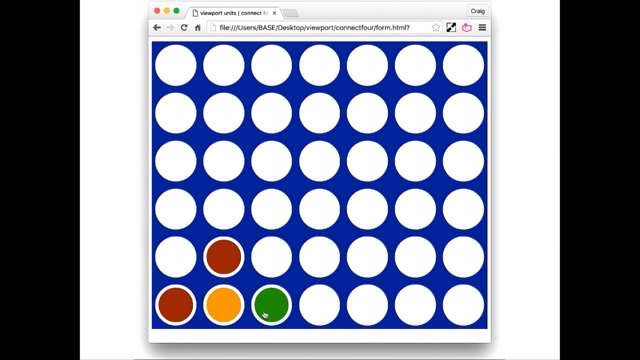
Let's talk about making some things look brilliant. How about the fact that there could be more than topography out there.
I know it's a bit dangerous to say that sort of thing, but let's say how about I think Connect Four is more important than topography.
And here, we've got a grid made up using viewport units. For the squares that the circles sit in are all controlled by viewport units.
We're using vmax, which means that the group we're trying to take its lead from the very largest view that we can get.
When we go smaller it's fine.
Done.
Quite a complex thing.
It's controlled by the browser.
We can now play some Connect Four.
(mumbles), and I got in there.
Anyways, all of that game is done purely in CSS, no JavaScript, not a bit.
Because we're able to focus our attention on the good parts of CSS, we can get rid of the.
Okay, we just do the sizing, do it once, put it aside, focus on making a fantastic game out of CSS. Now, it's potentially true that there's only one outcome that will work in that game.
If you go to Start there and put in the right order. But we've got the chance to use CSS for more than just making your browser look pretty.
But then, speaking of pretty browsers, a chess board. All the browsers we've got come with an inherent inbuilt font, allowing us to make chess pieces.
There's some sexy CSS girls in there.
But the CSS to control the grid is purely done with viewprt units.
Anyone ever wanted to make a thub nail of a website? Well, with viewport units, you can actually make the website itself into a thumb nail of itself.
It's really sexy.
We're focusing on the fun parts of CSS because we're not worrying about making sure that our text fits within a browser.
And you can see that it stays within the minimum 'cause we're using vmin units here.
And the last thing, of course, is how to graph the graphs we use.
In our early part of our presentation, we're all done with viewport units.
And you can see here that the illusory idea of centred in the middle of the page, vertical alignment. (mumbles viewport units.
Very simple, very classy, just works a treat. Which brings us cunningly to the fact that v dubs, vhs, vmins, and vmax are viewport units.
And viewport units are very nice.
Thank you very much.
(audience chuckles) Thank you.
(audience applauds) Here's a photo of my daughter.
This is a great place to work.
Thanks a lot.