(wind blows) - So Ethan Marcotte has been doing amazing things over web for many, many years but most of us probably know him particularly because around six years ago now, he wrote an article that was based on all the work that he was doing in the Boston Globe and gave a name to something which we'd been talking about for many, many years before that.
He gave a name to responsive web design and he talked about the core technologies and patents and practises of that and so, he really kicked off, I think, whether you wanna call it the third or the fourth wave of web design with that very famous and rightly famous article at A List Apart and subsequent books and presentations.
He's really cornerstone of our thinking about the web and so, to kick off Respond here in 2016 in Melbourne, I can't think of no one better so would you please welcome to kick off this morning, Ethan Marcotte.
(audience clapping) - Thanks, John.
Wow. John, thanks for setting the expectation this low. That's incredibly kind of you.
Melbourne, good morning! - [Audience] Good morning! The coffee's out in the hallway.
I don't know if anyone will just walk past it. My Keynote deck is not that impressive.
I just sort of sprint back past caffeine but it is wonderful to be here, wonderful to be part of Respond.
As my first time in Melbourne, I'm excited to be here for the next few days so I thought I'd kick things off with a little bit of a confession in front of you lovely people which is specifically that my name is Ethan Marcotte. I'm beep on Twitter or RWD if you don't like gifts and my confession is that I am a impossibly, impractically lazy person but I'll get to that in a minute because the first thing that I'd like to do today is tell you a little bit of a story about a tree.
Now this is a very special tree located in a very special forest specifically this is the Pando Forest which is located back in the United States. It's in Utah and if you happen to know the state pretty well, it's part of the Fish Lake National Reserve. It's fairly good-sized forest, Pando is, at some 40-odd hectares in size and as you and I are travelling through this wonderful forest looking for this special tree that I've told you about, we are surrounded by some of the most beautiful tree trunks you might have ever seen in your life.
These beautiful white trees that are just shooting up out of the ground in front of us and there's some 40,000 of them in Pando but the thing is is that after some time of travelling through this forest, I turn to you, I tell you that I've lied to you, if just a little bit because the thing is is that Pando isn't a forest, Pando is just one tree.
You see, Pando is actually the Latin term for I spread and that's what's known as a clonal colony. It's one giant quaking aspen tree so each tree that you and I might see with our eyes is actually just one stem.
Each one of them spreading up out of this massive underground root system that they all share. Now Pando's age is actually a matter of some debate in the scientific community.
Most seem to agree that it's roughly 80,000 years old although there's some scientists who suggest with evidence that its age might actually be closer to one million years but regardless of which side of the debate you have to fall on, Pando is both one of the largest and one of the oldest known organisms alive on the planet today.
This is a talk about web design, I promise you. The reason I love this story is because I think in recent years, we've started to see web design's forest for its trees that we've moved further and further away from this idea of a page, of this abstract system of columns and rows that we then fill with stuff and we understand now is we moved further beyond the desktop that our design practise has to begin a level below that. A good friend of mine, Trent Walton, once wrote this beautiful essay about his transition from kind of a responsive design sceptic into somebody who I would argue is actually doing some of the finest responsive design work out there today and he talked about how he traded the control he had in Photoshop for a new kind of control and you'll notice he doesn't say less control but a new kind.
One of which he could use flexible grids, flexible images, and media queries to build not a page but a network of content that can be rearranged at any screen size to best convey a message and that is a beautiful, wonderful line and it's a wonderful image because I can't think of anything else that perfectly encapsulates the transition that's been happening in responsive design discussions over the last few years, right? We understand now that this page, the sort of canvas in thinking that we used to practise, of creating a canvas in Photoshop and filling it with stuff, isn't necessarily robust enough to deal with our design needs as we're designing for more contexts and devices than ever before and in fact, our work begins by understanding the components of a design, the individual pieces of UI and understand how they might change and adapt at different rates and it's only by doing so that we can stitch together everything to build these complex, nimble, responsive design systems that are accessible to more devices than ever before. And I have to say, every time I give a talk like this, it feels terrifying to be the guy talking about responsive design some six years later because I honestly believe I wrote an article, I hit a publishing deadline and I kinda thought that was gonna be the end of it and I wasn't prepared for the kind of excitement that responsive design generated and still generates today, from designers and small agencies that I deeply respect and admire, from brands and major publications experimenting with the flexibility at the heart of responsive design, or maybe more accurately, at the heart of the web, and designing these networks of content, these robust, responsive systems that can access, be accessed anywhere in the world, that can broadcast themselves to screens both large and small, to reach more devices but maybe more importantly, more people than any other point in the web's very short history, than we ever been able to do.
At least speaking for me personally as a responsive designer, it's maybe one of the most exciting times to be working on the web today but here's the thing, I think it's safe to say we have a little bit of a tough job.
I mean, don't get me wrong.
Working on the web is by no means the toughest profession out there but we have our fair share of challenges, I think it's safe to say and you're gonna be hearing about a lot of them over the next two days, right? And most of our challenges usually tend to be represented by things that look a little bit like this, by all these amazing and terrible devices that we're being asked to design and build compelling experiences for but it's not just about individual device classes, it never really was.
We're dealing with more operating systems than at any other point in the web's very short history. We're dealing with more input mechanisms than we ever thought we'd ever have to deal with when we signed off to work on the web and some devices that can't be neatly categorised into analogue or touch.
Some of them actually marry multiple input mechanisms in really effective ways.
We're dealing with displays of varying colour density and degree.
In other words, we're at this point now where the words we used to refer to these devices most broadly, tablet and mobile are so broad and so inexact as to be completely unhelpful in addressing the scope and complexity of what we're trying to build on a daily basis and I suppose Google Glass is in there somewhere too. I'm a massive fan of the platform but the problems kinda keep compounding themselves, right? Every time we show up to work, it feels like there's a new device or a new browsing context that we weren't aware of a month ago, much less a year ago.
For example, in certain parts of the world, handheld gaming consoles are massively popular ways to access the web.
We're dealing with hardware and software vendors who are actively experimenting with new interaction models and just unleashing them on the general populace and the users of these devices expect that our sites and our services are just gonna natively work and let's say, split screen UIs that are being quite popular this year.
And the network that we use to browse the web on a daily basis, to publish our work is far more broadly accessed today than at any other point in its history but it's also far more volatile and much less reliable than we might like to think it is and it's definitely not informing the way we talk about good design for the web today so I don't know about you but I would like to stand up here in front of you wonderful people in this terrible jacket and say that, "I can look at all the challenges "in front of us, right?" These new devices that are just sort of hitting the marketplace, these new interaction models that our users are expecting our work to work with, the fragility of the network and I'd like say that I have a perfect solution crafted for every single one of these problems but more often than not, my response tends to be one of laziness.
I get more than a little bit negative.
Most days, I get very, very sleepy and frankly, I just wanna go back to bed most of the time. "Always leave with a gift," mom said.
She didn't actually say that.
Think about laziness.
It's a really, really interesting word because we use a lot of language in our daily work to talk about our designs, to talk with each other and our teammates, and as we do so, there's a lot of subjectivity that comes into play.
I could be talking to you about a mutual friend of ours. I could say that this person is a daydreamer or incredibly logical or I could describe her as conservative or a liberal and depending on who you are and the values that you hold dear, you could hear either one of those words as a compliment or a complaint.
Laziness does not have this problem, right? Everyone just sort of universally agrees that this is a terrible thing to be or to aspire to, right? That if you are a lazy person, you are not your best self. You are not producing your best work but I wonder that maybe the picture's a little bit more complicated than that with all the challenges we're facing today on the web.
There's this quote that I love by a man named Hugh Prather who once said that, "My anxiety doesn't come from thinking about the future, "but from wanting to control it." And I know at least for me and my practise that's definitely the root of a lot of my stress. I look at all these challenges that we know about today and all the challenges we don't know we're going to face in the years to come and I absolutely feel that the need to control it, the need to perfectly anticipate every one of these problems and craft that perfect solution is what's causing a lot of my anxiety so I wonder if maybe a little bit of laziness applied intelligently to web design could actually be a little bit of a virtue and actually give us an answer to solving some of these problems in a more effective and long-term friendly way. In other words, maybe we need to look for more areas in digital design where we start to let go of that need to perfectly control that outcome intelligently, of course, but maybe a little bit of laziness could be really of a help rather than a hindrance so this talk is kind of an open meditation on laziness as I've started to see it manifest itself in my own practise over the last couple years and I'd like to talk about it in three specific areas and then maybe at the end of the day, we could have a little bit of a conversation about whether laziness could be a help for you or whether over the course of 50 minutes, I've just ended my career on the stage in Melbourne so with that, let's get started.
I'll talk right about layout.
Now laziness, at least in terms as it applies to front-end design and development, I really think of just introducing a little bit less code, removing a layer of complexity to get a net result that's maybe better than the one we originally anticipated and this had definitely been manifesting itself in recent years with the layout systems I've been working on for my responsive designs. This is a very recent example that I worked on. My good friend and colleague, Karen McGrane who will be wrapping up the conference tomorrow, we co-host a podcast and in it, we actually recently redesigned a website so that we could adopt a little bit more of a grid-driven layout so that at a glance on a widescreen display, we get a greater breadth of all the different episodes and interviews that we've conducted over the last couple years. Now the nice thing is that after working on a few responsive design systems, if somebody were to hand me a comp of this layout and start talking about how we'd actually implement it mechanically, well, I could look at a three-across layout like this and I'd know that there are certain components that I'm just going to need to make this layout work so for example, this particular layout in this three-across view, we ended up using floats for the layout.
Don't throw anything, please but in float-driven model, there are certain things that I know that I need in order to build this particular grid system. Because it's a flexible grid, it is a responsive design after all, I need proportional widths and gutters assigned to each one of those elements and also I need some directionalities and actual floats applied to those cells to build this three column view.
Now that's not quite everything I need.
There's a little bit of fit and finish work that needs to happen.
The first thing that I need is I need to ensure that the leftmost cell in every single row is set to clear all the floats that precede it so I can have a nice row of three cells at this particular breakpoint and then finally, the rightmost cell in each one of these rows needs to have the margin removed from it so that it sits flush against the righthand edge of the design and we'll get rid of those unsightly floatrops that are so famous with the float model.
Now in the old days, six months ago, in order to actually get those three components in place, I'd probably need to go into the markup and actually address those cells specifically, right? To say that this is the first cell in each row and that this is the last cell in each row. The challenge with this is that this limits the markup to one particular breakpoint of describing a specific outcome in my HTML and what's more, there is so many wonderful tools in CSS that allows to abstract these layout rules out of our documents and move them up a layer into our style sheets.
Now, again, this is a very modest layout that you'll hear about floats.
You're gonna hear about so many more advanced layout rules over the next few days like template layout and flexbox but at least for this very modest design, one of the tools that I leaned on very heavily is something that I use in my entire responsive design practise which is nth-child from CSS3.
This is a very easy way to directly address individual components of a design based on where they sit in the overall document structure so for example, let's say that I wanted to apply some rules just to the second cell in the grid.
I could do that by saying episode:nth-child two to basically immediately select that second episode that's the second child of its parent.
This is completely useless.
Why would I ever do this? But nth-child gets really interesting when you start to say things like nth-child two n and what that allows me to do is it immediately select every even-numbered cell in this particular grid. This works because n is counter.
It starts from zero and increments by one each time which then turns into simple multiplication. Two times two, two times one, two times two, and so on and so forth.
It doesn't matter if there are 20 cells in this grid or 20,000.
This one selector has immediately picked out every one of those even-numbered cells in the grid and applied some rules to it without having to muddy the markup up with these presentational classes.
Again, for this layout, totally useless.
You'd never do this but nth-child gets great for this particular breakpoint when I say something like nth-child three n to basically select every third cell in the grid to remove that righthand margin and ensure that it's flushed against the righthand edge of the design and then I can also complicate things a little bit more by saying nth-child three n plus one to select every third cell in the grid but this time, I'm starting from one rather than zero and as I do so, I can then clear every single one of those floats to ensure that every row of this particular grid is a nice, discrete grouping of three cells and I've been able to do all of these without actually having to touch the HTML.
I now have a completely proportional grid that never described itself in the document and just by using two selectors, I can quickly build out this layout, ensure that my flexible layout works perfectly. This is not super useful yet but where this gets great is because I haven't actually muddied up the HTML with any kind of descriptors for the grid system, I can very quickly build a responsive layout that begins, let's say, with a baseline design, a mobile-friendly layout that actually doesn't have any kind of grid system outside of the media queries. It's a small screen friendly layout with tasks and features sorted from top to bottom but then as with any responsive design, I can start widening the viewport_a little bit and look for opportunities to enhance the layout and then at a breakpoint of around 44 ems, I can move to a two-column layout by using nth-child two n and two n plus one and that I could repeat the process, right? Because I haven't described the grid system in my HTML, I can make things a little bit wider still and then at breakpoint of 68 ems, I can move to that three-column layout we just looked at by using nth-child three n and three n plus one. I think you can see where this is going.
Because we're not describing the ideal reference grid in the HTML, we can use content-driven breakpoints and lightweight selectors like nth-child to very quickly spin up new breakpoints whenever we want to and what's more, we're no longer constrained by some sort of outer boundary.
We have so many wonderful tools available to us in the CSS specification including nth-child, including flexbox, including template layout that allow us to step back out of this need to perfectly describe our designs in our HTML and instead, build these grid systems that are effectively infinite.
We can build responsive designs to look beautiful on the widest screens possible and then reduce themselves down into something that's incredibly compelling and useful at the smallest one.
It's an incredibly exciting time to be working responsively. If we're being just a little bit lazier in how we talk about our grid systems which means this is probably an ideal time to talk just a little tiny bit about the F word, specifically frameworks.
Now let's be very clear.
I love third-party frameworks.
I use them frequently in my practise, right? I often use them mainly for prototyping, to get ideas down on paper very quickly as it were, to get them in front of clients so we can talk about content hierarchy issues and breakpoints that we might want to introduce and talk about a prototype before we've actually begun the design process in earnest and if you're just learning about CSS or responsive design, I think these are wonderful entry points for understanding the mechanics of page layout and at an organisational level, frameworks like this, these off-the-shelf patterns of HTML and CSS, take a lot of the ambiguity out of page construction, right? You can use something like Foundation or Bootstrap to quickly build a responsive layout across very large distributed teams and take some of the guesswork out of the design process. I think they're wonderful utilities but they're also very heavy and when I say heavy, just to be clear, I'm not talking about the performance constraints that might be introduced by a third-party framework like Foundation or Bootstrap although the extra code and markup and CSS that you inherit to work with page layouts like this could definitely be a consideration but when I say heavy, I mean they're conceptually heavy, specifically I think they're all very much focused on this idea of a page, of the sort of canonical reference layout that's usually defined in 12 or 16 columns and then they use sort of markup structures to articulate when and how that reference grid is going to adapt at certain specific rote breakpoints and I wonder if with all the challenges we're facing, with all the devices we don't know about today, much less tomorrow, I don't think that these are gonna be nimble enough or robust enough for some of the challenges that we have. There was this one wonderful video that popped up on YouTube recently and I'm a little sceptical about smartwatches as an emerging browsing marketplace but there was this one example of somebody browsing through the responsive redesign of techcrunch.com on an Android Wear device using a browser on a device that hadn't even been invented yet when they launched that responsive redesign so that's why I wonder if these frameworks aren't necessarily gonna be suited for some of the challenges, that talking about specific columns and classes alone aren't necessarily gonna be robust enough for all the challenges that we don't know about and all the devices that we don't know about and instead, I think we need a better model for frameworks, for designing on the web today.
I've been reading a lot about the early days of modern animation where you had people like Winsor McKay and Max Fleischer who are really the forefront of defining what animation could be for Western audiences and they were, over 100 years ago, producing breathtaking work, right? Especially Winsor McKay, his draughtsmanship is still unparalleled today. This is beautiful, stunning stuff at the forefront of defining what animation could actually be but I don't think it's taking anything away from their many accomplishments to say that this work feels early, it feels very much of its time, right? You can sort of see where frames are being recycled so they could cut down on the massive amounts of work they had to do because they're literally hand-drawing every single one of these frames and the character's movement doesn't quite feel right, it feels a little bit mechanical, it feels a little bit early.
Now this is partly because these guys had a tough job. They didn't have the benefit of kicking back in terrible jackets and talking about best practises in animation design, they were defining a new medium, much like we all are today on the web.
We're trying to figure out what we can actually do on this thing but it wasn't until a man named Walt Disney came forward and formed his studio that people started to take animation incredibly seriously, not just as a commercial venture but as an art form for expression.
It feels kinda weird to say that, right? You hear the word Disney and you think just the epitome of mainstream but this is absolutely true because when people saw Disney's very simple, very straightforward drawings on-screen for the very first time, there was something there that hadn't been there before, there's something human, almost real.
There's this line that I love by a man named Marc Davis who was one of Disney's original animators who said that before Disney founded his studio, "Animation had been done before "but stories were never told." Now that is a powerful shade being thrown at everybody who predated Disney but I think there's something to true to that because Disney's drawings weren't technically more complex than many of the other people working alongside of him. In fact, they're a lot simpler than most of his peers but when those drawings were coloured and animated, they felt real, they felt human.
Now this wasn't because Disney himself was an incredibly talented illustrator or that he was an incredibly talented animator. He did, however, hire some of the best but Disney himself was an incredibly exacting director and a demanding one by all accounts.
In fact, he asked every one of his staff members to be able to produce drawings that have what he called, "A caricature of realism, "an illusion of life." That is a massively tall order.
I would not want to show up for my first day of work and being asked to, I don't know, somehow design five caricature of realisms before lunch.
I would walk off my job but this line, "An illusion of life" eventually turned into the title of a really wonderful book written by two of Disney's original animators, gentlemen named Frank Thomas and Ollie Johnston and if you ever get a chance to get your hands on a copy of this book, I would wholeheartedly recommend it.
It's funny, it's accessible especially for a book that by all accounts, is an incredibly technical book and in this book, Thomas and Johnston are actually talking about how they managed to live up to that incredibly high standard that Disney set for his entire team, how they actually managed to produce illusions of life and in it, they're not actually talking about the pencils that they used on a daily basis or any production workflow tips, instead they're talking a little bit more broadly. They're talking instead about 12 concepts that have since been become known as the 12 basic principles of animation.
When you're watching an animated feature or a short film, you are, in many ways, influenced by some of these same principles.
Now these principles were recently adapted into kind of a really cute animated format and I thought I'd play a very brief excerpt to give you a quick idea of what the concepts are. - [Voiceover] The following has been paraphrased from The Illusion of Life by Frank Thomas and Ollie Johnston.
Squash and Stretch, this action gives the illusion of weight and volume to a character as it moves.
(playful music) Anticipation, prepares the audience for a major action the character is about to perform.
Each major action is preceded with specific moves that anticipated for the audience what is about to happen.
Staging, it's the presentation of an idea so that it is clear. (bell rings)
- It's a really cute little video.
I would totally recommend checking it out and it's not a perfect translation of the 12 basic principles but it gives you enough of an idea to sort of communicate what it was that these principles meant to Disney's animators.
These were terms that they could use, a shared vocabulary they could use to talk about work as it was evolving toward production so they could look at a character, for example, as it moved from one end of the frame to the other and ask themselves, "Did it have enough squash and stretch as it moved "to perfect represent a specific emotion or feel?" If a character was about to throw an object, "Did the arm properly staged the event "that was about to occur before it actually did?" In other words, these 12 basic principles, as Disney and his animators used them, were a framework but not a framework in the web sense, the sort of prescriptive list of items they would have to check off in order to produce these illusions of life, instead this is a way that could talk about their designs to assess their quality and how well they were actually being implemented. In other words, this was a much, much lighter way, sense of the word framework and I wonder, with all the challenges that we're facing right now, if this is the conversation we should be having because I really feel in the columns and classes alone or atoms and elements aren't gonna be robust enough for some of the challenges that we have.
These are the kinds of frameworks we need as digital designers working with our clients and our internal teams to talk about the quality of our responsive designs as they're evolving and moving beyond one device class to another because as much as we sort of dump on print for being sort of the old, outdated medium, this is a conversation they've been having for centuries, if not longer.
There's a wonderful example just recently that came out of the rebranding of the Whitney Museum den back in the United States and this is a beautiful, simple, minimalist logo that's also incredibly versatile.
In fact, it's really funny because the designers of the logo actually called the responsive W and then they proceed in the brief to say for literally five paragraphs about how this has nothing whatsoever to do with that cute, responsive design thing those web designers are doing but I think this is really beautiful, right? I mean, it's incredibly evocative especially for something as simple as this and as I mentioned, it's incredibly versatile. It can incorporate artwork from upcoming exhibits in the museum to talk about very specific events that are on the calendar.
It can also be encountered online and offline at various points in the user's days.
Now for a logo with dozens, if not hundreds of different applications of this, you might be sort of thinking that there's an algorithm sitting in a closet somewhere like printing out massive complex numbers to sort of spew out all these different logos. This is where it becomes clear I've never actually seen an algorithm but instead, what the designers did was they came up with an incredibly lightweight framework to describe how these logos could be designed and how much more versatile they could be than if they'd been very prescriptive because what they said was that if you have a specific piece of media, you know that you have certain fixed elements that you'll have to incorporate for that particular application and then with the remaining space, all you have to do is divide it into four equal lines and then it becomes a matter of connecting the dots from the top of the first line to the bottom of the second to the top of the next and so on until you've completed your responsive W.
I think this is a beautiful framework and this has a very rich history that I think we can draw upon and what's more, print designers have been doing this for centuries, thinking about how design systems need to adapt from one kind of media to another. One famous example would be Karl Gerstner who's a Swiss designer who was working in the middle of the 20th century and talking about this very specific problem because he did an incredible amount of branding work and thinking about how it was going to need to change and adapt across different sheets of paper or different classes of media was incredibly important to him so as a result, what he ended up doing was investing a lot of time in designing frameworks that would allow him to spin up variations very quickly. One of the most famous examples of this would be something that he called The Morphological Typogram which, to me, suggests that Mister Gerstner was incredibly fun at parties but because he did so much branding work, what he did was he kind of looked at the body of work that he had been producing and he then sort of determined that every mark that he created had four broad characteristics and each one of those characteristics could then be broken up to subcategories which then could be sort of broken up into specific kinds of outcomes or results so in other words, he could quickly spin up variations of a work marked for a client by selecting different features from different points of the grid and figuring out different combinations that could be potentially pleasing to him and to his clients.
In other words, this was a framework that could support future designs.
It's a framework that would support future creativity rather than constraining it to some specific outcomes. In fact, Gerstner once actually said that, "Instead of solutions for problems, "we should be designing systems that then produce solutions "for no problem is there an absolute solution. "There was always a group of solutions, "one of which is best under certain conditions." And I think this is a really beautiful way of thinking about frameworks because more often than not, our responsive designs aren't organised in terms of neat groupings of columns and rows that break from 12 columns to nine columns to three, instead more and more especially on the more complex interfaces, we're dealing with a network of small layout systems, individual components and pieces of design that are, in fact, themselves responsive.
Certain elements might have more or fewer breakpoints than the other and figuring out where and how those elements adapt is really kind of a large part of our work so that's why I think it's so critical right now with all the challenges in front of us if we should be moving past these off-the-shelf frameworks and designing frameworks that allow us to talk about how and when those changes need to happen so how does your team or organisation talk about when a breakpoint in this had been introduced for a particular element in your design? How do you make some of those decisions? Because, again, it's not just about columns and rows or atoms and elements, it's about establishing a framework that works for your team and for your organisation and that might be different than every other person in this room.
Thankfully, this conversation has been starting over the last couple years.
We've had designers talking about the success that they've had in designing these frameworks for conversation about responsive design.
One of the best examples I've seen recently was Nathan Ford wrote this wonderful article for A List Apart on designing content-out layout, how we can capitalise on some of these principles that Mark Boulton's had when we need to start from small and build more complex systems out from there but he basically found that at a lot of the languages that he used to make decisions about where and when adaptation needed to occur was actually driven directly from graphic design, from the constraints of the printed page using terms that print designers might use, for example, to look for fault lines in their layouts. One other great example would Sevens where an image would be shortened as its width gets scaled down, creating these unsightly gaps underneath it. That's an opportunity for a breakpoint.
That's a point of adaptation in your responsive layout. Looking for Drifts, for example, where elements get too far removed from their related content creating these unsightly gaps and then conversely, you might have Pinches where elements get a little crowded, they get a little too close to elements that they might not necessarily be relevant to. You'll notice that all the parts of the language that he's using don't focus on device classes or columns or specific screen sizes.
He's looking at the content he's actually designing and looking at where things start to feel uncomfortable and then using that to drive a decision about where a breakpoint needs to occur because for so much of our work, moving past these stocked systems of columns or rows is really just about making it fit.
That's what we've been doing up to nail this point, making sure that it looks good on some of these individual device classes but I think with more nimble, more conceptual frameworks, we can really look for opportunities to build better design systems so we don't have to just worry about making them fit, we can make elements feel at home regardless of the device that they're being rendered on and one of those element classes that we have to design more often than not is incredibly challenging because making navigation systems feel at home is something that we're actively working on as an entire industry and there's a lot of experimentation around responsive navigation, right? And I wonder if there maybe is an opportunity for a little bit of laziness here.
Here's one example, this is fivethirtyeight.com. This is a news, politics, and entertainment site that's based right in the United States and they've adopted a fairly common pattern for the widescreen view of their responsive navigation where they have these menus that tease content from each section but those are just widescreen enhancements because below a certain point, the navigation dramatically simplifies itself just down to a list of five or six lengths, just the primary nav.
There's coop.se which is a beautiful e-commerce site and their navigation undergoes a number of breakpoint changes moving from a horizontal list of lengths to a vertical one and back again but they've also adopted this off canvas menu pattern that's fairly common, I think where you'll have a list of navigation items that are sort of accessible off canvas like it's an actor waiting offstage, waiting to be pulled into view by the user. Walmart.ca, this is sort of the first Walmart property to go responsive before they rolled out their global platform and they also adopted this off canvas pattern so while the navigation's visible by default on wider screens, on smaller ones, again, it's sitting just off in the wings waiting for the user to invoke it, to pull it into view so there's a lot of different experimentation with the responsive navigation patterns that's happening right now but I didn't point out that the one element these examples all share is your good friend in mind, the hamburger. Is anyone else hungry right now? Is it just me? Let's talk about hamburgers for a second.
Hamburgers are massively popular, right? Online and off, sure but from a digital standpoint, the reason they're so popular is because they're so terse, they're so concise. It's this wonderful stacking of three simple bars and they're very easy to incorporate with a little bit of SEGs you'll hear from Sarah a little bit later or maybe some Unicode if you're one of those Dungeons and Dragons playing people but the thing is is that I wonder if maybe folks, maybe we just need to talk a little bit about hamburgers because I worry that our industry has just the tiniest bit of a hamburger problem.
Now I'm not gonna bore you with data or statistics but there's some examples here that maybe suggest the icon is not as robust as we need it to be because the interesting thing that I learned some time ago is that this icon, this hamburger actually has a very deep and real cultural context that has a definition, specifically this is the Chinese trigram for sky or heavens which, at least for me, feels like a little bit of an arbitrary choice for tap or click on this thing to get directions to a restaurant but maybe that's okay, maybe we can respectfully and humbly appropriate things from other contexts or maybe they can take on their own definitions over time but I also think there's some indications out there that the hamburger is not working quite as well as we might think it does.
This is the responsive redesign of time.com which is a beautiful responsive site.
It's incredibly dense and if you want to talk about balancing multiple tiers of navigation, I actually think they manage it quite well. It never feels too overwhelming but you'll notice that time.com did decide to hamburger themselves on widescreen or small screen layouts.
The interesting thing they did is that the hamburger icon has a label of menu and then when they first launched the responsive site, you'll notice that there is an overlay that appears for first-time visitors to explain what the hamburger actually does and then if your device happened to have a mouse attached to it and you could hover over that icon, a tooltip would appear that explained click here to show its site navigation.
In other words, this hamburger icon has about 58 levels of help text.
This suggests a possible number of things to me. One could be that maybe the stakeholders involved in the redesign didn't feel comfortable in the icon clearly communicating itself to Time's readers or perhaps more accurately, maybe the icon didn't perform well in acceptance testing before they launched the redesign so they felt some additional text and some helper information would actually be valuable. This, at least to me, is a really wonderful reminder to test any navigation systems especially icons are the ones to ensure that you are not introducing a single point of failure before you roll out your responsive redesign but I also think the ability to conceal navigation is problematic potentially, potentially.
This is the responsive redesign of disney.com and I think this is a very straightforward and beautiful responsive layout especially for such a major brand.
You'll also notice they have hamburgered themselves but the interesting thing was is that once the design gets small enough, if you tap or click on that hamburger, that off canvas menu is going to appear and in it is contained every single link that's ever existed on the World Wide Web.
(audience laughs) If you're looking for the GeoCities page you worked on back in 1997, I'm very sorry to tell you it's around level five. (audience laughs) I'm officially trolling but I do think that we run the risk of because we can hide certain parts of our design and hide complex pieces of content like navigation systems, I wonder if we're creating these patterns that allows us to present these immaculately tailored, first look designs.
When somebody comes into this room, it seems incredibly well-ordered but then they tap or click on that hamburger and that off canvas menu appears and inside of that drawer is all the shit we didn't wanna deal with during our redesign process.
(audience laughs) This, at least for me, is a reminder that we can't avoid these hard discussions. The ability to conceal navigation is so important and I absolutely agree but I often wonder if by seeing it as a default, we're avoiding some of these discussions about why we should be designing mobile first in the first place.
If we feel we need to hide a certain piece of content or a certain piece of navigation because it doesn't fit on smaller screens, maybe we should be pausing to have that conversation about what benefits it can provide any of our readers widescreen or small screen.
We should be looking for these opportunities to simplify our designs and our content whenever possible rather than simply suppressing information just because it's not convenient and what's more, just simply toggling navigation isn't the only pattern out there and I think by seeing it as a default, maybe we're closing ourself off to exploring new and more interesting responsive navigation patterns. One of my favourites is this progressive reveal pattern I've been sort of calling it.
The BBC News have a really wonderful example of this and so, you'll notice that primary nav in the red band is fairly visible on widescreens but if you tap or click on that More link, you'll see some additional links.
The interesting thing about that drawer though is that as the design gets smaller, they're using a little bit of JavaScript to pluck primary nav items out and move them into that More area.
It's kind of like an overflow drawer.
It's a nice transition point until they get all the way down to the small screen and then they've adopted a full show/hide pattern when the navigation's too complex to fit.
Another example of this would be on The Guardian on their sort of semi-adaptive layout and this is a really interesting navigation pattern. I haven't seen it used to many areas and it's a fairly complex-looking primary nav, right? There's a lot of stuff in it and if you tap or click on that All Sections link on their hamburger, you see a very comprehensive site map of all the topics and features that they published over the entire site but the primary navigation itself, those key links, those are never hidden from view.
In fact, what they've done is they've turned that area into kind of a scrolling region using a little bit of overflow CSS to basically ensure that you can always move through those links either using a mouse if you're using one or using your finger if you're on a touch screen display. It's a really clever piece of device-agnostic design and ensures that primary navigation links are never hidden from the user.
What's more, just adapting the layout can also be incredibly valued.
You don't necessarily need to hide things from view. One of my favourites examples of this would be on Filament Group's responsive redesign and they have a very lightweight navigation, I think it's safe to say but on their homepage, they've decided that that navigation provides important sign postings so it's never actually hidden from the user. In fact, it actually lives natively in that hero area and then when you move into the site into a content-driven page where hey, the content should be a little bit more of a focus, they've adopted a show/hide pattern.
Now what I like about this isn't necessarily of the two patterns that they've used, they're not necessarily that novel but I think the application is nice and nuanced. It's a reminder that the patterns we use don't necessarily need to be global defaults throughout our entire sites.
We can be a little bit more practised and careful about when and how we introduce them and then there's Frank Chimero's website which is one of my favourite responsive designs. The challenge is that he redesigns at about every three minutes but I love this particular layout and you'll notice that his navigation area, while it's very straightforward and simple, is never hidden but as a trained designer, he's also spent an incredible amount of care and time ensuring that it always feels at home regardless of how wide or small the screen might be and I wonder if maybe freeing ourselves up out of this notion of concealing navigation by default, maybe we should be looking for more opportunities like that to be just a little bit lazier, not to necessarily see navigation as a thing that needs to be hidden or managed and maybe we can conserve our effort for some of these bigger challenges that we have in front of us and maybe we can also look for opportunities to have a little bit of play in our designs and spend a little time investing ourselves in animation in our responsive layouts.
Just as a quick example of this, I'm focusing more on interaction, I'd like to tell you a story about a circle I designed recently.
Hold your applause.
More accurately, this is a story about four circles. I don't know what a web application is but I've been told I've been designing a number of them lately and in interfaces that I've been working on, they tend to be very transactional and responsive at the same time and there might be certain parts of the design where you're trying to communicate state change and even in a dry interface, you want to look for those opportunities where you can have some visual interest, introduce a sense of play even on very dry UIs. Now this one four-across picker is a great example of this where we spend a lot of time doing some paper prototyping and some Keynote sketching about how we can come up with a simple animation scheme to communicate state change from one point to the next and what we ended up doing was coming across this sort of three-steps scheme where basically from a row of four elements, a user will always select one and then it would move into the second position from where its original spot was.
Simultaneously, some confirmation and cancel buttons would appear to allow the user to submit or back out of their choice and then the both of those things would be happening with all the sliding transition-y bits that all the kids are talking about today.
I don't talk to many kids.
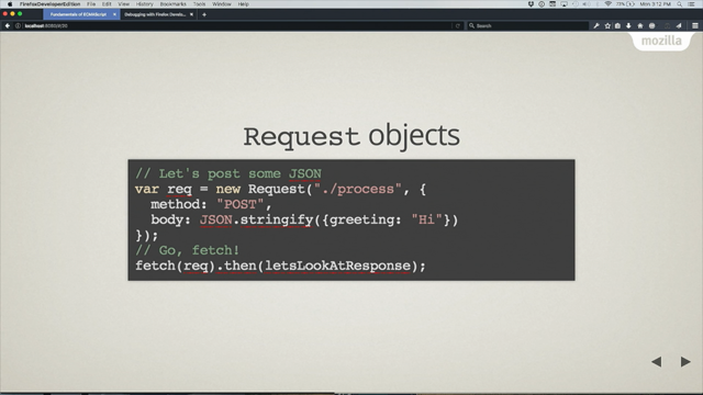
Now the tempting thing when you're looking at a design like this whether it's Keynote or Photoshop or whatever, when you're thinking about actually implementing this is to really focus on the aesthetics, right? To look at the circles of the typeface or maybe the animation work that you're sort of planning for later down the road but I would actually argue that when you're looking at complex, responsive UIs, those are actually the last places you should start, instead I think we need to be asking ourselves how we can move beyond the layout and the animation in front of us and really talk about the underlying interaction, the transaction that we're actually trying to support. If somebody's simply reading content, we should be thinking about document hierarchies but if they're completing a workflow, if they're completing a task, what is it we're actually asking the user to do? We're not asking them to select from circles and look at specific pictures of the doctor, instead what we're actually asking them to do is make a selection from one out of four options and they can only make one selection at a time and then at the same time, we're asking them to either back out of the choice they made, to reset it to its original state or to submit the choice back to the server so in other words, we're not talking about circles or images or text, what we're really talking about is a series of radio buttons, each one of them has a label associated with it that contains the text and image that we'll ultimately be styling and then the okay and cancel buttons that appear in the enhanced UI, those are simple form buttons to submit or reset the form itself.
Now if I showed this to a client, I would be fired but this is the foundation for everything that's gonna follow on top of that because if somebody doesn't actually see the interfaces you and I might, if they're having it read aloud to them, we want to start with something that's independent of the final aesthetic and build up from here so with this in place, we can then start applying a little bit of light styling, right? So for certain enhanced browsers, we could accessibly hide the radio buttons themselves, move them off canvas so that the sight of the users are only ever seeing the actual input that they're interacting with and then we can set the labels themselves to table-cells so they occupy roughly 25% of the row and then finally, we can all use a little bit of border radius to round off all the visible elements on the screen and there's a little bit of extra light styling that occurs around these rules but this really kind of the core mechanic that we need in order to move from those baseline radio buttons up into something that more or less looks like the finished aesthetic that we need. The only thing visible to the user are the labels and the images that have been rounded off. Now this isn't quite perfect, right? Because our major elements are basically sort of stacked on top of each other.
We have two rows rather than one and of course, nothing is sliding around of that fancy, flashy pattern but again, just as with the radio buttons, this is the foundation for the next step, the next step in the journey effectively because what we can then do is with this in place, we can ask the browsers using a tiny little bit of JavaScript in a Modernizr style test if it supports certain animation properties that we're gonna be needing in other parts of the design and if it passes that test, then we could apply class of has-animation to the body allowing us to ensure that we can move to that next step in the styling so with that class in place, what we can then do is basically use a little bit of simple positioning to take those submit and cancel buttons and move them up on top of the inputs that the user is gonna be interacting with. In other words, I effectively just broke the form. I've stacked two elements on top of two options that the user is gonna need to interact with but what we can then do is we can use some scale transforms to take those okay and cancel buttons and turn them into zero-pixel tall and wide elements and turn off their opacity and actually stack them underneath the input element themselves.
In other words, we can then only show the inputs with the labels, excuse me.
Now that show/hide mechanics can be useful for any other part of the design, any other part of the picker that the user hasn't actually selected and that's where this more complex selector comes into play and while it looks a little bit complicated, all we're basically saying is that if our form has a class of .selected, hide all the labels that don't have a class of .checked. In other words, the JavaScript we were actually gonna write for this element doesn't actually have to manage position of elements or is it to control the animation, all it needs to do is moderate the state change so when the user makes a selection, the JavaScript's gonna apply a class of .checked to label that they chose and then apply a class of .selected to the form to signify there's been some sort of change in the internals and when that happens, all the nonselected labels are gonna be hidden from view using those same scale transforms so we have the positioning and we have the show/hide mechanic and then we could finally layer on some actual transitions and animation so we'll define those kind of a global level for the labels and for the button elements themselves and then finally, we're gonna use translateX transforms using relative weights of 100% to nth-child to move elements from their default position into the second one once they've been chosen so in other words, what happens is that basically of these four elements, we know that the second position is the terminus. Any selected element should slide into that position but then when that happens, basically those translateX transforms basically use those units of relative to the width of that particular element and slide it into that spot so the fourth one is translateX transforms 200% of its width to the left into that final spot and again, all the JavaScript's doing is changing classes and the CSS is doing all the heavy lifting so it's going to apply the .selected class when they actually select a specific radio button by tapping or clicking on the label and then all the classes get removed when they press cancel returning the form to its default presentation. Now I realised what I'm doing is maybe a little bit counter to what I promised you. In fact, I'm talking not about designing one interface but three.
I'm starting about talking with foundational, semantic markup as a foundation for everything that precedes it and then moving up with some light styling to more or less move to the aesthetic that we want and then finally layering on the transforms and animation we need to power the finished UI and maybe it's the fact that some of you are excited about another cup of coffee or maybe it's this nice, comfortable room we're in but I'm seeing some crossed arms and some sceptical faces and that's okay because in beginning of the talk, if you remember, I said we should be looking for opportunities to be a little bit lazier and do a little bit less and designing three interfaces may not necessarily feel like the best approach. I would actually argue that this layered approach to responsive design or to UI design in general is maybe one of the laziest ways we can design for the web at large right now, today because I think a well-crafted responsive design in 2016 now more than ever has to be device-agnostic by default. Now that's a nice-sounding term and it means a lot of things to a lot of people but Trent Walton who I mentioned earlier wrote this wonderful essay about how this is a driving design principle for he and his practise at Paravel and he basically said that designing responsive layouts by focusing on layout is really just the first step. We have so many more challenges in front of us. We're dealing with hostile browsers that don't care about perfectly translating our designs faithfully to end user, we're dealing with tiny screens and wide ones as well, we're dealing with incredibly slow connection speeds at the same time as the fast ones, we're dealing with different kinds of input mechanisms like touch screens as well, and he basically said that, "There's more to devices "than just the size of their screens.
"A device-agnostic approach also takes into account "infinite combinations of screen resolution, "input method, browser capability, and connection speed. "Like cars designed to perform in extreme heart "or on icy roads, websites should be built "to face the reality of the web's inherent variability." This is such a key concept for designing responsively or just designing for the web in general.
We should be thinking about digital design for the web as designing for these adverse conditions.
Now what's more, this idea has been at the heart of every major responsive design at scale over the last few years.
The BBC News is maybe the flagship example at this where they just rolled out their global responsive product last year and this is a beautiful responsive design.
It's incredibly fast and it's very lightweight. We all notice on a sufficiently modern device or browser, there are all these lovely little UI niceties throughout menus that expand in place or tabs that show you different content when you tap or click on them, secondary stories that have images associated with them but each of those things is just one view of this responsive design because let's say you're on a less capable device or maybe a slightly less modern browser or heck, maybe your network connection drops, you're still left with an incredibly fast responsive design but the experience is just a little bit different. Those tabs are actually just links that bring you to separate pages where the content natively resides, those expandable menus are just skip links that bring you to bottom of the page where the navigation actually sits near the footer, and those secondary stories don't actually have images associated with them, those images are seen as enhancements, not core content that the user or the reader actually cares about.
In other words, what the BBC have done is they have started with a baseline, basic, accessible, and fast responsive design that serve universally to every browser on the planet and then they conditionally enhanced that baseline up depending on the capabilities of the device or the browser. Now the process they used to determine which view of the responsive design you get is this wonderful process that they call cutting the mustard which is my new favourite phrase ever.
Does your browser cut the mustard, sir? Effectively, all they're doing is using just a tiny bit of code to see if your browser can then handle more code. They're inlining a little question in JavaScript to look for specific features in that browser that by BBC's standards says, "This is a modern browser" and if it passes that test, then they bootstrap the rest of the UI with all those extra niceties that you and I might expect from a modern responsive design but if the browser fails that test or if some of those assets don't necessarily reach the end user, they're still left with the BBC's responsive baseline, an incredibly fast responsive design.
This kind of layered thinking, whether practised at the site level or individual modules, allows the BBC and publishers like them to practise letting go on a global scale.
They don't have to track a massive database of device and browser combinations across this ever-increasing device marketplace that we're all designing for today, instead they can think about their responsive design as existing in one of two incredibly broad experience tiers. In other words, this is maybe one of the laziest ways to design for the modern web and I'd like to applaud them for doing it.
Just a few things to wrap up, I've been covering so many different challenges and approaches today, I know and you're gonna hear so much more over the next couple days but the web is everywhere.
It's every size.
It's on devices both old and new and we just talked about just a few of the challenges that you're probably dealing with in your daily work and I absolutely believe that in the challenges to come, established patterns and third-party frameworks are definitely gonna be part of the solution but they're only gonna be part of the solution because I think in many ways, the patterns we know about and talk about today and the frameworks that we use in our daily work are, in many ways, a snapshot of the web as we understand it right now.
There's this concept in Buddhism of this idea called the beginner's mind where that when you're approaching a problem even if it's one you've encountered dozen times before, you should be trying to disabuse yourself for that prior experience, essentially to approach that problem as though you're seeing it for the very first time with the eyes of a child or with the eyes of a beginner and I don't know about you but as I'm settling in to two days of amazing talks and I'm part of this incredibly intimidating lineup, you're gonna be hearing about the future of layout, the future of design, the future of communication for the responsive web.
I don't know about you but I definitely feel inspired but I also feel like a beginner so as we settle in and we start talking about what's gonna be next for the web and for responsive design, let's remember that there's some value in maybe approaching some of these problems are getting right to work but in some cases, there could be value in doing a little bit less and in many ways, it's gonna allow us to do so much more. In other words, I give you permission to go forth and be just a little bit lazy from time to time and I'd like to thank you very much for your works. (audience clapping) - Thank you so much, Ethan, for kicking off in such an emphatic and challenging way.
(wind blows)