(whooshing) - And now for something completely different. In my own head I gave the title A Tale of Two Redesigns to this particular session and you'll see why well almost from the beginning of when Simon starts speaking.
He's got to focus a bit more on some of the actual implementation details as more of a development process rather than the design process, but also the way in which Kogan.com have gone about their redesign is almost completely the opposite to the approach that Fairfax have and it's not to say either is right or wrong. Of course we can learn from both and different approaches are required at different times for different organisations.
But I think we'll get an awful lot out of this as well. So to tell us all about what up in Sydney we termed gonzo development, would you please welcome Simon Knox from Kogan.com. (applause) (mumbling) - This is a talk inspired by actual events. In the interest of anonymity and I don't want to blame anyone, names and things might be changed.
I'll just kind of tell how I saw it.
Basically gonna talk about this website.
This is Kogan.com.
Internally we call it K3 'cause it's the third iteration of the Kogan website.
This has been around since about 2011 according to Git commits I think and yeah it's pretty solid website.
I like it, spend a lot of time there and it's solid, fine, it works, we sell stuff. But the problem we realised is not everyone is on a screen that looks like this.
Most of them, a lot more realistic, not just like six rectangles hacked together around a picture of a website.
But the real problem began when we started seeing stuff like this.
People are using their phones to view websites and this is not so good 'cause in the ghost version they can sort of see what's going on, but in reality you don't just have a ghosted version when you're viewing a bad mobile website.
Your experience is a lot more like this and I'm not really gonna judge anyone, but I probably wouldn't shop there.
I can't really see what's going on.
I've got kind of one option and then a logo. I'm just gonna leave instead of having to pan around and guess where I'm going.
So the 2011 people were my predecessors and they kind of thought about this.
They thought alright people are gonna use their phones and tablets and all sorts of other crap to browse our site. So they come up with this, the old M dot site.
We've since deleted it just as a spoiler alert for how the talk goes.
But so I don't have an actual copy.
You can just look at this and use your imagination. I kind of talk through how it was and then what we did with it, why we deleted it and how it got there.
So M dot sites are great.
This one in particular was really fast, it was responsive, it was snappy on your phone, it was a single page thing and it was good, it was working well.
But the big downside basically for developers is you've then got two code bases.
We'd add features to the desktop site, they don't make it to the mobile site or we'd have a breakage on one site and then we'd fix it and then the same thing happened on the other site. It's not so good and they were linked to the same back end so back end changes happen and then they break stuff and then your mobile site doesn't work anymore. Not so good.
So...
One moment.
Basically we decided, I don't know when it first started, maybe a year ago.
Just shortly after I started I thought alright I'm sick of this, let's get rid of it and we're gonna make a single code base, single site that is responsive and works on phones and tablets and even small desktop screens, which I'm gonna mention later 'cause that's an undervalued space for responsive things. So this was kind of our target for getting responsive. These aren't super innovative goals.
You want responsive design, you want feature parity across the two, and you want it to be pretty fast.
Like loading full desktop site on a five-year-old phone, pretty shit time. So the speed was a big focus and that was where we thought this is not gonna work with the current desktop site. It's slow enough on a desktop.
So you load it on a phone, on an EDGE connection, and it's gonna take 40, 50 seconds to load. People won't use it, they're gonna leave.
So this was our first attempt.
We called it F5.
In the interest of really pithy naming, it's named after the refresh key on a keyboard for any Windows people.
Not super creative, but I don't know, we were focusing on other stuff for our creativity. F5 was basically meant to be not a full redesign, but it was a refresh, hence the bad pun of our keyboard thing.
But we basically we said okay if we want the site to be fast, we're gonna have to burn it all down. But we can't burn all it all down.
We're just gonna burn down one page at a time and then rebuild that page.
So just using the product page that I pictured on like slide two as an example, we'll just start by adding an image and that's what we did.
The first thing for this was we had new product page, empty HTML file, add product image.
That's good at this stage.
We're going fine, project's ticking along nicely. We're like that's a pretty good site.
That's fast, it's responsive.
Done.
And then like yeah, Simon, that's not really gonna fly. We need some more things on these pages.
So I'm like there you go, buddy.
Now you got a title and now that's almost feature parity.
That's a few of the big things.
All that's remaining is price and add to cart and prices are a little complicated.
We don't have quite this many variations, but in terms of like conditional logicfor prices, there's, I don't know, 50, 60, something.
There's a lot 'cause you get multiples that add up and that's a tonne of logic and it's risky logic 'cause you get prices wrong and it's not great for you as a store if you have like dollar undefined or zero dollars and it's not actually zero dollars. You get in trouble.
I get in trouble, I don't want that.
But it was again like this was as part of what was meant to be a small, low effort redesign, refresh rather.
This was getting pretty high effort.
I was not just focusing on making both these things work and look how amazing they look and they load fast and so that's kind of like enough cognitive overload without worrying about stupid pricing rules and other business logic and stuff.
We've already got working in templates in what is a perfectly okay site.
So this was not so good either and I should have mentioned earlier Kogan has quite a small dev team.
So working on this we had one dev and a designer. We've got about 5.4 devs in total.
The .4 guy's part-time.
You can always imagine like a really short guy or missing an arm.
No, he just works two days.
So we've got five and him.
So we had like two people full-time on this. This is not really something we can do and then people say oh we need this other stuffed changed and I say oh no, we're kind of focused on this right now. Sorry guys, we're not gonna do anything else. And when you're on a small dev team, then that's not really so good and same as even if you're on a giant dev team you have other goals at the time and convincing people at this, even showing them our website doesn't work on phones is kind of pretty hard.
So we needed a way to make this happen, but without just taking people out of action for weeks. So I went with some revised goals.
This was my own internalised, I didn't tell anyone, but we decided we'll strip out the design completely, not even think about making stuff lay out differently, I'm just gonna use the existing style and everything and just make it responsive as quickly and dirtily as possible.
So like all the stuff that people say is boring about web design, that's what I'm gonna pile in here and just make it work, like just classic column reflow and stuff.
The consistent style was while I don't want it to be a redesign, it's in a bit of a shambles.
There was different colours and things everywhere and just as an indication what that was like, I ran a talk called CSS stats, which gives you sort of different colours and font sizes and things and I came out looking like this.
Now, that's a few things.
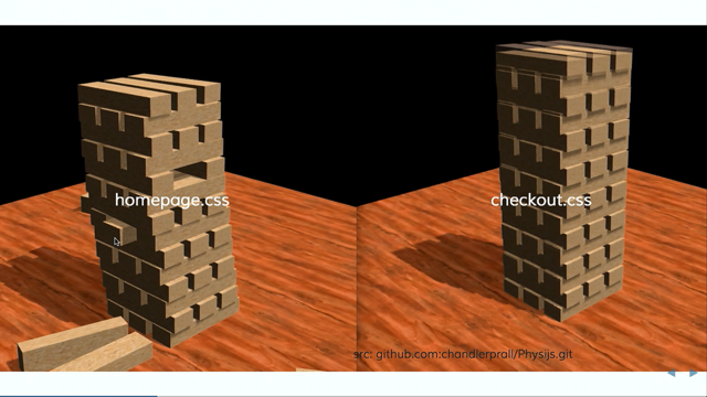
The bad and big thing to notice here is of those colours, a lot of them are just actually just different ways of saying the same thing and similarly with the font sizes, there's like 10 font sizes there that mean 16 pixels. That's not really good in terms of consistency and it means if you want to change stuff later, then random stuff starts breaking and the random stuff starting to break is what led to rule three, don't break stuff 'cause on particularly older, bigger code bases, you'll find that CSS feels a lot like this. So this is how I usually edit CSS.
I kind of just start dragging out my blocks and then you notice some surrounding blocks I'm moving. You're like yeah, I've made enough changes for today and then it's like just as you're doing that, then this other tower, almost in slow motion, the real reason it's in slow motion is this is like a super graphics heavy webGL thing, but this actually happened.
This is how it looked in my mind of just changing stuff and then the other guy just in slow motion falls to the ground.
In real life, it wasn't slow motion.
The checkout fell over really fast and people just stopped buying stuff.
So that was sort of a fire alarms go off, everyone get under their desks and then take a computer under the desk and fix it. But this is what we want to avoid.
So I didn't really have a solution for this at this point. So the easiest way is not to do anything and then you're not gonna break stuff.
But then I thought we can probably go better than that. So I thought if we just go incremental way. So incremental just meant obviously a little bit at a time, but we started off that's how I broke it down. So starting small was like really small and the small part was also known as the going rogue part.
Just make changes so small that no one notices them at all. That's what it means to start small.
I mean literally, I've seen some people logged on to like their work environments and stuff.
If you want to start making changes during the talk, I encourage it, just kind of I'll give you some stuff that you can just copy, paste and push to prod and it'll be fine.
If anyone actually does that, I'll be amazed. But following that, you get into more serious CSS development, which is just hacks and then after that then you want to try to component size things, which just prevents all your other Jenga towers from falling down just 'cause you want to move some of the blocks up to the top.
So starting small and this was just literally going rogue. Don't tell anyone.
You can if you want, if you want to be open about it, you got great team communication and we do and as I'll get to we sort of did eventually tell other people and they find out anyway eventually. But so starting small is you just like load up your site right now and have a look at it and have a real look.
But we're not focused on the code part yet. So ignore that and just look at the actual site and so the first problem that we've really got here is old mate red button.
Red button is somewhat important to us as an online store. That's the add to cart button.
So given that's now mostly obscured and off screen, that's a pretty obvious starting point for the problem. This guy is a fixed width container and fixed widths are the number one enemy of becoming a responsive and they're also like the number one easy thing to fix. So we start, well I said we were gonna start small and then I've picked like the biggest element on the page. Small doesn't mean physically small 'cause we're dealing with screens and there's not physical sizes to anything. Small in this case just means something that's an easy like small code wise and easy to change and make better.
We basically start with this, which is 1,000 pixels. That's kind of obviously and understandably bad. Not everyone has 1,000 pixels.
I don't have 1,000 pixels in my eye width.
I don't know what real resolution of eyes is, but it's probably not that wide.
So we need something better.
So we do this.
That's setting a max width so it won't get any wider than 1,000 and the actual width is 100%.
That's like obvious, hopefully most of you know this, that means if you start shrinking down the screen, it will just be 100% of the available space and like that you're now certified responsive technically. But you don't want to do that yet.
Like A, that's not a real qualification and more importantly when we said don't break stuff, that means like not just game breaking code changes that break the checkout and ruin lives, but you also don't want, you've got an existing site that people are using and even if it's not ideal, it is working currently or people wouldn't come to your store and you'd close and then be fired.
But none of that has happened.
So basically just need a way to wrap this in some protective code so your work's not wasted, but still no one notices 'cause at this point you still don't have to have told anyone.
So you add a min width of 1,000 and then you're probably saying what are you doing, that doesn't do anything.
But the magic is really in that CSS comment, which says delete it later, and you just basically litter your code with enough of these comments and then you can do it like a single find replace and then your site will just become responsive. So this is kind of seems really dumb.
Like why would you set a min and max width of the same thing and then a hard code width of 100? And this is like the point of this is these are very small changes that it's a definite improvement and you're just doing ground work for future use so there's less to worry about.
Like you saw with the colours and sizes things, you're gonna have thousands and thousands of these and you kind of just get to them one at a time and then you'll patiently, painstakingly get through it. So in the case of widths, we've done the container and that's a good starting point 'cause then you can if you remove that line, then you can show someone oh look, the site is now responsive.
But then you're gonna see the classic condition of CSS bugs, which is stuff starts breaking out of its containers and looks weird 'cause what you'll realise is there's other stuff on the page that for some reason or other has decided to be fixed width at some point. So as soon as you do get below the width and that's just gonna like press together and then break containers and then you get the CSS is awesome type square. So then we get through all those, you just keep changing, you fix widths to be percentages and fix your other containers and things and then it's still fine, but then we got to consider breakpoints.
So shrinking down to a point is okay, but obviously breakpoints is a thing that people talk about and you know you're gonna need.
So people are gonna tell you about good breakpoints and at about this point like the width thing is fairly obvious, but breakpoints needs a bit more thinking. So I just started digging into some CSS frameworks and stuff, you look at your bootstraps and your foundations, you're like these guys probably know what they're doing and they say usually use breakpoints.
These are set to devices and it's a personal preference thing, but I don't think these are particularly good breakpoints for a couple of reasons.
You've got obviously devices are gonna change. Like 375 still strikes me as quite an odd device width. And secondly, not everyone is on a damn phone. I just sometimes have really narrow desktop browser windows. I don't want people to think I'm on a phone and make touch screen assumptions just 'cause my screen is narrow.
So sort of by thinking about devices too much, then you're focusing perhaps on the wrong things, which is just we want to make the site work on small screens as quickly as possibly and not have anyone notice.
So basically you just pick any numbers.
We went with something vaguely like this, but you're gonna change them anyway and when you're earlily setting your breakpoints and just doing some experimenting, just try changing them just or if someone else makes them then change their breakpoints.
It's like a good test that stuff is being done correctly. If you can't just randomly change someone else's breakpoints by 20, 30, 300 pixels, then not that much, but I don't know, like 20 to 40 is a decent range.
You should just change it randomly.
But don't use pixels as a side note they're there because people know how big they are, but use ems just for reasons I don't care to go into. But yeah anyway, to actually use them, this was another dig into bootstrap and foundation code, how they do things, and it looks like this. I'll give you a second to read while I have a drink. Anyway, the significant part was the first two lines. So sorry to anyone that read past that.
Basically we've got one breakpoint of 400 and that's fine, but then they've made us use two variables here. That's really dumb.
And the reason for that is that CSS doesn't have like a less than or equal to or greater than operator.
We just have this weird min width, max width junk and I don't want to add two variables just 'cause CSS is not doing its job.
So you can use, I'm gonna mention a bunch of assassin stuff so just pretend it is doing things correctly in the background, but you don't have to worry about it. But the important points here are A, we're just back to one breakpoint, which is convenient, and then we just wrap up the media thing in what I consider an easier to read.
You'll say it's less than this or it's greater than or equal to.
So it's kind of easier if you're a developer. I was just basing this off the WiFi hotspot names from earlier, there's at least a lot of developers in the room. If you're more on the product or planning side, then just grab a dev and they can do this sort of thing for you. Tell them it's really easy and not to tell anyone. But that is kind of all you need in terms of breakpointing stuff.
Just don't do the two variables just to do one breakpoint and don't have off by one areas in all manner of other stuff.
Now you've got some breakpoints in, you've got rid of fixed widths, and now you want to test it.
So you still don't want customers to know that your site's semi-responsive at this point 'cause stuff still probably looks crap.
So you can hide it.
So that's an easy way to hide it.
This is also like a great order resize, a test thing goldish, which just is not super pleasant to actually use the site while it's going through this tool, but it does alright.
You can just add some kind of switch that you can activate with code and this can either turn off all your min widths and that sort of thing or it can, I don't know, do whatever that's doing. Just start randomly resizing the site so you can test it. It's also a cool Easter egg if any customers do happen to find it.
So if you wanted to ploy this to production, then feel free, they'll probably enjoy it and good luck actually buying something with that. And at this point, then I suggest you bring some people in.
Again, like I said, we've got a small team. So everyone at this point already knew what I was doing anyway, but I needed some help. It was like I'd down that five or six widths thing and added some other stuff, but it's like that's about as far as you want to take it. You want to have other people help you and then you can make the changes a lot faster. Just bring them on board.
We didn't actually meet in a room like this. It was just standing by someone's desk, but I don't know, if you want to meet in somewhere like that then they're more likely to do what you suggest. So your mileage may vary.
But at this meeting you're gonna want to tell them something more than just this fix widths and breakpoints stuff that maybe they already know about or it's kind of obvious. You want to give them some advice.
It's not necessarily going to be good advice 'cause that's just how CSS is, but is not bad in a bad way, but I don't know, I'll introduce some bad advice that I've been given by various people that's legitimately bad and you shouldn't do, some bad advice that people say is not best practise, but you definitely should do and just some general hacks 'cause they're good. On the term CSS hack, I read a great article that gave a much better definition than I will, but my definition is like a lot of things.
People say using floats for layout is a hack. But when the guy who coined the word responsive design says he's using float layouts, that's probably okay. They're reliable, they have tested everywhere, experts of industry are using them.
It's kind of a good indication that some random guy on the Internet calling them a hack isn't really justification to not use them. So do use them, they're good.
Don't just feel that because there's new technologies available that you have to start using them. It's often safer to just start using stuff that you already know about and are familiar with. Similarly, you're gonna want to experiment with some new stuff.
Part of what tanked F5 was we were all trying to learn a lot of new stuff.
So we're like oh we can use Flexbox and all this sort of thing.
But what you'll find with Flexbox is it is really solid and great to use, but there's some random bugs that even this one that leads to classic overflow of the container under certain obscure conditions. So these are like again easily work-aroundable, but the act of working around them is a hack. So we've got the old float layout as a hack and Flexbox is still a hack.
It can't really win.
I've just kind of conceded that most of stuff you're going to encounter in CSS is a hack or just CSS has a series of hacks and that's okay. You just will learn them and come across them and get comfortable with them and tell people that they're fine.
I'm tired of just all the guilt tripping around what is valid and correct and proper CSS. There is none.
But this is the legitimate bad advice, don't do it basket. I don't really know what happened between 2006 and 2011. That was like a blurry couple of years for me. But that was kind of when LESS and Sass started to come into the forefront and people were like oh yes you can nest in these languages and it was glorious.
So if you look at code from around that time, before people started telling you not to do it, then there was like some of our legacy LESS code had kind of four or five, six levels of nesting, which is great, but then it's not so good later and then you come to the rewrite and people still say ah nest.
This is the first school of thought.
So I creatively named this incremental redesign K4. I sort of name spaced on K3 and I'm not the names guy so K4 seemed alright.
But the first school of thought says you just name your new class like new dot redesign dot responsive dot whatever. So I just went .k4 and then laid out a bunch of styles. I'm like now they're protected, these styles aren't gonna leak, I've solved the container problem.
The second school of thoughts says just take up all your existing code, wrap that in a legacy class and then don't touch that again. The important thing is you don't do either of these things. We had the great misfortune of having both for awhile. Here's why that's bad.
You've got here a description for a grater, there's a product, and then there's your rapid style down the bottom and then it's just I want to style the product description and that's not gonna work 'cause CSS specificity will just beat you down. So that's kind of any level of nesting you do, even if like ah this is just for basic resets and stuff, it's just gonna backfire later and it can be okay. I'll probably contradict myself in this later and say you can do it, but it's like given a choice, just don't nest and style just classes one deep seems like a pretty good way to go.
And if you really do have that problem of nesting, then this is a hack that is glorious and fixes it and that's the same class name, there's not a typo or anything.
You just can stack a class any number of times against itself and if you had like three levels of nesting then that will beat it.
If you had 10, then you can just do that 10 times and I don't officially condone doing that, sorry. But to get you out of a pinch, if you know this is the only place that you're defining product description, then go ahead. You can say you heard it at a conference and it's okay to do.
But yeah, the pattern I don't want to come out of this is people start doing two product descriptions and later in the document they want to overwrite that so they do three and then further down they do six. That's not a good pattern.
But like in a pinch, this is good and this will get you out of like class and tag selectors, but if you got IDs then it's game over.
Just use important or something I guess or just swap out the ID selector with a bunch of classes is also fine.
Didn't officially say that, but you heard it from someone at a conference. And now this is not a hack, this is not even bad advice. This is kind of just went a bit differently to how I often see variables being used in Sass and other preprocessors.
They say so this is our code from earlier with our amazing min width that doesn't do anything, but I've got 1,000 pixels twice there.
So the obvious thing is just turn that into a variable and the only difference here that's like not even illustrative with code snippets, but it is with files, people often dump all their variables into a file called variables and that's all well and good, but not once you start kind of trying to keep your CSS a bit separate or even just trying to disentangle the mess that you start with. The thing I started doing was if I wanted to make something a variable, I just declared it where I was actually using it and then gradually if I wanted to use it elsewhere, then you move it up and outward and then eventually maybe into variables, but just keep them kind of close to where you're using them and then stuff is a bit less abstract. In terms that might make a bit more sense in these not very explanatory code snippets, this is something I've been really into, atomic design. But going incrementally atomic, like we already had pages, we already had templates, we kind of had organisms and stuff, I thought let's just start with organisms 'cause even thinking in terms of how those things worked in the physical world, it's not like we discovered atoms first and then later discovered dogs. We had kind of the organisms we found first because they're clearly visible and in your pages it's like you've got a form there. So you start planning for the form thing and then later you can break that into, oh god, what's happened? There we go, we can break that down into molecules and again don't do that literally with the animal example of breaking down organisms into molecules, but in design terms, that's fine.
Like if you're starting from full pages or templates or anything, it's kind of good to start at the organism level is pretty approachable and then you can break that down into smaller parts. I didn't get so far as atoms because I didn't want to do those from the outset 'cause I'm really bad at planning and didn't want to overengineer something that would be a horrible and ill-fitting solution. But starting from organisms is where you're actually using stuff.
It's like working from there and then making smaller stuff, then you know it's very suited for the purpose and then you can make it more general later and fit other purposes as you try to combine them. But you kind of get there eventually and it means that again you're not designing a full system of tiny components that you then have to teach people how to use and figure out if they work and then they don't work so you need to rewrite them and then test the whole thing again.
Then again with the Jenga towers.
But so this is just basically start close to where stuff is used and then generalise it as you go and the same thing for mixins.
You know, once variables can only take you so far. So I highly recommend just write some little, short-lived, super basic mixins that do stuff. So in this case, this just does our code from before and takes a width and then we can just use that somewhere else and you get all those joyous effects of responsive that doesn't actually look responsive until you remove the comment line.
But in this case, you can just move it from one place and like you update the functionality of your mixins and all your CSS starts behaving as it should. And again, just the big thing with these is keep them really simple and don't overengineer them because then they're gonna be rubbish and won't work properly and you're parsing at 30 variables because you planned it with 10, but it was the wrong 10 and then someone else needed to use it with an additional five things and it turns into a whole thing.
You keep this sort of stuff very simple from the start and then you can just, I don't know, make it better as you go.
But there are still gonna be some that you're gonna want to steal.
This is an old one.
It's from like 2010, 2011 or something.
It's been floating around for ages and it just makes something one pixel, but then just pushed up so it's not visible and it's like invisible, but still technically clickable I think, but you don't want to have to deal with this. This is not something you should practise and play around with getting right yourself. Just use the existing hacking solutions.
There's tonnes of them and they're awesome. In case you're wondering what the hell you'd ever want to use this for, it's one of my favourite hacks and now widely used on the new Kogan.com is the checkbox hack.
This is not the checkbox hack.
This might be an Easter egg somewhere on Kogan that you just start clicking checkboxes and this happens. If it's not, it will be very soon.
The checkbox hack is maybe something you're familiar with, maybe not, probably is, but maybe you've just forgotten about it, but it's awesome.
What you're seeing right now is practical application of the checkbox hack.
You got that little button at the top is a label that points to a checkbox.
So the checkbox itself is hidden and we wanted a way to do this without JavaScript. So that background there is a checkbox and the browse button is a checkbox and oh sorry these are all labels, not checkboxes. There's one checkbox and multiple labels that point to it and then you can just have these labels everywhere. So you can have 30 buttons that all trigger the checkbox and then you can just have styles that look a bit like this.
You have a menu that's hidden by default and then when the checkbox is checked, then display. That's kind of simple enough I hope and makes a lot of sense.
You can then just add labels and things and you get JavaScript-like functionality just from doing stuff with checkboxes.
If you wanted more complex logic, you could maybe add a second checkbox and then you've got four possible values.
I don't know if you'd want to do that.
Then you're kind of reinventing a computer in CSS. In terms of making just this thing, like the checkbox hack, people sometimes say that's not a hack, that's just an actual checkbox and selector thing. This is getting more into hack territory.
Something I don't necessarily recommend, like styling with IDs there and with the asterisk and misusing a bunch of other things.
But that let's you do something like this.
We can now show to fade in every second menu item in a list that's way up.
You can just have like a bunch of hidden checkboxes at the root of your document and then use them for all sorts of wacky logic throughout.
Just play around and see and if people call you out on bad CSS like at the top there, then they're gonna say oh the selector's really slow. It's probably not.
Selectors don't tend to actually be slow.
Browsers, over the past 20 to 30 years, have gotten really good at rendering the stuff that they were built to render.
So if you start worrying about selector performance, really just get a real hobby I guess.
And finally now, you've got kind of some sufficient hacks and other ideas and things in place, then you're gonna want to enable your site and you don't want to just redirect everyone that hits your site to responsive redesign equals go. So you can just start doing this on your pages. This is viewport and as we've done this incrementally, we still don't have all of our pages responsive. So this sort of thing is still floating around. If you've got a nonresponsive page, it's arguably better to just give people a zoomed out version.
Then they can kind of see where they want to go, zoom in on that.
Still sucks, but if you're manpower limited and need a panic switch for a rarely used page, then that's fine.
For your actual pages, then you just set proper device width and proper zoom level.
The one thing that I didn't include 'cause I don't want people to see it and accidentally copy it and say it's okay is the prevent zoom thing.
This kind of comes back to the device breakpoints. It was popular for awhile to make a fixed width responsive version of your site and then set prevent zoom with a viewport, which means you can't zoom in on small images, you can't, that was really, really frustrating. So don't ever prevent zoom or I will find you. And now we've got kind of some groundwork in place, we've got sufficiently bad CSS, but hopefully you feel okay about it.
I don't know, CSS is great 'cause it's a fault to learn. It's not so great 'cause it's mostly hacks. But we've still got the Jenga problem.
The Jenga problem, not just of it kind of being a fragile tower, but like the quantum Jenga problem of you change stuff and it changes other stuff that you didn't even know existed and then people tell you and that's not good. So the first step of this is you want to kind of if you've got a bunch of legacy code or just code you don't want people changing anymore, then make it hard to change.
This is maybe a bit of a childish approach, but it works.
You can just like either name the file or put in a comment saying please don't change this file or please don't add new stuff to this file. We're trying to go responsive and changing stuff here has knock down effects that we don't want.
Alternatively, just call it unicode moustache dot CSS and then people can't even open the file.
So then it can't be edited.
In the case of preprocesses, it's good to just kind of take it out of the builds step, so that unicode moustache dot CSS is like we didn't call it that, but we've just got a precompiled version of the legacy styles and it means that if someone does it, they've got to jump through a bunch of web hack hoops that I've laid out to recompile it and again childish, but this is effective.
Maybe discuss it with someone first 'cause you could actually get in trouble, but it's mostly fine.
So once you've done that, then now your legacy styles are safe and now you want to wait to change the new good code without it becoming the instant legacy bad code. So this is again on me saying just style stuff with classes and don't nest and things.
But invert nesting is still technically nesting I guess, but it's done a little bit differently.
In this case, we want to style the product, which is this inner div and maybe he's on sale, in which case he's wrapped in an outer div. So oftentimes you just see you have the sale class completely separate and then the product's there. I prefer to keep everything about the product in a product class and then you can nest the parent and in this case ampersand next to sale down the bottom there means it'll be .sale .product. So then you've kind of, the good thing about this is all your product styles are together.
If at some point in the future, Kogan.com stops selling products, I don't know if we'd pivot or something.
It's probably a bit late in the game.
But could happen at any time.
We can now just go into this one file.
If I delete everything in product, I'm like there's now no more product classes, what do we do now? But it's kind of keeping this stuff easily and all in one place just means that it's easy to change and people that are changing stuff in there know what to expect, which is good, and it means you don't have random product classes floating around everywhere.
You've just got all the styles, you've got one thing in one place.
So inverted nesting is basically everything pertaining to a class nested inside of that class.
Where this gets more challenging is things like if you're using BEM, do you nest the child, unrelated elements and things? That's really up to you, that's a later problem. One thing I do insist that you do is the nested media queries.
So when you start talking about responsive redesigns with people, they say oh your site's not just slow now, it's gonna get slower 'cause you're adding mobile dot CSS and tablet dot CSS and responsive, just like these completely separate files as if it's a whole standalone thing.
But in reality and this way, you can kind of again it's the...
You keep everything a product, I don't know, like I feel my screen doesn't care if there's a product on it, but my product does care if he's on a big screen. So this way you kind of dictate changes and media queries and things inside of the class. It's again keeping it componentized there and it means you're not looking at some file 10 miles away just to look at how a product looks on a big or small or whatever screen.
You can I think do that without using the mixin way. You can just nest in regular media queries in Sass and the compile code will look the same, it's still like random media queries scattered around, but this is just a bit more manageable from a source perspective.
And same defaults.
Again, with the nesting pattern, the point is you have most of the stuff about a product should just be not nested at all and just sitting there like font size and then you want overrides for a particular, if you want overrides for a small screen, then just have the one or two things that are actually different.
But for the most part, you don't need like a full set of every possible CSS attribute on every possible variation of every possible type of product. You just have most of your stuff's gonna be the same. Font color's probably not gonna change on small screens. Font size might so that's the sort of thing you want to change. And this is, yeah, I guess this is just me misusing BEM. But if you want kind of absolute protection, you just go wild with really, really long class names that you're gonna style on.
That second one is probably not technically a very good BEM name, but it is fine and it's safer and if I later choose to then get a better name, then anyone's welcome to come up with one, but just I find being overly specific and protective with your class names early on is good. And the second point is, I don't know, it's a thing that we also like to do with Sass. I'm really not into it 'cause then if I do a code search for a product tile price dash dash big, I'm not gonna find this and then I'm gonna delete that class and then anything could happen.
So if you do want to do that, then it's good to have maybe a comment with the full name of the class, but that's again just a bit of consideration for keeping developers happy.
Other developers.
That's kind of a vagueish overview of how we got to where we are.
So nothing's broken really badly in the last 72 hours. So I wasn't even there for that.
But no, it's mostly been going really well. We got to a stage of a MVP of responsive and we switched off the mobile site just based on, I thought it was arbitrary, they apparently knew about it months in advance, but we managed to get it done just within the final leg of it was a number of weeks and turned off the M site and conversion rates didn't hugely improve like some of us thought they would, but they didn't drop to zero, they just didn't really change, which I consider a huge success given we're now serving what isn't a superoptimized mobile site. We're just serving the deskop site with some optimizations. So it's kind of the big thing was just start fixing stuff and then people are gonna tell you oh your design's still shit, you got to worry about speed.
That's all fine and you can fix it later.
We've been sort of optimising slow stuff as we find it, but rather than stressing about all of that upfront, it's better to just start making the small changes as soon as you can and then once that snowballs up and off, then you'll find that your site actually is just responsive.
That is the end.
(applause) - Thanks so much, Simon.
As you can hopefully see why I called it A Tale of Two Redesigns.
Very, very different approaches toward the same kind of outcome.
I'm sure there's some questions for Simon.
There a few in that, some observations yourself, some queries.
But while someone up their hand up and Mel will come find you, but I'll start with one for you, Simon.
- [Simon] Sure.
- So do you feel like you've kind of reached a base camp now? It's almost like with the folks at Fairfax, right from the beginning the goal was to get to the top of the mountain, right, and they had a plan, it was a very structured approach. It seems to me in a way what you're really building for is to really build that base camp and then the next phase starts from here.
Would that be a reasonable analogy for what you've been trying to do? - I think I'm more like we got to the base camp and then build a helipad there and now we're just gonna fly a helicopter to the top of the mountain and cut out all the annoying climbing between the two. But yes.
- So what's gonna come next? How do you see this evolving? What has it, I guess more importantly in a way, what has it allowed you to do? What is this helipad that simply couldn't have existed? I mean it you gave it a couple of goes as you said in the beginning of just alright, this is it, we're gonna effectively do what the folks at Fairfax did and you faulted a couple of times with that. So what's it enabled you to do to allow you to kind of shortcircuit what happened before? - Oh as you may have guessed from the very ad hoc and unprofessional nature of my talk, I don't really plan very far ahead.
- This is why we call it the gonzo approach. - Yeah, so like I said, there's still a number of pages that aren't yet responsive.
So we ultimately want to get those in there and start pushing the atomic design errors in both other directions.
So kind of get some more base components that other people can use 'cause it's still being largely keeping stuff standalone has been important so that we're not breaking stuff.
But allowing stuff to be more easily reusable so people aren't reinventing the same things. - And you see quite a bit more work going into now that the same source base is being delivered across all these different devices whereas before you said well for that bunch of devices we'll give them the M dot.
Do you think now there'll be some more specific design-focused work around what gets delivered into mobile devices.
- At some point.
I would like to still, I guess you can't tell from my boring font choices, I'm not much of a designer.
So I'd like to just keep focusing on the more code-oriented aspects and then get to proper design after that's ready. So just doing kind of cleanup and things at this point. - Alright.
Are there any questions out there? I'm sure there are plenty.
Come on, there were loads that's in here.
Right, right up the back here.
Hello, how are you? Yeah, we'll give you the mic, then we've got it for posterity.
- Thank you.
Thanks, Simon, that's a great talk.
Did you have any pressure put on you to do things differently to the way you did them? - In terms of actually tell people or? - Yeah, like-- (laughter) - That's why you didn't tell them, right? So you didn't have any pressure.
- Perhaps from management did they try and get you to achieve a different goal or push you in a different direction? - No, no, they were all really open to it.
Like we all knew kind of what we wanted to achieve. I wasn't as secretive about it as I said.
Like this was all very loosely based on truth. Everyone knew what I was doing the whole time. But the point was that was just sot of you do that while you're doing other stuff. So I wasn't just actively going rogue, not showing up to work for 10 days and doing other things. This was sort of we'd get other requests coming in and I'd be doing that and say oh here's a fixed width, I'll replace that and so you just kind of make it work around whatever your existing stuff is and in terms of the overall approach, I don't know, that was largely driven by a few of us. So okay, we're doing it this way.
Does that kind of answer what you were going for? - [Man] Yeah. - Hope I didn't.
- Was there one, was there anything that really surprised you about it? Did you get any hard moments about things that you had been doing that were just man or oh that went pretty well? Was there something that came out of it that you didn't expect in terms of perhaps at that really specific level? - I don't know, yeah, it actually working was quite a surprise that we-- - [Host] Well you thought that maybe this whole approach wouldn't work? - It had its moments.
I've just extremed out.
But that's, I don't know, really how to answer that. It seemed okay most of the time 'cause again I was just at the start keeping the changes small enough that there was no harm in having them there and the big thing that with the initial full rewrite thing that we did learn that I liked was that that was like a concerted effort and then code that we then threw away completely. - [Host] So it was the F5? - Yeah, yeah, the F5 one was just completely disguarded and some people don't like to do that.
Once they've committed to something, then they'll just run with it.
Like oh we've invested this much time and effort into it, but the fact that we-- - [Host] Sunk cost fallacy it's called.
- That's the one.
Yeah, I just sort of being willing to throw away stuff that's not working is good.
Like I could have stopped doing this at any time and said well I've got that first.
Someone can pick this up again later maybe. So it's yeah, I don't know, less sunk cost to trigger the sunk cost fallacy, but I don't know, lower commitment means that you can bale at any time.
But still being willing to say this isn't working and stop doing it would have been good.
- [Host] And can you imagine a big bang? Will you design at some point in the future? Or do you think that's still on the table? - No, no, that's out.
(laughter) - Well you know, well no, that's probably, I mean I think that they're often in the history of software engineering when products fail is when you start again from scratch.
I think Joel Spolsky might have written a brilliant piece on that.
If you look up Joel Spolsky he's got amazing articles around this.
I can't remember the exact article, but I remember years ago, I think you'll see the opposite of literally starting code base scratch on a product couple times myself.
So the great thing about the web is the code's gonna keep running forever, right. It's not like we have version 2.0, well except with Angular and React.
Alright, but the web technologies, they're compatible forever, which is one of the things I love about it as as software engineer.
Time for one or two more perhaps if we got any more out there.
Right here, Mel.
At the same table, very nice.
- Alright, I was just actually wondering with an ecommerce and you did mention before some of your pages aren't responsive, were you concerned, for example, (mumbles) point of view that go to web page that wasn't responsive and then take me back to a page I was or did you focus on those pages first? - We focused on core checkout flows.
So it's kind of 90 plus percent of customers just hit those ones and that was okay.
Yeah, the concern of nonresponsive versus responsive did come up and that was why we made sure we had the core flow all working so people on that regular path through wouldn't have the jumpy, jagged experience. In terms of the nonresponsive versus responsive thing in general, the M dot site that was existing didn't have a lot of the pages.
Like the ones that we don't have responsive yet weren't on the M dot site at all.
So I consider it a bit of an improvement that you get a page rather than a 404 or a redirect to the homepage or one or the other. Equally clever solutions to not having pages on M dot sites. - And so did you begin by doing some analysis about, I mean, you're not really open about it, you make it feel very loosey-goosey, but it seems to me that there was some strategy around which particular parts you were particularly gonna focus on, as you said, like that core checkout flow. - Yeah, yeah, we knew.
So that was kind of the bigger cleanup thing. So the initial going rogue thing, that was like literally just clean up little changes and things that aren't unquestionably better and then when it came to things like we're gonna turn off the M dot site and we're gonna have these pages be responsive and things, then everyone was really involved in planning that out. So we had a good idea of here's the definite things that we need and if they hadn't been then we just wouldn't have switched off the M dot. - Have you got any feedback from users? Do you get that sort of thing from them or whether directly or via user analysis sort of thing? - Yeah, usually people just email the CEO and then he forwards it and tells us.
We had a guy say that it was really great that we were using React on the site and he looked at the old backburn M site and that's like a lot of things for him to notice, but yeah, that's kind of the usual path.
But if anyone wants to check it out and give feedback, then you can just email him I guess.
That's the best feedback for code stuff.
- Well he has got his name on the store, doesn't he really? So he's probably the right guy to go to.
Alright, we might have time for one more question before we break for lunch and then I let you raise your blood sugar levels and caffeine levels for our afternoon session, which is a bit of a doozy.
One more, not to far for you to go there, Mel. - Thanks Simon, I feel your pain in doing what you did.
But I wanted to ask what is the mere challenge in the atomic design? Is there something that you want to address and if there's a big challenge that you addressed, how did you address it? - The major challenge, so I consider it a really good thing overall. So they often just say that if you've seen it, that step back and apart the UI and get little cards and things of everything. I didn't really have the manpower to do that myself or the patience.
So I just figured starting with more from a code side rather than a strictly design side.
So the proper way to do it is still very solid and can be done really efficiently if you take it apart, but I just given I was working with an existing thing and wanting to make minimal changes started with the smallest same pieces I could separate out. And the other reason I didn't want to go atoms first and then make stuff bigger was just like I said, I'm bad at planning and architecting stuff. - [Man] Thank you.
- Thanks, well let's once again thank Simon for sharing the process.
(applause) Having chatted with some folks in Sydney after Simon's presentation, I think that sense we got to in some ways is we're all under deadlines and we're all trying to probably do far more than we can possibly do in the time frames that we've got and it's kind of okay to be given permission to do what we do without it necessarily looking like perfect solutions that will be enshrined for all time in some sort of paper or published on some sort of website.
Oh one more.
(mumbling) Microphone's off, I'm just gonna, there we go. - I think Claire might be in the audience still. There was someone that might have hats if anyone wants a hat.
Otherwise if you want a job, then you can come and talk to me.
(laughter) - So if you want to work gonzo with Simon, go talk to him.
But it's great to sort of given us permission to sort of accept the way we do things is okay even if it's not necessarily the way it's supposedly textbook and I think that was one of the lessons that really came out of that.