Measurable Design
(funky upbeat music) (applause) - So, I have two problems that I'm here to discuss today. I'll just run you through those.
The first one is, I find design decisions very difficult to make. People sometimes come to me and they say, Simon can you choose which one of these two things we should do? Like which one of these icons is better, A or B? And I've got like the, I'm tone deaf for colours, I can't really tell. So I usually think either one of, I don't wanna tell them that.
Like I wanna tell them I'll think about it, and I just go away on my own.
In reality I'm either thinking these look the same, or I have absolutely no idea.
Well, right-o, I'll be over here.
This is my realistic true outcomes but people don't wanna hear that.
You don't want to tell people I don't know, 'cause then you don't seem like you know what you're talking about.
So I usually just go somewhere discreet, I toss a coin and it's B.
All right! So we're going to go with the one on the right, and then we've made the design decision and now we look for stuff that's good about it to justify that.
This time we've got this nice big arrow head, looks good. People like bigger arrow heads, sharper rounded corners there shows that we're on point.
This is obviously ridiculous and people shouldn't ask me to make design decisions, but this is what we do. This is kind of how design decisions get made, and that's how it goes.
Improving design is largely just guess work. We're like, yeah we think this is better, let's just run with it.
And we see a lot of that.
And problem two has been more of the creep problem, where design starts out pretty good.
Here was a medium clone I wanted to whip up for a new start-up.
And the baseline for design now is pretty good. People know how to do line height, they know about font size, they know about images and stuff.
We've got pretty standardised layouts.
Some people say this is boring.
I think it's great for people getting started. There's a very high standard of stuff looking mostly okay. But then, over time, you get kind of, Anna from the mobile apps team coming to say, hey, engagement's much higher in the Android app, can we just slip a little top banner in there? And you're like, yeah we can probably fit a top banner there, so we do that.
We then get the accounts team come in and say we find that logged-in users like a lot more posts, so we wanna encourage people to log in.
You're like okay, we can probably add a banner. And then you get your European lawyer come up and say ah yeah, the cookie warning's been updated, it's now a four-page non dismissible model and there's a quiz.
You're like, ugh.
So before you know it you've got something like this. And just look at that message in the cookie warning at the top.
I've looked at this image a lot and I still haven't finished reading the message.
So, this is kind of how designs are getting driven by people from outside of design.
And I think it's largely because of problem number two, and so I don't attribute any of my quotes 'cause I Like fake internet quotes that get misinterpreted all the time and have vague attributions.
So, people always say that you can't manage what you can't measure, and over time that's just been butchered to mean you can't manage what you can't quantify.
So everyone loves turning stuff into numbers in the interests of management.
We like everything to be quantifiable and breakdownable. Because everyone loves numbers.
People, I don't know But not just any kind of numbers.
People like magic numbers.
And so I wanted to try to find the equivalent of like like a performance metrics easy, you make it faster and it's better.
For marketing it's like more engagement and more users is better but we don't really have a design metric.
We can't say this is quantifiably worse.
So I wanted a magic number for design, but I didn't really know what units we'd use. Do we use pixels? Do we use RAMs? Do we use design points? So I was thinking of a number more like the Dow Jones Industrial Average.
So this is a number that no one really knows how you come up with it.
It's like the sum of the stock prices of 30 companies and then multiplied by a random number.
And they change that number all the time so that the Dow itself stays pretty consistent.
So the number itself is second like 26,000. I don't know what that means.
But the number's an indicator, we've got a little red arrow there we can see, ok it's bad, it's not too bad.
That's kind of what we want for design.
So, this was my search for the Dow of Web Design. This guy gets it.
That was an insider joke just for John.
So we just basically want an arbitrary number that we can get to.
So we want to start with some stuff that we can measure. But then broadly what are we trying to quantify with design? Design's pretty broad.
Are we talking about visual things? Are we talking about usability? And I'll kinda leave that up to you.
I'll just cover stuff as I remember it.
But design is very broad, which is why it's hard to measure. We can talk about measuring line heights.
We can talk about measuring user retention and drop-off and all sorts of other things but it's very difficult to know what to quantify and how broad you wanna go.
But I just wanted to start with what things can I turn into numbers from design? And, start it inside, 'cause I don't wanna talk to users 'cause they're gross.
(audience laughing) So if you just start looking at how much a design system is worth. So a design system we've heard a lot about today already. And they're not targeting customers so you don't need to worry about a lot of custom metrics. But this is stuff that's easy to quantify.
You can get a dollar value on your design system. You can say this just saved us eight engineering hours or this just saved a three day discussion over what this value should be, because they just answered things for us.
So if you look at an issue or a pooled request or something from before a design system when it's just a big long back and forth between the designer and the developer who refuse to agree on the right amount of padding. And then after, and there's no discussion, 'cause there doesn't need to be.
So that's kind of a good way of quantifying some numbers for a start.
It's also a good way to justify getting design systems in. That's kind of a quantifiable internal thing, but then we wanna actually look at the measurable impact of the stuff that real people see.
So we start with physical measurements, again 'cause they're easier to quantify and we just want some number first.
Like we'll get a number and we'll decide if it's bad later. We just wanna that down.
So the first thing, contrast is a super easy thing to measure but we keep fucking it up.
This is like grey on grey.
Basically we just want a bunch of design numbers that are outside of just temporary design trends and other things like this.
Grey on grey I still see too much of.
Contrast is a super easy thing to get right. You can automate measurement of it and everything so your sight will tell if your contrast is too low. It'll tell you people can't read it.
My eyes are getting worse all the time so I just get angrier and angrier about this every year. This is like an easy one, and a good point to start. You can get a direct number from that.
It's a contrast of about two.
It's two oh.
There's other just all sorts of topography stuff that you can measure.
There is like signal to noise is a big one from graphing.
I read a bunch of old books on topography and charting and they were obsessed with just maximising the amount of message with minimal amount of chart junk, and other decorative stuff.
So in the economist example earlier that was mostly noise and about three lines of signal, or information. You want the opposite of that.
You wanna kinda consider your signals relevant information. Noise is the shit that people tell you to put in there. And that's another that's a bit of a harder one to measure. That's modest, you grab a random page and see. We have too much noise on this page, it upsets people. And line length.
People love this.
So it's widely known that lines longer than between about 50 and 70 something characters is optimal line length for reading and it minimises stress or something.
It's widely known, and studies have shown all of this.
People always refer to the line length studies, and we love 'em.
But I wonder where did that actually come from? And the main study that was like one thing on reading newspapers and books from quite some time ago and that did show it's kind of different things based on column length.
But the optimal length did come out about that. And I wondered, have people actually redone this with computers? And yes, you're correct, they have.
So some people have given similar results.
Some people have given longer lines.
There was random internet study I found that said that 95 was optimal for reading speed.
Comprehension and satisfaction and overall enjoyment were unchanged, so that's kind of an extra, maths, like 30% wider lines.
Just from the change of medium.
And this is kind of gonna depend on audience and things as well.
Like it may be different for your user.
It's gonna depend on your content.
Don't just try to kind of choose a globally accepted magic number from print days because you think it'll work now.
Kind of validate that stuff is correct.
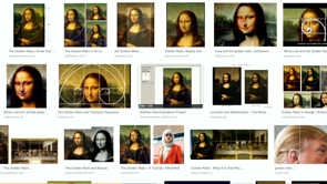
There's obviously magic numbers for design. This is everyone's favourite magic number, the golden ratio.
So I googled Mona Lisa and the golden ratio, and I like that you get a wide variety of different golden ratios out there.
Sometimes it's like eye to lip, sometimes it's chin to forehead.
One of them's the side of Donny T's head.
I don't how that got in there but this is the effect of magic numbers on design. People just make stuff up and then run with it without validating, is any of this remotely accurate, true, or useful? And that's, so there's our easy physical metrics. But validate things yourself that they actually make sense rather than just jumping to the conclusions of here is the values you should use.
Onto something a bit broader, is I wanted there a measurement system.
Like how do people, how are they making broader measurements than just looking at physical things? Like how can we measure overall user enjoyment of the site. And I'm pretty lazy so I just wanted to look into existing ways that websites have done this. And the OG of internet metrics was the PULSE metrics and these were unexciting enough that I just thought I'd put them as five dot points on the one slide. We had page views, uptime, latency, seven-day active users, that was a bit of a stretch of the acronym, and earnings.
And this was like overall site health.
So if your design's completely broken, this will tell you eventually because everyone will leave. But this is, in a similar way to, being alive or dead is not a very useful indicator of the quality of your life. Like if my pulse is up, it could mean something great's about to happen or that I'm being chased by a puma.
It's kind of, PULSE is it's a useful measure to have, but we need something a bit more information rich. And surely enough just digging through research, there's a bunch of people that about a decade ago came up with something that was a bit more user-y and user friendly than just PULSE metrics, which was HEART metrics.
Again with the, I don't know how much effort they put into these acronyms versus the actual research but there was some glorious ones in there.
So HEART was more user friendly.
We had happiness, engagement.
Oh, happiness, sorry lady.
Happiness is an obvious one.
Engagement is how much people click on stuff. Adoption is getting new users.
Retention is keeping the users.
That's a picture of a tent.
I didn't know how to illustrate retention.
(audience laughing) And task success.
So, this is the five.
And I read through these five and thought, I love two of these, I hate three of 'em.
And then I said that to someone else and he said, I also love two and hate three.
But we loved a different two and hated a different three. Fortunately, continuing to read the paper on HEART metrics, they suggest choosing two.
Just choose a couple.
Right on, we can both do that.
So you just choose a couple of these things that you wanna focus on, and then you do goals. It's like, set some goals based on those things that you are aiming to improve.
So if you wanna improve engagement, say we wanna raise engagement by whatever, and they say to check that you're getting towards your goals.
Then you get signals.
So look for things that suggest that you're getting towards those goals.
And a critical difference here is that your goals should not contain your metrics.
So people will often have goals like, I think I just mentioned one.
Like increasing user engagement.
That's using a metric to determine your goal which is kind of then self fulfilling.
Rather than thinking of the actual thing you wanna do. Again for design that gets harder.
People should have a better time when using my application.
So you can look for signals that are like less angry feedback forms.
And then you look for a metric for that number of one star reviews in a week.
And that just means you've got a good separation between the things that you're measuring and the thing you're actually trying to achieve, rather than just being a bit of self fulfilling or self serving goal.
The, yeah.
Customer accounts, always a good way of that. They talk about, we want this many customer accounts to meet our Q1 goals, when their Q1 goal for new accounts is just a made up number in the first place. And then they say we need this deleted.
But, so yeah.
Just keep goals and metrics separate.
And so the metrics that I thought were most useful for measurable design, it's late.
I decided to drop adoption and retention, because they're both kind of, they're effected by design but it's a bit too long term and if we start losing users after three months 'cause the design's bad, then it's probably too late to course correct and it's too late.
Engagement, I don't like also, because of this. We're focused on engagement for too long.
This guy's so engaged.
He's just stuck looking at his phone.
He won't even look at what's on the computer. Engagement just got into a war of endless scrolling, an infinite scroll.
And I don't think engagement is a very design-y metric. But it's very easy to measure.
So, that's why it's been a popular one.
But it's not suitable for improving design. We can't say the experience is better because you were more engaged.
That's just we've trapped you there somehow. You're addicted to using a platform.
So the two that I went with were happiness and task success. Which, unfortunately, are the most difficult to quantify but we'll see what we can do.
So, my first thought of how to measure happiness of users in your web application was you can ask them.
Just see if they're willing to turn on their webcam, do some face feature tracking, and then see how often they smile.
This didn't get very wide adoption.
(audience laughs) These prompts generally don't.
No one ever clicks allow.
That's lesson one.
So, and this is obviously also pretty unreliable, and the reason happiness is hard to measure in the first place.
If I'm at my laptop here, just giving you access to use the webcam.
I'm just having a great time and I'm smiling here. I'm smiling 'cause I'm looking at a different window while you're still filming me.
Or maybe I just had a great day prior to using the thing. Like happiness is kind of a pretty blurry anyway. But we've still just gotta try to guess, how much of this are we responsible for? Maybe you could measure Twitter outrage.
So a popular one is after redesigns then you just see a big flood of people hating on the new design.
It's what happened with Slack, Aruba.
That was just, quite outrageous.
And that's a real thing.
This change of version.
If you're measuring happiness over time, then you'll see people are pretty happy, and then they're furious.
Furious, and then after a while, then they're happy again. Kind of the baseline stays about the same regardless of what the change was or how mad they say they were about it. They just kind of deal with it eventually.
And so, how can we measure happiness and change aversion? And I was trying to find a good way, using the magic of the internet.
And it seems like the best way is just surveys. I was hoping for something more exciting but this is pretty much where we're at.
Boring old surveys.
So I thought, all right, how do we make a better survey? What kind of research do we have on that? The most common one is don't ask people more than one question.
If you wanna get a lot of people to answer, just ask one question.
How did we do today, and some kind of star rating. People actually respond to that.
If you wanna do more than one question, which you obviously need for more informative surveys, then you're gonna get fewer people.
The two kind of people that will do surveys that you'll get results from are people that like doing surveys or the people that wanna win a free iPad, if you're offering prizes for your surveys. It's kind of always gonna be very limited involvement and you just have to know that you're gonna miss out on some people going in, but they're mostly jerks anyway, 'cause great people do surveys.
Then there's a bunch of things on just how you structure questions, trying to make questions repeatable and reliable and thing is a whole art form in and of itself. I learned a lot about how to make neutral questions, and I still take issue with some of these.
Like a happiness one's a good example.
The only time I ever rate my happiness on a scale of one to seven, is when I'm doing a survey that asks me, how happy are you on a scale of one to seven? I generally don't think of my happiness in number terms. And changing it to words makes it like equally difficult.
I don't know if I'm somewhat happy or slightly happy right now.
It's always a little bit blurry.
And kind of they're good for like a broad indicator. And similarly, how you collect the answers is if you just give them dot points of things, or drop downs, pre-filled answers versus free text fields. Like you wanna give people a bit of freedom to express themselves, but you also don't want them to type the words twenty two instead of just the number 22.
So you kind of wanna limit how you are collecting survey results.
And that's yeah.
I don't have an exciting answer for measuring happiness. I'm sorry.
That was about the end of the line on that one. We just do surveys and ask how we do it and keep them short, and yeah.
That's happiness.
(audience laughs) Task success is the other fuzzy one.
This one is like a bit at least more directly measurable than happiness and you don't have to ask for the webcam permission.
You can do stuff like the funnel thing, where we say this many people started at the check out, this many people dropped out over time.
But the funnels that we usually have for measuring task success are pretty limited because we don't know why people did a thing. I'll often add something to my cart just 'cause I wanna see how much shipping costs. I never intended to check out in the fist place so my task was different.
And so I thought what's a good way to measure task success? Surely we have some kind of magical, machine learning AI robot that can just measure how people are doing.
Still, sadly no.
There is a bit of analytics work.
Like just the kind of built in task but they're still very, very limited in what you can actually measure with funnels, and that still sucks to use.
So the best one for this is still user tests. And this was the second, this was kind of weeks into researching how we could go about measuring design.
And at this point, I'm just getting pretty down on it. Like these are pretty boring answers.
This is stuff we already had.
User tests is just about having a person in the room with you or on webcam, if you wanna do it remotely and just say you know, can you do these tasks? And then see how they do them.
And the main benefit that you get from watching someone use stuff isn't for the things you directly ask them to do. It's more for the other things that don't happen, that you don't see them do.
If they get lost somewhere, if your navigation's bad. If you realise that no one is using search 'cause they just use Google to get there.
There's a lot of kind of little things that you only really notice from seeing people in person. And because of the way you monitor that, that's not something that scales particularly well that I have found.
And it just depends on you watching actual people use the application.
And you get more feedback from them then.
That's again like the longer form of feedback. So you wanna listen to what people have to say, and they'll suggest improvements.
But the feedback is often just kind of negative or heated. My first time feeling very angry.
Zero star, cannot even help my anger.
Terrible experience, one star.
This is not very actional feedback but it's glad to know that the happiness score of this person's low. So we've got some value out of that.
But basically you wanna take feedback from users, and often the risk with doing too many user surveys, if you're talking to people all the time, then they're gonna tell you what to do.
They're gonna come to you with answers.
And if you just go to users for all of your answers and use that as your only source of input, then you're gonna end up with a Homer Simpson car. (audience laughs) Which is basically, a car designed by users, is a car with a bunch of crap on it that no one actually wants.
So, I don't wanna talk down to your users, but you probably have a better idea about your product than they do, 'cause you're using it all the time. So you get feedback from many, that's a good idea.
It was something I hadn't thought of before. I'll think about it, and it's more things for you to think about. Use that as kind of a way to drive things that you're thinking of, rather than just as this. Don't let them decide everything.
And, going the other way, a car by pure data metrics is not any better.
I couldn't even find a picture of one.
It's like just going for metrics and discarding user feedback entirely.
You probably wouldn't have seats.
You just strap people to the doors and say, we'll see you on the other side.
I don't mean the destination.
They'll die.
And similarly, the broad data analytics metrics, things that we're measuring, don't let you come up with new ideas.
That's data tells you how you're doing with your existing goals and things that you're tracking but it doesn't let you invent new stuff.
That's not how you learn new things.
New things will come from, you see users using stuff and you're like wow, you're using that totally wrongly, but that means either our design's broken or we can do something with it.
And similarly, data is not insights.
A lot of people like to call it data insights. They have an insights product and they think that you know, you just view this one graph and it will change your world view.
Data is just data.
It's like a source of information.
You've combined multiple points of data, and then you get insights and you think, oh wow, these multiple sources of data combined can give us something that we didn't know before. And so, on this, I was kind of reminded of an engineering term called AM / FM.
And this was, so at this point I was hoping I could kind of pull all this together into the magical design number and then I had just ended up with user surveys and kind of usability testing and some basic boring stuff. And that seems to be about the best way to go it. And the reason that I was reminded of this. This stands for actual machines verses fucking magic. (audience laughing) So in engineering terms, we always have the actual machines which is the reality of stuff we use.
It's usually pretty boring, not very exciting, and hard to sell, just generally unexciting. Fucking magic is the amazing new thing it's coming next year and is just gonna change everything. And that's the magic design number, which we sadly don't have yet.
We're still pretty much just down to measure stats in the old way.
And, don't let data completely drive your decisions. You need to kind of, if someone comes to you and says that, oh we need this for more account sign ups, we need this for better user engagement.
Then you can kind of come back with some data of your own say, here's some things that we have been measuring. And data shouldn't be the things that dictates exactly what you're going to do.
It should inform what you're going to do, but it shouldn't direct your product.
And, get multiple sources of data.
Find things that conflict, and that is the other good thing about having different metrics between different departments.
You kind of, argument is good.
It makes you validate that your beliefs aren't just stuff you heard about from a study 50 years ago.
If you're constantly arguing with other teams, then you're kind of forced to check, ah, is what we're saying actually true or we just making up numbers to confuse people? So measuring design was more about just trying to find numbers and stuff that's quantifiable easily.
And my final fake internet quote.
This one I think actually does have attribution but I couldn't remember who it was.
But it said not everything that counts can be counted, and not everything that can be counted counts. So you can manage design without measurement, but it certainly helps.
And I think that is the end.
(audience applauding) (funky upbeat music)
Faster is better. That much is obvious. How much better? That we can find out. For people preoccupied with performance, numbers can tell a clear story. But how can you determine success for design changes? “It just looks right” isn’t going to be enough.
You can’t embetter what you cannot measure. So let’s look at how to make design measurable. Which metrics matter, and which can be ignored. A better looking hamburger won’t improve your navigation, but there might still valid reasons to change it.
This is true and hard. @psimyn tackling the ambitious question of how to measure someone’s happiness when using a product #design19 pic.twitter.com/UyCROa1Jcx
— Laura Summers (@summerscope) April 11, 2019
Two problems:
- Design decions are hard – and there are times people basically just guess!
- Design starts out great and slowly unravels – you can’t manage what you don’t measure..?
People love numbers. People like magic numbers. Some things like sales and performance have clear numbers. But what would that be for design?
There is a DOW average – it’s a measure almost nobody really understands, but it gives a number. We are seeking the DOW of web design (great in-joke!).
Start on the inside… “I don’t want to talk to users, they’re gross!”
How much is your design system worth? How many engineering hours is it saving? Look up the design debates people were having in PRs, or planning sessions, that aren’t required any more.
Physical measurements:
- contrast is easy to measure but we keep getting it wrong!
- Signal:noise ratio can be measured for typography and charting (signal is relevant information and noise is stuff other people made you shove in there).
- Line length – “studies have shown”…? actually there really are studies and they’ve been reproduced! But you can work out what works for your product then measure if you’re sticking to it.
- Golden ratio
Measurement systems
- Pulse metric – page views, uptime, latency, seven-day active users, earnings. But being alive or dead is not a good measure of the quality of your life. It’s just not very expressive.
- Heart metric – happiness, engagement, adoption, retention, task success (the methodology suggests you pick two to focus on)
Goals → Signals → Metrics
Goals should not contain metrics! Keep the goal broader, to avoid making it self-fulfilling.
People should be happier → measure the number of one-start reviews → reduce the number of one-star reviews
Engagement isn’t a great goal but it’s easy to measure so it’s popular.
Simon went with happiness and task success. These are really good metrics, but they are hard to measure.
Happiness – could you measure twitter outrage? Over time you’ll see people go through change aversion responses after every relaunch. It seems the best way to measure happiness is still….sadly….surveys.
- ask one single question. If you want to do more you will get far fewer people filling them out.
- how you ask questions matters – ask neutral, reproducible questions
- how you collect the answers matters – free text vs multiselects etc
Measuring task success
- Analytics work for some tasks
- User tests work best for measuring task success
Take feedback, but don’t let them tell you what to do! Get feedback but don’t literally do what they say would solve the problems they’re raising.
You can’t measure your way to new ideas. Data only tells you about the things you already have.
Data is not insights.
Engineering term: AM/FM. Actual Machines/F***ing Magic. The things we have now vs the things that are coming next year that are going to solve everything… like magic. Sadly the design number is still FM.
So don’t let data make your decisions. Measuring design is more than just numbers.
Not everything that counts can be counted. Not everything that can be counted counts.