Dynamic Typography with Fluid Sizing and Variable Fonts
(upbeat music) (audience applauding) - Thank you very much.
Yeah I do want to sort of say out loud how excited I am to be at this event, because this is one that I've known about for many, many, many years.
I may have lobbied him with an email or two over time, and so, I'm really thrilled to be here.
I am lucky enough to have spoken at a whole bunch of different conferences over the past like eight or 10 years or so.
But it's always really special to get one of those, ones they've looked up to and you always hear great things about, so, thank you for having me. I really appreciate that.
So, this is actually going to be a lot more technical than some of the talks that we've been having, but it's actually coming to, it's coming to me that this is I think actually a good thing because based on kind of what we've been thinking about and talking about during the day, are the inter-connections and the seams between what we do.
So, it is a design focused conference and this is a somewhat technical design talk but I think it's really important for us to understand what we can do with this emerging technology, in the ways to sort of rethink the way we communicate on the web.
So, as John said, I've been around doing this stuff for a long time.
Really the main reason most people know me, oh come on, don't do that, really? Okay mainly it's because of that.
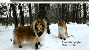
And so I consider myself typographer, primarily a walker of these two and on the left there is Tristan.
We've had him since he was a puppy, and that's his cousin Tilly.
They've got their old snow boots on.
I figured I'd show something that's a little foreign to you. You might not necessarily see that.
That is snow.
(audience laughing) And so I spend a lot of time thinking on our walks. Let's say that alone time I always try and capture an interesting image or two, and think through stuff.
And I love that and so something that I actually think about a lot is this adjacency between design and development.
It's I think really important, especially in the context of design systems, where we are building a technical infrastructure to encapsulate the language of our design, and how we then put that on the screen, and what I want to stress is and what I'm going to show you today is a lot about a system for typography that this is meant to be a foundation, not a finality. And I think that's the struggle I have with design systems, is too often people treat it as the answer, not the beginning.
It's something upon which you can build.
So moving forward, this level of complexity in the technical stuff has a little bit of a backstory, and so I wanted to talk a little bit about how we got here, because you haven't most likely seen the talks that I have been giving for the past eight years on the subject.
So, I'll try and encapsulate that a bit with something of a journey, and so I sort of settled on the odyssey as the text that I would be using because for one thing I've flown a lot in the last few days. You have no idea and and a lot of it was driving the week before.
So, since he actually travelled through Ithaca in Greece, I would mention that I was in Ithaca New York, just two weekends ago.
Yes helping my son move and then came back home to go for a 200 kilometre bike ride with a bunch of people that I went, and I thought that would be a good idea.
I was maybe mistaken but it was fun and then I got on a plane a few days later and flew to Wellington, and did a workshop and a talk there, and then I came over here and this long kind of winding journey is somewhat analogous to the journey for me to get into all of these weird corners of typography.
So this is the foundation.
Type is important.
Type is the voice of our words or as Beatrice Ward put it, type is the clothing our words wear.
And I think that's a really beautiful thought, but it's also very instrumental to why typography is that central part because most of what we do is put text on screen to influence people to take an action.
That's really kind of the fundamental thing about any kind of design.
So, with that in mind, we have to remember and this is a quote from or rather a response to a quote from Beatrice Ward's essay called The Crystal Goblet that the type itself is part of the friction that creates the experience, that creates the memory, that helps us absorb what it is that we're meant to take away from this website.
And I'm very curious to actually talk to John Bell afterwards and see if he notices the Spackle around me adding this code in this morning. He's told me last night maybe I shouldn't, but I really think this is important to us to keep in mind.
So, all of the stuff that I'm going to talk about is how to put type on screen well.
This is the reason why we need to do it.
So, the little bit of backstory about how we got here is when we were first able to start using web fonts and I have to thank Typekit for that.
It's the start of a very long career for me working on it. We were able to put a better voice to our words, but then very quickly following on 2009's introduction of Typekit we had the advent of responsive design a year later.
Ethan's book came out a year and a half or so after that, so by 2011 we were stuck with thinking through not just how do we change the voice of our words but how do we make that work well across a whole bunch of different screens.
So, with responsive design we were able to think through setting the proportion of the text differently on a small screen to a large one.
So a heading that's the normal size on a large screen looks really ungainly on a small one.
So, we adjust for that but then we also very quickly had some backlash from using web fonts because nobody liked the flash of unstyled text.
How many people are familiar with that phrase? If you weren't involved in the industry at that time I can certainly tell you with absolute certainty that I have had clients come back and say, we don't want web fonts at all, if we have to deal with this flash of unstyled text. That was a real reaction, and I think that had to be distressing for Jeff and everybody else here.
I'm not sure if he's in the room but that was a very real problem.
Now what a lot of people overlooked is that it was almost entirely manageable.
So, within a year of launch of Typekit we had something that was put together I believe with Braunstein and the people at Google called the Web Font Loader.
And with the advent of that, what we were able to do is with our Fallback fonts, we want to put that up on the screen, but we want to style them. So font is only font if it's actually still unstyled, but we want to hook into the Web Font Loader, which gives us a class in the page, wf-inactive, which gets swapped out for wf-active once the web fonts are loaded.
And with that we can tweak things like the font size and the line height, so that stuff doesn't move around and when the web fonts finally load, nothing moves. So, people don't notice the change.
That was the problem.
Not that the fonts were changing as it loaded in. It's things were reflowing, and so this was correctable starting within just a few months of all of this stuff coming about, and yet I'm willing to wager that a number of people in this room have never known about that trick or tried it, and I continually have this same kind of reaction. It's very disappointing given that I wrote about it in 2012, and it's still not something that is widely known. So, I haven't been telling the right people I guess, but this is what we can get to and now I want to talk to you about where we can go, taking it even further. So, this is sort of the fourth episode.
That's my one Star Wars joke, and we're now going to talk about three different things that we can do in CSS.
So, these are new capabilities in what we can do using CSS variables or custom properties as they're technically known.
Also calculations, we can do really interesting calculations in CSS dynamically and something called variable fonts. And that's the thing that I'm most excited about but it's actually the combination of these that makes the big difference.
So, here we have the title here, set in this dark blue, and it's got this heading class on it, but if we wanted to actually change it, we could just change that variable.
So, if we have the text colour assigned to the CSS property, we can then affect that property in a variety of ways, either by when it's placed in a different part of the layout or using JavaScript or any number of different things. So, that was really kind of interesting, not exactly life changing, but we can then start to use it for text size as well. So, this is an example of the variable being used with the calculation.
Again kind of interesting maybe not earth-shattering but we're starting to add up to something novel that we can do.
Well that changed the size, but that doesn't really satisfy what we want with the layout, so we might do something a little bit different and start to calculate the width of that text and the weight.
Well now we're getting somewhere.
We've been able to dynamically change the width and weight of that heading so that it fits the style of our layout a little bit better. And so that's incorporating the third thing that I wanted to talk about.
So, this is also it, in combination this works beautifully with design systems.
So, when you have your components there along the bottom and you haven't to take that little card and move it somewhere else in the layout, perhaps all you have to do is scope it inside sidebar and then reassign those variables.
You never touch the core mark up or CSS.
So, you have these things that are themeable that you can move around in your design system and all you have to do is reassign a couple of variables and you're writing much less code. So, that actually starts to get a little bit interesting, but we don't want to overlook something that was pretty novel going on before. What is a variable font? So, a variable font if you're familiar with installing them on the desktop, normally you have to put in a single file for every different width and weight and variant. So, you might have 32 different files or 96 different files for the complete family of a given type face.
This format actually lets you put it all in a single file, and then expose those axes of variation to CSS or desktop applications.
So that gives us a way more efficient way of dealing with this, and that also could potentially address the biggest drawback or the biggest hurdle that we have in implementing typography on the web, which is the performance of delivering it to the user. So, as designers we can be incredibly expressive and then we go over to engineering and they say get the hell out, because you want to put too many bits of data there, we can't have you downloading an extra 50k of font data because we need our JavaScript. I kid a little, but this potentially will dramatically change that equation, because this file is nowhere near the size of all of those original separate ones.
I can give you some specifics but first I have to get some more pictures of the dogs in here, but it's for a reason.
It's not entirely gratuitous.
I want to show you how the different axes work. (audience applauding) Or you could have a weight axis, you can even vary the X-height and of course we wouldn't really want to forget about slant.
So all of those are different kinds of axes of variation. Most of them are what are called registered axes. So, width, weight, italic, slant and optical size which I'll talk about a little bit later. Those are all what are called registered axes. They're the ones that are going to be most common and what you see is these variable fonts get released. Slant is different from italic.
Italic is meant to be all on or off.
So, more of a binary choice versus oblique where you can actually set the number of degrees. All of this ties into standard CSS.
You'll notice that if we're looking at all of these it's tying into not font weight, there we go. Font stretch that's a property that's been around for a very long time.
It just didn't really do anything.
Font weight works the same way.
We're just supplying a number instead of a keyword. Font variation settings is the way we set any of the custom properties, so you can just list them all here and impact the way they represent on the screen, and you can list them out multiple ones at a time, and then slant again it would be oblique and some number of degrees.
So, this is all very familiar to us and it's also very easily accessible in the Firefox developer tools.
How many people have taken a look at Firefox dev tools lately? So, if you might not have seen there's a fonts tab in there now, and we all have to stand up and say thank you Jen Simmons because she has been fighting for this stuff for a very long time and has really been driving the force behind the dev tools that we have for CSS there.
So, huge thank you to Jen for that.
Now one of the things that I wanted to come back to after which I had a little intro to the variable fonts here is talking about bringing these three things together. The CSS variables, the calculations, and the variable fonts and how might we rethink how we set type on the web, rather than having a number of breakpoints where we change the scale of these things at this breakpoint at this breakpoint, at this one what if we could do something a little different? And this is where again it comes back to Typekit. Tim Brown, family is familiar with him, has been with Typekit for a very long time. He's actually the first person while he was still at Vassar writing about web typography that I read and has been a huge influence on me.
He wrote an article called CSS locks.
And so that idea is the ability to use things like Viewport width units to scale something like line height, but have a cap at the bottom and the top at some breakpoint, so it doesn't get too small or too big. That's the short description.
So, what this is going to do is start to set up some of these variables and calculations in order to scale the typography across screen size, as it changes in a much smoother manner.
So, we're scaling font size and line height here. We're setting it up with these variables and then as it gets wider, you'll see that that line height opened up and the text size of the heading changed.
All of that's happening with this math.
The good news is you'll never have to write it more than once, because once you set this up it's the exact same formula and I'm gonna get into a little bit more detail here in a little bit.
You don't have to change it.
You can reuse the same formula and feed it different variables.
So, like whether it's writing a mixing or some other way you might incorporate it into your system what that does is it starts at the low end breakpoint you define and the high end one and it scales from the small number to the big one. So, font size and line height are two easy ones that we can do and this is kind of writing it out. So, what exactly does that mean? Well this is the narrative.
Please take this thing and scale it from this size to this one, from this break point to this break point, and then don't get any smaller than that.
Don't get any bigger than that and we kind of break down the math a little bit and start to do some substitutions in here. It gets a little bit simpler.
That's about as far as I can take it, because Tim's better at math than me and that's fine, because what I realised was again I don't have to rewrite it.
I can take that same typographic system and move it from project to project.
All I have to do is change a couple of variables at start, and it just works.
Now it does have some limitations.
It ends up with a value of the unit at the end. So, it's appropriate for font size or line height, but it is not going to work if we want to apply a percent or get a unit less value like font weight.
Thankfully that is changing.
The CSS working group has already actually updated the spec. It's just waiting to be implemented in browsers so that we could use the same approach to then smoothly scale a font weight from a smaller scale up to a larger one to sort of modulate the rhythm in our headings a little bit better.
So, there's a lot of potential there and a lot of future growth that's coming.
We can sort of take some other shortcuts in the meantime to still take advantage of it. So, looking at all of these things together now with this demonstration and I should point out that this is all running in the browser.
These are all real web fonts and all of this is available for you to look at upon notice. There'll be a link to take a look at it later. So as this thing sets up, we have all our breakpoint variables.
We've got the text weight and width and things that we want to change and then as it scales, everything kind of moves together.
So, the width of the text changed.
The text size, all of those things kind of worked in concert.
Now width I've mentioned a couple times.
I want to talk about that a little bit because when we look at this on a small screen, now some studies have shown that line length is important. (audience laughing) This is true.
What that exact number is, no idea, but what I think is true is the way we read is in groupings of syllables.
That's just, there's a little bit of science there that generally suggests that something that's too short is hard to get a rhythm and something that's too long is hard to follow. So, the reason why line height changes as the line length gets longer is so your eye can travel back to the beginning of the next line.
So, there's just kind of fundamental things that we can hold to generally be true, so that if it is narrower and we want to have a few more characters per line, because normally font size 100%.
It's about 16 pixels-ish.
Most of the time on a phone you're gonna get about 35 to 40 characters per line. That's a little short, it's a little choppy. Now given that we're all reading on our phones all the time that doesn't make for a particularly conducive experience to reading long-form text.
Because we know everybody reads long-form text on the web, especially on our phones.
That could be because it's a crappy experience and we could make it a little better.
So we make the characters slightly narrower, maybe 90% instead of a 100, because we have a width axis.
So, we could easily fit 10 to 15 more characters per line without sacrificing text size.
So, it's still readable.
It's not even that perceptible but it is a dramatically improved experience overall.
So these are small things that we could do that add up to a much better experience.
So, we have all of these things working in concert. We have our complicated math that we're replicating and we can do things like this.
Now I put this up here.
This was something that I was asked by Monotype to help them introduce FF Meta, which is a typeface that I really love, and they asked me to help them create a demo and to do it what I ended up doing was actually writing an essay and then typesetting it with FF Meta and so everything in here is all done with a single font file.
84K replacing 300K, 16 or 18 separate files. And that's just a sort of early release of this and this is up on CodePen, that's the best part. So that's, they let me publish this on CodePen. They link to it from their site and everybody else can play around with it too. So, all of these things that I've been talking about in here are incorporated in that project, so you can go fork it, pick it apart, play around with it and you're even able to use that font on your own site if you'd like to. You have to link to their CSS, but that's fine. They're not putting any licencing on it for a while. So, that I really enjoyed that whole process because it was also an instance where Monotype was actually acting in a way that was really much more engaged in the community, and seeing a large corporation do something that where we could be that open with what was being done I thought was really great and you can see it sort of reflows in kind of an interesting way.
It doesn't have to be exactly the same.
It is providing an interesting experience on the small screen and the large one.
So, I thought that was really kind of neat. So, there's something else from Tim's book. And this is really central to a difference that we have to accept in the way we work on the web. There's no certainty.
There is always going to be failure in stuff getting from here to there.
There's going to be latency.
There's gonna be dropped connections.
There's going to be blocked elements.
There's gonna be firewalls, so what we have to remember is the enhancement of this it starts with semantic text and from there it moves on to loading some web fonts and adding these styles, and then enhancing it in other ways as we go. So, all the stuff that I'm showing you is not reliant upon JavaScript.
This was my one bone that I had to pick with Typekit, which was addressed sometime in like the last two years or so,, was that it conflated JavaScript with web fonts and I know there are a lot of good reasons for that. So, I'm not trying to be overly critical but fundamentally I was opposed to those things being tied. I know you've got to track stuff, as that's how the licencing works, but we were tying something that didn't need to be and that actually could result in an adverse experience for the user.
I like using the JavaScript as an enhancement, so that's why I like Braun's replacement for Web Font Loader, which is called Font Face Observer. The text to the font will still load.
That's the thing that's important to the experience for me. Getting it to load faster is the enhancement, so we want to not block the text getting on screen and we want to have that font eventually, so that's why I want it in CSS and then the JavaScript is what will speed up that experience and make it smoother.
And there's a whole lot of things that we could talk about with that but that's a whole workshop.
So, we're not going to get into it.
Now, looking forward even further what kind of suggestions can we make to improve the experience for people beyond just putting text on the screen in the fonts that we like in a manner that is quick, that's responsive, that's going to work well wherever they're seeing it. Let's come back to that for a second, where are they seeing it? Are they seeing it in here in a low-light environment? Are you seeing it in a train? Are you seeing it in bright sunlight? Whatever, you might want to use some kind of perhaps an appearance mode that's been built into the operating system.
So we could use a media query that's been supplied handily for us to react to that, so we could do things like automatically switch the text if they have the appearance mode switched on their device, but we do want to actually adjust the typography there and this is where the variable font comes in, as well as a little bit of extra knowledge about type. When you reverse the contrast you tend to want to make sure that the type is strong enough and when I say that, it's not exactly an absolute. Sometimes you need to make it a little bit heavier. Sometimes you need to make it a little lighter and that is going to depend on the quality of the display. If you have a low DPI display, you probably need to make it a little bit lighter because the display is going to have the natural tendency to thicken the strokes.
So, think non-Retina versus Retina display. We have a media query for that too.
So, in this case because it's a very high-resolution display, the text had a tendency to fall apart when it was reversed.
So, I increased the grade of the text which happens to be another axis that is available in this version of Roboto.
Grade is not an axis that's available in every typeface and I should point out that these axes are the choice of the type designer.
It is not the browser forcing an interpolation. It's only what the type designer actually enables in the font.
So, not all of them will have all of these axes, but this one does.
So, this is on GitHub.
You can download it and play around with it. It's open source.
It's called Roboto Delta and I'll have the link to that at the end of this as well. So, we're tying into user context here, but there's also other things that we want to consider and this is where we can start to tap into the needs of other kinds of users.
So, thinking about accessibility.
Where else might you want to deal with grade? Well for people with low vision you might want to give them the ability to set a higher contrast mode, and so again we can use grade to subtly increase the colour and the text grade, to strengthen the foreground background contrast there.
So, it's subtle, it doesn't really change the flow of our design but it can dramatically increase reading comprehension. Kevin Larsson from the Advanced Reading Group at Microsoft has given a great presentation about a particular condition that some people with dyslexia suffer from called crowding.
And the research showed that if you could increase the word spacing and line spacing in text, you could increase reading comprehension for people with that particular condition by as much as 50%, that's five zero.
So you're nearly doubling the ability of someone to read, using two standard elements in CSS, word spacing and line height, give people the ability to set that themselves. And sorry that's text size.
That's the one that I wanted to show you.
So, these are really standard things that will dramatically improve people's ability to read the content that you want them to read to take the action that you are trying to influence them to take.
It is in our interest to cede control.
We need to give people the ability to tailor this typography, these suggestions that we are providing to dramatically improve their experience, and we could do that with something as simple as a little accessibility panel, that they could open up and make some changes themselves. And if we've done our job right with our design system, we know we're not going to break anything.
That's really important.
That's why we're doing our homework here is so we can work on these aspects of typography it can ripple across our entire product ecosystem and provide the control for the end user to get the most out of our product.
And yes it does make our job a little bit harder, but that's why we do it in a design system, because then we only have to do it once.
So, there's a lot of strong ties there and it's again just this ability to fine-tune what we have going on here based on where things are in a layout, and this is wider than it was before on my desktop, so now it's reflowing a little bit. But again we've been focused on using these CSS variables. What if we just change the font stack? There we go.
We don't have to change any of the underlying code if all we have to do is reassign a couple of variables. So again coming back to making a system of this typography that we can carry from one project to the next one design system to the next.
If we've done it right, we could actually set up all of those values for text size, the fallback tuning, the font stack itself in a CSS variable file and it's an entirely themeable system.
And I do actually have a link to a repository that has a bunch of this stuff in it, so that again you can kind of download it and play around and see it for yourself.
So I wanted to show you, obviously you want to have proof that this can actually work.
Well I've been working with one of the state governments in the US, with a fantastic development team from a company called Lullaby.
And we've taken all of these things and built it into their pattern library that is baked into a Drupal theme that we'll be driving 89 to a 100 state websites with the first few launching in the next couple of weeks. And so I actually have the pattern library here, so we can see this is the actual code that's really gonna be driving it and then if we go up here and we play around with these controls, you can see all of that dynamic scaling is going on that I've showed you that's built into this system that is absolutely Enterprise ready to drive something that will take millions and millions of pageviews, servicing the entire population of that state. So, this kind of stuff does work and I do want to point out while I can't easily show it to you here.
One of the important things that we had to make sure would work is that it has to work in browsers that support variable fonts or not.
I didn't actually stop to mention this earlier but variable fonts are now supported in every shipping browser with the only exception being a couple of smaller Android browsers, which are generally not mainstream market ones. So, the UC Browser, so it's not nothing, and then Baidu I think are the two that aren't supporting it right now.
IE 11 though does not and it so happens that the state standard in IT for the state of Georgia is IE 11.
But that was actually a good thing because just like what Gina was describing about figuring out how do we use this design system to do a non-profit website, we want to make sure that our typographic system works where the variable fonts don't.
And so we actually extended what we were doing using ad supports, so another standard CSS thing. If your ad supports works, it tests in, it does have support for variable fonts, then we can do all of these things.
You get CSS variables and and calculations for free if you have the support for variable fonts. That's just how it lined up, but we have static versions of Source Serif in addition to response variable ones, so that if you have a browser that doesn't support it, it uses the static different media queries to scale the typography just as we would prior to variable fonts, but if you have them then it gets this nice smoothly scaling system that will work on any device you throw it at, and so that was really important for us to be able to demonstrate on an enterprise level that you can actually do all of these things, and because it's in the context of a system, it is going to be replicatable across every single state agency website and I suspect a number of other Lullaby projects, which just makes me happy.
So, that was pretty interesting, but you don't really know that much about the state of Georgia.
There is another company that you may very well have heard of though, that is now embracing variable fonts, because just two days ago, they made public that they have taken Plex and released Plex Sans Variable.
Now here's another illustration of the economy that you get. There's a whole bunch of files that total 960K and that is a lot, even when the two variable fonts upright and italic, it's 233K.
So, that might seem like a lot of font data to load until you start to think about the fact that that will serve a fair percentage of the languages on the planet.
It's not CJK but it includes Cyrillic and a whole bunch of other character sets well over 2400 glyphs, and all of that is encapsulated with a full range of width, weight, and italic in 230k. One JPEG or maybe one jQuery plugin, but so you know like that kind of thing or react component, I don't know, just insert something here that would be offensive.
(audience laughing) So, you can go to github, go to github.com/IBM/Plex and right there you can download this.
It's open-source, you can play around with it. I would suspect that Serif will be coming next. I certainly hope so because they're beautiful typefaces and this gives us something that is truly enterprise class in terms of the font engineering and the typeface design that's going on in there and I know with certainty that the next place this is going will likely be the carbon design system.
So, that's not fooling around.
This is going into the real deal, major enterprise class design system.
They know where this is headed and that's I think a really significant testament to how seriously people are taking this and what kinds of things we can do with it, it really is incredibly remarkable, and there's one other thing that I wanted to show you that of course I forgot to start up Safari, but we'll get there.
And this is again coming back to my travels with the Odyssey.
I've tried to set this up in kind of an interesting way so that I have as much of the better typography in here that's it's responsive, it does some interesting things with an initial character and the first line of the text, none of those things are requiring any additional markup. It's just basic CSS, selecting the first letter and the first line.
Those things are supported in every browser but that behaviour of the system could change based on what is supported in the browser.
And I wanted to investigate how might, just gonna see if I'm really adept at this. The answer is probably no, but let's see exiting and this is gonna be worth it I promise.
What I wanted to do is show you how we might re-envision a reading experience with all of these things, because I think this is where we can take all of these things as far as we can logically take them.
That's not really what I was looking for.
Okay there we go, that wasn't that bad.
Thanks for bearing with me.
So, we've just gone to exactly the same page in Safari, and what's going on here it's that Safari is supporting an early implementation of CSS Scroll Snap. And if I have CSS Scroll Snap, I can then look at what multi-column can do, and I could size those columns a 100 view port units wide, and then I could start to see about things like widows and orphans because that's actually supported in CSS fragmentation.
Rachel Andrew just wrote a really great article about that on Smashing not that long ago and if I start to layer these things together in the exact same page, without any change in the markup I can then get a very different experience, one that lets me do stuff like this, and that is also fully responsive.
So, when I think about re-envisioning the reading experience and how might we make that better in a digital environment and you think about the shortcomings that we have in eBook publication platforms, well here we can hang punctuation.
We can get the multi column.
We can control for widows and orphans.
We can use all the web fonts that we love.
We can tailor the width and characteristics of the text all based on the browser and the context in which people are reading it.
We can do a light and dark mode.
We can do all manner of these things if we want to number the paragraphs to let people figure out where they are in the text from one device to the other, CSS enumeration is built in.
We can then create bookmarks that tie into it. So, yes this is a little bit of JavaScript layered onto the CSS but this is all really standard stuff that would be integratable into any content management system.
So if you wanted to create a book publishing platform, you could very easily do that, and then have this reading experience that you could tie into a service worker and have it work offline.
So, it's just bringing all these things together and layering them, adds up to an experience that is far greater than we could deliver in any other platform in history, in history. Real stone tablets or iPads, it doesn't matter, we're able to have more control and give the user more control over that reading experience than has ever been possible before.
And that's the kind of thing that gets me really excited about where we might be able to go.
Wow this just gets better and better, about where we might be able to go with this and this is really just the beginning.
So, we have a bunch of different variable fonts that were featured in this.
If you go to v-fonts.com, that's a great catalogue website to see all manner of variable fonts that are available, but this is a nice mix of ones that are both commercial and open source.
The most fun are the ones that I've gotten from David Jonathan Ross.
If you check out Font of the Month Club, it's a fantastic way to pick up some interesting new fonts and he does variable ones almost every month. So, Roslindale the one that's driven most of this talk is one that I use on my website and everything, and he's got a really cool italic version that actually separates the italic character forms from the slant and you can control them independently. So, it's really kind of some neat stuff.
Source Serif and Source Sans are available from Adobe. Those are also on GitHub.
Give a shoutout to Mark Simonson because he's not really convinced that we really want Proxima Nova as a variable font. I think it'd be kind of cool right? So, that was in a bunch of these slides.
He's done it.
He's made a beta of it.
He's not convinced whether or not he's gonna sell it yet, but I suspect there would be a market for that. So, I contend that you should probably tweet him and tell him so.
And like Plex Sans of course was the one that I showed you. Amstelvar is an interesting one to experiment with and if you go look, if you go to my website, rwt.io, you can look at a whole bunch of my old talks. I have a bunch of demos that feature Amstelvar. It's got a whole bunch of different variable axes in it for all kinds of things like the X height, ascender height descender height, all different kinds of things.
There's even a variable font out there, a commercial one that can go from Sans Serif to Serif and the stuff in between is beautiful.
And all of these things you can animate too. So, it opens up a whole different world of interaction design that we can layer into our typography that can really make for some interesting results. So, that is the thing I want to leave you with at the end of this and of course I'm always happy to answer questions, but we have these capabilities.
We have the ability to be more reactive to our user's needs.
We can be more expressive with the language that we put across and we can be more true to the brand when we work on getting like IBM is doing, a variable version of their core brand typefaces in this format.
So, rather than having to substitute something else in different contexts they can actually to thine own brand be true.
That's pretty important and that's a pretty compelling argument for companies to invest in doing this in the first place. So, with that, thank you very much.
(audience applauding) (upbeat music)
Newer developments in CSS make it easier than ever to create robust, scalable, elegant typographic systems on the web and in apps. But the fun really starts when you add Variable Fonts. The design, technical, and performance benefits are really exciting, but when you combine them with other CSS capabilities like custom properties, calculations, and grid it’s a whole new way to think about design and development.
We’ll see how they work together by using some variable fonts in layouts that work across screen dimensions, accessibility needs, design requirements, and even network speeds—better than you thought possible.
Font variation axis illustrated by way of dogs. The best way to learn. #design19 pic.twitter.com/M00AyVVWDv
— Web Directions (@webdirections) April 11, 2019
Something Jason thinks about a lot is the adjacency between design and development. Particularly in design systems where we are building systems to support design. The typography techniques he’s showing today are not the final destination, they are a beginning.
Type is important. Type is the voice of your words and your brand. Most of what we do is put text on screen to influence people to make an action.
There are no crystal goblets, no defaults devoid of friction. Design has visible surfaces, inevitably, and they brim with significance and context and connotation and intent and tone. – Nina Stossinger
With TypeKit and responsive design there was so much scope to make things work beautifully-but-differently across devices. We gained the ability to do great things, but people hated the FOUT and they pushed back. But it was manageable, there were ways to make the implementation account for font file load time; so that people didn’t notice the swap.
A new chapter, a fourth episode with three things…
- CSS custom properties (aka variables)
- CSS calc()
- scalable fonts
A variable font is a single font file that behaves like multiple fonts. – John Hudson
Variable fonts give us a way to do great typography, without the significant weight and performance problems of loading multiple font files.
The technicalities of fonts are that they expose various adjustable axes like height, width, stretch, weight, slant…
Reference: MDN variable fonts guide
A great tool for this is Firefox Dev Tools which now includes a Fonts tab.
So how can we bring these three technologies together into a scale? There is some (admittedly complex-looking) maths you can code up and feed different values.
See Flexible typography with CSS locks for the code. Currently the technique does result in a value with a unit, although there is standards work going on to bring in a method to produce unitless numbers.
The role of the typographer has changed. We no longer decide; we make suggestions. – Tim Brown
So what suggestions can we make?
- Dark modes – when you reverse contrast, you usually want to make the type thicker or thinner depending on the device DPI. There are media queries to allow this (see CSS Tricks: Dark Mode in CSS and try out Roboto Delta)
- Accessibility – people with low vision might like a higher-contrast mode, or someone with cognitive issues could benefit from wider word spacing and line height. These can be done with tiny amounts of code.
- We can offer alternative typefaces with very little extra code.
So what happens when you hit something like IE11 support? For those features a browser doesn’t support dynamically, you can serve static compilations.
This tech is enterprise ready – IBM is as enterprise as you can get and they just released IBM Plex Sans Variable – while it’s a big font at 233kb, it has tremendous support across languages.
There are new features coming like scroll snap and CSS enumeration, which give really powerful typography options. We can start typesetting book-style layouts that swipe left and right, all in the browser. This opens some really interesting options in ebook publishing.
Plus you can animate transitions between properties!
We have the ability to be more reactive to our users’ needs and more expressive with the language we put across. We can be more true to the brand and avoid poorly substituted typefaces. To thine own brand be true!
…
v-fonts.com has a great collection; there are many others published separately on github as well.
@jpamental | slides | rwt.io
Resources
The following resources were mentioned during the presentation or are useful additional information.
-
Web Typography News
A weekly newsletter I publish with tips and resources about web typography.
-
IBM Plex Sans Variable
Brand new! IBM has just released a 2-axis (width and weight) variable version of Plex Sans.
-
Typetura.js
Scott Kellum and Sal Hernandez’ fluid typesetting tool. Really interesting, and able to scale more than just type. Well worth a look!
-
Textblock.io from Glyphic
Another Javascript tool for typesetting blocks of text from Theo Rosendorf and Glyphic.
-
Dark Mode in CSS
Great run-down on different techniques for dealing with day/night modes on the web.
-
MDN Variable Fonts Guide
I guide I wrote on the MDN site covering the basics of implementing variable fonts.
-
Variable Font Demos on CodePen
A collection of demos I’ve created on CodePen for you to play with!
-
Variable Font resources on my site
Lots of links, articles, books, talks and whatnot
-
Essay explaining variable fonts as a concept
Good for less techy and more designy/brandy folks as well.
-
Firefox (font tools!!!)
Explore the new fonts tab in the Firefox Dev Tools that will show you everything available in a given font (normal or variable, but let’s all agree that the variable ones are way cooler)
-
Wentin’s Font Playground
Wentin is a designer/developer at Adobe, and she has pioneered some truly unique and compelling UI ideas for working with variable fonts. Really amazing stuff.
-
Wakamai Fondue (What Can My Font Do… get it?)
Simple drag-and-drop web interface to discover all the features available in a given font file.
-
Avenir Next
It’s an earlier beta, but still an interesting experiment. Hoping a fuller release will be out by the end of the year.
-
Axis Praxis
The original variable fonts playground.
-
Cera Pro by Typemates
(Variable font is a beta, but you should ask them about it and tell ’em I sent ya)
-
V-Fonts.com
Nick Sherman’s variable fonts catalog site
-
Roslindale by DJR
David Jonathan Ross’ design is what forms the primary typography for the talk and for my own site.
-
FF Meta from Monotype
This is a fantastic typeface, and it was a real treat to design the demo page for it’s introduction.
-
Amstelvar by Type Network
One of the first variable fonts, and still one of the most compelling ones to showcase the breadth of possibilities.
-
W3C Github CSS Fonts Level 4 (variable fonts and other bits)
Read up on the features and issues, provide feedback, and help shape the direction of the web