Design Systems & Creativity
(upbeat music) (audience claps) - Thank you so much, awesome entrance, (laughs) thanks. I'm really excited to be here, as I mentioned, if you were here yesterday it's my first in Melbourne, and first time doing web directions design, though I've done web directions in the past, I'm really excited to be here.
So, am Jina, I am an independent design systems advocate, a consultant and adviser.
I advice a couple startups, and design particularly for design systems in San Francisco, and I live in San Francisco. I'm also on the core team for SAS which is probably, the most commonly used CSS processor right now, when it comes to design systems that at least I've observed. So, my role on that team is I maintain the brand and the website.
Am basically the SAS webmaster (laughs), so, there's that. (laughs) and then recently I was added into Google Developers Experts Programme as a product designer in the visual design category.
So, kind of like dipping my toes in a lot of things right now, just a lot of fun. So yesterday if you were here, I got a little vulnerable and talked about protecting your hybrids and basically your givers in the organisation. Which I used a metaphor like your bass players and your drummers.
And today I decided I wanted to focus on creativity. And particularly design systems in creativity. I always like to kinda get a feel for the room so who is working on or with a design system? Almost the whole room, that's awesome, cool. So I don't have to explain it to you which is great cause am not going to. (laughs) I think everybody has a pretty good idea at this point if not though, I will give a couple of resources at the end so you can get a little bit more up to speed in that. So, there has been a little bit of negativity around design systems especially on design, Twitter, and particularly that as John alluded to that design systems inhibit creativity, and so, I'd like to talk about that.
I did work on design systems at some companies you might have heard of.
At Apple I was focus on the Apple Online Store, so doing both front end development and visual design there. And then at Salesforce I led the design of the Lighting Design System which had to scale to multiple products.
Then at amazon, I led design systems in operations for a design team of a new product that isn't out yet, and I'm still under NDA so unfortunately I can't really talk about that right now, maybe one day later.
But speaking of Apple, I'd like for you to just imagine with me, imagine that you're a designer at Apple. And this is hypothetical but you have to design what would be the Apple stove, the ice stove if you will. So as you think through the features, you might start to think, okay, well obviously we can have a touch inner phase, but not near the burners, you know Apple doesn't like buttons or knobs, everything is super smooth and sleek, and maybe you have like an induction surface, so we have that smooth cooking surface, and the induction surface is also good cause it doesn't you have a low risk of burning yourself 'cause it only heats where the actual pot is.
Maybe you can even listen to music while you're cooking. So you design this thing that you think is like really beautiful.
And then you receive some guidelines, may find that you have a very specific set of materials that you need to use, you have to follow a certain visual aesthetic, has to accessible to a person who's maybe in a wheelchair. So how would your design change? So this was actually an interview question that I received when I interviewed at Apple, they don't use this question anymore which is why I find or feel it is okay to mention it, I hope I don't get in trouble.
But that was like 10 years ago so, oh well, (laughs) but anyway, in this situation, you've received guidelines, you've received standards, so when you are designing that ice stove, would you consider yourself being creative? Would you? Like okay, a few of you maybe not everybody, that's okay. So for me I absolutely would consider myself being creative. I think many folks in this room will hopefully remember the CSS Zen Garden, I think this was like really exciting when it first came out, I think it was like during the time when CSS was like gaining traction and it really showcased the beautiful work that could be done with just changing the style sheet and I'll say one of my biggest regrets is that I didn't submit a design when it was in its prime and I kept thinking about it and I never did, but I definitely admired the site and I even like if I was interviewing at agency and try to convince them that we should be using CSS instead of flash, and then I would like show them the site, they'd be like well, that's really cool but how do we even do this? It was just a really good shining example of how creative we could get with constraints. And during this time of CSS redesigns, CSS galleries were propping up, blogs obviously were becoming more and more popular, some people questioned whether blogs were killing web design.
I was actually invited in 2010, to join a panel at South by Southwest, where we discussed whether WordPress was killing web design. And of course, the consensus was no, so I guess that's kind of a boring panel, and everybody's agreeing with each other.
Um, but yeah, and then, later on, you have the rise at desktop web applications, mobile applications, tablets, and I remember some people be mourning whether that was killing web design.
And then you had the the rise of designing in the browser, which is basically designing directly in HTML and CSS, and this begin to change how some designers approach their designs.
And I latched on to this approach, and I still enjoy doing this today.
I hope many of you are probably in this camp as well. And so now, I mean, the rise of design systems with style guides and pattern libraries and CSS frameworks or what have you.
The question is coming up again.
And there is this negative perception that creativity takes a backseat.
And I've been told this in the workplace.
I've seen people writing think pieces on medium about it. As I mentioned earlier, designed Twitter definitely has a lot of opinions on it. But design systems have actually been around for ages. They're not new.
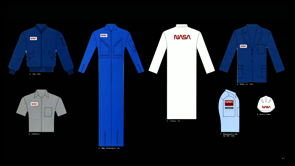
If you've seen the NASA graphic standards Manual from 1974.
That was a design system.
And they documented their system across vehicles, air and spacecraft's, even their uniforms.
Everything was thought through as a system. And some could say that these were more brand focused. However, you know, these days, especially with software and digital product, digital products, design systems have come to mean a lot more or to include a lot more.
And so fast forward 45 years from the NASA system I mentioned, you have online design systems or digital design systems, and they've come to have a lot more than identity or branding guidelines.
And for some folks, it's a sketch UI kit.
And this was the sketch UI kit for the Salesforce Lightning design system that we worked on in 2017.
And some folks would argue that this is not a design system. I would suggest that perhaps it is and only because the words design and system are really vague words.
And if we take it at its simplest meaning it's just a design thought through as a system of elements or just as a system.
However, I will say, you know, I am of the opinion that a sketch UI kit is pretty basic, and might not be the most effective, especially with the everything that we need to do with design systems today. And so it could be taken so much further and be to be truly useful.
So at Salesforce, this UI kit was only a piece of the design system.
So for many companies, design system showcase a component library, or pattern library or UI library, or like whatever you decide to call these, everybody has different names for them.
I used to just call the style guide, whatever you wanna call them, basically documentation which shows code, usage guidelines. This definitely has a more practical and effective value over a sketch UI kit in my most humble opinion. But that's not to say that this is the only way a design system can be either. So these days, a design system has come to mean an entire ecosystem.
The UI kit can be part of a group, including design assets, design principles, and the visual design language, which is also part of a larger group of brand. And brand can include content strategy, voice and tone. And these can be in the style guide, which also includes components documentation, UI presentation layer, and that overlaps into development standards and processes. A little while back, an article came out by Alex Schleifer, who is the head of design at Airbnb, and I did mention this yesterday too, but he wrote an article called The Way We Build, How Rethinking the Airbnb App Changed The Way We Approach Design.
And he wrote about their ambition to rethink how people are Airbnb worked.
And he said, "Here's the simple truth.
"You can't innovate on products "without first innovating the way you build them. So hopefully, you already know that design systems do not inhibit creativity.
But just in case that you are thinking that I am gonna try to convince you otherwise.
Yesenia Perez-Cruz wrote an article a while back for the Happy Cog Blog called Sweet Systems. And in it she said, "a beautiful design system is about finding the same balance "of consistency and variety to systemic "or systematic and the design becomes predictable "and repetitive.
"Too much variation and the system is confusing "and overwhelming." So I have observed a little bit of debate among some dudes. It's always dudes on Twitter, on the creativity and the design of design systems itself, like I mean the actual design system website rather than the product.
And I'll share some opposing views that I've seen without personal comments, you can come to your own conclusions on where you stand on this.
So, Andy Clarke is written and presented on finding many style guides and design systems to be unimaginative, and in his words, "Ugly enough to have been designed "by someone who enjoys configurator router. "And he argues that they should be art directed "and inspired." And he said, "In many ways, I'm as frustrated with style guide design "as I am with the general state of design on the web. "Style guides and pattern libraries needn't be dull "in order to be functional.
"In fact, there's a prefect place for you to try out "new ideas and technologies.
"There's nowhere better to experiment with new properties "like CSS Grid than on your own style guide. "The best style guide design showcase new approaches "and possibilities.
"And don't simply document the old ones.
"Be as creative with your style guide designs "as you are with your with any public facing part "of your website." Um, he even released what he called inspired guides, which were a set of templates that you could use as a starting point or for inspiration to have more beautiful looking style guides. And it seems like he's taken the site down so I'm not sure if he can still get these but I imagine if you email him if you're interested, he'll probably send them to you.
So an alternate viewpoint comes from Josh Clark another Clark just spelled differently.
He wrote an article called, "The most exciting design systems are boring." And he said, "Design system builders should resist the lure of the new. "Don't confuse design system work with a rebrand "or tech-stack overhaul.
"The Systems Design Patterns should be familiar, "even boring, the job is not to invent, but to curate. "Design systems or containers for institutional knowledge, "they provide tested and proven solutions "to design problems.
"And when these solutions are held together "by consistent visual language and UX guidelines, "they represent what good design looks like "for the organisation or platform.
"When the design system is boring, "it frees designers and developers to do the new stuff "to solve new problems.
"And the design system carries the burden of the boring "so that the designers and developers don't have to." And finally he says, "Crafting a design system is about clearing the way "for others to invent and imagine.
"And that means boring has never been so exciting." So two product designers that I worked with at Salesforce, had some interesting takes and wrote for the Salesforce UX blog.
And one of them was Katey Basye who wrote an article called, "How the Salesforce Lightning design system helped me onboard as a new product designer." And in it she said, "Fortunately, the design system has helped me "move forward each day with some degree of confidence. "Because it was created in a collaborative, "user-centered way.
"The design system has a lot of agreement baked in, "and my team won't be distracted by whether "I'm using the right blue-gray on hover." And she kind of concludes the article with, "Freed from some of the daily tedium "that can come with being a designer, "I can shift the bulk of my time and energy "to looking at the bigger picture." And another product designer that I worked with was Raymond Sutedjo-The, I hope I pronounced his name right, sorry Raymond if I didn't, but he wrote about turning constraints into catalysts for creativity. And the article goes over like how he came up with creative solutions when certain constraints either through like technology limitations, or maybe there's requirements for accessibility that came into play.
And he said, "As designers, we love to explore possibilities "and push boundaries.
"So it's easy to think that technological constraints "often put a damper on creativity.
"After all we wanna work with, "we want to design to work with not dictated by technology "to provide a good user experience.
"Facing limitations, however, forces us to take a second, "third, or even fourth, look at our idea.
"What is the merit of the original idea? "What are the existing limits? "Why were they put into place? "What are negotiable and what aren't? "Can we accomplish the same goal in a different manner?" And finally, he says, "Constraints need not to be suffocating.
"They don't always make your lives easier.
"But embracing them can lead to new paths "and surprise you in a good way." So, let's talk about what it means to be creative, And so for some people, when they think about being creative, they think about aesthetics, like how things look. And yet for some other people, when they think about being creative, is it more about problem solving.
So there's a little bit of friction here and what it means to be creative.
So what does creativity mean to you? Is it solving problems or applying a good aesthetic? And so let's talk about aesthetics.
Amelie Lamont is a really good person to follow on Twitter if you don't already follow her.
And she's have a lot of really provocative and thoughtful threads on design, inclusion, ethics. She started a new thread with, "What if there was a school teaching design "decentered from the hegemonic design gaze "and centred unheard voices, ideas and cultures." She made a mock up of what that website for that school could look like.
And she said, "the hegmonic design gaze dictates "what good or bad design is, "even are often from an aesthetic point of view "with little regard for utility, origin or environment. "And many of the formative ideas "of the hegemonic design gaze "stem from the Eurocentric ideas of design. "Have you ever noticed that when you open a design textbook, "all the design, greats, historical or modern "come from Western white cultures?" And I think this is an interesting conversation to have, especially when it comes to design systems. A little while after that Isha Kasliwal had some similar thoughts that she shared.
She said, "I love travelling to Asian countries. "Because it's such a good reminder," Bless you, bless you.
"Such a good reminder that minimalism, symmetry, "black white design is not all that matters. "And there's so much aesthetic beauty in loud colours "and patterns and visual balance doesn't only "come from evenness.
"And the fact that every young designer is taught "that Eurocentric design is the best needs to change ASAP." And this really struck me and I agree that most folks I know, including myself, were educated on design that were rooted in Eurocentric standards, the grid, typography, the style, all comes from that point of view.
So obviously, when you're designing, you're gonna have your brand's existing aesthetic, but when it comes to starting a fresh new brand, or perhaps evolving a brand, just something to consider.
Jennifer Hom is a person, I really love her work. She leads to the illustration and art direction that Airbnb. And she had this really awesome presentation that I've had the opportunity to see a few times now. And it goes over like their approach to illustration as a system.
And it included extensive exploration on not only ensuring that those illustrations were inclusive and diverse, but also how to localise them to markets such as like China where diversity is gonna be represented differently than in the US. So, you know, there may be videos of it online that you can find I would recommend watching it. I'm hoping they launched the one she did from Clarity soon. I had to get her permission first.
But there is an article, Wired Magazine wrote if you can like Google it or I can send you the link later, but they did a whole feature on her and her team and there's a quote in that article that I really loved. And said, "I looked at it not from an aesthetic perspective, "but what is the company trying to do? "How is it moving into the future." So thinking about the overall goal or vision is essential. So design principles are a great way to bring alignment. Alla Kholmatova recently wrote in her book called Design Systems, that design systems must be relatable and memorable.
And she suggests that you should always use them, you should always refer to them, you should include them in your presentations, reference them and design critiques, and you should even display them.
And she also suggests that you shouldn't have too many of them.
So at Salesforce, we had four design principles that guided our organisation.
And the first was Clarity and it's a total coincidence that my conference is also called Clarity.
I bought the domain two years before we landed on these principles, but it's kind of cool to see that like, you know, that was already so ingrained in our organisation that influenced how I named my event.
But anyway, the idea behind Clarity is to eliminate ambiguity, enable people to see, understand and act with confidence.
And the second principle was efficiency.
Streamline and optimise workflows, intelligently anticipate needs to help people work better, smarter and faster.
Consistency, create familiarity and strengthen intuition by applying the same solution to the same problem. And finally, beauty, demonstrate respect for people's time and attention to thoughtful and elegant craftsmanship. So we had these beautifully illustrated posters displayed all over at Salesforce.
Our design systems intern at the time Myles Thomson created these beautiful illustrations of monuments in San Francisco and we gave them out as postcards at events. We talked about them all the time.
But most importantly, we used them to drive our design decisions.
And in case you're wondering, we did hire that intern, and he's an awesome product designer at Salesforce now. This is Craig Villamor, he's my friend and mentor friend-tor, if you will.
And he was the chief design architect at Salesforce at the time.
And he wrote an article when we launched the lightning, not just the lightning design system, but the actual product, the Lightning Experience that the design system was made in, tandem with. And he wrote, "The more decisions you put off, "and the longer you delay them, "the more expensive they become." So it's really important to get to your design decisions as quickly as possible.
And you can use your design system or your design principles as an actionable tool.
So in our case, that order that I gave you the principles in are very intentional.
We stack rank them according to our priorities. And that can actually work as a tool, so that you can like weigh your options.
So for example, you have a tab that describes a feed. But maybe in another screen, you wanna call that tab collaborate.
This is actually something that we dealt with. And so there's the argument like, well, we call it feed everywhere else.
So why would we call it collaborate here? But in this particular context, based on what you're doing with the feed, collaborate made more sense of provided better clarity. So in that case, that actually won out.
So by having your principles stack ranked, it actually enables you to make design decisions with confidence.
As exciting as design systems are right now, it's unfortunate that some of them do fail. And in my experience, I found that failed design systems are due to a lack of unified vision, no shared language and no purpose.
So these are the areas you wanna focus on so that you can set your design system up for success. And collaboration can really bring out your creativity. In fact, one of my best friends Mina Markham said in her art direction presentation that she gave recently, collaboration breeds creativity. Jerlyn Jarnpoon-Phillips wrote about the work that they did at Clearleft, which is an agency in Brighton and she was talking about, you know, they're doing design systems but for clients, and she said, "Through sketching with clients, "we use their expertise to generate a deeper understanding, "and more informed visual designs.
"And in these sessions, people tend to tell stories "as they draw or talk out loud, "about ideas they have and can't really articulate yet. "We work off each other's ideas "to come up with solutions together." So like, instead of saying like here, client, here's your standards.
And it's more of a collaborative process where they come up with those standards together, through working together.
And I think it's also important to remember that you don't need to feel limited by the system. Not everything has to be in the system.
And not everything has to be from the system. It's totally okay to have special snowflakes. If you're using them to like show intent or like communicate, or provide a specific interaction that only serves that particular context, it's fine. I also love the talks Mina Markham gives where she shows you know, they have their standard type our fee, their standard general components, like buttons, and inputs and things like that.
But then they can combine that with some really interesting, beautiful, responsive layouts that they do with CSS Grid and get really creative and more editorial. And it's really awesome what you can do when you combine these two concepts together. Additionally, it's okay to evolve a system, Claudina Sarahe had said in her talks "That patterns are not dogma, they can change and adapt." A great design system should allow room for change and evolution.
So I mentioned the UI kits that we worked on at Salesforce. And I admit, it was really tedious to create these alongside the actual coded components, which we saw as the source of truth.
But things are getting better.
Lots of emerging tools are coming out that make UI kit components actual code that you can have in your framework.
It's funny I already had these two companies mentioned before I realised they were sponsors.
But you know, fun coincidence to see but one is Mojos which had a really awesome Kickstarter campaign recently.
And you can see as you're designing your screens in a way that shows it's true, like responsive nature, you can apply changes to it much like you would with CSS, but in a composed, like graphical way.
And so I see a lot of potential in this one. And another one is Interplay, which has a very similar mission.
And you can bring in like your actual framework code. And, you know, play around with the grids and specs and things like that.
So definitely go check out those demos, I promise they didn't pay me to say this.(laughs) And I also wanted to mention Webflow, which is like if you took the website creation tool, similar to Squarespace and combine it with a design tool that produces code like that's kind of like what Webflow is.
And they recently added a CSS Grid editor.
So I was designing my website, and I use the CSS Grid editor.
And I have to admit, this tool actually helped me understand how CSS Grid works, because I was interacting with it and seeing it so it was really exciting.
Sometimes it's fun to do other fun things outside of the product and systems work.
It may not go into your design system or product, but it's more about like relationship building with customers or like creating better morale on the team. And so 18F, which is the digital organisation in the US that at the time, it was called the Draught US Web Design Standards. They've since rebranded to the US web design system. They actually just launched a new version like this week or last week, and it's really cool, so check it out.
But a few years back, they did this fun design system themed digital Valentine's Day cards, and this one said according to me you're the best. And this one was like roses are hex value for red, violets are hex value for blue.
So I thought these were super fun.
And the Microsoft's fluent design system team did a Twitter contest, where they asked you to choose which of these items you wanted a shirt, a tote, water bottle, socks, some pins, and I was just kind of playing around, like I want all of them.
And I won, I didn't even realise it, (laughs) I was gonna win and so they sent me all these things and so this is some of the best looking design system swag I've seen recently.
I mean, it's all black.
So it's like my entire wardrobe and I dig that geometric goth aesthetic, I'm into it(laughs) And so at Salesforce, we we did create a lot of swag for not just internally but also for our customers to give out like a dream force.
We had designs, principle postcards, the standard puffy vest that's required uniform in San Francisco (laughs) and all sorts of other fun things and it can really help generate some excitement. I wanted to wrap this with a final comment, which is funny cause my talk yesterday and today kind of had this band metaphor thing going.
But I was in New York a couple years ago to attend Designops Summit.
And one of the talks that really stood out to me was by Jim Colbeck, and he begins his talk with basically what you can see here, these band members, they all get up on stage, and they just start playing jazz.
And it was really good.
Like, we were all kind of like bopping our heads around and snapping and stuff, like it was really, really good. And then he gets to the mic, and he explains that they had never practised together before. And there was a reason they were able to get up and play awesome music together, even though they'd never practised together. And so, he basically explains the jazz, apparently I learned something new on that, that trip, but like, jazz is essentially a pattern library. And when you learn all the rules and the patterns, then it enables you to be able to do things like that, like just get on stage and just play.
And then you can have like your moments where you go off on your, you know, explorative, you know, maybe somebody on the sax just kind of goes a little wild. And then the guy on the base, do, do, do, like, you can have all those like really fun moments and then come back together.
And like play together through those patterns. And this, I, when I saw this, I was like, that's brilliant, that's gonna be my response now when people talk to me about systems and creativity, cause I thought that was just so perfect.
The last thing I wanna mention is something I always want to remind people of I've kind of made it my mantra recently, but design systems are for people. It's not about tools and pixels, and automating things and all that though it's fun to explore all that and it's good to explore all that.
But really at the end of the day, it's for people, whether its internal customers, like your teammates, or external customers.
So I encourage everyone to get involved in the design systems community, it's a really awesome community.
styleguides.io is probably one of the most expensive resources, it's got articles, presentations, podcasts. It's kept up to date by the community.
So definitely check that out.
I also run the design system slack.
It has like over 10,000 people in there now, which is awesome.
And it's actually not too noisy.
Believe it or not, I'm a good cop in there. (laughs) If you want to go to design.system/slack and put your email in there, it'll automatically send you an invite from me and then you can join.
As mentioned earlier, I do run a conference in San Francisco, actually, last year was in New York, but generally in San Francisco called Clarity. So this year is in August, if you're able to make the trip. You know, I would love to see you there.
Maybe come let me know.
And maybe I'll give you a discount code, we'll see. I also wanted to mention Patterns Day so they did an event two years ago in Brighton. This is by Jeremy Keith, who's at Clearleft. They did announced they're doing another Pattern's Day this year, which will be June 28th. So if maybe Brighton a little closer or more appealing to you than San Francisco. Go check that one out.
And there's also a design systems conference in London. And there's rumour that they're gonna be announcing some stuff soon for their next event.
So check, keep an eye on them.
And then Steve Robson, who's a really awesome guy in the community, curates a newsletter for design systems.
So it's at news.design.systems.
And then finally, if you wanna kind of just get up to speed on design systems and the practise of it. There is a free online book that I co authored with some awesome folks and it was published by Envisions called the Design Systems Handbook.
It's just free online.
So it's on the designbetter.co site, so you can grab it there.
If you wanna catch up with me, I'm on Twitter, GitHub, Instagram, like almost all of the things as Jina.
And that's basically my talk.
So thank you.
(audience claps) (upbeat music)
A common misconception about Design Systems is that they prohibit designers from being creative. This is far from the truth. Jina Anne, a design systems practitioner and advocate, will share her thoughts and ideas on using design systems to empower and strengthen your creativity while still keeping its goals of scale, maintainability, and efficiency at heart.
Today Jina is talking about design systems and creativity – a show of hands indicates most people here are using a design system! There has been a lot of pushback against design systems in the design community.
An old Apple interview question: imagining an Apple stove… there are a lot of guidelines – particular materials, accessibility requirements and so on. Would you consider that a creative task? (Well surely yes!)
Remembering the CSS Zen Garden – it was an example of how to be creative within constraints.
It’s a perennial question…
Is (x) killing web design?
Generally, no. Things don’t kill design. Design systems aren’t new, they’ve been around for decades.
Many companies surface their Design System through a UI library or something like a Sketch UI kit – those aren’t the design system, they are part of it. The term Design System really refers to the entire design ecosystem including things like brand, voice and tone and so on.
Design systems do not inhibit creativity!
A beautiful design system is about finding the same balance of consistency and variety. Too systematic and the design becomes predictable and repetitive. Too much variation and the system is confusing and overwhelming. Yesenia Perez-Cruz
Andy Clarke famously lamented that many style guides look ugly enough to have been designed by someone who enjoys configuring a router
. He argues that we need art direction; that style guides and pattern libraries needn’t be dull; an that there’s no better place to experiment with new things like CSS Grid than your own design system.
Josh Clark wrote an article saying the most exciting design systems are boring. They are not there to invent the design or brand, they are there to curate it. “The design system carries the burden of the boring” so that designers and developers don’t have to.
Freed from some of the daily tedium that can come with being a designer, I can shift the bulk of my time and energy to looking at the bigger picture. – Katey Basye
Raymond Sutedjo-the talked about turning constraints into creativity. Constraints do not need to be suffocating, they can lead you to new paths and surprise you.
What does it meant to be creative? Many people will think about aesthetics, others will talk about problem-solving.
Aesthetics…
What if there were a school teaching design decentered from the hegemonic design gaze + centered unheard voices/ideas/cultures? – Amelie Lamont
I love traveling to Asian countries because it’s such a good reminder that “minimalism,” symmetry, black/white in design is not all that’s matters; there is so much aesthetic beauty in loud colors and patterns, and visual balance doesn’t only come from evenness. – Isha Kasliwal
The point is that design is heavily influenced by white, euro designers and education reinforces it; and that needs to change.
“I looked at it not from an aesthetic perspective, but what is the company trying to do? How is it moving into the future?” – Jennifer Hom
…
Salesforce used principles to bring the design system together:
- Clarity
- Efficiency
- Consistency
- Beauty
Many people will be familiar with the beautiful posters of these principles, illustrated with San Francisco landmarks.
The more decisions you put off, and the longer you delay them, the more expensive they become. – Craig Villamor
Failed design systems are due to a lack of unified vision, shared langauge and purpose.
Collaboration can bring out your creativity.
Mina Markham – “Collaboration breeds creativity.”
Jerlyn Jarnpoon-Phillips (Clearleft) – talks about using sketching as well as a design system.
Not everything has to be in or from the system. It’s ok to have special snowflakes, if they are being used to provide a specific interaction that only serves that context.
It’s ok to evolve a system. Patterns are not dogma.
There are new solutions and products coming out trying to bring design and code closer together:
- Modulz
- Interplay
- Webflow – includes a great CSS Grid editor!
Sometimes it’s fun to do things outside design systems work.
- US Web Design Standards did a set of design system themed valentine’s day cards
- Microsoft fluent design did a twitter competition about which bit of swag they wanted
- Salesforce fcreated a lot of swag to give out
…these things can all generate some excitement.
"**Jazz is a pattern library**. It allows people to compose, create in harmony. It brings consistency without hampering freedom of creativity"
Absolutely loving this analogy. ??❤ pic.twitter.com/D0yvaBLPWk
— Simon Vrachliotis ???? (@simonswiss) April 11, 2019
A last comment is a band metaphor. Jina was attending Design Ops Summit and they had a band get up on stage and start jamming, and they were doing really great freeform jazz – even though they had not played together before. Jazz can be thought of as a pattern library, if you know the patterns people can quickly and easily play together.
Design systems are for people. They’re not about tools and pixels and automation, although those are fun and useful. At the end of the day they are created for people, whether internal consumers or your users.
styleguides.io
design.systems/slack
clarityconf.com
patternsday.com
news.design.systems
designbetter.co/design-systems-handbook