Better Onboarding
Thank you so much for that introduction, and thank you all for being here as well.
This is my first in-person talk since the pandemic began, and so I'm just really excited to be able to talk about my favorite topic, which is onboarding design.
But today I do need to start us off on a cautionary note with "A perilous tale of onboarding." This tale begins with a designer who has taken on the task of creating an onboarding experience that welcomes new users to their product.
They happily start putting their design skills to work, choosing a common pattern.
Three carousel screens presented upfront that highlight the top features of the app.
They add some welcoming text and imagery, ending up with something that they think looks really nice, but then it begins.
Someone from the team pops in," I love what you've done here, they say, but I'm afraid it's missing two of our favorite features.
We can't risk new users missing those." So they beg our designer add them in.
The designer hurriedly adds two more screens.
It feels a tad crowded, but after all, what is two more in the grand scheme of things, if it means new users know everything they need to.
But then someone else comes in, they say, we need to allow, ask people to allow notifications at front.
Notifications increase engagement, and I'm afraid that if they don't turn them on right away, they'll never turn them on.
So our designer hurriedly adds a notification prompt at the end of the carousel, but the voices don't stop.
Some people come in asking for agreement screens, maybe some additional prompts for permissions.
How about some new features that we can highlight as well?
Maybe more detailed text and imagery.
And our designer frantically toils away, addressing all pieces of feedback until, finally, their work is done.
Everyone feels satisfied.
They've got everything they need in that experience.
Now they can lean back and wait for those new users to roll on in.
But just when they thought it was over, the data comes back.
New users aren't sticking around like they'd hoped.
So the team starts chatting about maybe adding some additional tutorials.
How about a tooltip tour?
Maybe a video cue the sequels.
Thank you for indulging me in that little bit of dramatic theater.
But the point I'm trying to make today is that oftentimes it's fear that gets in the way of better onboarding.
We fear that new users will leave if they don't know everything about our products right away.
Or we fear that they won't do a single thing after day one.
And sometimes, even selfishly, we fear that they won't recognize our team's hard work.
Show of hands if you've run into any of these fears before.
Yeah, I understand where these come from.
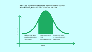
However, when we try to follow such fears, that can lead us toward unnatural, the most common of which is frontloaded instruction.
This is when we try to tell new users everything above our products right away upfront, using anything from carousel tutorials, slideshows, set up flows, video tutorials, that sort of thing, and it comes with its perils.
For one, it's very hard to remember.
It's like attending lecture at a university.
You will not know everything from a class after just one sitting.
It's also out of the context of use.
It's really hard for someone to understand how what you're telling them applies to things they'll do in the future in the product.
And this approach also has questionable value.
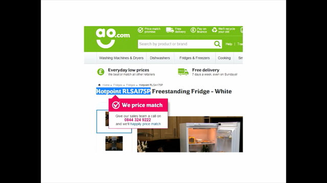
Consider a case study from TV and music platform Vevo.
They did an AB test where they had removed some tutorial carousel screens from the front of their app, and when they did so, they found that the number of signups for their product increased without any downstream drop in retention or engagement.
Or another way to think about this is that perhaps this was actually hurting their core metrics.
In a research study done by on mobile app tutorials done by Nielsen Norman Group, they found that participants who read the tutorials actually perceived what it was teaching them as more complex than people who didn't read the tutorials.
And yet they were no more proficient at what those tutorials taught than those who skipped them.
So now they're starting with a first impression of complexity with no added benefit.
And I learned some similar lessons when I worked on Android Wear, now called Wear OS by Google, a smartwatch operating system.
At one point, we'd created a tutorial video to play on people's phones while the watcher was setting up.
We had done that in order to help increase awareness of the features of the watch drive usage.
However, in practice, the video got few views.
And when we researched people who actually did watch the video, didn't actually have any impact on their understanding of features or usage of it, and eventually we removed it because of this fourth issue with front loaded instruction, which is it's very costly to maintain this stuff.
It's possible your team might be spending weeks, months, even years trying to keep this up to date as you change things in your product or make other changes.
So we have to ask ourselves: if this has questionable value, aren't there better ways to approach the onboarding of new users?
And that's what I'm here for today.
I wanna help us look past our fear and towards better onboarding.
And that starts by recognizing that better onboarding comes from guided interaction, not front loaded instruction.
Guided interaction really has three things underpinning it.
First, it means that we onboard users at their own pace.
Instead of forcing them to do everything on a compressed timescale, we defined for them.
It also means that we anchor information to action.
So instead of presenting instruction or information out of the context of use, we anchor it to that context while people are taking action.
And it also means that we extend guidance to people that feels like an authentic part of our products as opposed to something that's tacked on or separate.
So what might this look like in practice?
Well, let's say we have a hypothetical product.
You can ask questions about fashion industry topics and get answers from a community.
This product has a set of community guidelines , and the team really wants new users to understand and follow them because people who follow the guidelines create content that keeps the community active and coming back.
Now, the typical front-loaded instruction approach would look something like this: a big screen presented up front that says, "These are our guidelines; read them and please agree, but of course this is really easy for people to skip or read and forget later.
What if instead, we could distribute the relevant pieces of the guidelines across the experience so that they're encountered when it's more relevant?
For example, we can get rid of that front-loaded screen and instead take new users immediately to the homepage of our product, here they can start interacting with our content, see what we're about.
It's immediately more actionable for them, but we can start to drop in breadcrumbs about the community guidelines, even at this stage.
Perhaps by associating them with the call to action of asking a question or posting a question, and we can frame it here about, you'll get top-quality answers to your question because of these community guidelines.
That's all we need to say at front.
Then, of course, if someone gets into doing certain actions in our product, they need to create an account.
Here's where we can disclose the guidelines in a more formal manner, framed around the need to agree to them, but we don't have to forget about those guidelines.
After they make this agreement, we can keep bringing them back and reinforcing them.
For example, if someone composes a question, we can bring in the relevant guidelines that help them create a good question and follow the guidelines for that.
So by taking the right amount of information and distributing across the experience, anchoring it to the actions that most supports, we create community guidelines in this case that are instantly more memorable.
And this is much better than putting them all up front in a place that's easily forgotten or disregarded.
Now, this kind of distributed and in-context approach is also helpful if your product requires a commitment from its users.
For example, graphic design platform Canva lets new and unregistered users of its website compose design materials without an account.
They have an inviting design on their homepage.
They can choose from current templates or just hit a play with Canva button.
And if they do this, they get right into the Canva editor, and there they're guided through setting up a design, editing it all the way through to the point where they can download a local copy to their desktop.
And it's not until that has successfully downloaded to their machine that they are then prompted to create an account.
Now this prompt can be framed around the value this individual has received, framed around coming back to edit their design later by creating this account.
And again, that's much better than if we demanded they create an account upfront without any knowledge about what the experience is going to be.
So how do we get to the point where we can see these opportunities to distribute guidance across an experience?
That's by also recognizing that better onboarding comes from treating it as a journey over time.
See, many of us think that onboarding is a single moment of instruction, and then, poof, magically everyone knows everything they need to about our products.
And we'll happily jump right into building habits with it.
And often our fears come from the pressure to get things right in this small amount of time that we perceive as being available to us.
But in reality, that single moment only describes first time use, and it's part of a broader journey of onboarding that's comprised of many actions people take until they build up to becoming a core user of a product.
So this really means that we need to have a different way of measuring onboarding success.
We cannot measure it simply by short-term measures.
Things like signup rate, click through rate setup, or tutorial flow completion rates.
That's not going to measure the success of onboarding.
Neither is testing if participants in a lab study can remember all of your features at the end of it.
None of those will tell you if by the end of an onboarding journey, someone will be a core user; instead, onboarding success will show up in ways that are more closely related to what success means for our products.
So it will show up as something like better shortened midterm retention of users, deeper feature engagement, adoption from new markets, especially if your product's goal was to scale to new audiences.
And higher short- or mid-term revenue if your product generates revenue.
Another way to think of all of this is that onboarding successfully ends for a person when their core use of a product begins.
Core use describes this state where a person is able to sustain their needs in a product.
While contributing to the sustainability and growth of the product in turn, and having a good definition of core use will help you align your team on the idea that onboarding needs to be treated like a journey over time.
So what might a core use definition look like?
It's gonna depend on the product.
But, here, we can look back at that hypothetical fashion question and answer product from earlier to see what an example might be.
Now, in this product, core use is gonna need to represent the fact that the community's able to be sustained and growing, and so a core user is probably one who's contributing to the community in some way multiple times per week.
Here I've said two times a week, but depending on the product, that can vary, right?
Again, this indicates a state where clearly somebody has found their needs satisfied by the product but are able, in doing that to contribute to the growth of the product as well.
Now, once you have a definition of core use, and sometimes complex products might have multiple like SAAS products, but once you have a definition of core use, you can then think about how people begin.
Now, there can be many ways that people start out in a product.
I will focus on just one to illustrate the next few slides.
Here.
We'll have a person who has arrived at our product because they have a specific question and they were searching for answers to it.
Once you have these two end points in place, then you can start to map out the actions that someone may need to take between them until they build up to that state of core use.
Now these.
I'm quickly listing them here, but in practice, we'll be informed by your qualitative or quantitative research, things like interviewing existing core users of your product to figure out what they did in the past.
And if you have a brand new product, it may take some brainstorming and journey mapping before you can get to a point where you can validate some of these actions.
Once you have a set of actions mapped out.
Then you can zoom in to each individual one to see how to apply guidance that helps bridge someone from one action to the next.
Let's say, for example, I wanted to zoom in on the action of someone posting their first question.
I can figure out how to apply guidance to it by breaking that down into three parts: a prompt, which is how we guide someone to initiate the action.
The work, which is how we guide someone to do the tasks of the action, and the follow-up how we guide someone after they complete the action.
To guide someone toward posting their first question.
We want to find a prompt that fits the context they're coming from.
So if we had looked back at this particular journey, we see that someone had searched for an answer to their question, and in doing so, they might arrive at our search results page.
Here we can have a prompt that's just simple, and in line at the bottom of the list of search results, we can just have a button that says, "Post a question, perhaps because you didn't find your answer in these results." If someone acts on this question, then they get into the work of the action.
Here, the work might involve needing to sign up for an account cuz it's most likely they don't have one yet and they need one in order to post a question.
And guidance in this state is about good form design that has cues and hints so that people put in the right information handling validation errors.
But also, we remember that you might also have to highlight some of those community guidelines that are also important to agree to as part of this.
Then, once someone creates that account, they get into the main body of the work, which is composing the actual question.
And here again, guidance can be pretty lightweight and embedded in the screen.
We've got some content prefilled from their search query just to connect those two dots.
But also, we have again the tips from the community guidelines to help them ensure that they craft a good question.
Then, of course, when they post the question, they've completed the action, and then they get into the follow-up state, and here we can guide people in two ways.
One, we're guiding them so that they understand where their posted content will appear later.
So we are redirecting them to a page that's called Activity in this case, and that indicates to them where they can go in the future to find things.
But also, we need to guide them towards next steps.
In this example, you might see we're guiding them towards turning on notifications.
This is the next step they can take in their journey.
And in doing so, they will be notified when they get answers, which will help bring them back to the product.
But this doesn't have to be the only next step they take.
They can also, as you see here, start browsing open questions that haven't been answered because they haven't provided any answers yet.
And so they can do that activity while they wait for answers to their own questions.
So in this way, we see how the follow-up state of one action can actually lead to more than one path for users.
And that's the beauty of thinking about onboarding journeys in this way: is that you can zoom out and understand how different people may choose to take different paths through.
And this is how we achieve a bit of that self-pacing that I was talking about earlier as part of guided interaction.
After all, onboarding is just not a one-size-fits-all journey.
Now at this point, I want to address and preempt one more fear that may be rising up as you think about this or perhaps that your team might express.
What about the fear that this sounds like extra work?
This is a fear that comes from viewing the work of onboarding design as separate from the work of designing your product.
But in reality, better onboarding is better product design in the first place.
Onboarding design in your core product begins there, not with overlays or add-ons.
It's what remains if a user skips, ignores, or otherwise forgets.
And even the most well-crafted add-on tours or tutorials cannot make up for confusing elements in your product design itself.
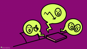
Consider some trouble that folks ran into when they tried to migrate from a certain social media platform recently.
Perhaps you're in the middle of this yourself.
Now, some platforms offer different conceptual structures than people were used to.
Things like the fed, averse, distributed servers, however you want to explain it, and this is daunting for new users not exposed to these concepts before.
This is a great quote from artist Kira, who thankfully gave me permission to use this here.
When she was talking about how it was to move over to Mastodon, and she said every Mastodon explanation is like, "It's very simple; your account is part of a kerflunk, and each kerflunk can talk to each other as part of a bumblurt.
At the moment, everyone you flurgel can see your bloops.
But only people in your kerflunk can quark your nerps, like email." Show of hands if you've been in a situation similar to this, trying to deal with new concepts.
Yep.
Someone says, Hey, it's just like email, and you're like, okay, great, cool!
But look, this does sum up what it can be like as a new user to a product that is not bridging them to new concepts super well.
Now, luckily and, I don't wanna talk too poorly about Mastodon.
It's a good offering, and it has great potential.
And luckily for it, it's had the success of momentum.
A lot of people have been moving over.
Those people are motivated to help other people, and that's helped them a lot.
But most products cannot rely on the convergence of such momentum and motivation at the same time, and they will struggle if their only way to address some confusing issues in their core product is just with an add-on onboarding experience.
So we have to think about how the basics of our designs can have impact on new users.
Things like the concepts that we use and the content model we have, navigation and affordances, even transitions between states.
All of these go a long way in influencing how learnable and understandable your product is to new users.
On the notes of navigation and affordances.
There have been many studies showing how pairing an icon with a text label is more effective than having just an icon standalone, and it can lead people to understand and actually use the features.
Those things lead to more.
Now Microsoft cataloged such an experience and a blog post from a few years back, and they found this out when redesigning the ribbon toolbar in office products.
Initially, there had been only icons for the tool sets in the toolbar, but when they added labels back into those, they said almost immediately, the tool bars were a big hit in people from all skill levels started using them.
And improvements in things like your core design can also have monetary impacts on your product by making it easier for new users to find and make purchases.
Take PrintGlobe, a company that sells custom-printed products.
For example, they originally had their shopping pages with just thumbnail image navigation all together in one grid.
But when they add text-based navigation off to the side and highlighted top categories at the top of the page, they saw an 18.5% increase in order conversion just by making those simple changes, because now newcomers to the site didn't have to have this understanding of where things lived in that period of thumbnails; they could find it more easily.
Now, once you've got a decent foundation of core product design in place, that's when you can start looking at adding layers of guidance that support specific new user states.
Unfortunately, many products tend to jump to the use of overlays to achieve this additional guidance.
I get it.
They're easy to implement.
You don't have to do anything in the core product in order to add them.
However, I wanna say that we shouldn't just jump to this, because they have perils of their own.
They're highly disruptive.
They interrupt even if they're not interrupting by popping up in the middle of something; they're interrupting you being able to understand what is underneath it, right?
If you're there to read an article, for example, you've got this thing in your way.
They're also heavily prone to collisions.
This is when multiple overlays show up at the same time, and this is actually quite hard to avoid if you're using many overlays because you cannot guarantee two things won't be triggered at once, and this is a nightmare for people with screen readers.
And it's just a nightmare for new users who wanna come to a site, see a piece of content, and then are suddenly blocked from doing it.
And anyone who's been on, say, an e-commerce site that has a cookie slide-up sheet as well as a pro-promotional pop-up has run into these issues before.
And for these reasons, they tend to be quickly dismissed without anyone actually paying attention to what they say.
I'm sure a few of these get decent conversion rates, but perhaps that's just in isolation.
But if you want people to remember information, that's much harder to get with an overlay.
So instead of just jumping to them as your defective solution, for additional guidance, we wanna think about ways to extend the authentic design of our products so things feel more integrated and therefore more memorable.
One of the best places to start doing this is with the empty states of your product.
Here we have an example from money transfer tool Wise.
Someone is on the empty state of the home screen, and in the home screen normally there would be account activity there.
Of course, you're a new user, you don't have that account activity here, so they create a special state of the screen.
It's got messaging that clarifies what will be here and brings the actions of sending or receiving money into this state as well, so that they can start getting this activity happening.
Sometimes it's not empty states you have, but sometimes you need to introduce a feature to a user in the context of the product experience itself.
Here we have an example from Gmail using the Smart Compose feature.
Smart Compose helps people complete sentences as they type.
It will show gray text as a suggestion, and you hit the tab key to accept it.
Now, to introduce it to new users, they had a little intro message off to the side of the email.
So yes, this is an overlay.
It's not interruptive; it's supplemental.
It's not blocking someone from composing their email.
And also ,they added a little hint that says "tab" in line with the suggestion.
Once somebody hits the tab key, starts using this feature.
This gracefully reduces into just the day-to-day experience, which is just the grace suggestion text.
So now we've got a way they've extended the authentic design of it without having it be a completely separate layer from the experience.
And finally, we have a robust example of special content just for new users.
This comes from the iPad drawing app Paper by We Transfer.
New users have the option of playing with a demo sketchbook of sketches.
This demo sketchbook marries interactive art samples with videos and help content.
What we have here is a page that is focused on highlighting the blend tool, and we can see there's some art prefilled.
You can start editing away playing with the tool, or you can watch the little video that's in an overlay.
Yes, another overlay.
But notice here it's not interrupting this task; it's supplemental.
And the other notable thing with this is, yeah, here we have a video tutorial example.
But again, it's brought into the context of this experience.
It's not presented up front like you have to learn, blur a blend separate from using it.
So again, we can use these things, but you have to find out what feels like a natural extension of your product and then choose those patterns.
So Better Onboarding is about better product design.
We wanna make sure that we try to address confusing issues in our core product first, and then think about how we can add guidance just for new users by us extending it authentically.
Better Onboarding is also a journey that happens over time, so we need to think about the many actions someone might take on their onboarding journey and then zoom in to see how we can break down guidance within the flow with it.
And both of those just ladder right back up to the idea that better onboarding is about guided interaction.
Making sure that we're not telling people to do things or know things out of the context of use, but bringing into the context of use.
Thank you very much for joining me here to talk about better onboarding.
I have some reading you can do; obviously, I have a book, which Simon thankfully talked about earlier.
I also have a bunch of articles and a reading list at kryshiggins.com/onboarding and you can connect with me on LinkedIn as well.
Thank you!
When new users arrive at your product, their onboarding experience is the process that welcomes and guides them towards lasting success. But in a team’s quest to address their worries about meeting short-term metrics and feature awareness, onboarding often gets condensed into just a one time, frontloaded flow, missing out on its longer potential. In this talk, you’ll get an overview of what it takes to design a better onboarding experience through guided interaction.
We’ll cover how to fit onboarding into the user journey, why guiding users through interaction is a more effective strategy than relying on passive instruction, and how designing for new users connects to designing a better product overall.