Fixing Frustrating Design Patterns in 2023
Hello, dear friends over there in Australia!
I'm so tired, I can't make it this time around.
I hope that our paths will cross very, very soon.
But in the meantime, I hope I can share a couple of things with you.
You know, like this.
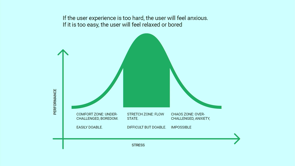
So over the last couple of years, I was very, very excited to be working on a number of projects where I could test a lot of different things.
And I really like identifying, I would say, pain points, things that people really struggle.
Things that really are frustrating, annoying, you know, this dark nightmare of UX almost, and try to find a way to fix them.
And we were able to find a couple of techniques that worked really, really well, and this is what I want to share with you today.
But first, I want to take you on a journey, on kind of my journey of how I even got into this world of computers and the Web.
And in the beginning everything was different for me, right?
This was the star for me.
This was the game I would play day and night, trying to figure out just how to get through all this levels of this game called Prince of Persia.
Some of you might be familiar with it because this is what it looked like, so get in and spend.
I would spend literally days and weeks, and months trying to figure it out, and I never did.
So I had to go through the walkthrough on YouTube, actually, to figure it out.
But then eventually, a couple of years later, I discovered this website.
This website has changed everything for me, and I made it absolutely everything.
With this website, I was able to identify myself almost, and I discovered that this is what I want to do on the Web.
Ironically, for this one website, right, if actually maybe slow down a little bit for that website today is 27 years old, and I assume that that website might be bit older that some of you sitting in the audience today, right?
This was possible back in, 1997, 1998.
That was incredible.
No flash by the way, it was Macromedia, uh, Macromedia or something, uh, right back then.
So we went a long way from there.
So we got to pages like this, and I was really excited to see this innovation happening around 2010, 2009, where we got this Ivan Ferreiro website that making rounds, incredible rounds all over the Web back then, which kind of meets video text meets Web design in kind of weird, funky way.
And we went a really long way from there, right?
Getting to this puppet theater website, which happens to be one of my favorite websites ever.
Everything just fits so beautifully in here.
That's a puppet theater from Warsaw in Poland, and you had this metaphor of this puppet theater thing, both on the main new and in carousels and on the homepage and everywhere.
It's beautiful; it's absolutely amazing; I love it in every possible way!
But how come that we ended up in this world instead?
So those things that I showed, and this little website from Poland, it's a, it's a wonderful, delightful experience, but usually we don't get that on the Web, right?
Usually we get maybe things like this, where we have an incredible wall of text around passwords or even, you know, really complex and sometimes even ridiculous password requirements, which we just have all over.
And eventually you stumble up on some ridiculous things, like altogether, like this is, the website that allows you to add a newsletter signup in your shopping cart.
You then check out with that new set of signup in your shopping cart for free; fortunately, well, fortunately this free, so that's kind of cool, right?
So you go into this thing, and then you go and do checkout for free, which is good.
And then, you obviously, get a confirmation on your email with the link to sign up for the newsletter when you have to click, and then you actually go there, you type in your email again, then you get a confirmation again, then you click on the link again, and it's only then when you're signed up.
That's just totally frustrating.
It's weird.
Why would we do that?
and some things are just evil.
But when we look into those kinds of things, they're just really ridiculous and evil.
Now, we don't have them anymore, to be honest, but we have them discussed in slightly different way, like this.
And I don't know about you, but I'm always that person who is going in and tries to figure out in that particular rectangle, that particular piece , is it still kind of technically a crosswalk or not?
And I waste, I don't know; minutes trying to figure it out.
So sometimes I feel like I'm in a movie where somebody's pulling all the things just to, for me to play that game.
That's just really confusing and very, very strange.
So how can we fix that, now that we probably cannot fix, but we can fix some other things.
And specifically, I think it's one important and significant thing that we started doing when we actually tried to think about any kind of design, is to really think about KPIs.
So when I give you this kind of pattern, you would say, "This is just confusing." So this is a date picker.
Well, it's not necessarily date picker; it's more like a date constructor of sorts, right?
And so what you do here, you're constructing your data, but the problem is, oh, when you'll see for the first time, you think this is just totally weird and strange, and why would you do that?
Right?
But you need to be very careful about the context because design is not art.
It's not supposed to be in the museum somewhere, right?
Designers is supposed to solve a problems, but if it solves a particular problem in a particular context, we should be able to kind of figure out and to measure, how well a particular design solves a particular problem.
And this brings us to the notion of design KPIs.
This was designed specifically for a public library.
And in that public library, it actually allowed people to type in the registry, the registry books, right, to index books approximately 15 to 18% faster.
That is significant.
In that regard, it's a brilliant design for that context, but we probably wouldn't want to see it all over the place when we are actually booking a train ticket or anything like that.
Like that would be just very strange and confusing.
So one thing that I started working on is this notion of design KPIs where we actually, when we try to measure the quality and the effectiveness, I would say, of a pattern of a design pattern, we're looking at those things, and there are plenty of those.
There are two most important ones: the most important ones for the tasks that people are most likely to do on our website or in our ,product or in our service, right?
First, how high are completion rates to get there to kind of get their tasks done?
Second, how quickly they actually get their tasks done, right?
Third, how often do errors occur?
And fourth, how often do people actually recover once errors occur?
Right?
So these are the two, four most important ones that you also see here on the top right here.
Right?
So basically, we would get an time to complete for most important tasks, time to relevance.
For example, things like search, frequency of errors, air recovery speed, and a couple of others.
I also try to frame things like accessibility and performance, and some established metrics like system ability scale, in here as well, but also service desk inquiries are a part of it too, right?
So I would actually spend quite a bit of time thinking about how can my design help other departments in an organization, and how can this pattern or this idea, or this technique help to solve their problem?
Right?
And most recently, it was also around environmental impact, right?
Where it's all about how can we actually make sure that our website is as sustainable as possible.
So given a series of tasks, we then give these tasks every four to six months to people, and we track how well we're performing across these four main metrics.
Um, you know, overtime, right?
And this brings me to some results which actually work better than others.
So let's take a look at some of them.
The first one that I want to focus on is Carousels.
I know that you hate carousels.
Well, most designers actually have carousels, I hate carousels.
At least, I have very strong opinions about carousels.
Maybe I will make you fall in love with carousels because the carousel that we're usually designing are not working.
But the carousel, you know, one carousel is not like the other.
So we can actually have quite a bit of innovation there as well.
So there is nothing wrong about carousels per se, right?
There is no reason to hate them.
They're beautiful.
They're nice.
Like, just look at this wonderful illustration by Jacky Gilbertson, right?
There's nothing wrong with the carousel.
There is one beautiful carousel in the back, wonderful carousel in the front, fantastic!
But once we start diving deeper and we're looking at this kind of pattern, we have a frame, which also called a slice or a slide of a carousel, and then we have arrow left and arrow, right?
And then we can navigate between, right?
Sure enough, yeah.
So that seems to be like a pattern that we all understand, but if we actually look in the data, we will see that most of the time, those patterns or those carousels don't perform well.
So we see that some slides normally position number one of that carousel gets a lot of attention, but then the others do not.
So, like, two to 3% each, or so.
Well, position one gets around 85 to 90%.
That's actually quite typical.
So, um, how can we actually make it more exciting and engaging for people?
Well, if we look back here, there is no reason for somebody to tap through that carousel, right?
Because they have these dots, which represent basically the state or the progress, and that's it.
There is no context in here.
Why would you want to click on the random button?
You wouldn't.
But if you start looking around, it's not always like that.
You will find, for example, that in Turkey there is no point of using these bullets or dots in between, right?
Instead, what you find much more, right?
Much, much more are numbers.
And when I actually ask people, "Why would you use numbers?
That's a little bit strange.
I've never seen it before." Well, this gives you a point of reference, so this is a little bit more context.
So instead of saying, "Count that bullet from the left, like six bullets from the left, at least have now a number." Sometimes it's combined with a regular carousel as well, but it kind of gives you an idea there too, right?
And it's actually all over the place.
You find these numbers; these usually all over the place.
And this is probably one of my favorite examples ever, right?
It's like if you had to design, uh, a museum for carousels, that exhibit is definitely going to be there.
So you have a horizontal carousel, a vertical carousel, a carousel with thumbnails, and a content slider all in one single place.
But let's dive a little bit deeper.
So numbers, sure.
Okay.
But that's not really helpful, right?
So if we look at this, and I want you to think for just a second, if you wanted to navigate that carousel, you wanted to move this carousel, this is a carousel that you see here, right?
And we have this little slider thingy.
So you have this kind of vertical line, have a thumb or dot in between, like the blood dot here.
Have these numbers: one and six.
So think for a moment for yourself; where would you actually tap here?
Would you tap on the numbers?
Would you tap on the dot, or would you tap actually on that, oh, no line, vertical line, or you do something else, right?
So if you have an opinion now, uh, it's probably not quite what the experience is going to be like because you can do as much as you like with this carousel, with the slider, right?
You can click anywhere you like, it doesn't matter.
So, you know, go, go ahead.
It doesn't do anything.
In fact, I tried to tap, and I tried to click, and I tried to drag, and it wouldn't work at all.
No, it's not how it works because, of course, if you want to navigate the carousel, you have to do something else, and that would be swiping.
That's not obvious, but why is it not obvious?
Well, because again, whenever you have a mismatch of expectations and you have the arrangement of that slider different from the expected movement, you get into trouble.
Now, what would help here?
Well, if you just flip that slider on the on the left and make it actually horizontal, that will help.
Right?
But then it's, you know, you might say, "Well, this is just one website." Well, there are many websites doing that.
This is another website Van Gough museum in Netherlands.
You scroll down, but in reality, you're being scrolled left and right, although if you actually look at the page, right?
Scroll for more.
There is this horizontal line, but actually the navigation that you have to perform or the movement you have to perform is vertigo.
That's always an issue.
So how can we fix that?
Well, first of all, we can try to actually get rid of these dots that I mentioned earlier, how?
You know, if you want to indicate progress, you could have a slider as well, that could be fine.
So you have the slider; they can drag it if you want to, and this is kind of the same story, right?
It also indicates progress, right?
But on the other hand, you can do much more than that, like, for example, adding labels.
So here in Thalia, you have actually labels replacing every individual dot.
So at least you know what you're going to click into, right?
If you need an auto-rotating carousel, you absolutely need to have a pause button.
Why?
Because if you auto-rotate rotate or auto advance automatically too quickly and too quickly, meaning faster than you know, once every five seconds or so, then people actually scroll past it and ignore it altogether.
That's actually the worst thing that can happen to you.
So it's better to be slower than to be faster; then you at least have a chance to be noticed.
So talking about labels though, we can also go further than that.
We can also have sort of hover thumbnails or previews or video previews, even like they do here in creativedenmark.com, right?
Where you get this preview of what is going to be expecting you once you actually tap on that part of the slide or the carousel, that's fine.
On mobile, they kind of tilt these labels a little bit by 90 degrees, maybe I wouldn't go as far, but maybe like 35 degrees would be a kind of good options.
Beyond that, you don't have to stop at labels.
We can also go with photos or thumbnails, we can also go with icons, right?
And one thing that really bothered me for a while is if I think about those labels, right?
Oh, all the dots.
Sure we can replace them and with something more contextual, that's always a good idea, right?
I would always challenge you to go ahead and replace the dots with something more contextual.
Be, the you know the label on a news item, or product, or anything else, right?
But you also have arrows.
That arrows left and right.
So how do we present them, especially on mobile?
So there are different options, really.
So there is an option where you can show them at the bottom, you can show them in the middle of the screen, you can show them on the top, but also you could show them spread out, one on the left, one on the right, or grouped like we see here and also here.
So what would work best?
Now, in my experience, you will get a lot of errors, a lot of issues with this pattern.
Why?
Well, because very often people misstep, they don't click in the right way, and they end up clicking on the image and getting into the image of product page instead, and they have to return back, but because carousels usually don't maintain the state, they have to turn click-through all the slides yet again; that's not ideal, right?
But on the other hand, between these two options, I would probably always prefer this one.
Why?
Well, because whenever you have it right here, and it's actually a good idea to group, because if you think about remote control for a TV, so the next and previous buttons are very, very close most of the time because you will be moving left and right quite a lot as well.
But the issue here is that whenever you have your mobile phone with you, right, and you tap on, try to navigate those buttons, what happens is you're going to be covering some part of the content you're trying to consume, and so that means that the navigation will be slower.
So as you navigate left and right, you will always have to lift your finger, lift your hand, basically palm, right?
In order to read or consume that content, right?
This is not going to be the case here, right?
Because here, you will always see your content as you're navigating left and right.
The only issue, though, is discoverability.
So if it's all the way down and, you know, it's maybe not even visible on the first scroll or when somebody reaches a page, right?
They will never know that there is a carousel in the first place.
So what you can try to do is maybe, if it's an important one, you could try to make it sticky, so people can always see it and they can always navigate.
Still, I would make these buttons a little bit larger.
They're probably way too small for my liking to be honest, right?
And you find this kind of grouping, by the way, happening quite a lot.
Like, for example, here when it comes to news, sometimes they're grouped in the center of the screen horizontally as well.
If I had to pick a reference example, for me, it would be this one.
So on desktop, we have big buttons, like huge buttons appearing above the carousel, right?
On mobile, they don't have to appear above carousel.
So here we actually have only four options.
So you might not even need the carousel, but if you had more than that, it would be reasonable.
So on desktop, above the carousel, and then you have these big, like literally big buttons, I think each of them is around 60 pixels in radius, in, um, at 60 times, 60 or so, right?
But when it looks, when we look at mobile, it's going to be a little bit different.
So let me just go a little bit faster here.
So we have these options, but then we have the label, on the left bottom corner, right?
And then we have the arrows, also grouped and also big, but also under the images, under slices of the carousel.
So that's probably going to be the best option.
The most important thing only is that these arrows need to appear close to the carousel, so you don't need to add a lot of white space in between.
That's probably not necessary.
This could also go in the other direction, like, for example, vertical doesn't have to be on horizontal, of course, kind of the same story with me.
So when you think about carousels, what I would always try to do is be very careful about the choosing the sequence of slides.
So the most important one should be coming in first because you will see the duration of interest and engagement, and attention, also, as you have more slides, they should not rotate too quickly.
So at most, five to seven, seven seconds if you need auto-advancing.
And if you do have auto-advancing, it's important to have a pause button so people can actually pause it, right?
Um, also always support swipe gestures.
Always show maybe a slice of the following slide, maybe with a fade in or fade out or anything like that, right?
Sometimes you get the situation where a button leaves on top of, an image, and if that, and it's transparent.
So if an image is white, like it has a white background, then you can see that button.
But if it's a dark background, you cannot.
So you always have to be very careful about making sure that people can always get access to that button and can see it.
And in general, always go ahead and replace dots with individual labels or anything contextual; that's always going to help.
And on the other hand, if you think about the way of how to place your icons, right place, the next and previous, uh, arrows grouped on desktop above the carousel and mobile below the carousel.
That's gonna be working well, especially for image galleries and on product pages.
All right, that just carousels.
Let's take a look at a few others.
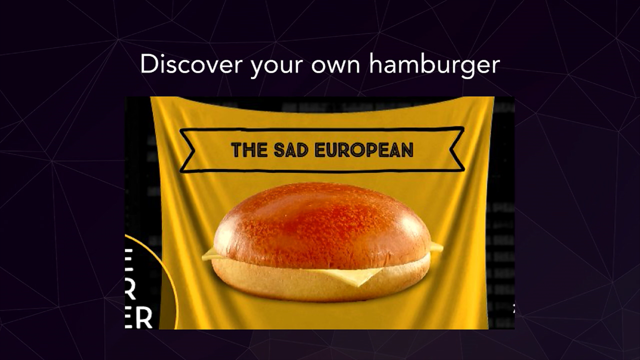
Like, for example, hamburgers.
I know that not everybody likes hamburgers, but there are also different kind of hamburgers on the Web; there is Oreos and Kebab and Candy box and Chocolate and Whatnot, right?
There are plenty of them.
And in fact, you will find them all over the place.
It doesn't matter where you go.
You go to India, you will find them.
You go to Georgia, you will find them, you go to Israel, you'll find them.
They're literally kind of all over the place and usually they will look pretty much the same or similar, right?
They're just going to maybe look a little bit different, or work a little bit different, or the interaction design is going to be a little bit different, right?
However, sometimes it's just getting a little bit out of control, like here.
So if you just look for just a moment at this website, COFFEELAB which is a wonderful, magnificent coffee shop in Netherlands, right?
You'll find there are a couple of menus.
Now, do you know what each menu represents?
I do not.
So we have four of them.
We have a menu, then we have a menu, then we also have a menu, and we also have a menu with search, right?
And in fact, they're all different menus.
So if you actually think for a moment, like, what would be doing what?
Well, it's impossible to find out.
So what you find is you have all these different menus, and if you start clicking around, they are doing different things.
When you click on one menu, get to different locations.
Here, you get to different products, right?
Here, you get through different social media and newsletter kinds of things, and then you have a label that doesn't do anything, right?
So that's maybe a little bit confusing.
But the question is, you know, if you go with four menus or if you go with just one, it doesn't matter, and again, this is more done like for fun rather than actually for a reason, right?
You might wonder, "Do I need one at all?" So there are different ways of how you can actually design your experience.
Like, it's not like, necessarily just, uh, the, the Hamburger icon, it could be an eye, it could be a spaghetti.
So here, if you look at the right, it's kind of a voyage icon, right?
And then here, this is a restaurant from, uh, from in, a London.
And of course it's an Italian restaurant.
So why would you use a hamburger?
You would of course use a pasta.
And if you start looking around, you'll find the ramen, and you find beer and you find cats.
You find everything all over the place, right?
I would say that sometimes you don't need a Hamburger icon or any kind of menu like that.
There are different tricks to make it work.
Like, for example, MoMA.
They just group things in a way, so you actually focus on things that matter.
The same goes for ARBETET, which is the Swedish news website where you kind of swipe left and right, and you see at least something, right, like you also have on The Guardian, we kind of try to show navigation.
I think we often have a tendency to hide navigation, but it's actually very dangerous tendency because people need to be able to know what the website is about; that's number one.
And number two, if you hide something, you shouldn't be expecting a lot of traffic coming there.
So it's can like, because in, in many ways, hamburger menu is like a basement.
So if you put something in the basement, you're not going to use it a lot or not as much.
So if you have something important to show, you want people to drive traffic to particular pages, then you might want to show navigation rather than hide it.
Then for us today, it's gonna swipe away, swipe left and right, and then work business is kind of the same story which kind of fades out, and you can still use it, right?
Here, for example, you know, this is a big Mongolian e-commerce site on the left, no menu, no hamburger menu.
Just see everything, and everything is grouped as it probably should be.
But, okay, okay, I can hear you.
I can hear you.
Not everybody can afford it.
Sometimes you actually need a big menu because you have a lot of navigation.
So how can we actually then design it?
How can we make it better?
Well, there are a couple of patterns that I want you to really try out.
One of them is called " Vertical Layering." So this is when usually we put layers of navigation and place them in one direction or the other.
It's very reliable, it works best for shorter titles, and it often relies on icons.
First, let me show you what I mean.
I don't mean this, right?
This is a very common pattern, which is called the slide-in pattern, where you have a navigation sliding in from right to left, from right to left.
So as you move from one section to another, you go from right to left, from right to left, and so the new level always covers the old, the previous level, and the new level, again covers that level.
So that's not what I mean.
This, in my experience, is the worst pattern you can use.
This is the slowest mode of interaction.
This is the slowest mode of navigation on mobile.
So I would try to avoid it as much as I can.
That's just not working.
Sometimes people get lost, sometimes people have to go back twice in order to go forward.
They just really, really wait to slow.
So what can we do instead?
Well, instead, we could try to figure out how we can actually design it better, maybe first.
So we could have different levels looking different, right?
We could also have this little pattern over here, which is just accordion.
So you have basically one level, then you have second level, you have third level.
Accordions always perform better than the pattern I showed before, right?
Why?
Because you don't have to move down, kind of back, in order to move forward.
You can actually quite quickly move forward right here.
As long as you have distinguished colors and typography for these three levels, you're just fine, right?
So that's something again to keep in mind.
But if you have too many colors, it's getting a little bit frustrating as well.
Like on the Royal Museum's, uh, museum's, Greenwich, right?
All these different arrows representing different colors.
This can get a little bit annoying, especially when it's kind of mixed as well with accordions, that's a little bit too busy, I would probably not do that.
In the same way, I would try to avoid aging or having too many errors.
So accordions do work, but not when there are too many arrows in in flight, almost.
So you have all these different levels here, right?
Over here.
But then, whenever you open, let's say, one of them, you get to this point where one of them is now open, right?
But then you also have these arrows.
Now what are they, and how they're different?
Now they're not going to open a menu.
They're kind of links directly to DSL and internet, and other things, right?
So if it's a link, you don't need to have an arrow at all.
This is what I would try to do here: just make it look like a link.
That's enough, right?
So this is actually much more obvious than actually having these arrows on the right.
Do avoid the too many links if you can, right?
But you can actually take it to the next level, depending on how much content you have.
You can also pull off doing this.
This is LCFC which is a football club in, uh, in soccer club in England, and you have the sections here.
When you click on the menu, you get the sections over you, but then what they do is they split the screen vertically.
This is the vertical, split I was talking about earlier, right?
We get access to both levels very quickly, right?
Then you can navigate between them very, very quickly as well.
No problem here at all.
No need for slide in and slide out.
A good alternative to accordions as well.
And you can see it in different places, like here on the left, you also have this kind of menu showing up, where whenever you click on that hamburger menu, you have this basically access to the first level, access to the second level.
You just, I wish that these arrows were a little bit larger.
They'll probably work a little bit better.
On Cancer dk also similar, but they also have this dashboard thing where you can actually jump in into one and then the other opens, right?
And then you also get this PlayStation, where you have icon on the left, and you can actually also get access to the first level and also get quickly access to the second level, right?
So that's called the curtain pattern.
So that seems to be working really well, and can use it not only for navigation but also for other things like filters.
So here, for example, which is uh, an Indian e-commerce retailer, whenever you get into filters, you have to split, right?
Again, the same story, and I don't get it.
While sometimes we would, you know, block some part of the UI and keep some of the red, the rest of the UI blurry with filters, just give people access to all filters on the left all the filters, on the right actual values for those filters.
Perfect!
That's all you need, right?
And then you also need to have floating buttons at the bottom on the, on at the top, right?
So you can clear, you can close, you can apply, right?
Those kinds of things are quite important.
This also goes, again, for very complex filters.
Think about equity, stock screeners, things like that.
Kind of the same story.
We can say.
I'm going to have accordions, and then I'm going to have these groups and as you keep going through these filters, have filtered on the left, we'll have failures on the right.
Fantastic.
It's really, really great.
I can only recommend.
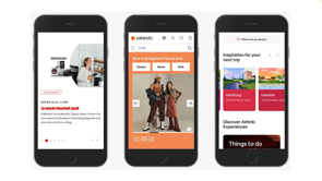
And another pattern that kind of relates to that is the "Billboard Pattern." Where we want to highlight some of the most important things that people want to do on the site, and it could look very much like, hold on, let me just jump right there, here.
That's a wonderful Korean Postal Service website, on the very much on the homepage and also on the mobile view, on understand, right?
What they focus on are things that are important to people.
So there is a hamburger menu.
Sure.
But there is a lot of navigation that's kind of pleasant and nice and nice looking, right?
So for every top task that people perform on the site, you actually get to where you want to go, right?
That's incredible.
That's absolutely fantastic.
You can also find it in other scenarios as well.
Here's one of them, right, where you kind of get to these most important tasks right here, and you get them done, and that's it, right?
The same story, so it seems to be working really well.
And you'll find it in a few places, especially in the commerce and, and think about maybe highlighting some important things, some things that are critical, and showing them in your navigation right away, right?
Like they do, for example, in German post, um, postal service I think, in here, right?
This most important task, the five tasks are in navigation, but they look different because they live outside of the tri menu that we see here, right?
Good stuff right there.
All right.
What else can we do with navigation?
I'm glad that you asked because one, there are a couple of other things that you can do.
One of them is maybe we could consider using slightly better breadcrumbs.
Breadcrumbs do matter.
They can be very, very helpful.
In many ways, they can be actually quite remarkable, because very often when you think about breadcrumbs, you think about just, you know, them showing a path.
But at one point, you know, I discovered those kind of examples where it's just a little bit messy, especially on mobile.
It's really difficult to get right, just seems like a little bit too much, maybe.
So once I discovered this page, and this is when my life changed forever, because what if, indeed, and I never thought about it.
Really.
What if indeed, if we actually go and explore?
Why don't we go and turn breadcrumbs into a dynamic navigation?
So it could be a replacement for site by navigation of sorts, right?
This kind of allows us to jump between the neighbors of that level.
That's great, and you can find it in many places.
This is a city of Dusseldorf in Germany.
Kind of do the same thing on the medium level, right?
And if you go to one of my favorite websites, which is the , the Federal Statistical Office of the Federal Administration in Switzerland, which is a wonderful, fun, and hobby thing to do on a Friday night, I highly encourage you to go to the site a lot; you'll find that they're using this kind of breadcrumbs pattern all over the place.
It's kind of replacing global navigation altogether.
So do you maybe don't even need main big mega dropdown menu at all because you can actually get a lot done with breadcrumbs alone, right?
So that could be actually quite helpful.
So another interesting and very useful pattern to keep in mind when it comes to navigation, uh, navigation queries.
Now, this is something that we give as an add-on to traditional navigation with mega dropdowns or serge or anything else, right?
And then here, the idea is to kind of help people construct their own navigation query, so they can actually get to where they want to go very, very quickly.
And it's based very much on this idea that instead of giving people just a bunch of results, a bunch of links, we can actually drive them to, into more kind of exploratory reason, exploratory way towards the goal.
So rather than actually just giving them a bunch of stuff and go ahead, try to find their way out, kind of give them some little steps that nudge them to the right path towards their task completion.
So there are different ways of how we can do that, right?
One of them is to actually do something like this, where additionally to what we have on the page, right?
Like navigation or search ,or anything like that.
We give them sort of a simple way to say, Hey, um, what do you want to do here?
I want to borrow money for an mba at BYU or anywhere else, and you kind of go there.
And the same way if you are looking for something different, right?
So that really depends on what is it that you want to do.
That also can be applied to many other things as well.
Not only navigation, but also, for example, FAQ right?
This is actually more of an information system approach in here.
So this is a city of Dusseldorf where you can say, Hey, what I want to do here?
I want to book an appointment, and where?
Uh, here.
Right off you go, this is the result that you're looking for.
So instead of going through all the navigational, instead of searching, you can actually find what you need much, much faster.
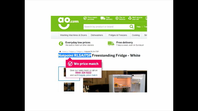
This is another example of the same pattern here on AO which is an e-commerce retailer.
And here you're being asked, what do you want to buy here?
Right on the front page.
I want to buy a washing machine.
What kind of washing machine?
Uh, frontlader.
Alright, how big should it be?
Uh, big.
And then you define your pricing range, and this is it.
So the time to relevance here is around 10 to 12 seconds.
That's incredible.
You will not be able to achieve the same thing if you ask people to go for navigation, to go for the categories, right?
Be the mobile or desktop, or then filter and search and look at all the results.
No, this is actually much, much, much more proficient.
So, think about it.
If you think about getting people where they want to go, this kind of approach can be very, very powerful.
So think about that when you're actually designing your navigation as well.
Right?
So when we are thinking about navigation, then there are basically a couple of things that we can consider.
So again, when it comes to, any sort of menu, like large menus, I would say avoid mega-dropdowns on hover, but give them on top, on click.
Hover delays and transitions that we usually use are always a bit frustrating because they're always either slow or too long, take too much time.
They're just very frustrating in general.
So also allow people to navigate with the keyboard; that is very important.
Some people will actually tend to prefer to use keyboard navigation instead of mouse altogether.
It is actually a good idea to think about splitting the screen on mobile, allowing people to navigate between multiple or also at the same time.
Slide in, slide out is always kind of a bad idea.
That's usually going to be too slow, taking too much time.
And in general, if you think about it, horizontal and vertical accordions work well.
But again, as an alternative to that, that split can actually work really well as well, also called the [?]. Right?
Okay, one more, and that's actually one of the painful ones, because if I ask you if you like Infinite Scroll or not, you probably will tell me no, probably not, because usually when you think about Infinite Scroll, it has all these issues that people complain about in testing.
You always get this incredible amount of options, you always get lost in them.
It's very difficult to tell: what is the new one?
What is the old one?
What's the new item kick in?
It's very hard to reach the footer.
There are so many accessibility and usability issues related to that.
It's also overwhelming, difficult to manage, high abandonment rates very often, especially when you are kind of faced with a really long list of items.
The URL in the address bar is often broken.
You can't copy paste it and send it to somebody.
For example, you can't bookmark a location and return to it later.
You have to go for this entire list over and over and over again.
The footer issues, it breaks the scroll bar, accessibility, performance issues.
There are so many things happening there.
So my job was actually to try to improve it, right?
So how can we do that?
Well, we just need to fix all the seizures.
We can surely do that.
So what can we do then?
Well, typically, in some interfaces, you will find this pattern, right?
And it starts scrolling down and eventually get to this button which says, "Load more products." And it's only when you click on load more that you're actually going to see more products.
Right?
That's reasonable.
But why stop there?
Why don't we allow people to choose what they want to do?
And you can say, well, we've seen now so many items.
This is a fresh hope, maybe, that you can define, so you can continue browsing later.
So click in here or type in an email address and send a link to yourself to continue later, right?
Or send a link to somebody else to continue later as well.
Or even better, why not just have a button saying, "Oh hey, here you go, you can always stop.
Don't worry; but you can continue here later." So once you click on it, it gets like a green check mark, those kinds of things.
You can still copy a link right to the page, or you can also show the item that you have seen already on a separate page; that's also an option.
But the next time you come to the same page, you'll be prompted at the very top saying, "Hey, would you like to continue where you left off last time?" And it's a new item that are dynamically coming in, they're dynamically kind of coming, kind of updates or anything like that, you might want to show them as well on the top of that next kind of continuation of that list as well.
Right?
So that could be actually helpful in allowing people to stop, and pause, and continue later, right?
But you also have other issues, right?
One of them is a sticky, a footer issue.
So why don't we actually take an example from "dahmakan," which is a food delivery service from Malaysia, and in there you have a sticky footer.
So that footer is collapsible, so it always opens when you need it, and you can always close it if you don't need it.
So it's an influence call right here, but at any every point of time, you can actually go ahead and reach the footer.
Problem solved.
Or you can go ahead and combine pagination and infinite scroll in one, right?
Because pagination has some upsides.
You have this sedate of control.
You go from one page to the next, but in here on pepper.pl, if you look at the top, the URL changes as you keep scrolling.
So that means is basically what you have is infinite scroll with pagination.
So you always have a way to reach the footer.
You always have a way to reach the header or go to the top of the page.
You always have a way to just continue scrolling and, you know, add a new link and see another section of that infinite scroll list.
But at every point also, right?
Not only can paginate back and forth, and it automatically paginates as you're infinitely scrolling at the same time, if you need to jump to a particular page, you can do that as well.
But I'm always wondering at which point and why would anybody wake up in the morning one day and think, I want to go to page number 13 now.
Now that's the page I'm interested in today.
That's, that would be a little bit confusing and strange.
So maybe we can make that pagination experience better as well.
How can we do that?
Well, by adding a little bit of context to what people are scrolling through.
So if somebody's looking at the list and they're searching by a particular value, like I say, price low to high, well, we can actually surface that overview, like pricing from low to high, next to the scroller on the right.
So as people are scrolling down, they can actually click on one of those labels and get to them right away.
So they can kind of scroll in that infinite list.
It can also be dynamics; it can get kind of smaller and larger as time passes by.
Very similar to what you find sometimes in some applications for calendars and events and stuff like that.
And, an iOS or an Android, right?
Kind of the same story, really.
So it doesn't have to be price alone, though.
It can be anything that people choose to sort by.
But when they're sorting by something, we can surface that information prominently next to the scroll bar.
If you do not have an infinite scroll, but you use a pagination set can still do the same thing as well.
You space out the numbers, and in between, I would probably space it a bit more.
In between, you plug in the value or range that people are looking at, right?
It could be alphabet, it could be pricing, could be anything really.
So now you know that if you go to page number four, you'll be expecting pricing ranging from $83 to $122, which is a little bit more useful than just not showing anything.
In many ways, this resembles the problem that we have with carousels.
Dot alone does not stand for anything, so we can actually make this a little bit more contextual.
And if you have some sort of visual experience, right?
Maybe, or if you have a lot of products, and you want to allow people to bookmark multiple occasions, we can do that as well.
So you have this mini map pattern where you actually show some portions of the page, kind of the preview of the page on the right.
And then at every point, you can just bookmark a location that you liked or that you wanted to come back to.
And so at every point, you can actually go ahead and come back to that point if you want to, so that kind of works to.
So with infinite scroll, what do we do?
Well, if in doubt, I would always prefer pagination.
If I can, just solves all the accessibility and performance issues down the line.
But sometimes, especially in large lists, you will see more people, people discovering more items.
If it's an infinite scroll.
So if you do have an infinite scroll, then always integrate a footer reveal when it kind of opens up on tab or click, we might be separating visually, at least with enough white space, what the old segment is and what the new segment is when new items kick in.
It might be a good idea to allow people to pin a position and continue from there on later.
You might want to experiment with either combining a load more influence scroll, so you kind of start scrolling, scrolling, scrolling.
And eventually, when somebody hits a threshold, you switch a lot more pattern, a button.
Why would you do that?
Because if somebody has seen too many items, they might just turn off and will not be interested in seeing more items at all.
They just abandon, so that might help.
And on the other hand, the other option would be the combined pagination and infinite scroll together as well, like we saw in the Polish Retailer website.
But then as you do so, change the URL as new items are loaded in, allow people to jump with the pagination drop-down, but also allow people to understand where they're going to jump to with scroll bar range intervals.
And then, as you know, whatever you do as far as you go, always consider accessibility and performance issues as you're doing.
All right, now, with all those things that I wanted to highlight today: I just wanted to bring your attention to one significant thing.
Every time I think about any kind of design pattern, I always think about, "Is it right?
Does it make sense?" And I always try to challenge myself and that design pattern, in its viability." Is it really a good one?
Is something missing?
Is there anything we can do to make it a bit better?" So I hope that those things that you have seen today will help you get there, right?
So many of those things, very obvious.
Like we know exactly what we need to do in terms of visibility, in terms of use, uh, in terms of accessibility and so on.
We just know that because these things haven't been changing for the last decade or so.
Still today, people like; when experiences are fast, accessible, large text, checkboxes that look like checkboxes, radios buttons, look like radios buttons, input boxes, that looks like input boxes, all those things are kind of well known.
So we just don't have to break it.
We can still be creative, but we doesn't mean that we need to break this basic, fundamental part around accessibility and usability.
Now, many other things, as I mentioned today, and also many things mentioned here.
I kind of highlighted, I brought them together over the last two and a half years in this video course that I've been working on, which is called "Smart Interface Design Patterns." It's eight hours video content, but also a lot of new stuff coming in every year; five new segments coming in.
And on top of that, we also do this live UX training, which is fun, collaborative.
We do real-life projects and so on and so forth.
So if you're interested in what I was talking, talking about so far, you might find this interesting as well.
With this in mind, I'd like to kindly thank you for your attention.
I hope that there was some insights that would help you in your work.
Uh, if there is anything I can do to help, please let me know.; I'm happy to help.
In the meantime, cats and more cats, and thank you so much for your attention.
I'm so sorry that I couldn't be there, but I would love to connect with you, so feel free to drop me a message, and I'd love to help, right?
So thank you for being here, and I hope you enjoyed the rest of the conference.
You’ve seen them before. Confusing and frustrating design patterns that seem to be chasing you everywhere you go, from one website to another. Perhaps it’s a birthday selector dropdown that always starts in 2022, or a date picker that prompts a clock wheel, or tooltips that — once opened — always cover the input field just when you need to correct a mistake. They are everywhere, and they are annoying, often tossing us from one dead-end to another, in something that seems like a well-orchestrated and poorly designed mousetrap.
In this talk, we’ll take a closer look at some frustrating design patterns and explore better alternatives, along with plenty of examples and checklists to keep in mind when building or designing one. We’ll look into birthday input, mega-drop-down-hover-menus, disabled “Continue” buttons, draconian password requirements, unusable sliders, poor inline validation, invisible tooltips, broken filters and of course scrolljacking — along with identifying buses and fire hydrants.
The insights are coming from usability tests and user research conducted by yours truly or our colleagues in the community. You’ll walk away with a packed toolbox of techniques that you’ll be able to apply to your projects right away.