When new CSS features collide: possibility and complexity at the intersections
it is very, nice to be here.
It's a very long way.
I think it got further during the pandemic but it's, it is very nice to be back in Sydney and, to be at this conference.
So I think.
Thinking of the pandemic, a lot of things stood still.
But CSS did not, CSS kind of kicked it up a notch.
And so in the last couple of years we've seen a flurry of things land on the platform.
And some of those things are things that we actually said, those was in the CSS working group said were not possible for a long time.
How did all of that happen?
How did we get from floats and media queries to subgrid cascade layers and container queries, and what does that actually mean for the future of the language?
What does that mean for us as designers and developers?
What do we need to understand in order to really benefit from all of this new stuff that is landing?
So from the beginnings of responsive design in 2009, until Flexbox became generally possible to use, floats were what we had to do layout.
Now floating boxes to make something look like a grid was unintuitive.
But it's actually pretty simple.
You have to do a bit of math or you have to find something that will do the math for you.
You need a container.
You nest your boxes inside.
Each box has to have a width in percentages, and the total width must not be more than a hundred percent, and we got good at it.
Designers got good at designing around the limitations of not being able to have one box as tall as another, and we developed tools and frameworks to abstract away the complexity of it all and to avoid having to do the math.
And we built perfectly reasonable websites.
And the thing about having a way to do things, is that very few people then look beyond it.
And now this quote is attributed to Henri Ford.
He probably didn't say it.
If I would've asked people what they wanted, they would've said faster horses.
Now, even if he didn't say that from years of developing products and working on Web platform features, the sentiment of this quote rings very true.
If you asked designers and developers what they wanted to be able to do, it was equal height boxes, spacing things out evenly.
No one was asking for an inbuilt grid system for the Web or anything fundamentally different to what we already had.
They wanted floats plus a few features.
Technically, however, the things you wanted weren't possible with floats.
We couldn't add some magic way for floats to make one, add some space at the bottom of the other to respond to, another float.
A floated item is taken out of flow.
It's independent of other items on the page.
It doesn't know about the floated thing next to it.
We try to make it look like it does.
We try to make it look like these things relate to each other by managing them carefully, but there's no relationship between them.
They're just individual boxes that happen to display next to each other.
Flexbox changed that because in a Flex layout items are treated as a group.
Because the items are a group, they can respond to each other, they can align against each other.
They can be as tall as the tallest by stretching to the height of the flex container.
They can distribute space between them, either inside or outside of the boxes.
So in Flexbox, we got the key things that people wanted.
This is the Solved by Flexbox project, created by one of my colleagues at Google.
Philip Walton created this in 2013 to show how Flexbox had come to solve all of our problems.
Now, at the same time that Flexbox was saving the world, CSS grid was being developed initially by the Microsoft team, and there was an initial implementation went into IE 10 in 2011, and I wrote about it.
This is a 2012 post from 24 ways.
So by the time that Philip was publishing his Solved by Flexbox examples, the Chrome and WebKit implementation based on outdated spec was underway by Igalia.
Now, that initial IE spec didn't include what I think is one of the most compelling features of grid, the grid template areas functionality.
This is the ASCII art representation of layout in CSS.
Now the interesting thing about that feature is that it predates Flex layout and the Microsoft Grid spec by many years.
If we go right back to 2005, we'll find an initial spec for CSS Advanced layout, which eventually became CSS Template layout, and it defines a layout method that will look very familiar if you've ever used grid template areas.
So the syntax is slightly different it looks pretty similar.
Now that's the, this example here is from that original specification, and this is how you would do the same thing with grid layout today.
So in that old spec, rather than placement happening as a value of display, we have a new property and we're using grid area rather than position in, the new spec.
Now that early spec didn't have a great solution for how the page was laid out.
It was trying to build on top of positioning.
And if you've ever tried to build an entire layout with absolute positioning, you'll know that doesn't work very well.
And so that's why that spec didn't really get very far along.
The Microsoft Grid layout spec though created the way to create a grid, with lines and tracks, and this idea of templates could then be joined to that spec to create a new, nice way of doing layout on top of this grid of lines that we now had.
But would developers care about it?
That was the question I had as soon as I saw the spec, I knew how powerful it could be.
It was something that I really wanted, and I knew how many use cases it could solve, but I worried it wouldn't get any traction.
So that's why I started my sort of one woman mission as the devrel of CSS grid.
I talked about it for about five years before it was landing in a shipping browser.
The, actual updated spec.
But along the way, more people started to pick up on those demos and realize what could be done with it.
And I like to think that my incessant going on about Grid helped in some small way to push the spec forward.
This quote here is, from the list part article about the story of Grid.
It's in my notes, which I'll share at the end of, this presentation.
It's really worth a read because the number of people who were involved in getting Grid layout into the browser it's, quite a fascinating story.
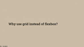
But during all those years of showing people Grid, and even once it launched across all three engines, almost simultaneously, people would ask me, why would I use Grid instead of Flexbox?
And has that really changed today?
I wrote the 2022 CSS chapter for the CSS Almanac.
Now that's an annual look at what websites are actually doing with CSS rather than what developers say they're doing with CSS.
Now that's really interesting data and it helps us to bust out of our echo chamber because it's very easy to think that well everyone is doing this, because the people that you follow on the internet are doing it.
So actually looking at the data is very interesting.
So here's a couple of charts.
Now this is from the State of CSS survey asking people if they've used CSS grid, and this is from 2021.
So 83.1% of developers have used grid.
That looks really good.
Lots of people are using grid layout.
But let's have a look at what's actually happening on the web.
This is Flex and grid adoption over the past few years, and you'll see that actually Grid layout has not been used on that many sites.
Now, CSS Grid layout landed in all three major engines in March, 2017.
Two years later, only 2% of sites were found to be using any grid at all.
Now, that's not to say that these developers who are saying they use Grid are lying.
There were obviously lots of sites that were developed before CSS Grid was a thing that are still there on the Web.
And the CSS survey doesn't ask people if they used grid in production, it asks them if they've used it.
So they might have built some demos or they might be working on it at the moment, but they haven't the, site's not in production yet.
But that kind of shows you that there's not so many people actually using Grid layout as, you might think.
And I think a lot of it is that Flexbox provided the faster horses.
Flexbox gave us the stuff that we wanted to be able to do.
So why Learn Grid?
Why spend the time learning a new layout method when all your immediate problems have been solved?
Now, grid does several things that aren't possible with Flexbox, but are those use cases compelling enough?
Are there other things that are lacking in the platform that mean developers can't take advantage of some of this stuff?
And so perhaps to start answer this question, let's have a look at some of the other things that have landed or landing this year and see whether maybe they'll help developers move away from Flexbox as their primary layout method.
Because here we are in 2022 with a feature that developers actually have asked for repeatedly for years, and it's now landing in browsers container or element queries has been asked for really forever it seems.
Certainly people have been asking me for it for a very long time.
Zach Leatherman did a bit of digging and found the first mention of container element queries was in July, 2011.
Now Ethan Marcotte's article on responsive Web design was published in May, 2010, so almost as soon as we had responsive Web design, people were saying, can we have container queries please?
And it's taken all of this time for us to be able to do it.
So testing the viewport size is fine for major parts of your layout.
If you want to know whether you've got room for another sidebar, that's fine.
That's all you need to know.
But increasingly we're developing using component libraries.
We want to build reusable components that can be placed into different areas of responsive design.
I might have a card like this one.
This is the, media object with an image and some text.
And I'd like to be able to place that around the site into a sidebar or into the main content area, perhaps, you know, with some comments or what have you.
And so I want my narrow view, not for narrow view ports, but for when the space is restricted.
And that's what you need container queries for.
So to use container queries the thing that's going to be the container needs to be identified.
You do that by adding the container type property with a value of inline-size.
There are gonna be other types of containment in the future the, the current shipping implementations do this most common use case, which is the width or inline size of the container.
You can also give it a name that's optional, but it's needed if you want to query something that isn't the first container around the element doing the querying.
Once you've set up your container, you can use container queries pretty much in the same way you'd use a media query.
So if you use, if you just wanna get the first container, you can use @container rather than @media.
Or you can query a container by its name, which lets you skip the immediate container.
So my example, I've got my narrow and, a wider wrapper made in both container dropped the same component in.
The component uses container queries to test the size of the container and rearrange itself accordingly.
And that's pretty much it.
That's container queries.
So why did it take so long?
Why were you told for years it was gonna be impossible to create container queries and now it's so simple.
And this is when we come to the fact that as CSS and as browsers develop, we essentially unlock things.
Just as that advanced layout or grid template spec, which needed the lines and track solution that the Microsoft Grid version gave us, container queries needed something else.
In the case of container queries, there were a couple of suggestions as to how we might do it.
But the one idea that stuck was an idea proposed by David Barron suggesting that this fairly new CSS containment specification could provide a way forward.
The reason we didn't have container queries is that you would need, you could end up with a situation where the styles depend on the size of the component, but things inside the component influence that size.
So then we get a loop and bad things start to happen.
Size containment, however, tell s the browser that we know how big this thing is.
Don't keep recalculating it.
We know how big it is.
It was designed as a performance optimization because if you know that something isn't gonna change, you can tell the browser that and it won't try to keep recalculating it and updating it when something else on the page changes.
But we didn't have a way to do single axis size containment to that point.
So we couldn't say, I know how wide this thing is, but the height or block size might change.
So if you give an element contain-size, you tell the browser that you know how big it is in both dimensions basically.
Now that's a problem.
I've got a box here.
It contains a varying amount of text and becomes as tall as it needs to be to fit the text.
Cause that's how things work on the web.
If we add contain-size to it, it collapses cause it's got no size.
That red border is now the actual height of it.
It's collapsed and the text is sticking out the bottom.
So we needed single axis size containment.
We needed to be able to say, I know the width or inline size, but not the height or block size.
And that was the beginning of the idea.
And it was an idea that Miriam Suzanne then built on in her proposal, and it evolved to the CSS working group.
And it's now implemented in Chrome and Safari and is in Firefox nightly as of about a week ago.
So we now have inline-size containment.
Without containment, there could not be container queries.
And so once again, something which seems very, simple to use for Web developers, it stands on the shoulders of many years of careful work.
And so I was playing with container queries and that got me to messing around with hot air balloon images as I do, and the relatively new aspect-ratio property.
Now, that lets you define an aspect ratio for an element, which means you can do things like make perfectly square grid items, which is rather pleasing.
Pop an image in there, use object-fit: cover, and you can create some pretty nice effects.
So here's a demo at narrow width, and this code is all in, in my resources, which you can have a proper look at later.
So don't squint to see it on the screen.
And then we can use that figure and we can redefine it using container queries.
Test the size it's got available, and then we can drop that component anywhere.
It will size to suit and with aspect ratio the images are always perfectly square.
And so thinking about things we've been told that we can never have we now have :has, sometimes referred to as a parent selector.
What it enables is selecting the parent based on things that are inside it.
Now, that's incredibly useful for components because we don't always know what's gonna be in a thing when we're designing the sort of box and the frame of it.
So it's sometimes useful to be able to do something with CSS when a box contains an image or some other HTML element and, we sometimes see people working around the lack of this by adding classes to things, you'll have a class of video because that box contains a video.
Well, :has let's us figure that out for ourselves.
So here's a list of items and I want to select elements that contain an h2.
So we've got two items here that should be selected.
The third and fourth.
And so I could just do this using li:has and then the h2 in brackets.
So what we're saying here is do something with this only if it contains this selector.
So that would select the item with an h2 plus those with an h2 and some other content.
And you can use any selectors here.
So if you wanted to just select the h2s that were followed by a paragraph, you could do something like this.
Now this is super useful, as I say, for components where you don't quite know what's gonna be inside them.
One of the websites I look after people, sometimes post blog posts without a thumbnail image, and then the listing looks a mess.
And I get really sad.
Some of the items have images and some do not.
Now we could probably do something like this by stopping people from doing that, for example, but if that turned out impossible, we could do something with, :has and insert an image or a gradient to fill the gap left by the missing images.
So in this case, I want to look for the absence of an image.
So I'm chaining :has with :not.
If the item doesn't have an image, I use generated content to insert some content as the first child of the element.
Give it the same aspect ratio as the images and use a gradient.
You also use an image or a background image or something here.
Now I'm not a designer.
And that's the gradients I came up with, which I think would probably encourage people to put images in, so it might work.
But you this, sort of thing is really useful for component based designs.
We're used to adding classes to everything to identify what's inside.
Instead, we can start to use CSS to, to figure out what there is there.
And so it gets really interesting when we start to combine these things because both has and container queries were made for component-based design.
By combining them, you've got this way to know what's inside the component and how much space the component has.
So here I've got a card component.
Now it might contain a few different things.
It might contain a figure with a caption.
It might contain some text, it might have the figure and the text.
I want to have different layouts for different content and also for the different content at different break points.
So I can put the card anywhere I like and it's always going to look good.
So that means that these are the same component.
We only get the grid here if we have the figure, because we can check and see what's inside and then only turn on grid if we know we've actually got something to put.
If we try to do that without, :has, what we'd end up with is all the text on the left hand side.
We'd always have this two column grid, and then we've, put the text in one of the columns.
Here we can just have the two column grid if we know we've got two things to go into it.
I think there's lots and lots of little examples like that where we can start to use these things together to, create really reusable components for our designs.
And then we have subgrid.
Now I do a bit of grid and I've been waiting a very, long time for us to get Subgrid.
And it's recently shipped in Safari.
It's already in Firefox.
It is coming to Chrome.
I think it's now behind a sort of flag, a feature flag in Canary.
So how does Subgrid work and how might it be combined with other features to solve interesting problems?
Subgrid doesn't bring us any new grid properties.
It's a value for grid template columns and grid template rows.
So if you give either of these properties a value of subgrid, and the container is a grid that is also a grid item, the size and number of grid tracks is inherited in that dimension.
So here I've got a grid, it's got 12 columns and it's got four rows.
And I'm gonna place a grid item on it between column line four to column line eight and row line two to row line four.
So the item is now a grid with four column tracks, two row tracks.
It's lined up with the grid lines of the parent.
Say all of this code in my demo so you can have a play around with it.
Now if we have a look in dev tools, what I've done here is I've highlighted the parent grid with the 12 column and four row tracks.
So the subgridded element has got a border, so you can see where it is and you can see how the item that's inside the subgrid can align with an item directly inside the parent.
So this is really useful.
We can have the kind of all the structures that we have in HTML.
And that can allow us to align things that are outside of something that's nested deeper.
If I highlight the subgrid, you can see all of the lines.
The line can, the grid can have, can only have the column and row tracks that are defined from the parent because we've created a subgrid here for both columns and rows.
So the kind of, the number of cells we have are then locked to what's been defined.
And you can also see there how I've placed the items and how that one is, a direct child of the parent and one is inside the subgrid.
So I can place each child item separately there.
What I've done is I've I've, just placed them by lines, but if I name the parent lines.
Those line names inherit into the subgrid.
Now that's really useful because that means that I can name my lines.
I'm naming all the lines in my grid there and I'm giving a class of item to both items.
And because line E inherits into the subgrid, both are placed at line E and I can address them with a single class.
So Line E is always going to map to that line of the parent grid.
Now this is really handy.
And I think line naming is something that we don't see people do a lot looking at the data.
People are not going around naming their grid lines very often when they're using grid layout.
It's a funny looking syntax and maybe it's not that useful when we've just got a grid.
But once we bring Subgrid in, the fact that the line names will inherit by the subgrid, that means we can have consistent naming for our lines.
And it doesn't matter whether you are in the main grid layout or a subgridded layout, that line is always gonna be called the same name, which allows you to then line things up very nicely as, you descend into your subgrids.
So I think it'll be interesting to see if the data shows that more people are naming lines as subgrid becomes widely available.
Because I think that's a really useful sort of use case for that functionality that was added to the grid spec.
So the subgrid value essentially replaces the track listing, and that means that you can have a subgrid in one dimension.
So a really common use case is to define a set of columns on the main wrapper, and then inherit those columns into components so that something in your footer can align with something in your header.
But there was at one point a proposal to simplify subgrid by locking it to both dimensions.
Subgrid was actually part of the initial grid spec and got moved so that the grid spec could go to go to CR and actually be implemented by, browsers.
Because Subgrid turned out to be quite complicated and this idea was maybe we could just lock it to both dimensions and that would make it simpler and we could ship it.
But the problem is then if you use Subgrid, you'd have to know exactly how many columns and rows the component would have.
A bit like my simple example you wouldn't have any kind of implicit grid.
You'd not just be able to fill your component with as many things as you needed because they would then overflow and in fact they'd just stack up in the corner.
The fact that we held and waited and subgrid has been something which we've been wanting for a long time and I've been wanting since before Grid actually got into browsers, I've seen how important it would be that we did have this ability to inherit grid tracks I'm very, glad that we waited and that we got this single axis ability with Subgrid.
Cause it means that you can do things like just have a subgrid on columns and, then have as many rows as you need.
So being able to work in single axis is key, as with containment, and I'm very glad that we waited and we slowed the progress.
As so many things in this talk, we have to wait.
We have to wait to get the features and functionality that we want.
And the waiting, I think, is worthwhile if it results in a more elegant, useful, or performant solution.
Because as we know, once things get into the Web platform, they're there forever.
It's very hard to roll back web platform features.
And I think that subgrid, when paired with container queries is going to allow all kinds of magic.
Because a very common pattern is to set up a multiple column grid, and then when there's less available screen widths, the components span more tracks of the grid.
And that's how a lot of the sort of class-based frameworks work.
It's always a 12 column grid.
And if you've got a narrow size, you just span your components over more tracks.
So that's, very common use.
And so here I've got a component and it's covering two tracks of my grid and I've got dev tools turned on.
So you can see how the tracks work.
So there's my component, it's spanning two tracks.
The it, the stuff inside the component is just laying out in block and in inline layout, cause it's just gonna lay out the image and, then the text.
So then I use container queries and I can change the display of that component.
I know I've got enough space.
Now it spans two tracks already, so I make it a grid, and I give it grid-template-columns: subgrid.
So my component now has two columns and that's all I need to do to display it like this.
I don't usually change the layout because the way that Grid auto places we get the image and then we get the text.
Now, that's a very simple demo, but I think there's some really powerful things we can do with very simple CSS and taking advantage of these new layout methods in a sort of holistic way, not thinking, oh, you, there's Subgrid and there's container queries.
It's thinking actually, what problems have I got?
What sort of janky nasty things do I have to do in order to get the layouts that I want?
And then seeing if these new things can solve those problems in a more elegant way.
I think there's so many new possibilities.
As I look at all this stuff and I see people starting to pull it and play with it and come up with new ideas, I'm seeing each of these new things acting as a multiplier for all of the other things.
So please play with this stuff.
See what problems you can solve in new ways, because I really, look forward to seeing what you come up with.
Thank you very much.
You'll find all those demos and notes and resources at that U R L and hopefully I've got a bit time for questions.
okay.
hi everyone.
. my name's Charlie and, Yeah, so I'm a senior advocate, a developer advocate at Stripe.
And, as part of my role, one of my responsibilities is to maintain our open source, repositories.
And while I'm doing this, so you know, if you've never used Stripe before, so we're a FinTech company and we have SDKs in seven different programming languages.
and we have an open source team that, is in charge of actually building these repositories.
But my role as a developer advocate is to actually create samples for people to understand how to use our product and services.
And they also have to be in seven different programming languages.
So, in the end that's actually a lot of maintenance.
And as I was working on this, considering that Stripe is a relatively well known company and we have like financial data about a lot of people, I realized.
The fact that I'm installing open source software that, built by people that I've never met, that I probably would never meet, and I'm installing that on my laptop, in which I have some, stripe stuff on it.
I, realized that it was a pretty big attack vector for anybody who would want to, to find stuff about stripe or, to hack us.
And especially as developer advocates, if somebody is trying to hack us, they would, like going through open source software and targeting developer advocates who have to try a lot of different tools all the time to stay in touch with what's going on in the industry, it would be, yeah.
So something that I have to be really careful about.
yeah.
And the more I researched, open source security, I realized that there's not a day that goes by, especially in the last few years where there's not some kind of cybersecurity.
problem in, in, the industry.
I'm sorry about the, I'm just gonna go.
yeah.
Okay.
So there's like US News website that have malware or GitHub that has vulnerability that allows people to actually have access to open source repositories.
There's also like nation threats, attacks, and, anything that's called zero day attacks.
So it's security vulnerabilities that people don't have patches for yet.
And, yeah, so overall, there's researchers have found that there's a huge increase in cybersecurity, issues and aimed at open source repositories particularly, and I was thinking that people in this room, developers, but not only developers, it's something that we can actually try to mitigate.
It's if there's other type of security attacks that can happen that maybe have nothing to do with, us, that's fine.
That's like a separate thing that security teams are in charge of.
But us as developers through open source, we can.
, actually we can actually try to learn how to defend ourselves and, yeah, And the way that I'm usually learning is, is by doing.
So I, we're gonna learn how to create like three different types of cybersecurity attacks, but I want to say that this is for educational purposes only.
because obviously what you, can use what you're gonna learn in this talk to run your own ransomware, all of that stuff.
But I take no responsibility for.
this and, but the, so the thing is, if you understand how to actually run these attacks, then you'll have a better idea of how to actually stop them as well, or at least be aware that they can happen.
And then you can, go back to your team and say, okay, I understand how a ransomware attack can be run, and now we can, we can look through, potential solutions.
okay, so first ProtestWare so this one is it's cute because it's not supposed to do that much, damage.
But what is ProtestWare So it's software created to raise awareness about a social or political issue, but it does not take, it does not damage or take control of the user's, computer or system.
in general there's like different ones, but the one that I'm going to show you is not supposed to damage your device.
So the important thing is that this type of attack is just to wear, raise awareness.
And here, don't worry about understanding the code, but it's an attack or a type of protest that was added in the, in the NPM package event source polyfill and not in the latest version.
So if you realize that you're using this package, it's fine.
The latest version doesn't have that anymore in it.
But for two or three minor versions, there was this piece of code that was added by the maintainer.
And what it does is that you have a set timeout and after 15 minutes it actually, opens a URL that redirects you to a site, where there were like a message about a social political issue.
And it was first looking at the time zone that you were in.
And if you are in the specified, countries or time zones that were at the top, then it was redirecting you to another page.
So it doesn't steal anything.
It doesn't correct any files, but it is annoying that if you're adding this in your production website, it means that your user.
would be I don't know, using your, if you're building a bank or whatever, like it was a, you would look, you would log in into your, account and 15 minutes later the user would be redirected, and it's not exactly what they want at all.
and usually as I said now, it's not really in the package anymore, but it is something that when you're updating your versions of packages, you don't really look through the entire source code of every single NPM package that you're using to look for some kind of, of attacks.
So what I'm doing, at the moment, is I'm using a tool called Socket where if I'm using a tool and I'm not quite sure that I trust the author, I actually look for, for the name on it.
And it kinda tells you, graphs like, like your Chrome performance or Lighthouse tools, and it tells you the kind of like the health of the package.
And even though the current version doesn't have the ProtestWare they still add, a little warning that said that before there was a ProtestWare or troll package.
So you can decide if you want to trust that version, or not.
So as I said, ProtestWare usually is just to raise, in Awareness about a certain issue, but you do have certain packages that were ProtestWare that were actually, damaging the computer.
So there was a package called Peace Not War, that actually was encrypting the entire computer of anybody who was, who was using it if they tracked that your IP address was located in Russia.
But what they'd not have thought about is that you can use a VPN and have location Russia, and it doesn't mean that you're a Russian.
And it's it's ProtestWare is a bit weird because it's really like a personal thing.
Like I wouldn't.
use ProtestWare to voice my concerns about a certain thing, but it does mean that if people were using the package Peace not war, inside packages, whatever, they lost everything.
So not cool.
but the second one that I want to talk about that is a little bit more, exciting and dangerous is ransomware.
So ransomware is a form of malware that is designed to, encrypt the files on a device and it renders them and the system that rely on them and usable.
And you demand payment to restore access.
So the important things here, that it encrypts the files and then it demands payments.
So you cannot have access to, you cannot.
see your files anymore unless you have access to a private key.
So the way that it works is using asymmetric encryption and you can, encryption on its own on your computer.
It's not a bad thing at all, like I'm all for encryption, but it can, as any tool, it can be used for, bad stuff as well.
So if you wanted to, experiment with doing encryption stuff on your computer, you can use, open ssl.
So all the comments I'm gonna show work on Mac cuz I don't have a Windows machine.
but here you start by creating a private key.
You can use different algorithms.
I'm using, the AES256 You can try with others, if you want.
And from that private key.
So it creates a funnel on your computer.
Usually you call it whatever, but I think I call mine, private dot pen.
And then, you can generate a public key, from that.
And that public key is used to encrypt the files and then to decrypt it, you use the private key.
, but then how do you actually create ransomware?
So this is like a very small demo of what a super small ransomware script could do.
it's like in a few lines of code.
I'm gonna try to go through the lines, but the screen is going to fail me.
So first here, oh by the way, I didn't say it, but when I'm hacking stuff, I'm hacking myself.
Like I'm not actually hacking people.
I should have said that at the very beginning.
educational purpose only, and hack yourself.
but here, I am, what I'm doing is I'm, navigating to my desktop.
So again, I know my username, so I got a slash user charliegerard desktop.
If I really wanted to do bad stuff, I would just go to route right away.
so I wouldn't have to figure out people's usernames.
And, then I copy my public key in a file on the victim's machine.
So this script would be run by the victim.
So they download an NPM package, they don't realize what's in there, and, I create a file with a private key on their.
laptop By using the echo command in which I pass, passing the public key, then what I would do is I would use, tar to, encrypt the folder.
So I called my folder like super-secret-stuff and I compress it into, gotcha dot tar dot GZ file.
And once that is done, the next line is this one.
Okay, so with open ssl, I use the private.
key And I encrypt my, compressed file into a gotcha dot enc And then, I actually remove the original files because I don't want my victim to have access to the original files.
Otherwise never, they're never gonna pay me if they have access to their stuff.
you remove the compressed file and the original folder.
So in the end what's left is only the gotcha dot enc And then you leave a little message note dot text.
Usually you would add instructions about how to, pay, back in crypto or whatever.
So I'm gonna try, I want you to try to demo it.
So I have here, you should see, okay, so I have my folder for you too.
That has actually my real stuff I'm not gonna encrypt that one.
And I have a private and public key and I have a folder that's called super-secret-stuff And there's not much in it.
I think there's just like a note.
And here I have the script that I.
Told you about.
Okay, cool.
here I have my comments.
So if I run, oh by the way, and I'm running it as . Okay.
So what I'm, I guess what I'm gonna talk to you about as well after is about how to hide malware.
But here I'm running it as a post-install, comment.
So post-install dash script.
So if I do, npm install, yeah, I'm just working npm install whatever, and.
then Boom, it's gone.
my super secret stuff folder is gone.
What I'm left with is the gotcha dot, enc For the encrypted file.
And, if you're on Mac, if you double click, Mac doesn't actually know, how to, go about this.
So, you know, I'm done.
I'm not gonna decrypt it cuz there was nothing in it anyway, but, but you end up with nothing and your original files are gone.
And I want to go back to my slides.
Okay.
as I said, I'm running it, I'm using the post-install, comments in, the packages on it.
And again, by default, post-install is not something bad at all, like pre-install or post-install.
A lot of popular packages actually use, these comments so that once either before or after you install the package, you run some stuff and, and it does something, but you, let's just unplug it.
yep Yeah.
here, it's pretty obvious in my post-install Script that I was running bash dot script.
dot Sh.
So if you are thinking, oh, now I'm just going to look for, bash files inside.
I hope it's gonna work.
Thank you.
But let's give it a Okay.
so in the slide before here, Seems like it's, okay, so in the side here, I was doing bash script, bash script.
Sh.
So that's pretty obvious.
If you're looking at like a shell file, if you see a shell, a bash, like a bash script inside a repository, again, that's not something that's necessarily a malicious, neither.
There are famous packages that use, bash scripts, but you could be like, oh, my team now is just gonna look.
And, if there's a.
weird Post-install comment, then we're just going to, filter for that.
But if you really want to attack stuff, you're gonna find a way.
So what about, that looks a lot more legit, right?
node install js it's just installing stuff.
But then you can, another way, if you wanted to use JavaScript for that, it's like you don't actually have to have the bash script inside the repository.
You can actually fetch it at on post-install so that way it means that the shell script wouldn't be in the repository.
You wouldn't.
see it But when you run post-install, it runs this, and what this does is it's fetching the script at a remote url.
It creates it on the victim's computer.
With the code and then it runs, bash script sh as well.
So again, it's like I'm just showing you that, there's different ways of running this.
You can make it super obvious or you can try to hide it.
And even that, I didn't really hide it that much.
you could go a lot, a lot.
You could do that a lot better.
And here I'm running in post-install but if you are running, if you are building an NPM package, you could, if you wanted to hide yourself a little bit more, you could run it as, when the package is imported and then.
used So when you, create an NPM module, you can export default function, and here I call the use, use ml.
If I was faking that, I was creating a react hook to do machine learning in the front end, and that would run as soon as you import and actually call, the main function.
So that was for ransomware, but now the third one is kinda like my favorite.
it's reverse shells.
And what is a reverse shell?
it allows you to, gain remote access to a machine by opening a tunnel between computers, and it allows an attacker to create, modify, delete, and execute files on your machine.
You gain remote access, so it means that as a victim, I install a package on my computer and I don't realize that I just opened a tunnel between my machine and an attacker's machine as well just by installing an NPM package.
how would you do this?
So there's, we're gonna use a tool called netcat.
And again, by default, Netcat is a networking tool.
It is not malicious at all.
You could, if you're at home and you just want to communicate between two of your own computers, like your own machines, or if you wanna do stuff with friends, you can open a tunnel between both.
And it doesn't have to be something malicious either But here we're going to do something malicious.
and what this comment.
does It opens a connection.
So I'm the, so I'm the victim and I install it on my computer.
And the IP address here is the IP address of the, attacker.
So that's like a fake IP address, but what it does is it opens the connection on two port, on port 80.
And then on port, 53 and in the middle you have bin slash sh and it means that as an at attacker, any command that I, so I have my terminal open on port 80 and port 53.
Any command that I run on my laptop as the at attacker on port 80 is gonna send it to the victim's computer, run it as a bash command, and then send me the result on port, 53.
And then this exit means that it's just gonna run in the background.
So as a user, you're really not going to see what's going on.
Like maybe I have a real shell open on my computer right now, and I don't know.
So as, as, as somebody who just install a package for you, you would not see anything at all.
But to me, I would be able to run, who am I and see are your username.
I would be able to copy files, I would be able to, edit the name of file, remove them.
I could then, create a shell script on your laptop, create somewhere you wouldn't, you have no.
idea What, what has happened.
So there's, you could run it this way, but you could also run it that way where again, you could have a shell script that has the same netcat command So there's always different ways.
Either you could have a shell script on your repository.
You can run the command, directly.
So that's why if you wanted to now, have security measures that just, I'm just gonna filter for the n the NC command, like you, there, there's different ways to, run, things.
like this and again, you can read it as a post install.
I'll show, in the next section how to hide a malware.
But here I have a little demo, so I wanted to do it live, but I had issues, putting, like setting that up this morning.
So here I'm gonna explain what the gif does and then when it comes back, you have a second to look at it.
so on the left, side of the terminal, so I hacked myself on a, with a raspberry Pi So on the Raspberry Pi here, I ssh'd into it, but you could think of it as like a victim's.
computer And I have a file in it where I just node test js is just opening the, connection.
And here on the, in the middle and right, panels of my terminal, I have the connection open on port 80 and port 53.
And the commands that I run in the middle one are actually printing all the results on, the third one.
So you can see that when I say, who am I, it prints pi because all of a sudden I'm on the raspberry Pi I'm not in my own computer anymore and I can change the name of files and, things like that.
Again, when I do this stuff, it's it's not malicious.
I'm just trying things, trying things out.
But you could definitely, if you hide that into an NPM package, I would have access to, people outside of my network, people I don't know, and, things like that.
So I think it's super cool.
but it's just to know that this can be, done and as a victim that's not super cool, but as an attacker it's fun.
So let's talk about hiding malware, because here I'm telling you what it does.
I'm telling you it's in script files, but there's ways that are actually like really interesting and I've been, I mean I've started researching this like on the side.
Obviously I'm not a cyber security researcher.
There's definitely other ways to hide that stuff, but, alright, so first I talked about, installing scripts and packages json so I'm just gonna move on to the next one.
You can use code obfuscation to make it really hard for people to actually see what your code is doing.
Again, by default, obfuscation is not necessarily a malicious thing.
You use it when you don't want people to understand what your code does, if you don't want them to steal it, and things like that.
But you can also use it, in a malicious way where if all of a sudden you decide that now you're gonna have security reviews that read the entire source code of every single package.
If you obfuscate it, it's really hard to know what it does, it's like by design, but used in a malicious way.
The next one is something that I tried a few days ago and it was.
Really cool.
You can corrupt the resolved URLs in the package-lock.json So here I'm gonna try to demo it.
and okay, cool.
So if I op , if I open that, so I have an NPM package.
I'm gonna close this and it's just my test package and here it's installing node fetch.
cool, cool.
So you just run, and if you look at the package-log json what does, node fetch use, it uses dataURI to buffer, fetch, blob, et cetera.
A lot of other things.
And again, by default, package-log json it's not something bad at all.
It, allows you to, everybody can have the same, versions of packages and whatever the thing is.
Then if you look at this, that area to buffer.
It's called bytes Now what happened?
So what happened is that I just went here and I just, instead of having data to buffer, I actually linked it to a separate, package.
And when you've had prs, I'm pretty sure that you've had PRS with your team where sometimes there's so many changes in the package-log json that you just like, forget it.
I'll just merge.
But the thing is I could do that.
Like I could just, and here it's pretty obvious because I called it like, bytes I could do what it's called, the typo squatting, which is, I could call it something very, similar, just like one little difference.
I could do like data-uri-to-buffer and you, have to work fast.
You don't realize what's going on.
And then it actually, you wouldn't even see really what's going on unless you go through every package and be like, which one is the one that is, corrupted?
So that is like a fun one.
Yeah.
Okay.
Then something that I realized, recently is called Bin Script confusion.
So I didn't know, and when I tried it, it didn't work on me, but I trust, the researchers.
It's like when you use, bin to create an executable of your program, apparently you can call them Node and npm.
So it means that when you're gonna run in your package node-index dot js instead of actually using NodeJS that's installed on your computer, it's gonna run these scripts there because it's going, is going to be confused–which node do you want to use.
It's gonna think that the node is come from your personal package as an, executable instead of going, and using NodeJS So this is like another way.
and people also do that where you can use TSC for TypeScript or anything that.
That is popular.
If a tool becomes popular, you can try to do that with bin script confusion.
And then finally, VSCode extensions.
VSCode extensions, it's, I've tried to run a ransomware via, and actually it was a reverse shell.
I tried to run my reverse shell in a VSCode extension and it was also super easy because when you create a VSCode extension, there's something called onStartupFinished which kind of is the same, thing as post-install.
VSCode extensions, you could think that, if they go through the security process of like, the Marketplace, then it should be all right.
But there's always things that slip through.
And there's also extensions that you, can install via GitHub.
I'm, some of you might have CRE tried to create your own Chrome extensions or VSCode extensions, and sometimes they're not actually available on the marketplace.
but they're available on GitHub and there's instructions on how to install them.
And if you don't check the code, for that, there could be, issues, hidden in there as well.
careful what kind of extensions you install.
Both.
Both for browser browsers and and VSCode as well.
So these are only the ones that.
Ways to hide malware that I thought about, but there's a lot of different ones.
as well.
There's something called stegware which uses steganography to hide, scripts inside PDFs or gif files, images.
And you do have PDFs that you can also, that are part of open source repositories as well.
If you're reading research papers, they usually, not usually, but, when they are good research papers they're available on, GitHub and, you might not realize again, you.
You just open it and boom, if something happens and you have no idea what, what's happened there.
So now how to actually protect yourself.
You don't actually, I, did wanna say like you can't.
Really?
Yeah, you can't really, again, I said a reverse shell.
It's really hard to know even if it's on your computer or not, and you're not gonna check every single connection that goes in and out of your computer.
It would be just impossible to have to validate everything.
It's yes, do I want this connection?
Do I want that one?
It would just be too much.
So this one is hard.
And ransomware, once it happened, you kinda lost everything.
So it, you can't really go back and be like, what?
What happened?
But I'm gonna try to, it's gonna be like a boring point list of what I could think of, of ways to protect yourself.
So you can use security tools like, Snyk or socket.
they do different things.
Snyk has a VScode extension socket has like a, site where you can, where you can check for, packages.
And they also have GitHub action that goes through your, PRs And they look for, certain things.
So I, from what I understand, but I'm not sure s Snyk reports what are the vulnerabilities that are known that have been reported to the NPM registry.
But socket goes a little bit, a step further.
Where they actually, parse the code and find things that might not have been reported yet.
So you could have a combination of both.
but another way is to integrate manual security checks in your workflow.
But that again, is like we all have to work pretty fast.
It's a little bit, difficult to do this, it's like you gotta try something.
there's something I wanted to show you that I realized if I go fast.
Okay.
This thing here.
So I was trying to, I was using socket and I was trying to trick them.
I was like, can I do something that they're not gonna find?
and there is something that they found everything.
So it was really cool.
But there's one thing that I never actually thought about that I realized when I worked at Stripe, cuz somebody told me that somebody tried to do that to us.
It is like you could spend time with your team looking at code all you want, but sometimes you don't realize that you have to scroll horizontally and then you hide shit on the right.
So, yeah, that's something that you have to think about.
Now I do it now I scroll like down and then But it's just it would take so much time, but I would.
still, if, you can spend some time looking at overall the kind of, security checks in your workflow when you merge prs, it's cool.
don't install packages you don't need.
I think that in terms of even performance usually is like what you try to do.
There's so many packages on NPM that just are a function that you could have in your repository.
You don't have to like, go and fetch and it's like less maintenance.
And you have also, in terms of attack surface, you could reduce it if you.
don't You know, if you write your own utils and you don't, install packages that are just like, ease even npm package, you can regularly update your dependencies So this one is hard because I, even myself, haven't found the right balance between updating too much, which means that if, if a vulnerability had been supported, you take the risk of installing it on your computer.
But if.
you don't Update enough.
You also have, true like security, fixes that are added to popular, frameworks that you do need to install as well.
So I don't have the right balance on that one.
This one is a little bit more, expensive.
so, using an air gapped computer.
So at Stripe I have two.
So I have this one that's it's not air gapped to have access to, our VPN and stuff like that, but I have another, as an advocate.
We also have, air gapped computer, which means that I don't have access to any, I don't have access to our Jira stuff or anything on the other computer.
And as an advocate, I have to, I try all the new tools.
I know that I'm taking the risk of installing something on, the laptop.
So we have two computers, one where I can run anything I want, and one that is actually, connected to Stripe stuff.
You can also at least have a principle of least privilege.
I don't have access to any client data, on Stripe, and I hope that if you work for a company that has access to some kind of sensitive data, if you don't need it in your role, I hope that you have in place at least something that doesn't allow you to have access to anything or at least.
Preventing the installation of packages known to have, vulnerabilities.
So on this laptop here, sometimes, I think I was trying to just, code with remix and it actually blocked the installation because I think Remix was using a package that Stripe didn't so it means that I had the big popup that says You can't do this.
I was like, okay.
and that's a bit annoying, but I get it.
And again, I have my, air gapped computer where I can install anything I want.
this one is interesting because the more I started thinking about this, the more I.
thought Well, we work locally, which like it's, we're very vulnerable to any kind of attack.
And with that mean, there's platforms where you can work in the cloud with Code Sandbox and stack blitz and stuff like that.
and I know that probably for a big tool, you probably can't do everything on the cloud, but if you're building something smaller, we, it would be nice to be able to move and work, on the cloud instead of.
locally be careful of typo squatting.
So this one is like when you go too fast, as I said before, like a lot of people are targeting popular packages, but just change a letter or, forget a letter.
And when you're type fast, you instead of npm install react, you do npm, install, reac and then that's it.
It's over.
and then finally, I would say prepare a disaster recovery plan.
As I said, you can't really protect yourself that much, because when somebody wants to attack you, they'll find a way, no matter what.
thinking about, you have disaster recovery plans if your site goes down, but I think that we probably should have one as well if there's any kind of breaches.
I just, I'm getting to the end of this talk, so I just want to say again that, hacking without consent is illegal.
and, I'm, again, I'm hacking myself.
You can hack with friends, if you tell them in advance, but, don't go to a cafe and be like, oh, I'm just gonna hack everybody.
alright.
So I just have a list of, resources that I read often.
I wrote a few blog posts about the attacks that I'm trying myself.
Otherwise there's, security blogs that I read.
You have Like a second to take a picture and then it's over.
and I'm gonna leave it for 1, 2, 3.
Oh, I'll just send it to you.
anyway, I was just thinking recently, especially in Australia with, Optus, hacks and, Medibank, if you are trying to find, if you work in a company where they don't really give you the time to maintain things and to think about security, I do hope.
that it's a bit sad that we have to wait for things like that to happen, to then care about it.
But not only does it have, cost in terms of money, but also in terms of, privacy and people's, data, no matter what the project that you're building.
I, when I read that, I think in Medibank, like hackers were leaking abortion details on the dark Web, I thought it was just like, disgusting.
And, but the thing is, maybe you don't care about abortion details, but it's very private information and you're building something for the people and it's just, Maybe if there had been more security, practices, something could have been avoided.
But again, you can't protect yourself entirely.
But what do you do?
Could these details have been encrypted in the way that couldn't have been just leaked like that?
but anyway, what I, if you, there's something, one thing that you need to remember, at the end of this talk is that it's not an if we get attacked, but more of a when especially through open source.
More and more hackers are looking at that as an avenue.
because we don't really check what we install.
It's just oh, a cool new tool.
Sure.
npm install and, it's nice that there's not more attacks that are run this way, but it's not, I think that trust-based system is not gonna last forever.
anyway.
So on this, I'm really apologize for the slides.
but thank you, so much.
I hope that at least, you learn something in this talk And again, it's it's something that as developers we can help, but even people who are not necessarily product engineer, but they somehow interact with open source software.
If you can just, share the news, about, how to protect yourself in the kind of attacks, then at least one more person that knows about it.
And then hopefully it will be like a, chain and things will get a bit better.
But anyway, thank you so much.
We finally got a proper layout system for the web, and each browser release seems to bring with it another new feature that promises more creative, performant, or intuitive CSS. Each new feature is exciting on its own, but where it gets really interesting is when we combine these things.
In this talk I’ll walk you through a recent history of CSS layout, demonstrating how thinking has evolved, and new features have become possible because of earlier decisions. You’ll discover the possibilities, and the complexity that lies at the intersections. Leave this talk with a deeper understanding of how CSS layout works, the inspiration to try combining different features, and a little peek at what might be around the corner.