Welcome to the Layouts of the Future!
(upbeat music) - Welcome to the Layouts of Tomorrow, which is really just a dramatic way of saying welcome to my talk about, Responsive Design with Modern CSS.
My name is Erin, if you would like to argue with me about this or anything else, you can get me on Twitter @ErinJZimmer, I'm the community engineering lead at Cogent, which is a consultancy company based here in Melbourne although we're kind of looking outside of moving these days. I actually started at Cogent the first day that Melbourne went into lockdown.
So I have never, even really been into the office and managing community has definitely been an interesting challenge.
Things are going well at Cogent and we're definitely looking for more people so, if you're interested, definitely hit me up. On top of my work at Cogent, I'm also a Mozilla Tech Speaker, and a Google Developer Expert and I really like meeting.
So, if we were at a physical conference today, you would definitely see me in the audience with my knitting needles at hand.
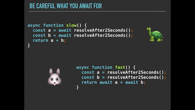
Finally, if you'd like to follow along at home today, you can grab the slides from https//layouts.ez.codes. All right, now I am sure most people here are familiar with this meme and it's not so subtle implication that CSS is, perhaps, not awesome. Now I would disagree with that.
I think the CSS is pretty fantastic and I also think that this layout is the one that makes sense if you've ever seen the card that you actually need to write to make it work like this.
On top of that, there is a bunch of tools that are available today that can help us to help CSS to understand what it is that we're trying to do.
For example, there are a bunch of frameworks out there, I don't know why CSS frameworks are so obsessed with single letter logos, especially the letter S, don't know what's going on there, but we can definitely use them to help with our layouts. So, as an example, imagine that we had a menu like this, which we wanted to stack vertically on very small screens and then on larger screens, we want it to spread out horizontally.
And we can achieve that using a framework like Bootstrap, using some cards and went to this.
So to have a responsive layer in Bootstrap, we need an element that has a class of container, and inside of that, we need another element with a class of work.
Then by default each of the elements inside that row are gonna spread out to take up the whole wall and we'll get that vertical layout that we started with.
If we also add this class of col- sm, then once the screen is above a certain size, the each element will start acting as a column. And they'll all fit across the row that they do in the horizontal layer.
If you not that into frameworks, you can achieve a similar effect using vanilla CSS via something like this, so, here we're saying that we'd like a flexible layout in one dimension, and we would like that direction to be column or vertical, which will give us the very small screen layout, and then once the screen is at least 576 pixels wide, we wanna flip around to the row layout, which will give us the horizontal layout.
Note 576 pixels is just preach drops, a small break point. And this kind of approach works in this situation, but it's not always the best approach and it's not always gonna work.
This whole idea that we should align how, greater designs align to break points that are aligned to specific device sizes has a few problems. And just the general using media queries for responsive design has a few problems.
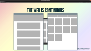
The first issue is that the web is continuous. So, when we create designs that are optimised for devices of specific screen sizes, we're creating, it's detrimental to screen sizes that are all the other sizes.
So as an example, if we had these two designs for a mobile and a tablet layout, and then I came along and opened my browser Window slightly smaller than the tablet break point, I'm either gonna get the mobile layout sort of blown up, big and weird, or the tablet layout scrunched down small and gross.
Now you might say that you would never do this, obviously you test all of your designs on all of the screen sizes, but there's definitely some folks out there doing it, into that, or I just open browser Windows that really weird sizes, I am not sure.
You can mitigate this to some degree using media queries if you set your break points so that they're aligned with your design, rather than creating a design aligned to the break points, but it still leaves us with another problem. And that problem is that we don't have all the context. So at the point that we're writing a CSS, we don't have enough information to know what that CSS is gonna end up looking like on the screen. For a stop, we often don't know how big the content is. So, sometimes we don't know how many items we get on the screen or we don't know how big each item is gonna be.
More importantly though, we don't know how big the container is.
When the container is the view port, then we can use media queries to work around this. These days though, a lot of the time we're building components, which stay inside of other components, which stay inside other components, and we don't know how big any of those components are. Even worst that we could be building for design system, and then we don't even know what the context is that a component is going to be used in.
So, what can we do instead? My suggestion would be, that we should just let the browser work it out. I think we forget sometimes these days that the flexibility of the web is a feature, not a bug.
And instead of trying to cut around it, we should be using it to our advantage.
Instead of trying to place each pixel on the screen in their exact position, we can just give the browser some guidelines and some boundaries and let it work out what it is that we're trying to do and the best way to do that.
Just a bit of a spoiler alert this is actually a test CSS works, when you write CSS rules, you sort of giving suggestions to the browser, and then it takes those suggestions along with everything that it knows about how big everything is, and it decides on what the best layout is gonna be. But now we have some really good tools for making that work. So the first example, let's look at building some columns, not those kinds of columns, these kinds of columns, like newspaper columns, and let's make them responsive. Now, this kind of layout is not something that you see that often on the web.
And I think one reason for that might be that it used to be quite difficult to do, because you don't know how much content you have. You don't know how big the container is.
You don't know how many columns there's gonna be. So, you need some kind of JavaScript running on the page, this kinda sort of work all of this out.
And then you need a bunch of complicated CSS, that needs to basically know how the JavaScript works so that it can work out how the outcomes are. And it's quite complicated.
Fortunately, these days we don't need to do any of that. Instead we can use CSS columns.
So, CSS columns are gonna let us achieve that responsive column layout in a single line of code, which is this line. So what this is saying is, as a guideline, I'd like a multi-column light up.
Now, I call this a guideline because if the browser doesn't understand the columns property, it's just gonna to ignore it, and we'd just gonna get a block of text.
The chances of that happening are pretty all over, because columns is actually supported all the way back to E10.
Next up, we have a boundary here saying we'd like no more than four columns, not more than three columns. We could have one column or two columns, we definitely won't have four columns.
And lastly, we have another guideline that says, I'd like the columns to be about 200 pixels wide. In this case, the columns almost certainly not gonna be exactly 200 pixels wide, but the browser, we use to sort of work out how many columns they should be.
So, for example, if we had a container that was 190 pixels wide and it had some padding in it, then we might end up with a single column that was 125 pixels wide.
On the other hand, if we had a container that was 580 pixels wide, we've got the same padding, but we also got a gap between the columns and a bit of a border.
Then we're gonna end up with two columns that are about 250 pixels wide.
Cool, so, that's columns again, it's not something that you see that often on the web. And I think that's a shame.
I think there are some really good cases for using it such as this one! So here we have some texts and columns and an image off to the side.
As the container shrinks, the columns get smaller and we get less columns.
Eventually, the containers shrink so much that the image drops underneath the text and when this happens, the space that's available for the columns stretches, is bigger again, right? So the text stretches back out and we get two columns again. And this is something that the browser just does for us automatically.
We didn't need to plan for this.
We didn't need to work out when we wanted it to happen. We just said with the browser, we want columns and it just does it.
And this is I think a really great example of just saying the browser, this is what I want to do, you wake up to find details.
That said, call him still not something that you see that often on the web.
So let's look at something that is a bit more common. Things that grow and shrink.
Now, I don't know if anybody remembers websites that have these buttons on them at all, but this pattern of two buttons side by side is pretty common.
So, when you have buttons in this pattern, we want both of the buttons to stretch out, to take up the available space.
And when the container is smaller, we want the buttons to wrap so that they're laid out vertically and still stretch out to take up the available space.
And provided that your container is your view port, you can absolutely do this with media queries, but there is a much more robust way to do it. And that is using Flexbox.
So, here's our buttons and it here's the Flexbox curd that we can use to display them.
So, here we've got a guideline that says, we'd like a flexible layout in one dimension, and by default, that will be horizontal.
If the buttons can't fit all in one line, then we're happy for them to rock onto a second line, but as a boundary, we would like a 20 pixel gap between them.
If you're not familiar with this gap property, it's similar to the, well, the same as the grid cap property, it's a new one. I think it's only available in Chrome and Firefox at the moment.
But yeah, like I said, it works exactly like the grid cap property. So, here you can see we've got a 20 pixel gap horizontally. If we've got a smaller container and the buttons vertical, we get a 20 pixel gap vertically.
Cool.
And we've got another guideline here that says our buttons are able to grow and shrink and a boundary that says that they mustn't shrink below it 10M.
The reason for that is below it 10M, that text is gonna wrap onto a third line and then the height we had and it's cool.
All right, so again, this is just us saying, hey browser, this is what we're trying to do.
You work out exactly at which point, things are gonna drop, move and everything. You work out the details.
And so this works well, but you do have to be careful that you don't add too many boundaries into these kinds of situations.
So, as an example, these are some buttons from an activity tracker that I use. And I can tell you the first time I opened it up, it was a little bit confronting.
Then it seemed to be four times as interested in my period as any of the other metrics.
Now, the reasons this happened, is because there's too many boundaries.
So you can see here, the buttons aren't allowed to shrink, but also each one needs to be at least 24% of the width of the container.
Now, I'm guessing what happened is they were four buttons and then, maybe a competitor at a period trucking or possibly women's health was trending on Twitter, so it was cool for everybody to stop pretending to care about it, and somebody added this fifth button and maybe didn't do the testing that they needed to. The good news is that it's quite easy to fix. And we just jump in here and remove that 24% boundary then our buttons will all line up next to each other nicely. Cool, so the other example that I want us to look at today, is an issue that I'm sure is me and dear, to the heart of all web developers.
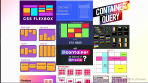
And that's the issue of how you align things. The modern CSS has some really good options for this. For stock, We have Flexbox.
So if we have all about our slurms here, and we want them to be aligned in a single dimension, we can use Flexbox.
So you can see they're all aligned vertically, but there's no alignment horizontally.
And this is of course responsive.
So these are gonna re-floor, and this is sort of a fun organic layout, which sometimes is exactly what you want.
Sometimes though, you really want your slurms to be aligned into dimensions, and you want it to be responsive.
And this is not something that you can achieve with Flexbox. In fact, it turns out that if you want your slurms to be aligned in a grid alignment arrangement, then what you need to use is grid.
Now I know not everyone is super familiar with grid, and unfortunately I don't have the time to go through the entire API today, but let's do like a quick crash course in grid. So this is a grid.
If we inspect it, we can see that it's a grid because it has display grid. It has two columns, each column is 200 pixels wide, and it has two rows and each row is 200 pixels high. If we're using Firefox and we are, then we can use that grid inspector to get a visualisation of the grid and we can see what's going on. So once we've set up our grid, we can add elements to the grid.
And when I add an element there, it just adds it as a child of that grade container here.
When we do this, the browser is gonna use those guidelines and boundaries that we gave it about how big we want the rows and columns to be, and it's gonna use the information that it has about how big the container is and how big the children are. And it's gonna combine them with the grid, lad algorithm, and give a secret.
Awesome. Congratulations, you now know our grid. Now there's a couple of ways, that we can make grid responsive.
The first is that we can make it responsive to its own content.
So we can do that using something like this, and we've got the grid.
Where we can see we've got two columns and each one has a width of alter.
And the order keyword is kind of like, a guideline and a boundary wrapped up together.
So the boundary is that the column needs to be at least as wide as its content.
So it needs to be wide enough to fit whatever's in there. Then the guideline is that it needs to stretch out to fill up the available space.
And how it stretches out, is kind of up to the browser.
So, you can see here that the second column is wider than the first column, and that's because it's got more content in it, right? It needs more space.
As the container grows, only the second column grows. And that continues to be the case right up until this point where the second column is now wide enough, that it can fit all of its content without wrapping. Once it's reached that width, then both columns are gonna grow at the same rate. So the browser is worked out, look, we want things to fit that content.
We want them to shake up the available space and it's sort of worked out the best algorithm for making that happen. The other way that we can make grid responsive, is by dynamically changing the number of columns that are in the grid.
So if we jump in here, this one is a bit more complicated. We can see that we've got columns defined as repeat autofit min-max 300 pixels, one FR.
Now it's possible that it's not immediately obvious what this means, so let's break it down.
So the first bit here repeat autofit means we want to fit as many columns as will fit in the space available. So it's just up to the browser.
You work out how many columns are gonna fit. The second bit he had min-max 300 pixels one FR, is saying each column needs to be at least 300 pixels wide, and it needs to stretch to take up the available space. So, in this configuration where we've got a container, that's about 400 pixels wide, we're gonna get a single column, and the column is gonna stretch out to take up the space. As our container grows, the columns gonna continue to stretch out, to take up that space up until the point, where there's enough room for two columns, and then it will split into two columns and three columns and so on.
The important difference between these two options for responsiveness is that, in this version, all of the columns are gonna be the same width. They're gonna grow by the same amount.
You can't make this dynamic column version responsive to its own content.
So, for example, if we were to jump in here and instead of saying 300 pixels, we could say, well, we can sell this out.
Let's just tell it to be responsive, to have a minimum size of main content, right? Then it should fit its own content in.
Unfortunately, if you do that, then the browser is just short of areas.
That's not enough information, I'm not really sure what it is you're trying to do. And it just kind of gives up.
And instead you just get the default grid layout here. So one column.
So for this reason, this kind of responsive layout is better in situation where you either know how big your content is, or you can control how big your content is. So, as an example, here, we have a grid of images. So here, we've given the browser guideline that says, we'd like as many columns as will fit, and we've given him a boundary, which is the width of the column.
And then for each of the images, we've said, how many rows and columns it should cover.
So for instance, if you takes up two rows, but only one column, whereas fry takes up two rows and two columns. So we can then combine that with the dense grid layout algorithm, and we get an image grid that's gonna re-floor and fill in the space nicely and would be, I don't even know how you would do this with media queries, but it works really nicely and is actually quite simple to implement in grid.
All right, so the last example that I wanted to show you is a combination of all three of these properties, columns, and Flexbox books and grid.
So we have a look at that.
Here, we have a page that's got all of our season's a few drama and all of the episodes in season one here, and a bit of a solid advertising down the side there, every click on one of these episodes.
Then we get a little synopsis, which you can see is laid out in columns.
If we resize the browser Window, then you can see the number of columns changes, but also the layout of the entire page changes. So we get our advertising is still quite prominent because obviously that's quite important, but the layout of the thumbnails and the size of each thumbnail changes as the screen resizes.
The other thing is that when we get down to the really small layout, we do actually lose that advertising and the menu flips from this vertical layout to the horizontal layout.
And there is one break point on this page, and it's at this point where the word season disappears. I could not work out how to do that without a media query, but if you can work it out, let me know.
And John says, he'll give you a price, right, John? (giggles) All right, cool.
So, that's basically how we can do responsive layouts using other methodologies than just relying on those device-based breakpoints. And I'd like to leave you with a quote from Jeremy Keith, in his book, "Resilient Web Design," which you should definitely have a read off, even if it's only just to see the little mention of John in there.
And Jeremy says, "Relinquishing control does not mean relinquishing quality.
Quite the opposite.
In acknowledging the many unknowns involved in designing for the web, designers can craft in a resilient, flexible way that is true to the medium." Or in other words, the flexibility of the web is a feature, not a bug, and we should use it to our advantage.
All right, sir, like I said, the slides are available @layouts.ez.codes along with all of those examples, they probably work best in five books.
(giggles) On the subject of whether these features work in different browsers, they do, you can use them in all of the browsers.
There are a couple of known issues with Flexbox in IEE, but there's some pretty well known workarounds for those. So just Google a bit, you can also use grid IEE. You can probably wanna use some kind of Perseus, CSS tool to help you with that third.
And there are some features that are gonna work on the Perseus CSS tool is really good these days, so it will actually tell you if you're using a feature that's not supported IEE.
And give you suggestions about how to get around it. Alright, I've been Erin and thank you very much.
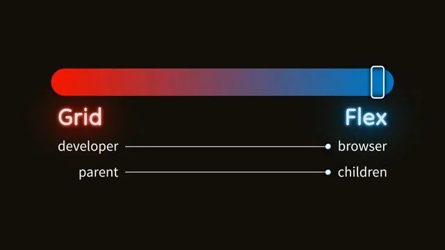
Historically, layout on the web has been quite difficult. Developers have relied on third-party tools, like Bootstrap, and media queries based on “average” device sizes. Today, however, the web is available on an increasingly large range of devices – everything from your watch to your fridge! We are reaching the limits of what these tools can handle.
The good news is that CSS has you covered now! Modern CSS contains a number of properties that support responsive designs natively. We’re going to have a look at CSS columns, flexbox and grid. We’ll take a quick look into how each works individually. And then we’ll learn how we can combine them to create truly flexible layouts, that work across a huge range of devices, without relying on device-based breakpoints.
Welcome to the Layouts of the Future!
Erin Zimmer, Senior developer Cogent
We’re probably all familliar with the “CSS is awesome” meme, where the text breaks out of the box – and this is supposed to suggest CSS is not awesome. In fact the layout is what actually makes sense in reality.
There are a bunch of frameworks out there, weirdly obsessed with single-letter logos, but still…
Frameworks like Bootstrap enable a lot of powerful layouts without a lot of custom code. Or if you want to roll your own, it’s still only a few lines of code to get a basic responsive design working.
But there are some problems with the assumption that all responsive design should be attached to breakpoints.
The web is continuous – people don’t all use windows sized to your breakpoints. Many websites look surprisingly clunky if you happen to open your browser at a size that’s awkwardly placed between breakpoints.
You can alleviate this by setting breakpoints aligned to your design, rather than trying to aligning to screen size.
But when we write our CSS we don’t have all the information, such as how big the content will be; or how big the container will be. If the container was always the viewport, media queries would be perfect.
Design systems face this problem a lot, where a component is designed without knowing the context it will be used in.
So what can we do instead? Erin’s suggestion is let the browser work it out. The web’s flexibility is a feature, not a bug. Don’t try to place every pixel perfectly, give the browser boundaries and let it figure out what to do.
This is really what CSS is doing anyway – making suggestions to the user agent.
As an example, let’s look at making some responsive columns – the real newspaper-style column isn’t very popular on the web as it was really hard to do for years.
But now we have CSS columns which can do it in a single line of code:
.columns {
  columns: 3 200px;
}
Why is this just a suggestion? Well if the property isn’t supported, the content will behave as a normal container. We can suggest a maximum for the number of columns and how wide we want them, but we don’t know what will fit.
So the browser takes info and finds a layout that fits the suggestions within the constraints at the time of rendering.
Then you can combine columns with flexbox. Text is set with columns, while an accompanying image is set to the side or below. The browser then goes ahead and makes it work in whatever combination makes sense.
A more common use case is things that grow and shrink. Two buttons side by side is a really common pattern; as is wanting the button to stretch wide if the parent is wide; or stack up if the container is narrow.
This seems hard but you can make it work using flexbox and a minimum width on the buttons. The demo uses a new flexbox property gap which sets space between elements – browser support can’t come soon enough!
This works really well but you need to be judicious with your boundaries. By setting too many you can create unwanted effects.
(Demo of a set of buttons, where four were normal sized and the fifth full width; because they’d been given a boundary of 24% min-width. It works better without that boundary.)
Next is an issue that is near and dear to all web developers – how to align things.
- Flexbox is good for alignment in one dimension (eg. vertical)
- Grid is better for alignment in two dimensions (ie. both vertical and horizontal)
(Two minute crash course in Grid)
There are a couple of ways to make Grid responsive.
You can make Grid responsive to its own content using width auto. Auto sets the boundary that the column needs to be at least as wide as its content; and the guideline is that it should stretch to fill available space.
Or, you can dynamically change the number of columns. This may not be immediately obvious so let’s break down the code.
repeat(auto-fit– fit as many columns you can in the space availableminmax(300px, 1fr)each col needs to be at least 300px wide; and stretch to fill available space
The big difference in this option is that the columns will all be the same width and not driven by the width of the content. So it’s better when you know or control the size of the content.
The last example combines everything… columns reflow to fit content into the available space; the whole page reflows to adapt to viewport size.
Finishing with a quote from Jeremy Keith’s Resiliant Web Design:
Relinquishing control does not mean relinquishing quality. Quite the opposite. In acknowledging the many unknowns involved in designing for the web, designers can craft in a resilient flexible way that is true to the medium.
A final note that browser support is better than you expect; although you will need some postprocessing for IE11.
@ErinJZimmer | slides: Welcome to the Layouts of the Future!