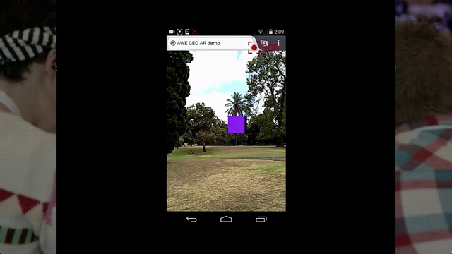
But what about normal flow?
Introduction to Normal Flow in Web Layouts
Erin opens her talk on the topic of normal flow, the original layout of the web, emphasizing its fundamental nature in web design and contrasting it with Flexbox, Grid, and container queries.
Exploring the Basics of Normal Flow
She explains that normal flow is the default state of elements in a webpage layout when no specific CSS rules like Flex, Grid, position, or float are applied.
Understanding Elements in Normal Flow
Erin discusses how normal flow functions with different types of elements. For example, if a form is made to display flex, the form itself will be flex, but elements inside it remain in normal flow.
Normal Flow's Purpose in Document Layout
She highlights that normal flow is optimized for laying out documents, including text-based content like news articles and blog posts.
Distinguishing Block and Inline Elements
Erin explains the two kinds of HTML elements: block elements that hold other elements and inline elements which are content-based, such as images and text formatting elements.
Size and Position of Block Elements
Discussing block elements, she explains that by default, they are as wide as their container and as tall as needed to fit their content. Erin covers the sizing techniques using CSS properties like width, height, and min-content.
Positioning Block Elements
Erin moves on to positioning block elements using margin properties, discussing how the flow of elements is affected by each other in a normal flow.
Understanding Margin Collapse
She delves into the concept of margin collapse, a feature of normal flow where the larger of adjacent margins is used, instead of summing them up.
Positioning Inline Elements and Limitations
Discussing inline elements, Erin highlights their positioning relative to the line box and limitations in adjusting their size and vertical position.
Using Vertical-Align for Inline Elements
She explains how the vertical-align property can be used to adjust the vertical position of inline elements relative to their line box.
Line Boxes and Their Role in Layout
Erin introduces the concept of line boxes, invisible to developers, which play a crucial role in positioning inline elements within block elements.
Inline Block Elements and Their Characteristics
She addresses the concept of inline block elements, a mix of inline and block characteristics, and how they function within the layout.
Concluding Remarks on Normal Flow
Erin concludes by summarizing the significance of normal flow in web design and its optimization for document layout, while acknowledging its limitations and alternatives like Flexbox and Grid.
Hi, yes, we're going to talk about normal flow.
I'm not going to tell you any of that because Mark just said it, except if you want to play along with the slides at home, they're at layouts.ez.codes.
so if you look on the web these days to find out about how to do layouts and stuff, you're going to find heaps of blog posts and articles about Flexbox and grid and container queries.
And that's, awesome, right?
Those things are all really fantastic.
They're really great.
But today I want to talk about something a bit more fundamental.
I wanna talk about normal flow.
So normal flow is the OG layout of the web.
It's the layout that we had before we had flex and grid, but it's also the layout we had before we even had tables.
normal flow is so fundamental that if you look up its definition on MDN, what you actually get is the definition of what it isn't.
So elements on a webpage layout your normal flow if you haven't applied any CSS to change the way that they behave.
So if you haven't done any of these things, if you haven't used display flex or grid, or their inline variants.
If you haven't used position, absolute, fixed, or sticky, if you haven't floated things, if you haven't used column count, and you haven't made it a table, then it's normal flow.
It's actually even more insidious than that, because layouts aren't inherited.
So if we have a page here, we haven't applied any of the things that make it not normal flow, it's all in normal flow.
If we jump in here and say, make this form, now display flex, the form is going to be flex, but the things inside the form are still going to be normal flow.
so the point I'm trying to make is that if you are laying things out on the web, you are using normal flow, and probably understanding how it works will be helpful.
So today we're going to talk about what normal flow is for, how it works, and some use cases where you maybe don't want to use it.
So the, sort of the point of normal flow, the thing that it's optimized to do, is normal flow is for laying out documents.
like I said it's the OG layout of the web, the original intent of the web, we're sharing documents, so that makes sense.
by documents I mean anything that's text based.
So it's going to have sections with headings and paragraphs and maybe, images and stuff embedded in there, but largely text.
So things like news articles, blog posts, all those recipe pages where they tell you their entire life story before they give you the ingredients.
Those are all sort of text based things.
Your web app might not be text based like this, but I'll bet that some parts of it are.
And the parts that are text based are going to work well in normal flow.
Okay, so to understand normal flow, we have to understand that there are two kinds of HTML elements.
There's elements that hold other elements.
So things like articles, detail, details, all of the header elements, the list elements, the footer section, those kind of things.
And there are elements that are content.
So all of the text formatting images, elements like code and strong and em, which stands for something now, I don't know what they're pretending that is.
emphasis.
Yes.
yeah, so those are the content and also the image and video.
So the ones that hold other elements are called block elements.
And the ones that hold, the ones that are content are inline elements.
And the rules here are that block elements can contain anything, you can put whatever you want in them, but inline elements can only contain other inline elements or, text nodes.
I say they're rules, it's a web though, so if you break these rules, the browser will just figure something out.
It'll be fine.
But for your own sake, I'd recommend keeping these rules in mind because it'll make it easier to reason about things.
All right, so let's start with how block elements are laid out.
And when we're talking about block elements, we've got our block elements.
If you want a block element that doesn't have any semantics associated with it, you can use a div.
And actually the, dirty little secret about this whole thing is that none of this is HTML.
It's actually just CSS.
A block element is anything that has display block.
there is no such thing as a block element.
The, when I say these things are block elements, what I mean is that the browser's default stylesheet gives them display block.
It is just CSS.
cool.
So when we're talking about how things are laid out, there's two aspects to that.
The size of the thing and the position.
So how big it is and where it is on the page.
By default, a block element is going to be as wide as its container and as tall as it needs to be to fit its content in.
So if we jump in here and give it some more content, really great.
you can see it gets taller, so it still fits everything.
we can also change the size.
To the surprise of probably nobody, we can set, say a width on this, element and we can say it's going to be 300 pixels wide and it's now 300 pixels wide.
And because it is no longer big enough, wide enough to fit all of its content, it automatically gets taller.
if we set a height as well, we can set a height, if we set the height too small for the content's going to overflow.
So this is something to remember.
The browser always prioritizes content being visible.
So if you make the content too small, it will overflow and that is on you.
So let's get rid of that height.
So we can set our heights using, an absolute value like pixels or, em or rem where it's, I guess it's relative, but it's absolute to the font size, but we can also set it relative to a bunch of things.
So for instance, we can set the width of the element relative to the width of the container using percent.
and we can set the height relative to the height, but you can't set the width relative to the height.
Except you can now, because we can use container queries.
so you can use our container query widths to set the width and the height relative to whichever of those you like.
we can also set the width relative to the viewport, so the, screen size.
So 30vh is gonna be 30 percent of the width of the screen size.
you can set the width relative to the height if you want.
And also we've got these nice values vmin and vmax.
So vmin says set it to the 30 percent of the width or the height, whichever is smaller, and vmax is whichever is bigger.
So this is, this can be a way to make things square, but still be sure that they fit on the page.
we can also set the size of this thing relative to its own content.
So we can say we want the width to be min-content.
And that means it's going to be as small as it can be, as narrow as it can be, and still fit its content in.
So as long as, it's going to be as wide as the longest word.
and that does include the padding as well.
if that looks a bit squishy, we can add some more padding.
we can also do max-content, which means it's going to try and fit all of its content on one line, and it's just going to be as wide as it needs to be to fit that.
And finally, we also have fit-content, which looks like it does exactly the same thing.
it doesn't though, there is a difference.
If we, add some more content in here again, you can see, if we use max-content, then all of that content is going to be on one line, and it's going to overflow the container.
But if we use fit-content It's going to wrap onto a second line and everything's going to be nice.
So probably you want fit-content.
cool.
So there are some things though that we can't set the size relative to.
And the big one is you can't set the size relative to the other siblings.
So I can't say I want all of these elements just to be the same width as each other, but also big enough to fit their content.
There isn't a way to do that with, with normal flow.
like this particular, version is using grid, which is a way to do it, but what I would actually suggest is just change your HTML.
add an extra container in the middle there.
That extra container, you give it a width of fit content, it means it's just going to be as wide as the wid widest thing.
and then all of the child elements will stretch out to fit up, fill up the space because that's what block elements do.
So this works well for widths, unfortunately it doesn't work for heights.
So this is, a very common thing people want to do on the web where we have a header and a footer.
And we want the content in the middle to stretch out to take up the available space and you just can't do that in normal flow.
You can do something like this where you set the height and you set the height of the footer, height of the header and then you take up, but don't.
It's not good.
So if someone say for instance looked at this website in German, probably the header would be longer and it would Wrap.
you might say, you don't support German, but I've got terrible news for you about what Google does with auto translating plugins and, So don't do this.
Instead, just use Flex.
we can make it display: flex-direction: column, and make the content stretch out to fill up the space.
Cool.
So what about positioning of block elements?
by default, the first element is going to be at the start of the container, and then every element after that is just going to follow it down the page.
we say the start of the So this, direction where they follow each other after that, one by one, that's the block direction, as we talked about in the previous talk.
and here, the start of the container is the top of the container.
Technically speaking, it's only the top if you're using a horizontal language, so left to right like English or right to left like Arabic.
If you're using a vertical language, the start is the right hand side and it's going to go left.
I say technically speaking because it turns out that even languages that are written vertically normally, like traditional Chinese and Japanese, when they're on the web, they're actually normally written horizontally, left to right.
So this is the home page of Nintendo, arguably Japan's most important company.
and as you can see here, the text is all written left to on the off chance that anybody here doesn't actually speak Japanese and can't read that, there's English words in the middle there.
You can see Japanese people feel the same way about English writing as English speakers feel about Japanese writing.
So they chuck it all over the place.
get bad tattoos, all kinds of things.
so we can change the position of these elements using the margin top property.
margin, no, you've got to put the hyphen in there, yes.
so if we go to margin top, 40 pixels, it's going to move down 40 pixels.
We can give it a negative value and it will move up 40 pixels.
Be careful doing this, things can overlap and it will go bad.
and you'll notice when I move that element, all of the elements that follow it move as well, because that's what the flow is in normal flow.
It means that every, the position of every element depends on the one before it, and the position of every element affects the ones after it.
We can also move the elements after this element without moving it.
Itself.
we can give it a margin bottom and you can see it pushes it down 40 pixels.
One trick for new players here is that if I then give a margin top to this second element, no margin top, the gap between them doesn't get any bigger, right?
The gap.
It's not 80 pixels, it's still just 40 pixels.
You can see both of the margins are actually there, it's just that they overlap, right?
They're both occupying the same space.
If you want the distance between the two elements isn't going to be the margins added together, it's going to be whichever is bigger.
So if we make this one bigger, it's going to move.
Now, this might seem a bit annoying, and why would they do this?
But there is a good reason, and it comes back to the fact that normal flow is intended for laying out documents.
So a very normal way to lay out, a very common way to lay out a document would be to have a very large margin on your headers, a medium sized margin on your paragraphs, and a very small margin on, images and things, just because that's the way that we like text to flow, that's how we like things to be broken up.
But the caveat here is, if we have a header followed by text, We want the distance between the header and the text to be the same as if we have a header followed by an image, right?
And if the margins added together, it would be really complicated to make that work.
So instead the margins just overlap and you just get the bigger one.
If this is a problem for you and you want to look up more about it, it's called margin collapse.
and generally the easy fix is to use paddings instead of margins.
okay, so that just leaves horizontal positioning or inline positioning as we learnt just a minute ago.
so if I give this a width so we can see where it is, by default, the element is just going to be at the start of the container.
This is, this page is in English, so the start of the container is the left.
If the page was in a right to left language, the start would be the right.
We can move this using margin-left, we'll move it to the right, or we can give it a negative value or move it to the left.
but this will only work now in a left to right language.
If this page was translated into Arabic, this margin wouldn't work anymore because it would be on the wrong side.
So what we can do instead is use the new CSS logical properties and call it margin-inline-start.
And now this will work whether it's left to right or right to left.
Margin can also take a keyword, auto, which says just put all of the available space in the margin.
So if we have margin-inline-start: auto, it'll push it all the way to the end.
But we can also do a neat trick, where we can say we just want margin inline to be auto, and it will center.
So that's nice.
this won't work vertically.
I can't say, I want margin auto and it will center it vertically.
That just won't work.
which is something that has frustrated CSS developers for a long time.
But if you think about it, it makes sense.
Like, when we're talking the horizontal direction, there's only one element there.
What it means to say center it makes sense.
It means put that one element in the center.
But if you're looking at it vertically, there's three elements there.
What does center mean?
if I center the top one, is it in the center of the container?
Is it in the center of the available space?
What if I center two of them?
Are they then in the same place?
It doesn't, yeah, it doesn't make sense.
if we want to center things, then again we use, Flexbox, again.
And because flex is can is applied to the container, it means center all of the children.
and we can use justify-content for that.
same deal with positioning things at the end of the container.
I don't have a good reason for why that doesn't work.
But we can use flexbox again for that.
yeah.
Another thing that we can't do in normal flow is we can't have block level elements, block elements that are next to each other, right?
This, flow, this layout is just not possible in normal flow.
If we want to achieve a layout like this, there's a couple of options.
If we want one just like this, where we're just fitting as many elements as we can on a row, and then having them wrap onto the next row, then we can use Flexbox.
but if we want something more like this, where we have a specific number of elements per row, we want them all to be the same size, then for that we can use Grid.
and the final thing that we can't do with normal flow is we can't position an element relative to its siblings.
So I can't say I want that Planet Express logo to be to the right of the text before it.
There's just no way to do that in normal flow.
So again, we can use grid.
Cool.
So that's block elements.
They can be sized absolutely, or relative to the viewport, or the container, or their content.
they can be positioned using margin, but we can't size them relative to their siblings, we can't position them vertically in the center, and we can't position them relative to their siblings, or at the end.
Cool.
that's block elements.
What about inline elements?
our inline elements, again, are our text formatting elements and image and video.
the inline element that has no semantics associated with it is span.
And again, it's all a lie, and it's actually CSS.
You can make anything an inline element by giving it display inline.
If you do, I'd maybe ask questions about whether you're using the right element, though.
I'm not sure there's a good use case for that.
sizing of inline elements is very straightforward.
an inline element is the size of its content and its padding.
that's just how it is.
So this element is the size of the purple box.
If we add more padding using, we, so we can do padding-inline as well, then it's going to get bigger.
That's cool.
But if we set a width of 400 pixels, nothing happens.
And in fact, browsers these days will tell you width has no effect on this element since it has a display of inline.
You can't set the size on an inline element.
The exception to this is image and video.
I guess because they're replaced elements, they're special, you can set sizes on images and video.
But if your inline elements have text in them, you can't set a size on them.
All right, so positioning of inline elements.
Positioning of inline elements is a little bit more complicated because it relies on this concept of line boxes.
And lineboxes are something that the browser uses internally, but that we can't see as developers, right?
They don't show up in the dev tools.
Trust me, I've looked.
so lineboxes are when you're in school and you're doing those, like doing an assignment where you had to make a poster?
And so you'd like, rule pencil lines, and then you'd write on the lines with pen, and then you'd rub the lines out afterwards, obviously, if you had a pen license.
so you rub the lines out afterwards and it looks like you're magically good at straight writing.
So that's what the browser's doing, it's drawing in pencil lines.
And then rubbing them out so it looks like it's got neat writing.
And so the way that line boxes work is that an inline element always lives inside a block element.
even if you just put a span on a page, the browser is going to wrap it in a body and a body is a block element, right?
So inline elements always live inside block elements.
And when the block element goes to layout its inline content, what it's going to do is it's going to draw a line box.
It's inline things will live.
The line box is going to be the same size as the container minus the padding.
And it's going to be as tall as it needs to be to fit its content, right?
And then the browser is going to grab the content and it is going to, break it out into space separated tokens, or as we call those, words.
and it's going to put them in the box until there's one that doesn't fit.
And then it's going to create another line box, and it's just going to keep adding content until everything is in the line boxes.
if we have an inline element like this span here that doesn't fit all in one line box, it doesn't matter, it just gets broken up over two line boxes, we don't even worry about it.
If we have an inline element like this bold, the strong element here, we don't have B elements anymore.
if we have this strong element, which is a strong element inside a span, Then that strong element lives inside the same line box as its parent, right?
Inline elements don't create new line boxes.
There's just one line box and they all live inside the same line box.
And that's actually the fundamental difference between block elements and inline elements.
Block elements create line boxes, but they do not live in line boxes.
And inline elements live in line boxes, but they don't create them.
Okay, so we've got all of our content laid out in its line boxes, and we're ready to try some positioning.
The positioning of inline elements is always relative to the line box.
and we can position them horizontally the same way that we did with our block elements except using margin left.
that will move it to the right and give it a negative value.
Don't do that, though, that will look terrible.
so that's all fine, that's easy.
we can also position things horizontally using the text-justify on the parent.
text align, sorry, on the parent.
Text align, yes.
So left is the default in the left to right language.
Also start, end is going to take it to the end, we can center it, or we can do my favorite, which is justify, which makes it spread out and take up all of the available space, like some kind of 90s word processor.
It's great.
oh, too far.
vertically positioning these elements, so let's get rid of that text justify.
when we go to position these things vertically though, unfortunately margin top isn't going to work.
It doesn't do anything.
Nothing changes.
And you can see what's happening here.
Like the margin is there.
It's just not changing the position.
same thing if we added like padding, the padding is there, but it doesn't change the position of the element.
So the only way we can change the vertical position of an inline element is using the vertical-align property.
vertical-align is going to change the position relative to the baseline of the line box.
So here it's just going to move it up 40 pixels.
If we give it a negative value, it will move it down 40 pixels.
And vertical align also comes with a bunch of handy keywords.
So we can, vertically align top and bottom, which aren't going to do anything because the thing's the same size as the line box.
we can vertical align super and make it super text like, math notation.
We can do sub, makes it subtext like chemistry notation, and we can vertical align middle, which is something I'm pretty sure everyone has done at some point and then been disappointed by.
And the reason this doesn't center your elements vertically is because it always centers them relative to the line box, right?
It only works on inline elements and it only centers them relative to the line box.
it is actually more disappointing than you realize though, because this is the kind of thing that we can center with display in, with vertical align middle, right?
We could say we want the text to be aligned with the middle of the image.
This is exactly the kind of thing that this will work with.
So we can jump in here, and we can say vertical align middle, and It makes it worse.
the reason for that is that fonts are witchcraft and very complicated to understand.
So the definition of vertical aligned middle is it aligns the middle of the element with the baseline plus half the x height of the parent.
So you all understand what's going on now?
let's try and understand this.
so the, the middle of the element, that's, an easy one.
So the middle of the element is going to be Like that blue box, halfway down that blue box is the middle.
So around about here.
The X height of the parent is the height of the letter X in the font of the parent element.
So here it's going to be the height of the letter E or the letter O, the letter S, any of those.
And then half of that height is what it sounds like, half that height.
So around about where the horizontal bar on the letter E is.
So now we can see, if we jump in here, oh, and, the base, what was the other one?
The baseline.
We need the baseline as well.
so the baseline is like the line where you would write the text.
So if we give the parent a text decoration of underline, where the underline is, where the baseline is.
so if we jump in now and give our element a vertical align middle, You can see what's going to happen is that red line is going to move down to where the, the middle of the E is there, just like that.
So you can see now it's sitting below the baseline.
So now I guess we understand why it doesn't do what we want, which isn't quite the same as having it do what we want, but I guess it's a start.
to make this actually work the way that we want, we can do vertical align middle on the text and then also do vertical align middle on the image.
And then it's centered!
Hooray!
Or you can just use Flexbox with a align center.
If you do use Flexbox though, you'll lose the space between the text and the image, so you'll need to add in a margin there.
Cool, so that's inline elements.
Inline elements are the same size as their content, and we can't change that, except for images and videos.
They're positioned horizontally with margin and text align.
Positioned vertically with vertical align, and vertical align is relative to the line box.
that's, inline elements.
One last thing I did want to talk about is this situation.
so we have a button in the middle of some text here.
The button is clearly an inline element because it is sitting in the middle of a line box there, along with all of that text.
But if we look at the button, it turns out it's got a width and a height set on it.
You can't set a width and a height on an inline element, we just discussed that.
it turns out the reason for that is that the, button is neither an inline element nor a block element.
It is an inline block element.
An inline block is, as far as I'm concerned, a terrible cheat.
because at some point everyone realized that the way that display is defined, we're actually doing two things with one value.
So a block element, doesn't live inside a linebox, but it generates lineboxes.
And an inline element does live inside a linebox, but can't generate lineboxes.
And sometimes you actually want to be able to do both of those things at once.
So we just smushed them together and called it inline block.
And more recently, the wonderful people who are in charge of the CSS specs have realized that this is terrible.
And, the new CSS spec actually provides, has a new way of, defining display, which uses two values.
So one for whether it generates lineboxes, and the other one for whether it lives in lineboxes.
the browser service port for that currently looks something like this.
Sorry.
I probably wouldn't worry about learning it just yet, but when it does come time to learn it, you'll understand exactly what's going on.
Okay, so inline block elements, they live in their parents linebox, they create lineboxes for their children, and you can set the size on them because apparently if you can create lineboxes, then you can have your size, set.
That's obviously, Cool, so that was Everything I wanted to talk about normal flow today.
What did we learn?
normal flow is everywhere.
If you're designing on the web, you are going to be using normal flow.
normal flow is trying to lay out a document.
That's what it's optimized for.
That's gonna, what it's gonna work best for.
That's not what you're doing.
Maybe use something else.
We learned the concepts block, inline, inline block, and linebox.
And we learned that sometimes normal flow just isn't the answer.
And we should use something else.
again, if you wanted to look at the slides, they're at layouts.ez.codes.
if you want to learn more about layouts, I highly check out, recommend checking out MDN.
if anybody is still on Twitter, I guess you can hit me up.
thank you.
When people talk about CSS layouts these days, it’s all about flex and grid. And, don’t get me wrong, flex and grid are pretty cool. But normal flow is still the default layout on the web, so that’s what most of your app is probably using.
And given that normal flow is so fundamental, it’s important to have a good understanding of how it works. But how it works can be a little counter-intuitive. Why, for instance, can we easily centre a thing horizontally, but not vertically?
Let’s have a look at the mental model behind normal flow, what kind of things it’s good for, and when some of the newer, shinier features might be a better choice.