Debugging CSS
(upbeat music) - Hello everyone, my name is Ahmad Shadeed.
And I'm really excited to be here at WebDirections. For today I will talk about debugging CSS.
So software developers spend around 35 to 50% of their time on validating and fixing bugs. And that thing cost about 100 billion dollar each year. So what is debugging? Debugging is the process of finding and resolving issues within a computer programme, that might be preventing the user from doing something important.
And for CSS, well, it's the same.
So let me give you a bit of history.
In 1998, a Style Master was released, and it was one of those tools that allowed us to inspect and to edit the CSS in a given web page. And then, in 2006, Firebug was released as a browser extension, which was very similar to what we have today in DevTools. But today, lots of things, like have changed.
So every modern browser has a built-in DevTools now, we have a huge number of devices to test on. And the size of our page can range from 1 maybe to 1000 pages.
So why debugging should be taught.
Okay, the first thing is that learning how to debug will reduce the time used, you will spend on fixing a bug.
And actually the fast development of DevTools is very, very overwhelming for newcomers.
So there should be like, maybe a learning resource or something that can guide them. What is a CSS bug? Okay, so a CSS bug is, when a developer made a mistake.
Maybe he used an incorrect value or something. And I want to highlight that a CSS bug is not a browser implementation bug.
So this is an important distinction.
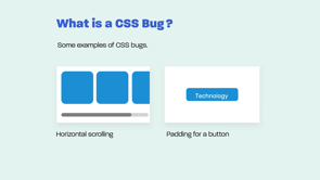
A CSS bug, could be a misaligned icon, or maybe a stretched image, it could be a horizontal scrolling thing, or it could be a padding maybe for a button. So let me start with the DevTools.
So as you all know, you can inspect an element, and you can toggle on and off the CSS styles that are attached within it.
So let me like start with the device mode.
So in the device mode, you can emulate how a website will work on mobile size.
Okay, that's cool.
But there is one thing and especially in Chrome, the device mode, that you cannot like reveal if there is a horizontal scrolling issue, so you have to scroll this manually with the right or left to scroll, and there is one thing I like in the DevTools, which is Scroll into View feature.
So say you are testing a mobile website, and like you want to scroll all the way down. So with Scroll into View, you can select an element from the HTML, and you can scroll all the way down very very quickly. Media Queries, okay, so maybe you also know this.
So like, you can inspect an element, and you can see the media queries that are attached to it. So in this example, we have a media query that is attached to the navigation toggle.
A media queries order is very important.
So in this example, we have a navigation toggle, and it should be hidden if the screen size is more than 500 pixel.
So in this example, it won't work because the media query is being overridden by the CSS declaration. So in this example, the media query should be like, below it, you might be having a case, where a media query is not working as expected. So in such cases, the first thing I do is that, I add a background colour.
So let's say I add a background to the body element. And if it works, then the media query is working as expected. If not, I will maybe check the cache.
If maybe CSS is cached, or maybe the CSS file is linked incorrectly. Or maybe I missed an open or closing bracket. There is one important thing, which is Debugging Double BreakpointS Media Queries. So in this example, we have the same media query value and it's used for two elements.
It will cause an issue on the 500 size, so none of the navigation or the mobile toggle will be visible.
So this issue can be solved by using a different value for each one. Debugging an element that is being added or removed via JavaScript.
So the DevTools will actually flash, the CSS styles that is being added, or maybe the parent element that contains the thing that is being added. So in this, in this example, let's say you have a menu that is being shown on hover, you can Right click on its parent, and you can choose, Break on attribute modification or Subtree. So in case, one of, one of these things happen, the JavaScript execution will be stopped.
And finally, I want to highlight that you can increment or decrement by using the Up and Down Arrow keys. So you, you can use them with the Alt, Shift or Command, to increment or decrement as you see in the figure. And now let's move to a common CSS issues.
So Padding and Inline elements, padding vertical won't work with an element that has a display inline.
So I span element for example, unless you change that display type to maybe inline block. Spacing below an Image, okay, so spacing below an image is a case where an image has a very little, has a very little spacing below it.
And that actually because the image or because the browser is dealing with image as a character, because it's an inline element.
So in that case, you have to give it display block.
An inline, okay, so you, you might inherit, or you might work on a website that was made by someone else.
And in such a case, you have to check if there is any inline styles in there. Because if yes, they might be confusing to you while debugging. Okay, Margin Collapse, this is maybe, is one of the most maybe known issues on the web.
So let's say you have two elements, one of them is having margin bottom and the second one is having a margin top.
The one with the larger, the one with a larger value will actually be used, that's all.
Okay, so I like to call this Just In Case, because it serves as a just in case thing, so in this example, just in case the title got longer, we have, we have a margin with it.
So if I want to stack to the icon on the right side.
Okay, so now let's move to the Min Width in CSS. So Min Width is very useful and one case, we use it as with buttons.
So in this example, the Down button at the first row is looking very good.
But when the text got longer, it like stuck to the left and right edges.
So this thing is very confusing and the reason is that because we didn't add, padding to the left and right side, make sure to include that.
Okay, so also, maybe this is one of those common, but less known issues.
An element is floating above its sibling.
So in this example, we have the pill, and it's overlapping with the, with the header element.
And the reason, the reason of this, is that because it has a higher z-index value. The transparent keyword, so in some old versions of Safari, the transparent keyword will actually show a blackish colour, So make sure to test well when you use it.
The Order Of the Background Size and Position. So in this example, we have the position and then the size.
So if you flip those, the whole, the whole background declaration will be invalid. Overriding a Transform By Mistake.
So in this example, we have an element that has a translate Y, and on hover, we want like to rotate it.
So the correct thing is that the rotation should be appended to the Translate.
If you don't do this, it will actually, it will actually override it.
So make sure to append it as in the second code. Horizontal Scrolling.
Okay, so thankfully, now we have Firefox, that shows a Scroll Label, which is very useful.
So let me like explore with you some of the causes of horizontal scrolling. So in this example, we have an absolutely positioned element with a negative value, and it's like going out the viewport.
CSS in grid.
Okay, so in this example, we have a grid container.
And if you don't pay attention to the mobile size, it will actually cause a horizontal scrolling issue. So the fix is actually will be to rub it into a media query like this, a long word or a link will very easily cause a horizontal scrolling issue.
So make sure to break it.
So use overflow-wrap: break-word, and it will solve that issue.
CSS Overflow.
In this example, we have an element with a fixed height and what we want to achieve is that the content within it, it might be short or long, so we need to have a scroll bar.
In such a case, it's much better to use overflow-y:auto, because it will only show the scroll bar in case the content is long.
Flexbox is a very useful layout module.
But in cases where you won't use flex-wrap: wrap, it will cause horizontal scrolling on mobile. Flexbox and space-between, so let's say you are using space-between to add the spacing between a group of cards for example.
So it will cause an issue in case, the number of columns is not even.
So as in this example, notice how like in the second row, the spacing below them is very, very large. And now let's move to Breaking a Layout With CSS. So adding long text or content can very easily re carry out, trying content in a different language is also one of the causes of this.
And there is also one thing which is resizing the browser window.
Yes.
So, you have to pay attention to the in-between design case. So between the mobile and the tablet, there is a case which I like to call the In-between.
So in the in-between, you might find that an element is either too wide or too narrow.
And you also need to avoid using placeholder images.
So, in this example, the text in the first is looking very clear but in the second one, it is like very hard to read, because the image is too light.
And finally, you can flip between portrait and landscape mode.
So in this example, notice that the Close button is overlapping with the navigation menu.
So, in such a case like, I reveal this issue by only flipping the viewing between the portrait and landscape modes in the DevTools, which is very easy to do.
And that's all, thank you so much for watching this.
I hope you enjoyed it.
(upbeat music)
Practices and techniques for debugging traditional programming languages, like C or JavaScript, have developed and matured over the last half century or more.
But CSS, as any developer who’s even moderately familiar with the language will know, is very different from such languages.
Even spotting, let alone tracking down the cause of incorrectly styled content can be maddening. And managing the interaction of potentially numerous rules spread throughout a style sheet, or across multiple style sheets, or the cascade and inheritance of a property and its impact on an element’s style causes frustration even for very experienced CSS developers.
In this presentation designer and developer Ahmad Shaheed asks why hasn’t a systematic body of debugging practice emerged for CSS? And what might that look like?
Debugging CSS
Ahmad Shadeed, UX Designer • Front End Developer
Learning resources can make it less confusing.
- Browser devtools
- Mobile devices
- Emulators
- Virtual machiens
- Online
- We trigger this with the contextual Inspect menu
- Device modes to emulate mobiles, tablets, etc – but it’s not 100% reliable
- Scroll into view feature is very useful for testing small screens
Beware of the double breakpoint bug, where two media queries set to the same value try to hide content. At that exact pixel value, neither will be visible, so offset your value by 1px.
- Vertical padding won’t work with inline elements (fix by setting them to inline-block)
- Space below images can be removed by setting images to
display:block - Beware of inline CSS overriding the intended styles
- Margin collapse catches a lot of people out – this is where the larger of two margins between elements ‘wins’ and both collapse to that size
- Just In Case Margin – this is where you set a margin even when your test case didn’t need it, but larger content would cause content to collide
- Don’t rely on min-width alone, add horizontal padding as well
- Elements floating above siblings – check for z-index
- Transparent keyword can show a dark colour in gradients – set the colour you actually want instead
- `background` size must be included immediately after position
- Amend
transformsif setting multiple effects, to avoid overriding the earlier effects
- Use the Firefox ‘scroll’ label to debug this
- Check for absolutely positioned elements with large negative values
- Ensure all wide layout like grid containers is set behind media queries
- Use
overflow-wrap:break-wordon small screens to stop long words and URLs triggering scrollbars - Beware the difference between
overflow:scrollandoverflow:auto - Don’t forget to use
flex-wrap:wrap - Don’t depend on
space-betweenfor the spacing between columns
- Revealing more content or switching languages
- Forgetting the in-between sizes while resizing windows
- Developing with ideal placeholder images that mask things like contrast problems