Beyond responsive design: new and future media queries
Hey everyone.
First off, thanks hover for having me.
This conference has a truly stellar lineup and I hope you're all having a good time.
The media queries you use today are almost certainly all about screen sizes, and indeed that's what responsive design is mostly about.
However, browsers haven't stood still in the decades since the term responsive design was coined, and new media queries let us adapt websites not just to device properties like screen width and height, but also to user preferences, and, as we will discuss later in this presentation, even their surroundings.
Some of what we'll go over today is already implemented.
Other things are nearly here, and others still are pretty far out.
Those will probably change between now and when browsers start implementing them.
This also won't be a comprehensive list of all new media queries coming up.
Just specifically the ones I think you as a developer will find useful.
With those caveats out of the way, let's look at a timeline of what we'll go over today.
This timeline is a bit of speculation on my part, and will probably be wrong already by the time this talk gets broadcast, but that's how it goes.
Reduce-motion, color-scheme, color-gamut, and force-colors are already here.
Contrast and reduced-data have implementations in various browsers, even if they're not exposed yet.
From there though, any of those might be changed, replaced, or even never get implemented.
Similarly, we might see new media queries come up, like prefers-reduce-complexity, but none of that is clear at this point in time.
Every now and then I'll have examples up on the screen using the browser I'm making, called "Polypane".
It lets me show the same sites with different media queries side-by-side, so if you see a cool looking screenshot that's Polypane.
We'll start with everyone's favorite: Dark-mode! Or as the media query is called: prefers-color-scheme.
Your users can have a preference for a darker UI or equally important, a preference for a lighter UI.
There's many reasons for wanting a dark screen.
From light sensitivity, to having to look at screens in darker environments.
Dark themes tend to have less contrast though, and can be hard to see for people that don't have perfect vision.
For them, the increased contrast in light modes is much easier to see.
Both modes can improve your site for different people, or the same person, but in different situations.
The media query is called "prefers-scholar-scheme", and not "prefers-dark-mode", even though it only has two values - light, and dark.
That's because the spec writers want you to keep the option open to extend this media query in the future.
For example, with a sepia value.
Creating a dark mode is essentially double the work for all your UI colors.
While this can be planned for new websites, for existing sites, this might be a difficult task.
On those, you can implement something I call "cheap dark-mode".
It works like this.
First, we use a CSS filter to invert all colors, so that everything that's light becomes dark, and the other way around.
Then we hue shift by 180 degrees to go back to the original hue.
While this won't match your brand colors perfectly, they'll still be close enough.
At this point, text and colors will look pretty good, but all your images and videos will have turned into negatives, which is not so nice.
We can invert and hue shift the images and videos again, reverting them to the original color.
While this isn't perfect, it's a lot simpler than redefining all the colors across your site for dark mode.
As described earlier, dark mode can be considered an accessibility feature.
So consider trying the cheap dark mode trick and see if it works for your site.
Another accessibility feature worth taking into account is "prefers-reduced-motion".
Since animation has become so much easier in recent years, with CSS Animations, transitions, and scroll behavior, many websites have added these animations to provide a nicer experience - from fading hover styles to slide-out menus.
And while these definitely improve websites, large motion where it's not expected can negatively affect a group of people with vestibular disorders, for which unexpected movements can be disorienting, dizzying or otherwise unpleasant.
In practice, the prefers-reduced-motion media query can tell you if people appreciate the animations and transitions you made.
Note that the media query says "prefers- reduced-motion", not "prefer-no-motion".
When something happens in direct response to user inputs, or it happens with a subtle color change rather than actual motion, it tends to be less of a problem.
So this is something you can and should take into account, even without the media query.
Like any type of design element, try to apply animations tastefully.
If you want a handy reminder, think: "Less swoosh, more fade".
In general, you'll find that animations and transitions are rarely essential to a site, regardless of how strongly the designer insists.
Indeed, the web went literal decades without them.
When you work on a new website, the best course of action is to begin with a non-animated version of your design, and only when "@media: (prefers-reduced- motion: no preference)" matches, add your animations.
This progressively enhances the design in modern browsers, and browsers that don't understand the media query similarly don't get the animations.
Since they were nice to have to begin with, this is more than fine.
For existing sites, however, going over all animations and adding the media query can be a lot of work.
Instead we can add - here we go again - "cheap reduced motion".
This just turns all animations and transitions off, as well as disabling fixed backgrounds and smooth scrolling.
There's still some animation duration, even if it's way too short to see, so that any JavaScript that depends on animationEnd and transitionEnd events will still be executed.
Speaking of JavaScript, you can use the "window.mtchMedia" API to check for this media query and prevent JavaScript animations, or auto playing video.
Out of all the media queries we'll discuss today, "prefers-reduced-data:" its the one I'm most excited about.
I think it can have a really big impact when it finds its way into browsers, and that might be sooner than you think.
In Chromium, it's already available for testing behind a flag, and Polypane lets you test it with a single toggle.
Reduced-data tells you that a user wants to use less data when they visit your site.
This can be because they have a data cap on their internet connection, or they have slow internet, or even that they just appreciate a faster website.
In short, it will make your site accessible to a wider range of people that do not have unlimited fast internet.
A related http header called "Save-Data" is already widely used, especially outside of the western world.
With the header, you can send alternative resources from your server, but in Chromium and Firefox, you can also access it through JavaScript and prevent loading resources there.
Prefers-reduced-data is also a prime candidate to implement as a progressive enhancement.
By default, everyone gets the lean and fast experience, and only when there is no preference, do users get the full-fat experience.
Here's some things you can put into a "no-preference" media query.
You can add your custom web fonts in an no-preference media query, and fall back to system fonts by default.
Large background images can also be switched for gradients or smaller images.
Additionally, you can use it in picture elements to load small source images and in JavaScript to prevent preloading or auto-playing videos using the "window.matchMedia" API.
With no support at the moment, that would mean that everyone gets the lean version, so this isn't a strategy that can work for everyone.
Luckily, you can already implement the inverse today, where "(prefers-reduced-data: reduce)" overwrites the font, large background images, et cetera.
They won't work now, but when browsers come out with support for reduced data, these will automatically start working.
I'd encourage you to start implementing this today.
Prefers-contrast can tell you if a user wants more, or less contrast.
It's not currently available in browsers ,though "prefers-contrast: more" is implemented in the latest Safari technology preview, where it maps to the "increase contrast" accessibility option in MacOS.
It's also secretly implemented in most other browsers due to its proximity to forced-colers, which is a way of forcing a certain contrast.
But more on that later.
Increased contrast intuitively makes sense.
More contrast usually means things are easier to read, but who wants less contrast? Well, have you ever turned on your phone screen in the middle of the night only to recoil away at the bright light? That's too much contrast.
People with light sensitivity or photophobia can experience this throughout the day.
It can also be around certain colors.
Very highly saturated colors have more contrast, which is why yellow text on red backgrounds is used to often draw attention.
On screens that can be downright unpleasant.
So what should we do with more and less contrast? For more, we can take a page out of Apple's book: increase contrast on macOS does increase the contrast between background and text, but not hugely so (they already have good contrast}}.
What does end up happening is that rather than depend on shading to convey different areas, everything additionally gets a clear border.
Less contrast is a little harder to envision, but consider something like night-mode that exists on most devices now.
By dimming the blues, you already end up with less contrast.
It will probably make sense to consider desaturating your design here.
Like reduced data, you could implement this now, though it's definitely more difficult to understand how this will impact people and, how people will want to be impacted by this setting.
Forced-colors maps to the Windows "high contrast mode", which is a feature that lets you reconfigure all the colors on your device.
This means you get to choose the default text, background, button colors, and more.
It overwrites everything.
It's available in Edge and Chrome, and behind a flag in Firefox.
While forced-colors usually means people end up with a white-on-black or black-on-white color scheme, there's also plenty of people that use it to dim the screen or render it in a sepia-like color scheme, depending on their personal preferene.
That's also how forced-colors affect your sites.
The layout will be preserved, but all colors will be overwritten.
When there's text on images, that text will get a background color called a "backplate" automatically.
Because forced-colors already overwrites all your colors, there's not much for you to do other than make sure that any elements that haven't changed along in the right way, like svg icons, are changed along with it.
You can do this with a set of CSS Color Names that map to certain types of content, like windowText and buttonface.
Y ou can also use the media query to set certain colors back to the original ones where important, for example, when people need to choose a color on an e-commerce website.
Speaking of color, Color-gamut lets you detect if your site is being shown on a screen with a wider gamut.
Most screens out there operate in sRGB by default.
But for example, P3 screens on Apple devices can show more colors than you can describe in sRGB, with more vivid colors in particular.
The third possible value: "rec2020" is the widest color space we currently have available, though, you won't be able to find that on devices anywhere soon.
You can use this media query in Safari, Edge, and Chrome to serve up images in P3, or use colors that are outside of the sRGB color space, while providing the right fallbacks for regular screens.
You can use the CSS color function to describe colors in P3, where the "R", "G", and "B" channels are described in decimal numbers between 0 and 1.
While the previous media queries I mentioned all had some support or are about to get wider support, the rest of this talk will mention media queries that have no support yet, and no indication that support is coming.
Explaining them will be a little more theoretical and we'll spend a little less time on them.
A common pattern to make designs more interesting is to place text over images or layer transparencies to create depth.
However, this can make it difficult for people to read, for example, when they have visual impairments.
But it can also be distracting to people.
The prefers-reduced-transparency media query should be used to tone that transparency or translucency down, especially around text over images.
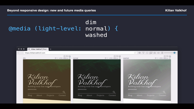
Light-level comes with three possible values: dim, normal, and washed - for dark, "normal" and bright environments respectively.
When these get triggered, specifically, will be left up to operating systems, with the assumption that they will use built-in light sensors to detect the light levels in the environment.
Operating systems already compensate for light levels, of course, by dimming and brightening the screen when they think that's needed.
For your website, you might choose to decrease contrast and overall brightness for dim situations and bump up the text contrast for washed situations so that it remains readable on the screen even when shown in bright sunlight.
Environment-blending describes how the screen is "blended" with the environment.
This sounds like some sci-fi level stuff, but there's already devices out there where this makes sense.
"Opaque" is the default, and it's like your regular monitors and phones.
They don't blend in with the environment at all, you can't see through them.
"Additive" is when what's on the screen is added to the environment.
For example, this is how the HoloLens works.
Light is projected on the HoloLens screen and anywhere where there isn't light, you can see your environment instead.
"Subtractive" is the opposite, and it's how LCD works.
You can see through an LCD, until it turns a pixel on, then it becomes black and you can no longer see what's behind it - Gameboys worked like this.
With CSS custom media queries, we can improve our CSS by only defining a media query once and then using that property everywhere.
If we ever need to change that value, we only have to update it in a single place.
Just like how we use CSS custom properties already.
And you can already use this with postcss-preset-env.
That brings us to the end of this presentation.
There are a number of media queries we don't have time to discuss.
Among them: resolution, screen-spanning, and the rest of the items on screen.
If you want to learn about those, I wrote a huge guide available at bit.ly/allmediaqueries.
I hope this tour gave you a taste of what's to come, and inspiration to start implementing prefers-color-scheme, prefers-reduced-motion, and even prefers-reduced-data in the websites you're working on today.
Throughout this talk, I've used Polypane, the browser for developers that I make to illustrate some of these media queries.
I'm biased, but I think it's an excellent way to develop websites, in particular to test across different media queries.
If it looks interesting to you, please check it out at Polypane.com, and start a free trial.
If you end up implementing anything mentioned during this presentation, please let me know! I'm @Kilian Valkhof on Twitter and would love to see what you made.
Responsive design turned 10 years old last year. Since then browser capabilities have changed a lot, and they’re set to change even more. We’ll explore new and upcoming media queries that will let website authors make websites that respond not just to screen sizes, but to many different user preferences and situations. Learn how to implement these in forward compatible ways with practical tips and examples.