Understanding display
Hello, it's great to be here and talking to you about the display property.
CSS 1 became a recommendation in December of 1996 in August that same year, internet Explorer 3 shipped.
It was the first browser that had CSS support.
The CSS one specification is tiny.
However, it contains the fundamentals of the language that we still use today as such a website built in '96 using CSS 1 will still work today in a web browser.
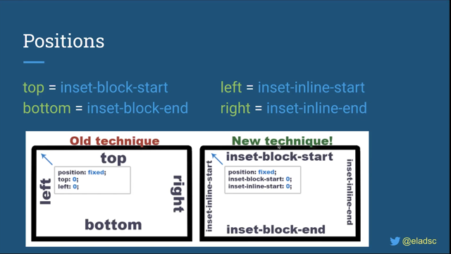
Now the CSS 1 spec contained a set of amazing ASCII art diagrams and these detailed the CSS formatting that model.
Now in CSS 2, this is what became known as the box model.
Now I've got no idea how many times I have drawn a diagram of the box model and explained the box model to people.
I've written about the hacks to get round the box model problems in older versions of internet Explorer, the CSS 1 specification also includes the rudimentary explanation of what's likely to be one of the very first things that you learn about when you learn layout in CSS.
So even people who've done a tiny little bit of CSS have probably encounted these two concepts, some things are block things and other things are inline things.
Now something that I think is kind of underrated about the web, and we don't talk about that often, if you create an HTML document marked up properly and put it up on a website and you get something readable, we don't have to position every single line of text.
You mark your content it with HTML, you pop it on the web.
And you've got a published document.
Now this works because browsers have an inbuilt style sheet, which dictates some basic styles that are used by HTML elements.
So that makes your headings large and bold and gives lists bullets, but it also causes some things to become block elements.
And so here's that sort of basic kind of layout.
And you can see that we have headings and we have texts and those things are laid out in a fairly readable way.
They're not all squished up as they would be if we didn't have, you know, some things being marked up as block elements in that default style sheet.
So block-level boxes.
They include by default things like headings and paragraphs, and they have certain key features.
They stretch out in the inline direction to take all of the available space.
Or you can give them a size in both dimensions and they'll push other things away from them and any margin or padding applied to them will also push things away from those boxes.
And they always break onto a new line.
Inline level things have boxes too, and they behave like words in a sentence.
So they don't break onto a new line.
You can give them margins and padding, but in the block direction, this won't cause other elements to be pushed away from them.
We can see that if we add some padding to a span, you can see that in the inline direction, it's pushing things away, so the, the, the words are getting further away from that box, but in the block direction, the background color is going over the line above and under the line below.
And I've used a semi-transparent color.
So you can kind of see that happening.
So it's really important that we can change the value of display.
We can change between block and inline.
And that's a really important feature of the web because it means we can pick the right element for the job, the correct semantic HTML element, and then style it up using CSS.
We don't have to think, Oh, I want this bit of text to be large and bold.
And so I better use an h1.
We can choose, you know, any, any type of, of element.
And then we can style it up as we want.
So I've been teaching CSS for a very long time, really, for as long as CSS has existed, I've been writing about it.
And this is pretty much how we have dealt with, with layout in CSS.
You know, there's an inline thing.
There's a block thing.
There's the box model, which is very, very important.
You need to understand all about it because it's also a bit weird.
But in the last few years, I've completely changed how I teach CSS layout because these ideas of block and inline while they're very important and it's still, must've be important as we'll see, they only give part of the picture.
And I think that we've sort of lent on that so much that the box model, we're kind of leaning on that and they've kind of led to confusion because we've got these new layout methods of Flexbox and grid and, and focusing there's something entirely different.
Um, they're not part of the sort of general model of the web.
And I think that has led to a bit of confusion.
So this talk is really the result of my own experimentation in terms of how I teach people, the web.
Um, and it really all starts with display.
So the CSS display specifications is the key to unlocking CSS layout.
You have to understand display because it puts the rest of layout into context.
It's a level three specification.
Um, much of the content is based on CSS 2.1.
So CSS 2 took those simple ideas that were in CSS one and refined them approaches that continue to CSS 2.1.
There's actually a CSS 2.2 spec because a lot of specs of at level three and beyond, still refer to CSS two for key concepts.
That's where things are defined.
So you can see modern specifications is building on this earlier work.
And the, the old CSS wasn't throwing away and new stuff put in its place.
It's all just a progression and building on top of what was already there, which is why things from the past, still work today.
So let's go back to block and inline for a moment.
You know, what does block and inline actually mean? Here's a block-level paragraph.
It's got a background color and it's expanding to fill all of the available width.
And if we introduce a second block level thing, it goes below on a new line because we're working in English, which is a horizontal writing mode.
So here, the paragraphs are displaying one after the other, in the block dimension, and then expanding to take up all of the available space in the inline direction.
So the block dimension is the direction that paragraphs lay out in the writing mode of the document.
The inline dimension is the direction in which sentence's run in the writing mode of the document.
Change the writing mode to vertical or RL the block dimension now runs right to left and the inline dimension top to bottom.
So block and inline is tied to the writing mode of our document.
When we describe something as being block level, it's a box that will take up all of the space and the inline direction and appear after the previous block level box in the block direction of our layout.
And these block level and inline level things make up the normal flow of our document.
So normal flow is sometimes referred to as block and in line layout.
And normal flow we can kind of think of that as what your layout will always return to.
And so working with normal flow makes your life much easier.
If you've got a well-structured document, as we already know, that's going to display in a readable way.
So you can make changes then to normal flow where it makes sense, but take advantage of the fact that you've got this reasonable readable layout by default, it saves you some work.
So while we're here in normal flow, I often talk, you know, in former times when I could travel the world, I would say that I would travel the world talking about little boxes, because if you talk about CSS, that is what you talk about.
You talk about little boxes, it's little boxes all the way down.
So it's pretty easy to think of our block level things as a box, you've got an element, a paragraph or a div, and it creates a block level box.
We can see a boxy thing.
If we give it a background color, or a border.
We can see it in dev tools and it matched our understanding of the box model.
However everything is creating boxes, inline level things, create in-line boxes.
Lines of text, they also create boxes.
So align inside a paragraph, creates a special kind of box called a line box.
It's all boxes.
And so all of our kind of misunderstandings all of our confusion tends to come when we don't really understand what those boxes are doing and how they're interacting with each other.
So the CSS level 3 displays specification details, how these boxes are generated.
And I say that builds on the work of CSS 2.
Now the spec says for each element, CSS generates zero or more boxes as specified by the elements display property.
So with display we're right into the action with the boxes created by elements.
The browser's looking at the value of display and creating a box or several boxes.
Something with display block gets a block level box.
Something with display inline, gets an in-line level of box.
What about something with display flex? Well if you've made an element a flex container, it gets a block level box on that element and any direct child elements, get boxes, which are flex items.
And so they start behaving in the way that flex items behave.
So the flex container is described as creating a flex formatting context for its children.
So new CSS terminology, what's a formatting context.
It's really just a fancy way of describing behavior.
Now, CSS specs use lots of odd words because we have to try to be as kind of detailed, but as short as possible in terms of what we're describing.
So we have words and phrases that spec editors and browser engineers understand in the specs.
These are usually assuming that the spec editor remembers linked to a definition.
So, if you come across one of these odd phrases, you can figure out what we mean.
The good thing about standard phrases is that even if they're a bit weird once, you know what they mean, they always mean the same thing.
So that helps with clarity.
So a formatting context describes how things behave.
In normal flow items, participate in a block formatting context or an inline formatting context.
The paragraphs on your page are participating in a block formatting context and they're displaying one after the other, in the block dimension.
The other words and inline elements in your paragraph are participating in inline formatting context.
They're laying out one after the other, in the inline direction.
You apply display flex, and the items inside the container start to participate in a flex formating context.
So now, you know, that normal flow rules don't apply.
You have to look at the Flexbox spec to find the detail of your items and how they're going to behave in that formatting context.
So here we have a block level box with children participating in a flex formatting context.
We know it's block level because it's expanded to take up space in the inline direction.
There's some available space.
If we add some following text, it won't hop up into that space because that container is actually taking up all of the available space.
So the extra text and displays after the block level item.
Now we've got some extra space.
We can use it.
We could use justify content space between and distribute the space between the items.
Now, if we use the value of inline flex in this case, the flex container becomes an inline level box with flex item children.
If we try to use justify content space between here, nothing would happen because the inline level box wraps the flex children.
The same for grid.
Any elements with display grid become a block-level box and their direct children become grid items.
So by default, you're going to get a one column grid.
And if you add extra properties to the grid container, you start to see the grid like behavior.
Once again, if the grid hasn't been given a size, it would expand in the inline direction.
So with, for those of us working in a horizontal TB writing mode, the fr unit tracks can then distribute space between them.
So we get something like this.
So you can see now that when the value of display is identified, it does two things.
It defines how the box you have applied it to behaves in the layout.
Is it block level or inline level? It also defines how the direct children of that box behave.
No, it can't be denied that the introduction of all of these lout methods has made display seem a little more complex.
And to some extent it's powered a refactoring of the display spec in order to better rfect what's going on when you change the value of display.
In this refactored display specification, we can be more clear with our intentions.
So when we say display flex, and you get a block-level box with flex children in the two values spec, we can say, actually say display block-flex.
Give me a block-level box of flex children.
Um, if we say display inline-flex.
Then we're asking for an inline level box with flex children.
We've got the same for grid layout.
If I say display block grid, I'm asking for a block level box with grid children.
And regular block layout also has these two values, a block level box with normal flow children is display block-flow.
Now, these mappings exist for all of the single values of display.
Now I don't expect you're going to rush out and use them.
Don't refactor all your code right now.
They're only actually implemented in Firefox.
However, I think they're useful to understand because they.
Actually explicitly explained to you what display is doing.
Um, and so thinking of the two values, I think can be quite a useful way to remember what display's actually doing.
You can get all of the effects of those values with the, the old values and existing values of display, but it's kind of worth looking at these new values and.
They explained some of the sort of mysteries of CSS, some of the things in display that we kind of know works, but maybe we don't know why.
So let's have a look at some of those.
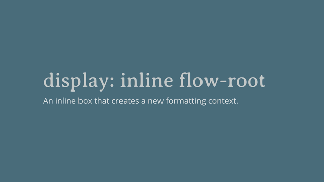
So fairly recently, CSS got a new value, which was display flow-root.
Now in the, in the two value world, this is displayed block flow-root, and let's have a look at what that does.
It's a really common problem.
Um, you've got a floated item.
You floated an image and you want it to be visibly contained by the parents.
The parent, in this example is the white box that actually wraps around the image and the text, in the mock-up.
Uh, but because the image has been taken out of flow, the box has just hopped up and gone below the text.
That's something that we're all very used to.
Um, and, and, you know, we've all had to fix that problem in the past.
Now we might have fixed it with a clear fix hack.
That's a common way to fix it, or you might've used, um, the value of overflow to clear the floats.
If you change the value of overflow to anything that might cause scroll bars, so overflow auto will do it.
That will cause the, the container to wrap the image and the text.
Now the reason it does that is that it creates a new block formatting context.
Now we've talked about formatting context and a new formatting context, um, has to contain everything that's inside it.
So your actual page creates a new block formatting context.
So everything stays inside the page.
You know, you don't get a floated image doesn't poke out of the bottom.
doesn't sort of get pushed off or disappear, um, out of, out of your page.
So it creates a new block formatting context that contains everything.
If you explicitly create a new block formatting context, on a box, it's going to contain everything inside it, and that's going to include floats and it's going to include margins.
And so that's what happens when you change the value of overflow.
Because if you have scroll bars, you don't want to have something sort of poking out of the box at scrolling.
That would be weird.
I don't even know how that would display.
Um, so that's why that works to contain floats.
So display flow-root or display block flow-root basically just creates a new formatting context.
That's all it does.
It says that this box is the roots of the new formatting context, the new block flow layout.
Um, and it can all start inside that.
Um, so that's what you're doing when you say.
Display block flow-root.
You're saying create a new block from formatting context here, please, and keep everything inside it.
A display flow-root has really good browser support.
You can use that now.
And that's just that the two value version as we've got two value versions of other things.
So this kind of a matched pair, you know, most of the other things, you know, we had display flex and display inline-flex.
There's a matched pair for display block flow-root.
And that's display inline flow-root.
Now you might say I've never heard of inline flow-root.
Um, but I actually think that you have, and you've used it an awful lot because display inline flow-root is actually display inline-block, which has been around since the early days of CSS two.
This allows us to take an inline element and give it display inline-block.
And then things like, um, padding and margin will actually push the other books as a way from it.
Uh, which, so that said that's quite useful.
You know, you use inline block for making a bigger hit area for links and so on.
We've been using that for very long time.
What you might not know, cause it's a bit less common use case is the inline block contains floats.
So here I've got a floated item which is inside an inline element and it's just breaking out of the container, which is what will happen if you float something inside an inline element.
If you give that display inline-block.
It contains the float in the inline element.
You can see it's still in-line.
It's, it's wrapping the text.
It's not expanding to the full width.
Um, but it's now contained the float.
So that's what display inline flow-root does it's display inline-block and understanding this in this sort of two value world shows us how inline-block actually works.
I did not really understand what inline-block was doing for very long time.
Uh, is there any by kind of digging into it and unpacking, um, you know, I, I really understood what its mechanism was, um, as opposed to just, you know, what I could do with it.
Um, so I think there's some really interesting stuff there.
Um, in terms of how the spec is being clarified, that can help us build our understanding of CSS.
And something else that happens that I mentioned, I talked about flow-root a new formatting context, also prevent margins collapsing.
So these items here, we've got three divs inside a wrapper.
Now they all have margins of one em on all sides.
The margins between the items collapsed as you'd probably expect.
But the reason the first and last item've got no top and bottom margins, so the border is right flush against them is because their margin has collapsed through the box and combined with the margin outside the box.
Um, you can see that in devtools, if you're ever having a problem with margins collapsing or not collapsing, you don't know what's going on, inspects it with dev tools to be able to see where the margin has actually ended up So if we create a new format in context, with display flow-root, you can see now that the margin stays inside the box.
Um, so your margin is now nicely contained and not popping out of the box.
There.
Flexbox or grid.
Um, they also contain margins, everything inside a new formatting context agains stays inside and flex items and grid items, actually don't collapse margins between them.
And you can see that again with dev tools that that's happening.
Back to our boxes.
We know that any element in a document gets a box and these create a box tree.
As our boxes nest inside of the boxes.
Each parent has a set of child boxes and they themselves contain more boxes.
However, there are some things which don't have that an element turn into a box.
For example, if I have an element which contains a string of text, part of which is wrapped in a span, then I turn the payment element into a flex container with display flex.
The span element gets a box, which is a flex item.
However, I get two more flex items as the two rooms of text.
Either side also get wrapped in an anonymous box.
And you can see these items and no longer participating in inline formatting context because the space between them has gone.
Inline formatting context preserves space, you get a character of space, either side of your items.
Um, and that doesn't happen once things were in a flex formatting context.
And we can do all of the standard Flexbox things with these three items.
So we could use justify-content-space between and space them out.
So anonymous boxes are interesting, we find these in a few places in CSS.
Now they're created to contain free ranging bits of text.
So in the flex example, they're becoming flex items, but even in normal flow anonymous boxes will be wrapped around any string of text that's not inside an element.
Now in normal flow, we never really think about it.
It's only once we're in Flexbox and grid and these anonymous boxes start acting like flex or grid items, then it matters to us.
So in this example, we have the box of the span on item two, it's an actual element.
It means we can style that thing using a direct child selector we can get at it.
Um, so I'm styling every direct child of P in the green color.
But that doesn't get the anonymous boxes because while they exist to another flex lout to work, they're not a real element.
And therefore they're not a direct child of P.
Another place you're going to find these anonymous boxes is if you use display table-cell.
Now we don't use display table sell quite as much as we used to.
It was a common way to deal with lack of support for things like Flexbox.
If you turn an element into a table cell you get some useful functionality for doing layout.
So by using display table-cell you're essentially saying this, this element behaves like a cell in a table.
Now the thing is that a table and HTML has a structure.
Doesn't it? You have a cell which is inside a row, which is inside of the table.
And so to make the CSS sort of work, um, if you make elements table cells, an anonymous wrapper is going to be added to fix it, the need for tr and if you don't have anything set to display table around them, you'll get another to fix up the need for a table.
And this is kind of interesting because if you've got this happening, you've got these anonymous boxes happening.
What happens if they then become a flex or a grid item, or what have you, are you going to end up with these anonymous boxes hanging around in the layout? And the thing is you won't, um, and the sort of reason this kind of works is as you now know everything on the page is participating in a kind of formatting context.
So we have your block and inline layout, normal flow, and then you have these things that become flex or grid containers, which caused their children to take on different formatting contexts.
Now, what that means is that some of the things we used to in CSS that work in, in block and inline layout, Don't work in the same way once things become a flex or a grid formatting context.
So things like floating and positioning, and both of these things are described as taking an item out of flow.
So if we set an item to position absolute, that's probably the first thing we think about, when we think about taking things out of flow.
And so we've got some content in normal flow like this, you've got our image and the text is displaying after it.
How do we use position absolute with the image? Um, and so it's top and left it's then pulled out of its spot in normal flow, the space, it would have taken up disappears, and we can then position that element according to its containing block.
And what happens there is that managing overflow kind of becomes your job.
The Brown's just not going to do that for you anymore.
And so you have to sort it out.
Floated items are also taken out of document flow.
I think it's less obvious because they don't completely disappear.
They still have space.
They don't overlap text in the way that, um, positioned things can.
Uh, but we know that it's taken out a flow because the, the box that it is inside ends up sort of ignoring its height, and that's the example that we looked at with block formatting context.
What actually happens to the floated item is it's taken out of flow, but the line boxes of any following text, respect it.
So the line boxes get shortened, which is what gives you the wrapping round and image effect.
Um, but it is, you know, taken out a flow in the same sort of way as an absolute position item is.
So really where I'm going with this is that this behavior is specified only for items in normal flow.
It doesn't apply in the same way when the item is floated.
Uh, when the item that's floated or positioned is participating in a flex or grid formatting context.
The specifications though, do explain what will happen.
They don't just sort of leave us hanging.
So the result that can be excellent or frustrating, depending on what it was that you were trying to achieve in the first place.
So if I've got a floated item and make the payment a grid layout, the float is removed.
So the item becomes a grid item.
All of the floated behavior is thrown away and that's because the item is no longer participating in normal flow.
So this can actually be very useful because you can use floating to create fullback patterns, which you then override with grid or flexbox.
So this set of cards are floated.
And then we make them into grid items we're making that parent display grid, and you can see that the floating behavior is just going way.
And it's now ignored.
Now where this is less useful is if you want to have floating behavior, but you'd like the floated things to utilize the lines of the grid.
I know that's not currently possible.
It's actually a very common pattern in editorial design, which isn't available to us because of this.
Um, I I've, I've talked about this before and I've written about it and it's linked in my resources.
Um, this was, uh, uh, posted by someone who was, who was upset that this was the behavior.
Well, you know, it was pointing out that this was actually a problem in terms of editorial design.
Um, I think it's actually better solved by the exclusion spec, but it's a useful thing to understand that your floated items, you know, will no longer be floated once you're in a grid layout.
Now absolute positioning behaves differently if you're in grid layout or flexbox.
Um, but again, there's some useful functionality that it doesn't get completely thrown away it just behaves slightly different, uh, than you might expect.
So in this example, I've got a grid container with the position relative.
I placed an item here on the grid using grid lines, the items spans four column and three row tracks.
Works so far as normal-position relative isn't doing anything at this point.
If I give the item a width and height and absolutely position it, the grid area it's in acts as the containing block, not the grid itself, not the grid container.
So the offsets are from the boundary of that area.
So back to a table cell, um, you know, what happens if you use inline block or table cell, and then the item becomes a grid item.
If you use table cell, um, do you end up with those anonymous boxes floating around and becoming magical grid items? A bit like the way that runs of texts can become flex or grid items.
That's not the case.
The spec defines that if you've used display table cell, then the item becomes a grid item um, the, the grid part of it happens before those anonymous boxes are generated, they don't get generated.
You're not going to get weird boxes in your grid layout.
So what's really important about this is that it's defined in the spec, the spec details that these don't apply.
And that's really important.
Because if it didn't, every browser would have to come along and think, Oh, what do we do with those anonymous boxes that get generated and make up their own decision.
And they might do different things.
So that's really important.
This stuff is written up in the spec.
So as we get all these complicated layout methods, we don't get lots of different implementations of complicated layout methods.
Um, to make sure that browsers then implement according to the spec that's been written, it's all testable.
As a spec editor, you have to make sure that your spec has tests.
And so any bit of spec text should have a test that goes with it, that browsers can run and make sure that they're doing the right thing.
Um, and that's how we get interoperability.
You can actually look at all the tests on the web platform test project, and kind of see.
You know, which ones are passing and failing in different Browsers.
That that's quite an interesting thing to do, and, and the tests themselves are quite, quite useful to look at sometimes if you're trying to work out how something really works.
So then we have things that don't generate boxes at all.
You can ask for no box.
There are two things in the spec, two values of display that don't generate boxes.
The first of those you probably know about is display none.
It doesn't generate a box for the element and it doesn't generate boxes for any of the children.
So it's like that box was never there.
It's like, it's been just removed from the layout.
It's gone from the tree.
Importantly, this happens for visual rendering, so onscreen and in print but also for speech output.
So if something is display: none screen readers will not announce it or interact with it.
Either displaying them is supposed to be the only value that behaves like this.
All of the other values of display are specified only for visual layout.
So you should be able to change the value of display and not change the semantic meaning or interactivity of an element.
It is worth keeping this thought in mind, as we discussed display contents.
So display none removes the box and the children.
Display contents removes the box, but not the boxes for the children.
So in terms of layout, it's like they are promoted to being direct children of their grandparent.
So I've got a layout like this, uh, UL with list items.
I want the list items to participate in the flex layout, but they can't because the UL is a direct child of the element with display flex and the children are not.
So you end up with something like this.
Um, you've got the, the direct child, which is the home, and then you've got the three navigation points are being laid out as a different flex item.
If I use display content that removes the box of the UL.
So the children are now promoted to the flex formatting context created by the parent.
Now, as I mentioned, it's only display none that should affect whether an element is read up by a screen reader and whether it's children can be interacted with, um, unfortunately when this was implemented by browsers, um, they kind of influenced it like to display none, but putting the children back.
Um, and so it basically removed the semantic meaning of the element.
Um, so in our example, the list would no longer be announced as a list.
This is fixed in Firefox, it's fixed in a recent version of Chrome.
Um, and so it will make its way into all the other chromium browsers, including edge Safari have yet to fix this.
So please take some care when using display contents test, make sure you're not, um, removing things from the accessibility tree when you use it.
Um, it'll be, I think become very, very useful in the future.
Once you've got those issues worked out, um, they apparently weren't easy issues to solve in the browser.
Um, But yeah, just take a bit of care.
It's perfectly safe to use it, to remove, say an extra div that you've popped in in order to make a fallback layout of a grid, for example, work.
And that's not going to cause any problems because it doesn't affect the children then of, of the element they'll still remain in the accessibility tree.
Uh, but just be very careful when using it to remove semantic elements for the time being.
And then we have somebody interesting box, generation things that happen, which are kind of worth a little note.
Um, if you think about lists, if you've got a UL that essentially becomes a block-level box, the children get the special box children treatments, um, they become display list-item.
So I don't know about you, but I kind of always thought that the special stuff that happens to list happens on the parent.
It was something to do with it, it being a UL, but it's not all of the listiness happens on the children.
Um, it's much like flexbox or grid.
We make the path into flex or grid container and that causes their children to do flex or grid things as it's similar for lists.
So with our list items, a bit more new CSS terminology, the content of your list item becomes the principal box.
And another box is generated, which becomes the marker box.
So the principal box doesn't include the marker.
The principal box just goes around the content and the marker goes around the bullet.
Now you probably know about this because when you put a background color on a list item, it doesn't go behind the marker just behind the principal box.
So list markers are kind of interesting.
For a long time, it's been impossible to style them separately from the content.
So if he wanted to change the text on the item to white and leave the bullet black, you can't actually do that.
Changing the color, changes the bullet and text.
Uh, so the way around that was to wrap a span around the text, you could style that, which is kind of annoying.
Um, So in the CSS list specification, the marker pseudo element is introduced that allows you to target the list marker.
So we don't need to add a span anymore.
We can just style up the marker, like, so, and that lets us change the color of the marker.
If you use dev tools, you can have a look and you can see the marker there um, this is now in Firefox and Chrome.
So that's something that you can start to use.
Um, this actually opens up some interesting bits and pieces that you can do as well, because you can use generated content on markers.
So you can add a string of text if you want to.
And because you can turn other things that aren't actually lists into list items by using display list items, you can use this functionality in some quite nice ways.
So here I've turned a heading into a list item with display list item.
And then I've, um, taken that item and, and I've changed the, the content of the marker into an emoji, some broccoli.
Um, so that's something that you can do.
You can actually play around a bit with, uh, turning things, into list items, and then using the marker to add some stylings, just quite nicely.
It's sort of by default kind of hangs out over the edge there, which might be the effect that you're looking for.
So it's really worth remembering all of this stuff, you know, Flexbox, grid, list items and so on.
They've all just a value of display.
When the browser comes to render a page, it needs to decide the display type of your element and therefore the display type of the children.
And then it moves onto the children and figures out what display type they are and what are their children.
Now, if there's no, sort of nothing set, you haven't changed the display type.
Then it's going to go back to normal flow to block an inline layout.
So saying display grid or display flex isn't anything different.
It's just changing the value of display.
So, you should use the value of display that makes the most sense for whatever it is you're trying to create.
You don't need to worry about, you know, too much about, you know, is this grid or is this flex, or should I be using all grid or all flex and just use the value of display that works best for you? The fact we have separate grid and Flexbox specifications is essentially just working group process.
It stops the display spec becoming, you know, this enormous thing, which would be very hard to work on and move on.
Um, but they are all just values of display.
Uh, so you should be using the value of display that you think is most useful to you.
Something that's worth understanding about values of display as they don't inherit.
So they only act on the, the principal box and its direct children and the grandchildren go back to normal flow.
We always start over, you know, with that new formatting context inside the children.
We're not going to inherit Flexbox all the way down because generally that wouldn't be that useful.
Normal flow, it tends to be the most useful sort of layout for us.
So just to finish, what's actually going on with subgrid.
I mean, does subgrid not give us some kind of layout inheritance.
Um, if we're cascading the grid down through the grandchildren.
Well, it doesn't, and let's just take a look at why not.
What subgrid lets you do is it lets you have the track definitions on the parent grid.
So the number of tracks, sizing, gutters, and names, and it lets you pass those down into a child grid.
So I've got a grid layout here.
It's a six column grid pattern of columns, the row of boxes.
The second row, I kind of sat in the individual columns.
You can see what they look like and to make it even clearer, we can turn on the grid and spectrum.
We can actually see the lines between our boxes.
Then I introduce a component that has an internal three column grid.
So it's also got display grid, um, where it is there because I've tried to match the pattern, they almost line up and you might not notice that it didn't line up.
Um, in if, if you didn't have the good inspector on, but if you move the component over, because you've got uneven columns, you can see it doesn't line up at all.
If I used grid template, columns, sub grid, rather than giving it its own grid, the tracks and the parent become the tracks on the child, but we're not inhabiting values of display here.
If I remove display grid from the component, it stops being a grid.
So, subgrid, no longer applies.
So to use sub grid, you have to create a grid formatting context with display grid, and then you can opt your columns and rows in.
So we can now move that component around on the grid and it stays lined up.
Now, everything else about the grid stays independent and the gaps between the items, because the gaps are inhabited by default, but we can change that on the sub grid by setting gap to zero, just as if that grid was independent.
So again, if you want to use subgrid, make it part of the grid layout.
It needs to participate in a grid formatting context.
It also needs to become a grid container itself.
The only inheritance is that your track listing is taken from the grid tracks that the child grid spans, um, setting the value of grid-template-rows, or grid-template-columns to sub grid, or you can set both as well.
In the resources for this talk, there are more examples of subgrid.
Um, I've written quite a lot about all the different things that you can do with that, if you want to take a look and you will find those resources, loads of code examples on the URL for this slide.
So that's display.
I hope that after this, you've got more understanding of this key CSS property and all of the other things that are enabled by it.
Thank you very much for listening.
CSS Layout is all about boxes. We know that some boxes are blocks, and others are inline, and we can change the display type of elements by changing the value of the display property. That property holds the key to much more than this, however. It is the foundation on which all layout is built; the core of the inbuilt CSS layout system. Learning Grid Layout, or Flexbox, without understanding Display, leaves you with a wobbly foundation and more questions than answers.
The real question isn’t “Should I use Grid or Flexbox?” but instead, “How do I want these boxes to behave?” Understanding the interaction between layout methods will enable you to easily create fallbacks for older browsers, and be able to make more informed decisions when deciding how to build any part of your design, big or small.