CSS Variables for Real Life
The internet wasn't created for regular websites like you are using today.
Think about one of the basics things that you are using in CSS these days, like the models of CSS, of CSS flexbox.
CSS flexbox only started to being implemented in web browsers only in the year of 2012.
And still one of the basic things that we really using the most, like reading content isn't implemented in such a good way.
If you didn't know we have a lot of different type of languages that can be read from different directions.
English is written from left to right, but all the Semitic languages are being written from right to left.
And if you wanted to create a multilanguage website, until now one of the best ways to do it is to create two different style sheets for the same website, and this is a lot of duplication.
I don't need to explain why duplication is bad.
And because of that, we got a new model in CSS to help us to support all the different type of languages that we have in the world.
This model is of course the new CSS logical properties, and it's here to help us not to support only left to right, and right to left languages, it's even here to support special languages that can be even written from top to bottom.
But before we will start, let me represent myself.
I'm Elad, and I'm a CSS/HTML architect.
Besides, I'm the founder and the leader of the CSS Masters Israel community, and I love CSS! I'm writing a lot of articles on CSS that you can find in medium.com, and beside of this, I love to talk and speak about CSS in every conference and in every meetup.
And the first things that I want to talk with you today, before we starting to dive to the new CSS logical properties, you need to understand how websites are working, or more precisely: to understand the world of axes, the world of axes that we have in every one of our websites.
Every website has two axes - the main axis, which is called the block axis.
This axis is the main flow of the website and websites by default are going from top to bottom.
And this axis is called the block axis.
And you may ask me: "Isn't it, websites are going always from top to bottom?" and then, so that it isn't always working like this.
The second axis is the way that we are reading the text.
By default, the English language is going from left to right, and this axis by default going from left to right.
And this axis is called the inline axis.
But in a traditional Japanese and traditional Chinese website, something very special is happening.
The text is being written from top to bottom.
And you may think, okay, the text is the inline axis.
Maybe the inline axis is being rotated 90 degrees to the right? But this is only half of the truth, because in traditional Japanese and traditional Chinese languages, it is like to take an English website and rotate all of it 90 degrees to the right.
And now, the header of the website is on the right.
The footer of the website is far on the left.
Instead of vertical scroll, we now have an horizontal restaurant yes, the text is written because of that in a vertical direction.
For you to understand that, let's see a live example, how it can look like.
This example is in traditional Chinese.
And you can see that the header is in the right.
And we have some paragraph, images, paragraph, images, paragraph, images, paragraph, and instead of the website is - will be scrolling in the vertical direction, it's scrolling in the horizontal direction.
Interesting.
Okay.
After we've hunderstood that we have this block axis and the inline axis, and it's changing according to different direction of languages, we want to know how to control it.
To control the block axis, the main axis of the website, we have the writing-mode property.
By default, it had the horizontal tb value.
The most important thing when you are reading the value of the writing-mode property is to read only the last two letters.
By default, websites are going from top to bottom, and because of that, this is "tb", meaning: "top to bottom".
The first word in the value of this property is horizontal, but every time that websites are going from top to bottom, the text is being written in the horizontal direction.
It doesn't say if it's left to right, or right to left, it's just saying that the text is written in the horizontal direction.
And if you want to create a website for traditional Japanese and traditional Chinese languages, we have a new value for the writing-mode property, the value of "vertical-rl", meaning: "right to left".
And now, the main flow of the website, instead of going from top to bottom, it's now going from the right side of the screen to the left side of the screen.
The header is on the right, the footer is far, far in the left.
Instead of vertical scroll, we now have an horizontal scroll and the text is written in the vertical direction.
But we have even more special languages in the far East.
One of the traditional Mongolian languages is written again from top to bottom, but the way of the reading is starting in the opposite side of the screen.
And because of that, we have another value for the writing-mode property, the value of "vertical-lr", meaning: "left to right".
And now the main flow of the website is starting in the left side of the screen and ending in the right side of the screen.
The text is being written again in the vertical direction.
The scroll is in the horizontal direction, but now, starting in the left side of the screen.
To control the inline axis you all already know this property.
This is the direction property, but until now you didn't know that it's connected to the inline axis.
And there isn't anything new with the direction property.
It has its two values, one "ltr" for all the left to right languages, and the second value is the "rtl" value for all the right to left languages that are Hebrew and Arabic.
Because this is very important, let's recap it: To control the block axis, we have the writing-mode property with its three main values: one that is going from top to bottom; one that is going from left to right,; and one that is going from right to left.
To control the inline axis, we have the direction property with its two values: one "ltr" for left to right; and one "rtl" for right to left languages.
And we are talking about a new world in CSS, the new Logical Properties world in CSS, but until now we have been living in an old world and we never gave it any name.
Before we will jump to the new CSS Logical Properties themselves, we need to understand in what world we have been living until now.
And the old world that we have been living in until now in CSS was the physical world, and because of that, all the properties that we have been using would have been physical properties.
Think about properties like margin.
You use properties like margin-top, margin-right, margin-bottom, and margin-left.
All those directions are physical directions.
But in a logical world, we no longer have top, bottom, left, and right.
And we need new logical directions.
And those new logical directions are working according to the logical axes - the block axis and the inline axis.
And because we no longer have top and bottom, but the top and bottom are sitting by default on the block axis - the top representing the start of the block axis - and because of that "top" is updating into "block-start".
Bottom represents the end of the block axis, and because of that, "bottom" is updating into "block-end".
In the inline axis, we're starting to read the English by default from left to right.
And this is the inline axis.
And the left represents the start of the inline axis.
Because of that, "left" is updating into "inline-start", and the right represents the end of the inline axis, and because of that, "right" is updating into "inline-end".
But what is very special in this specific diagram is that this diagram is not a fixed diagram.
This diagram is changing according to the type of the language, and in traditional Japanese and traditional Chinese languages, this diagram is being rotated 90 degrees to the right, in this way.
And now the top of the website is in the right side of the screen.
The bottom of the website is in the left side of the screen.
And instead of reading and writing the text from left to right, we are now doing it from top to bottom.
And this brings us to a new world in CSS.
In the new world, the top doesn't need to be top anymore.
It's like a maverick's world and yes, it's for supporting different types of languages - but maybe we can do with it other things? Maybe instead of creating a website that is going from top to bottom, why not to create a website that is going from left to right? And now let's start talking about the new logical properties themselves.
And as I told you, we need to update all the physical directions to the new logical directions.
Because top and bottom sit by default on the block axis, top is there to represent the start of the block axis, "top" will update into "block-start", "bottom" will update into "block-end".
In the inline axis, the axis of the text, we're reading text by default from left to right.
Left represents the start of the inline axis.
"Left" is updating into "inline-start" and "right" is updating into "inline end".
And in this way, I'm just updating all the physical properties.
For example, all the Box Model properties, all of them are being updated according to the new logical direction.
As you can see here, for example, padding-bottom/bottom.
Top/bottom is the block axis.
Bottom represents the end of the block axis.
Because of that, "padding-bottom" is updating into "padding-block-end".
And, and what about width and height? In the logical world, we no longer have width and height, because when something is width, for example, in another type of language, it will be height.
And when something is height, it can be width in another type of language.
And because of that, we have in new properties the new size properties.
And because width by default sits on the inline axis, we now have a new property that's called "inline-size".
The height is sitting by default on the block axis.
Because of that, we now have a new property that called "block-size".
And all the minimum and maximum width and height properties are updating as well.
And this creates us a new CSS box model, that everything here now is with logical direction, logical sizes, and all the older properties of Box Model's are being update to these new ones.
And I can assume that between two to four years from now, we will maybe stop using these old properties of the Box Model.
Because with these properties, I can create one website that's supporting all the different type of languages! Think about it.
But we have a lot of other things that need to be updated.
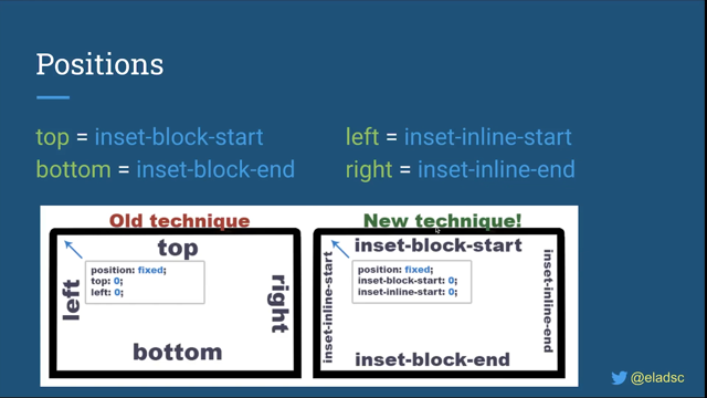
Because for example, we have the CSS positions that had in the past physical direction.
In the past.
If we wanted to put a element that is "position: fixed" in the top left corner, we will need to give it "position: fixed" and with the properties of the direction: top and left.
Top field value of "0" and left field value of "0".
But now, all the four properties according to the physical direction need to be updated to the logical direction.
And as you can see here, the top, bottom, left, and right properties are updating according to the logical direction.
But as you can see here beside the logical direction, we'll have a prefix of "inset" in all of them.
And you may ask why we need the "inset" prefix in those new CSS logical positions properties.
And let me tell you why we need the inset prefix.
In the past, when you were using CSS positions - for example, you wanted to create an element that it's covering all your screen - you gave it: "position: fixed": top: "0", bottom: "0", left "0", and right: "0".
And you may think that now, if you want to do the same thing with logical properties, you need to write it in this way: "position-fixed" with all those inset properties.
But have you ever asked yourself why, in properties like margin - we have properties like margin-right, margin-bottom, margin-left, margin-top - but if I want to use all of the directions, I can use the property of margin with four values.
But with CSS positions, we couldn't do it because there isn't anything that connect all these four properties.
And this is kind of a mistake in how they created CSS positions in the first place.
But now, when you are creating the CSS position again for CSS logical properties, why not to fix the problem of the past? And this is exactly why we have the inset prefix in the beginning, because now, instead of four different properties, we can write only one.
It's shortened for all of them.
And now we can write "position: fixed" with the new insets property and to give it all the - load all the four logical directions.
And it can get even more better, you know why? Because when you are using a margin shortened and all the four values are the same.
You can write, instead of four values can write only one value and here you can do it as well.
You can write only "inset" with one value of "0" and that's it.
And it's really amazing because now it's a lot easier to work with CSS positions.
And I love to see how now we can solve a lot of the problem that we had in CSS in the past, and to fix it and to create CSS in a lot better way.
But we have a lot of other stuff that needs to be updated.
The text align old values of "left" and "right" are updating to new values of "start" and "end".
Floats values "left" and "right" are updating to new values of "inline-start" and "inline-end".
The resize property.
If you don't know what is the resize property, you have it by default on "input: text area" HTML element that you can resize on horizontal or on the vertical.
But in a logical world, we no longer have an horizontal and vertical direction because when something is in an horizontal direction, in another type of language, it will be vertical.
And because of that, we have new values of inline and block.
Because the horizontal direction by default sits on the inline axis, it's now updating to a new value of inline.
The vertical by default sits on the block axis, and because of that, we have a nevalue of block and you can assume that everything that has physical direction, like top, bottom, left and right, horizontal and vertical, and maybe even the X and Y axis - we will get in the future new properties and new values according to the logical axis.
And what about the models of CSS Flexbox and CSS Grid? And you may think, "Whoa, now we need to update those as well?" But think about when you are using, for example, CSS Flexbox.
CSS Flexbox from the beginning was already built according to the logical directions of the flexbox.
We never had in Flexbox directions, like top, bottom, left, and right.
Instead we have values of flex-start and flex-end.
And what about CSS Grid? CSS Grid is already built in logical direction, and because of that, when you are using CSS Flexbox and CSS Grid, you can continue to use them the same way that you were using them in the past.
You don't need to update anything in your own thinking.
And now let's start to talk about how you can start to work with these new CSS Logical Properties.
I see that there is a lot of front developers that are really afraid to start using those new CSS Logical Properties.
And I wanted to show you that it's even simple to update an old website that is already built with physical properties into those new logical ones.
For example, if we are looking on this code that is already built with physical properties, and let's say that this code is using an English website.
We just need to go on the default direction of our logical axis.
For example, if we're looking on the property of "max-width" we no longer have a width and height, we have the new size properties and the width by default, it's sitting on an inline axis.
And because of that, "max-width" will update into "max-inline-size".
Margin-left, margin-right? Again, inline axis.
We're starting to read the English from the left side, and because of that, "margin-left" will be updating to "margin-inline-start" and "margin-right" will be updating to "margin-inline-end".
And let's take the last property.
Let's take margin-bottom.
Top, bottom: sitting on the block axis.
Bottom represents the end of the block axis.
Because of that, "margin-bottom" will be updating into "margin-block-end".
And, and in this way, I'm just updating all the properties from physical ones to the new logical ones.
And in the end, after you will finish to update all the properties from physical ones to logical ones, you will be a little bit afraid.
You know why? Because when we are doing a lot of changes, we are expecting to get in a new result.
And here we've done a lot of changes, and when you will refresh the screen...let's say you are refreshing the screen, you expect to get a new result, but nothing is changing.
And if you're thinking about it, this is a good thing because what does it matter if we are working with physical properties or in logical properties? A website in English needs to look like a website in English.
And if nothing is changed, it means that you've done a really good job! Okay then, okay then.
Then how we can use now this new CSS with these new logical properties to support all the other different types of languages that we have? But if you're thinking about it, I already teach you that in the beginning of the talk, with how to control the inline axis and the block axis, which is new to properties, and to support an English website you don't need to do anything because this is the default of the browser on the root HTML element with the direction property and the value of "ltr".
But now if you wanted to support Hebrew and Arabic websites, the only thing that you need to do is to change on the root HTML element the direction property, with a new value of "rtl".
But if you want to support traditional Japanese and traditional Chinese websites, instead of using the direction property, you are now using the writing mode property with the value of "vertical-rl", and if you want to support the traditional Mongolian website, you need to use the writing mode property with the value of "vertical-lr".
And you need to understand what we achieved here.
In the past, if you wanted to create a multilanguage website that's supporting left to right languages and right to left languages, you needed to create two different style sheets.
But now, with the same CSS file we can support all those different types of languages that are existing in the world in such an easy way.
We just need to update one property on the root HTML element, and that's it! For you to believe me that it's so easy, the first time that I was learning logical properties, I wanted to test it for myself.
And I created for myself this code pen, that as you can see here, everything is written with logical properties.
And when I will use the drop down arrow, and I will change the language from English to Japanese, the only thing that it does is that it is adding with JavaScript on the root HTML element, the writing mode property with the value of "vertical-rl".
And when I will do it, and I will change the language, you will see that the website is being rotated 90 degrees to the right, and it will now support traditional languages like traditional Japanese and traditional Chinese.
Let's check it out and click on it: and that's it.
I changed one property and all the website is now supporting traditional Far East languages like traditional Japanese and traditional Chinese.
So easy to use logical properties.
But because logical properties are changing a lot of stuff in CSS, we have some problems that we need to talk about them.
The first issue is when we are using all their shorthands, like margin and padding, the browser cannot know if you want to use it with physical direction or with logical direction.
And because physical properties have been here first, every time that you are using margin or padding, for example, it will always work according to the physical directions.
And if you want to create a logical website, for now the only way that you can do it is to write all the properties separated.
And this isn't so nice a solution to use on a huge website, and the W3C understands that this is a kind of a problem, and they are thinking how you can work in a better way if you want to work with a logical website.
They have one suggestion that adding a new CSS keyword that's called "logical".
In this way, if you want to use shorthand in a logical direction, you can put in this new keyword "logical" in the beginning of the value.
In this way, the browser will know that this shorthand is working with logical directions.
But to tell you the truth, I don't love this solution, because if I want to create a full website that everything is done with logical properties, it means that I need to put this "logical" keyword in every one of my shorthands.
And I'm creating here a lot of repetition - and if I forget to put it in one place, it will be breaking another type of language.
And because of that, and because I was learning logical properties when it started to happen in the web browser, I thought: "Maybe we need to create a new solution?" And I thought to myself: "How we can solve this specific problem?" And I created in my imagination a new property that I call it: the "flow-mode" property.
By default, it will be with the physical value.
And in this way, if you are not writing this property, all the other websites, because this is the default web value, they will work in the same way - in physical direction - but if you want to create a full website that everything is done with logical direction, you can use this property on the root HTML element with the new value of "logical", and in this way, you are declaring that you want everything to be with logical direction.
And in this way, I don't need to remember to put the "logical" keyword in every one of the properties.
And this is my real suggestion in the W3C Github.
And if you think this is a good suggestion, because still nothing has happened in how to solve this specific problem, you can upvote me via this link.
But for now, if you want to create a website that is done with logical properties, you cannot use any shorthand, and the only way that you can do it is with separated properties like: margin-inline-start, margin-inline-end, and you understand the idea.
The second issue that I want to talk with you is: about responsive design in logical websites.
And from the beginning, when I wanted to try to test logical properties, I was creating the CodePen that I showed you a minute ago.
And from the beginning, I understood that responsiveness would need to be done in a different way.
Because when you're creating a responsive website for left to right languages and right to left languages, it doesn't matter - the responsiveness of the website is according to the width of the screen.
And this you already know.
But if I were taking the screen in traditional languages - like traditional Japanese and traditional Chinese - 90 degrees to the right, the responsiveness of the websites needs to be according to the height of the screen.
And I thought to myself, "It's very easy to do it!" Why not create a media query? Instead of max-width of 1000 pixels, why not create a media query of max-inline-size of 1000 pixels? That's it! Problem is solved.
But this media query with the logical properties doesn't work in browsers.
We still don't have any media query that's supporting the rules that are created in logical thinking.
And for now you cannot create this type of media rules.
And you may think that maybe this is a reason why not to use logical properties.
But most of the languages that we are using on the web are all languages of left to right languages, or languages of right to left languages.
And they are both according to the width of the screen.
And because of that, you can still work with logical properties.
But you will tell me: "But what about Chinese and Japanese?" But you need to understand the difference between the regular language of regular Japanese and regular Chinese to traditional Chinese and traditional Japanese.
Regular Chinese and regular Japanese are being written the same way that the English way is written: from left to right.
And traditional languages are almost not used in the web.
And because of that, you can still work with responsive design to support different types of languages, because 99.99% of the languages that we are using in browsers are all left to right, or right to left.
And they both need to be according to the width of the screen.
And yes, we need to get the support to support special languages, like all the Far East traditional languages.
But for now we still don't have the support.
And if we're talking about problems, let's start to talk about the browser support.
Surprisingly, the main features of logical properties are already implemented in all the browsers.
All the new Box Model properties with the new logical directions - the new size properties, the new values of text align - all of those new features are already implemented in all the browsers.
But not all the features are implemented in all the browsers.
Like the new CSS "position" property for logical direction, the new" inset" property, which is implemented in all the browsers except Safari, and the new values of "float" and the "resize" property with the new logical direction are only implemented in Firefox.
And you maybe will tell me: "Who needs CSS floats in 2021?" But still, you need to remember why we have CSS floats in the first place.
If we want to float an image and put it around the text, this is the only way that you can do it.
And because of that, it's a small problem, but it's still a problem.
Before we finish my friends, I wrote two full articles about logical properties.
This is about logical properties, and in these articles, you can find the more ideas, how we can create logical properties even better.
And I will retweet this presentation in my Twitter account that you can find here.
You can see all my other articles in medium.com here, and you can see all my other stuff in my own website.
And any CSS question in the future, you can find me via the CSS Masters community on Facebook, and my friends: Thank you very much for listening!
CSS Variables is still a bit of a buzz word. Many of us have googled it, looked at some examples, maybe even done a tutorial, but how many of us have used CSS Variables in production?
I want to show you how and why we used CSS Variables in production in the new deployments view in Jira. More importantly I want to show you how to spot a potential use case for CSS Variables so you’re ready for it when it’s staring you in the face! Oh, and our use case is not dark mode or theming!