The State of CSS-in-JS
Today I'm going to be talking to you about the state of CSS in JS, which is a very big and active space.
And I only have about 20 minutes to talk to you.
So I better get cracking.
Now the TLDR is that the CSS and JS space has been very active for a long time now.
And there's a lot of libraries out there all trying to tackle the problem in very different ways.
But the space is very much dominated by two libraries, style components and emotion.
Now Styled Components is arguably the first, really big mainstream success in the CSS in JS space.
And that's largely due to the brilliance of its API design.
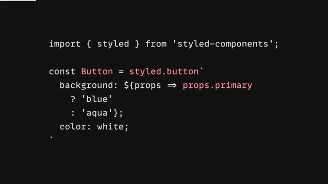
So what's all components does that was really different is it's really taking advantage of the fact that JavaScript and CSS is sitting side by side in the same file by not just creating styles, uh, in line, but creating a component on the fly.
So you can see here, what we're doing is creating a button component by using this style function.
And this is what that's been known as the styled API.
We're creating a button component and attaching styles to it directly.
You can see that there's some dynamic styles where we're reaching into the props that are coming into the component.
And we're deciding based on the presence of this primary prop, we're going to change the background color from in this case, that contrived example of a, of an Aqua background to a darker blue with a full grand color of white.
And so just with a few lines of JavaScript, we've created a React component with dynamic styles without having to go through and do all the plumbing ourselves.
So on the consuming end, what that looks like is we've got our button component, but we can pass in this primary prop that we set up, which will change the look of the button as we saw before.
But because we extended the native button type we're able to pass in things like on click handlers of ARIA attributes, whatever it is we need on our button, we'll go through to the underlying native element.
And it really didn't take much work on our part at all.
Now, as of right now, it's sitting at 2.6 million weekly downloads, which is really, really huge.
So you can see it.
It's a hugely popular library.
And again, the brilliance of that API design has come through and in the popularity, out in the community.
Now the only library that's really come to challenge the dominance of Styled Components is Emotion.
Now, Emotion's been around for quite a while at this point.
And it's gone through quite a few iterations in terms of the API, but its real breakthrough was the introduction of this pattern of the CSS prop.
Now Emotion has this ability to replace React's built in element constructor to have its own version.
From Emotion, which gives you access to the CSS prop.
And what that does is it effectively gives you something that looks very similar to an inline style prop, where you can just put styles right there on the element.
But the differenc is here that you have, that you have access to the full power of CSS.
So even though this is a simple contrived example, with a couple of properties, we can equally be writing things like hover styles and media queries and support feature queries and so on.
And all of this will get turned into actual CSS in the document.
And this inline on the element will get replaced with a class name.
So it's much more like what you would write by hand.
Typically, if you're trying to optimize styles across a lot of elements in the document, but in time, in terms of the developer developer experience, you can see here that you get the, the nice fluid ability to put styles in line on the elements.
What's great about emotion is while providing these high level style APIs, uh, and the CSS prop.
It also gives you access to lower level functions like this, where you've got the CSS function for creating a class name.
What's really nice about that as it means that if you ever want to drop down a level, you can do that and write more traditional style sheets, or you can generate class names on the fly.
So having that ability to reach for different levels of abstraction is really useful.
If you're building something like a library where sometimes you, you want to do something, that's a little lower level.
And so as a result, we've seen that emotion has really taken off with, uh, component libraries in particular, and that's helped drive its adoption in the community further.
So I didn't actually realize this until I was preparing this talk, but Emotion actually has more downloads than Styled Components.
Not at all what I expected.
It's sitting at 3.9 million weekly downloads, which is really, really huge.
And again, as I said, I think this is in a large part due to its, uh, its acceptance within component library spheres.
So.
The fact that it's being adopted there means these numbers are getting pushed up even higher.
Now you might look at all the choices that we've had out in the community for a while now.
And the dominance of these two libraries and wonder is CSS in JS a solved problem.
Now it's a bit of a tricky question because as I'm sure you're aware, CSS has a lot of trade-offs and if you're running a CSS in JS library, you inherit a lot of those trade-offs yourself as, as well as a bunch of extra ones.
So, if you, if you were building a CSS in JS library today, there's a few different things.
You were going to be juggling.
You going to be thinking about the bundle size.
What's the, what's the payload that you're introducing.
And what's the performance of that.
If there's a run time aspect to that, how much flexibility does your library provide? Is it high level or low level? What sort of abstractions are you providing? So we've got the Styled Component style API, or do you just have low level style sheet, APIs, or do you have a mix? And there's also the question of static extraction, which is to say, do you support things like server rendering, or even going so far as pulling out static CSS files at built time to minimize the amount of work that's happening in the browser once you ship your library to production.
There's also the ever-present question around.
You know, the not invented here, uh, concern where people who are often building big libraries or working inside of big companies, there's this concern that they don't want to bet their systems on technology choices, that they don't have any say over.
So that often leads to new libraries getting created as well.
So as a result, we see that the community is still experimenting a lot and.
It really hasn't slowed down.
There's still lots of new ideas coming out all the time.
So to get our heads around where the state of the community is at the moment, what we're going to do is look at a few different libraries that are tackling these constraints in different ways.
And we can sort of see how the community is responding to some of these new challenges that they're facing as they try and roll out to new areas.
So the first one we're going to look at is the funnily named Goober, which is at first glance very much like libraries we've looked at already.
So here you can see we're using the styled API, we're creating an icon component by creating a span with some styles bound to it very much like again, what we've seen before, they also have the lower level APIs, like what we've seen with Emotion, where you can create a class name by calling the CSS function.
But the what's different about this library is that they've really focused in, on bundle size and performance.
And this is really critical if you're building libraries on top of the CSS in JS primitives, because you definitely want to make sure that your library doesn't come with a big bundle size or performance cost before you even introduced your own ideas on top of that.
So, first of all, in terms of bundle size, you're looking at less than a kilobyte.
So it's really, really tiny.
That's the core.
There's some add ons that you can add on top of that, but the point is those are optional.
You can get by with the core library of less than a kilobyte if you like.
In terms of performance, they have a benchmark that they've set up, which you can go look at yourself, but.
Basically it boils down to this.
They've got a styled component with, with, you can see there's a random number being passed in there.
So there's some dynamic stuff going on.
What they do is they render this component to a string in React, uh, as many times as they can in a second and see what numbers come out.
So comparing the popular frameworks, you're looking at with Styled Components about 12 and a half thousand renders per second.
Emotion's quite a bit more than that at 104,000 a second, but Goober then doubles that at 200,000.
So if performance is important to you, uh, this is a really good library to look at.
And, you know, you might look at these numbers and think they seem a bit extreme if you're just rendering a relatively basic webpage, but where these numbers are particularly important is if you're doing something like server rendering, where.
This has a direct impact on how quickly you can service requests from your users.
Beyond looking at the status quo and making it faster and smaller there's also the, the idea of having higher level obstructions than what we've seen, even with the styled API.
And that's what Stitches is doing.
Stitches is, is really getting a lot of buzz about it at the moment.
It's come from a company called Modules who build a react based design tool and Stitches is their answer to bringing that declarative world of design tools into your React components.
So you look at this API here and as you can see, it's very similar to the styled API, as we've seen from Styled Components and other libraries that have copied it even uses the same name of style.
But the difference here is that rather than having a very dynamic function with access to props, it's a lot more declarative.
We get to define our variants.
And we can name them whatever we want.
Here it's actually just called variant and we've got two of them called solid and transparent.
So the solid has a background color of blue and the transparent has background color transparent and the foreground color changes as well.
So you can see here that we haven't really made it super dynamic.
It's very readable, very straightforward.
Uh, again, very declarative.
And then from a consumer standpoint, it's, it's like what we've seen with Styled Components, where you've got that variant property of set up.
We can pass in solid and it will resolve to those styles we, we, we saw earlier.
But what's really good about this setup is that it's designed for TypeScript users.
So because, because of the way it was written before.
The type signature actually matches up with those variants.
So as you type the word variant, you'll get auto-completion.
It'll tell you which options are available.
And if you type the wrong thing, of course you'd get those type errors that, that you come to expect.
You're not limited to one variant, of course.
So you can have things like a size of corners, whatever you want.
So it's completely up to you.
And again, it stays completely declarative the whole time, which is nice and easy to work with.
As we've come to expect.
Now you've got the different levels of abstraction available.
So you've got the high level styled stitches API has been come to known, but you can drop down a level and just use the CSS function to generate a class name, obviously a little less declarative in terms of wiring it up to a component.
But it's good to know, especially as a library author or a design system, maintainer that you have those different levels of abstraction that you can reach for.
The other thing that stitches is doing, that's really interesting is trying to take CSS variables and make them a first class part of their API.
So the way they do that is give you the ability to pass in a set of design tokens into your, uh, into this create style function that they provide.
So as you can see here, Uh, we're passing in, uh, a small contrived set of tokens where we've got a primary color of blue coming in and out the back of that function call comes the entirety of the stitches API, but with your tokens baked in what that means now is that when we go back to our example before, so this is cutting a little bit, but we can use our tokens in line in our style.
So you can see that the background is set to $primary and for the transparent version, the foreground color is also set to $primary.
So that means that at runtime, it's going to look up those tokens from the set of design tokens we passed in.
And if it happens to be referencing one that wasn't there, we'll also get an error as well to make sure everything lines up correctly Because their API is so, it's so declarative, it means that they actually have the door open to have static extraction out to plain CSS files, because they're able to look at that, that object and convert it into plain CSS.
This is something that they don't do today, but they are planning to do this very soon.
Now, static extraction is something that a lot of libraries have made the focus from day one.
So one, one such library is Vanilla Extract now, uh, full disclosure.
This is actually one that I've worked on with some people, uh, from Seek, Seek Jobs.
Uh, Matt Jones, Michael Taranto, and Jared Hope.
Uh, we've worked on this library together.
And actually as of the time of this recording, this library's actually two days old.
So it's hot off the presses.
The idea with this library is to go all in on static extraction.
As the name might suggest.
The goal here is to have zero runtime CSS in TypeScript library.
And I'll show you what that looks like in a second.
So here's our button example that we've been looking at so far, slightly different version.
But you'll see here that it's in a separate file button.css.ts.
Now that's so that we can, uh, statically, we can evaluate this file at build time and figure out what styles are coming out the other side.
So he we're importing the style function from vanilla extract slash CSS.
And we're going to export a class name called that we're calling button that we get from calling the style function that we can pass in all of those, those different styles there.
Now, one thing I want to stress here.
Uh, is that even though it's written in TypeScript, this file, won't be in your final bundle.
We evaluated that at build time, extract the static CSS and send the, the hashed class names over to your runtime.
But otherwise there's no code left in the final bundle.
So from the consuming end, this is what it looks like.
You input our button class from the button.css.ts File.
And then we can put that class name on any element we'd like.
So if you've worked with CSS modules before it basically works the same as CSS modules, except that the style sheet was written in TypeScript rather than CSS or a pre-processor like SASS.
LIke with stitches there's also a focus here on making CSS variables a first class part of the API.
So here, what we're going to do is import, create global theme from vanilla extract slash CSS.
And what that allows us to do is first set up our CSS variables.
Now it's called CreateGlobalTheme, because it allows us to attach our variables to a selector.
We're going to go with the very standard pattern with CSS variables, which is to attach them to :root.
You see here we can, we've passed in color and font variables.
And, and this function returns to us this vars object, which mirrors the structure that we've passed in.
So then consuming it, it looks something like this inside of our style function, we're able to reference vas.color.brand Or vars.font.body And what's great is because this is all written in TypeScript we also get type checking on this.
So if I try to access a variable that isn't there or has been deleted or renamed, I'll get a type error and I'll know before I ship it to my users, that something's wrong with my CSS and with my, my variables that set up.
So to stress in terms of the static extraction, this is actually what you shipped to your users.
Once you build for production, you can see here that we've got our root variables set up and they're hashed.
So there is they're very, very small.
And then the class name that we generated just referencing those, those CSS variables that we set up.
The idea here is to use TypeScript as your pre processor.
So conceptually it's not that different from using something like Sass or, Less coupled with the CSS modules for doing the local scoping.
But we're just using a fully fledged, uh, you know, general purpose programming language to do it with type checking as well.
If you're big on CSS, if you can consider yourself a CSS developer, what's really great about this is that it's a minimal abstraction over standard CSS.
It's not trying to hide away the, the details of CSS variables or the way CSS works.
It really is no different to writing the style sheet.
Uh, by hand, it's just in a different language with some different constructs, but more or less, it's the same thing.
So all the skills that you have working with CSS at scale translate directly over to this environment.
Another way to you look at the static extraction problem that's really interesting is coming out of Compile another great Australian project that's coming out of Atlassian.
Now, what Compile's doing is trying to give us more of these high-level APIs that we've seen before.
So here you can see we're creating a button component that renders a button.
And it has a CSS prop on it like what we've seen with Emotion, but you can see at the top, they were importing @compiled/react an, this is now set up for us to start the static extraction process.
So the first thing is to introduce this Bable plugin that it has.
So @compile/babel-plugin, you wire that in, and then it performs this transform on your code.
So what you can see is that the styles that we wrote in line have now been pulled out into this separate variables at the top.
And they're just strings of CSS.
First thing to note that's interesting is that there are atomic.
So even though I'd set background and foreground color in one rule, they've been pulled out into two separate rules, class names here.
You can see that there's some odd looking components here, CC and CS.
Um, they're just a plumbing to get those styles into the runtime.
But in terms of the button, you can see there that its class name is, is referencing those two classes that are those atomic classes that have been hoisted out.
So now this code is in a place where it can be transformed even further to pull out the static CSS and perform that static instruction that we're after.
And that happens via a Webpack plugin.
So those classes that were hoisted to the top of the file in JavaScript can now be pulled out of the JavaScript entirely and put into a static CSS file so here you can see our fore and background color classes are now in regular old CSS.
Which means that our JavaScript code can be minimized even further into this, where we've just got a component, rendering, a button with two class names baked in with none of the runtime code leftover.
It's really, really exciting stuff.
So the catch with this is that the code must be statically analyzable.
So the, the Bable plugin needs to be able to make sense of the code you're writing.
So if you do anything too tricky with JavaScript, it's not gonna be able to make sense of it, and it's not going to be able to optimize it.
So that's kind of the trade-off that's happening here.
Luckily though, in cases where you've done something a little too tricky for it to analyze it falls back to a runtime.
So what's interesting here is that they're really aiming for that Holy grail, where you can be as expressive as you like with the full power of JavaScript.
And you can do lots of tricky con uh, you know, dynamic runtime styles.
But if you, in, in most cases, when your styles are very basic, it's going to be able to optimize those out and get rid of the runtime entirely.
So it's really, really exciting work that they're doing that.
Now, this is really just the tip of the iceberg.
You know, this is a short talk.
I've showed you a few examples of libraries that are really tackling it in different ways, or even just taking the status quo and trying to make it as small and as fast as possible.
But there's a lot more work happening out there at the moment.
And if I had more time, I could go deep into some of those other areas.
Not least of which is the interesting world of Tailwind and people try and do Tailwind and JavaScript as well, but maybe that's for another time.
So if you're building a project for today, the million dollar question of course is what should you pick now? No one's ever going to get fired for choosing Styled Components and Emotion.
They're big, popular libraries, very dependable, very flexible.
And, um, either of these are great choices, but as we've seen today, the community is still experimenting.
There's lots of interesting ideas coming out.
And so maybe some of these are piquing your interest in today's talk has triggered you to go in and look into some of these futher.
So I think it's worth it.
It's worth it to keep an eye on new ideas, because what you might find is that even if you've completely written off the idea of CSS in JS.
Some of these new libraries coming out may tackle some of the core problems you've had with the up to this point.
So it's an interesting space to keep your eye on them and worst case, if you don't like anything, that's out there, you could always build your own.
That's always fun.
That's it for me? Thank you so much for listening.
It’s been six years since Christopher Chedeau’s seminal yet infamous talk on CSS-in-JS. The community has come a long way since then but the experimentation hasn’t stopped. In this talk we’ll look at the current state of CSS-in-JS and examine the trends that are driving the space forwards.