Container queries are (almost here)
I'm here to talk about the future of CSS, but in order to understand where we're going, we have to understand where we are and how we got here.
In my mind, CSS exists for two primary reasons.
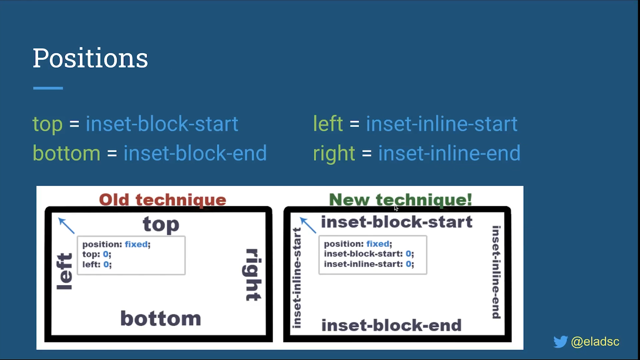
First, to make styles responsive, and not just responsive to the dimensions of the viewport, but also user preferences and device interfaces.
When Sir Tim and the team at CERN released the first hypermedia browser, it was designed for the NeXT machine with a fancy graphic interface.
But you can't make a web that's worldwide by saying, "It works on my machine and everyone else is an edge case." So right away, they released a second browser, the line-mode browser designed to work on any terminal with an internet connection.
And this becomes the mission statement of the web: "Web for all, Web on everything", and that includes assistive devices and non-visual media, always with the user in control of the final outcome.
So we provide hints and suggestions, semantic clues, but only the browser can put it all together.
And the cascade describes that process by accepting style sheets from everyone involved.
Browsers and users establish defaults and preferences across the entire web, and then we fill in the details for our particular site.
These are the primary cascade origins, each one representing a different set of needs and concerns, different perspectives sometimes in conflict, and the rules of cascade and inheritance describe how to merge all three and resolve any conflicts.
By default, user preferences override browser defaults, and for better or worse, we get to override everyone.
But when things get really heated, when it really matters, the user and browser can insist that some styles are more important than others.
And this important flag creates new important origins that cascade in reverse order.
Important author styles aren't that special, that's us in the middle.
But users can override us when they need to, and the browser finally decides what's out of bounds, what's possible on this device, and what features are supported in what ways.
The second goal of CSS is to make our design objects reusable.
Instead of repeating the same styles over and over in our HTML, we can use selectors to apply styles broadly.
We can create patterns on things like classes and attributes, which we can combine to compose reusable objects, entire design systems and component libraries.
CSS is object oriented by default, but it's also declarative, contextual and resilient.
These are features of the cascade.
CSS is cascade oriented and selectors create another potential conflict for the cascade to resolve.
Since we can use multiple selectors to target the same element (and in this case apply different background colors), the cascade needs to determine a winner and it uses a clever heuristic called specificity, based on how narrowly a selector is targeted.
Again, each selector type represents a different goal.
So the most generic selectors help us paint in broad strokes and establish low priority defaults.
Classes and attributes allow us to describe higher priority patterns and make up the majority of our styles, and then one-off IDs are both the most narrowly targeted and the highest priority.
One ID will always override any number of attributes, and on down the list.
It's not perfect but it's an approximation, a heuristic of the layers in our code.
But things sometimes get complicated especially as our projects become larger and more complex with more distributed teams and third-party integrations.
There's a lot of situations that don't quite fit that heuristic.
Some low priority defaults are very specific while some generic attributes really ought to have more weight behind them.
And out of all of these selector types there's only one that we can actually customize and reuse - classes and attributes.
So we spend a lot of time fighting over how many attributes should be in a selector with rules and conventions to ensure that cascade specificity matches carefully crafted layers of intent.
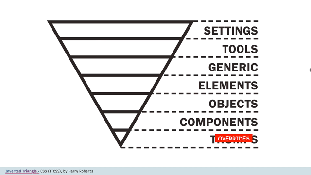
Building up from global abstractions to components and overrides and throwing importance like a grenade when we get stuck, or if one part of the system doesn't play by the same rule.
So that brings us to the first feature that I want to show you: Cascade Layers.
Jen Simmons and I introduced this idea at the end of 2019 and last February the CSS working group approved it, and I expect browsers to start implementing it this year.
Originally we called this Custom Origins because we're again creating layers that represent different perspectives in the system, different parts of the system, and potentially different teams on the project.
But we get to define the layers ourselves as authors for things like resets, defaults, frameworks, themes, components, utilities -anything we want in whatever order we want.
And the important flag works as intended for origins.
When it becomes necessary for a lower layer to insist on something and punch above its weight but we're not actually adding new origins here.
So it may be better to think of these as customizable layers of specificity.
We can define a layer and give it a name and add styles to it using either a layer function on the import rule, or by nesting styles inside the new @layer rule.
So here: @layer default and then we have styles inside that.
Or we can use both: Here we're creating a default layer using the headings.CSS import and then we're adding more styles to that same layer using the @layers stack in the order they were first defined, with the highest layer taking precedence no matter what specificity is used inside.
So components will always override theme, will always override defaults and then specificity only matters inside of each layer.
In this case the override layer wins even though the selector inside it has a lower specificity.
But we don't need to keep all of our styles in order.
Once a layer has been established, we can add to it from anywhere in our code.
The priority is based on when the layer first appears.
We can even use the @layer rule with only a name to establish our order upfront, so we don't have to worry about the actual code order.
And there's a shorthand syntax to make that even easier using a comma separated list of layer names.
One of the goals here is to make sure that we as authors get to define exactly where third-party tools belong in our layering.
No matter what specificity those tools use internally, or whatever layers they create, we can always override them without resorting to specificity hacks.
And this also gives frameworks or component library authors a way to provide layers that we can hook into - either directly or by wrapping those layers in a contained namespace.
We can create nested or namespaced layers using a dot notation to combine the names, or we can actually nest those layer rules.
Of course we don't have to put all of our styles in a layer.
Unlayered styles will work the same way they always have and will belong to an implied highest layer that overrides all the others.
This gives us as authors a lot more control over our little corner of the cascade, so we're not totally reliant on selector specificity and code order to determine what takes precedence.
And hopefully it allows us to replace all of our specificity and importance hacks with more clearly defined patterns.
The next feature is also about how selectors work.
With scope, we're trying to address two issues that come up regularly and drive people to use tools like BEM syntax or CSS in JS.
And the first goal is to avoid naming conflicts as our projects grow, which we can solve by focusing on our second goal which is expressing membership or ownership in our selectors.
And while nested selectors might seem like a way to express membership, in this case the title that is inside the post -that's not quite the same thing as a post title.
The first one only describes the nested structure, but the second describes a more clear membership in a pattern, in a component.
Not all the titles in the post, just the title that belongs to the post.
We don't have a good way to convey that in current CSS selectors, unless we invent a new unique name for every kind of title based on where it belongs, either manually using a convention like BEM, or automated with JavaScript compilers.
And if we want some global styles we end up using multiple classes and hoping the more targeted pattern will override the more global pattern.
Another way to think about this is to say that some components have lower boundaries The component in itself is a donut with a hole in the middle for content.
We should be able to style a "tab" component for example, or a "media object" without worrying that we might accidentally style everything that we put inside it by mistake.
This might sound similar to Shadow DOM encapsulation and there certainly is crossover between scope and encapsulation but the Shadow DOM is designed for more highly isolated widgets.
This creates a one-to-one relationship where boundaries are defined in the DOM each component has a single scope, and styles are isolated from getting in or out.
While that can be useful, it's very different from the lighter touch scope that we get from existing build tools and conventions.
Scopes can reference the DOM, but they're also able to overlap and integrate more smoothly with design systems.
Different styles can be given different and overlapping boundaries while global styles continue to apply globally.
This provides us with a much lower impact alternative.
Scopes are defined in CSS and can be reused across components or overlap and cascade together .So we're proposing an @scope rule, which accepts both a scope route selector (in this case, media), and a lower boundary selector (in this case, content).
Any selectors inside an @rule only apply between the root and the lower boundary.
In this case we're styling images inside media unless they are also inside the media content.
We can also talk about this in terms of proximity.
These two selectors apply to links inside a light theme or dark theme class, and that works great, as long as we never nest one theme inside the other.
Since our selectors both have the same specificity and ancestor proximity is not part of the cascade, dark theme will always override light theme in nested situations.
That's not what we want.
We can solve that problem using lower boundaries so that the themes never bleed into each other, and that's okay, but I think it would also make sense for scope proximity to be added as part of the scope feature.
When specificity is equal we would default to using the closer scope root.
But this part of the spec is still being debated, so I'm not sure exactly how it will come out.
There's a lot more to this proposal which you can look into If you're interested.
The CSS working group has expressed interest, and feedback is welcome, and Chrome plans to prototype this soon for more testing.
So that brings us to the real reason we're all here: Container Queries.
People have been asking for this feature since media queries were implemented more than 10 years ago.
Media queries allow us to change the layout of a component when the viewport is above or below a particular size, but if we put the same component inside different sized containers, that's not what we want.
Ideally each component should be able to respond to the container that it's in, no matter how those containers are nested.
At first this seemed impossible but there's been a lot of people working on it over the last 10 years, laying the groundwork to make it happen.
And last year two proposals emerged showing different paths we could take.
Both are interesting but David Barron's approach currently has the most momentum, and it's the one that we're going to look at.
This proposal has two parts: the containers and the queries.
And first we need to define our containers, and what's important is that we make sure they're contained.
One of the coolest responsive features in CSS is the way that layouts are calculated based both on content and context.
If you add more content to an element it will try to expand but only until it fits its context, and often we constrain the width and we allow the height to grow.
But once you add container queries to that, you can cause an infinite loop, so we have to turn that off on our containers to make sure they're contained.
We can do that using the "contain" property - once we contain the size of an element it no longer takes it size from content, only from context.
So we have to give it some external sense of sizing.
And that would be really limiting if we always had to do it in both dimensions, but most of our layouts - like I said - we contain the width and we allow the height to grow.
So we've added inline-size containment.
In our current proposal, applying the appropriate containment layout and either 1d or 2d size containment creates a container, and that container can then be referenced by a container query.
And these look exactly like media queries but @container instead of @media, and each element inside of it will query the size of its nearest ancestor container -"What container context is it in?" So why don't I just show you: In this example, I've created two containers each with two cards, and two of these cards are laid out depending on the size of the media, and two are laid out depending on their container.
So if we change the size of the containers you can see that those container query cards change depending on the context they're in, while the media query cards always stay responsive to the same media.
My colleague David Herron created this demo with the same blockquote in three different containers, and each block quote changes its layout depending on the size of its individual container, and we get three different styles of blockquote.
Now both of those demos are based on components that are querying an external context that we put them in, but there are some cases - like with Flexbox and Grid - where the size of the grid track or the size that a flex item has is not the same as the size of its parent.
So we can wrap each component with its own container: Here I've used a "div" with class = "card" around the article.
I've turned the card into a container, and the article responds to the size of its card.
And we can see here, each of these cards changes depending on the size available to it in the Flexbox layout.
So Chrome already has a prototype of this in Chrome Canary - - you can download Chrome Canary and turn on the feature flag, and I've started collecting some demos in codepen.
I'm recording this talk in advance, so by the time you watch it there might be more resources.
I'll update this slide and I'll share the link so you can check back.
All of these features are designed to work together: Cascade Layers, scope styles, and Container Queries, and they build on existing features in CSS and the cascade that holds the whole language together.
But they focus particularly on the overlap between the two main goals: to make styles responsive and also reusable - building components that are inherently responsive - what Jen Simmons calls "intrinsic web design." Not forcing everything to be an exact percentage of a 12 column grid but allowing for different components to manage their own intrinsic sizing.
There's already been a lot of progress in this space with tools like Grid and Flexbox and aspect-ratios.
Now layers, scope, Container Queries, but also color functions, nesting, and more.
Our medium is not done, our medium is still going through radical changes.
Over the last decade Object-Oriented & Responsive design have become the norm – with tools like Flexbox, Grid, intrinsic sizing, and aspect-ratio giving us even more layout control. CSS has always been designed for a responsive web, but that goalpost can shift over time. Now several new CSS proposals like Container Queries, Cascade Layers, Scoped Styles, and Nesting are all aimed at improving the way we write responsive components and design systems.