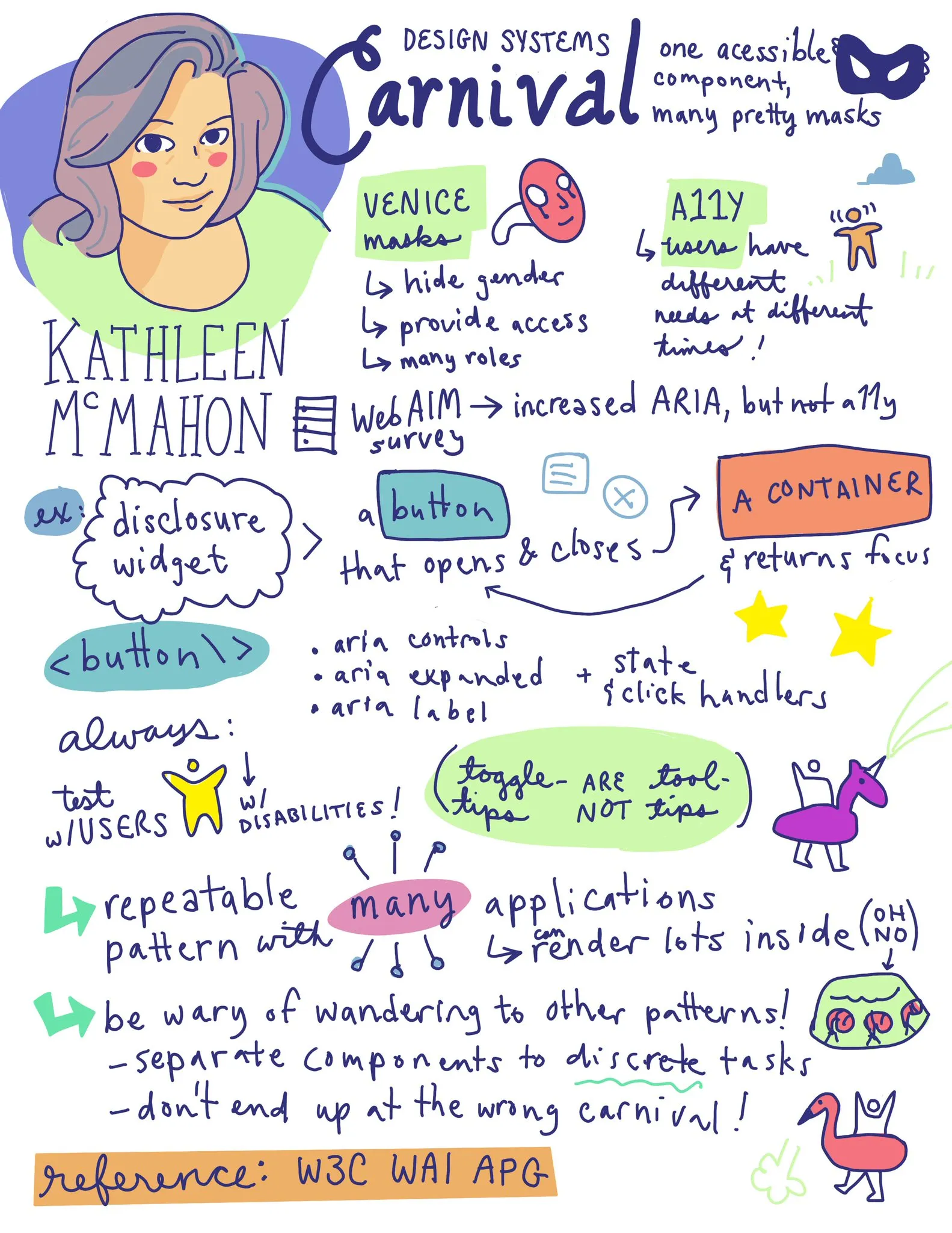
Design Systems Carnival: One accessible component, many pretty masks
Introduction
Nathan Curtis introduces Kathleen McMahon, highlighting her hybrid role as a software engineer and designer, her passion for accessible apps, and her involvement in various community groups and networks.
Kathleen's Introduction and Background
Kathleen discusses her background and interests, including her involvement in cyclocross racing, her love for lights, and her work on design systems at companies like O'Reilly Media and LaunchDarkly.
Design Systems as Carnivals
Kathleen likens design systems to carnivals, drawing parallels to the variety and accessibility of masks in Venice's Carnival.
Accessibility in Design Systems
Emphasizing the importance of accessibility, Kathleen discusses the variety of user needs and the challenges in implementing accessible components in design systems.
Building Accessible Components: Disclosure Widget
Explaining the anatomy of an accessible Disclosure Widget, Kathleen details the necessary keyboard interactions and ARIA attributes for making this component accessible.
Focus and Mouse Click Management
Kathleen delves into focus management for accessibility, discussing how to manage focus and mouse clicks in design systems, especially for multiple widgets.
Challenges of Over-Complicating Components
Discussing the pitfalls of over-complicating components by adding too many features or mixing different patterns, Kathleen advises on keeping components purposeful and distinct.
The Risks of Mixing Patterns
Kathleen warns against mixing different design patterns, illustrating how it can lead to confusing and ineffective design systems.
Conclusion: Maintaining Clarity in Design Systems
Kathleen concludes her talk by emphasizing the importance of keeping design systems clear and focused, avoiding the pitfalls of over-complication and mixed patterns.
Q&A with Nathan Curtis
A Q&A session where Kathleen discusses various topics related to design systems, including the role of cats in a designer's life, the challenges of making accessible components, and the importance of simplicity in design patterns.
Nathan Curtis: Welcome back for our second talk today we're going to hear from Kathleen McMahon.
And I have to say that she describes herself the same way I describe myself.
So I feel like akin to how Kathleen sees the world in many ways.
She fashions herself as a software engineer and designer, a hybrid in the space between, and conversations we've had share a lot of beliefs and challenges and experiences.
And she has in her bio a passion for beautiful, accessible apps, and that's very similar to how I promote my business too.
So I'm really looking forward to this.
She's also an editor of the Design Tokens Working Group or community group.
And she is a creative director for CX Sisters Network.
I also am a cyclist.
And she describes herself as, can be found racing bikes in costume.
Keep that in mind.
As the best Lantern Rouge.
Cyclocrosser you'll ever meet.
So please give a warm welcome to Kathleen McMahon.
Kathleen McMahon: Let's see if with this mask on, let's try this out because masks are awesome.
And this is my second way of doing a mask because I can try a mask this way.
And then also take it off for visual context for anyone that has trouble with facial cues, like I do, because I am neuro spicy and sparkly.
So enjoy the mask for a little bit, and then I'm going to put it down.
I'll put it on later.
it is so pretty.
Okay, welcome everyone.
I am Kathleen McMahon, and I'm here today to talk about Design System Carnival.
One accessible component.
Many pretty masks.
Woo!
And all my stuff, because I have a lot of stuff.
bear with me.
Before we begin, let's get some details out of the way.
My presentation will be posted sometime after the talk on notice.
That is https slash noti st slash R-E-S-O-U-R-C-E-1-1.
I include links to resources there.
After my talk, I'll also post a full URL on Twitter.
I refuse to call it x.
I'm obstinate.
You can also follow me at resource11 on Twitter, Instagram, and GitHub.
Let's back up a little bit so I can introduce myself a bit better.
I will try to go a little bit quickly because there's a lot of code.
I know there's designers in the audience.
I'm going to bring it up higher level to be kind and compassionate to everyone in the audience.
I'm gonna do my best because I'm verbose.
I'm an engineer It's pretty here, and a designer, and I like to speak about things like Nathan said.
I'm an occasional psycho cross racer in costume of course!
I love lights!
Thank you.
Something is rubbing.
We'll find out what's rubbing later.
I'm a lover of lights.
I'm a beachgoer and I spend a lot of my time looking for sand dollars because it's literally the Where's Waldo of the ocean.
It brings me so much joy.
I love my cats, Thor, and Otis.
I create, I collect a ridiculous amount of crystals, and I try to get good photos, but Otis has other ideas about where I should put my attentions and has opinions about this.
And Thor has learned to do the same.
He's very proud of himself, but I can't resist him, and this is how I reduce my talk anxiety, so I appreciate your patience.
I've worked on a few design systems in the past, like O'Reilly Media, LaunchDarkly, Northwestern Mutual, and like I suspect a few people in the room.
I love design systems!
they are the hotness!
And it's exciting work, especially if you like herding kittens.
Always fun with a lot of moving parts, but I like to think that design systems are like a carnival, and what do I mean by that?
last fall I visited Venice, and I was fascinated by the masks, by all their beauty, like their variety, and they were everywhere in the city, everywhere you looked in Venice, in the shops.
In the souvenirs, I even made my own mask, and I learned that masks have a rich history providing access, helping a person blend in to hide their gender, their identity, their social class, and some of the well known masks are the Bauta, the Moretta, the Gagna, the Harlequin, and so on.
And wearing these masks gave you access to places and more freedom, like this parade during Venice's Carnival.
Similar to a design system, when well crafted, masks create consistency of experience.
But is it consistent for everyone?
Let's talk accessibility.
Our users have different needs at different times.
I suspect a lot of you are familiar with this slide.
I love the animations for this.
From vision, hearing, motor skills, cognitive, sensory, language needs.
Bandwidth, speed, and more.
Our users have so many needs and so often if you know in your work accessibility is what's handled last.
And all of y'all I know we don't want to leave our users behind.
So that's why we're talking about accessible components.
If you've all been following the WebMillion report for the past five years, if you look at the stats from 19, 19, 19, I'm a child of the 70s.
if you look from, this is stats from February of 2019 through 2023 of the amount of ARIA attributes through 23, 2023 is nearly.
There's been a 29 percent increase and it's the amount of ARIA attributes have quadrupled since 2019.
There, is that better?
Me too.
Success.
Okay.
And there are 68 percent more detected errors on homepages with ARIA present than those without this year.
So what that means is developers have the best intentions.
But they are currently making the web worse in that same spirit.
So what can we do about this?
first, take a sip of water.
And you can take a look at the W3C's Web Accessibility Initiative page.
And I will project a little bit more because I think my mic just went out.
And this is Web Accessibility Initiative page has some fantastic guidelines for us to follow, especially for ARIA authoring practices.
Design patterns and examples, like the disclosure widget.
If built correctly, it can have a few issues in your design system.
It can have a few uses, a few good uses in your design system.
This pattern can be used for things like pop ups, toggle tips, and toggle searches.
Now, I generally, with my talks, do deep dives and give examples on how tos to make your component accessible.
If this is not that type of talk, I know Homer Gaines will be talking later on today with some tips, so I encourage you to listen more, to his talk.
I'm going to do some patterns on the Disclosure Widget.
Now, the anatomy of a Disclosure Widget is a button that opens and closes a container and returns focus to a button.
And the WAI site has a documented pattern for this Basic Disclosure Widget.
I think the battery has gone from my mic because I can hear me or if we're still good.
We're good?
I can't see your thumb.
I just see this.
so this WAI site has document patterns for the Basic Disclosure Widget.
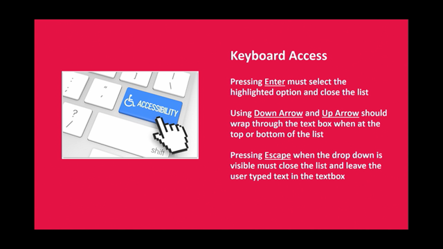
And this widget has primary keyboard interactions like these three that are required.
You have to, have spacebar and enter key interactions, mouse click, you have to support mouse clicks, and a special spice that is nice to have is to support the escape key, which is a part of an extended disclosure pattern.
when you build a disclosure pattern, and I'm going to show you how I build it in React, you start with a JSX button.
Now this looks similar to an HTML button.
You see a little slash there.
When you start with a button like that, under the hood, that renders as a button because the HTML is awesome.
And a button supports, by default, for free, mouse clicks, enter, key presses, space bars, by default, which is awesome.
Simple, done.
It's amazing.
Let's work for all of us.
And when you start with that, all we have to do is add just enough ARIA attribute support to give support for screen readers to inform the screen reader when a container that is attached to the button to know when that container is being opened and closed.
And in the case of you have many disclosure widgets on the page, which container is being opened or closed on the page.
on a button, we are adding three ARIA attributes.
One, aria-controls to tell assistive technology the ID of the element that the button's controlling.
In this case, the name of the container.
aria-expanded, which says if the widget is expanded or not.
An aria-label, for the cases where we need a more accurate button label.
In the cases where we are doing icon buttons.
Or, if we have multiple similarly named buttons on the page.
But there's also a case where when you're doing this pattern, it's important, and I did not put this in the notes and I will add this, and Sarah Soueidan will say this a lot, is when you are adding ARIA labels, you should make sure your ARIA label pattern should match the initial name of your button to support voice recognition.
That is very important.
Otherwise, chaos.
Bad.
you also need to add state and click handlers because React.
we have to add these state and click handlers to make sure we are going to toggle this container open and closed.
To do this, we have to use hooks in React.
And these hooks are these functions that allow us to define state for opening and closing this container.
Two of the hooks that we use, one of them is useState.
And we're going to use this useState hook to define a variable called open and Use a setIsOpen function, and we set it to false.
Say, alright, this container is closed.
And then, optionally, we could also say, this container is default closed.
And this could be important, for example, if you have a disclosure widget that's in a bank.
And you have to have your widget open by default.
Because when you're working at a bank, and someone comes to your page, you would have to have your Terms of Service.
Open by default.
So it's nice to build in a default expanded prop, so when you have this container built, you have a container, set up so you can have, this widget set up so you can always pass in a prop for your developers of, hey, is it always, expanded by default?
Cool.
Set it up, they can pass in a prop, good to go.
Then we can make this function to pass in of, to toggle the widget open and closed, and it can toggle between true and false.
And then in the button, we can pass in that function to a click event.
And then pass in that value to this aria-expanded prop.
Because this expanded prop communicates to screen readers whether this container is expanded or not.
And then we pass these props down to any of the children of the components.
And then we have to do some focus management for this container.
Because we want to manage whether the fo when the container is open or closed.
When the container is closed, we want to send focus back to the button.
So if you close the button with a keyboard when you hit escape, or when you close it, you want to make sure the user is focused back on the button.
So they know where they are not lost on the page.
This is more of an advanced pattern, and it's a better UX pattern.
So this is what you do for this.
This is where you're adding this escape key.
So what you do for this pattern is you create a ref using XU's ref hook, initialize it to null, add a handler function, listening for escape key presses while the widget is open, and if the widget is open, set that toggle to false, send the focus back to the button, and then you set some events to the div, pass in the ref, and then your widget will now close on an escape key press.
This is an extended pattern, and this is the nice to have, and it's great.
There's a caveat.
Always test with your users.
your stakeholders will be like, eh, test with your users.
Push to test with your users.
Test with your users with disabilities.
Can't say that enough.
But I'm going to dip into one other thing.
CSS focus states.
Who loves CSS focus states?
Anyone?
Yes!
Okay, so we have focus management done, but before we go on Normalize your CSS focus states, because it's just a great thing to do to just get it started.
Because once you get that done, like this, since browsers don't give a consistent focus state, you can do this with your CSS.
just do a star focus, just do Yes, you can do outline: 0 it's not a, it's if you do it, replace it with a style that you like.
Have a nice style.
And then, you can go back, like in, like your buttons, and do something different.
It's now I want my buttons to do this.
And that way you have a consistent baseline for everything, and then you can go back with your different components and override where you need.
But, then you have generic focus styles everywhere.
You've already done baseline accessibility.
It's really cool, but you've already had focus styles everywhere.
Once you have that done, now that you have focus management, then you can do mouse click management.
say you have five widgets on the, five widgets on the page, but you only have, want to have one open.
You can set up another function, or a handler, to make sure that when one widget is open, you can close the rest.
So you can set up a function with refs to pass in, pass in, different functions to listen for when you are clicking outside your component, and if you do, listen for key presses and mouse presses, and if it happens, you can use the useEffect hook, and if this happens, you can Close the widgets, and then do a cleanup function, and make sure you prevent re renders, and boom, you have everything cleaned up.
And now I'm just going to pivot, because we are at 20 minutes.
I just want to make sure we rip through things, because there is a lot of code.
I want to talk about the complexities, and I'm not going to talk about the patterns, like toggle tips, because they are not tooltips.
And I'm not going to talk about icons, because these are also part of the code, and you can talk, you can look at these later.
or any of the extra CSS, because these are also part of my notes.
And this is some of the stuff that maybe Homer will talk to you about.
And I don't want to give you an hour presentation, because I think that would be sad for you.
But these are some of the patterns that you can do as a basis with a disclosure widget.
You can add focus management.
You can add, um, an embedded search form.
You can do things like, going back, you can do things like sending in, um, targeted focus management.
Where you can, when you open your widget, you can send focus to the first item in your widget, like a toggle search.
So when you're having a search menu, and a search input with a button, you can have a nice UX where it's like, Oh, I want to search, have a search bar, and you search that first item.
You can do a targeted, first item.
It's a nice little UX for this little component, and it's nice and simple, or straightforward.
I don't like simple because simple is not necessarily simple for everybody.
So you could do this pattern, which is nice, and keep it straightforward.
But, when you start doing this, as a component API developer, it can get tricky, because when you have this component that opens a container, and you start adding a lot of props into your components, you get a little power hungry, or excited.
Or, creative, because you will work with your designer, and you will see something like this from your designer.
You will see something, really pretty from your designer, and you're like, This is really nice.
Your designer sends you this, and you're like, Ooh, this is a hamburger nav.
And these are buttons.
They look like buttons, but your designer's no, those are links.
And you're like, oh, okay, those are links, but they don't look like links.
How about we work, partner together, and do that hot potato thing that Dan Mall talks about, and let's redesign them to be, look like links, because that's, cognitive accessibility lets, have, form, communicate the intent.
And then we could add some links into our disclosure widgets and pop things into our pattern.
That's cool, but then, you could add some links in there, but then when we have this, that could be fun.
But then what happens when we have this widget, and they're like, alright, we have this container, what else could we add in the children of this container?
We could add buttons in that, because we have this really cool pattern.
We could start adding things like that.
What else could we do with this container?
Could we add more props?
What else could we do, to extend this component and make it more powerful, so we don't have to build five components?
We can just build one component and just start adding more props here to make our life more efficient, rather than adding ten components.
What else can we do?
How?
How about we can do roving focus?
how we people want to do those up and down keyboard arrows when you see a nice design with a select, they're like, oh, I want, the arrows to go up and down.
How can we do something with, when we do those up and down arrows?
We could do that.
That could be fun.
Let's add that in.
Let's like add a feature like that and add it to our, our menu.
Sure, we could do that.
What's, the harm?
We could do that.
Or, oh, we could even be more fun.
We could rather than making this one widget, we could make a tag component.
So we could have this tag component, and then with this tag component, all we can pass in any HTML tag we want to that tag prop.
And so we could render a piece, we could render a button, we could render a span, we could render a div.
We could render anything we want with that tag, in that list item.
And do, everyone, we are so powerful right now.
We're so clever, right?
Cool.
This is getting fun.
And then we can do like some moving focus, and like targeted focus management.
This is awesome.
What else?
that's nice.
What else can we do?
There it is.
And then we can add some roles in there, like the menu item role.
That can work, like for select menus, we can do some role, like some, roles and stuff.
Render link, render button, we could also render an input in there with that tag component.
This is awesome, so efficient, just with a tag component.
Really powerful, one tag, nothing else, you don't have to do five components now.
We can do fancy lists, separation of concerns now, don't have to do anything else.
And then, alright, now we have this, we could, this is getting fun, but now this component's getting big.
What do we do?
Because the component's getting long.
now the component's about that size.
Maybe we can do some ternary magic, if we render this one, if the component is open, if it's a list, we can render a div.
Otherwise, we can render this other thing.
That could be fun.
Why not?
only, we'll have to, handle, a few support requests.
No one's gonna get confused.
No one's gonna yell at us in support.
Oh, and then, in our Uber disclosure widget, we could have an enhanced widget, a list, we could pass in a list prop, we could render a list, we could have list items, we could pass a path, a tag prop.
We could render whatever we want.
Maybe we can even render, radio items and stuff in there.
What could go wrong?
Maybe this is a bad idea.
because at this point, what pattern has this become?
Because we're starting to different, starting to dip into different patterns.
We went from a disclosure pattern to a menu and a menu bar pattern.
And the menu bar pattern has menu item roles and menu radio, menu item radio roles.
And these different roles are needed.
There are different roles for needed for unordered lists, and their respective children.
And a hamburger navigation has different roles.
And they're technically part of disclosure widgets and Dero's implementations, but it's when we're starting to get clever and shove everything into one component, we get into trouble.
when you start thinking about those mega menus, and those checkboxes and radios, you're gonna get into trouble because you're not thinking about the logic when you're just trying to consolidate everything.
And that's when you start to mix things up.
And you mix that one pattern with another pattern.
And, whoa.
You're like, wow.
You have one pattern that has many uses, and it's important to keep your pattern uses separate.
And then you start to make unwise decisions.
It's like creating dishes with jello and shellfish, and things can go very wrong very quickly.
Also, I've had this slide in every single presentation since my first presentation.
Very proud that I've made that in.
but yeah, it's very important that you do not mix the masks or break the rules of ARIA.
You should be separating your components out into their purposeful intents.
You may think your magical mask will give you the access to that very exclusive carnival masquerade of having, all those masks, but instead you may end up at a completely different carnival than what you expect [tinny carnivale style music plays].
Oh!
There is music coming out of Let's try it again?
Let's try it again.
Hold on.
Stand by.
We're trying with some audio.
Let's figure out my audio.
Stand by.
Let's get my audio.
Try again.
[canivale style music plays properly] Cuba!
Que viva Cuba!
Ah, we got it.
Cuba para siempre!
And that's it.
You end up with a carousel [ music switches to heavy rock guitar].
Kathleen McMahon: You're the live system.
Music playing nobody wants a carousel in their design system.
I sure don't.
But I do have to say, disclosure widgets aside, those aside.
The OpenUI W3C community is working on a solution for native components, like disclosure widgets.
It's coming, which is awesome.
And I'm very excited to know that.
But, the TLDR is, avoid chaotic carnivals like that.
And, the via reggio, this is, or this one, which is the via reggio carnival, which has some extremely large floats in Italy.
They're amazing.
Like that.
So do not mix your masks.
But, to wrap up, Design Systems, our carnival, our users, are diverse.
Do not mix your masks, or you'll make bad choices.
It's not delicious.
And you may end up at a different, entirely different carnival than you expected.
With a completely different experience than you wanted.
And Design Systems are always the hotness.
Thank you.
I'll leave it on, I'll leave it on.
Nathan Curtis: I, for one, would love for you to leave it on.
You've brought some well, you've injected a, thorough amount of joy into this, design systems conference, so thank you for that.
Kathleen McMahon: design systems are joy!
Nathan Curtis: Awesome.
let's start light.
I'm a pattern hunter, I'm looking for themes.
Okay.
Jules, and Danny, and you, and maybe others.
Why do we need cats in our lives to be good at design systems?
What makes you a better design system professional because of cats?
Kathleen McMahon: God, they accept.
They push you to do better things.
They interrupt your flow.
Cats interrupt my flow.
They do.
but they also soothe, I would say.
Nathan Curtis: I love that.
as I was, watching you walk through all of your code examples, one thing that struck me was, I really appreciate how you drew focus into each of the sort of tiny zones of your code file, of where you touch this part, and you touch that part, and you touch the other part to make this pattern work.
But that means, is accessibility like a sprinkler over all the things you need to do in code as opposed to a nice chunky bit that you can just encapsulate and inject in?
Because a sprinkler makes you feel like you need to touch a lot of places.
In ways that, might evaporate pretty quickly and you really just have to continue spraying and spraying to make it work well.
what about, your practice can you do to make it not seem like an, an intimidating sprinkler over the code file I might be responsible for maintaining?
Kathleen McMahon: So, how do I not make it intimidating?
Nathan Curtis: How do I not, it just, it feels like I have to touch so many parts to make a pattern work.
Kathleen McMahon: I would say, if you make it part of your workflow, it doesn't feel intimidating.
It just becomes part of everything.
it just feels seamless.
Nathan Curtis: So when you, are making choices around, you see a thing you need to do and you have a component that does similar things, what comes to mind to help you choose, I need to actually create a second separate thing versus I need to actually extend and make more complicated the first thing?
Kathleen McMahon: I look at when you see, when you're starting to add more props, like, like for example the tag component, right?
And you're thinking.
You could put every single tag into that component.
Wow, that's so brittle, right?
Because you're, you are allowing so much flexibility that it makes it easy to make mistakes.
there's a careful balance.
For example, you, theoretically you could use a tag component.
You could.
It's like, all right, you can use a tag component here, but you could also say you can use a tag component only if you use these three tags, and only if you carefully guide, and document these are the tags you should use and why, it's just But then there's a trade off do you do that?
How are we gonna guide that?
How are you gonna document that?
How much pushback are you gonna get?
How much maintenance are you gonna do?
But then also when you do that, how much are you hand holding?
How much are you trusting your team?
Because when you start brute forcing your opinions on your team, are you allowing them to grow?
Or are you saying, we don't trust you.
This is how you should do things.
Like, where's that balance?
Where's that way to allow people to grow at the same time?
Like, how do you encourage people to grow?
How do you encourage people to learn?
Versus locking everything down with a, like parental knows best attitude, which I've seen way too much.
Nathan Curtis: Yeah, and I really, partway through what you were explaining, it made me think about, you, you choose to create a second thing when, if you were to add it to the first thing, I, sensed you saying, this particular case would have to use only these three parts of that first thing, and you'd have to know to not use the other 17 parts that it has, and it starts to have a model that's really different.
Yeah.
and then you bridge to really what my next question is, I remember a case where we had this product owner and it felt like they were, we called, this person, the no storm.
Like a snowstorm, but it was just a constant storm of, no you can't do that, no you can't do that, no you can't do that, no you can't do that.
And so how do you prevent yourself from being a no storm in design systems to empower other people to grow and experiment and, extend kinds of things in, reasonable ways?
Like how, do you like not immediately instinctually react and just say no all the time?
Kathleen McMahon: It's like, how do you, it's, how do you, provide, and it's that, how do you, it's, I go back and forth on this, because there's ways that you can do guardrails, for, in previous design systems, for example, I've created input components where it's no label, no input.
that can be a robust pattern, and there's reasons for that, right?
And then, there are, and I, still stand by that one, because that's a, that's a strong position to take.
But there are other times where I see such hard line take, hard lines taken with component API designs, where there's no room for experimentation, where it's, it just locks people down from growing.
And I just, there has to be a way to allow people to grow, but also provide the freedom to explore.
Using an API, but you're giving guidance or doc, like, how do you give them guidance or coaching?
Is it adding JS docs, with this is what this is used for, or this is, like a warning of if you do this, is, this will break this rule.
And it's also hard with, um, with accessibility because you hear, a lot of talk about, hey, AI will solve accessibility for us.
But will it?
But will it?
Because it might solve all the things, but it doesn't solve the manual, accessibility test.
And all, all these other things, it can solve a scan, but it's not going to solve those manual tests.
It never will, in my opinion.
Nathan Curtis: And so that leads into the next question I had, which is for you, maybe personally, or us, maybe as a community, are we going to get to a point where we feel like we've accomplished the mission of injecting accessibility into the practice?
Is there a place we'll feel we've succeeded?
What does that look like?
Kathleen McMahon: I wish.
No, there's so much ableism out there.
I think we will always have work.
We will always have work to do.
Nathan Curtis: So then let me finish with where you ended with all of this joyful dancing and celebration with a completely dissonant backdrop of a carousel?
And the carousel, we talked about this last night at the speaker dinner, and the carousel, at least at our end of the table, and the carousel was by far the number two, worst component to having a design system [applause].
And so, however, Kathleen McMahon: what's the number one?
Nathan Curtis: Oh, I think Donut Charts gives it a run for the money.
Anyway, but, that's a different topic.
The, with the carousel, though, is that an interesting, conversation because they're really hard to make accessible, but they're made up of lots of smaller parts, and if you can put together the smaller parts, compose them in a good way, and achieve your accessibility goals, is there a role for a carousel, even, in this kind of push and pull that we're talking about?
Should we even open our minds to something like that?
It can happen.
It can happen.
I can get salty.
I can still be salty about carousels, but yeah, it has to be done very, well.
I agree.
And I think you did really well too.
Please give me a, please help me give a warm hand to Kathleen McMahon.
Thank you so much.
Design System components are like Venetian Carnival guests. Enter the disclosure widget, wearing many masks, elevating the Carnival to luxury status. Or… are they? What happens when masks get mixed? In this talk, learn how to create an accessible disclosure widget and save your Carnival from chaos.
Keypoints by Amy Lee–find the original article here.
TL;DR: The point of the talk is that getting too clever in the goal of efficiency creates chaos. Learn to read the docs, separate concerns, and collaborate across teams (e.g., with designers).
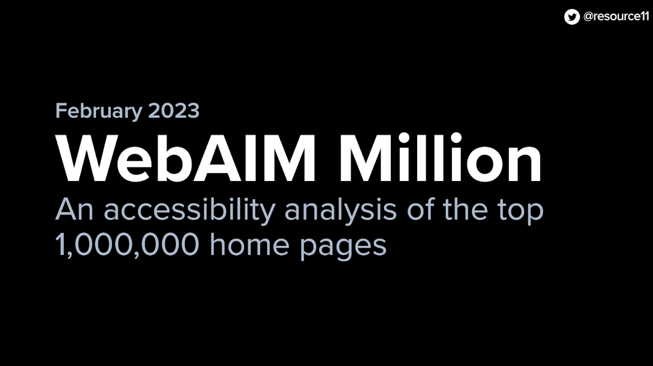
ARIA attributes are more popular than ever, and that’s a bad thing
Kathleen points out that the WebAIM Million survey shows a sharp increase in the amount of ARIA attributes detected. While it is encouraging that more developers are aware of how ARIA attributes inform screen readers about web pages, as the report shows: “Increased ARIA usage on pages was associated with higher detected errors.” The spirit of good intentions is unfortunately making the web worse. Developers should use the ARIA Authoring Practices Guide (APG); Kathleen’s presentation showed how using just the minimum of ARIA attributes on a Disclosure Widget can improve accessibility and achieve design goals!
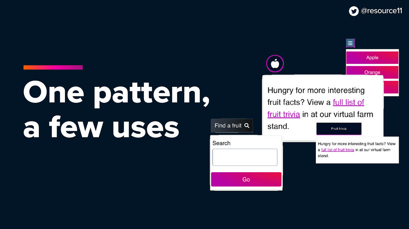
Disclosure widget pattern makes many patterns
A disclosure widget is: “A button that opens and closes a container, then returns focus to the button.” You begin with semantic HTML, add keyboard interactions, focus management, mouse management, and decorate the markup with ARIA attributes. Once you have those, you can now create several component patterns by combining specific elements and styling changes:
- Toggle tips. Toggle tips are not tooltips! Toggle tips need the user to click a button to reveal the content and then dismiss it; tooltips display themselves on hover or focus. Toggle tips can contain interactive content.
- Toggle search. Reveal a search field. You can also focus on the search field when opening the search UI.
- Hamburger navigation menu. The opener button can be a hamburger menu icon, opening the container containing links.
But, don’t use this pattern for everything. Use the recommended pattern.
With so much power, you may think every menu can be a disclosure widget. To avoid the chaos of mixing the “masks”, Kathleen cautions us to review the APG for an appropriate pattern (e.g., the Menu and Menubar Pattern for “mega menus”) — different patterns may have different ARIA attributes.
What is the best pattern? Check out Open UI.
Open UI strives to create solutions to some of these patterns at the browser level. Keep watching this space!