Designing a community-driven design systems roadmap
Introduction
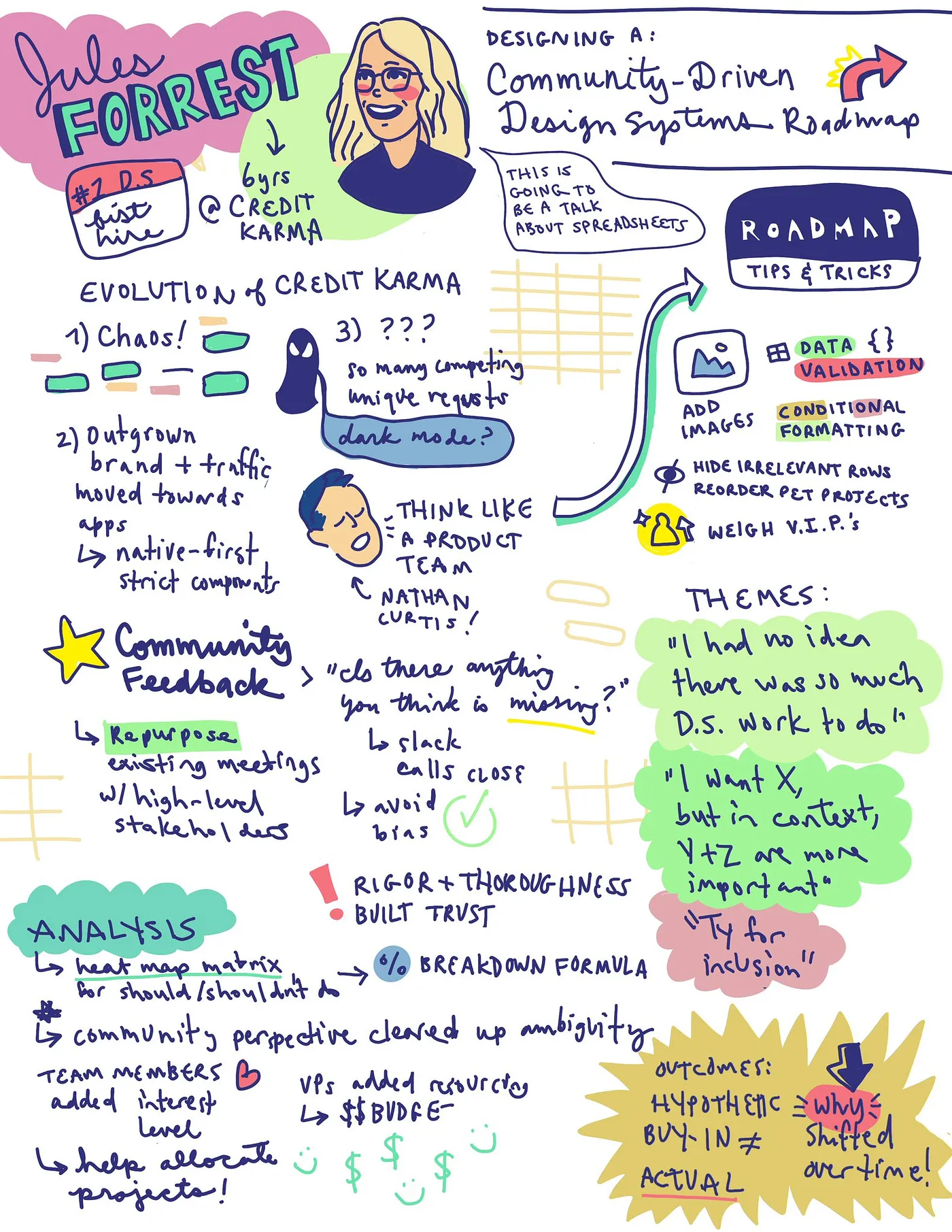
Nathan Curtis introduces Jules Forrest, a Product Design Director at Credit Karma and founder of Women Who Design.
Opening Remarks by Jules Forrest
Jules introduces herself and her role at Credit Karma, mentioning her experience and the teams she leads.
Co-Creating Design Systems Roadmaps
Jules discusses the process of co-creating design systems roadmaps with internal teams, emphasizing the use of spreadsheets and feedback collection.
Evolution at Credit Karma
Jules shares her journey at Credit Karma, highlighting how the company's evolution influenced their design systems.
Addressing Shifts in Design and Branding
Jules talks about the need to update the design system to align with brand evolution and native design practices.
Challenges in Project Prioritization
Discussion on the challenges faced in prioritizing various design system projects amidst conflicting requests.
Defining the Design Systems Roadmap
Jules describes the process of defining the design systems roadmap, including goals like organization, community validation, and clarity.
Using Google Sheets for Organizing Work
Explanation of using Google Sheets for high fidelity design control and custom data visualizations in managing design system projects.
Optimizing Feedback with Visuals and Data Validation
Jules talks about strategies like adding images and using data validation in spreadsheets to optimize feedback quality.
Creating Feedback-Oriented Project Columns
Details on creating a system for project assessment and feedback collection, emphasizing clarity and organization.
Community Feedback Sessions
Jules explains the process and importance of conducting community feedback sessions to refine the design systems roadmap.
Interview Process and Feedback Collection
Insights into the interview process for collecting feedback, including techniques to avoid bias and ensure comprehensive data collection.
Data Analysis and Insights
Discussion on analyzing the collected data to inform the roadmap, with a focus on stakeholder roles and impact assessment.
Finalizing and Implementing the Roadmap
Steps taken to finalize the design systems roadmap, including aligning team interests and securing additional resources.
Reflections on Roadmap Implementation
Jules reflects on the outcomes of the implemented projects from the roadmap and the lessons learned through the process.
Closing Remarks
Jules concludes her talk by emphasizing the importance of transparency, empathy, and clarity in managing design systems, and looks forward to the next steps at Credit Karma.
Nathan Curtis: Our second talk is by Jules Forrest.
Jules is a product design director for the KDS Karma Design System at Credit Karma.
She also built Women Who Design, a directory of accomplished women in the design industry.
I've worked with Jules for two years.
It's been a tremendous experience.
And I find her supportive, sharp, sensible, and a joy to dish about life in New York.
And also, her cats.
Please help me welcome Jules Forrest.
Julies Forrest: Hello.
Can everybody hear me?
Great!
my name is Jules, and I'm a product design director at Credit Karma, as Nathan said.
I'm currently based out of New York with the aforementioned two cats, who are incredible.
Cat people, find me later.
where I lead our design systems, content design, and design technology teams.
a bunch of us Credit Karma folks are here at Clarity this year, and we are so excited to be with you all today.
I first attended Clarity at the Alamo Draft House back in 2017, so I'm especially honored to be back in this amazing space, at this amazing conference, as a speaker.
Thank you, Jina and team, for having me.
Today I want to share our team's process for co creating design systems roadmaps with our internal design systems community.
If you can't already tell, this is going to be a talk about spreadsheets.
I know.
Oop.
Cat pics, anybody?
I don't know if we have time.
Okay.
for those who aren't familiar, Credit Karma is a financial tech company that was founded in 2007.
Its mission is to champion financial progress for all of its 100 million members across the United States.
Canada, and the UK.
We provide financial tools primarily through our IOS and Android apps.
I joined Credit Karma over six years ago as the first design systems hire.
And when I joined, I didn't think I'd be able to stay interested in one company long enough to stick around for six years.
But over time, I've been fortunate enough to experience Credit Karma not as one single company, but as multiple companies that have changed and evolved and grown roughly every two years.
And of course, as the company changes and evolves and grows, what it needs from its design system changes also.
Back in 2017, The first order of business was simply taming the chaos.
Before our first generation design systems release, our UI was disjointed because our small but mighty product design team was understandably occupied by full time feature design.
As I worked towards our design systems MVP, I audited the product and codified our first set of color palettes, typography scales, and components.
But by 2019, things had started to shift.
We had outgrown our old brand and visual language.
We also saw massive traffic shifts to our native apps over our desktop web app.
And years of divergent feature design had pushed each vertical's features too far from the app's core experiences.
The impact of these shifts was fairly straightforward, and luckily for me, included an investment in additional design systems headcount.
Credit Karma team, right over there on the left.
Thank you for being here.
the business ask was to update the design system to leverage the brand's new visual identity, to align to native first design best practices, and to encourage the convergence of features with strict and configurable components.
Spoiler alert, that didn't last that long.
As we know, nothing in tech stays steady for long.
By the back half of 2021, the path forward was feeling fuzzy again.
And it wasn't that we'd run out of things to do.
It was that we were getting so many large, competing, and often conflicting requests, we didn't know how to prioritize and sequence them.
we heard things like "Can you change this component to support my use case?" When will the design system have more data visualization components?
I don't like the new visual language.
This component doesn't work for the higher density views I have to design.
I thought I was using this component correctly.
And when is the design system update going to include my new pet favorite Figma feature?
And have you heard of dark mode?
We had.
Around this time, we started consulting with Nathan from Eight Shapes.
You know him as the friendly MC of this event.
and when I brought up the ambiguity of the path forward, Nathan encouraged us to think like a product team.
And how do product teams navigate questions of ambiguity and priority?
They define product roadmaps.
Now, usually defining the roadmap is a job that falls to a product manager, which is not a role that we have on the team.
So with Nathan's coaching, I decided to put on my PM hat and define our first roadmap.
The roadmap project had a few key goals, the first one being to just get organized by collecting and documenting all possible design systems projects in a single place.
I also wanted to build confidence in our project prioritization by validating the relative importance of each project with our design systems community.
And I wanted to provide clarity and predictability to the workload of the design systems team.
I started with organizing the work.
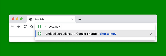
Right off the bat, I reached for Google Sheets as the right tool for the job.
I like that it gives you high fidelity design control over how the content is presented.
It's also something at work that everyone was already familiar with, which is really important for busy stakeholders.
And it let me create very custom data visualizations.
But a lot of the process that I'll cover today can apply to other tools, like Airtable, Notion, Coda, or even online whiteboarding tools like FigJam or Miro.
If you want to dive into some of these concepts in more detail, I'll share the presentation, I'll slip, share the templates at the end of this presentation, so you don't have to worry about capturing all of these really fun and nerdy formulas in real time.
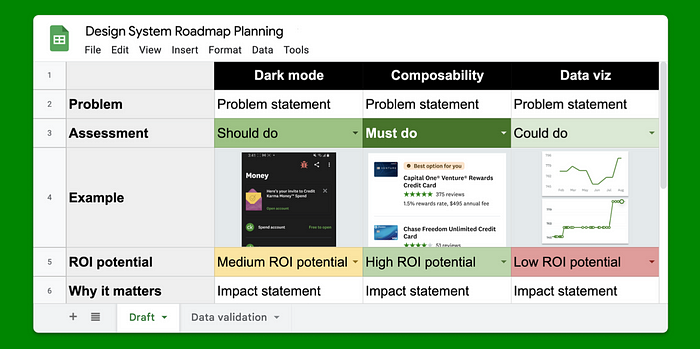
So my basic plan was to create a column for each project, and organize different kinds of information about the projects in each row.
I knew I needed high quality feedback for the project to be successful, but I also knew that many of the community members weren't necessarily fluent in all of the ins and outs of a design systems project.
So I mapped out categories based on what I thought would be the most frequently asked questions.
What are we trying to solve?
What's the impact?
Is this even important?
What will be delivered?
Why are we doing this now?
And what could go wrong?
After that, I started populating the columns with projects, like Dark Mode, Composability, and Dataviz.
It was a huge relief to write down all of these disparate projects, asks, and requests into a single place.
But it quickly became overwhelming to look at after I populated the cells.
Which brings me to my first strategy for optimizing for high quality feedback, which is adding images.
Images help break up the wall of content, they ground the projects listed with a concrete example, and they prevent context switching while conducting these feedback sessions.
I created example images for each project, and dropped them into a newly created example row in the spreadsheet.
At this point, I also started thinking about how I actually wanted to collect the feedback from community members in the interview sessions.
I imagined sharing the spreadsheet with folks in a one on one setting, and asking them to jump into the spreadsheet with me to rank their opinions on each project.
So I added a comment row, and decided to use data validation to make it easier for people to make their selections.
Data validation is a spreadsheet feature that allows you to constrain the values that can be entered into a cell.
You can use it to make a checkbox, a date input field, but in this scenario, I wanted people to be able to indicate their opinion using a dropdown.
I created a new sheet called Data Validation to serve as the back end for the project and designated the first column.
for the assessment options of must do, should do, could do, and should not do.
That makes data validation my second strategy when optimizing for high quality feedback.
It's faster than retyping repetitive content by hand.
It ensures consistent formatting, which will be important in a minute.
It makes it easier to analyze the data.
And it makes collecting the feedback a little more interactive.
When the data validation dialog popped up, I selected the list from a range option and entered this formula.
Basically it's saying, go to this tab, which I named data validation, grab the values that start at this cell location, which in this case was A2, and end at this location, which is also column A.
I'm starting at row two here because the first row has the column assessment header that should be skipped.
I'm also intentionally not adding a row number at the end of the formula.
When you skip adding a row number at the end, it tells the formula to grab as many values in that column as it can find, which is useful because I can add or remove values from the list later without having to update the formula.
At this point, I had my assessment drop down working nicely.
So I repeated the process for my other sets of reusable information.
I put each information set in its own column for easy maintenance.
So I had columns for ROI potential, I had a binary yes no column, and a few others.
I reused the same data validation formula, updating the start and end columns when necessary.
Setting up data validation made tinkering with the values faster, and the images helped break things up, but I still had a wall of text problem.
To break up the information further, I set up conditional formatting for the most important rows.
Conditional formatting is faster than formatting repetitive styles by hand.
It ensures consistent formatting, which goes hand in hand with my previous note about data validation.
When your data is consistently formatted, styling it consistently is easier too.
it makes it easier to scan the data, and it draws attention to the most important content.
This is what the conditional formatting for the assessment tab looked like.
If the text contains must do, flip the cell to a dark green with white text.
If the text contains should do, flip the cell to a medium green.
If the text contains could do, flip the cell to a light green.
And if the text contains should not do, flip the cell to a light red.
After adding conditional formatting to the assessment row and the ROI row, things were getting a lot easier to digest and compare, and I was finally ready for a few rounds of critique.
My team helped me refine some of the images and descriptions.
and pointed out additional rows that might help sort and filter the information.
They were also easily able to follow the template and propose new projects by filling out additional project columns.
Filling out this monster spreadsheet was definitely a team sport.
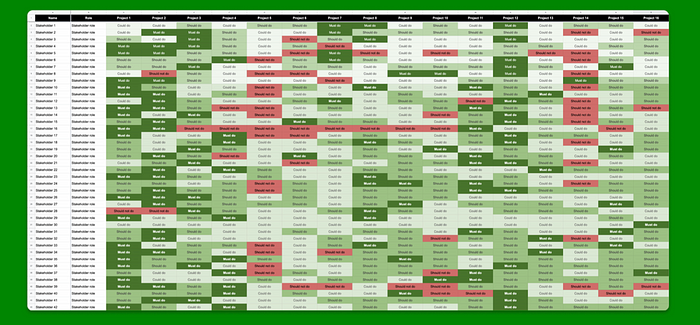
By the end of this stage, we had gathered 16 columns worth of projects and 22 rows worth of organized data.
We added additional rows to capture dependencies, how we received the project request, the level of effort for our team to do the work, the level of effort it would take for adopters to adopt the work, and more.
Before moving into the community feedback sessions, I had a few final cleanup tasks to do.
I collapsed any row that I thought wouldn't be relevant for our community members giving feedback in the moment.
I also organized the projects into similar themes, and I evenly distributed our team's pet projects so that it wouldn't be super obvious that the stuff that we thought was most important was in the front.
At this point, I was ready to move into the community feedback sessions.
And, as an introvert, I thought this would be my least favorite part of the project, but it ended up being one of the parts of the project that I enjoyed the most.
The first step was sourcing community members who were interested in giving feedback.
I wanted to get a good mix of leaders and individual contributors, designers, engineers, and PMs.
I put out the call in Slack channels, asking people for 30 minutes of their time to make sure that we were on the right track.
And to avoid calendar touch with senior leadership, I also leaned on our VP of Design to repurpose some of his existing meetings with those holders to serve feedback sessions.
For each interview, I created a new copy of the spreadsheet and I opened each conversation with this prompt.
I'm gonna share my screen and quickly run through each column of this spreadsheet.
Afterwards, I'll share the link with you so we can look at row 3 in more detail.
In row 3, you'll rank each project as must do, should do, could do, or should not do.
You can only rank three items as must do, but everything else is unlimited.
Some interviews required getting feedback from multiple stakeholders at the same time.
When that happened, I collapsed the assessment row on the main view and created one tab for each participant so they wouldn't bias each other.
Which you can see here on the bottom.
All in all, I conducted 42 interviews across our internal design systems community, which included the design systems team.
Oop.
the design systems team, product designers, engineers, product managers, and senior leadership.
I closed each interview by asking, is there anything that you think is missing from this spreadsheet that we should be working on?
And I took notes on their answers.
The responses to these sessions were really, fascinating.
Outside of the structured assessment feedback, the comments we received fell into a few key themes.
The first one was, I had no idea there was so much design systems work left to do.
Yep.
It was clear that the roadmap offered a level of transparency into our workload that people were surprised by.
The next theme also hit on notes of transparency.
I heard a lot of variations of, I really want you to work on project X.
But now that I see everything laid out, projects A, B, and C are probably higher priority.
Many participants had a better understanding of how their requests fit into the bigger picture, and had more empathy for the design systems team as a result.
We also heard a lot of comments like this one, expressing appreciation for being included in the process.
While we weren't being intentionally exclusionary before, Participants enjoyed stepping in to help us shape the prioritization.
We heard comments about the level of rigor that went into the roadmap preparation.
One senior engineering leader said, Great work on vision and roadmap.
Love how much thought and effort your team is putting in.
The rigor and thoroughness helped build trust with our community and increase their confidence that we were on the right path.
There were also a handful of instances where I got emails from co workers that I didn't know, requesting access to the spreadsheet.
And when I asked them, hey, do you want to participate, do you want to give us feedback, they explained that they didn't consider themselves design system stakeholders, they'd heard about the roadmap exercise from somebody else, and they wanted to borrow the format for defining their own roadmap.
This happened most often with platform engineering teams, which are also not staffed like a typical product team at Credit Karma.
As the interview started to wrap up, I was ready to move into the next phase of work, which was analysis.
I created a fresh spreadsheet with columns for the participant's name, their role, and copied over every project.
After that, it was easy to copy and paste my assessment row of each interview spreadsheet into the responses tab.
I also copied over my notes on how folks responded to the question, Is anything missing from the roadmap?
And I ended up with this heat mapped matrix of all the responses.
Shout out to stakeholder 16 who had a record 9 items marked as should not do.
I can definitely appreciate when folks have a strong point of view on priority.
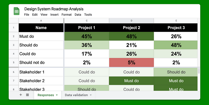
After that, I needed to calculate the total vote breakdown for each project.
I added some summary rows at the top of the sheet for each voting option.
And I wrote another formula to calculate the vote percentage breakdown, which again will be in the templates that I share at the end.
What this formula is saying is that the number of cells between cell C6 and the end of column C that contain the text must do.
And then divide that by the total number of cells between C6 and the end of column C.
This formula gave me a nice, clean percentage to then repeat and modify slightly for the rest of the options.
After setting up each option, I dragged the formulas across the remaining columns, which updated the referenced column automatically.
After that, I applied formatting, this time using the color scale option.
And I ended up with a nice, neat summary at the top.
Showing me how the responses broke down.
I selected the summary rows and hit the insert chart button to create a better visualization for this data.
After some more formatting and moving the chart into its own sheet, I ended up with something that looked like this.
As you can see here, the projects are priority ordered from left to right.
Projects that receive more must do and should do votes are further left.
And projects that received more could do and should not do are further to the right.
Of course, we couldn't use this as a perfectly linear list of things to do.
If project 2 and project 10 both touched the same components or groups of components, we didn't want to create confusion by trying to do that work in parallel.
But our community gave us a clear perspective on which projects would be most impactful for them.
Which cleared up a lot of the ambiguity of our path forward.
Capturing folks roles was also an important part of the analysis.
Using Google Sheets data slicer feature, I was able to create additional charts that let me compare how people in different roles viewed our work.
Which was a really interesting way to compare the data.
So if you're interested in embarking on a similar data analysis, here are some tips.
You can weight feedback from important participants higher by just duplicating their response row.
In this way, I was able to elevate the input of the design systems team and our most important stakeholders.
Using data validation saves time on data entry and creating those summary charts that I just showed.
Use filters to examine the data by role.
And share your final analysis summary with your community, even if the way you sequence the work can't follow the exact order that emerged from your research.
My last goal for the roadmap project was to provide clarity and predictability to the workload of the systems team.
When conducting the feedback sessions with my team, I provided a slightly different copy of the roadmap with an additional category called project interest.
The possible options were want to work on it, neutral, or don't want to work on it.
After they gave their assessment on priority, I also asked them about their interest level in working on that project.
Which gave me important signal that I used when dividing up and assigning the work.
Using this method, I was able to align the workload of every team member to their stated interests, growth areas, or both.
I also spent time with Upward stakeholders on the resourcing information, which included projects that were well suited for external agency support, like 8 Shapes.
This built a better understanding of our team's strengths, and where we could advance or accelerate the roadmap if we were given additional funding.
Leadership appreciated our proactivity in proposing projects this way.
And using this method, I was able to secure a budget to hire agencies to complete two additional projects from the roadmap.
taking everything into account, the community feedback, team interest in growth areas, agency budget, dependencies, and product complexity and coverage, we ended up with a roadmap that looks something like this.
To be honest, I don't really find Gantt charts to be super useful.
they're really good at illustrating a plan at a single moment in time.
but I find that they can get out of date quickly.
Our priorities definitely changed and shifted over these last two years.
But our roadmap allowed us to have more intentional conversations about trade offs and bandwidth.
Which in turn helped keep the workload for the team manageable.
out of the 16 projects we identified in 2021, how did they actually shake out?
Two projects, or 13 percent of the roadmap, were a delightfully clear, flat out, do not do this.
That was very helpful.
An additional two projects were started, but then deprioritized.
Interestingly, they were the second and fourth highest ranked projects by stakeholders.
And this was very puzzling to me at first.
We'd clearly articulated the breadth and depth of these projects, we had community buy in that the work was important to pursue, but we kept hitting roadblocks and progress was slow.
Over time, we had to accept the reality that despite all of our research and preparation, hypothetical community buy in did not translate to actual buy in when we started to plan and execute the work.
We needed to pause, stop, and reflect.
Or, as Amy Hupe would put it, We needed to know our specific why to create a design system for Credit Karma that delivered value.
Just like the company, our why had shifted and evolved over time and needed to be updated.
For those who haven't seen it, I highly recommend this talk that Amy shared at last year's Clarity.
She goes on to say, It's okay for us to swim with the current sometimes, to embrace the realities of our context.
As it turned out, pursuing these projects that were ultimately deprioritized was incredibly helpful for clarifying our updated why.
And these missteps were the catalyst for other necessary generational changes.
Because making your design system fit the company is a lot more productive than trying to make your company fit your design system.
Which is a fancy way of saying you can't align your design system to the business priorities if you aren't super familiar with what they are and how they change over time.
After clarifying our why, we were able to complete six projects, or 38 percent of the roadmap, as originally scoped.
Three projects, or 19 percent of the roadmap, were completed at a smaller scope than initially anticipated.
So that means that 9 out of 16 projects, or 57 percent of the roadmap, were pretty much right on the money.
Three projects were partially completed.
We will continue to make progress on them over the next two years.
And we invested in four new initiatives over the last two years.
that were informed by the missteps that led to our newly clarified vision.
Backed by the data of our design systems community, we were able to have a really productive couple of years.
So much so that our VP of Design said the design systems team has fundamentally changed how we work in the past two years.
Product designers no longer waste time on pixel authorship, and subjective debates allowing our function to have a far greater impact on the business.
In closing, our biggest wins from this project were building empathy with our internal design systems community, increasing the transparency around our work and workload, setting clear boundaries with cross functional partners, increasing the focus of our team, and aligning team priorities And, since we're almost done closing out all the work from our 2021 roadmap, it's time to figure out what the next two years are going to look like.
Starting next quarter, which is actually today, we'll run this same process again to align ourselves with whatever version of Credit Karma is coming next.
On that note, I'll be posting the templates of all the spreadsheets I talked about today on Twitter.
I refuse to call it by the other name.
Feel free to duplicate them, remix them, make them your own.
I'm barely on social media anymore, but you can find me on Twitter under the handle at Jules Forrest with two Rs.
It's been really fun sharing this work with you all, and I hope that you found it useful.
Thank you.
Nathan Curtis: Thanks, Jules.
So to start, so spreadsheets, a lot of spreadsheet formulas, et cetera.
Some people hate spreadsheets.
Can you do this without a spreadsheet?
Julies Forrest: I feel like that's a trick question, because I've seen you do a very similar process in FigJam, so the answer to that would be a resounding yes.
It's a lot harder to tally up all the data though.
I Nathan Curtis: agree.
Alright, since you've done this, with many of those, how are the, you've essentially reported on how all the projects did, and some that were completed, some that were rejected.
Did you look back or do you instinctually have a sense of, were the stakeholders instincts on ROI correct?
Were they helping you make good decisions with their data?
Julies Forrest: I would say it was a mix.
Those two that I mentioned that we started and deprioritized, those were the clearest examples of, no, the return on investment is not worth it.
The investment to make in pursuing these is too large.
And, uh, they were not expecting that, I don't think.
Nathan Curtis: Okay.
With your roadmap to you, you exposed the fact that this is a big roadmap.
There are lots of columns, you completed lots of these things and you're now revisiting doing this exercise for the first time in, I don't know, 18, 21 months.
It's been a while.
You like filled up the bucket and now the bucket's almost empty and need to refill it.
Is that the right cadence?
Would you do it more often or less often?
If you're another member of the audience?
What would you tell them?
Julies Forrest: Famously unhelpful answer of, it depends.
I think the size and scale of your design system, your design systems team, your product, design, product and engineering teams probably play into that.
If you are a design systems team of one working at a small startup, you might need to do this more often because you move fast and.
I'm not going to say it.
things change more frequently.
For us, I think two years was the right cadence because we needed to get ahead of what was coming so that we could set realistic expectations of hey, if you are asking us for new stuff, just so you know, we have a highly prioritized bucket over here.
So what do you want us to take away?
so I think it depends on the scale of the company and what they do.
How fast the company is moving.
Nathan Curtis: in retrospect, I really loved the questions that you asked.
You essentially had the column on the left that had ROI potential and all this other jargony stuff, but then you demystified with really simple plain language questions.
Were those the right questions?
Would you change any of them or remove them?
Or did you actually need to ask a question that you didn't ask?
Julies Forrest: That's a great question.
If we were maybe four weeks further along in doing this for the second time, I would have a better answer for you.
But off the top of my head, I think every single row was referenced with at least one stakeholder.
so they were all fairly useful, and there were definitely themes about types of stakeholders who cared more about certain rows.
So like senior leadership.
cared a lot more about risks than, random IC product designer working on a super fast moving initiative that was risky to begin with.
So risk was much more, normal for them.
Nathan Curtis: So when you visualized all the data and you had that essentially set of stacked bars from left to right with the four colors in each bar.
The statistician in me was triggered.
And I was thinking to myself, that's great data.
I can see preferences biasing towards one choice or the other.
But I actually saw no dominant winner.
And I didn't see, there was one or two that had some significant red in there.
But no, terrible loser.
And Of course, these things aren't going to be statistically significant.
That's not the, that's not the goal of the exercise.
But how did that lack of decisiveness in the data influence your, prioritization that you took away from that, or the choices you made after gathering that data?
How did you make choices, given the potential subtle differences between some of them?
Julies Forrest: I think when you know the people who gave the responses, you can intuitively understand which ones are more important.
you should know which of your stakeholders are more important than other ones.
So I think, as you said, having the data was a good foundation, but looking at some of the other stuff, aligning projects with, upcoming product initiatives, stuff that, maybe wasn't clear from the must do, but it's oh, this other thing, this other part of the org is happening in three months, they're gonna need this, we should do this now was helpful.
for the two that I said were flat out rejected, I would say those were more of a not now, or not relative to everything else that's going on.
so it was all signal, but like I said, we didn't go from A to B to C and just do everything in a linear order.
Nathan Curtis: my last question has more to do just with energy and personality, and you, I think you said 42 interviews, was that the count?
Something, that's a big count of conversations.
And I sensed before you started, there was a bit of internal resistance or reluctance, but then you seemed to say, and I've seen this experience in myself and others, A massive energy explosion by talking to people.
what would you tell people that are maybe resistant to having those conversations or, fearful or whatever the reason is that's constraining them from having those conversations?
How would you encourage them to get out there?
Julies Forrest: It's so cathartic, is how I feel about it looking back.
especially for anyone in the audience who's been a team of one, you feel like you are pushing a boulder up an impossible hill, and you'll never reach the top.
And talking to people and being able to share the breadth of work that's still to do, and just seeing people be like, Oh, wow.
I had no idea.
gave me a lot of energy, because it validated, that all those times that felt overwhelming, like we were never going to get through it, weren't, Weren't avoidable.
There's like a ton of work and having other people see that, was really helpful for me.
Nathan Curtis: That's great.
Please join me in thanking Jules Forrest.
Roadmaps are a valuable tool in the product development toolkit: they shape a body of work by clearly communicating the projects, priority, and scope required to complete that work. Unfortunately, not every design systems team has the luxury of being staffed like a product development team, with a dedicated PM to drive the roadmap. In this talk, I’ll share how our scrappy design systems team at Credit Karma co-created a design systems roadmap with our internal community to bring confidence, clarity and focus to our work.
Keypoints by Amy Lee–find the original article here.
Roadmaps with the tools you have
“How do product teams navigate questions of ambiguity and priority?” asks Jules. “They define product roadmaps.”
As a “product serving products,” design systems must understand what their adopters need and inform them through roadmaps. Jules breaks this process into three phases:
- Organize. Collect and document all possible design systems projects in a single place.
- Prioritize. Validate the relative importance of each project with our design systems community.
- Stabilize. Provide clarity and predictability to the workload of the design systems team.
And what better way to do this with the tools your organization likely has? Enter spreadsheets. (Jules points out that any spreadsheet or collaboration software will do, e.g., Google Sheets, Airtable, Notion, Coda, FigJam, or Miro.)
Goal 1: Organize
Jules recommends that each column can be a different problem. Per each problem, we have these questions:
- Problem statement. What are we trying to solve?
- Assessment. Is this a “must do,” “should do,” “could do,” or “should not do”?
- Example. Screenshot for reference.
- ROI potential. What’s the impact? “Low ROI potential,” “Medium ROI potential,” or “High ROI potential”?
- Why it matters. Is this important?
- What you get. What will be delivered?
- Product alignment. Why are we doing this now?
- Risks. What could go wrong?
Also, add color coding by conditional formatting to create a better visual summary.
My commentary: I’m a big fan of using tools your interviewees are used to. People are busy, so you have to meet them in the tool where they are most productive. If your organization uses online spreadsheets, choose that. If your organization is email-heavy, choose that. Or, if your organization wants a real-time chat, you may schedule meetings with the most essential stakeholders.
Goal 2: Prioritize
By interviewing our stakeholders, we can better understand what’s meaningful to the organization. Getting an assessment (must do, should do, could do) from each person gives you objective evidence from subjective assessments!

Step 1: Duplicate the roadmap sheet per interviewee
Duplicate the main sheet per person. Also, capture each person’s role.
Step 2: Aggregate the assessments
Copying the assessment responses per project to one main grid begins to show patterns. You may also want to create a summary at the top of each column:
Pro tip: One cool technique is to weigh VIP’s answers more by duplicating their responses (so they get two votes!).
My commentary: some people like numbers, some people like colors, and some people like to step back and see groupings of colors. What I love about Jules’ approach is that it works on all levels. She tries to reach people with very different roles and some are more visual thinkers.
Step 3: Stabilize
Understanding what resources you have to work with through data can be powerful in asking for additional help.
Do you want to work on the project?
Jules added an extra row to the assessments for design system team members: “Project Interest”. Interviewees responded that they “Want to work on it,” “Neutral,” or “Don’t want to work on it”. She could then align projects to people’s interests or growth areas.
Which resourcing?
For important stakeholders, Jules added an extra row for the kind of resourcing: “Must be done in-house,” “Could use agency support,” or “Needs agency support”. This can reveal how leaders may also want to allocate resourcing — Jules used this method to get the budget to hire agencies.
My commentary: it’s smart to add these extra dimensions to see how people feel about the process of completing the work. We trust that each person will do their best, and aligning their interests will increase the motivation and velocity. Getting a group to talk about resourcing is also effective at seeing how the leadership thinks about which projects are core to the business and which are just work to be done.
Final advice
Jules left us with a couple of thoughts:
- “Pursuing work that’s ultimately deprioritized can be incredibly helpful for clarifying your ‘why’ ”
- “Making your design system fit the company is a lot more productive than trying to make the company fit your design system.”