Pursuing Design Quality
Pursuing Design Quality
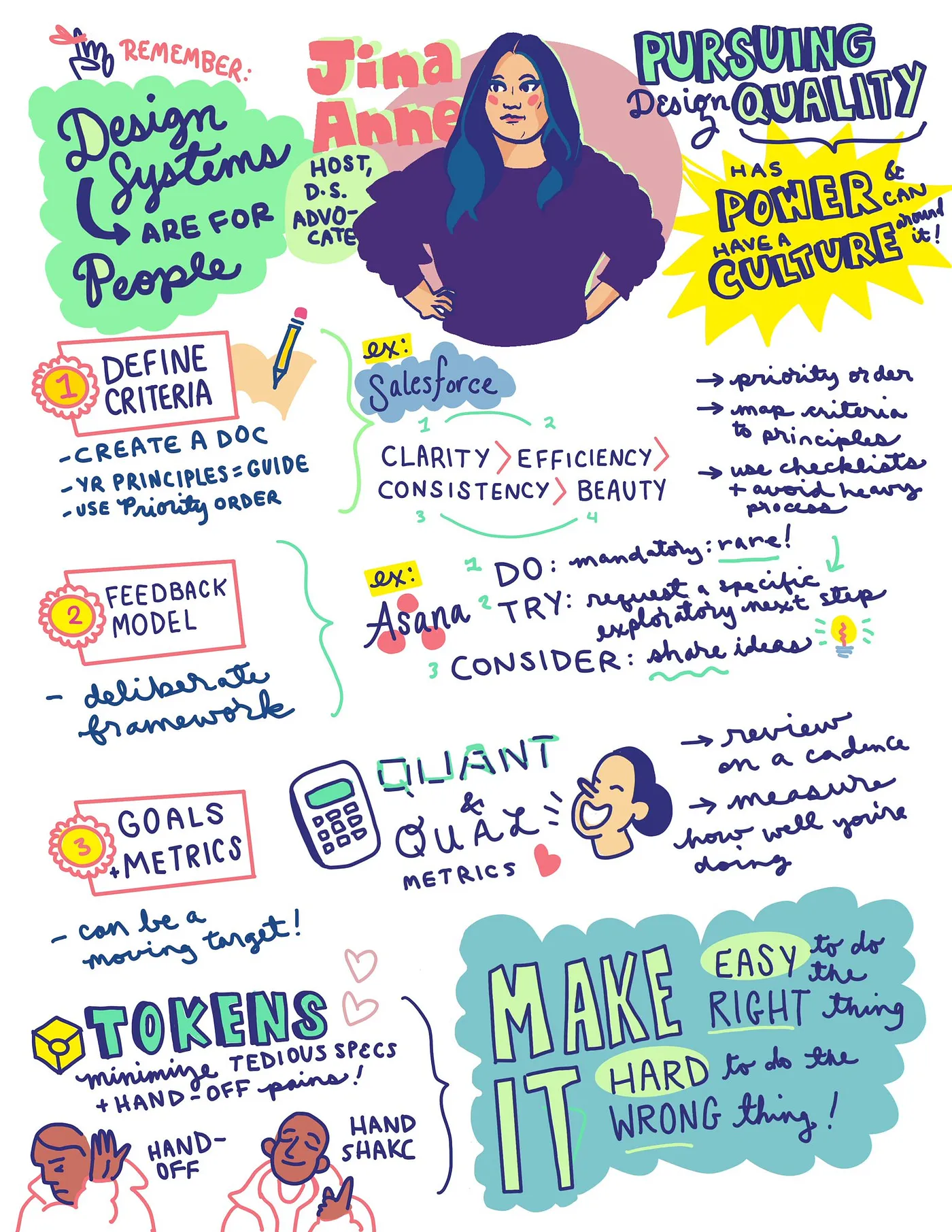
Jina Anne, a Design Systems Advocate, introduces the topic of pursuing design quality, emphasizing its importance in the design community.
Create a Culture of Quality
The talk emphasizes the need to create a culture that prioritizes design quality within organizations.
Create a Design Quality Criteria
Jina discusses the process of creating criteria for assessing design quality, focusing on clarity, efficiency, consistency, and beauty.
Asana Design Quality
Exploring the design quality principles at Asana, Jina shares insights on their approach to ensuring high-quality design outputs.
The Criteria
Jina outlines key criteria for design quality: inclusive, intuitive, reliable, cohesive, and delightful, elaborating on each aspect.
Mapping our Quality Criteria to our Experience Principles
Discussion on how Asana's design quality criteria align with their broader experience principles, ensuring a unified design approach.
Create a Design Feedback Process
The importance of establishing a robust feedback process in design to ensure continuous improvement and quality assurance.
Use Design Quality Checklists
Jina advocates for the use of checklists as a tool to maintain and evaluate design quality throughout the design process.
Establish Goals & Metrics
Setting clear goals and metrics is crucial for measuring and achieving design quality, as highlighted in this section.
Have a Design Systems Practice
The role of having a dedicated design systems practice in achieving and maintaining design quality is discussed.
Use Design Tokens
Jina explains the importance of design tokens in creating consistent and scalable designs.
Bridge the Gap
Exploring ways to bridge the gap between different aspects of design to achieve a cohesive outcome.
My Design Systems Journey
Jina shares her journey and experiences in the field of design systems, highlighting key milestones and learnings.
Thank You!
The talk concludes with Jina expressing her gratitude and providing her contact information for further engagement.
Nathan Curtis: And let's get started.
Let's get ready for our first talk, which is Jina. Jina is the founder of Clarity.
She has experience, like she mentioned, with Apple, Amazon, and, as I got to know her, Salesforce Lightning Design System.
She also co chairs the Design Tokens Community Group. She's part of the Saas Core team, and I would call her the center, at least in my life, of our design system community.
Please help me welcome Jina.
Jina Anne: Thank you.
All right.
Let's see.
Everyone hear me okay? Sorry.
How about now? Yeah? Okay.
Hi, I'm back.
Hey everyone.
Today I want to talk about design quality.
I've actually seen some folks share negative thoughts on making quality something to strive for, to achieve with design systems. And, you know This phrasing does seem off.
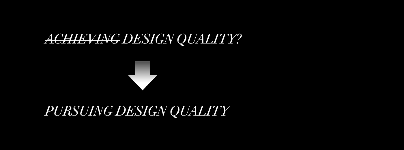
Achieving design quality? How does one achieve design quality? Quality isn't a finite thing.
And if you ask, if you, maybe if I stand up, I hear a ringing. Sorry.
Can you, can y'all hear the ringing, or is that just me? Okay, cool.
I'm gonna keep, huh? Sorry? Oh, okay, great.
Alright.
If you ask a few different people, what quality means to them, you will get widely varied answers, so is it even worth it? that's why I didn't call this talk Achieving Quality, it's called Pursuing Quality.
For me, design quality is a standard of a designed experience, usually measured against other designs.
It's a degree of excellence of a design, not just in how something looks, but also in how it functions.
And we can find good design in everyday objects and experiences. It can be as simple as a really good office chair, or as complex as an operating system.
Design quality is what, design quality is what makes these experiences great. So to me, design quality is not a luxury, it's essential. And we should all be striving to pursue design quality in our work. Because it has an enormous impact on people. And people rely on designed experiences every day to make their work or their lives easier, more enjoyable.
So, depending on what this designed experience is that you're working on, actively working towards quality can impact improved usability, increase user satisfaction, reduce time and effort, not just internally as designers and developers, but also externally with the users using your stuff. Brand perception, there's so many things that it can help and it can be tailored to what it is that you're working on.
Another reason that I say pursuing design quality is that the work is a continuous practice, much like design systems.
There's always going to be new challenges to face, there's gonna be new ways to improve the experience, and to me that is a big part of design systems. And to ignore that makes me wonder why you would be doing design systems in the first place.
maybe you just really, love designing buttons, and you're on your 500th button by now, and if that's you, do you.
But for me, as I like to say, design systems are for people, and that's not just who we work with, but also the end users. so I wanted to share a few things that you can do, to make the pursuit of design quality, a part of your process.
So the ultimate thing that you can do is to create a culture of quality in your organization.
And that means that everyone is aware of the importance and is working to achieve it.
And one way to do this is to make design quality a part of your product development process.
And by having design quality as one of your key objectives, you're reminding everyone that it's important.
you would create a document of your criteria, and when I say document, I don't necessarily mean like a 300 page book, it really can just be 3 to 5 slides, it can be a poster, just something really memorable and short, and you can use that as a guide for your team to measure success. If you have design principles or experience principles, then you can derive your criteria from those.
for example, at Salesforce, we had four design principles that we used to guide our decisions.
The first one is clarity, and I will let you know my conference was called Clarity before Salesforce had these principles, but I think it was just ingrained in a lot of our minds, and so it just was a nice coincidence. but, yeah, so clarity is about eliminating ambiguity, enabling people to see, understand, and act with confidence.
Efficiency, streamline and optimize workflows, intelligently anticipate needs to help people work better, smarter, faster. Consistency, create familiarity and strengthen intuition by applying the same solution to the same problem.
And finally, beauty, demonstrate respect for people's time and attention through thoughtful and elegant craft.
Now, these principles are in a very specific order, and this was something that was important to the way we worked at Salesforce. Anytime we had a list of anything, it was always in a priority order. And that way, you can actually use it as an actionable tool to guide your design decisions.
And maybe you're having a debate, we can't do this because it's going to break consistency.
But actually doing this thing might actually improve clarity or efficiency. Then that direction would actually win.
And that's how you can use principles as a tool. So at Asana, I managed designers focus on design systems, accessibility, visual design, and mobile foundations.
And the director I was reporting to asked me to come up with the criteria for design quality at Asana.
And we would often use the word, or the term quality bar, like in critiques. Oh, this doesn't meet the quality bar.
But we didn't actually have anything to point to that provided a clear definition for what this meant.
And that's what I set out to do.
I started out by looking at Asana's experience principles. And I can't share all five of them because of NDA. but I was given permission from Legal to share two of the principles with you. so one of those is provide value for every offering. We deliver a high quality experience at every tier and a clear understanding of our paid feature set.
And to lead with an opinion, have a strong viewpoint, guide our customers to make them more successful in the long run.
those two principles, along with the secret other three, um, give a sense of what is important to Asana and their mission and vision. So I spent time researching various quality definitions and rubrics that I could find online.
Not a lot of people put this stuff online, because it's usually very, usually things are under NDA or, companies don't want to share their trade secrets. But what I could find online, I would brainstorm and look at, terms and definitions, and figure out, like, how this could apply to the way Asana's objectives were.
And then I ran them by lots of people, PMs, design leaders, engineering partners, user research, data science, and so on.
And I received a lot of input, and sometimes it was conflicting opinions because as I mentioned, everyone has a different view of design quality, and so a lot of people had different opinions or expectations for what this work would entail.
and so as you can imagine, we are just looking at mountains and mountains of feedback from people.
Like, how do you process all of that? fortunately, Asana actually has a feedback framework, which I use. it's called Do Try Consider.
And do basically says, this is mandatory.
We can't move forward without it.
But do should actually be rarely used.
everything can't be a do.
The next one is TRY, which is explore this, see if it works, maybe try some alternative options.
And then CONSIDER is to like, think about it, but you're not really required to act on it, but just consider it.
if you want to read more about it, they have an article on Medium, I made a bitly for it, it's bit.ly/dotryconsider.
So, using that framework and iterating through the feedback, I finally landed on a criteria that the entire organization could align on. And I was given permission to share this with you, and so I'm glad, because I wrote them.
And here they are.
The first category in this criteria is inclusive. To build toward our mission of enabling all the world's teams to work together effortlessly, we need to account for the needs of all people. We want our design to be inclusive of all people using our products. I'm not going to read all of the paragraphs for these, but I can share the slides later and you can read them, in full, but yeah, this was, this for me was like number one critical.
The second one is intuitive.
When our customers feel confident in their actions and next steps and decisions they make when using our products, they are better able to achieve their goals. The third category is Reliable.
We protect flow by building a seamless product that helps customers perform tasks quickly and efficiently, or easily, rather. And the fourth is Cohesive.
We create a familiar experience by having strong consistency standards that enable us to deliver innovative and creative products. I chose cohesive because I didn't want to over index on, uniformity, and instead, have something that feels aligned, but sometimes allow for change in the certain context where it was needed.
the fifth category was delightful.
delight is when a customer feels empowered, motivated, and rewarded for using a product.
and we wanted our customers to feel satisfied. they're in this product all day doing work in Asana, You don't want to be cumbersome and feeling, tedious.
again, coming from Salesforce, I had the whole priority order thing in mind as I wrote these out.
So this is the order, inclusive, intuitive, reliable, cohesive, and delightful.
now, obviously, this is just, the first step, it doesn't mean everything's fixed. it's not all overnight, we solved quality.
This is gonna be more of, this is our intention, this is where we're headed. But now we had a vocabulary, and we can use this vocabulary in design reviews, critiques, and so on.
So then, I showed the mapping of the quality criteria to the experience principles.
for example, provide value for every offering. I felt all the categories mapped towards that. whereas something like lead with an opinion, I felt were more closely mapped towards inclusive and intuitive.
But this exercise was really an effort to ensure that we were aligning our purpose with this effort.
now with the criteria in place.
Creating a design feedback process, if you don't already have one. maybe you want to model after the do try consider framework that Asana has, or maybe you have your own.
but the important thing is to get people to make decisions quickly and have everyone speaking the same language.
I found that a helpful self serve way to apply criteria from day to day are through checklists.
And, this is just to help make sure people are, hitting that criteria. And there are a lot of ways you can do this. you can do it by phase, you can do it by deliverable, you can even design a checklist that helps you evaluate how well your product design meets the five, in our case, five design quality criteria.
But the important thing to remember is that this is not a substitute for a design review, a design critique.
it's just a tool to help you and guide you through the process. and there sometimes is a perception of heavy process when you introduce a checklist.
And so you want to make sure that this checklist isn't overwhelming, it's feasible, and it's something that's integrated with people's already existing workflow.
if they're working in Figma, it can live in Figma. If they're working in GitHub, it can be in GitHub as like a, commit check or something like that.
you just really want to make it so integrated in the process that it doesn't feel like it's really, this heavy extra step. And then goals and metrics.
you can track the progress, how you're doing. this will help you identify areas where you can improve. I think, a few things you can think about, not just from, hitting all the things in your checklist, but it's are my users happy with this? Are they able to complete their tasks easily and, efficiently? a couple examples of that, if you're looking for more, qualitative data, you might do surveys, and the goal of that would be to increase customer satisfaction with the design of our product.
Whereas if you're looking for more quantitative data, it could be something like reduced number of accessibility related issues reported in the audits. Note that sometimes that when you track these things, it can be a moving target. So for example, your accessibility compliance criteria will probably get updated as the accessibility standards evolve. And so it's important to view this quality cri, criteria as milestones rather than a single target.
So once you have like your goals and metrics, you might even create a rubric, to, measure against.
So that would usually mean you have a scale of one to five. you might have specific tests in place to help determine that score. And then, of course, you want to test early and often, and this could be a combination of automated tools as well as people driven UX testing. Both are essential.
I probably shouldn't have to tell you this because you're here, but have a design systems practice.
and yes, I do say practice, it is a practice. Design systems are an excellent way to further design quality, and it is more than just tools and artifacts, it's, it could be a lot more than that, like the people and collaboration side.
I think that's why I just emphasize all the time that it is a practice, it's not just like a style guide website, it's more than that. as we all know, design systems do help solve problems. you've got things like inconsistencies, duplication, The, basically the idea is that if everyone's coming together using the same building blocks, your product will look and feel cohesive.
and there is this perception when you, ask someone, what do they think of when they hear design systems? They're probably going to refer to one of these like big, the big guys. You've got like material design at Google and Lightning, Carbon, Polaris, and more. but, a little cheeky thing I like to say is there is no design system. And you're probably like, wait, what? Okay, why am I here then? No, but what I mean by that is to not just think about it as this one time thing that you're making, like the artifact.
and I think about these, beautiful websites that we make and produce, and I love looking at them, I love working on them, but as our design and engineering tools get closer and closer together, and with, no and low code tooling also making things open and attainable, and of course, this, the one time I'll mention AI, but that's looming ahead of us too, it does make me wonder, like, how much time we're allocating to building this a beautiful design system website, rather than focusing on what that website is representing. So I'm looking forward to a future where our tools suggest things like better, better ways of designing for accessibility, localization, performance, and so on, baked in the tools that we're already using. So that's just a thought, had to throw that in there. Obviously, I'm a big advocate for design tokens. I could give a whole talk on that alone, but I'm not going to do that. But the gist of it being that design tokens do help minimize friction and confusion around communicating about design through a shared vocabulary that can be transformed to all the platforms and things needed at scale. And more importantly, as we know, it does save time with tedious redline specs, and, the back and forth process of a handoff.
I think back to Salesforce, where before we implemented tokens, we did an audit, and we realized we had 106 unique text colors, and we had 120 unique background colors, and we had 73 unique font sizes, some of which end up looking like the same font size, but were just a different type of unit. So So, we had our work cut out for us.
Design systems were our answer.
but I love things like design tokens and then, these new plugins and tools that are coming about that are trying to bridge that gap. and I feel like, we're moving towards where we just remove the gap altogether. rather than just bridging, and I think that's pretty exciting. I once heard Peter Michaels Allen, who's not here today, unfortunately, but he referred to design tokens as a Rosetta Stone, and I really loved that, because I thought it was a great way to illustrate that design tokens are, a vocabulary that's shared.
I went to a talk recently, last week I was in Sydney at a conference, And I saw Adekunle Oduye, who's, he's been at Clarity before. He was giving a talk about the rise of design technologists, and he mentioned the concept of a handoff versus a handshake.
And I really liked that framing.
So I was like, I wanna borrow that But, yeah, I, love the idea of rather than a passing off, it's like a working together.
And I'm really keen to see our design tools move away from just bridging gaps and actually closing them.
let's remove the gap.
Let's work more closely and bake these features into the tools we're using already.
Accessibility, provide contextual guidance if and when you need it. otherwise get out of the way.
I want to see more of this type of stuff.
a phrase that we used a lot at Salesforce was we wanted to make it easy to do the right thing and hard to do the wrong thing. and so I think this is an approach that we can apply to design quality and design systems.
creating a culture of quality is essential for producing great experiences. And by establishing a design criteria and having a feedback process, using actual tools like checklists.
You can create a system where quality is the norm, and by having more inclusive practices.
I ask, what are some steps that you will take to create a culture of quality in your organization? As I mentioned, I'm a design systems advocate. I've been implementing them for a long time, from my internship at Odin in 2004, all the way to Google, where most recently, until I was laid off earlier this year, womp.
I enjoy helping designers and developers and product practitioners in working together to create high quality experiences for their users, keyword their quality, hence this talk.
And I need a job, so if you're hiring, and I can still live here in SF, let's talk. Thank you.
Nathan Curtis: Thanks, Jina.
At this point, we are, after each talk, we're going to have a short conversation with myself and each of the speakers, where I'll ask a number of questions. As we get set up, this is going to be a small set up, interlude as, we prepare for that.
I try to focus the questions to channel things that you might ask as well. and so I value feedback.
If you find me not asking the right questions, let me know. But these should take about five to ten minutes, and then after each of the Q& A sessions, we'll have a short break.
And then I think we're probably going to get on pace such that each of the subsequent talks, I think Jules is next at 10:30, we'll probably start at 10:30, maybe a little bit more delayed, but we'll get on pace with those in general. Sound good, Jina? Yeah.
Alright.
Thanks for your talk.
I have lots of questions.
One of them is, I'm not really a principles guy, and I've written about this, like I find it very hard to invoke principles in a constructive way to facilitate decisions, but I always loved Salesforce's principles. and you listed them in order.
They clearly have a precedence.
I always favored the one at the end, beauty, because it talked about craft, and I like to think of ourselves as craftspeople. So that was always my favorite, but were, there any that were invoked the most, or that you have as a personal favorite? Jina Anne: Clarity, obviously.
Yeah, I just, like I feel like sometimes people get stuck on consistency and might put that as number one in design systems, but, like, when you're trying to always think about the end user, for me, clarity, I think, solves a lot of, it's just, if somebody knows what they're doing and it's very easy to get that just by, scanning something without having to spend a lot of time, trying to decipher it, then, that's a huge goal that you've, achieved.
So I've always been drawn to Clarity as, that, and obviously I can't apply that to every company I work for, so you know, they were a little different at Asana, Intuitive was still closely connected to that, Nathan Curtis: That's great.
I really hooked into the Asana principles that you wrote, and there was a phrase Opinionated by default, flexible under the hood, and that really speaks to the way that design systems empower other teams to achieve and control their own destiny. But how do you measure or even see or have visibility into how others are making those flexible choices and how they improve or degrade quality? Did you, do you have an example from Asana where you saw flexibility that you needed to corral or you actually needed to push them to express more? Jina Anne: I'm trying to think of an explicit example. can you ask the question? Did Nathan Curtis: you see, in terms of flexible under the hood, did you see or how do you encourage us all to be able to see how other people are making those flexible choices to understand whether they're expressing themselves enough or going too far? Jina Anne: I think, One example that maybe comes to mind is really around like theming and customization.
It's like that delicate balance of giving people the control to customize their experience, but making sure that they're not making decisions that would actually hamper the experience, especially when it came to things like color contrast or even like legibility.
And so it's I'm not sure if this is directly answering your question, but, that was something that we were always trying to have a balance with, giving, enough flexibility that somebody felt like it was theirs, um, but, still having that opinion of oh, we want to make sure they can actually look at it and read it and understand it, and so we have to give some constraints there. Nathan Curtis: Yeah, so that goes into actually the next question I have where With all this configurable systems, stuff that we can do with properties and other aspects of how we deliver our pieces, we still rely upon guidelines to express the boundaries of what you should do or what you shouldn't do or don't do. And immediately when you showed that, do try consider, that invoked to me the, oh, I've always, or I initially was so binary in thinking do and don't, and then when I think material started to inject a yellow caution, I was like, Ooh, there can be more than two choices here.
But try, consider, those are great empowering words. How should that philosophy influence the way we write things like design guidelines? Jina Anne: yeah, I know I, I, forgot where I saw or heard this, but I've often heard, you shouldn't.
Of course, I'm saying shouldn't right now, but you shouldn't, yeah, like saying, you should do this.
It's using that language, it just doesn't really clearly communicate whether this is actually something you never can do, or if it's like, we're just hoping you don't do this.
so just being very, clear when something is a guidance versus absolutely mandatory, critical.
maybe in some cases it is more of a guideline, and that can be okay, but if something is something, that's going to hamper accessibility, or anything like that, you need to be very stern and clear with the language, so it's not maybe consider this.
Nathan Curtis: Yeah, another word that I've appreciated, a distinction, is between never, which you should have few of those, and avoid. Which still provides the ability for the person to make their own judgment and choice there.
so checklists.
I am guilty as charged.
There are people I've worked with in the audience that know I love a long checklist.
but in our pursuit of quality, there's so many things that we could check. And you talked about making those checklists not overwhelming. Do you have a practical suggestion or maybe a before and after experience that made checklists not overwhelming? Like things that you did with your checklists so that they weren't a long list of stuff we have to do? Jina Anne: I hate to use that very, overused phrase at Clarity, which is, it depends, but it depends.
I find, sometimes you just have to have a long checklist, but if you can, make them things that are, like, if it's in a checklist, it should be, like, quick to do.
If it's not quick to do, it should be a project. And that's different.
And so it's, making sure that these things really are just, quick tasks that you can really do, and it won't, completely, put everything on hold, because, again, that's, a whole project then.
sometimes you can, automate some things, and, especially if you're using tools that have third party integrations or, whatever, get a workflow going, to do some of those things for you, but, yeah, there are certain things that really need a human to do, so it's like Again, I just try to keep them tight to the work you're doing.
I don't need to see the entire checklist for all the things if I'm only working on this one thing.
And so if you can, tailor the checklist to that actual thing that you're doing, I think that's a good way to do it.
I also like when tools, Have things that it wants you to do and it won't let you move forward.
Like I, so I use Webflow for the Clarity website. And if I have some image that I forgot to alt text or if I have a color that, and I go to publish, it's whoa, hey.
And I love that.
I'm like, good.
I'm glad it's doing that.
Nathan Curtis: It catches your nevers.
Never publish without an alt text.
Exactly.
Yeah.
That's great.
If, you were consulting with a design system team and they say, asked you, what are the three best tools to automate checking design quality? What would, without any other qualifications, or it depends, what would rattle off your tongue? Should we use Webflow? what, tools should we use? Jina Anne: from a code side of things, I, do think a lot of the stuff with GitHub, actions can help.
I, like linting, but I like when I can get, lint tools to automatically fix things.
I have a lot of, I use VS Code, and so I have these things that like will automatically format the code I'm writing in, the way that the linter is, defining. Nathan Curtis: Do you have, is there a specific tool name or package that you like? Jina Anne: yeah, I like StyleLint, and, ESLint, yeah, I even have a YAMLint, MarkdownLint, I've got all the lints.
How about for designers? But yeah, so that's a, that one, I admit, I actually don't spend a lot of time in design tools.
I write my, I write CSS and that's my design tool. unless I'm doing something for mobile, then that might change things. so I'm probably not the best person to answer that question, but I know there's a lot of cool plugins out there.
so there's probably some sort of design tool. Oh, Stark.
A sponsor of Clarity, Stark.
What does Stark do? So Stark, it integrates with their design tools to help call out like accessibility issues.
And definitely check that out.
Nathan Curtis: Awesome.
So last question.
I think a lot about process and work with teams on process and oftentimes across all the steps we do and all the checklists we have in each of those steps. It becomes quite daunting.
It becomes difficult to train people, even on the design system team. But I also see this trend of people outside the design system team increasingly making their own stuff.
And so it's almost there's this unintended consequence of higher levels of quality that it ends up creating a gate where people don't want to go through that gate because it's too intimidating.
They, decline being a maker.
And so how do you deal with that unintended consequence and still bring people in that are unacclimated to those kinds of tools, but still feel confident to be a maker.
Yeah.
Jina Anne: I definitely think, you want to encourage people to want to integrate these practices in their practice.
and so if you can do it in an informative, educational way versus feeling like they got a slap on the wrist kind of thing, helps. And then I also think, doing, if your organization does, office hours or, at Salesforce we called it an advisory board, that can be really helpful because you can actually talk through it with people, whether it's a, simple problem and you're just just getting into design systems or if it's more complex and digging in the code, whatever level that they're at, you're able to, work with them rather than feeling like you're some, ominous, board of government, somewhere that they have to, listen to, making it feel like more of a partnership and collaboration. And I really do think, just working one on one with people goes a much Further away, like you, cause then those people, once they've got it, then they end up in turn doing it with other people.
And it just grows and spreads from there.
Nathan Curtis: Yeah, I'll plus one that, a hundred percent. So that's great.
Everybody, please help me thank Jina for her talk on pursuing design quality.
Design quality is essential to creating an excellent product user experience. It can be difficult to agree on what design quality means and how to achieve it, but with a design quality criteria in place, we can hold ourselves accountable and strive for excellence. In this session, Jina will share why it’s important to create a design quality criteria and give an example from their recent work. They’ll also share some insights into creating one so you can use this in your own organization!
Keypoints by Amy Lee–find the original article here.
The pursuit of design quality
Design evolves as the product and business needs change, so the pursuit of design quality never ends. Instead, we should focus on creating quality criteria.
A set of principles with an order of importance is a powerful decision-making tool. At Salesforce, Jina’s team adopted this order:

In this example, Clarity is more important than Consistency. If you have two competing design choices, the more clear one should be considered over the other, even if it reduces consistency.
Asana’s design criteria have echoes of this as well:
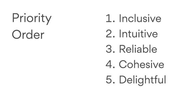
Understanding what’s vital allows individuals and teams to make creative solutions and while adhering to experience principles.
My commentary: there is no standard of “common sense”; we must write down what makes our user experiences better. Setting a hierarchy of what principles are more important than others removes arguments. Then, the team can spend their energy on improving the product.
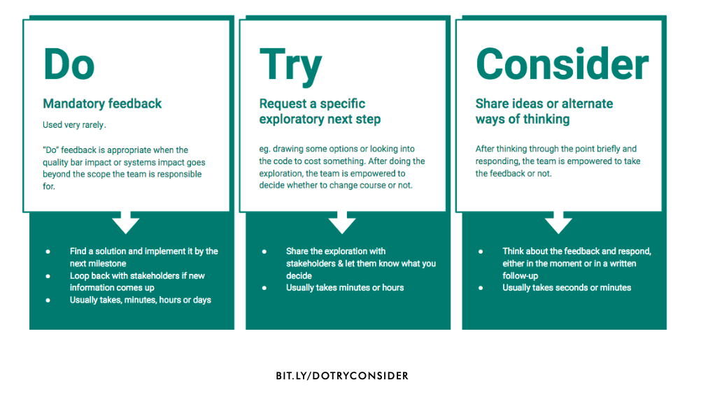
Do/Try/Consider feedback framework
There are a few frameworks when giving feedback, such as:
- “I Like, I Wish, I Wonder” from Stanford d.school
- “Rose, Thorn, Bud” from Boy Scouts of America
- “Plus, Delta”
At Asana, they use the “Do, Try, Consider” framework:
- Do: Mandatory feedback. (Used very rarely.) Find a solution and implement it by the next milestone.
- Try: Request a specific exploratory next step. Research requested and the results are discussed to create the next set of work.
- Consider: Share ideas or alternate ways of thinking. The team is given optional feedback.
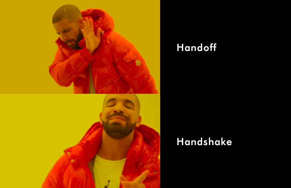
A handshake, not a handoff
There are several ways to improve the quality of the design transfer from the product design stage to the engineering implementation stage. Even with a design system, relying on design tokens, documentation, and tools is not enough. Designers and engineers must continue to speak with each other. Testing the product and communicating results improves quality. The organization rallies around shared goals such as “increase customer satisfaction” and “reduce [the] number of accessibility-related issues reported in the audit.”
My commentary: I love this “handshake” because it implies the two people meet to transfer the work. The two people can clarify the details, highlight new things, and air concerns. In practice, a feature team can create a Slack channel thread where the engineer walks through the experience with the marketer and designer. Secondly, when organizations rally around common goals, it becomes less about the individual roles and more about the team’s success.
