Your Face Here
(techno music) - All right.
So, I'm Jennifer Hom.
I'm the illustration manager for product at AirBnB. And I wanna talk to you a little bit about the development of the illustration system at AirBnB .
I don't necessarily have any lessons for you, but this just the journey that I went down. So, I'll walk you a little bit through the history of our identity first.
AirBnB had a pretty fly-by-night reputation in the beginning because it was literally a way for our founders to make rent in San Francisco for the next month. So, you can see the logo design change over time, where it was like, pretty lighthearted.
And then it went through, what I like to call a sticker phase.
And then, also, what I like to call the laundromat logo phase.
I'm sure that they've heard that said to them before, and I hope no one repeats that to them after this session. And 2014, we started to become more buttoned up, more clean, more Silicone Valley looking.
But the sanserif and logo mark that we call the bailo. So, illustration at AirBnB was never really considered up until about a year ago.
Before I came onboard, illustration was just addressed as add needed project.
For these first illustrations, the company hired a freelance illustrator to just come in and do some images one executive's deck presentation. And because there was no one in house to decide anything, about an illustration system, the company just adopted these as their style. After that, another designer came onboard full-time. She was a junior designer, and she happened to illustrate. She just brought in her own personal style. And it looks nothing like the previous style at all. It's all filled, it's disembodied floating heads, it's very playful.
After her, another junior designer was brought onboard. And she made an attempt to merge the previous two styles. This is the first time anyone at AirBnB had tried to take, kind of, a half step back, and examine the company and try to achieve some kind of consistency with the rest of the brand.
Here are the icons that existed when I first came in. They're all stroke based.
And the reason why they are using these grey lines, is because it was a nod to that logo mark that I talked about before, that bailo.
So, when I was hired as the first full-time illustrator proferred, I was hired as an illustration manager.
Which means that I just answer to everybody else who wants an image for their project.
So, that was fun.
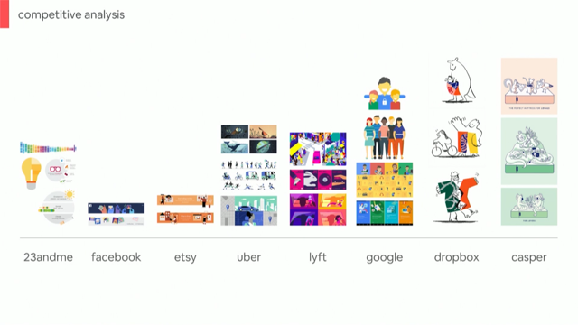
But they wanted me to come in and re-do their style so that it was actually considered for the brand as a whole, and not just treated as something that was there to put out fires for someone's presentation. So, I decide to look at other companies within our peer group.
Other tech companies.
And the reason why I picked these, is because travel companies don't really use illustration, but these companies do.
And they have about the same user base as AirBnB. And they're all operating under the tech sphere. So, I'm gonna start from right to left because I just decided to do that.
Casper is a mattress company.
They depict interaction between quote, unquote "humans" as animals who are having parties on mattresses in a non-sexual way.
(audience laughing) Dropbox, has IKEA people, with the occasional kangaroo. And I didn't plan that.
That kangaroo was already here.
Google, has literally the same cookie-cutter human form that are sometimes darker than other cookie-cutter human forms.
Lyft has mostly Caucasian people, with the occasional magenta person.
(audience laughing) Uber, and because I was there while they were doing this style in particular, avoids human diversity all together, by making everyone grey scale. Similarly, Etsy has the same philosophy, except they have monochromatic people in orange, instead of grey.
Facebook does what I like to call fruit-loop people, which is like an omage to diversity, in that people are red, green, blue, purple, orange, anything but an actual skin colour.
Which is like nod to diversity, but it's very, kind of like a round-about.
And 23andMe, arguably the most human centred company of all of these, does not show people at all, because they're already showing DNA.
But I will not speak ill of them, since they have my DNA, and I don't want them using it against me.
(audience laughing) Hey, so our future.
When I was talking to other employees at AirBnB, I wanted to get a sense of what they liked, and didn't like about our current, then current illustration style.
And from those conversations, I formed four principles. The first one, is that it needs to be scalable, because it's illustration and tech.
You have to accommodate different platforms, different devices, has to be in ads, in product, as icons, as heroes.
So, it has to be scalable.
This is a technical part.
It has to live in different places, and size up, size down. Since we're a global company, everything that we do has to translate globally.
So, out metaphors cannot be US-centric, and cannot be China-centric.
Everything that we say, if it's a metaphor, it has to scale across cultures.
It also has to be grounded.
So, if you remember the early illustrations were pretty cartoony.
They're pretty free-hand and very loopy.
As AirBnB moves to the future, we're going into higher tiers of curation and professionalism, I hope.
So, the illustrations have to reflect to this growth in our attitude.
The illustrations also always live within our design languid system.
So, it always appears on a page with design, because this is not just a poster that we're illustrating. It has to go with the rest of the flow.
So they have to be lightweight, because the design languid system has a lot of white space, a lot of breathing room, and the illustration cannot be so heavy that it takes all the attention away from the rest of the page. And finally, it has to be diverse.
And this is the thing that I hinged most of time on while I was working on this illustration style. But I'll do a deeper dive on that later.
So, before I set out to draw anything, I had to make sure that I had the right tools to work with. And one of the biggest tools for illustration is colour. So, this is the brand colours that I was given by the designers when I came into the company. And it was great, because it has a range of values, and has a range of temperatures.
There are cool temperatures and warm temperatures, which is awesome.
At Uber, all I had was like grey and blue, it was a nightmare.
So, I was like, great.
I get to work with a rainbow.
So, I had to come up with the lighting philosophy, because those weren't enough values for me to actually build illustrations.
As you can see, these are all very close in value. But I needed light versions and dark versions of all these colours.
So, the colour philosophy that I was working off of, is that when a colour becomes lighter, it doesn't just scale across the value spectrum, it also scales across the temperature spectrum. So, if something is lighter it also is warmer. If something is darker is also is cooler.
This gives a sense of environment, and also makes the palette look more vibrant in general. When you do not scale the temperature, you just get a value shift, and ends up looking kind of dead, or like a hospital.
So, I wanted to make sure that AirBnB felt more like a sunrise or sunset, depending on your preference, and not like the inside of a sad, dead hospital. So, this is the palette that I came up with for the illustration style, but there was something that was missing in here, that I definitely needed. And that was to incorporate the the fourth pillar, which was diversity.
It is impossible to represent diversity when you don't have skin tones.
So, I augmented it with something that I call the skin and hair palette, which is, the best name I could come up with, because the alternative was flesh and hair palette, and that was disgusting.
(audience laughing) So, I would hate to say, flesh, every time I talked about this palette, so skin and hair.
OK.
So, illustration is not just one representation of how an image appears.
It's actually a sliding scale.
So, if you think about all the illustrations that appears in any product, there are many different sizes. There are icons that are very small.
They get down to like, 16 by 16.
And there are full hero illustrations, that take up the entire width, or the entire height of a page.
And sense these are so drastically different, illustration systems have to scale across all these different sizes.
So, I started with the small spot illustrations, which are technically icons.
And it was a nightmare when I looked at some of our web page because we would see things like this, where the stroke weights would vary greatly across different images. And it was clear that these small icons were just scaled up for like, 100 by 100, and not redrawn. And the stroke weights are all older place. And it was a nightmare, it made me sad.
So, when I approached scaling the icon system up to spot illustrations, I'd make sure that every concept has at least three different representations of that one concept. So that you keep your stroke weight consistent, you just add more density for the larger canvas sizes, so looks intentional, when you have something that appears at 100 by 100.
Because if you scale up the 24 by 24, it's gonna look like that.
OK.
Here's some befores and afters, I hope you can tell which is the before, and which is the after.
If not, I haven't done my job.
But the left is the before.
And as you can see, the most obvious change is the use of colour. Instead of focusing the colour on the colour of this woman's sweater, or the colour of her device, I flipped it so that the colour is emphasising the person herself, because we are in the unique position of the product that we sell is human interaction across cultures, across continents, across timezone, whatever. So, we wanna make sure that we're not just a tech company about devices, but we're a company about human interaction. So, I wanted to make the focus on the human instead of the devices, or her sweater.
So, I flipped the value.
I also made sure that all the ways that these are drawn are more grounded in geometry and regular angles. They just felt more sophisticated.
So, the that hands are drawn, changed pretty greatly. It's pretty free form on the left side.
It's incomplete.
It's loopy.
It's almost like a blind contour drawing by Picasa, but like, super clean and in vector.
And on the right, it's more like a hand model. OK.
So, scaling up, we go to be a little bit more complex, and say more complex things with our illustrations. Medium and large spot illustrations appear pretty frequently throughout the product.
And they're usually to describe a little bit more complex things like, this is how you sign up for AirBnB. Or, this what our community is, and what you can expect from our community. So, I did some exploration around what these could possibly look like.
And, as you can see, my several passes were this like, very strong aversion to talking about diversity directly. Because I was doing the jello coloured people, that are red and purple.
And I took this to my manager, and he's like, you are not saying what you need to say about differences in people, you have to re-do this.
I was like, great, OK.
I felt ashamed.
And then I went back, (laughs) and then I did a few more explorations, where I actually used real skin tone, but I kept doing things that I knew were wrong on purpose. So, one of the lessons that I learned when exploring styles, is that you need to do something that you think is right, and then you need to definitely need to things that you know are wrong, just so you can prove to other people that you're thinking about it. And you prove to yourself that you're thinking about the wrong things, as well as the right things. You can always dial it back.
And then, you have horrible nightmare things to show for it. Like this middle row, all the way to the right is what like to call the 1990's Lipton Tea Bag ad, which is just like, this really uncanny, terrible collage of like, people's heads cut off from their bodies. So, I quickly rejected that.
And I even tried like, aliens on the bottom right. And that was clearly not AirBnB, but I did it anyway for fun.
But I ended up here.
So, for this illustration, it kind of leverages a few different principles.
First, there's diversity.
These two people are very different from each other. It's also light weight, in that the things that are the narrative focus of the illustration receive the fill, and it draws your attention there, so that you know this is what you're supposed to focus on. It's about this woman handing the keys off to this man. So, the stroke comes into play, for contextualization. So, you need to know that she's a host; therefore, there's a house in outline behind her. And you need to know that he is a guest; therefore, there's a suitcase in outline next to him. But you never say more than what is needed, and it doesn't suck all the attention away from the rest of the content on the page.
When I was examining how to depict people closer up in more of like a personal expression, I did the same exercise.
Like jello people, who are like blue, and green, and some people with just blue and green hair. I don't know why it dit it.
I didn't make any sense.
But then I ended up here.
Which is still along the same veins as the previous exploration.
And the weight of the illustration is on the people themselves.
Their skin, their hair, and I didn't want to focus on his jacket, or her sleeve, so those receive a stroke treatment.
But, as I was moving forward, I knew that diversity was really important. I didn't have a method to follow in order to address this. But it kind of became clear to me when a few of my co-workers, who happened to be African-American, came up to me completely unsolicited.
I wasn't even asking for compliments that day. I wasn't like saying, people tell me how great this is. They just came up to me and they said, hey, we really love your representation of this woman in particular.
And I was like, oh, that's cool, thanks.
And they were like, no, it's not because she's black, it's because of the way she is shaped.
She is not just another skinny, commercially acceptable, female form.
They said that they love that she is a curvy woman of colour. And I didn't even think about it when I was drawing it. But I was like, you're right.
And it reminded me of this podcast that I was listening to. And I live in Silicone Valley.
So, we all listen to podcasts to feel enlightened. There was this one episode about this famous advertiser from New York, I believe.
And he was the first person to tailor the advertising community to a black audience. What he had said about advertising to black audiences, was, "Black people are not dark-skinned white people." And I was like, that is genius.
And it's sad, in a way, because it's so obvious. You shouldn't have to say this.
It's not just someone who is like, sorry Google, but it's not someone who's just the same body, in a different colour.
It's everything about a person that make them authentically their identity. So, it's the way they're shaped, it's what they're wearing, it's their gesture, it's maybe the things around them, if they're in a home setting, it's everything. And in order to achieve authentic representation of different kinds of people, you have to consider the whole person.
And you have to consider not just the colour swatches that you're picking.
So, the lesson here was to get reference for every single person that ever appears in an illustration for AirBnB. Which is really important because illustrators tend to draw on the one face that they see most in their entire lives. And in my case, it's this face.
And I would be horrified to see all of AirBnB illustrations look exactly like me.
So what we do, is we get reference from all over our environments.
I work with a few freelancers, so I tell them, I wanna see your mother in this. (laughs) I wanna see your best friend.
Some of these are people who work at AirBnB, some of these people are my friends.
I threatened to put one of my co-workers faces in here, just for kicks so he could feel horrified today. But, yeah.
We wanna make that we're representing across all demographics, ages, gender, body type, everything. Because our philosophy at AirBnB, is Belong anywhere. And by extension, that means everyone belongs. So, here is a before and after of the early representation of a host and a guest.
And here on the right, is a refreshed version, and just like four of many different versions that you can make.
Because you can make billions and billions of these. And true to finding reference.
Here are my references.
So, top right, is like my favourite K-pop star, that's Jessica Williams, next to him.
There's Idris Elba on the bottom right. (laughs) The top right left is my friend's mother.
She has no idea she's in this presentation. But I thank her for donating her face to me. So, yeah.
Here are (laughs) other representations of people in the illustration for AirBnB.
To the left, this one came from one of my freelancers in the Philippines.
She likes Black Panther, so she referenced, what's her name? Dani Gurira from the Black Panther movie.
And she also likes Steven Yeun, from the Walking Dead. 'Cause that's him on the right.
(audience laughing) OK.
On the left is Fred Korematsu, who happens to be a human rights activist from San Francisco, California. But most importantly about this one, is that when we say diversity, and representation, we really mean it.
And this is something that I didn't even think about when I came to AirBnB and started this philosophy. I had a conversation with one of my co-workers, Michael Sui, who is the lead designer for accessibility design.
He said, hey, 15% of the world's population lives with a disability.
And everyone in the world has the potential to join a disabled group, especially with age. It could be like glasses, or your hearing impaired, or whatever.
So, I was like, oh, yeah, you're right.
I should probably think about that too.
So, he and I started doing some research and talking to a bunch of external groups, as well as internal groups of people, who live with disabilities, to give us references that they think represent them, and they think are respectful to their communities. So, there are some groups that are just visual, easy to identify disabilities, like a prosthetic leg. It's very visual, like this woman here.
There are things that are more subtle, like the deaf or hard of hearing community. And something that I learned with this cochlear implant, is that, that is one way to depict someone with a hearing disability.
But even within their group, they do not necessarily agree on how they should be depicted.
Because some people don't use cochlear implants, some people just prefer to show the use of sign language, which is fascinating, because that would involve animation at that point. And it's a language, so that would need to localise and scale across cultures.
So, that is actually my team's next project, is to figure out how to do a depiction of sign language, that could apply to China as much as it does to America, as much as it does to Germany.
Oh, yeah, that's Charles Gabino up on top.
(audience laughing) (Jennifer laughs) I'm like obsessed with him.
So, that's him.
Similarly, there are...
As we scale to more subtle disabilities, there's neuro diversity.
This is an invisible thing, that it has like, no physical representation. But there are subtle cues that I learned of from the community.
And they were telling me, that some people will carry around...
Oh, this is in particular depicting people with autism. So, they sometimes have large headphones that are noise cancelling, so they could put them on when they need to focus, or take them off when they wanna communicate with other people.
The point here is, that it's still representative of a group, and it's not necessarily overt. This is something that you would only notice, if maybe, you're familiar with it, or if you'd practise the same thing.
So, I think it was really interesting to work with these affinity groups, and really get their take on how they think their community should be represented. This is just a quick snack in the middle, because my co-worker decided that he wanted my deck to be shinier and more interesting, so he put one of these in motion for me.
It's so cute.
OK. (laughs) So, those were all illustrations that appear within products.
They appear within flows, and they are kind of like in your experience. So, here are illustrations are different.
I consider them the cover of a book, rather than the illustrations inside the book. So, these would appear at the top of an email, product marketing, or the top of a landing page. This is an example of an illustration and how the style will scale for something a little bit more complex, that deserves more time and attention from the user, while they're observing it.
So, it's not just information, it's more celebratory. And this is to congratulate you on your first trip with AirBnB as a traveller.
Oh, yeah, that's my former co-worker with the baseball cap. He looks like a child.
This is an illustration that went out for hosts, who just achieved, what we call super host status. Those are the top 5% of host in the AirBnB platform, who are just exceptional with how they treat their guests, how well they take care of their homes, how responsive they are.
So here, we decided to go less literal, and more metaphorical with this idea, that you are nurturing something over a great amount of time and you take care of it, and it blooms into something that is rewarding for you. My generous co-worker, who is also the creator of Laudi. His name is Su Lee.
He put this into motion.
That was mid-motion.
Here we go.
Yeah.
The fun thing about this, was that I got to see how the super host were reacting to receiving this.
And some of them share them on social media, and I was like so delighted to see that they didn't hate it. (audience laughing) Hey.
So, Hero illustrations, again, but this is a more expanded view of our style. So, AirBnB, again, is part of the global community in interaction. So, once in a while we'll have travellers use AirBnB, and they will write a story about their experiences. And we will curate that and highlight it on our website. So, in particular, China has these things called stories. And they have guest voices speaking about their experiences. And we want to be true to the voices of these guests, and bring in quest illustrators.
So, this is an illustration that was done for Chung Du in China.
The artist is Leonard Pang.
He's one of my friends.
So, you can see how the style conflects to expand for a more worldly view.
Here are four illustrations in that series. They were done by different illustrators.
The only restrictions that they had, were a colour palette restriction.
So, they all feel a little coherent.
Cohesive, there we go.
And here are four more illustrations later on in the series. These are artist from China, America, and Japan. And this is what the whole system looks like together. So, as you can see, the small spot illustrations are the most simple because they have to be very direct. They are giving you information, and they are getting our of your way.
As you scale up, they become a little bit more complex, and they're saying more about whatever the content is. It's not just, check your email, it's also, we respect people on AirBnB, and you can trust us.
So, that gets a larger illustration.
And as you scale up even more, it become more celebratory.
And once in a while, we tap into the larger world's community of artist, as we are tapping into the larger community of travellers, and try to bring in guest.
But, seriously, belong anywhere.
Even in China.
So, China has been notoriously difficult for Western tech companies to break into and find success. What we do at AirBnB, is we allow the team in China to operate as they see fit.
We don't dictate to them what we think they should be doing, because, honestly, I've been at two major tech companies that have completely failed in China, while I was working there.
And I thought I was bad luck.
But I think we're doing OK in China right now. So, I had to think about what the illustration style should do for China that is focusing on a Chinese market, that lives in, and works, and travels in China. It's not about anyone else coming into China, it's about people there.
So, I had to address what diversity means within this market.
And me, in my arrogance, just went to Facebook and looked up my Chinese friends.
And I just stalked them for half a day, and pretended that I was working.
But then, I...
That's the first four columns.
You can probably tell.
And then, the right most two columns, those are super hosts that actually work in China. I was also looking at how Chinese tech companies were showing expression within their brands. And while we can't depict everyone, as a squishy dinosaur, with like a little girlfriend.
We can take cues from how they're showing emotion. Which is that all these characters have some kind of augmented symbol next to them. Like, those dancing bunnies and the music notes. Or that, I think it's a duck.
That thing, that says, OK, and has like all these dotted lines around it. So, I thought, oh, simple enough.
I'll just change up my reference material, and I'll add some more expressive lines.
So, I came up with it.
And I thought I was so smart.
I went to the Beijing office, and I said, look at this.
You're gonna be so happy.
And they were polite. (audience laughing)
So, they were like... (laughs) They're like, yeah.
That looks like great.
And then my project manager closed the door of the office, and he said, no really, what do you think? So, they gave me this feedback.
OK, I'll run through it.
So, the first one was reasonable.
These eyes were too red, so they looked like they had rabies.
(audience laughing) The second one, whom actually, is a real friend of mine. I call him hot Michael Jang. (audience laughing)
He was too hot for China.
They were like, this guy is so buff.
He's clearly Chinese-American.
And I was like, oh, dam, you're right.
So, sorry Michael Jang, you're too hot.
The next one is Jing Wei.
She's actually one of my friends from Rizty. Her cheek bones were considered undesirable for a woman of her age.
I was like, oh, OK.
So, I was like, I won't tell Jing that.
Leonard, is actually one of the freelancers, whose work I showed earlier.
He was considered to have an undesirable body type, and they we're like, but we will accept him anyway. I was like, that's very progressive of you. Thank you. (audience laughing)
And my favourite bit of feedback was the top right. That's Shawn.
He had teal coloured strokes going through his hair. And I found out that is a signal, that green near or around a man's head, shows that he's being cheated on by his wife. And I was like, well, he's gay, so that'll never happen. (audience laughing) But that still not a message I wanna accidentally push across AirBnB.
So, these are the changes that I went through. And most of them were simple enough.
But hot Michael Jang had to go.
He's just not, he's not gonna show up anywhere on AirBnB. He's too hot.
Maybe for America he'll be OK, but China, no.
I replaced hot Michael Jang with a guy who actually works in the AirBnB office as a designer, so they can never say that he doesn't fit in, 'cause he's literally critiquing this himself. (audience laughing) OK.
So, that was the first interesting localization effort that I put in for China.
The second one was a little bit more subtle. So, this was to show users...
It was an avatar that was supposed to animate, move its head, open its mouth.
Show users how to take a selfie to verify their identity on AirBnB.
So, I gave them this avatar.
They said, clearly enough.
Like her hair is taking up too much visual weight. It's gonna be distracting, please change it. I gave them two other options.
The first of which, the one in the middle, was based on my hair style.
And I was like, oh, I'm gonna be on AirBnB. And they were like, that hair style is out of date. And I was like, oh, great. (audience laughing)
They were like, she is real unfashionable.
I'm like, OK, that's enough. (laughs) So, they gave me some reference.
And I changed it.
Fine, whatever.
I'm in America, I don't care.
I'm getting judged by your Chinese audience. But it was fine, so I changed it.
And then they got back to me.
They're like, actually just kidding, your hair is fine, you can keep it, just like change the colours a little bit. But this was an interesting exercise, because it wasn't really about the hair, that was like...
OK, I was a little offended.
But it was mostly about their choice in colour. So, the Chinese audience prefers aesthetically lighter hair, and lighter skin.
But, I know I've seen Chinese ads, and the way that the skin is treated, is very, very pale.
And I wanted to stay true to AirBnB's identity, as well as making sure that I am cognizant of their preferences are in China.
So, I kicked the colour swatch to one swatch lighter, that already existed in our palette, because I wanna strike the balance of what do we think is right, and what is going to appeal to them.
I didn't want to prepare a whole nother Chinese skin palette that's like super, super light and airbrushed. So, we ended up here.
So, those are all ways in which we use illustration, that are like the good ways to use it.
But there are also bad requests that we receive. So, here are do's and don'ts.
So, I'll just read this, because I don't have the brain capacity to improvise. So, not everything can be special.
Some moments need to be subtle so the zenith can sing. It's a difference between playing the notes and playing the song.
So, something to remember about this, is that people tend to think that illustration is purely fun.
It's not just fun.
I know that Yee Ying, was giving a speech yesterday, that there is fun in functional, but it also has to be functional.
So, when I receive a lot of requests, a lot of people want things that are way too fun for what it is.
So, this is an example.
The designer wanted a full bleed.
A full poster, showing the globe, and people on fake continents, with an aeroplane flying in the past.
I was like, no, that's way too much.
All you're trying to say, is that we have a respectful community, and we treat each other as human beings.
So, just show people who look different, co-existing. Simple enough.
The next one was, check your email.
They wanted to show and aeroplane, a train, an automobile flying through the sky.
I'm like, no way, (laughs) that's way too much. Because you're just supposed to get the user out of the experience, to get out of the app, and literally check their email.
You don't have to throw them a parade for checking their email. (audience laughing)
So, putting the emphasis on functional over fun here. Because you don't want them to forget what they're supposed to either.
This one is a thorn in my side, because everybody wants a footer illustration. And that is a waste of my time.
Because footer illustrations don't say anything. They're not there to say anything important to the user. It's there to break up space and add a little more interest to the bottom of the page. Who scrolls to the bottom of a page anyway? So, I tell them, don't do that to me, please. And the last one is my favourite.
It's no bummers.
I don't want anyone giving me a patronising illustration. When I'm trying to get my email list, get my email off a mailing list.
I don't wanna talk to you.
I'm breaking up with you.
You don't need to show me a sad face.
Or, like rain coming down on this poor woman being assaulted by emails. (audience laughing)
I don't wanna know about it.
So, the idea here, is that you never want to make a negative moment memorable.
And you don't want to invest time, and literally money into making these moments memorable. You wanna solve the problem, and get them out of there. So, if I am to leave you with any lessons about illustrations here, is that it is not decoration, it's communication. And it's folded into the core of any companies brand. The aesthetic choices reflect our brands community. So, it's important to really think about who you're speaking to, and reflect that community respectfully.
And, lastly, it drives connection and understanding with our brand.
It's a very strong representation of who AirBnB is. And that we are a part of the world community. Thanks.
(applause) (techno music)
Come for a walk through the development process of Airbnb’s illustrative aesthetics–describing their philosophies on color, representation, and editorial voice. Jennifer will even discuss how superstitions helped localize the style for Airbnb in China.