Designing recommendation systems
(upbeat music) (audience clapping) - Hi everyone, I'm Diana MacDonald.
You can find me on Twitter @DiDoesDigital.
I am a product designer as John said, working at Culture Amp, leading the design systems team there.
Our product is an employee feedback platform that helps companies like Netflix and Airbnb understand their culture and drive change.
Through the course of my work at Culture Amp, as well as one of my own side projects over the last year, I've learned a fair bit about recommender systems, so I wanted to share a little bit about that today. And first things first, what am I talking about? Recommender systems predict preferences.
They predict user's preferences about items and then show relevant items.
They're used to aid content discovery and decision making. Products like Netflix use recommendations to help you discover what shows and movies you might watch. Coursera suggests what to study.
And Amazon suggests what to buy.
They're pretty handy.
They power some of the most popular products today, and yet for many designers reccomenders are uncharted territory.
And part of the problem is that not much has been said or written in plain English on the user experience design of recommenders. It usually looks like this.
Which is not much help to us, right? It's a deeply complex space in terms of the data science behind what goes into a recommender.
So I wanted to talk about the design side of it. I worked on Culture Amp's survey designer.
This helps customers create surveys that are right for them, so that they can ask questions that help them gather feedback from their employees so that they can understand their culture and figure out what needs to change in their organisation. A customer might ask a rating question like this. I rarely think about looking for a job at another company. And that helps test their present commitment towards your organisation. And then you rate it on a scale of strongly agree to disagree.
And we offer customers templates like this to get them started.
But then we also help them look at recommended questions for their organisation specifically.
So zooming in on this question.
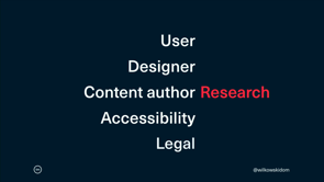
What does a question need to tell a user so that they know whether they should include it in their survey or not? Do they need to know how impactful it is, or if it leads to action, or what benchmarks they can compare against? Well that depends on a few things, so today I'm gonna talk about three aspects in particular. Choosing outcomes for your recommender, design considerations, and how to improve your recommendation system over time.
First of all, choosing outcomes.
What are you striving for? You can't improve your recommenders if you don't know what success looks like.
And for many businesses the primary driver of a recommender is business impact.
So for e-commerce products, it's things like maximising sales, maximising the value of a shopping cart, or the lifetime value of a customer.
Products like Facebook and YouTube have come under fire in recent years for optimising towards viewing, towards keeping you endlessly scrolling and watching to maximise their advertising revenue.
This is a financial incentive that makes sense to a lot of businesses, We all have to think about how we make money to keep our organisation going.
But you might also counter this by thinking about what values you're optimising for.
If we don't think about the values, we encode our biases into our algorithms and as we saw earlier today, that data, left unchecked, can have all sorts of unintended consequences. For Culture Amp, we value good people science. So a question like this might sound good to someone who isn't well trained in gathering employee feedback. How do you feel about your day at work? And responding with a smiley face to figure out if you're slightly happy or somewhat happy, is not necessarily actionable.
So we discourage customers from asking questions like this. And when a manager or HR leader is dealing with executives breathing down their neck, and priorities and a million other things going on in their day, they don't necessarily want to hear that we're telling them that shouldn't ask this question. So it's worth thinking about how much money you can afford to leave on the table to risk relationships with your customers or to counter negative impacts of chasing after advertising revenue and things like that. The sooner you can have those conversations, the better, because it only gets more challenging over time. And you can also think about this outcome.
Time to decision.
How long does it take people to make a decision within your platform? This can be really useful for subscription products and software as a service, because you don't have something as tangible and obvious as sales to know if a recommendation is going well or not. So instead you might say, how quickly can someone make the decision they came to our platform for? So in our case it's a useful indicator if a customer can quickly design and launch a survey. If they are able to choose questions and get on with their day so that they can start to get value out of our product and move on to more interesting things. Finally, you might consider satisfaction as your desired outcome.
I run a side project called Typey Type that helps stenographers learn how to write using a stenotype machine. It can help them type very quickly, using a kind of combination of fields like learning a language or a musical instrument at the same time as practising typing, and I don't use this for money. I don't charge for this product, it's free. So I'm not optimising the recommendations of which lessons people should take next, so that I can make money.
It's rather so that they can actually enjoy the process of drilling and practising stenography, because otherwise practising the same words over and over could get quite dull.
As another example, Spotify doesn't try to sell you each song, but instead they try to keep you as a happy customer and not switch to one of their competitors, so that month after month, you continue paying their subscription.
So there is still a financial incentive there, but in terms of how recommendations work, they have something more immediate to work with, which is, did you enjoy that song? Did you skip it or not? So once you know what success looks like and what you're actually striving for, you can start to consider design considerations. We'll look at designing for trust, as well as designing for experience.
When it comes to designing for trust, one tactic you can use is social proof.
So, social media products do this all the time, they surface recommendations from your trusted networks, your friends and experts and associates, so that they don't have to prove that their recommendations are relevant and trustworthy.
They already depend on the people you trust as it is. This is a great way to shortcut the process of developing trust in your recommendations. And it turns out people also pay a lot of attention to labels and headings.
Nielsen Norman Group did a study on how people infer if a recommendation is generic or tailored for them. And they pay attention to things like this, where it says recommended for you, or in Netflix's very clear example, because you watched X. You know for sure that this recommendation has been from your actions, your behaviour. And also consider labels like sponsored, or promoted, and they're usually written in teeny tiny text, so I'll zoom in for you.
This is because they can actually reduce the click-through rate.
People tend to take this as an ad and a reason to distrust the recommendation. But it also goes both ways.
In this case, Culture Amp's Diversity and Inclusion survey was created in partnership with Paradigm, and they're an inclusion thought leader.
And for HR leaders this can be a really powerful signal of how high the quality is of this content. But on the other hand, managers that are less familiar with this organisation might mistake it for the promoted or sponsored label that we saw earlier.
So it's worth thinking about your audience, and who's interacting with it, and what signals will work for them.
It's also worth experimenting with how fast and slow your recommendations update.
So that's balancing the recency and stability in what you recommend.
My Pinterest feed includes interaction design, graphic design, robots and some other topics. So if I search for a keyboard and click on a few Pins and look around and return to my feed, my homepage I guess, it'll have some more keyboards in it. So this is the recency effect in action.
This is a really powerful way of making it look relevant to your current interests, but it's not a complete takeover. It isn't keyboards all over.
And when I was preparing this talk, this is what most people complained about, was actually that when Pinterest is too sensitive to this kind of thing.
That can be really distracting, like you've polluted your feed by glancing at something one time.
So it's important to balance the two, recency and stability. Let's talk about transparency.
A bad recommendation can leave people feeling really misunderstood, like that's not me.
I have a Pinterest board for hamburger menus. This is about the icon and unfortunately I have a few screenshots in there from the Tom's website, which sells shoes, and now my feed is full of shoes.
Luckily, Pinterest has some transparency about how they came to this decision to show me shoes. It says this Pin is inspired by your board Hamburgers. And I can now make the connection between why there are shoes in my feed, and how they got there.
So I can actually take steps to address that. I could delete that board.
I could remove the Tom's photos in particular. And that gives me an idea of the black box of recommendations so that I know whether to trust it and if they've made a mistake. So that was a little about designing for trust, and now we'll look at designing for user experience. It turns out people love novelty.
So if you can, use diversity and serendipity. Instead of listening to 17 remixes of the same song, most people tend to listen to a lot of different songs within the same general mood or genre or something like that.
So that's diversity.
Serendipity is when it's a happy accident, when you get a wildly different recommendation, that you didn't think was obvious, that you wouldn't have expected, but it turns out to be surprising and excellent. So those are two ways that you can improve the experience of recommendations.
And unsurprisingly, visual clarity is important to user experience.
Digging into our data, we found that when we gave people ideas for action about how to drive change in their organisation, people were rewriting our paragraphs into bullet lists. So, this is an opportunity for us to actually change how our content is presented.
We're not going to change necessarily what we're recommending, but just what it looks like, so that people are more interested in it, and more likely to use it.
And it's worth remembering that data is not neutral. Recommenders depend very heavily on data that has bias inherent in it.
So that when you do a Google image search for nurse, you see something like this, and yet when you search for CEO, you get quite a different experience.
Interestingly, if you do a search for CEO on Pinterest, it's not quite the same.
I've been really impressed with Pinterest's initiatives around diversity and inclusion.
I would suggest that you think about how your product can tackle issues arising from data that is not neutral, because it can be done.
So once you've decided what your desired outcomes are, and given some thought to design considerations to improve the experience, how can you actually improve the recommender over time? First up, we'll look at a few popular recommender techniques from data science, and then we'll look at a slightly simpler option.
So the simplest place to start with recommenders that use machine learning, or data science, is a knowledge-based system.
This is where you can lean on how your product solves user's problems. For example, a mortgage broker can tell you about what house loan to get by knowing something about the industry, and a little about your constraints, but they don't necessarily have a lot of customer data around how people interact with loans.
This is the easiest place to get started with recommendations.
You usually know stuff about your business. Then you might look at content filtering, so when you buy a product such as a book, we know that this other book is in the same genre, so therefore we might be able to recommend that and you might be interested.
And then finally, collaborative filtering.
This is when person buys item A, they also item B, so we can probably recommend item B to people. Using those different systems, you can also then combine them together in different ways, and that leads to hybrid filtering.
Hybrid filtering has different models, again, there's like eight different ways that you can combine recommender techniques, including, for example, the mixed hybrid model, which is actually showing the results of two different recommender techniques side by side.
So this is similar products and customers also bought. That's the result of two different kinds of recommendations shown together.
Culture Amp's survey designer is a hybrid.
It uses our knowledge as people scientists and experts about what makes for a good question, scientifically. It uses content filtering to consider the topics and themes of the questions that go into our platform. And we learn from how our customers use questions and different surveys.
And that makes it collaborative.
To then improve predictions, many recommenders look for positive and negative feedback signals. For example, Pinterest, again if you save a Pin, or follow someone on Pinterest, that's a positive signal that you like that content, you prefer those items and want to see more of it. For a negative signal, you can choose to unfollow a topic, hide items like this, or report it as going against their community guidelines. And that can be quite a strong signal that you don't want this content, and to stop showing that kind of content.
And you can also consider implicit and explicit signals. That is, if you abandon a show in the middle of watching it and never return to it, that's an implicit signal that you didn't tell anyone about, but it can be inferred from you behaviour.
So in that case, that would be and implicit negative signal, but if you're binge watching a show, that's an implicit positive signal.
However if you actively rate with a thumbs down or a thumbs up on this content, that's an explicit signal. You're telling the system you don't like it or you do like it, and therefore show me more or less. And as a designer you can build these feedback opportunities into the platform to actually help improve the accuracy of you recommendations, so that you improve the experience in the long run.
But let's talk about the old-fashioned way, without machine learning.
In my typing app, there's a lot of different lessons, and I make recommendations about about what to do next, such as practising a specific story with real sentences, or playing a game, or when to take breaks.
I use website analytics to actually see how many times a visitor started one of those recommendations, or chose to skip it, and which ones were successful and which ones weren't. And it turns out no one takes breaks.
People like to just keep typing.
Of the started recommendations, only 4% were for breaks, and together games and breaks accounted for 46% of skipped events.
When people want to use this product, they want to just keep practising lessons.
So using this information, I can change how often I show those different things, and potentially in the future, I'd like to add onboarding as well, so people can self select if they do or don't want games in their experience. So this is an opportunity for me to improve the recommendations without any data science or recommender systems that depend on machine learning, but I can use data and feedback from humans to understand how to make it better.
So to recap, recommender systems predict preferences so that they can show relevant items.
You can choose outcomes like business impact, values, satisfaction, and time to decision. You can use design considerations like designing for trust and for experience to improve how people receive recommendations. And you can improve them over time using machine learning or good old-fashioned user research.
As a designer, I'm in a position to influence decisions, as are all of you, so I encourage you to think very deeply about what the future of nudging users and making recommendations means, because we are dependent on the data that goes into them, as well as the experience that we share.
I hope some of what you've heard here today helps you learn a little about recommenders and how you might use that in your own practise.
And if you want to learn more, I'd suggest checking out these links.
They're mostly plain English.
But that being said, if you are working with a recommender, I would highly encourage you to also write and speak about recommenders, because there's not a lot out there on the user experience design side of recommendations. So please, share as much as you can.
Otherwise, thanks for listening.
(audience clapping) (uptempo music)
At the heart of many products in the information age is 1 critical factor: relevance. A misguided recommendation can instantly shatter trust in your product. As a designer, how do you create a system to provide relevant information to your audience in the right place and at the right time? What is an ideal experience? In this talk, we’ll look at data and design, building feedback into your system, and what you need to know about content and machine learning. We’ll explore in depth case studies of designing recommendation systems and the role of “nudges” in changing behaviour and improving outcomes.
CultureAmp is an employee feedback product, which has led to a lot of Recommender Systems.
Recommender Systems predict preferences and show relevant items. Products like Netflix use this to recommend new shows to watch, for example. They are handy but the design territory is often quite uncharted and the UX guidelines aren’t great.
CultureAmp give people preset questions to get started, but then they recommend more. To guide people on which ones to choose they provide context and likely outcomes for each question.
@didoesdigital giving us 3 things to consider when 'Designing recommender systems'
– choosing outcomes
– design considerations
– improving over time#design19 pic.twitter.com/5DaiOCmSSq— LadiesThatUX / Melb (@LadiesThatUXMEL) April 12, 2019
Things to think about:
- choosing outcomes
- design considerations
- improving over time
…
What values are you optimising for? Cultureamp values good people science. What people often think are good questions don’t hold up under the science, but they are of you need to consider how you can guide customers to pick better questions. Other things to consider are time to decision and satisfaction.
Design considerations include things like designing for trust and experience.
To build trust you can use social proof – draw on trusted networks, so you don’t have to prove the recommendations are good; the user’s existing network provides that proof. Using really clear labels helps a lot as well, eg. Netflix is very clear “because you watched X you might like Y”. You don’t have to guess why you are receiving a certain recommendation.
Experiment with how fast or slow your recommendations update and change. Pinterest updates immediately, making use of the Recency Effect. But when done too quickly you can get the ‘instant takeover’ effect. People get upset when you pollute their feed because they looked at something once. Pinterest reveals why things are showing up and lets you tune it.
People love novelty, so use diversity and serendipity. Spotify will give you a bunch of songs in the same general genre (diversity), with some unexpected recommendations mixed in (serendipity).
Data is not neutral. Recommenders depend on data that will usually have inherent bias, and you will have to work to undo that bias. Pinterest’s search results for “CEO” are markedly different from Google.
Techniques
- Knowledge based – easiest place to get started, you already have data about your own business
- Content-based filtering – automated recommendations linking similar things
- Collaborative filtering – things like a person buying product A and B suggests they may like C
You can also return hybridized results which incorporate more than one technique. CA’s question recommender does this.
Look for positive and negative feedback signals. Choosing a Pinterest pin is a positive signal, unfollowing a topic or manually reporting something is a strong negative signal.
Netflix infers a negative signal if you abandon a show halfway through and never return; vs binge watching. It also listens to active signals, for example when you manually “like” things.
Use analytics to track what people are doing. Diana’s Typey Type project offers recommendations on which lesson to do next; but allows people to take a break as well. But people rarely skipped – they just wanted to keep typing.
Designers are in a position to influence decisions. We can play an important role in the way these systems are designed and how they nudge human behaviour.
If you work on recommenders, please do share your knowledge on it as there is very little out there!