A New Future for the Interface: Reaching Toward True Adaptation
Hi everyone!
I'm really excited to be here today, even virtually, to share some of my ideas about design and hopefully get some of yours in return as an introduction.
I'm Liam, I'm a designer and design advocate on material design at Google.
It means that I contribute to material design system, but I also spend a lot of time working with designers outside Google to improve their experiences on our ecosystems.
It's important to note that I'm here today as myself, so I'm talking about my own ideas about design and not necessarily any of Google's plans or products.
This talk is a synthesis of a lot of things that I've been thinking about for the past several years, and it isn't everything.
It's not my full thoughts, but just some things to get us started thinking about potential futures for the discipline of creating digital interfaces.
Without out of the way, how many times have you seen an image that describes the experience of a UX designer?
The image that's probably been the most pervasive, vacillating between ironic and earnest at different moments is that of two ketchup bottles.
On the left, there's a glass bottle that stands upright with a metal screw-top lid, the kind of bottle that you have to hit with an open palm or stick a knife into to get things going.
But the image implies that it's at least aesthetically nice.
It stands for the type of design that's concerned with looking nice and sacrifices all else, regardless of the impact on our experiences.
There's an implicit value statement in the image that this bottle, which is labeled as UI, is mostly just concerned with visuals.
On the right, there's a plastic bottle with the lid facing downward.
This one squirts, and gravity helps the catch-up stay near the opening, and the lid is even bigger for better balance.
It is ostensibly, given the label UX, a bottle whose primary concern is ease of use, a good experience, and maybe more ketchup.
The image, of course, can't illustrate for us that this bottle you still need to shake beforehand.
It will probably fall over at some point.
It gets crusty around the opening, and in all likelihood, it's made out of a single-use plastic.
There's also the desire path image, that shows a well-trod dirt path right next to a perfectly maintained sidewalk.
The sidewalk is constructively labeled design.
It's again, aesthetic, full of visual function and meaning.
There's clearly a design intent being represented here, and the design path is labeled user experience.
This image, too, is loaded with implicit beliefs.
The desire path would tell us that perhaps a designer should have made a diagonal sidewalk instead of a perpendicular one.
Or maybe it's telling us that user experience really means that a user will do whatever they want, no matter how carefully we've placed bricks along the path.
Finally, and I'm sure this isn't the last image that comes to mind, there's the GIF of a guy with a glass of water who just can't seem to take a drink.
A straightforward task like drinking water is made to look impossible, even though, to us as viewers, the answer is right there.
If we view this as designers, we see that someone has designed a glass that's meant to be held in the hand and hold water, and it's meant to be put to your mouth, and we give a knowing chuckle at the representation of a user who just can't seem to get it.
These images feel really relatable to us at different stages of the design process, and they can provide some much needed comic relief too, but they share another common factor with one another.
They frame the intent and the context of the user as an aberration, something to be worked around to predict and influence, to standardize, or, in the worst case, to ignore.
If these images are any kind of touchstone for our understanding of our industry, then we can probably use them for critical reflection too.
Our work creating interfaces doesn't typically deal with ketchup bottles, glasses of water, or sidewalks.
The technology that we use to implement an interface is digital.
If we wanna understand the possibilities that digital interfaces actually unlock for us, it's worth backing up and examining how we got here.
Taking a much broader view of our discipline before coming back down to practical day-to-day application, we're talking about digital interfaces in this session, so let's start with the digital.
The digital, as described in 2021 digital anthropology, is that which can be reduced to binary code made of ones and zeros.
This definition, as pointed out by authors Miller and Horst, shows that, in a broad view, that digital can be thought of as an abstraction of the analog or physical world.
The binary code can conceivably be configured into anything we can imagine, though we most often encounter it as a series of highly specific instantiations, like apps.
Miller and Horse point out how this abstraction is not without precedent.
It could be compared to a similar abstraction that emerged with the invention of currency, which made the world reducible to a baseline of 10.
At this earlier point of abstraction could exchange became more distant and focused on equivalence rather than human and social consequence.
As currency enforced a boundary between people and products, it underscored a separation between production and consumption, or, bringing it back to our work, creators and users.
A separation that's easy to see in the processes of both design and coding.
On the other side is interface.
Interface is a dance taking place on the liminal point of encounter between the two planes of the material and human, between object and subject, between the one who is created and the one who encounters.
Design the practice of designating the shape of one plane from within the other long before the invention of the digital has understood this principle.
By creating objects that inherently reflect our subjectivity as humans.
Design reinforces the interfacial boundary by crossing it over and over again.
Take Marcel Breuer, a modernist architect with a prolific portfolio of furniture and chairs produced during his time at the Bauhouse.
Chairs we understand to be objects.
We as humans can bring to them our subjectivity, our bodies, our physical needs.
Are we tired?
Are we a crowd?
Are we indoors or out?
We meet a chair with these subjectivities, and it, as an unchanging object, imparts its objective nature back onto us by supporting our back, by looking nice on the patio, or by folding away for easy storage, this is interface.
And Breuer certainly understood the peculiarity of this dance between subject and object, for us, user and digital product.
Acknowledging the notion of interface while anticipating the possibilities that would be unlocked by digital production, illustrating in this 1924 poster that, roughly translated, chair design gets better and better every year.
In the end, one, it's on an elastic air column.
That our idea of what constitutes a chair would become so elastic that it no longer physically exists was a funny notion when Breuer expressed it.
But digital production promises the development of products that really are this abstracted, chairs that are as adaptable and easily replicated as thin air, accommodating our infinite subjectivity with an unopinionated, and fluid range of objectivity.
It's not hard to imagine how this kind of fluidity could deliver a reshaped relationship to the products we use, if not also to production.
It could address a wage, perhaps even correct the alienation between human and machine that's imparted by the abstraction of the world into digital binary.
As consumers of material culture, we understand that most of these fabricated objects are the result of a process of production, some process of combining and refining simpler materials to create something new.
Even the word product implies something that's produced or brought forth as a final creation.
In other words, it's lying at the end of a process of production, a process of refinement as a fixed object.
In many cases, the objects around us are also understood to be the result of a process of mass production.
The process whose origin lies near the beginning of many industrial chronologies of design, which is a topic worth returning to on its own, right?
Mass production functions best in continuous motion, using tools and processes that are optimized for exact purposes.
It owes its speed and efficiency, in other words, to the standardization of the objects it produces.
These qualities tie design and its rationales directly to monetary costs.
Not only in placing an emphasis on the process of design, but also reinforcing the idea that design should be correct and that a form that's recognizable as the final design should be attained.
In order to update the material properties of, to choose a random object, a ketchup bottle, the production line needs new molds for glass or plastic, new machined parts that can precisely reproduce the bottle over and over again, all dictated by the updated designs.
The cost of these updates not only encourages opinionated and fixed designs but also means that design's responses to consumption.
The conversation between designer and consumer is slow.
Adaptation in manufacturing as a response to things like material costs, consumer preference, aesthetic trends, or updated manufacturing processes takes a lot of time, and one production line is not likely to produce a great number of variations in a row.
The advent of digital products, made from binary code and electricity rather than more complex materials like glass and plastic, can quicken the pace of conversation between designer and consumer significantly, as the processes that create these products can do so without direct concern for the costs of materials or time for retooling.
The material costs of a button in an app doesn't really change based on the design of the button.
The only further input that the system requires is labor from the designer and software engineers.
Moreover, digital products, no matter the intent of the designer, don't behave like machine parts.
Mirca Madianou and Daniel Miller, in the 2012 volume, Migration, and New Media illustrate how the process of poly mediation makes digital products more like an assemblage of generalized tools, taking on different subjective meanings through use in different personal and cultural contexts rather than repetitively performing isolated specific tasks.
It's unlikely for an individual component in a mass production line to take on the same cultural significance or designation as a digital counterpart.
For example, consider the social significance of a belt that carries a generic cylindrical glass bottle compared to a green bubble in iMessage,.
If we acknowledge these discrepancies between analog and digital modes of production, it becomes clear that the conversation between designer and consumer can become faster, more dimensional, and more inclusive than before.
Unbound by the historical weight and conception of design as a discipline.
Digital production has an unprecedented ability to iterate on concepts, processes, and products, fine-tuning them to match both the goals of creator and user within broader systems that acknowledge the fluid nature of their use.
Despite this capacity, most contemporary design practices rely intuitively on reflections of analog mass production.
In actual practice, it isn't the conversation that's quickened, just the assembly line.
And as I have since I first heard it eight years ago, I come back to this quote from Keller Easterling when she discussed her book, Extra State Craft, at Span in 2015.
" You don't square up to every weed in this field with a righteous fight; you change something in the soil." As the people responsible for creating digital products, our collective gaze is fixed on systems, standardization, and the illusion of best practices to solve problems.
Mass production's promise of profitability and efficiency through standardization has taught us a distracting lesson.
Incentivizing systems that are only interested in consumption often this leads to solutions that satisfy not the user's intentions but our own, and our responses to externalities can only happen in aggregate because we are only shipping one app or product at a time.
The ways that we choose to describe the disciplines involved in digital production also point to a mental model that sees mass production and consumption as the primary modes of experience for which we should optimize, rather than some other facet of the human experience.
User experience and user interface, for example, are terms that are predicated on the experience through use of a thing that's already created, while interaction and product design straightforwardly describe the intent to optimize the reproduction of results.
The organization of disciplines involved in digital production exposes not only a limited understanding of what's possible but also assumptions about our own positionality within broader and more complex social, political, and economic systems that do more to shape and mediate the experience of digital products than we do.
By nestling too close to the comforting wisdom of mass production and the incentives of capitalism.
These systems of design ensure that no one thing is likely to be designed for any one person, despite the competing and, I think, very compelling promise of digital production that, in fact, everything could be designed for every person.
On the other side of digital products stand users.
"User" is a term that's common enough in discussions of digital interface, but I think it also must be disambiguated even as there remain open questions about what it means to call someone a user, whether the term is a useful heuristic or needs to be thrown out for something that's more humane and descriptive.
In this session, we'll use the term "user" to stand for the colloquial understanding that a "user" is someone who experiences products through use and, importantly for this work, not through production, but I will argue that no matter what term we end up using, our notions about the role of a user must evolve to encompass more modes of experience and integration into a more nuanced, subjective context.
In the role of "User," one is expected to find and fit into behaviors and patterns of action, developing new intentions as a mean of satisfying existing ones by learning to use digital interfaces.
This learning process, which is a direct consequence of a user's exclusion from the process of production, is not a task that can be underestimated.
In a local sense, it involves numerous small-scale tasks like learning and keeping up with abstract patterns like touch, interaction, physical actions like gesture control, and understanding the qualities and functions of the device on which an interface is presented.
In a holistic view, being a user necessarily involves that process of polymediation, requiring decisions about which digital product to use for a given task while also maintaining an understanding of how the assemblage of digital tools are related, used, and understood, both by oneself and others.
It's a process that is, itself, informed highly by the user's cultural and personal contexts.
In other words, being a user constitutes a relationship to digital products, and it interacts deeply with one's identity and perception, making it an ongoing role rather than a discreet task.
We must also understand that digital production extends beyond the practice of coding into the practice of deciding what should be coded along with implementation; design has always completed processes of production as an expression of intent.
In digital production, coding and design both remain abstracted themselves.
The code-based implementation of digital products is mediated by other digital products that are built for coding.
Design is mediated by digital products that are made for designing.
We should remain aware of how these tools, which cast creators as users, placing us in a recursive relationship with our own work.
Shape what is ultimately produced.
Yes, we have to add to our list of things to keep in mind that, even as digital producer, we are certainly users of the things that lie outside of our own production.
After all, while Marcel Breuer sat on his own chairs, he likely sat on other people's chairs too.
Having set up the background, let's explore what it would really mean to diverge from analog modes of production in our own work to fully take advantage of the promise of digital production.
To begin to get an idea of what that means, consider what it might be like if the people who we now call users were instead considered to be creators.
If the people who are now expected to passively experience and consume a product, dutifully reproducing its results that are designed by our intention, actually could derive their own experiences by expressing their intention.
How radically different could our work as designers of all types be?
Architecture, the tangible outcome of which is itself an interface, already recognizes some of the potential here, edging physical products toward a malleable, dynamic mode of experience through movable elements like Shoji panels, curtain walls, and other components that allow occupants to easily reconfigure physical space in a way that a chair or even an app usually can't.
We know as creators of digital environments that we have an exponentially larger capacity for expressing this type of potential in our work.
An interface in actual space as opposed to digital or virtual could be the physical contact between your body and a chair.
While ours is often finger voice, eye, or ear to device, consider that a chair rarely learns anything from how a person sits or where they want to put their feet, or what they can do with their hands.
One successful implementation of adaptable design based on user intent is the accelerating development of variable-type technologies.
Fonts that are not packaged as individual styles, as foundries have done for hundreds of years now, but rather one program that contains a continuum of possible expressions of a typeface.
The product of the design process for a variable typeface does not presume to know or understand the intent of the users who will work with it later.
Graphic designers and typographers are constrained only by which variables or axes are made available within the typeface.
When I studied at the Type@Cooper program in New York, I learned from type designer Hannes Famira that a font, the instance of the typeface that we were designing, was just one point in a multidimensional field called the design space.
The variables of variable type called axes run through this conceptual dimensional space.
Anywhere that there's an axis, we can see a continual line of expression through the design space.
Some axis, like weight, run straight for relief from one point to another, for example, from thin to extra bold.
Others intersect one another, drawing themselves into two dimensions; still others have gravity on one another; as one axis goes up, another might go up as well, but perhaps at a slower pace.
I see digital interfaces as existing within their own type of design space, where axes like touch and visual acuity, focus, time, and others could all influence the instance of an interface with which a user is presented.
Today, we are still mostly designing for one-dimensional points in this design space rather than lines, planes, or polyhedrons.
But we could actually have a few ways of instantiating, somewhat complex axis in our work already.
The screens or break points that we document could be understood to represent individual values within one axis, screen size, running through the design space of an interface.
But if we pause for a moment, it becomes easier to imagine moments where other axes may be running parallel, nearby, or intersecting with screen size in interesting ways that we must account for.
For example, on a very large or small screen, we can make certain assumptions along with other cues about what device it belongs to.
A screen that's TV size, when combined with other signals, might actually be used as a TV.
This is information that we have access to when we create and run the interface.
What then might be the other axis that overlap with screen size?
Design guidance for TV specifically draws focus to things like attentiveness.
We can draw from research and our own experience a rough knowledge of how attentive a person is when watching TV and create an interface that matches that attention with the right level of detail, size of components, and types of information.
The way we organize actions around that information could comprise another access having to do with Input Modality.
On a TV, you're likely to be using a remote control, a game pad, or another Input device rather than directly making contact with the screen.
These possible modalities represent stops along this other access, and this access will inform how the interface is ordered in your app, how quick it is, for example, to traverse from one item to the next or to reach a desired item from the top of the screen.
These questions might have different answers on different devices.
Material You, which was introduced with Android 12, opens up the system to an unknowable form of intent.
In this case, user selected wallpaper, which it uses to inform fundamental qualities of the interface, in this case, color schemes of the interfaces and imagery.
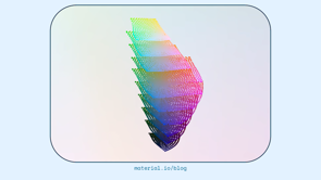
In this case, the axis of color expression is populated by the HCT color space, which was created specifically for accommodating unknown user intent with perceptually consistent responses.
Rather than making distinct individual choices for every color of an app's interface, the new color system is instead built around the relationships between different elements in an interface.
These relationships then absorb the intent of the designer for things like emphasis, importance, function, to apply colors, any colors in a consistent, predictable way.
The user's mental model takes shape without direct intervention from designers, and it's based on their own choices about their device.
There is, of course, a lot more work to be done to realize a fully adaptive future at the system level, and I think that's true whether we're talking about the design system like material or an operating system like Android.
And I personally think that we have to talk about both of those concepts.
The natural direction of this line of thinking is to fully realize all of these axis, seeing an individual interface as one point in a multidimensional space containing all possible interfaces for a given app, allowing an interface to function as one piece of technology that contains within it a fuller range of possible expressions.
Expressions that are directly guided by individual need and intention, but let's zoom back out one more time to understand why this model of design, a model where users can directly influence their own interface, is important.
Kerry Murphy is a co-founder of The Fabricant, which is a studio that produces virtual couture, that is clothing that exists only in virtual space.
When designing garments for virtual space, Murphy says that his studio uses the language of physical clothing design, while materials are unbound by normal physical constraints.
The raw materials he says are data; the texture, strength, color, weight, and dimensions of fabric are expressed as ones and zeros.
In our discussion for design notes, murphy also divulged his experiences creating and manipulating a photorealistic virtual avatar of himself.
Through trying on challenging new garments or performing here to for impossible dance moves, Murphy uncovered something about the self-actualizing potential of virtual experiences.
This embodiment allowed him, as it allows others, to reflect on what it would be like if their actual world intentions could be easily satisfied.
More than that, it drew into question the subject-object relationship that Breuer and others would've assumed before the advent of sophisticated digital interface.
Suddenly, the will of the images being presented to Murphy was actually aligned with his will as a subject, directly shaped by it in fact.
The conversation became two-sided, and both sides were in agreement.
Tom Boellstorff echoes this dynamic in his ethnographic work on virtual worlds, including in his 2015 book Coming of Age in Second Life, noting that corporations who simply saw Second Life as interactive, misrecognized interactivity for creation.
The cultural logic and play was not that residents were interacting with a commodity and its producer, but that they literally produced what they consumed through self-actualizing acts of creation.
The implications for virtual worlds where residents can create their own body, clothing, house and decorations are clear.
The resident of the virtual world exists as an entity solely through their own acts of creation within that world.
Their intention for their presentation and integration into the social milieu of virtual space is directly manifested through the world itself and the interface that governs life there.
Zooming back in, we have to ask what about the implications for our work, which largely manifests itself within the borders of smaller screens?
We can begin to get a better understanding of digital interfaces, self-actualizing potential for our users, and what it may look like to give individuals the power to create their own experiences with our products if we consider what lies at the root of most digital interfaces today.
Information and action, these I've come to think are the building blocks of what we would now call user experience.
From these primitives we derive components like buttons; components afford interactions, and these come together in TUI regions.
UI regions comprise screens and screens, comprise flows, and flows comprise apps.
You've certainly seen it broken down like this before, from small abstracted concepts to large practical applications, but I think information in action are the smallest particle or concept that we can observe directly.
Another foundational constraint that we often acknowledge in account for in design is human factors, or the realities of the human body and cognition that impact how people are able to interact with an object.
These principles, which have been variously documented by standards, bodies and design practitioners, myself included.
Often appear at the bottom of a conceptual layer cake of considerations in discussions of interface design, but in a model organized from the principles of information and action, human factors are more like the shape of the cake itself.
In the future presented here, individual intent would be a human factor that, just like touch, voice, vision, hearing, cognition, and others, we must be able to account for in the things that we create without precise knowledge of what it is or how it might change.
In other words, if information and action are the primitives that grow into the full flower of an interface, how people choose and are able to interact with technology at that interface is a superseding layer, and that is where true adaptation really lies.
In the more distant future, I believe that interfaces we encounter on our devices will be much closer to a pure flow of information and action, rather than being deliberately and carefully grown from primitives into entire distinct user flows and applications.
The interface will exist in a framework that allows it to spontaneously arise and configure itself into emergent patterns based on the intent and the subjectivity of the person using the device.
The interface is in this model still, of course, the site of our interaction with technology, but the dynamic between object and subject will shift, and we will see our own intent directly shaping the interface with which we're presented.
We will, in other words, finally have the equivalent of Breuer's elastic air column, but for every interaction that we have with every device, it's clear that changing the way that we understand and practice our discipline is going to be complex.
It will rely on new technology, experimental thinking, expanded resources, new tools, and a theory of design that reckons with our own position in the world as designers.
And in another interview for Design Notes, senior UX design manager Rob Giampietro underscored the gravity of our work and the importance of recognizing it, saying, "You're deciding when someone should turn the page, how heavy their phone is that they pick up every day, whether they need to swipe to get more information or can have it right on the screen, and all of those things are ways that you're actually changing someone's experience of their life through design.
And I don't think there could be a more transformative discipline than that." And transformative is act word here; when we design something implemented and put it into the world, we are causing transformation.
At the surface level, we're transforming someone's experience of their life, like Rob said, and that's big enough.
But we're also transforming and potentially constraining the range of possible experiences by making choices about what a product can do and how it can do it, and we're transforming ourselves as well.
Our discipline often puts us, our perspectives, our experiences, our beliefs into the world within the products that we create, just by virtue of the fact that we're humans creating things for other humans, and that, I think, should ensure that the future of design is, in so many ways, still personal.
Thank you all again for watching this session.
Again, this talk is just the ideas that I could fit within the time limit, and as I continue to develop and expand on these, I hope you'll follow along and give some feedback.
Have a great conference!
The discipline of design has historically produced primarily fixed products. Even the term “product” implies the end of a process, or something that is completed and unchanging. But we know that the intent of the designer and of the person experiencing the design are engaged in an ongoing conversation.
Digital products have drastically increased the pace of that conversation, introducing faster iteration, new modes of interaction, and – importantly – space to imagine a future in which a person’s intent directly defines their experience of digital interfaces.
This session will connect historic explorations of adaptable design with contemporary developments, including Google’s Material Design, looking toward a truly adaptive future that accounts for more devices and more people in more contexts.