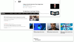
What to think about when designing maps: moving beyond generic and into amazing
Without a map, you’re nowhere!
Small Multiples have done a lot of jobs with maps – around 60 projects all up – across a diverse range of datasets. We use maps for all kinds of situations in our lives, private to professional. It’s really easy for maps to become frustrating; and harder to make them really awesome.
The idea of a generic map isn’t so bad – like the ubiquitous Google Map. They do work and there’s nothing wrong with them.
Framework for really amazing maps
How to make amazing maps on one amazing looking slide ? #design19 pic.twitter.com/90tALYLbXn
— Vivian Li (@vivzli) April 12, 2019
Great maps build up through these layers:
- intuitive interaction
- useful controls
- relevant data
- right context (base maps)
Base maps
Context lets people know where they are and what they are looking at: landmass and water, streets, boundaries and labels. These can all go into a base map, the lowest layer of the design that everything else is layered on top of. In some cases you don’t need much detail on this layer, in others you’ll want full satellite imagery.
Satellite maps are great for physical spaces, understanding things like vegetation and literally what’s there. The problems are that they are limited in detail, they are often quite varied in colour making them hard to design with, and they are heavy for performance.
Street maps are lighter and recognisable, people are used to dealing with them. Light modifications to Google maps can make them much cleaner to use. Google maps let you tweak a lot; and there’s Snazzymaps as well.
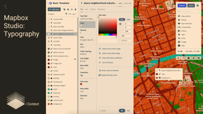
Mapbox Studio is a step up from that, Small Multiples use it a lot. It lets you control the typography (which all designers want!), plus you can control zoom level.
Designing with maps: there are Sketch plugins that can inline Google maps and Mapbox; but screenshots still end up working better.
You must always include attribution in the base map.
Data
Map data will generally be composed of points, polygons and markers. You need to consider the accuracy of this data; and how that impacts design.
Reference: Jacques Bertin’s visual variables
Lines can be very specific, or curiously nonspecific – but arcs are used for a variety of reasons, including generating a sense of movement between points.
Polygons – there are lots of tools to work with them these days, which is great. Colouring polys needs to account for the underlying data: category, sequential, diverging. These will all help choose colours.
Tool: Colourbrewer. A note on borders – you normally choose borders that blend in a bit, they need to clearly define the space but not be too intrusive.
Legends – these help people understand all the data you’ve provided. You need them to be as obvious as possible.
Controls
Controls let people change the context in some way – zooming and out, changing the location, choose a specific point, or refreshing back to the default state. Controls are usually placed in the corners to avoid distracting from the map.
Interaction
All our usual design considerations are compressed down into a smaller context, but they don’t really change.
Examples
Looking at the map for Design 19… Its primary purpose is to help people get to the venue. The google map is good; but it was clearer when it was pared down to less information, and that was focused on getting there. So public transport was retained. The zoom controls were kept to give people a hint that the map was clickable. A lightly customised place marker was used to be at least a little on brand.
Service NSW branch finder. The original was too busy and really hard to work with. So they clustered the markers to hotspots at higher zoom levels, to make it easier to drill down into the right region. They reduced the amount of duplication and detail on the lowest zoom levels.
Maps are everywhere. They are familiar, factual, and useful. But they also need to be designed: not by a professional cartographer who doesn’t work on the web but by a visual designer. A designer who wants to create beautifully formed experiences but who has limited skills in dealing with geospatial files and what’s possible technically. How do you go beyond tracing boundaries over static images of maps to get the vectors you’re looking for?
This talk goes through all the nitty gritty details you never thought you needed to know about designing maps from shapefiles and QGIS to symbology and basemaps. We hope you leave with a better sense of the endless possibilities of how maps can look and function and how your design expertise can shape those experiences.
(upbeat music) (audience applauding) – So without a map, you’re nowhere.
Thank you John so much for the privilege of presenting at Web Directions.
So, like John said, I’ve been doing data visualisation, design, and making things for the last fifteen years. And half of that time has been at a company I co-founded, and co-run, called Small Multiples, that concentrates on data visualisations.
So, while I was doing preparation for this presentation, I had to look at some– I’m controlling the wrong screen.
There we go.
I was looking at some old friends.
So on the left is the very first project that Small Multiples ever did.
It was the ABC, their first foray into data journalism. They decided to pick the very low key topic of coal seam gas.
So, Jack and I, my partner, we were in our study for all this time, making maps and letting people understand the context of where coal seam gas wells were, the potential impact of CGG on water.
Then, more recently, the right hand side is an election map for the federal election coming up in very soon, which is super exciting.
I’m in one of the swing, marginal, states for once. So I feel like my vote actually will count for something this time.
And so we’ve been old hands at doing federal elections. We’ve covered three already.
So in between that first project and the last project, the most recent one, there may be about 60 maps that we’ve done.
Ranging from frog habitats to elections, obviously, diversity, and transportation, just to name a few. But throughout all of these maps, it made me realise how much of an impact it has, and how useful we can find them when they’re designed well. You can have maps day-to-day, as I’m sure everyone has probably, although this being the second day, everyone needs to find out where the Arts Centre is, for example.
Find directions to it.
Having dinner, figuring out where you are.
Then there’s the more practical tasks at work, doing research, looking at policy, looking at how maps impact others.
And then finally, leisure and looking at holidays and planning.
In all of these cases, there’s a chance for maps to be frustrating, to be ugly, to be hard to use. And so, we have an opportunity as designers to go in and craft more amazing experiences for people. So, my talk is gonna be looking at four parts of a map design that you should be considering when viewing, and also when creating your own maps.
And then going into a couple of different examples. Now, the idea of a generic map isn’t so bad, and here I’m alluding to the generic Google map that you can just dump anywhere.
And it’s great, it’s really easy.
But the thing is that it’s almost a side thought after you’ve done a more amazing design for an app, or for a website, and that’s totally fine.
A map also takes time to design, obviously. So it’s its own little design problem in and of itself. The final thing is that we, as designers, have a very broad range of skills, and sometimes it’s just too much to go into something really specifically.
So I want to give you those skills for specific map design here today.
So here represent my framework for really amazing maps. Now, Donna alluded to this a little bit before, what is amazing? What are we talking about here, in terms of amazing design? Here, the context would be a experience for the person who’s using the map that makes sense, is actually useful to them, and is relevant to them. From a design point of view, you want something that, of course, adheres to a brand, but that also imbues your sense of visual style as well. And certainly, a generic Google map won’t do that. There are four layers, the first being context, it’s data, controls, and interaction.
So first off, controls.
Sorry, context, there are two starting with con, it makes me really confused.
So, context.
Context essentially lets people know where they are, and what they’re looking at.
It can be things like land mass and water, that lets people just situate themselves.
Then get more specific to be like streets, so they actually have a sense of place.
Then’s there’s boundaries that literally scope out what they’re supposed to be looking at.
And finally labels that add a little bit of detail for those that need more detail, or aren’t familiar with the area.
Now all of these things can go into a basemap. A basemap just being the lowest layer of a design that you place everything else on top of.
There are four options when it comes to basemaps. You could have nothing at all, maybe because there’s enough information on the other layers that it will suffice.
You might have something really simple, like the shape of Australia.
Or, you might have a satellite view or a street view. So, I’ll go into satellite views and street views in a little bit, more detail.
Here are just some examples.
So firstly, satellite.
So satellite obviously comes from satellite photography, and also aerial photography, that’s been stitched together, cleaned, compiled over a range of time.
Satellite maps are great for physical spaces in understanding vegetation, or when you’re buying a property, what the neighbor’s place looks like, and what your place actually physically looks like. But they’re also fraught with problems.
The first thing is that you can’t zoom in to much detail. The second is that they’re too variant.
So you can see in the top example that there are lots of different colours.
It’s very difficult to design over the top of. Obviously you have virtually no control over what’s on the map because they’re photos and you can’t manipulate everything.
And finally, technically they’re also less performant than street views, which I’ll talk about later, street maps. The middle example is really nice.
It’s actually the Black Marble that NASA did, looking at all of the night sky and the whole world lit up. So, because of all of those problems, street maps are usually the way that people go. And this one has its own flavours as well.
There’s the really basic one, which is the familiar Google map with its yellows and blues and greens and grayscale. The two in the middle are either darker or lighter, so that you can make your data pop out.
And the final one would just be an example of something really out there that really is a design statement.
So, in all of these cases– So I’m very old school, in Donna’s talk I’m like a pragmatic designer.
So I did everything in Google Slides so that I could get all of my revision history, but that means that I need to wait for YouTube to load. So this is a very basic example of a default Google map and how it’s embedded into realestate.com.au. You can kind of see, on the left hand side, this is the default, that the labels have been removed on Real Estate. They’ve left the universities, for some reason. And this is actually in situ.
There’s the tiniest bit of customization, virtually none at all.
If we compare that to Domain, Domain did a little bit more work.
They actually cleaned up a few of the labels. They changed colours just slightly.
They also removed the light grey border that was around roads as well.
So it’s slightly cleaner, but not that much different. And so that’s that one in situ.
Now in both of these cases, as a person who’s using this, I wonder, what’s the actual context that’s important for all of these properties? Is this the best information to give to someone who’s looking to buy a million dollar property, as in Sidney right now, that’s the kind of starting range. You’re committing so much, and all you’re getting is a really over familiar Google map? Is that the best way to do it? So, I encourage the people who work at Real Estate and Domain to think a little bit more about context. Now, what Domain probably did is that they used a tool that Google has to style maps.
There’s also another one called Snazzy Maps that you can use.
And in this case, it lets you control things like colour, not typography, but also things to turn on and off. So you can remove labels.
You can get to a point, for example, here, where all the parks are highlighted.
And after all of these little tweaks that you can make to things like points of interest, and business and admin areas, and water, of course, you can export it and save it with your team so that they can use that code to then apply to a usual Google map.
Google maps, however, doesn’t give you that much flexibility in terms of design.
It’s kind of one step on the process.
What we really love to use is Mapbox Studio. It’s pretty accessible.
It’s not as enterprise as something like ArcGIS. And so we use this on a very, very regular basis. I’m not being paid to tell you this.
What Mapbox really lets you control, which all designers love doing, is the typography.
You can choose anything you want.
You can, every single point, from defining a label at a country level to a road label, can be different and can be tweaked according to what your needs are.
Font sizes, everything is at your finger tips. The other thing that it lets you do is change different things at different zoom levels, as well.
So you can go from a very high level view, where the country is one colour, to a very low level view, all zoomed in, and you can have different, this is very distracting, different things turned on and off.
Skip that.
So in all of these cases, whatever basemap you decide to use, we found that working with all of these maps, that we kinda do something pretty regular, and not very streamlined, and we haven’t been able to find a better way, is to do screenshots, and then put them into your designs in Sketch or Illustrator, or whatever you use. There are plugins that Sketch has that actually literally combine that Google code that you get at the end of styling with that, or a Mapbox url, and those can drop straight in, but you end up having to faff about with zoom levels and lots of different things.
So, actually screenshotting seems to be the best way. The final thing in the case of all basemaps, is that you need to attribute.
All of these satellite views, imagery, road data, park data, has come from somewhere.
Someone’s done all this incredible work to get all of them into one place that you can style and do lovely things with.
So attribution, make sure that it’s always there. So that’s a bit about context and trying to define a basemap.
The second level is data.
So data really only comes in three formats for geospatial. There are points.
There are lines.
And then there are polygons, or areas.
So I’ll talk about all of these, but lines are, oh you’ll see.
So with markers there are two things to think about. One is how accurate your data actually is.
So in the more general case, you might have a marker that represents a suburb, sometimes even as zoomed out as a whole country, like putting a dot in the middle of Australia. In those cases, you want something that’s fairly generic looking.
On the other side of things, you’ve got more accurate data. Like if you go to nbn.com and look for your particular area and whether you have service or not, they have this cross spaced marker, because they want it specifically at your address. The other thing that you can use, different types of accuracy, for in terms of markers is importance.
So you might have a not important marker that does have really specific and accurate information, but you want it to be smaller, and maybe a little bit more fuzzy, just because it doesn’t wanna clash with more accurate data. The second thing you wanna think about is encoding. So there’s a lovely book called The Semiology of Graphics, by Jacques Bertin, a French cartographer, has really, really, it’s a very, very thick book. And even though all of these things were kind of old school, and written back in the day of cartography where it was a true physical and manual art. He named something called the retinal variables. And the retinal variables are a way of encoding data into your marker.
Whether it be by colour, which is the most common way of doing things, and the most instantly recognisable for everyone, to things like area, obviously, the bigger something is, the larger its value, 3D things, and angles. Icons are really good, but also fraught with some danger. For example, the Google map marker by default is only 20 by 32 pixels.
It’s pretty tiny.
And so to get a lot of detail into that, is going to be difficult.
So think about that.
Another thing that we almost always do, as designers, is put consistent circles, for example, around icons, which means you have even less space. So that’s something to think about.
So lines are a little bit fraught, I’m kind of in two minds about them.
On the one hand, they can be for very, very specific data. As you can see on the left hand side.
They represent roads and train lines and so forth. So you don’t actually get much design variability or diversity for them.
On the other hand, they can also be very, very abstract when they’re simply used to connect two points. But so abstract that it becomes a little bit of a hairball at times.
The only thing I would say is that arcs are used for a reason.
Here it’s because it means you have as much distance between arcs as possible, and it also has the sense of movement between one point and another point.
You can come and talk to me about lines later on. It feels very difficult to articulate, I think. Polygons are a little bit easier.
So polygons are very, very standard.
How you encode values into an area is known as a choropleth. So probably back in the day, and even when I was first starting, how you would get something like a polygon into Illustrator, again back then, was you would trace it, and that was the way it would go in.
Nowadays, you can actually use geospatial data to do that. So as a designer you may be thinking, Shapefiles, GeoJSON files? What are those, how do I even use those? Well, firstly the ABS has a really good resource to let you download all its different boundaries from around Australia, and it’s very easy to find other Shapefiles as well. Then you can use this tool called Mapshaper, where you drop that Shapefile in, and it will give you, what’s amazing, a preview of that data.
You’re able to zoom in and out as well to see all of the detail.
Then you can actually simplify it, and download it as an SVG, so that you can open it in Illustrator, for example, and do the work there.
Polygons have a little bit more constraints than markers, in some ways, because the area is fixed, and the size is fixed.
But you can obviously do lots of things with the fill. These are also written where rational variables. The thing with colour, though, is that it’s actually crucially, crucially important. This is the BOM rain radar, as all of us are hugely familiar with, with our obsession with thunderstorms and rain. This is the colorblind version.
As you can see in the gradient, that actually the moderate, the little whitish, off-white, on top of the moderate, feels like it kind of belongs at the end of the scale, rather in the middle.
For someone who’s colorblind, this doesn’t make any sense at all.
But the rainbow version, that those of us who aren’t colorblind see, is bit clearer.
So you have to make lots of different trade-offs when it comes to colour.
One way of figuring out how to control colour is to think about your data that’s underlying it. There are really only three types of data in these cases. So there’s category data, for example, in the case of the federal election, which party is holding that seat.
You might have sequential data, for example, the mortgage stress of different suburbs around Australia. And diverging, where you wanna juxtapose two different ends of the same spectrum, for example, longevity in between different countries.
All of these things will help you decide what colours to use. There’s a fantastic tool that’s been around for a long time called Colour Brewer that lets you look at these palettes as a starting point across all of these three types of data, and then also lets you select things for colorblindness, for example, but also printing.
And these are just starting points for you to create your own palettes, obviously. A quick note about the different borders.
So here they’re all white, and most of the time you choose boundaries that are borders that are blending in with your basemap. You need to be able to see the difference between adjacent areas that have the same colour, but you also don’t want the borders to be too obvious either, unless there’s a reason for that. So once people actually, once you’ve encoded all of this data, you need people to actually understand what you’ve encoded.
So this isn’t something that I’m going to give too much guidance on because you can flex your designer muscles here and do amazing things.
The only thing is that most of the time legends are on the bottom of a map, so that they’re not obscuring anything, and also they need to be super obvious to people. You don’t want people to go and look, constantly refer back and forth from what you’ve got on the map, to what you’ve got in the legend.
For example, in the top we’ve got something that’s initiatives and projects.
So initiatives are kind of, a little bit more, unformed, and so we’ve got a unfilled circle.
And projects a little get harder so we’ve got it filled. That’s a relatively easy to understand encoding that you don’t need to refer back and forth from. So that was context, and then a little bit of data. Now we’ll talk about controls and interaction, and both of these are pretty quick.
Controls are a way of people to, change the context in some way.
Whether it be zooming out and in, to change the extense of the map.
Or, to search for a particular location, or geolocate themselves using their mobile phone, for example, to place them in a particular place.
It could be refreshing or resetting the map to the default position that you have defined as a designer. Or it could be changing the basemap.
In all of cases, the controls are usually placed in the far corners, so that they don’t distract from the main event, which is the map itself.
Controls, however, don’t always get used.
So, in the case of the zoom buttons, everyone almost knows to pinch and zoom, including my two year old, who has observed us using Google maps, and things like waiting for delivery orders, and very intuitively just pinches.
And he hasn’t even seen it that often, so it’s pretty amazing.
So there’s all of this intuitive interaction that we have with maps that you can really play on. The final thing is interaction.
So interaction I won’t talk much on because, again, as designers we understand hierarchy, content, layout, structure, all the things go into everything from a big webpage in an app design, to a tiny little pop-up that goes on a map. You don’t change those rules.
Design your pop-up like you would design anything. Make sure that people are clearly seeing the detail that’s available, and that they can see what’s being selected.
Now that we’ve gone through that framework, of really amazing maps, I wanted to take you through two specific examples that I’ve gone through with our lead designer, Kurumi, at work.
So the first one is for the Arts Centre of Melbourne. This is the Visit Us page.
So, as you can see, it’s a default Google map. I hope you start learning what it looks like, so you can challenge the design of them when you see them. It’s fine, but we decided that we would go through the framework and think about how we could change it.
So first, context.
There’s lots of different points of interest here, businesses, a little bit of extraneous information. We wanted to take that context out, and put what we thought was most important, which for a Visit Us page, is transportation. For the most part, public transport to get here. So in Google maps’ styling tool, which we used, which Kurumi used, rather, we decided to highlight the public transport. We took out all of the other things, also took out the colouring and knocked everything back so that we could concentrate on the key thing, which was where is the Arts Centre.
The data, pretty simple in this case, just one marker.
We didn’t do much more.
It was very difficult putting their logo into a nice, little marker because it’s so intricate and so detailed, so we just decided to go for a brand colour and do a little bit of edging, so that it felt a little bit more on brand. Controls, this one was clickable, but it wasn’t obvious that it was clickable, so we put the zoom controls there, just to give people a hint that there was an ability to interact.
And then finally, interaction, nothing more, it was just a click.
So this is what we ended up with.
In the second case, something a little bit less simple. So this is for Service New South Wales, apologies that some of my examples are Sidney-biased. This was for people looking for a place to, say, renew their driver’s licence, and do a whole bunch of other government service things.
You could see all of the 200 and something locations, zoom in, do a search by location, and then get more information by clicking on the marker. And then each individual service centre also has a page with more information.
So this is the before.
So, in this case we decided, again, in terms of context. The familiar map was a little bit too busy. We decided to knock out all of the colour.
The idea is to support the markers as much as possible, so we tried to remove a little bit of the focus from the basemap.
When you get into the street view though, we left all of the detail there, because what’s gonna happen most likely is that people will go in, look for their particular location, their service centre, and then try to get more detail about how to get there. So we wanted to keep all of the street information and road information very detailed.
Then we had a look at the interaction, sorry, sorry, sorry, the data.
I’m already forgetting.
So in terms of the data, there are way too many parked markers for people to have any understanding of what’s happening. We decided to cluster them a little bit to give people a better idea of the spread and the range of all of the service centres, and also, in terms of interaction, be able to click, and then go in a little bit further.
Once people did step in, so the bottom example being before. It was a little bit, there was a lot of duplication. We decided to remove that duplication, and only have an icon for the service centre there. We also added a little bit of, one extra control, which was to go back to the New South Wales view, in case people wanted to go up and search for something different.
Finally, from a technical point of view, even though Kurumi did use the styling tool that Google has, to get there, we actually had three people work on this, even though it wasn’t their project.
So firstly, Joachim, our lead developer, he went in and actually hacked the Service New South Wales site in order to get all of the markers in the first place. Obviously, if Service New South Wales was your client, then they would hand over the geospatial files. We had to do it a bit more surreptitiously. I then as a slashy, prototype person, then created the clustering, and gave that to Kurumi as an interactive prototype that she could zoom in and out of, and actually base the clustering on top of. So a bit of a team effort.
And really interesting, from the point of view that designers now have to be a little bit more multidisciplinary and learn different skills. So, those are the four parts of designing a map, and two really specific examples.
I hope that having a look at this means that you can see maps that other people have designed with a really clear understanding of their intent, from the point of view of context, the data that goes on top of it, and how it’s controlled and interacted with. And as you learn and learn the language of looking at maps, that when you come to design your own, that you can make really amazing experience for people. And so that’s why maps, when designed greatly, can take you anywhere.
Thank you.
(audience applauding) (upbeat music)