CSS Architecture with Layers, Scope, and Nesting
All right, thank you.
I'm incredibly jet lagged, by the way, but I'm also incredibly excited for all the new stuff that's coming to CSS and Web UI because if you just take a look, everything that's been coming to the Web, CSS and UI related, it's this that's a huge list, right?
This is all the stuff that's been landing and will land like from the previous year up to the next year in CSS and Web UI and that's a lot of stuff.
The, black ones are in all browsers.
The, lighter ones are in some browsers.
Not all are, still being spec'd right now, and I'm really excited about all this, but admittedly, it's also a very confusing time to be a front end developer because this is way too much to try and understand.
Because browsers are now shipping pre-releases every four weeks.
Not Safari, ships like every two months maybe.
Every four weeks is a new pre-release of a browser, and that browser comes with certain features.
So if you want to keep up, if you wanna do that, you have to go through the release notes and check oh, what's new in this Chrome version?
Oh, this feature.
And you think, cool, yes, I can use this now.
Maybe you can, or maybe you can't because, it might be a pre-release feature.
So you then have to check websites can I use to, to verify, oh, can I actually use this now or is this a pre-release thing?
Or, you can check the, browser compat data, the raw data that powers the can I use website or some other stuff and really confusing it can become even more confusing if you really want to.
You can also follow like what the CSS working group is doing.
So that's like discussions about future things that might land into browsers at one day, but it's like way before it's even spec'd.
You can also keep track of the various platform trackers to know in advance which feature will ship in a certain browser.
like which now today, Chrome 108 is released this week.
Chrome 108 is out.
Now on the Chrome status website, you can check okay, what's gonna be in Chrome 109, Chrome 110, and so and so on But that's also tough, to track.
And I haven't even mentioned bug trackers because yes, these new things, they come with bugs.
So things work, but sometimes there's a bug in it, so it doesn't really work.
My brain is exploding at that very moment.
Thankfully, , there are a few clever people out there who are aggregating all the stuff.
Sime Vidas, for example, he runs Web Platform News, which aggregates many of the new things that are coming.
And Rachel Andrew sitting over there who spoke earlier today every month up on web.dev a post gets published by Rachel collecting all the new stuff that has shipped into browsers.
This is not Chrome only, by the way.
So this includes, Firefox, Safari and Chrome.
All three browser engines are represented in there.
Really interesting.
And yes, there is an RSS feed and yes, you can subscribe to it.
Furthermore, to make things easier for us, Web authors.
There's also some interop efforts.
Before we had Compat 2021.
Now, then we had Interop 2022, which was this year.
And next year we will have Interop 2023.
And this is an effort by all browser vendors to say Hey, you know what?
This set of features we're gonna focus on these this year, mainly for interoperable purposes.
For example grid is in all browsers nowadays, but there were some like, fine differences in between the implementations.
Thanks to Interop the Interop efforts we agreed Hey, we're gonna write a bunch of tests.
We're gonna run all engines against those tests and try and reach a score of 100%.
This screenshot is not up to date by the way.
So it shows 80, 82 and 86, I think Safari technology preview's at 97 or something like that right now, at this very moment.
So the goal is to reach up to 100% by the end of the year.
And the features I'm not showing them here.
No, I'm not showing them here.
The features are like A well aligned set of features.
For example, this year we had to work on colors.
We had to work on view ports which was an investigation effort.
We had work on containment, for example.
That was all part of Interop 2022.
And this should make us as developers more relaxed, right?
Yeah.
All the zen.
Now looking back at this, at the list of features that I just showed I'm gonna pick out four today because these can all be grouped in a topic of CSS architecture and how we write our CSS code.
Cascade layers, @scope, nesting and :has.
So let's go over them one by one, right?
The first one is Cascade Layers.
This was part of Interop 2022.
It shows on the top right, so that means all browser vendors worked on this year and tried to ship it and it actually shipped.
You can see support there, so Chromium-based browsers, version 99 and up.
Then Firefox 97 and Safari 15.4.
The cool thing about is what, between the time the first implementation landed and the last implementation landed, it was like only 30 days in between those.
So that's really great for you as an author that you can reliably know oh, this feature is available in all engines.
If people update your browser, of course, but it's available in all engines and I can use it.
So cascade layers, what's the thing?
Let's take a look at this little simple example.
I have some markup in there and input type password, and I have some CSS selectors which all target that very element than I have declarations.
And as you can see, they all wanna try and set the color.
So the color declaration here is called the 'competing declaration' because they all wanna try and set the color.
Now the question is, which one will win?
Is it the first one?
The last one?
Maybe the loudest one.
That's where the cascade comes into play.
The cascade being the algorithm that CSS use it to determine the winner from a set of competing declarations.
And it goes through these steps and it goes through each step one after the other.
So first it asks at the origin and importance step, like, Hey, can you determine the winner for me?
If the answer is yes, then it stops right there and it doesn't do any of the other steps.
If it, the first criteria can't determine the winner, it moves on to the second one, the third one, the fourth one, and eventually the fifth one.
If we're really honest, we're mostly struggling with specificity and order of appearance because most of the time all our declaration, all our styles are in the same origin, using the same importance.
Context does not come into play, and we don't use element attached styles.
So in that case, we need to move forward to specificity.
Specificity can determine the winner for us, which is give me the one with the high specificity, then we have our winner.
If the two selectors have the same specificity, then we move on to order of appearance.
So these are the steps of the cascade without layers just yet.
So here's an example.
This is from a reset style sheet that I used.
If the UL has a class, we set the margin and the padding to zero and no list style on there.
Okay, great.
The reset CSS file was there.
I wrote some CSS.
Namely the nav.
I wanted to give a margin of zero 40 pixels and that didn't work.
Dev tools told me this doesn't work.
Well why?
Is that cause of the specificity?
If you calculate specificity of the first one or in the second one, that the one at the top there wins.
It has specificity of 0 1 1 compared against 0 1 0.
How can we solve this?
We try and bump up the specificity right?.
If we know which element we are targeting, we make our selectors more heavy so that they will win in specificity or here in this case, since they have the same specificity, we move on to order of appearance in our cascade scheme.
And then order of appearance being the last one wins.
So here, that's why we win.
This was a very simple very simple example.
Another one, this is from a slider component that I used like a library, just throw it in there, and I wanted to change the appearance of the slider item.
That didn't work.
I didn't really bother with changing the selector there, if I'm honest.
I just slapped on important there and it worked, right?
Yeah, it works.
But that's not always feasible because later on if you wanna change it again, or if a colleague of yours want to override the style again, they also need to use important and make the selector more specific, and this is not really what we want.
And then a last one here for order of appearance.
Say that I have a div with a class of u-text-center and then a class of card__content.
What will text alignment be?
Well the text alignment will be left here and our u-text-center won't apply because all these selectors that are shown here share the same specificity.
They have the same specificity.
So order of appearance is what matters.
Order of appearance being the appearance in the CSS file, by the way.
So if you swap your classes in your markup and your HTML, it won't have an effect.
What you need to do is you need to swap our source code our CSS code.
Also that's not always possible because if you do that and something else on your website will most likely fall over.
So yeah, this is not always possible.
So we're, having a problem here.
We are struggling with specificity or, of appearance most of the time.
Now what if we didn't need to do that?
What if there was like something in CSS that allowed us to determine like, Hey, you know what?
This group of CSS rules over here, these will always win from that group over there, no matter what the specificity order, of appearance.
That's where cascade layers come into play.
It's an extra step in the cascade that allows us to determine the winner without needing to worry about specificity or the order of appearance.
Of course, if our selectors are in the same layer, then we do need to worry about specificity and order of appearance because if they are part of the same layer, the layer step can't determine the winner.
So how does it work?
With cascade layers?
I've just mentioned it.
We can group our styles so we can slice up our styles into several layers.
And the cool thing is we get to control the priority of each layer to indicate, you know what, this layer wins from th@layer and th@layer wins from the other layer.
You do this using the @layer statement or you create by creating an @layer block.
Back to our example with the nav where I changed the, specificity.
How would I solve it with @layer?
Like this, @layer reset there in go my reset styles and then @layer components there in go, my component styles, and this will miraculously work.
Why is that?
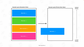
The spec says cascade layers are ordered by their order of appearance, and they're then given a priority.
Let me just show you with an example.
So I have a style sheet here on the left with several @layer blocks in there, so I have the blue one, reset, then base, components and utilities.
So on the left you see the order of appearance in the style sheet.
First reset, then the base,, then components, then utilities.
The priority is a reverse order.
Like this.
The first declared layer has the lowest priority, and the last declared layer has the highest priority, and that's why this here wins.
Oh, there's some leftover text there.
Copy and pasting slides.
Yay.
We'll do it live.
We'll fix it, right?
This one?
This one?
No, this one.
Sent to back this one.
Oh, also sent to back this one.
Yeah.
Got it.
Thanks.
Thanks.
So that's why this wins because our reset layer is declared first, so it has the lowest priority.
Our layer components is declared later, so it has a higher priority than our reset layer, and that's why it wins.
Yay layers.
There's a lots more things to tell you about layers how you can append to layers, how you can use anonymous layers, predefine layer order, blah, blah, blah, whatnot.
I will just pick out one here today.
Too detailed to you is how you can predefine layer order.
Because we bit have a problem here.
On the left, I have my declaration order on the right, I have my priority order.
If I move, blocks around in my CSS file, the priority also changes, and that might not be feasible.
If, you swap an import rule, just if you wanna sort 'em alphabetically and then all of a sudden the priority changes.
This is not always what you want.
And you can fix this by using an @layer statement.
It's an macro statement that goes at the top of your CSS file.
You say, Hey, you know what?
These are the layers.
At that moment using the @layer statement, you are declaring the layer order.
You are saying first, reset, then base, then components, and then utilities.
You can move blocks around.
The order will remain the same.
I like this.
This is cool.
Here's an example cSS file, how things can look if you use layers with all the extra stuff that I didn't mention from the list.
We predefined layer order, we import some CSS files, some external CSS files into layers, and then we create our layers.
If you wanna know more, I have a full talk on that.
Because I didn't tell you don't need to use layers.
You can perfectly have layers in one part of your code, you can also have un layered styles in the rest of your code.
You can just like progressively update your code while you start using layers.
More details in this talk.
It was given at CSS day earlier this year..
So that was layers.
The second thing I wanna talk about is CSS nesting.
Yellow here means yellow oranges means it's in the browser behind the feature flag.
So it's Chrome 1 0 9, which is currently a Chrome Canary.
Then red means no support.
Why is it?
Well the spec is still undergoing some changes, we still haven't decided upon this syntax within the CSS working Group.
So that's why it has no broad support and at Chrome we are experimenting with the syntax and just trying Hey, if we have this, will actually work, or will everything just collapse?
So nesting we have this little snippet and you're like, oh, whoa.
How can we do this better?
Because we're like repeating table dot colortable all throughout.
What if we had nesting?
You, must likely know something like Sass, right?
Where you can nest the selectors.
You have your table.colortable, and then you have the TD inside of there.
Then you have the dot C class inside of there and so on and so on and then you're like, great.
Nesting, this is a solved problem.
Ship it.
This won't work.
This won't work in CSS.
It will fall over the TD and the th declarations there.
This is because how CSS works.
CSS starts from top to bottom and starts parsing from left to right character by character.
So CSS goes I need to find a selector.
T A B L E.
Oh, table.
I noticed table dot color table.
Oh, this is a class, space open the parens.
Okay, now I'm expecting declarations inside of this block.
Then it goes, TD, this doesn't look like a declaration space.
Okay, maybe open the parens and it's whoa.
This does not compute.
So this does not work in CSS because CSS expects declarations in there and not extra selectors.
There's a few proposals being passed on within the CSS working group.
One proposal is to use an ampersand where we can say, Hey, know what?
Trick the parser into saying don't expect a declaration here, but expect a new selector in there and append the thing right there.
So we've added the two ampersands right there, and now it will work.
Then you might be wondering, oh, but why does the dot C work and why does the column first child work?
CSS already knows that declarations.
Start with A to Z and not with a colon or a period.
So that's why those work and the TD and the th ones didn't work.
The syntax is still under discussion.
We hope to resolve like selling on a syntax by the end of the year, early next year, but no promises yet.
Another syntax that's floating around is to use @ nest, where you can say like, Hey, @nest table.colortable.
And then the CSS parser knows the stuff in here is getting nested.
All right.
At td what you need to do then there is this little part here.
If you have some declarations that apply to that td, you need to wrap them inside of an ampersand block.
This has some advantages over the other one, over the previous one.
Both have their advantages and this disadvantages more info here on this link at the very bottom.
We have five proposals right now.
So there you can compare all the proposals next to one another.
To be clear, I've shown you proposal three and proposal five from that document right here on stage One warning, though, no matter which proposal we choose or which syntax that we choose, you need to know something about this.
Say we have this element, then div p, so we select a paragraph inside of the div or inside of the thing with ID element.
Then we also have div.foo p.
What if I actually have a div with a class named foo and a P Element inside of there?
What will the color be?
You might have guessed already because I'm asking you it won't be red, it won't be blue, and you're like, whoa, this doesn't compute.
Because if, I do div p and then div.foo.
This has a higher specificity here, the one at the bottom and then the top has a lower specificity.
No it doesn't.
That's a short story because internally CSS will expand the selectors using the is selector and the is selector says, Hey, you know what?
I accept forgiving selector list inside of there and my specificity, so the specificity for this whole thing right here, the one of the is a high specificity of the selectors in there.
So the specificity of element is 1 0 0.
Then you add specificity of the paragraph 0 0 1.
So we end up with 1 0 1.
Then here at the bottom you have 0 1 1.
So that's why the top one will win and not the bottom one.
So that's something important to remember.
If you use this and you slap IDs in there somewhere, you are also changing the specificity of other things that you are targeting.
Cool.
So that was the second thing I wanna talk to you about.
Because it can yes, this changes how I write my CSS or how I will write my CSS in the future.
And scope styles this is a cool one.
Support in Chromium behind feature flag.
Really, nice.
Not in Firefox.
And then Safari have indicated that they are like not opposing the proposal.
So things are looking good to, getting support in Safari.
Say we have light and dark, two things.
Then we have the links inside of there.
Okay.
I have a div with la this class light, I have the link in there.
What will the color be?
The color will be… red.
Red?
Yes.
The color will be red.
Then I have a, another nested div in there.
Dark.
What will the color be of this link inside of there?
That one will be yellow.
Yes.
Now what about this one?
So I have a light and then I have a dark in there.
And then I have another light in there.
The color of this, the color of this one will also be yellow.
It won't work.
Why won't it work?
Remember our scheme of the cascade.
We had like selectors and then specificity, order of appearance, light a and dark a have the same specificity.
So it's the order of appearance that counts here.
What is the last one that is declared in that list?
It's dark a that says color yellow.
So this link right here?
Yes, it's this light a, but this is also dark a.
This is a link inside of a block with the class dark.
So that's why this last one here applies.
No.
Oh yeah I had a slide of that just like 15 minutes ago.
So same specificity order of appearance is what matters.
The solution here is @scope.
@scope is something really, cool because it's an extra step inside of the cascade.
Yes, again.
And it fits in right there.
I sure do that the CSS working group does not add any extra steps to the cascade because I'm running out of screen estate but scope proximity is an extra step in the cascade.
Currently, it's spec'd to be over there after specificity.
They're not sure if they want to put it before specificity, but right now it's spec'd as being like it's after specificity so that if selectors have the same specificity, it's a scope proximity that will count.
This is what it looks like.
You create an @scope block with a selector, so everything inside of light apply this, everything inside of dark, apply that.
And that way if you have a link inside of a dark block, it will just look up the DOM tree.
This link right here, we'll just look up the DOM tree and we'll try and find its nearest scope.
Which is the nearest scope?
This one right here, light.
So that's why this link here will be red was it again.
Then this link right here will also look up the, DOM tree, try and find its near scope dark and then this one here will find light.
And that's why this will actually work.
So I think scoping is a really, good addition to to the cascade because this solves this very problem where we are nesting stuff.
You know, I think okay, but this dark and light example, it's like one that you just made up, right?
Yeah, it's one that I made up.
But a more practical example is one that I will show you later because there's also another way to write it namely like this.
If you don't wanna use an @scope block, there's the scoped descendant combinator is official word for it.
It's like the double greater than sign.
The code is equivalent to the thing that I just shown you with the @scope block is just another way of writing it.
So you have two ways of writing, @scope.
Why would you want to use this one?
Or why would you want to use @scope?
Like if we have two things, do the same thing why, do we have two things?
They're doing the same thing?
The cool thing is that @scope not only allows you to define the starting scope, but also allows you to define the end scope where you can say these styles apply from this element in the DOM tree down to that element in DOM tree and everything that's contained inside of it there later on.
Don't apply these styles right there.
Let me give you an example.
The media object, which Rachel also covered in her talk, which had the image of the balloons and then the, little description underneath and the title.
If I wanna style the image, I wanna say Hey, you know what?
Target the image right there.
We've had some solutions for that.
Like we wrote these very specific selectors, but if we moved the image inside of our markup, well the selector would break.
And then we went oh, do the BEM thing.
Let's just add extra classes to elements that, that way we can target them.
So we have a media object, IMG, and the media object video.
Yes.
But now we're like adding extra cruft to our markup, you don't really want it.
Well, with @scope, using the start and end scope, we can solve this.
You can say, Hey, you know what?
These styles apply from .media object to .content.
Find the image in there which will target only this image and not that image right there.
I think this is really, cool.
If you wanna visualize it, it works like this.
So it's targets everything in between the two lines and not anything inside of the red line.
If you're red, green colorblind, by the way, bad example that I did there, I just realized.
These are squares if you wanna make 'em circular because we call this 'donut scoping' in the spec, if you make 'em circular, it looks like a donut.
It looks like this.
Anything from main up to content.
And do note the content element itself is not targeted with the @scope thingy right here.
If you do want to include the content element, change our selector to this, add the little appendix there where you target its direct child, and then content will also be included inside of the donut scope like this, a broader scope.
Yeah.
Cool.
Another way to write scoping, and this is highly experimental because the syntax hasn't settled yet.
Maybe this is a way how we will be able to write in the future.
The syntax will most definitely change.
This is something that we're still like thinking about.
What should the syntax look like from media object to content, the IMG in there.
I don't like this one very much to be honest.
I'd rather have it like actually nest ed so that I can see it's the image inside of one of those things.
And then last one I wanna talk about is the, has pseudo classs.
Support in all browsers except Firefox right now.
Firefox has an experimental implementation.
They do support basic selectors, but they do not support relative combinators, so that's why it's still experimental in Firefox.
This is officially called the relational pseudo class selector, but people just call it the parent selector because that's what it essentially allows you to do.
And this selector here selects the image inside of the link, whereas the second one selects the link itself.
It selects the, link that has an image contained inside of it.
That way you can style the parent of the image, hence the parent selector.
Yay.
You can add some combinators in there so you can do the direct child only if it has a direct child.
It is an image.
You can also do like a section that doesn't have any of these elements, style this section differently.
I don't like this name, parent selector, by the way, because you can do way more with it.
It's not just about selecting parent elements.
For example, here with this selector, the first one, I select the figure that has the figcaption.
So I select the figure itself, but with the second one, I select the image inside of the figure that has the figcaption.
So you're selecting the image itself and not the figure element.
So you can't just do the parent, but you can also do like the nephew, the niece, or the sibling, whatever.
You can do lots of combinations with it.
For example, here.
If the link is followed by paragraph, then style the link differently.
Also really, nice there.
Jumping like from one element to the other.
You're chaining like the subject of what your selector targets.
Some practical examples.
Here's like a form where I type in my email address.
If I type in a correct one, it shows you like the green check mark.
If if type in a wrong one, it'll show you a red cross saying that this is not possible.
This is all done using just CSS.
This is what the code looks like.
We have a label and an input.
To the label is linked to the Input, the labels preceding the Input.
The CSS looks like this.
If the label is followed by something that is invalid, change the styling of the label.
If it's followed by something that is valid, make it green.
Cool, right?
Another example, if I have a dropdown and I change one of the values, I show one of the other dropdowns.
Again, the markup looks like this.
You have a select, you have some other selects, and then in CSS we say, Hey, you know what?
If the first select has an option of value 1, show me this select.
If it has a value of 2, show me the other one.
This is the CSS code.
Linger at the bottom code pen you can play with.
So you check the select, it has the option with the value 1 that this checked check select its preceding thing with data-shown one.
Crazy stuff, right with has.
Or here's another one.
My colleague Jhey made this one.
Where you can do like the, dock thing.
This is really cool.
The CSS looks like this.
You select the block, but then you select the element before the block and the element after the block that has a hover.
Then you select two elements up and two elements down.
That way it just works.
So more examples to close off.
You can do lots and lots of stuff with that.
For example, you can style an element based on the number of children it.
If it has five children style it like this.
If it has more than five style it something else.
For example, do something with overflow or change the grid layout , whatnot.
Here's an example.
If the UL has more than 10 children, 10 or more, give it this outline.
If it have, if it has exactly five ones start differently.
Another thing that I just came up with a few days ago.
You can style the first element that has a certain class in a group that has that certain class, Like here, the paragraphs, these are all paragraphs, but the gray ones, they have a special class and that the first one, I say the first one in the group, give it like the rounded corner on the left and the last one in the group, give it the rounded corner at the bottom, and then the ones in the middle just give them no rounded corner because they are in the middle of a group.
And this is what the selector looks like.
For example, the last one, find me a special element that does not have a special element as its preceding sibling.
Crazy, right?
I like this.
This totally changes how I write my CSS.
Like the, checkbox hack.
You don't, you no longer need to put a checkbox at the top of your markup.
You can just put it anywhere inside of your markup and then use the hess [???] To, find out is it selected or not.
A link dump.
Lots and lots of article articles out there.
This one was written by Jhey.
There's another one up here by Ahmad right here.
Really worth checking out because there's tons and tons of stuff you can do with the has selector.
And with that, I wanna close off, I wanna thank you for your attention, if you do have any, do you have time for questions?
Maybe , half a question.
. All right.
That was it.
Things have been going hard for CSS the past year.
In this talk we’ll take a look at some of the new and future additions to CSS that change the way we write our code: @layer, @scope, the :has() selector, native nesting, and more to architect cleaner, clearer, more maintainable CSS.