Designing for Learning Difficulties
(gentle music) (audience applauding) I've got my Twitter handle here but nowhere else so note it down or forget it, by the way.
I have lots and lots of links in my presentation today. You don't need to know any URL other than this one because they're all there waiting for you.
This is not me.
I always have to clear the air, this is not me. I'm not angry about the last Avengers movie that I wasn't in, I mean he wasn't in.
It's okay.
I haven't given up my acting career to talk to you.
This is me I think, possibly.
We could be twins possibly, I don't know.
This is also not me, this is my wife.
She's sitting right there.
She is the reason that I'm here today which is a bit unusual 'cause she's a primary school teacher.
One of the things that primary school teachers do is they learn about learning difficulties and how to teach children who comes from all sorts of different backgrounds and have all sorts of cognitive abilities or otherwise. And last year she was learning about dyslexia as part of an in-service courses. What teachers do, they keep learning things just like we do.
And she kept saying that this is actually quite interesting so you should know this.
Yes, I really should know this.
I need to tell other people about this.
And here I am.
And if you do want to, get anything good from today, you can tweet her.
Anything bad as me.
So just remember that Twitter handle, that's the good one. Before Twitter, before Facebook, you know, 64,000 years ago, people were compelled to share things.
And when I say people, this is actually a handprint from Neanderthals. So this is not even a human.
And this is one of the first known cave or earliest cave paintings that we actually know. This is someone sticking their hand on the wall, putting some ochre around it.
And you might look at that and, you know, (mumbles) was here but it's not actually that, it's more than that. This is actually a warning, this is a stop sign. Saying, don't go any further into this cave because there's a big drop and it's gonna hurt.
So it's not just a figurative illustration or something, there's meaning behind it as well.
Moving ahead, a lazy 24,000 years, we get pictures of oxen, like this around the place. And once you've drawn an ox like this once, it's like, got some really nice horns on there, you know, it's a bit of effort involved.
You wanna kind of speed things up a bit.
This is when we get into proto-language.
So this is Proto-Canaanite.
So this is not a written language yet.
This is when you get to that point of, you know, I've drawn a dozen oxen on the cave wall and my hands are getting tired.
I'm just gonna do it a bit quicker now.
There's no phonetic meaning behind the symbols that are here.
Each one is directly linked to what the picture is. So we see an ox head, we see a house, we have a throw stick or a spear or something like that, a fish.
It's pretty easy to see what's going on.
You don't have any verbs, you don't have any sentences.
It's all just directly what's there.
The next evolution in language was towards what we call logographic language and these are the first written languages.
So this is ancient Egyptian.
Middle to later forms of ancient Egyptian.
Not only to the letter forms have meaning but they have a phonetic value as well.
So you can actually construct sentences out of these. Logograms have been around.
So this is Chinese which is a logographic language. It's also the same symbol in Japanese.
So if you speak both languages, you can choose which one you want to mean.
So this is well, my pronunciation is gonna be bad, I do apologise. This means fire.
And you can actually look at the shape.
Kinda looks like some twigs put together and some, you know, that couldn't look like fire. So this is an evolution based on someone drawing a picture of a fire.
And it's gone through thousands of iterations until this is the modern character that we have in Mandarin.
This is (speaks Mandarin) which is mountain.
And again you can kinda get the idea of a mountain range or a hill or something along those lines.
There's something in the actual character itself. When we put them together, we actually get a different meaning altogether. So this is (speaks foreign Mandarin) which is volcano, fire mountain.
So this is how language actually works.
It's really quite literal.
I can see fire, mountain.
Yeah, that makes sense.
So this is a really easy to understand language from that point of view.
That when you know what the symbol means, you can actually construct the meaning quite easily. But it's not always the case, languages evolve, they get more complex as they go.
Yay, complexity.
So this is (speaks Mandarin) which is action object.
What's an action object? But does that even really mean anything? What this is, is actually animal.
When you say, animal in Mandarin, you're actually saying action object.
The individual characters and their meaning no longer mean anything on their own when you put them together.
So we've got, a meaning that's beyond what's immediately obviously there. So moving forward to, we're not necessarily forward but to alphabetic languages.
Alphabetic languages, each character has a phonetic value but it has no direct semantic meaning as well. So this is Italian.
And I've got two letters here.
Italian is what we call a transparent language. You learn in the rule, you apply the rule, you good.
You don't really need to know anything more. So I've got two characters M, and if you see an I in Italia it's always E. So M, I is me.
So I can repeat that forever.
If I make it a bit more complex, (speaks Italian).
I can see that the I in there is E once again. Every single time, I'm gonna get this right. the CH pattern, this is actually blends.
This is a bit more complex than just a single letter to a sound.
When I put C and H next to each other in Italian, I know I need to pronounce it with a hard K sound. So this is a K, (speaks Italian).
So I now know what that blend is.
They take it a little bit further.
No one knows how to pronounce this properly. If you learn anything else from today, you will be learning how to say bruschetta. This is a very hard CH.
That's the way Italian works.
There's no variation in Italian on this whatsoever. So you get transparent language easy to work out what's going.
And now you know, correct waiters when they get it wrong, please. My Italian mother-in-law will love you.
So another language which is a little bit less transparent, this is German.
And this is the word (speaks German).
The CH has gone from a hard K which is from a great derivative to something it's a bit softer like (mumbles). Still recently good, if I place an M in front of (speaks German), I get (speaks German).
That's all right, it's not so bad.
What if I put an S in front of (speaks German) It's now (speaks German) It's not (mumbles) or anything weird like that.
Something have got a different blend.
The rules I learned before, don't apply anymore. It's like great thanks German.
Let's get a little bit more complex.
This is a German word.
Of course it is.
How would you pronounce this German word with the rules you've learnt in German? You think, I'm not sure, something this is (speaks German) which is a French pronunciation of the French imported word. So this is called a loanword, a word that's brought into a language from another language. And Germans have a really strange habit of bringing the pronunciation with it as well. So you need to know that this is (speaks German) Because that's how it's in French.
There's nothing in German that helps you with this. I don't know why? That's just the way that German works.
I mean Paul confuse kookaburra.
He doesn't know either.
So another language which you may be familiar with, this one is English.
We have the or the, like I don't even know where to start with the pronunciation of this word.
I'm gonna put an M on the front this is now on the end. (mumbles) no, it's a them.
Come on.
Let's add another letter to it.
What's going on here? So English is an opaque language.
The rules are not consistent in any way whatsoever. And you get something like horse, right? Okay, horse.
So is this worse, no.
It's worse.
What am I actually learning here? Thomson, Thompson? No, I just don't know.
There are not enough patterns in here.
English is a trading language.
It's been put together by lots of different languages, lots of different language routes.
And there's nothing that's really dominant in there. So we're left with a mess of different rules, some of which apply I before E except after C, except for all these variations where that doesn't work. So great, thank you English.
But this is what it is, it's really hard.
But that's not everything.
It gets a little bit biological when we start talking about learning difficulties. 'Cause yes, okay, English is opaque, it's difficult to learn but there is a difference here.
Here we have a person, who is a child's brain scan where they have a history of dyslexia.
And on the other side we have a person who child's brain scan where they have no history of dyslexia.
And the key difference between these two is I need to read this because this is Latin and it's really complex.
This is the arcuate fasciculus which I'm going to call a bunch of fibres 'cause that's easier.
The bunch of fibres for someone who's suffering dyslexia is notably smaller than that with someone who has no dyslexia.
What's the significance of this? When we read something, we look at a word.
It ends up in the front of our head which is the frontal cortex.
It goes through the bunch of fibres to the back of our head which is the posterior cortex.
The back of the head says, what is this? Can I make a word out of this? I'll sound it out and get something.
Sends it back to the frontal cortex where it's stored.
And it's actually like a snapshot basically. So instead, it's caching.
It's cached in the front of your head.
This is the way the brain works.
If you have dyslexia and there are varying degrees, it can be more severe or less.
You don't get the caching.
So every single time you're looking at a word, having to read it, you have to do that processing again.
Like that is hard work.
This is the nature of the condition.
Estimates for dyslexia vary.
Interestingly if English is not your first language, you may subsequently learn English and suddenly find that you've got a learning difficulty that you never had before.
Because if you're learning Italian which is quite transparent, you may show no symptoms of dyslexia whatsoever. Then when you get to an opaque language like English and say, oh I can't actually read this sentence. What's going on? And this is what's actually holding you back. Estimates somewhere between around 10% of the population, something along those lines, 5% of the population categorised as severe dyslexics. A lot of people are not even diagnosed they just get told they're stupid 'cause they can't read.
Which is why we have really highly trained teachers like this one here, who look at look for the warning signs and do something about it.
Diagnosis is interesting.
You can do tests with say, maybe dyslexic, you may not.
But you need a brain scan to actually tell you what's going on.
It's similar to something like autism where there is actually something different going on biologically.
It's not just someone who's trying to be difficult or anything like that.
How do we fix it? By designers.
Yay, design fixes everything.
There are two typefaces notably out there that cater for dyslexics.
The first one here is Dyslexie which is a commercial font.
I don't know why they charge for it but they do.
There's OpenDyslexic which is free, which is great.
Here's an example, so I've got a sentence at the top in Helvetica and another in OpenDyslexic.
Key differences here, if you have a look at letter forms of Helvetica, some of them are quite close together.
So we've got some crowding going on.
I mean, particularly look at the R and N in modern. Like that's not that much different from a letter M If you look at the same word in OpenDyslexic, that's pretty easy to see what's happening there. So this is most of what these two typefaces are actually designed to do.
They're meant to make it easy to read what's going on. So the question is, like here's our hypothesis.
Let's build these these fonts around these principles of, you know, less crowding et cetera.
Has someone done some research on it? I have done plenty and plenty of research.
And Betteridge's law of headline says that if someone asks a question in a headline, answer is no.
So, do dyslexia friendly fonts really work? No, they don't.
It's really quite disappointing.
But what's actually working about these fonts? I touched on it before when we're looking at letter crowding, x-height makes a difference.
These fonts are just inherently easy to read. So if you choose a complex font, especially something that's got serifs, if it's got anything approaching italics.
These are much more difficult to read, not just for people suffering dyslexia but for everyone.
And if someone is suffering dyslexia, they may look at your typeface that looks beautiful but just not be able to read it at all.
You're basically doing the same thing as presenting a blank screen.
Surprisingly Comic Sans is quite popular amongst dyslexic people.
I feel very odd at a design conference saying that Comic Sans is good, sorry.
Where are these rules that we can actually pay attention to? W3C have accessibility guidelines, yay.
So the key things, and look this CSS, line height is important, letter spacing, word spacing and having a margin between paragraphs as well makes a big difference.
Key is large font sizes are very helpful.
Line lengths are really interesting.
We talked about that yesterday, you know, 60-ish characters based on what we used to put in books 200 years ago. That helps some people but there's a little research.
For some reason some dyslexic people like things in narrow screens.
So reading stuff on their phones is a whole lot easier for the line links.
And this does make sense when you think about it. Because if you're having difficulty with each word then tracking to the line, a shorter line's gonna help you a lot.
But at the same time, most people who are severely dyslexic will take care of that.
So just prepare for your design to be absolutely debauched on the screen because someone's going to apply some rules on it that's just not going to work for you.
One last point on typography is justified text is evil.
Under all circumstances don't use it and it's bad for other people too.
When you have ragged edges, it's very easy to track on to the next line. If you have fully justified text, you can't. So you lose that readability.
It's a colour contrast.
Everyone knows that colour contrast is important. Unfortunately it hurts my brain because we just don't have the easy tools for this. If you jump into Photoshop, you pick a colour you put on a background, there's nothing to tell you that it's good or bad. You need to know, to look for it in the first place, you need to know what colours are going to work. Same thing with sketch, same thing for illustrator. There are plugins for these but you have to seek them out.
They don't jump at us.
In the browser, it's the same.
There's nothing really there.
We can find plugins but not everyone is going to actually do that. It's changing somewhat.
In Firefox 65, they've got a colour contrast tool. In chrome 65, for some reason 65 is the lucky number, there's a colour contrast tool.
They're kinda hidden.
Its a bit disappointing that they've been implemented like this.
There are only five simple steps none of which is easy to actually activate the colour contrast tool in chrome.
But at least it's there.
I'm really hopeful that this is the start of something else. I mean, the accessibility panel in Firefox is a great step forward even if it's a little bit unwieldy at the moment. Moving beyond the basics of colour contrast. macOS Mojave introduced dark mode which allows you to see, like basically a darker version of the screen. And there's a condition called photophobia. I suffered from it when I'm experiencing anything close to a migraine.
And there are lots of different people who have the same issues.
I really like dark backgrounds, it makes things easier for me.
It's just easy to read, there's less strain in my eyes. I can actually read a lot better.
There's actually switch, there's a media query in CSS. So you can, add media prefers colour scheme as dark and light but we tend to design for light by default.
And you can switch on this which is awesome. You can actually, once the dark mode is set in the operating system, you can change your appearance accordingly. Going a bit further than this, some of the new experimental features are actually having the ability to switch on style sheets altogether.
So you can import a completely different style sheet based on the colour mode that's been set.
So that's still coming forward.
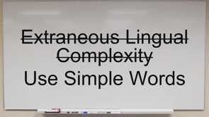
Safari are leading the way in this which is awesome. Extraneous lingual complexity.
Rolls off the tongue, use simple words please. Language is really hard.
We may give up and just try to invent our own words.
Here are the shark's, bitey boy.
And over here we have a swordfish, pointy boy. It's tempting to try to do this but the reality is (mumbles) in this language. Working at IRIS, I'm dealing with superannuation, no one knows superannuation.
It got lots of really complex terms that you've got no chance of working on.
So we work really hard to try to make the language as simple as possible for people to understand. You don't want to have to read ten paragraphs to understand what the term means.
Animation.
Hopefully, everybody who's done any animation has read this very important blog post.
Your UI isn't a Disney Movie.
The point of this is just to tone down your own animations.
Don't animate everything on the screen because it's is too much, it's too busy.
Our brains are working hard already before we're actually starting to try to read the text. Putting lots of animations on there gives us more, it's more taxing on the brain basically.
This is cognitive load.
If you have any reading difficulties, it makes it all the worse for you.
More media queries, prefers-reduced-motion exists.
And you may be tempted to go down what Roger Johansson suggests which is to wrap every single animation around this. It's only supported in Firefox and Safari at the moment.
So that would basically disable animations everything except for You Firefox and Safari.
Animations are still important.
So how do you actually get around this? I've done a couple of experiments on this, this is a CodePen it's linked to.
Using CSS custom variables, you can actually set your animation timings separately. Wrap the media around it.
So if someone actually needs to reduce motion you can cut your animations all together or just keep them really tight.
So this is very achievable.
I'm going to change my code when I get back to work on Monday to do this. I suggest that other people follow suit.
With standards of, you know, something doesn't actually support custom variables then you know just put the standard declaration without first and follow it up.
You could turn this into a mixing really, really easily if you're using a processor or some description. I'm going to do that too.
But this is not that hard to implement and it makes a big, big difference for people who suffer vestibular, vestibular disorders.
This is why I've got my reference right here, thank you.
Okay, lastly onto visual noise.
If you've used the internet in the last four years, you'll have noticed that everything is jumping at you all at once.
We've gone past pop-ups 'cause they've blocked by default in browsers now. But, you know, we can just do a dialogue in front of you instead.
We can animate some ads over on the side.
I'm just gonna put one in the middle of the paragraph you're trying to read right now. Now, even if you don't suffer from a reading difficulty, these things are terrible.
Fortunately, browser vendors are working towards this and I've kept the screenshot with the take the survey thing on here.
Thank you Firefox.
You can't even, like tell me about blocking things without blocking me reading that.
That's awesome.
So auto play of videos is being considered basically as opposed by default, so videos don't just start playing.
Chrome is doing the same which is good.
So these are very experimental at the moment, at least there's some work being done on here. I mean, it's hard enough if you don't have anything holding you back with this.
But no one out here likes auto play of video. No one likes it when the ad pops up in the middle of the paragraph you're trying to read. We're the ones who can actually say (mumbles), really, really shouldn't do this because if I do this, because some people can't even now read the text at all, thank you.
Which gets to the conclusion as much as there is a conclusion on this.
When we're told that we're building something, we need to design and we need to support IE because someone's still using IE 11.
It's like, great okay, grumble, grumble I'm gonna (mumbles) anyway, that's fine.
10% of the population out there I've got reading difficulties.
Do we do that? Do we think about them when we're actually designing this stuff? Like we'll do it for IE which is down to a few percent for some, depending on who your clients are.
But do we actually give the same weight for someone who is, you know, perceiving seeing things other than how we are. We don't, really.
But the thing to remember is we're all weird. Which is the converse of saying that there's no such thing as normal.
Every single one of us at some point or other is going to run into a situation where we need some extra assistance.
And for me when I'm approaching a migraine, I can't read your white background with dark text. It's just not gonna happen.
Most of the time, no trouble at all.
But it's up to us to actually step out there. I mean, we're talking about AI ethics but this is design ethics.
If you're producing designs that don't follow these rules, if you're producing text that is unreadable, that is unethical.
You're preventing people from actually getting on with their lives.
You know, go back to work, add your animations in there and make a difference.
Thank you.
(audience applauding) (gentle music)
More than 1 in 20 people experience difficulty with reading and learning, and those difficulties don’t just end at school. We’ll go through some common learning difficulties including dyslexia and discuss what impact they have on designing for the web.
Chris is starting off by walking us through the evolution of language and writing #design19 pic.twitter.com/9BeugA6L5u
— Web Directions (@webdirections) April 12, 2019
Chris is here today because of his wife @sazzarj, who is a primary school teacher. Teachers learn how to identify indicators and teach children with learning disabilities; and she started showing Chris the things she was learning.
People have been compelled to share information long before humans even evolved. Neanderthals left warning signs in dangerous caves. Language evolved through many forms through history and we still have extremely different forms of language in the world today.
火 looks a bit like early glyphs, pictures of twigs with flame. It’s not always this easy to see the thread. We’ve mostly moved beyond visual and into phonetic language.
The rules in Italian are reasonably consistent – i is always pronounced “ee”, ch is a hard “k”. Now you know how to say “bruschetta”!
But in German, ch may be hard or soft. Then you have ‘lone words’, like “engagement” which is given the French pronunciation because it’s a word lifted from French.
English is an opaque language with no consistency at all. The/them/theme… horse/worse… “i before e” except when it isn’t. English is put together from a range of root languages.
So language is difficult! It gets much harder when learning difficulties are involved. There are physical differences that show some peoples brains don’t have the same arrangement of connective fibres. This creates learning difficulties, but they may not surface if you learn a language like Italian first; then suddenly when you learn English you have trouble.
So how do we fix this, as designers?
- There are specific fonts for dyslexic readers, including Open Dyslexic which is free. However their effectiveness has been questioned and there are some more mainstream typefaces that test well, including Helvetica and Arial.
- There are typsetting rules to support dyslexic readers – larger type, more spacing, etc.
- Don’t use justified text… for anyone!
- W3C has cognitive accessibility guidelines
- Be prepared for the fact some people will be applying their own design settings
- Meet colour contrast – there are tools to support this, but they are hidden in dev tools or require extensions
- Dark mode is fantastic for photophobia. We tend to design for light by default, but we should also be handling dark mode as a media query.
- Extranous Linguistic Complexity…….. use simple words
- Animation – don’t overdo it! Tone things down, give peoples brains a break. There is a prefers-reduced-motion media query, although browser support isn’t really ready. However there is a trick you can do to avoid switching off motion for everyone (see codepen)
- Reduce visual noise – don’t autoplay media, don’t hurl dialogs at users for no reason
There's no such thing as normal. #inclusion #inclusive #design @MicrosoftDesign pic.twitter.com/xXW468mE5X
— katholmes (@katholmes) March 6, 2017
The conclusion: there is no such thing as normal. We’re all weird. We will all run into a situation where we need some assistance. It’s simple design ethics that we should not exclude people or make their lives harder.