(slow electronic music) - As John said, okay, we're up now.
So as John said, I'm here to talk about how you, the implementation side of things, and specifically in this case the implementation of an accessible auto suggest.
So we've all seen these, right, they're everywhere these days, you've got them on sites like Amazon, eBay, Google search were actually the first ones to come out with it in around 2004, and they called it Google Suggest at the time, with the premise being that as you type you get suggestions to make a selection from there, and it sort of does the search for you.
And since then they've become really, really easy to implement, 'cause every framework under the sun seems to have an auto suggest component.
So, whether it's Angular, React, whatever else, you include the library, you know you sort of you instantiate the function, and you get a nice pretty auto suggest.
Now the one thing, or the thing that these frameworks don't usually take into account is the accessibility side of things.
So for example, if we look at a screen reader and a screen reader user, if you've got a field that as you're typing, gives you some suggestions based on what you've typed, if you don't announce that to a screen reader user, then that field is just a normal input field.
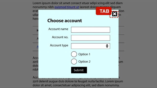
And sometimes you've got the circumstance where as you're typing in that field you actually have to, because of the way the back end works, you actually have to make a selection in order to continue, and if it's not properly accessible, and you can't make that selection, then you're kinda stuck. So I'm gonna go through a couple of steps here, step one being understanding the requirements, step two, I'm gonna look at some of the code, and step three, I'm gonna give you some demos as well. So first off we've got the search field or the input field. Now as with any other input field on the web, you need a descriptive label, which needs to be associated to its input field. So the For attribute on the label needs to be referencing the ID attribute of the input field. You need the role equals combobox to tell the screen reader user that, hey this isn't just a normal input field.
You also need an aria-autocomplete attribute, an aria-owns attribute, and an aria-activedescendant attribute.
Now, the aria-autocomplete attribute basically tells the screen reader, hey I can either select from a list of options that are available, or I can keep typing into the field and finish what I'm typing.
The aria-owns attribute you use to reference the ID of the container that's gonna hold your suggestions to associate those two things, and the aria-activedescendant attribute is what you use to, when you're moving through the options, have the correct option that's selected announced. You got the keyboard access side of things. So, number one is you need to make sure that anything that's interactive has keyboard focus, needs to be visible to users as they're moving around the page.
The suggestions that appear need to appear, or need to be navigable using standard keyboard commands, so the up and down arrow keys for one.
I've seen implementations of this where they've used things like Control-Alt and you know, A or B or C or whatever else to move up and down.
Don't do that, 'cause it gets really, really confusing, and also pressing up and down should highlight whichever sort of option you're on at that time. So as you move down, you get a visual indication of which of those suggestions you're on.
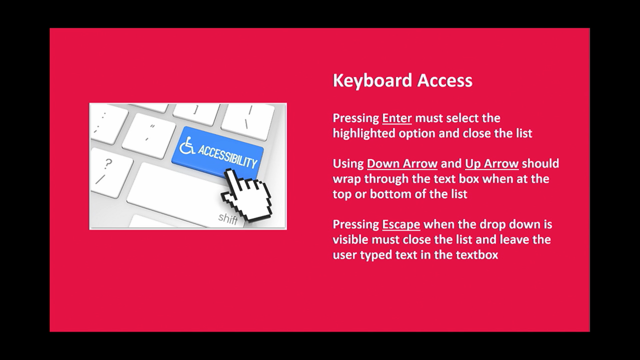
Hitting the Enter key, fairly standard, should make the selection.
Using the up and down arrow keys when you're either at the top or the bottom of the list should just wrap through.
So for example, if I'm at the top of the list, and I press up, I should go to the bottom.
If I'm at the bottom of the list and I press down, should go back up to the top.
And hitting the Escape key should close the list and just keep what the user's typed in the text box in the text box.
For the suggestions themselves, so they need to be displayed directly under the input field, so you'll see up there, it's fairly standard design pattern these days, where if you've got a field with suggestions, those suggestions are right underneath that field. But it's also important to make sure that those suggestions are directly below the field in code as well, so from a source order perspective, the suggestions need to be as close to the input field as possible, because if something were to happen and your JavaScript doesn't work properly, for example, for a screen reader user and for a keyboard user if they know the suggestions are down there, then using the arrow keys, particularly for a screen reader user, will get them to a suggestion anyway, and they'll be able to make that selection. And if there's no suggestions available, then the list shouldn't appear at all.
In terms of markup for those suggestions, so the container element that holds all the suggestions in the group, needs a role equals listbox, and the inside of that, each of the individual options needs a role equals option with an id attribute, because we then use that id attribute to reference the aria-activedescendant attribute that's on the input field.
When you're moving through with the arrow keys, you need to toggle aria-selected equals true to the option that's currently selected, and you must always, and this is probably one of the most important, must always announce the number of suggestions that are available to screen reader users, 'cause if, like I said before, if they don't know they're there, they can't actually interact with them.
So step two is kinda understanding the code. So if you see at the top there, we've got what's called and aria live region. Now that's what takes care of the announcements to screen readers, so the aria-live attribute can take in three values.
The first is none, so basically that says, hey, whatever happens here, I don't care, don't announce it unless I'm focused on it. Second one is polite, so it says, announce whatever sorta gets populated into this div, but only do it when you're finished doing whatever else you're doing at that time.
So for example, if the screen reader was reading a paragraph of text, and that regions was set to polite, then it'd finish reading the paragraph before it announced whatever had happened in that div. And then you've got the third one, which is the one I'm using, which basically says, hey I don't care what you're doing, just as soon as this gets populated, announce that. Underneath that we've got the search box or the input box, with the relevant attributes here.
The thing to just take note of there that the label is properly associated, you've got the role equals combo box, you've got the aria-owns that references the container of the options that's a bit further down, aria-autocomplete set to both, so, like I said, I can either select from the list or keep typing, and the aria-activedescendant in this case is set to suggestion one, which is the only one that's on the screen.
And a bit under that you've got the suggestions, so you've got the div with the role equals list box, and the options inside that.
Now the one thing to note here is, I probably could have used ul li markup, so unordered list markup to do this.
The reason I didn't do that was because you actually have to use the listbox role in order to get this to work properly, and one of the rules of ARIA, which I think Cordelia will touch on a bit more tomorrow morning, is that you can't override native semantics. So that's where I've picked elements that don't have any semantics, and turn them into what I need them to be.
Next we've got the DOM ready function.
I'm not gonna step through all of this, but the key callouts here are all of the different sort of key combinations that we've coded.
So you've got escape, tab, enter, left, up, right, and down, and they're each of the keys that keyboard users and screen reader users will interact with when they're sorta using this, and then you've got some event handlers there that'll call various functions based on the keys that are pressed, so one is on input, so as I'm typing into the box, and the other one's the sorta key press function that'll react based on the key that I've pressed. So do search is actually the function I've got that does most of the work.
So, what I'm doing is I'm checking to make sure that I've actually got a result based on what I've typed. If I have, I'm then creating the list box and then creating each of the options.
And the other thing to take note of there is, as long as I've got more than one suggestion, announce to the screen reader, hey you've got some suggestions.
If I don't have any options, or nothing's come up, then none of this happens and you don't get the list. Keypress is pretty self-explanatory, so based on the key that I press, it does what I mentioned earlier, so for example, Escape will just close the list, and keep whatever the user's typed in the input field in the input field.
Right does the same thing as pressing Enter in this instance, so I'm on a suggestion, I hit the right arrow or the Enter key, and it selects that suggestion.
And these are just sorta moving up and moving down. I'll show you the move up function, which basically says, hey, from wherever I am in this list of suggestions, move up one, and sorta toggle all those attributes as needed.
So you see, got the aria-selected goes to true, the aria-activedescendant attribute on the input field gets changed to the new value, and the highlight gets, well the new selected option gets highlighted as well.
I'm not gonna show the reverse of this, which is basically the move down function, because it's more important to get into the demos which are really the good bit.
The other thing that I'll say here in terms of this code is, I'm using ARIA 1.0 specification as the reference, so there's ARIA 1.0 and there's ARIA 1.1, which is currently in development and in draught, but they may be looking at changing this combo box pattern, but because it's still in draught I sorta went with what's currently being accepted and still gonna be supported in browsers, which is the 1.0 design pattern. The final function I'll touch on is the select option function, which basically does what it says, and selects the option.
All right, now this is where it all comes down to the good bit, 'cause you guys are actually gonna get a demo of this, I'm gonna get Zendy to strategically press Play when I move to the first video, so give me two seconds.
So this is an example of an inaccessible auto suggest first off.
- [Screen Reader] Accessible auto complete. Accessible auto complete.
Tab Suburb or Town Search Edit, type and text. M-E-L T T-L-E-E-L - Yep, so I'm typing and typing and nothing happens, so for a screen reader user, if they needed to make a selection from one of those they couldn't do it.
And I've gotta say, I'll be honest, I kinda died a little bit inside as I was coding that. I had to do it for the demo, but I kinda hated myself a little bit afterwards, because you know, I kinda want it to function more like the second one, which should do things properly. - [Screen Reader] Accessible auto complete. Tab Suburb or Town search edit, type a text. C-R-A-I Two suggestions found.
To navigate use up and down arrows.
Listbox Craigieburn, Craigieburn East.
Craigieburn.
Suburb or Town search edit, Craigieburn type a text. Tab Search button.
- See, that's better, it gives you that warm and fuzzy feeling when it kinda just works. And that's how these things should function, right? So if you or I can see what's on the screen and I can interact with it, then the same should be able to be done if I'm using a screen reader, if I'm using a keyboard, or any other form of assistive technology, right, and that's what this is all about.
So, you know, we need to make sure that these things work for everybody and not just you know, look pretty and kinda work if you can use a mouse and you kinda know where to click.
So I felt a lot better coding that one, 'cause it actually worked.
And this is my final slide, and if you guys take nothing from the presentation, then this is probably the one takeaway that I want you to have, so it's basically the checklist of everything that needs to be done in order to get the auto suggest to work properly.
So I will send out the slides, I know everyone's taking photos, I'm gonna send this out, and I've got a working code sample on CodePen as well, so that'll come out as part of this.
The other thing I'll say is this should, while it should work across pretty much all of the screen reader combinations out there, I did get some feedback after Sydney the people using the iPhone had some problems, so I am looking into that, I will fix it, and I'll let everybody know once it's all sort of done and sorted.
But that's it from me, hopefully you guys got something out of this, and I think I've got time for questions if I timed it right, but if not, that's fine.
Cool, thanks.
(applause) (slow electronic music)