Building the most inaccessible site possible with a perfect Lighthouse score

Thank you so much for having me.
It's such an honor and pleasure to be part of this first Access All Areas event.
Today, I want to present to you an experiment.
I've conducted two and a half years ago.
It's called building the most inaccessible site possible with a perfect Lighthouse Score.
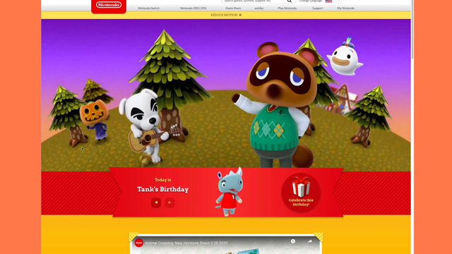
If you are on social media, you have probably seen a similar post of this one I'm showing on the screen, or maybe you have posted something like that.
What you can see on the screen is a fictional post by a fictional user.
And it says, yes, we did it all green and party emojis.
And below that you can see a screenshot of a Lighthouse Google's built in, Google Chrome's built in testing tool.
And there are four categories, Performance, Accessibility, Best Practices and SEO.
And each category shows a green circle with the number 100 in it, indicating that the site passed all tests in each category.
Now I want you for a second to think about how that makes you feel.
What do you think, what do you feel when you see a post like that?
I would tell you what I think I liked it.
I think that's great because it shows that the person didn't just build a site and put it online.
No, they build a site and they tested it and they probably didn't get a perfect score in each category.
So they optimized the site, they optimized.
it some more up to the point where they got a perfect score in each category.
And that's great.
And I believe that it's okay.
And it's actually a good thing to share that because it's fine to show that you're proud of your achievement.
But there's also a lot of criticism because there are many people who say that these numbers, these scores, are in fact just numbers and that they don't tell anything about the quality of the site.
So that a score of 100 in performance doesn't mean that you've built a fast site and that's actually a valid argument.
So for me, it's both, I like it when people post a screenshot of their achievement, but at the same time, it's also important that you understand what these numbers mean.
Zach Letterman posted back in 2019 these tweets, he said free blog, post idea, how to build the slowest website with a perfect Lighthouse Score.
And obviously I liked the idea a lot and I was thinking about how can I, how would I be able to pull that off?
What can I do in order to make, as a site really slow, but still get a perfect score and then Vadim post.
That would be a wonderful read!
Here's one for an accessibility audit.
And he posted a, code snippet of an image element that has the same value in the source attribute as in the alt attribute.
So that's something that will pass an accessibility and automatic accessibility test, but isn't accessible.
And I liked that even more because, you know, accessibility is my thing.
So I started thinking, Hmm, what can I do?
What can I do?
And I did some testing, actually, a lot of testing and I came up with a site or actually it's just a page, a very basic page.
So what you can see here is just a heading and a link, two paragraphs at least, and a very simple form.
And this site is pretty great.
It's fast.
It's fast by design because it's HTML only.
There is no CSS, no JarvaScript which could slow it down and it's accessible because I'm using semantic HTML.
So this is my baseline.
This is what I'm working with.
And I want to make this site as inaccessible as possible while still maintaining this perfect score.
And, now I'm going to show you what I did, but before I do that, there is an important disclaimer.
I want just, I want to make sure that you understand that this talk is not about Lighthouse, about the tool or about the Google Chrome team, the team at Google that built it.
I love Lighthouse.
I use it almost everyday and I'm also very thankful for the work that the Google team did.
I learned a lot from them.
So this is really not about Lighthouse and not about the team and their work it's about you and me and how we interpret automating testing results.
And the second disclaimer is just in case you don't, maybe don't get it.
And there will be a lot of sarcasm in this talk.
Actually, the whole talk is sarcastic.
So most of the things are actually bad practices that I'm showing.
I just wanted to make sure that you understand that.
Okay.
So I built this page and it's perfect.
And I want to make sure that it's inaccessible.
And I've invested a lot of time.
I did a whole lot of experimenting and it was really fun and I learned a lot and I was even able to come up with two principals, two web development principals on my own.
So you might know graceful degradation or progressive enhancement pbbbt [raspberry sound] I came up with a new thing and it's called progressive degradation.
And if you apply progressive degradation to a site, it means that with every line that you write, you make the experience for the user worse.
And that's pretty cool.
And that's what we are going to apply to the site I built.
So yeah, let's exclude as many people as possible.
This is my baseline again.
And the first thing I want to do is I want to add complexity, because we web developers, we love complexity.
We love to configure Webpack.
We love to create complex build pipelines.
And we also love to use JavaScript frameworks for pretty much anything that could go online.
So the first thing I want to do is to add the hidden attributes to the body elements.
This removes the whole page.
Now, I could stop here because hidden, just hide all the contents and decide is inaccessible to everyone.
And I would get a perfect Lighthouse score, but I don't want to make it too easy on myself.
I technically want to still show content on the page.
Um, the side looks like that right now.
So there's no content because hidden in HTML is what display none is in CSS.
And in order to get the content back, I'm adding a class to the body named loaded, and I'm adding a style sheet.
And in this style sheet, I select the loaded class, which is on the body.
And I said this page to block.
So now the page looks exactly like it did before, but the difference now is that CSS is a dependency.
So if for some reasons CSS doesn't load, there is no content on our page, which is pretty great.
Now you might say why would CSS not load?
It happens if you are in the middle of nowhere in Italy, for example, and you're trying to book a ticket for a bus or a ferry.
You are happy if you at least get some contents or whatever.
Okay.
I mean, it doesn't happen that often, but it happens.
But that's not complex enough for me.
Instead of adding the loaded class manually, I'm going to add it via JavaScript.
So I remove it from a body.
Again, I add a script and in this script I select the body.
I use classList and the add method to add the class.
Now the side still looks like it did before, but the difference now is that JavaScript also is dependency.
So if JavaScript doesn't load the class doesn't get applied and the content doesn't show.
Pretty cool.
Now I would say it's time for the first Lighthouse test.
So I opened dev tools.
I switched to the Lighthouse panel.
I click on generate report, Lighthouse is warming up and fingers crossed.
Let's see.
Perfect score.
Okay.
That is great.
But that was expected because, you know, I didn't do a really bad thing here.
I was just warming up.
So now let's get dirty.
Not let's get really, really dirty.
The first thing I want to do is I want to exclude screen reader users, and there are many different ways to exclude screen reader users.
You could just use divs for everything, or you can apply aria roles in a very wrong way.
But the most effective and easiest way I found is adding the aria-hidden attributes to the body element.
Now, I didn't do that in my experiment because I know that aria-hidden isn't allowed on the body element.
My workaround is to wrap all the content on the page in a div and put aria-hidden on that div.
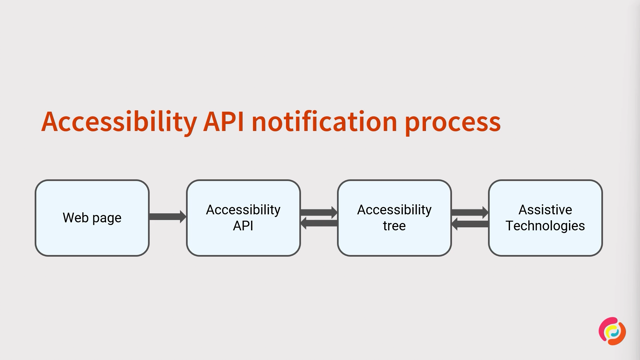
Now what aria-hidden does is it removes an element from the accessibility tree and the accessibility tree is a representation of your HTML that you've written similar to the DOM.
The DOM is a representation of your HTML that we can modify using JavaScript and style and so on.
And the accessibility tree is a representation of your HTML specifically for assistive technology.
So it includes all the elements that get communicated to assistive technology and their roles and accessible names and so on.
And if we use aria-hidden, with the value true, we can remove an element from this tree.
And if we put aria-hidden on an element like the body, we remove the whole page, basically from the accessibility tree, making it completely inaccessible to screen reader users.
Now let's run another Lighthouse test because now this site is completely inaccessible to screen reader users, and we should get a perfect score.
Oh, no.
As score of 95 and the error message says aria-hidden true elements, contain focusable descendants, focusable descendants within an aria-hidden true element, prevent those interactive elements and sort of, so the problem here is that we have interactive elements ,or focusable elements like link, for example, and it's not allowed to put aria-hidden on an element if it contains focusable elements.
Now the first focusable or internactive element we have is this link dealing with that, wasn't that complicated.
So I'm just using a pattern that I've seen on many other sites and the pattern works like this.
So you remove the href attributes.
So you are turning this hyperlink into a placeholder link, and then you just add the on click attribute.
And use location.href to redirect to the page.
Now you have a place holder link, of course you have to add some CSS in order to make it look like a proper link, but it works.
So this is pretty great.
The next interactive elements we have are these input fields and the button.
And again, it was pretty easy.
So what I did is that I turned the input fields into a div and I put a content editable attribute on this div.
If I'm making it editable so people can type in this div and again, I had to add some styling in order to make it look like an input field.
And I turned the button into a div.
And again, I also had to add some styling.
Unpopular opinion, button and div should be the same component.
And that's it.
Now we have no more interactive for focusable elements on our page.
And I know what you're thinking, Manuel this isn't really tried, this isn't sustainable, what happens if someone adds a link or if there is a WYSIWYG editor in a CMS, for example, and people add links or form items and so on, and you are right, this isn't really sustainable.
So a much nicer way would be to use JavaScript.
So you could select all interactive elements on the page.
In this example, I'm selecting the Input button and link.
You would have to add more elements to the selector and then I'm using a for loop and I'm adding the tab index attribute with the value minus one to each element, making them not focusable.
So this would work as well.
And it's much more sustainable.
All right, let's do another test.
Let's see what happens.
I'm clicking on generate report again.
Lighthouse is warming up.
It's checking my inaccessible site or at least a screen reader users inaccessible site, and we are back on track again.
Awesome.
That's great.
All right.
Now let's deal with the next group of users.
Keyboard users, excluding keyboard users also is really so easy and I'm sure that most of you have excluded keyboard users at some point in their career, at least I'm guilty of doing it.
So all you have to do is you select all items on the page, in their focus state, and you said outline to none or to zero.
What this does is that it removes the visual focus indicator, which shows people where they are on the page.
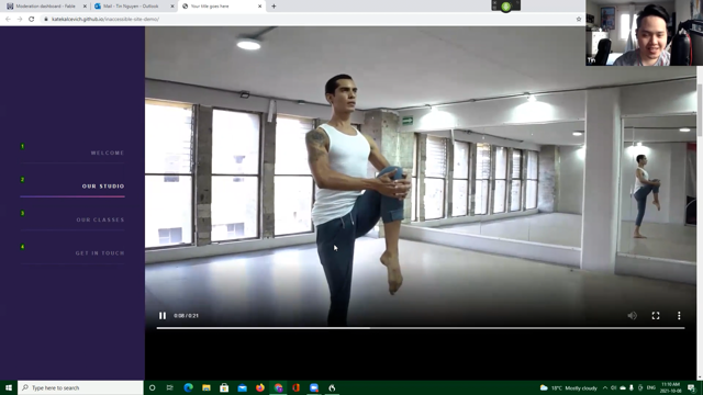
To give you an idea.
Here's a recording of this page with custom styling and the second half shows the same page without any styling.
So you can see as I'm tapping through the page, it's clearly visible where I am in the page, on the link or in the for item.
And now you can't see anything because I've removed the focus styling, and it's really hard to figure out where on the page you are.
The only thing you can see is that from time to time, you will see the caret in the Input field, or content editable field blinking, which means that you are here on that field, you could type but it's just really hard to figure out where exactly on the page you are.
And this also means that it's hard to navigate, but elements are still usable.
And I don't like that.
So let's add some JavaScript.
We already have a script element.
So I'm going to add a EventListener here, the keydown event, and I'm just preventing default.
Now if a user presses any key, nothing will happen because I'm preventing the default.
And the beauty of progressive degradation is that you might be working on one thing.
And at the same time, you're fixing another thing.
Now, all I did is I wanted to make the site inaccessible to keyboard users, but at the same time, I also disabled the ability to zoom inside using keyboard.
So if you were to press comand plus or control plus on this site, nothing would happen.
So I've disabled zoom, which is great.
Okay.
I would say let's do another test.
I'm pretty sure that I will get the perfect score here because usually, or actually it's fine to remove the outline.
And it's a good thing.
If you provide custom styling.
Okay.
Yeah.
As expected a perfect score.
Now let's deal with one of the most privileged user groups with mouse users, excluding them is also pretty easy I have to say.
What I did is I selected all items on the page in their default state and in the hover states.
And I set the cursor property to none.
cursor none to mouse users is what outline none is to keyboard users.
So if you visit the site, there is no cursor.
You can use the mouse, but there is no cursor.
This is one technique.
There's also another technique called the Böck offset, coined by my friend Max Böck.
And if you apply the the Böck offsets, what you do is that you take the default cursor, you open it in an image editing tool and you increase the width of the cursor of the visible area by 100 pixels and you align the cursor to the right and you save this and then you applied this new custom cursor to all elements on the page.
The beautiful thing about the back offset is that the hit area of the cursor is still in the top left, but the cursor is offset by 100 pixels on the right.
So the user think that they're clicking the area where the cursor is, but actually they are clicking 100 pixels to the left and this is really evil.
Here's a quick demo.
You can see me hovering the first button, but there's no visual feedback as I'm hovering the second button, the first button shows harvesters as I'm hovering the third button, the second shows harvesters.
So it's really confusing.
But you can still click stuff.
Now, at some point, users might figure out what's going on and they would be able to use the site and I don't want that.
So I'm using the pointer-events property in CSS.
I'm applying it to the body element and now you can't click anymore.
I mean, you can click, but nothing will happen.
And pointer-events gets also all the descendants of the body inherit the pointer-events property.
If you really don't care about your users, you want to make sure that this works in as many browsers as possible.
Um, if you want to make this work in Opera Mini, for example, there's a polyfill, the polyfill just checks if the pointer-events property supported, if yes, then just returns false.
If it's not supported, it will add a click events to the body and prevents the default.
Yeah.
And actually I like this even more than the CSS solution because CSS and HTML are such weak languages and we want to use strong languages.
So I would just get rid of the pointer-events thing and just use JavaScript in the first place.
And this brings me to the second principle I came up with, which is the rule of most power.
And the rule of most power says if possible for any given task, use the most powerful language.
So don't even bother using HTML or CSS use JavaScript.
If you want to add a paragraph to a site, don't use the P element in HTML use canvas.
Okay.
Now time for another Lighthouse test we've excluded screen reader users, keyboard users, and mouse users.
And this is what we get in Lighthouse.
Yes.
Perfect score, awesome.
Now I've conducted this experiment two and a half years ago.
And in preparation for this talk, I asked some people on Twitter if they had even more ideas, how I can improve this sites.
And Alvaro said, mobile users can still select the text and copy paste it somewhere else to read it assuming that they still have the energy to deal with the site.
To avoid that and make the content even more inaccessible, remove user selection from all elements, and he also provided the code.
Alvaro suggests that I select all items on the page.
I used to user-select property and set it to none.
Now the text, isn't selectable anymore.
And that's so beautiful about our web community.
So if you need help, if you're trying to make experiences worse for your users, there will be someone in the community on Twitter or whatever, wherever to help you with that.
That's just beautiful.
Okay.
The next thing I want to work on is a high contrast mode in Windows.
High contrast mode allows you to switch the default theme to a theme that uses colors with very high contrast.
So what you can see on the screen here is a screenshot of a Windows and all the background colors are black and the text color is yellow.
So there's a very high contrast and borders are white.
What's great about that is that we can target high contrast modes in CSS.
There's a media feature called -ms-high-contrast and.
Yeah, we can write special styles for high contrast mode.
Now, usually you shouldn't do that.
You should only fix things that are invisible for some reason.
For example, sometimes you have to add borders to buttons or input fields to make them visible in high contrast mode.
You shouldn't get too smart about using colors because it's hard to tell what kind of theme users are using.
There are dark themes and light themes, and uses also have the ability to customize their theme.
So it's really hard to tell what, how they're using color.
So my first solution was that for high contrast mode users, I want to select all items and set the color property to black because the background color is black.
So I would say.
Set the text color to black and this will make the content, you know, almost invisible or at least it's not visible because the text color is the same color as the background color.
But the problem is, I don't know if the user is using a light or a dark theme, so this wouldn't work for all users.
It's just not exclusive enough for me.
But the great thing about CSS is that there is a thing called system colors and system colors are mapped to certain parts of a user interface.
For example, the window system color, the window keyword is mapped to the background color.
So if the background color is black, window will be black.
If the background color is blue, window will be blue.
I'm targeting high contrast modes.
I'm selecting all items on the page and I'm setting color to window.
And now the site looks like this in Windows, high contrast mode, the background color is black and all the texts, colors are black.
The only thing you can see is the border around the input fields and the button.
And honestly, I'm so surprised that Facebook has knocked on my door yet to hire me because this is so, so evil.
I don't know...
maybe it's just not evil enough for them.
If we run another Lighthouse tests, we have now a, an accessible inaccessible sites for screening users, keyboard users, mouse users, and in high contrast mode.
And we still have a perfect score, awesome.
All right now, you can't interact with the site anymore, but content is still visible.
And as already mentioned, I didn't want to make it too easy on myself and use display none or visibility hidden or opacity zero.
So I'm selecting the body and I'm setting the opacity to 0.03.
Now, I'm not sure if you're seeing this, but content is kind of still visible.
So if you look closely, you will see some gray areas on the page, but it's not readable.
Yeah, and that's pretty much it now.
This site is pretty much inaccessible to everyone.
Let's do another Lighthouse test.
Let's see what Lighthouse has to say about that.
And, oh, no.
A score of 94 and the error message says background and foreground colors do not have sufficient contrast ratio.
I have to say that I was afraid that I couldn't fix that because it's pretty hard if I can't use opacity, what else should I use?
I don't want to use display none.
So I did some testing again and you know, I've been around for a while.
I'm a web developer for more than professional web developer, above more than 13 years.
And I know my CSS so I tried the filter property and I thought, okay, maybe I could just blur the page up to the point where the content isn't accessible anymore, visible anymore.
So you can see them increasing the blur, a blur factor here to 100 pixels.
And now all the content is gone.
And if I run a Lighthouse test, you can see that I still get a perfect score.
So filter works here.
And while I was experimenting a bit, I noticed that there isn't just this blur function in a CSS, but also a opacity function.
And it does pretty much the same thing as your opacity property in CSS.
So I just replaced opacity with the filter property and the opacity function.
And I passed the well, you have 0.03, and I ran another Lighthouse test.
And just like with the blur function, perfect score.
And I believe that this shouldn't be a thing, this shouldn't work.
I've already created an issue in the axe-core Github repository, and they're looking at it.
Dealing with filter doesn't seem to be as straightforward as dealing with the opacity property, but they will have a look at it.
Okay.
So our site.
Isn't Interactive anymore.
Content is pretty much not visible, but most readers of my blog are tech savvy.
So they know that they can right click the site and view the page source.
And if you view the page source, you can still read the content of this page, which I don't want.
So my solution was that I just turn all characters on the page into HTML entities.
And I don't believe that anyone can read entities fluently.
Yeah, that's pretty much it.
Let's do a last check.
Let's see what Lighthouse has to say about that, but I'm pretty confident that this will work.
Lighthouse is warming up again and perfect score.
Awesome.
Now what I don't want you to think, but you might think that Lighthouse sucks.
That this tool is bad, but this, again, really isn't about Lighthouse.
I only picked Lighthouse because it's the most well-known tool, I would say.
So even people who do not test accessibility or who are not interested in accessibility, probably know about Lighthouse because it's in Chrome directly.
That's the first reason.
And the second reason is that in 2019 Lighthouse was the most forgiving tool.
So Lighthouse uses the axe-core engine, but it uses only a subset of our rules.
And it was just the easiest tool for these expriment.
But I was wondering what happens if I run another tool on this side, like axe-core, let's see what happens.
So I have the axe devtools extension installed on my Chrome browser.
If I scan the page, I get only one issue.
And the issue is page must have means to bypass repeated blocks.
So what axe wants me is to add a skip link or a landmark to my site.
No problem.
I'm just going to add a skip link here and it points to an ID that doesn't exist.
I use this as to move it off the screen because I don't want to distract users.
And of course I add the tab index attribute with the value minus one just to avoid problems with our previous tests.
And if I run axe again, I get zero errors.
So that was pretty easy.
Let's try another tool.
I'm going to use the Wave extension here.
I'm going to wave the page and we get one arrow in the arrow says broken skip link.
Okay.
Wave is a bit smarter because it says, Hey, there's this skip link, it points to an ID, but this ID doesn't exist.
So my solution here is I just add the ID to the skip link, et cetera, so it's referring to itself.
Pretty useless, but I believe that this will work for Lighthouse and WAVE and Axe.
Perfect.
Okay, that's it that was my experiment.
I know that was a lot of sarcasm, especially for a talk about accessibility.
But I just wanted to make sure that you understand that these numbers are, in fact, just numbers.
And this is not the tool's fault.
I love all of these tools.
I use them almost every day.
The thing is these tools do what they're supposed to do.
They catch low hanging fruit for you.
And that's it, they're not supposed to do anymore.
So if you run a test and you get a perfect Lighthouse score and zero errors in X and zero errors in Wave, your journey, doesn't end, it starts there because now the actual testing starts manual testing of the keyboard and screen reader users, and if you're lucky, you're able to test with real users.
So be proud of your work, share it online, but just understand that these numbers are in fact numbers and they don't say too much about the actual quality of your site.
This talk is also available as an article.
That's the article that I published two and a half years ago.
I've updated it.
So it works now with all testing tools.
It's on my blog.
It's titled,like this talk, Building the most Inaccessible Side Possible with a Perfect Lighthouse Score.
And that's it.
Thank you so much for watching.
I hope that you enjoyed this talk.
If you have any questions, please ask.
If you want to get in touch with me to tell me something or to ask something I'm on Twitter as @mmatuzo so with two M's and I also have a Twitter account for my website @htm_hell is HTML underscore hell.
Thank you.
Google’s built-in testing tool Lighthouse judges the accessibility of our websites with a score between 0 and 100. It’s laudable to try to get a high grading, but a score of 100 doesn’t mean that the site is perfectly accessible. To prove that Manuel Matuzović carried out a little experiment.