The Low-Hanging, High Impact Accessibility Issues For Developers
Hi, everyone.
Great to be here at the Web Directions AAA conference this afternoon, or possibly this morning, depending on where you're located.
I'm Sam Proulx.
I am the accessibility evangelist at Fable.
And what that means is that I get to spend a lot of time talking to companies, individuals, and organizations about accessibility, about how to do it about why it's so critical and about getting the voices of users who use assistive technology and have accessibility needs involved in your development and research processes.
And that's what we focus on here at Fable.
But that's not the focus of my talk today.
Today, I'm going to be talking about the low hanging fruit of accessibility, because as a screenreader user myself, every day as I surf the web, I'm impacted by problems that are very easy to fix, and that have an enormous impact on my ability to use and understand websites.
And so that's where I'd like to start.
There is often this myth or this feeling that low hanging means low impact.
And that is absolutely not true.
Many low hanging accessibility issues can bring a website from something that is completely impossible to use or to understand to something that while it may not be a great, fully accessible experience is at least possible for someone using assistive technology to navigate.
As well, these low-hanging fixes have to be fixed before more difficult accessibility issues can be tackled.
Because if you want to tackle some of these more difficult, more problematic, harder to solve issues, you're going to want to get the help of people with disabilities.
But unfortunately, if we can't even use the very basic features of the webpage and perhaps can't even understand the intended behavior, it's very difficult to work with folks in order to get more complicated issues fixed.
And lastly, you know, these fixes can generally be made really quickly.
And so, you know, when you're starting off on the accessibility journey, there are a great set of first steps to make that can have high impact for somewhat lower effort.
As we go through some of these low hanging issues, we're going to cover issues according to the POUR guidelines.
You may have heard of these P O U R.
They're the kind of framework that was created for the web content accessibility guidelines or WCAG that are published by the worldwide web consortium or W3C as a guideline to help folks make websites accessible.
Of course, those guidelines are perceivable.
Can someone perceive the currentcontent.
Operable can, can they use it?
Can they operate it?
Understandable.
Can they comprehend what's going on?
And robust.
Is it usable in multiple different environments, platforms, techniques, et cetera so we're going to begin by looking at some issues in the perceivable, catergory.
By the way, all of the statistics that I reference in this talk come largely from studies conducted by WebAIM, by the W3C itself and by a couple of other, uh, accessibility non-profits.
So the first problem to talk about in the area of perceivability is that alt text is missing on 26% of images online.
That's more than one in four images that are impossible for screenreader users to understand, or to comprehend the purpose behind them.
And the solution is pretty easy.
It can be fixed with generally less than one line of code.
It's a simple matter of adding an alt attribute to an image.
And it can be easily detected by automated testing.
You may not be able to tell if the alt text is confusing or if it's well suited to the purpose, but you can at least tell if it's there and file that red flag and say "Hey, we're publishing a webpage, that's missing alt text, let's go back and let's make sure we get that added in".
And when you do that, It makes images comprehensible for screenreader users, meaning that we can actually come to understand the intent behind the webpage.
The next problem in the perceivable section of things is that 45% of form inputs remain unlabeled.
Again, this generally requires one line of code or less per form input.
It is extremely easy to fix even on existing webpages.
And it's very easy to test with an automated test, just to see for every form input and label, are the labels there?
And it's easy to red flag if they're not.
And when you start fixing these things, you find that your forms are much, much easier for screenreader users to fill in, because we actually know what data we're expected to type.
You also find that it is much, much easier for users of solutions like voice dictation to fill it in because instead of having to open up a grid and click by coordinates with the mouse to fill in a form field, they can say something like "fill in postal code" because the form field has been properly labeled.
And of course it allows those with physical challenges to use auto-complete and auto-fill solutions because it is now possible for the browser to detect what is the expected data here and make sure that reasonable auto-fill solutions are popped up.
And so that's a massive impact on the speed of users with multiple disabilities to, to understand and to fill in your form.
The next problem, of course, is that a whopping 86% of homepages on the internet today have low contrast text.
And automated color contrast checkers can easily flag this and it can be easily corrected by making simple changes to CSS and the color palettes.
And this has a massive impact because it can bring a website from impossible to use, not only for those who have low vision, but for those who have declining vision due to age, for those who are in environments without great lighting, and so on.
One simple fix can make a website go from impossible to actually possible for a huge base of customers to use.
And it doesn't have to be expensive, it doesn't have to take a long amount of time.
We'll move on to operable.
One problem that we have here is that 38% of homepages skip heading levels and 10% of homepages have no heading levels at all.
This can make it extremely difficult for screenreader users to understand how your content is laid out, to understand how blocks of content relate to each other and to skip to the content of interest in the same way that a sighted user might scan.
Those of us using screenreader, users will often skim by headings and when those headings are missing, we now have to just read the entire webpage because it can be very difficult to find the important sections of the page.
But this is extremely easy to fix.
It's just a matter of adding semantically, valid heading tags to those parts of your webpage that are probably already being visually presented as headings or as section markers.
And to make sure that your structure is marked up with correct heading levels, so that heading level twos are under a heading level one and so on, and that will make it possible for screen reader users to very quickly skim a website to find what we're looking for.
And that can bring a website from something that takes me 10 minutes to orient myself to, to something that I can jump right through in a matter of less than a minute and get right to the content that I'm looking.
Another problem is that 30% of homepages have no regions and have no landmarks.
Regions and landmarks are very simple HTML, five tags that can be inserted.
Uh, it's just a matter of figuring out where they ought to go.
It makes it much, much easier for screenreader users to understand your site structure.
It makes it much easier for us to jump directly to the parts of interest, for example, the article content, the search, the banner, and so on, and it makes your site that much easier to comprehend.
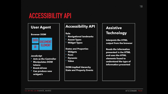
The last problem that we have here is that ARIA unfortunately is overused.
The vast majority of websites on the internet today that are kind of in that top million homepages use ARIA or the Accessible Rich Internet Applications set of tags in places where they don't need to use it.
And that can be a massive problem because native HTML controls in general are accessible, have great keyboard and mouse support and are very robust for users of switch systems, voice control, and other input methods.
And so when you use ARIA to mark up a div, instead of just using a native HTML checkbox or edit field or edit control, what you find is that these webpages will have more errors, more accessibility barriers that completely prevent someone from using a webpage and have much, much more complicated code, because now you are writing custom keyboard handlers, and mouse handlers, and other things that native HTML controls already provided for you, if you had just used those and styled them with CSS.
We'll move on to the next section, which is understandable.
The first problem is that on 22% of webpages ambiguous link names were present.
And what do I mean by that?
I mean, links like "click here", "learn more", "more info", et cetera.
Links that when somebody is browsing a webpage by tabbing through it, by looking for a particular link, it can be very difficult to associate a link that says, "learn more" with what, learn more about the content below the link or above the link?
Et cetera.
And again, it's a very easy solution that isn't expensive and it isn't a technical challenge.
Making link names unique and meaningful will solve for screenreader users.
Will solve for users of voice navigation.
You can sometimes encounter conflicts when there's dozens of links with exactly the same name on a webpage, and will make it far easier for those with cognitive challenges to comprehend the content of your webpage.
And again, repeated link names are something that is very easy to detect and flag with an automated test.
You know, the next problem, only 72% of webpages define a lang attribute.
Now the lang attribute for those of you who perhaps are not developers is part of the top-level HTML tag.
And what it does is it just indicates what document, what language this document is going to be written in.
And that is extremely helpful for screen reader users, because it lets us know what language of braille table to use, what language of text-to-speech to output the content with.
And it's easy to do.
It's just adding that single attribute and it's super easy to check with an automated test.
It's also very helpful for SEO because Google and other search engines and crawlers also need to know what language your content is written in, in order to act on it.
But when the lang tag is non-existing, or is wrong, now suddenly you have your content being displayed with the wrong braille settings.
You have it being read out in a kind of incomprehensible way with the text to speech voice, that thinks it's one language when it's actually another.
Next, we get onto robust.
One problem that we find is 30% of websites don't allow easy zoom in and don't allow easy resizing.
This can be easily tested by anyone just by resizing and magnifying the website and making sure that it still looks good.
And it makes your websites usable for those who use screen magnification, for those whose vision is just getting a little bit not quite as good as it once was due to age or other conditions.
They may be just using the magnification of their browser or for those who are just suffering eyestrain, because it's been a long day and making the simple style changes that are required to fix this also will make the website and usable and responsive on mobile, on screen sizes that may be different from what you expect etc..
So it's an easy fix that fixes things, not only for those with disabilities who use assistive technology, it's a fix that makes your website better for everybody.
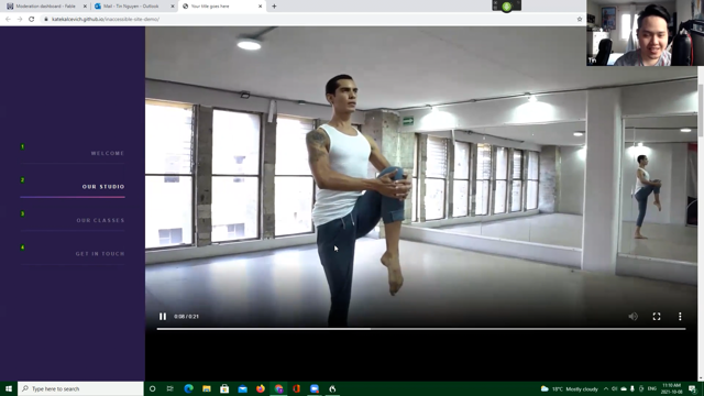
And the last problem that we have is that over half of web pages that have video, have that video autoplay and that can be a huge problem.
Because it can make it impossible for screenreader users to hear the text to speech voice over top of the website.
It is a very poor experience for those users who are on low bandwidth connections or who are on data connections, where streaming video may be costly.
And an auto-playing video can be extremely distracting for users with cognitive challenges.
And in general, to disable auto-play, it's just a matter of adding or removing a single attribute.
And once again, this is something that can be easily checked with an automated test.
And so as we've gone through a bunch of these problems, I would like to conclude with the idea that low hanging fruit and accessibility is easy to fix, is easy to test.
Is low contrast, low cost, makes better experiences for people with and without disabilities.
Makes better search engine optimization and has to be fixed before other more complex accessibility fixes can be made.
And so if you are a developer or a designer today, I would encourage you, if you haven't taken any accessibility first steps, to make these low-hanging changes your first steps and to ensure that at least some of these tests you're passing and by doing so you will be having a massive impact on all of the users of your website, not just those with disabilities.
Thank you very much.
In this talk Samuel Proulx, Accessibility Evangelist at Fable and blind since birth, will walk you through low-effort, high yield opportunities for you to improve accessibility in your apps and websites. It is tailored to developers and will cover major items within the context of the W3C principles, as well as informed by his experiences as a screen reader user and member of a community of people with disabilities
