(bright music) - And I'm very very happy to be here in Melbourne. It's actually my second time in Australia.
And I must say I love Melbourne, it's incredible, I was just passing by the streets yesterday and all of a sudden there was a free tour.
And I said, "Why the hell not?" I just didn't know that it's going to last four hours. But it was incredible, I spent like four hours going all the way around the city, and I kinda wish it was really, that Melbourne was called Batmania, that'd be really cool. But they have Batman street and they have Batman venue and have Batman everything, it's really really cool. It's like it's so close, so close, but it's really cool. So I'm very very happy to be here today.
Now, my name is Vitaly and I actually live now in Lithuania all the way quite far away (laughs), quite far away, actually. But much of time these days is actually still spent on this little website.
But the other half of my time, probably, spent on consulting with companies, working with them, trying to figure out what they do, how we can solve problems for them.
Mostly frontend and mostly responsive, but I also kind of coming from the UX side originally, which kind of makes me really interested, gonna be really interested about the entire space, responsive space.
And yes, it is red and it's going to be red, we'll talk about it later, it's okay, that's fine, all right.
Now, you know how it is sometimes.
You know, you attend the first talk and it's kind of boring and you feel like, ugh, when is it going to end? So I thought, "Maybe I can make it "a bit more interesting today?" So let's make it a little game.
("Think!" by Merv Gryphon) Oh, that's a bit loud.
So the game is called Responsive Adventure, and you're highly encouraged to participate in this game. And I come in peace to you, to Melbourne, so I brought some fruit.
I know it's know a zoo, all right, but I thought if you feel like, you know, you want to win something, I've got something for you, some persimmon fruit and bananas.
Bananas are great.
And mandarins.
They are from Australia, sorry about that, but I think it's a reason enough to participate. So we're going to go through a couple of levels. And the problems I'm going to pose or expose to you are quite complicated, they're not something that you could easily solve.
And so if you know an answer, just shout and you'll get a banana.
I don't know if it's a good enough prize, but let's figure it out.
All right, still with me? That's excitement, excellent.
All right.
So we need to figure out a couple of things first. Now you need to tell me how dirty you want to play today. (calm electronic music) I know it's morning and, you know, it's really early.
So who wants to take it easy today? Hmm, who wants to go medium? Who wants to go all the way? All right, so a couple of people do want to play hardcore, who just doesn't like to raise hands? (audience laughter) Anybody, some people maybe? All right.
So it's like somewhere between medium and hardcore, so let's see, all right.
Now, the first level is actually quite simple. And the reason why I'm bringing it up is not necessarily because it's a complicated level, but it's something that's been bothering me for quite some time.
It has to do with the way of how we're designing websites today in general.
Now, every single time I encounter, I mean, I'm in a company somewhere, I always talk to somebody about the process and it feels like, in many ways, we have a very strange understanding of what the design process looks like.
But the problem is that design process is weird and complicated because it involves people and systems and organisations which often are weird and complicated. If we had to design for, you know, machines, it would've been way much easier.
So when I work with companies, it feels like, in many ways, creative process is seen as this.
You start somewhere and go, and you iterate, iterate, iterate, iterate, iterate, iterate, iterate, iterate, until at some point you hit the finish line and you're done. Which is actually not quite true if you think about it. Now, how many of you are designers here in the room? How many of you are developers? How many of you kind of jack of all trades, something? Right.
So this is not quite what the creative process is like. And when I'm talking about creative process, I don't mean illustrations or design.
I think technical work, even CSS, JavaScript, is also creative work too.
So in many ways, I feel like creative process looks like this.
Where you start somewhere and then you keep exploring all the different options, all the different ideas, until at some point, you know, you start growing and you start realising, yes, this is probably going to work and then you keep going.
But at the same time, you will be encountering these situations where you hit dead ends.
And I hate dead ends because they're very expensive. These are the time points when, timestamps when you have to recover from them.
Have to recover and find another way where you're going to go next.
And this takes time.
So this is why we tend to rely on some kind of predictable solutions, something that we would call design patters. Where we tend to just use certain things because, you know, they used to work in the past.
But the problem is, they are kind of predictable because this is their nature.
So we'll be using, you know, off-canvas navigation and we'll be using Carousel if we want to highlight some things.
But it really forces us to think maybe about, to be a bit more constrained about what we do. So as a result, we end up with this kind of experiences. Which one of these two possible websites are you currently designing today? This one or this one, because there is nothing else on the web.
And yes, we talked about this, the Web becoming more generic and things like that, but this is not my point. My point is that I feel like, to some degree, we forgot how to stand out, and that's a bit sad. And I attended this conference just two weeks ago. Probably, maybe three weeks ago at this point. Where Mogens Moller said one thing that stayed with me for such a long time, it's like every single day, pretty much, since then, I wake up and I think about this. And I think it's really really important.
"If we want to stand out today - to outperform "our competitors - we need to delight customers with "a remarkable design and a unique, charming personality. "Be slow and mindful.
"With an unprecedented attention to detail..." And I know that delight gets bad reputation, delight, you know.
We always use delight if we want to sell something (mumbles).
But it's not about delight.
It's more about having these little surprises which really matter.
These things, when you're on the low battery, and all of a sudden the website is actually removing parallax and video and other things because they care, because they paid attention to your needs.
These are the little things that are really really important.
This is the unprecedented attention to detail. And then he continued, "...We should underpromise and overdeliver. "Capture attention and guide it skillfully. "On the web today, it all boils down to one single thing: "outstanding storytelling through great art direction." And this is a really packed sentence, but I think it's really important, because we don't talk about storytelling on the web that much as we used to maybe in the past.
And I think responsive storytelling is something that we have to keep in mind.
So what could it be? Now, when we talk about storytelling, personally I think about this.
Right.
I think about stories and tales and all those things that have existed for centuries.
Now, have you ever asked yourself, why is it that this tale, for example, about Goldilocks and the three bears, stayed and remained important and kind of known in our society for thousands, maybe hundreds of years? That's important.
Now, when I think about storytelling, I do think about those tales, I don't think about this. Right.
So when I think about storytelling, I definitely don't think about this experience.
Like, yes, Uber is a nice application that allows you to go from one place to another, but I ask myself just why is it that, if there was some service that offered something like Uber and was maybe like 10 cents cheaper on average, I would jump right away.
There is no reason for me to stick with Uber, I don't have this kind of loyalty, this kind of connection, emotional connection with Uber at all.
I don't know about you, but I would jump right away. But at the same time, if I think about MailChimp, somebody has to give me money so I move away from MailChimp. Because I have such a strong emotional connection with them. So why that, you know, two brands which are operating not in the same space, of course, but they're operating on the same level, on the web where we all use both services, I guess, have very different perceptions? Well, it's probably because MailChimp, of course, has some clever marketing and things like that, and they do these kind of colour books, but they're lovely. They have a character.
They have a unique point of view, something that Uber doesn't have.
Have a very unique personality that actually shines through everywhere.
And it's this, their monkey, the Freddie monkey. I love eating bananas for breakfast.
I love eating bananas for breakfast too.
Now we have a connection already right there. And then it keeps going and they create these wonderful little things which are totally kind of outside of the scope of what they do, but it really shines, lets their personality shine. This is like a really great one.
I love being me! Do you love being you? That's great, that's wonderful wonderful copy as well. So this has stayed with me for quite some time. And every single time I think about what we probably should be doing on the web, I keep coming back to this. And the reason why, again, how we can kind of change it is to maybe move away from these best practises that we talk about all the time.
And I don't think that they're bad.
But we're kind of sticking to them too rigidly, being too absorbed by them to some degree.
There is this kind of guide books of what we're supposed to do and what we're not supposed to do.
You should not define the line height in pixels. This is a rule, you stick to it, this is not cool. You should not base the breakpoints on device sizes. That's not cool, don't do that.
You should not take the name of the lord, performance, in vain.
That's not cool, don't do that.
So as a result, creative process becomes a strange thing. Where we think about, okay, so we have a new project, so what do we do? Let's, okay, create a new canvas, and we have content to put in, so let's do this. Also, put some navigation and some content, but then somebody comes in and says.
(alarm horn) Mobile first, right.
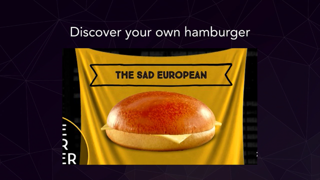
You should start mobile first, so you know, change the canvas, do mobile first, it makes you focus, you have to, kind of forces you to focus. So you say all right, so I'm going to add a hamburger icon in here so navigation isn't taking too much space, then somebody comes to you and says.
(alarm horn) Hamburger icons are not cool, if you have navigation options, just expose users to them so you're going to get high engagement.
Then you say okay, so I'm going to display them. The problem is, you still have this content you have to display somehow.
You're going to plug it in, but then somebody comes to you and says.
(alarm horn) So you say, all right, well, I can't just put things below the fold, I have to keep it above the fold, so there is a nice way of keeping items above the fold. (alarm horn) So as a result, you end up creating something predictable, and this is your creative process.
This is very sad, this is really weird and sad. Because if we look on the print, and I know the print is different than the web, you'll find lots of beautiful beautiful artefacts which use the possibilities you have in print.
So this layout, these kind of layouts, are totally possible today with CSS grid layout as well, which we'll cover in 22 minutes from now.
But this is not something you would see a lot on the web, and yes, of course, multiple columns, this might be weird for reading and so on.
Maybe one column is better.
But maybe we could at least experiment in this space because definitely, this is better than this. Now, there's like worlds between these designs, literally worlds.
So not everything has to be templated.
And I know that it takes time, but maybe, just maybe, sometimes it's really worth it to take time, to kind of sink in.
It doesn't meant though that you have to break things altogether like this.
This is Bloomberg Businessweek Design conference from last year.
Tickets were sold out within six minutes.
And yeah, not everybody can pull this off, and of course, maybe this design is crazy, maybe you don't like it, maybe you hate it, and I think that most people would.
But it kind of serves its purpose.
It has a very unique voice and tone that you will never forget, this is probably one of the most memorable websites I've seen in the last years. Now, of course, you might ask yourself, should a website be memorable? Is it a thing? Or should it be like a service? You do something and then you're done.
Well, maybe, but maybe sometimes you want to push your brand and show your brand, it's really a good idea to break some common conventions and create something like this. And for Bloomberg, it was really important, it was really really important.
Why? Well, basically, now this is my favourite bit. Oh no, damn it, okay.
It was really important for them because they, it's either die because, you know, Bloomberg is like many of those financial times and all the other web sites, all the other newspapers and outlets, or reinvent themselves, and they decided to reinvent themselves.
So they hired this designer, group of designers, who would create something like this.
And yes, of course, it's totally weird and it's done in December 2016.
It's not done last century or so.
But this is what they decided to do, and again, you might hate it, and I guess that many of you do, but they speak a very unique voice and they rediscovered themselves, it was an important thing for them.
So they created these weird experiences which, you know, they are off, a little bit off. Or maybe a lot off, I don't know.
But they still exist and they try and, they'd found a new voice, and they are now, have now become established as something different in general.
So we don't have to create something like this, although we could.
We could go ahead, if you run a portfolio, you can actually speak your own voice and do something really strange and weird and unusual. I appreciate the hover effect they have here on the cursor, that's interesting.
I don't know if you spotted it or not.
That's weird a little bit, but maybe we could pull this off. And you don't have to go all this way, of course. You can just say, maybe we could just allow users to drag elements around, to play a little bit with the interface.
And I'm not saying let's create inaccessible interfaces, that's not at all what I'm saying, but maybe we could create a beautiful, nice, semantic HTML and everything laid out beautifully, but then on top of that, add this level of surprises or little attention to details that would make a difference.
And a really great example of this, of how you can introduce some kind of really interesting stuff to your web site, is Hans Brinker hotel.
Now, how many of you are familiar with Hans Brinker hotel story? That's a remarkable story.
So Hans Brinker is a hotel in Amsterdam.
And, you know, it's a really bad hotel.
Now, the problem is, they were not selling any rooms in the hotel.
They were like, what do we do? They didn't get good reviews on TripAdvisor, on Booking, anywhere because, you know, it's a bad hotel so you should not be expecting a lot of good reviews. So they said, "Well, it's either reinvent ourselves or die, "so let's be not just a bad hotel, "let's be the worst hotel in the world.
"Let's be the absolute worst hotel in the world." And they hired a comedian to write a copy for the website that would actually illustrate it. So they literally are establishing themselves now as the world's worst hotel, and they got into news, and guess what? They're booked out three months in advance now. And they're expanding now to Lisbon as I saw right here, just because they are really bad.
I mean, they are really really bad.
But they'd said, "This is not bad enough, "we have to get worse than that." So if you keep going, you'll find all kinds of really interesting stuff happening there.
More honestly, less of everything else.
They have very small rooms, admittedly, what you see is what you get, just don't look too closely. And as you can see here, everything is messed up and weird and topography's totally off.
But maybe sometimes there is a place for it on the web as well, not everything has to be perfect Twitter bootstrap grid.
This is great.
We are here.
Your bag will be here.
You will be probably somewhere else.
And so there are many moving parts in it.
And in fact, I do see many companies now hiring a stand-up comedian that would write interface copy. And in many ways, what we do, this is great. In many ways, what we decide to do is to say, maybe we could actually start working around the interface copy first and then expose the design. Here's another hotel, also from Amsterdam, which also tries to reinvent themselves.
And this is Volks Hotel, and they probably have the best popup I've ever seen in my life.
It's kinda cool, I don't know why I hate it so much, but I love it at the same time.
It's really nice.
So there are many ways of how we can actually make things different, and we probably maybe should break things or two until we actually make them better.
And sometimes, this doesn't have to be such a big deal. Now, this is a very unique portfolio, just why, because this guy decided to split himself in three parts, and depending on what viewport you're using, (mumbles) displayed that he's been offset with different colour.
That's one idea that makes him very different. Another thing, Waaark here, again, they're using animation, again, a very unique animation that's common only for them to stand out a little bit. Like this.
This is playful, this is cute, this is nice. Nobody else has it, so maybe we could actually try to do something like this as well.
And even carousel don't have to be as boring as this. So this is my favourite example ever.
I was in Istanbul, and this is a great place to explore not nature, carousels.
It's a really great place to explore carousels. Now, in Istanbul, you'll find many websites using a lot of carousels, like a lot of them. Here's one.
Here's another one.
Here's another one.
And here's another one.
Four carousels in one, you know, above the fold. But these carousels don't have to be that bad. Because this is a fantastic carousel, I wish more websites had carousels like this. It looks great.
I mean, obviously it's a portfolio website that's highlighting what you're doing, but I think that we could be doing something like this and exploring options, and even moving away from this traditional predictable thing that we tend to talk a lot about.
Now, we tend to think about rectangles and circles, everything on the web is rectangle, perfect rectangle, or perfect circle.
What if you had to ask yourself or challenge yourself to create a website that does not have any rectangles and does not have any circles at all? Not because that's cool not to use those shapes, but it would really force you to think differently about what you're creating.
And even now, it just, sometimes it's just all about idea. Like it is in this website.
Or it's like an exhibition where you can move between different areas, and this is how it happens. Instead of just saying hey, here's an image, here's a text next to it.
Well, you can actually move in between rooms, because the technology is here, we can use all of it, and it's really not that hard to use.
Yes.
We could, of course, go ahead and create something crazy like this.
I'm not sure why it exists, but maybe we should be creating it just to break things for a while and to repair them later because we can.
That's just nuts.
Oh, I don't know, okay.
We should change the topic, yes.
But what does it mean for you? Well, just pick one little thing that is going to become your signature.
One little thing, could be a subtle transition. It could be something like a unique border radius. It could be a unique shape or something.
And use it everywhere consistently, doesn't have to be a big deal.
Like on some of the examples I showed before. Just one thing that is going to really make you different. I think it's something we should be exploring more. Sorry, it wasn't a level, it was more about me (rocks falling) trying to maybe inspire you to do something different. So here's an interesting problem though.
I mean, storytelling is wonderful and so on, but we have to create, at the end of the day, web sites that are going to remain usable and maintainable long term.
So what if you have, and many of you, I guess, have to support or create a design system or pattern library or style guide or style type, anything of that kind, to ensure that you're creating some sort of a system. What if you have a lucky day? You grow, and your company expands to foreign markets. Your site now has to support seven languages. How would you architect your CSS and JavaScript to support it? Or if you're a designer, where would you start as a designer? Would you create four different screens for every language, for every interface page that you have? That's going to take some time.
Where would you start, what would be your starting point, how would you architect an entire thing to make it work well? Anybody wants a banana or persimmon fruit? No? Nobody? This is a very difficult task.
So where would you even start? And I know it sounds like a niche or a very uncommon problem to have, but it's everywhere. If you're building a white label product, it's going to be used by many customers, you are going to maintain that kind of core product and you want to propagate changes very quickly to all of the custom builds of that product. If you're building a design system, it's going to be the same thing, you want to work once and then work everywhere on all kind of different screens.
This is actually the same problem, yes? - [Female speaker] Wouldn't it depend as well which markets you're going, if you're going for, you know, (background noise drowns out speaker).
- Yes, absolutely, so of course, it will depend on languages, so you, so it's left-to-right interface or right-to-left interface.
There are many moving parts in here.
But you have to break down this complexity into something more meaningful to set up things that work. So here's an example.
You should want to build something like this, you definitely want to avoid this from happening. This is an actual word that exists in German language. So if you say, "I'm going to optimise for English version "of my site," you might end up with this.
And at the same time, you want to optimise for Chinese, well, for Mandarin, then you might end up with, again, the same problem that's on the other site, where you have things just floating around in your site. So this word is, by the way, (speaks in German language), just so you know.
And you might want to plug it in in your interface and just see what happens.
So what did BBC do? Because they encountered exactly the same problem. They said, well, let's figure out what we can do. We'll think about neutral, configurable components. Pretty much everybody in this room is probably building something like this.
Because an accordion, you want to make sure that you're not creating one simple accordion, but a family of accordions.
Small accordion, large accordion, super large accordion, portrait accordion, landscape accordion and so on and so forth.
This is exactly what they decided to do as well. And everything has to be easily extended and adjusted. So they would go ahead and create something like settings, obviously, where they would say, okay, let's define global settings first that's going to go for everybody, and then of course, the languages are going to be broken down into groups, left-to-right, right-to-left. It also depends, of course, what languages you have to support.
If you have to support Icelandic, you need to have special characters which might not be available in a certain web font, if you're using it, so you have to be careful there.
So they have these global files, and then they would have english.json, russian.json and others, which would kind of specifically define the experience in those versions.
And if you think about it, it's not just about plugging in different text to different languages.
Because social media buttons, for example, are going to be very different in China than they are in South America than they are, let's say, in Canada or so.
We have to worry about this.
And even things like a date stamp.
The month could be in the middle, could be on the left, could be on the right, because you have to deal with all kind of different languages.
And so for them it was all about defining all of those things in those files.
What's really interesting is, if you want to extend, if you want to be flexible enough, this is probably a really good option to consider. Because even things like text length.
They had to be able to react quickly.
Why? Well, because for some reason, they realised that versions, Russian BBC for some reason had lengthier texts. And it was a running joke for a while that maybe it's because Russians get paid for word count or so. Nobody knows, but they had to be able to respond to it. Why? Because, of course, they could plug in more advertising in between those paragraphs of text.
So this is the level of customization that really is important.
And so once you have these global files that target specific languages, what go ahead and create is, for every single component on the component level rather than page level, you're going to create specific rules.
And they will look like this.
So let's say you have like an accordion and then that accordion you would have left-to-right and right-to-left rules, but at the same time, you would also have these kind of rules.
If Russian, do this.
If Arabic, do this.
On the component level, not on the page level. Which gives you guys much more opportunities, many more opportunities and much more flexibility to grow. And then they would use a templating language, of course, to plug data from config files and customise HTML output. But everything has to be dynamic, everything has to be a variable now.
Because whenever it comes to positioning, you know, left could be right and right could be left and top could be bottom and bottom could be top. So you have to be really careful about this. So depending on the direction, they would actually change padding-left or padding-right if they used them as variables.
As a result, every single property they would define in CSS is now a property alone, it's always a variable that could be turned into something totally different. So margin-left variable, which is 10 pixels in here, in English will automatically as a pre-processing step, output as margin-left 10 pixels, but in Arabic, it's going to be margin-right 10 pixels. Right.
All living from one code base.
Again, very important not just for multiple languages and so on, but for everything we're working on today, because this is, again, the level of complexity we're dealing with.
And at some point, it's not going to be enough. Because if you have a call to action button in the left upper corner, this button should not be just flipped, it should not be sitting on the bottom right corner, it should be sitting in the top right corner, once it was in the top left corner. So you will be introducing things like flipping to be specific about how you want to flip.
And then things like line-height, they might be different in Arabic than they are in Latin.
Basically, all these things are important for us because it gives us an idea of how we could make sure that our interface is flexible enough to accommodate for everything, whatever comes up next in our project.
So even things like date stamp could be adjusted this way. And then things like some components could gain different weights.
So they realised that in Africa, for example, podcasts are way more important or more popular than let's say in North America.
And at the same time, in Russia, hot ticker, like live ticker news, are way more popular than in other countries. So they ended up assigning weights to every single component on the front page. So depending on your weight, your component is going to be pushed up in the layout.
Now, this is the kind of flexibility, level of flexibility we should be striving for. And it still works just fine today, and it was built I think two years ago.
So this is incredible.
If you want to read a bit more about this, this is a really good article to start.
It's really quite remarkable, highly encourage you to read it.
(calm electronic music) I hope you appreciate the sound effects.
Not really? All right.
So that's all wonderful, system and so on, so let's go into more, maybe a bit more into technical details and think about what we can do with technology today.
Now, one of the things that's been difficult to do over the last couple of years is detecting specific parts of, specific technologies.
Or detecting hover, or detecting touch reliably. So if you designed something that requires sophisticated hover effects, you need to make sure that they are displayed properly even if the hover is not supported.
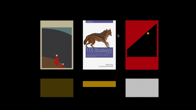
How can you make it work? Now, what if you want to do something like this in your design? So you have two kinds of images for your book covers, let's say, have a low fidelity image or SVG, which is an illustration, and a high fidelity illustration. And then on hover, you want to flawlessly switch from one to another, transitioning from one to another. How would you do this? Well, in the past, we had to use some kind of JavaScript hacks to detect things.
But I highly encourage you to look into CSS Level 4 Media Queries.
It allows to do much more than that.
We can detect if hover is available.
Now, we don't need to go into all the specific technical details, you can actually read it later, but it's important to understand that when it comes to all those, to this detection, there are different input modes that we could actually use. Mouse isn't the only device input that can hover. So game consoles can hover too, although it's a different way of hovering, so you have to keep that in mind, but there is always a primary input which is actually something that we can target. And when it comes to this, we're probably going to create two different images, we're going to maybe set opacity: 0 on one and then transition to opacity: 1 on hover, things like that, but only if hover is supported, and the way to do it is by using @media (hover), which is really well supported today, and nobody seems to be using it for some reason. And the problem is, if nobody is using it, it's gonna be dropped from browsers.
So I highly encourage you to go ahead and use it. So we can say, if hover is supported, then we're going to display it right away, and if not, otherwise we're just going to stick to what we have.
Which means, on a mobile screen, if you don't have hover, you're going to see high fidelity right away, and on desktop where hover is available, you could see low fidelity and then hover on it and then you see high fidelity.
So you end up with these kind of experiences for free, which I think is really really cool.
And of course, at the same time, you might say no no no, this is not good enough.
We want to use a gradient so it beautifully transitions all the way down.
Well yes, you can probably use something like a pseudo element to make it work.
You could create a linear gradient as a background. But then the problem is any content that falls underneath the shadow, which is created, will not be selectable or otherwise available for interaction.
So what we can do then here is to use pointer events, which again, is something that nobody is using on the web. Where we can say we don't want any interaction on that element, or we want some interaction on that element. So if we don't want this after pseudo element to have any interaction, so when you hover over it, nothing is going to change with it, you want to keep content below it accessible, then we just put pointer-events: none on it, and then repeat with @supports, which is a replacement for Modernizer in many ways, natively supported in CSS in browsers, and we just say, if pointer events are supported, well, only then let's add the gradient, and then for that gradient, let's add pointer-events: none so the content underneath it is still accessible. Browser support.
You know, we are used to this, this is not a big deal anymore.
And it's coming in Firefox.
And the Feature Queries which allow us to target specific features in CSS are the same story. We are, again, getting used to this.
And pointer events also really well supported. So no reason not to use them.
Right.
And here's a really great article introducing us to this idea.
(calm electronic music) I think we deserve a bonus level.
Do you feel like bonus level? Who wants to leave at this point? You're not being honest with me, that's okay. There's something else that we also don't, we don't use either at all, which I think we should be. And it's the contain property in CSS.
Now, for example, imagine you have an off-canvas navigation which has a huge mega dropdown, or like a set of accordions.
You don't need to render it right away when the browser actually accesses the page. It will come in later.
The same thing happens with a carousel, you don't have to render the entire carousel when it actually starts appearing on the page. So it's kind of lazy loading, but lazy loading done in CSS. So is there actually any way to isolate expensive components, be it JavaScript, comments or off-canvas navigation, similar to lazy loading, and paint important content faster using CSS alone? Anybody? I mean, I have a lot of fruit here.
I'm just going to start throwing it to you. Who wants a persimmon? Oh, I see, insurance, all good? Anybody? Maybe you'll get it later.
(audience laughter) Yeah, it's a bit, I don't want to, okay, we can give it to, excellent.
Yes.
Okay, well, whatever.
So there is a content property in CSS, which is also well supported.
And it's a primitive for isolating style, layout and paint. It allows us to limit a specific DOM sub-tree and the rest of the document with native boundaries, as they're called.
So we can use this content property to say third party widgets, while we don't need them, we can delay them like social media buttons and things like that, right.
Delay expensive layout with contain: strict. We just put contain: strict on that component that we don't need and that's not that important, and it's going to be delayed.
It gives a signal to the browser that it doesn't have to render it right away.
If we have any off-screen modules, we can say contain: paint.
Don't paint it right away, we don't need it right now, just focus on what matters most.
Container queries, well, they're kinda not well supported yet, but we can say focus on the local scope with contain: strict.
Do this first, this is important.
And browser support is coming, it's now already supported in Chrome, Opera, Android.
I think it may be even supported in Firefox, I'm not sure. There are some really good use cases which you can look up in CSS containment article by Michael from April, actually, so I guess it probably has come to Firefox already, it should've been.
So it's this, again, something that's, it's not a big deal, it's just adding a couple of properties to CSS, but it's really really powerful because it allows us to say, to lazy load things natively without having any expensive JavaScript.
(glass breaking) Now everybody's awake, I think.
I know I'm going fast, but I just want to push a lot of stuff to you so you can (sound effect drowns out speaker) right away. Now, this is complicated.
I think we need coffee for this.
There are some situations where, again, talking about creating those flexible design systems, it gets quite difficult to get them to work everywhere independent of how many items we have on the page. Let's say you're working on an e-commerce site. That e-commerce site might have five products, 50 products, 500 products, 5,000 products.
Now, your architecture or your website or your design has to be prepared for it.
You can't just say, okay, I'm going to go and update things totally, like refactor things entirely just because we have now more products.
That's not future-proof.
So what can we do? Now, there is a simple way of adapting the experience based on how many items you have in your design. Do you know how it goes in CSS? Okay, maybe I'm a CSS person, I'm sorry.
So what if you had this problem? You're working with a really hardcore designer. Now, that designer is driving you nuts all the time. They want to be perfect and it's really important to make sure that everything looks great all the time. So what if you want a tidy grid with fine, consistent line endings? Sometimes you might end up with not enough space to display all content blocks.
So this is you problem.
So you have, if you have this kind of layout, that's great. So again, imagine you have let's say 20 items. You don't want that last item, the 21st maybe, to be dropping on the last line, being a widow or an orphan. How many of you had to work with designers like this? Yes, some of you.
Well, and you could say, oh, this is not a big problem, not a big deal, it's like, flexboxing, we're just flexboxing that and it stretches all the way. Yes, it does, but then if you have 2,000 pixels width, do you want that last element to stretch all the way across 2,000 pixels? That's not going to look great.
And designers are going to hate you even more than they do now.
So maybe we can do it slightly better.
And again, here, this is not good.
This is no good.
This is no good and this is no good, but this is, you know, this is good.
Tidy, clean, beautiful, perfect grid, exactly what we want to achieve.
So how can we do this? Cats.
What if we have, let's say, again, on the product, on a given page, we have let's say 20 products we need to display or 21, it doesn't matter. We can select and define three different styles for these images.
So I could say, let's have, if we have space to fill in an image in a proper way, illustration or product, okay, five followed by 10 followed by everything else just as a data list, or just as a list.
If we can fit in four, okay then four, eight, followed by everything that can fit in the list. Three, okay, six, and then followed by the list. So it's always a perfect grid.
Do you understand what I mean? Or more specifically, this is what we're after. If we have, let's say, three different kinds of displays, we can define a specific display for specific breakpoints. So we could say okay, if we have this width, do this, if we have this width, do this, if we have this width, do this.
But this is so much work.
You have to think about all those breakpoints. And it's not really dynamic at all.
It's more like you trying to create if then, if then, if then, if then, if then.
And you really don't know what screen you're going to work with.
This is not flexible enough.
So how can we make it better? There is a quantity selector in CSS which is a selector that allows styles to be applied to elements based on the number of siblings. It's gonna be just fine, I promise you.
So there is this tool called quantityqueries.com which allows you to build a query that's going to target a match only if there is a specific number of siblings. So let's say if you have at least five, I want to style items in a certain way.
If we are at most five, I want to style in a certain way. So if I have five, it's going to be styled like this. At least five.
If I have at most five, at most six, I'm going to style it this way.
So if it's six, this, and if it's seven, then it's going to be styled differently dynamically with one of line of CSS without you having to introduce any kind of JavaScript into it.
Still with me? All right.
Now, there are a couple of things we need to know to make it work.
One of them is the general sibling selector. Which separates two selectors and matches the second element only if it's preceded by the first, and both share a common parent.
What the hell does that mean? So there are selectors that look like this. Whenever we encounter a selector like this where it's just basically a concatenation, it's always going to work like this.
Browser actually will go and search for that selector, li, a list item in unordered list or ordered list, but then it will actually read the entire thing, the entire selector, from the right to the left. That's important.
So it goes, okay, let me find all the lis, and then let me find the first child, and I'm going to select, the entire thing is going to be true only if it's first child and it's nth-last-child(6).
What the hell does that mean? It means you have all those alias, and so you're going to search for the first child and you're going to target okay, the first child, all right, this is first child.
And I also need nth-last-child(6), which means it's the sixth from the lats one. One, two, three, four, five, six, oh okay, then it matches. Only if both of these conditions are true.
Still with me? Yes? Some people are.
All right.
This is going to be very important.
Now, you could say, "But I don't want this, "I don't want to target only one of them, "I want to target all of them but only "if there are at least six." Well, what we can do here then is say, let's first child and let's sixth from the last one, and at the same time, I want to target all of the upcoming next siblings of that, JSON selector siblings of that one, starting from the sixth, from the end.
Right.
Still with me? So you're collecting, you're saying, "Okay, this matches and I'm going to target all of "the other ones as well that come after this "because I know that there are at least six." And then you can say, "I'm going to colour them "in a specific way." Now, for example here, if we have at least six, colour green the ones coming after the sixth one, including the sixth one.
And I can also say I can count not from the left or right, but from the right to left, this is going to happen with nth-last-child.
And now if you combine them, that's what you can do. You can say, "I want to target them specifically "if I have at least six items." All right, I know it's morning and everything, but you will see, it's really really powerful. And of course, one thing is, we know who doesn't support it but you know, if you start going ahead and optimising for Internet Explorer 8, people who are using Internet Explorer 8 will be confused why the hell this site looks great for them. So why don't you just try to make sure it actually works, but you don't have to go ahead and optimise the hell out of it.
So if you want to create this perfect grid, we need to define a layout for any number of items with specific quantity selectors within media queries.
So basically, it all boils down to if you want this, the only thing we need to do is to use exactly this technique but then for 3n, 2n, 4n, 5n. Five styles or so, they cover, you know, 2n, 3n, 4n and 5n. We can go all the way until seven because prime numbers, everybody likes prime numbers.
It's like four or five styles and you're done. You don't have to do anything and it's going to be future proof for long term.
So here you're saying, again, if it's, I'm going to style list items in a list divisible by three, and then you're going to style for list items in a list divisible by two and divisible by five and divisible by seven, right.
And you kind of took care of everything, that's it. You're selecting all following siblings which follow after the first child, which is first li in the list, and then divisible by three, starting from the end.
Kind of, right, and you're done.
And then you can also go ahead and be a bit more specific, saying I want to select specific styles, remember that second group? The first images are really prominent, the second images are smaller and the third one is a list.
You could say I want to target specifically the second area. So you can do this, again, by using a combination of minus n and n, and then you style list items from third to fifth.
And you've got this.
Okay.
No excitement in the room, I get that, that's all right. But you don't have to really manage it and really think about it closely because, you know, we're lazy people, designers and developers develop tools. So you go ahead and you plug it in what you need, and you're done.
So you don't really even need to know JavaScript and things like that.
But there are also two articles that I highly encourage you to read.
One of them on CSS Mod Queries on Alistapart, another one is on Quantity Queries, Alistapart. And again, this is all going to be available, slides, you're going to get slides anyway.
So you don't have to frantically take notes. All right.
Okay.
And the last level, I think.
(intense music) I don't get any signs, it's like, I can speak as much as I want.
All right.
You can leave any time, I don't mind at all, I'm just saying.
So payload, this is like all of the stuff we call (mumbles), kind of more about styles, it's all about the range of things, creating those flexible systems. And I know that they might sound a bit daunting and weird and complicated.
But to be honest, at this point, you are smart cookies. You can build a responsive accordion or design a responsive accordion, that's not a big deal. You can build or design a responsive table, that's not a big deal.
But when it comes to things like that, you really need to have some sort of a head start to know where you're going to move and how to fix this problem fast without spending too much time and too much effort trying to figure out what the solution is, recovering from these dead ends which I was talking about in the beginning. And one important thing which I think is really really critical for both designers and developers is to know a bit more about performance. And there are a couple of things which are useful to know. Now, one of them is.
When we talk about performance, we need to think about a couple of things.
We need to think about images, how to compress images, text, fonts, and then actual delivery with HTTP/2 and things like that.
So when it comes to images, there are a couple of tricks that you might be using today to make sure that your web site starts to render faster. How many of you are working on any kind of product? All right.
So you might have a landing page, and it's really critical to show that product prominently and beautifully and nicely.
Now, how do you do it, because normally, of course, images don't block rendering, so they will appear quite fast, but you want that image, really good image, to be appearing really fast.
So how can you make it work? Well, there are a couple of really strange techniques. I'm kind of, yeah, it's recorded, it's going to be made public, John? Oh, interesting.
Okay, so this is a technique that's often discouraged, but I saw it work in real life projects really well. Now, of course there is a fundamental, the native responsive images markup that we can use today, which is really important to use.
There is one other thing which can actually help you if it's like one or two images that you want to deliver really really fast.
This is how it goes.
Given two identical images that are displayed at the same size on a website, one can be much smaller than the other in file size if it's highly compressed and dramatically larger in dimensions that it is displayed in, sorry about the typo. What the hell does that mean? Well, let's say you have this image.
This image is 600 times 400 pixels, exported from Photoshop in the worst possible quality.
0% JPEG quality, when we export, we can define that setting, how it's going to be exported.
So we could also display it as 300 times 200. And we can compare it visually against another image which is natively exported as 300 times 200 with a decent JPEG quality, 80% JPEG quality. Now, surprisingly, or unsurprisingly, most users will not be able to tell the difference between these two images.
I don't know if you can, to be honest.
But this one is 7 K and this one is 21 K.
Now, this is just a small example, but if you have a bigger image, this difference is going to be dramatic, you are saving 66% in bandwidth at this point. The problem is, of course, and this is an article which is actually quite old, the problem here is, of course, if somebody decides to save this image, you know, they're not going to get a wonderful, shiny, beautiful version of it, and option number two, browsers, of course, do need more memory to display it, which is not cool, so you basically take your image, you bloat it up two times two times, at least, and then you save it with the worst possible quality. It will save on bandwidth, but of course, browsers have to do more work.
But if it's one image, that's kind of okay, if it's two, that's fine, but you can't do it for 20 images. But for those images that really matter, you can go ahead and do it.
There is a nice case study from Aftonbladet, which is a newspaper in Denmark, where they decided to use exactly this technique. Where they started with 0% JPEG quality and they moved to 30% because of the red bright areas which don't compress well.
But in the end, they decided to allow editors to select compression rates, but this aggressive compression is a default.
Now, the result was quite remarkable, because on their home page, which was, it was a while back. On the home page on a mobile device, they have 40 images, and 40 images plus HTML plus CSS plus JavaScript all together make up 450 kilobytes on a small screen, on a mobile screen. Have you ever seen something like this, like ever? That's an incredible size.
You will never get this, if you want to render fast, this is probably what you get.
But of course, if you look into the images, this is a yellow press website, so you're not expecting these fancy fantastic landing page images.
But even if you go on landing page, you can actually go, take away a lot of bandwidth with 30-40%.
It's actually Swedish not Norwegian, sorry about that. That's one thing.
Another thing is blurring.
Blurring compresses really well.
So here's a photo which is 1,600 pixels in width, and it's 971 kilobyte.
And the quality 60 Photoshop, which is already grey area, brings the size down to 213 kilobyte. But if you compare this image to this one, you will save another 80 kilobyte.
Why? Because they blur out all the unnecessary details. That can go a long way.
And you can take it even to the next level when you start removing colours.
But you know, you don't have to do it, but it will obviously help.
Or turn it into black and white, that will help as well. But you don't have to do it.
But some people go ahead and do all kind of optimizations. Now, you can go deeper, you could say well, there are two kinds of images on the web.
There are sequential JPEGs or baselines JPEGs where you just, you come to the page and you see image appearing from top to bottom. It's like dop dop dop done.
Right.
This is called baseline or sequential JPEG. But then you also have progressive JPEGs where you see an image right away in a bad quality, it's very pixelated, but then, and blurry, and then it gets better over time.
Now, the reason why it gets better over time, because there are a couple of scan levels in between in this progressive JPEG.
And most websites on the web are actually sequential, which means that they are rendering quite slowly, and progressive are rendering faster, but they're not necessarily in the best quality right away, but they do render faster.
So it's probably a good bet to use progressive JPEGs. But this is not good enough because you can go away and take your image encoder and try to manipulate scan levels to figure out what would be the perfect scan level ratio, the perfect scan levels, actually, for your image.
For that one image or these two images that you want to display fast.
Because these are the default scan levels.
Just for an image, and depending on the encoding, it's going to be different, and if you have nothing to do over the weekend, this is probably going to be a little hobby, why not.
Everybody likes to multiply matrices and things like that and figure out what the right coefficients are. So you can try to figure out what the right coefficients are for RGB colours for every single pixel, if it's your thing, or you can also use tools for this, but then you can achieve something really remarkable. You want to ship fast and you want to show soon. So if you try to manipulate the scan levels, you can shave off 200 milliseconds to start display, display something meaningful faster. So this could be a first scan level, and this already is a second one.
Well, the colours are totally off here.
But you see the structure, and again, remember, this is intermediate step between what you see, something blurry, and when you see something in a really good quality. So at this point, even step two already shows the structure.
And then three and four and five and six are all about colour correction.
And you can actually literally shave off up to 100-120 milliseconds just by doing this. And again, at this point, perceived performance is a big deal.
If you want to optimise the images, many people would say ImageOptim and others. Well, if you want to get this really good, fine control of how you optimise the scan levels, you can use Adept JPEG compressor.
Or Mozjpeg, which I think personally are the best. But then somebody comes to you, this stubborn designer you're working with, and says, "Well, "I have this large photo and it requires "a transparent shadow," pretty much like this, I'm not sure if you can see a shadow in the back, drop shadow.
But this is like a big massive massive background image. And it's like 1,600 pixels in width or so.
And it has a background.
Now, the problem is, what do you do to compress it? What do you choose? If you choose JPEG, JPEG is not going to run well because gradient doesn't compress well, so it's going to look awkward in a way.
If you're using PNG instead, it's going to be like 1.3-1.5 megabyte in size unless you really use a bad quality to make it better. So what do you do? Sorry, TinyJPG? (background noise drowns out male speaker) Yeah, it's either JPEG or PNG, or you could also use WebP, of course, but you know, it's not, it's supported only in Chrome, so you need to provide some fallback anyway.
Well, it doesn't have to be one or the other, you could also say let's split them.
Let's use JPEG for what JPEG is good for, let's use PNG what PNG is good for.
So JPEG, well, let's just extract that image, and PNG, well, let's just, okay, let's just export that alpha channel and the shadow and then use SVG as a container to use one of them, the mask, on top of the other one.
And you're saving 800 kilobyte here.
And you serve it like image source or background image, and it's done.
And of course, I know we don't want to do it manually, it's kind of annoying.
So just two days after this came out, somebody came up with a tool that allows you to upload the JPEG and PNG, and it generates an SVG mask for you.
So you don't have to worry about it too much. Now, this is one part of the story, if we need to optimise it, yeah, this is probably what level of optimization we're going to do.
The other thing is text.
Now, we know that text compression matters because much content on the web is text-based. So what would be the best strategy to compress assets and content these days? Now, how many of you have heard of Brotli or Zopfli compression? One person? This is going to change now, I'm afraid.
So we usually tend to use gzip as the most common compression format, but it doesn't, it's not necessarily something that we have to stick, we can actually improve it Now, for every compression library like zlib, which is what is being used in gzip, it has preset quality settings, ranging from fast compression, level one to three, to slow compression, levels four to nine.
And as developers, we care about transferred file size and compression/decompression speed.
Why? Well, because actually, sometimes we would serve static assets, sometimes we would serve dynamic assets. So if it's static assets like SVG files, we just put them on the server, they can be really, like, really compressed really really well, and then we just serve them to the browser. That's fine.
But if you generate something on the server all the time, you want it to come to the user as fast as possible, so we don't want to waste too much time compressing things. So there are two options now, new options.
One of them is Zopfli and the other one is Brotli. Now, Zopfli can be thought of as a way to do a very good, but slow, regular gzip compression. It's well compatible with all browsers, so no problem there. It's highly compatible, backwards compatible for browsers that support only gzip.
There is also the new kid around the corner which is called Brotli.
Which is a whole new compression format.
And in order for it to work, you actually need to support it, actively support it by the browser. Which is, some people will have very soon, because you have to deliver something to Internet Explorer anyway.
So Brotli, we're getting somewhere, but of course we have this, and we have to deliver something over there.
So Brotli is kinda difficult.
But we can use Zopfli, which is kind of like Brotli, just backwards compatible.
So if you're using gzip, it's a really good idea, good time, to move away and to at least try to figure out if you could use Zopfli instead.
Because you will save up 15 to 40% in file savings on your text files.
And I mean text, not only just HTML, but also CSS, JavaScript, SVG, whatever is text-based. Just really really cool.
So for anything text-based.
But the only thing to notice is that Brotli support is restricted to HTTPS connections if you want to use it, Zopfli does not.
So highly encourage you to do it.
The one problem there.
Zopfli is very slow, and when I'm saying slow, it's not just 15% slower, it's like 4,000 times slower or so or 400 times slower, I'm not sure.
So it's really really slower.
So you probably want to deliver all the static assets as Zopfli, but then serve content, dynamic content, via gzip still.
But it still will help you a lot.
All right.
So when it comes to strategy of what you would do, probably you will go ahead and do something like this. You would pre-compress static assets with Brotli+gzip at the highest level if you can use Brotli, otherwise Zopfli.
And then you would compress dynamic HTML on the fly, and you need to make sure that, if you want to do something on the fly, you probably want to use level one to four because then the compression is at least faster. If you really care about that compression, and make sure the file size is very very very small, then you'll probably go to 8 to 12 level of compression. But it will take more time, obviously.
This is the level of optimization we're talking about. And then finally.
One thing that really is important as well is the perceived performance, we talk a lot about optimising to bytes going through the network, but at the same time, we have to worry more, I guess, about users not seeing or not experiencing delays. And it's not necessarily the same thing.
Because we need to make sure that the loading is invisible. Now, you know, every time you go somewhere, it's always this loading bar or loading spinner, which doesn't communicate you anything except, you know what, wait.
That's not very helpful, it tells you wait, and it doesn't say anything else.
So maybe we can actually make it better.
You know, on Facebook, if you go on Facebook, as they show the skeleton screen, like the layout, and then the content keeps popping in.
Doesn't feel as much as waiting as let's say, if they had just a loading bar or loading spinner. And we can use a simple technology which is called resource hints today to allow developers to provide some hints and say these items are important, we want to load them faster, these items are less important, we don't want to load them yet, these kind of things.
You can use things like prefetch which tells browser to fetch a resource that will probably be needed for the next navigation. These are what we do all the time.
Let's imagine you have a landing page.
On that landing page, you might have a call to action button.
Buy a ticket or something like that.
Well, the user clicks on that button, you want them, you know, to go to a page where they can actually buy tickets.
So what we do is, if we know that the user's around 300 pixels around that button, we're going to prefetch all the resources they need on that checkout step one page.
When they start checking in, checking out in the first page, we're prefetching everything they will need on the second step.
I have to, you know, care about not falling down here. And so we're trying always to be one step ahead of the user. And this is where, again, resource hints can be very useful, because you can dynamically inject them.
But with prefetch, it happens low priority, it kind of puts things into cache, files into cache. Prerender is even better because you can prerender the entire page instead of just putting some assets into cache.
But it also happens as low priority.
You can also use initiate DNS lookup with DNS prefetch, and preconnect, which is also going to initiate TCP/IP and HTTPS TLS negotiation.
Because if you're running HTTP/2, you're running on HTTPS, so you're probably going to need this.
And what's new on the block, which is, again, something that we should be all probably using these days, is preload, which allows us to give a hint to the browser to prefetch resources with high priority.
Well, all of those are low priority, it's like browser will decide on their own whatever they feel like today.
But with preload, you can say that I want this file and I want it soon.
And the basic use case of it is to load late-discovered critical resources using the as attribute. You could say, for example, I have some JavaScript and I want to lazy load it, but I want it to be available right away.
Not just initiate lazy loading when I need it, I want it to be in the cache but not executed here. So you could say things like this.
I want to preload this late-discovered JavaScript and as script, so it's going to be downloaded and fetched and put in the cache, but it's going to be kept in the browser, it's not going to execute it, it's just going to wait for you to do something with it.
The basic thing you can do, if you're loading web fonts, this is it, this is probably should be enough long term. I mean, not everybody supports it yet, not every browser supports it, but if you want to improve loading of your web fonts, this is probably what you're going to do.
You're going to preload these fonts, woff2 of type woff2 and woff probably as well, as fonts. And then the browser knows, okay, I'm going to fetch it and we're going to put it in the cache with high priority.
And you can dynamically inject it and say I want to request the fetching of resource because I know I'll need it, but please don't execute it yet.
Like for a while, in Gmail, they had this really weird trick.
I think that maybe they're still doing it today, where everything, the entire JavaScript, which was huge, I think 400 kilobyte, was actually commented out in HTML.
And then, when needed, uncommented and evaluated. Now, you might think, "This is just crazy "and nuts and totally out of control, "and I feel dirty and I want to take a shower now." But this saved them approximately, I think 1.2 seconds on startup booting time.
Because, you know, you just take everything as text, as plain text, and of course, you're going to be faster, you don't have to execute it at all.
And then, when you need it, you uncomment it. But that's so ugh, right.
So this is what you can do today if you want to use the same technique in your React applications, or Ember, Angular, then you can say, hm, I'm going to fetch that file, I'm going to get it ready so it's already there because I know I'll need it, but I'm not going to execute it yet, and if I want to execute it, I will just run an event, fire a request to execute it or like, to load it this way, to adapt, to edit the body, and then you're done.
So even better than that, you can say I want to have some sort of conditional logic in here. So if you have a map, and on a small screen, you want to load a screenshot with a button to save on bandwidth, but on large screen, you want to load the full interactive map, you can just use preload for this as well.
Where you can say I want to load map.png if the max-width is 600 pixels 'cause it's a link, and if it's a link, you can also add media attribute to it. You can even, don't tell anyone, you can even use display block on link and do all kind of flexboxing on, okay, don't do this, but you could.
Because there are a couple of techniques we're using, it's great.
But don't use it.
And then you could say, well, if it's at least 601 pixels, then I'm going to load JavaScript.
And again, all this stuff is actually quite well supported, prefetch, prerender, dns-prefetch, this is free for everybody to use.
Preconnect, and yes, preload we need to wait a little bit. But yeah, at this point still, I think Firefox might be supporting it now.
So it's worth looking into it.
All right.
So I know this is a lot of stuff.
And I know that it might be, some things might be a bit too technical, might've been. But I hope ("Think!" by Merv Gryphon) that at least they give you an idea of what is the complicated, like, web that we're dealing with today.
Now, things that we're dealing with are not as easy as just adjusting an accordion somewhere or just making a table responsive.
It's way more complicated and it requires a lot of effort. But there are many technologies we can use today. But maybe, just maybe, using them, we can try to break things first by creating something that would be more unique to our needs and more unique to our personalities, and then we can repair it later, maybe.
Well, hopefully, hopefully.
With this in mind, I hope that some of the things I showed were useful and I'll see them in your projects. Thank you.
(applause) (bright music)