Accessibility: Small Steps for a larger Audience
(upbeat music) (audience applauds) - Hello everyone.
So, yes, this is my 50th talk, I did not know this until a couple of days ago, which is weird.
So I'm really happy to be here, this is I think my fourth web directions event in the last few years.
I hope it's not gonna be my last time in Australia. So yes, I'm a freelance front end Developer and I usually, in my work, I work with designers. So I joined teams of designers and developers, a lot of times it's back end developers and designers and I'm usually the bridge between the two. Usually I'm brought into a team early in the design process, so I get to give feedback about certain design decisions, sometimes make also design decision, and give feedback about how any design decision that is being made is going to affect the UX and the accessibility of the interface.
And sometimes I'm brought into a project after all of the design decisions have been made and so I get a design and I need to make do with whatever I get, and ensure that I build a UI that's as accessible as possible.
Now, about four years ago I did not know anything about accessibility and just like a lot of people who don't know anything about accessibility today, I was building websites and application, user interfaces that were not completely accessible. I felt ashamed about that, and I think the first time I heard the word was on Twitter. And I was intrigued enough to learn more, what it meant, and then I learned that it means making sure that everyone can use your website, which is the sensible thing to do. So I got curious, I started learning more about it, I followed all of the people that were writing about accessibility, I learned a lot more and learning about the fundamentals of accessibility over these last four years, especially in these last year actually, year and a month, 13 months.
Learning about the fundamentals of accessibility has fundamentally changed the way I look at a design, the way I see a design and the way I approach building and coding web components.
Now in this talk, I want to share some of the things, very few things that are also very important that I learned over the last few years, hopefully by the end of the talk, you will have a few tricks that you can take away and use in your projects right away to make them accessible. Now, at the foundation of every accessible website, the foundation of every accessible website is semantic markup.
Semantic HTML is descriptive HTML, it means that each element describes the type of content that it creates.
So if you have a heading use a heading element, if you have a button, use a button, not a div, if you have a paragraph use paragraphs, lists, et cetera. In other words, it means using the correct HTML element for the correct purpose as much as possible. Now, in design, visual design, headings define visual hierarchy, white space and specific areas on a page, they indicate which content is the main content and which content is complimentary, just by looking at the design you get the skeleton on the page.
A sighted user can do that just by looking at the design but a non sighted user cannot.
Now, using HTML5 sectioning elements.
So, define the specific areas on a web page, using HTML5 sectioning elements and proper headings is important because it allows screen reader users to get a similar skeleton of the page that a sighted user can get, but without having to see the page. So this allows them to skip the areas that they don't want, so they know if you're using HTML5 landmarks or sectioning elements, you're telling them which areas of the page are the main areas, which areas are complementary, so they can skip any areas that they don't want or don't need, and go straight to the content that they want.
Now, screen reader users, this is one of the most important things that I've learned, screen reader users use what is known as the rotor to navigate the web page, the rotor is like power commands but for screen reader users.
It increases their efficiency and facilitates their browsing the web.
Now using the rotor, which looks something like this, and if the document is using semantic markup and proper sectioning elements such as nav, header, main, footer, aside, et cetera, the user can move from one area on the page to another just like I do here without having to go through the content in each section, and it is very important for them to be able to do so. But the documents structure and the rotor is defined by the document structure in your HTML, so if you don't provide a heading it's not going to show up at the headings menu, if you don't use the main element, it's not going to show up, and they're not going to be able to jump straight to it. If you don't use the landmark, any kind of landmark, navigation, footer, et cetera, they're not going to be able to see it and so they're not gonna be able to efficiently navigate your web page.
Now, there's this really nice video that I want to play that brings across the importance of using landmarks and headings.
- [Narrator] Animation in the style of animated video game. Woman and room.
- [Screen Reader] Hope has spent all day preparing a surprise party for her son's birthday.
- [Hope] Oh no, I forgot the cake.
I better get online and find a bakery fast. - [Screen Reader] Hope rushes to her PC to search for a solution.
- [Narrator] Bing search engine response.
- [Bing] I found a site that can help you out. - [Narrator] The bingo bakery website appears, Hope spawns at the top of the page.
The Bing logo has a character with googly eyes descends. - [Bing] Here we are, nice sight isn't it? - [Hope] I guess, but I can't really tell.
I have trouble seeing well and it looks like this site has very limited accessibility. - [Bing] Really, let me take a look with the lights out. - [Narrator] A pull chord swings down, Bing pulls it to turn out the lights.
- [Screen Reader] Bingo bakery, homepage.
- [Hope] There's nothing to land on.
- [Narrator] Hope falls and looses a life.
- [Bing] Oh, I see what you mean.
Let me see what the developers can do about this. - [Narrator] A popup menu appears, the difficulty level changes from impossible to challenging. Hope spawns again at the top of the page.
Bing descends.
- [Bing] Sorry about that.
Here, take this developer power up.
- [Narrator] A popup menu with an image of shoes and the code for tabbing appears.
- [Bing] These shoes of tabbing will allow you to move from tab to tab on the page. Good luck and make haste.
- [Narrator] Bing ascends out of frame.
The shoes of tabbing flash onto Hope's feet. The lights go out again.
All page tabs are visible.
- [Screen Reader] Bingo bakery, homepage, 18 links. - Quick note, this woman speaking, this announcement, this is the screen reader.
Notice everything that it announces, right now it announces the number of links, and later the announcements are going to change. - [Hope] Okay, I've got 18 links.
I wonder how many I'll have to jump through to get where I need to go.
- [Narrator] Hope jumps to a link.
- Services. - Nope,
that's not what I'm looking for.
I need a ready made cake.
- [Narrator] A timer counts down.
- [Screen Reader] Catering, locations, contact, style, list with three options.
- [Narrator] Hope climbs down the list.
- [Screen Reader] Square, pan sheet, flavour, list with three options.
Chocolate, white, spice.
- [Hope] This seems like a build your own cake section. I don't have time for that.
I just want a pre-made cake.
- [Screen Reader] Frosting, list with three options. - [Narrator] Time is up, the bakery is closed, Hope looses is a life, she has two left.
Image of a closed sign.
Bing appears.
- [Bing] Goodness, this is harder than it should be. Let me see if the developers can help again. - [Narrator] A pop up menu appears, the difficulty level changes from challenging to inefficient.
Hope spawns again at the top of the page, Bing descends.
- [Bing] Still having trouble? Here, try this developer bonus.
- [Narrator] A popup menu with an image of a technical device and the code for landmarks. - [Bing] This landmark teleportation device will allow you to teleport to landmarks on the page. Good luck, and make haste.
- [Narrator] Bing ascends out of frame, the teleportation device flashes on Hope's wrist. The lights go out, all page tabs and landmarks are visible. - [Screen Reader] Bingo bakery, homepage, 18 links, four landmarks.
- [Hope] Okay, let's see what's on this page. - [Narrator] Hope teleports.
- [Screen Reader] Navigation landmark, list with six items, Bingo, homepage spot.
- [Hope] Okay, that's where I am now, what's next? - [Screen Reader] Main landmark, list with 11 items, style link.
- [Hope] Well, that was a nice jump.
- [Narrator] Hope jumps.
- [Screen Reader] Flavour, list with three options. Frosting, list with three options, more.
First day, list with two options.
- [Hope] Is this a pre made cake section? - Hope climbs. - Image of a round cake
with Happy Birthday written on top.
Flavour, white, frosting, vanilla, decoration, red. - [Hope] Yes, this is it.
- [Narrator] Time is up, the bakery is booked full. Hope looses a life, she has one left.
Image of a booked order form.
Bing appears.
- [Bing] Getting closer, let me see if the developers have anything else up their sleeves.
- [Narrator] A pop up menu, the difficulty level changes from inefficient to effortless.
Hope spawns again at the top of the page.
Bing descends.
- [Bing] You almost made it that time.
Here is one more developer gift that can help you out. - [Narrator] A pop up menu with an image of a gun in the code for headings.
- [Bing] This grappling gun of headings will allow you to swing to headings on the page. Good luck, and make haste.
- [Narrator] Bing ascends out of frame.
The gun flashes into Hope's hand, the lights go out, all page tabs, landmarks and headings are visible. - [Page Reader] Bingo bakery, homepage, 18 links, four landmarks, three headings.
- [Hope] All right, this is my last chance, I have to make it this time.
- [Narrator] Hope teleports.
- [Page Reader] Navigation landmark, list with six items. Bingo, homepage spot.
Main landmark, list with 14 items, build your own heading.
- [Hope] Okay, what's the next heading? - [Narrator] Hope shoots and grapples to the next heading. - [Page Reader] Pre made cakes.
- [Hope] Yes, here we are.
- Hope jumps. - First day,
list with two options - Hope climbs. - Image of a round cake
with happy Birthday written on top.
- [Hope] That's the one.
- [Page Reader] Check out, time, list with two options.
Now? - Yes. - [Page Reader] Filling, list with three options. Cash on delivery. - Yes, please.
- [Narrator] Hope jumps to finish button with one second remaining.
Image of bakery interior as baker hands Hope a cake. Hope is jubilant, Bing appears.
- [Bing] Congratulations, you've ordered your cake in the nick of time.
- [Narrator] Hope is back in her house.
- [Hope] Gee, having those extra accessibility options sure made that faster and more enjoyable.
I never would have got this cake in time for the party without them.
- [Narrator] Text of accessibility coding.
- [Page Reader] Accessibility navigation is a piece of cake. - [Narrator] Text displays.
The cake is not a lie, pixelated Microsoft logo. - Why does the pixelated Microsoft logo always make everybody laugh? I feel like it's always the funniest thing for everyone. Okay, so, Hope wouldn't have been able to get the birthday cake for her kid if the developer hadn't used headings and navigation landmarks.
And as you saw, she used both, the navigation landmarks and the headings to navigate the web page and this is how real screen reader users navigate a web page.
Now.
Okay.
This is where we were.
So, this sounds pretty straightforward, right? HTML5 provides sectioning elements such as main, nav, footer, et cetera.
And we have headings, with heading levels which allow us to define a document hierarchy. First users, non sighted users, similar to what a sighted user can get.
But things aren't always as straightforward as they sound. What if you're working with a designer and they hand you over a design that does not really have all levels of headings in a web page? So a sighted user would be able to get a clear idea of the skeleton of the page and which the main areas are just by looking at the page without needing the headings.
So what do you do in that case? A sighted used can get a skeleton but you don't have to headings that you need to provide the non sighted user with the skeleton of the page, so what do you do? Now recently I've been working on a project, which currently still unfinished.
I can't wait for it to go live.
So I had a couple of scenarios similar to this case. This is the first and the simple scenario.
I had a few page templates that simply did not have any headings inside of them, so the main area of the page did not have a heading associated with it.
Now, a page listing a series of articles like this. By the way, this is just dummy content.
It had a description on top of all of these for the sighted user and then the list of articles. The sighted user can tell what the articles are about and how they are related, especially since the logo helps with that.
That's outside of the scope of this talk, but part of the logo is actually, contains, kind of like category name of this web page. So a sighted user can know what this main sections is from both the description and the logo, but a non sighted used cannot.
Now first when I first started building this. Just looking at the basic structure of the page, as it is. I built the basic structure and without including a main heading for the main area, this is what using the rotor showed me.
So inside of the rotor you have the headings menu and you have the landmarks menu, you have the links, et cetera.
So, a screen reader user can choose to navigate using headings or using landmarks, or using other sections like links, et cetera. I got a list of H2's which are the headings of all of my articles, and then a couple of other H3's and then more H2's.
But there is no hierarchy for these headings, so you have all these H2's, but you don't have an H1, you don't know how these H2's are related to each other, so if a screen reader user where to navigate this web page they would see a list of headings, but they're not really sure what these are or how they're related.
And then when I navigated the page using the landmarks menu, I got the banner which is my header, I got the main navigation because I was using the nav element, I had the pagination navigation complimentary which is my sidebar, content info, which is the footer using the footer element, other navigation, other navigation.
And then I noticed something.
The main section, this is with voiceover on Chrome to be more specific, Safari does not have this issue. So with VoiceOver on Chrome, the screen reader was using that entire paragraph, which is the description of the main section not a title. It was using that entire paragraph as a title for my main section which, first of all, is not really beneficial because it doesn't necessarily say what these articles are, and it is a very long paragraph, it should not be used as a title for the main area. Titles are supposed to be short and succinct. Now, the fix in this case was simple because both of my navigation's were broken because the main section did not have a heading, because I was missing a heading.
And since the design does not allow me to have a visible heading, I added one that is exposed to screen readers but hidden visually.
So, I had an H1.
Secret project, et cetera.
And the most important part here is SR only utility class, this a utility class, it applies a basic set of styles to my heading which hides the heading visually whilst still making sure that it's screen reader accessible. I'm gonna talk a lot more about how the hiding content accessibly in the next section, but for now, it's enough to know that this title is in my HTML, it's exposed to screen readers, but it is not shown visually on the page.
Now, if I navigate using the rotor again, I'm gonna see an H1 at the beginning of the headings menu and then a list of H2's, so my screen reader user knows that all of these H2's belong to this H1, which is, for example, inspire articles, et cetera. And then if I go to the landmarks menu, I'm gonna see this title, which is, in this case it just says inspire, but it could probably be more useful if you add something else to it.
It's going to use this heading as a title for my main session.
Now, adding a title to sections where one was missing is straightforward, and you may find yourself needing to use this a lot. But then there were instances where it looked like the page had no heading. But there really was one.
So I had a couple of other templates that looked something like this.
So again I have the header, I have the logo, navigation, et cetera, then I have a description of the content on this page and I have what looks like a side bar on the left of the page, and then the main section, which contains all of my articles to the right. My first initial thought when I looked at this for the first time, I thought it was gonna be something like this. So a bunch of boxes that I'm going to lay out using CSS, I would have a description in it's own box, all of this would be part of the main element on the page and there should only be one main element on the page. So I would have a header there with the description and a side for the sidebar and maybe a section for all the articles.
Now I know that navigating using the landmarks and the headings menu, something weird was going to happen. And it's because of this part here.
So if I go back to this part, this heading is part of the sidebar, all right? And this is what the heading looks like.
So if I were to mark this up exactly the way it is designed.
If you were to translate the design exactly as it is to mark up, I would have a heading inside of my aside that says resources tagged with.
That's an incomplete heading, pretty useless. So, the first issue with this is that my heading it's not really complete, and if I were to look at this non visually, as a non sighted user, the whole headings should say, resources tagged with generative, the hashtag generative. So, the word generative should actually be part of the heading, even though it does not look like it's part of the heading.
So that was the first thing.
It was going to be a heading, I'm not sure about the heading level yet, it's going to be a heading, but I know that the generative is part of the heading, even if it doesn't look like it.
And then okay, I would drop the generative part, inside of a span, give it a display block, change the colour so that it looks like this. But under the hood I know that it's part of the heading. Okay, so if this whole thing is a heading, what is it heading for? It's in my sidebar and it says resources tagged with generative and then it's followed by another heading, popular topics, with a list of popular topics. But what is resources tagged with generative a heading for? Nothing really in the sidebar, so it should probably not even be in the sidebar. And if you think about this, resources tagged with generative is the heading for all of my articles on the right side.
So, visually speaking, I have a heading in my sidebar that is describing the content in the main section, which means that this heading should not even be in the sidebar, and it is the heading of the main section of the page.
Being the heading for the main section of the page, means that it's going to be an H1, even if it doesn't look like an H1.
If you look at the design, it doesn't look like a big heading, H1, but it actually is. So, when I thought about this again, after taking all of these into account, my markup changed a little bit, so I had a separate set of boxes, I had the description, I had this, I removed it from the sidebar, I put it somewhere outside, inside of the main section, and now it can be used to describe my main section.
And inside of my markup it looks something like this. Now, this H1 is actually inside of the main section, it's not outside of it, but I just put it here to make it, I should probably just put it inside again. So I have an H1 that says resources tagged with generative, generative is wrapped in a span, I can style it any way I want.
And then, because if I navigate the web page again using the rotor, using VoiceOver on Chrome, Voiceover was still using that long description as a title for my main section.
I think it's a bug, I'm not sure.
But in order to avoid that, I explicitly told the screen reader that this heading should be used as a label, as a title for my main area using ARIA labelled by. So the ARIA labelled by attribute is one of the most useful attributes if you're working with accessibility you will be using it a lot.
What it does is, you give it an ID of another element on the page or multiple elements on a page, so you can use one or multiple elements, as a title, an accessible label for another. So I'm telling the screen reader to use this heading that has an ID main heading, as a title for my main area. Now, without thinking about the importance of document structure and taking that into account, without thinking about the rotor menu, about HTML outlines et cetera, I would not have thought about it this way, I would have marked it up in a completely different way and it would have been completely inaccessible. Now if I use the rotor now to navigate the web page, my landmarks menus going to show the banner, which is my header, main navigation, resources tagged with generative main.
So my main section that has the title resources tagged with generative. And if I use the headings menu, I have resources tagged with generative and then a list of all of those resources as H2's. If you're not familiar with these things, with a rotor and with how screen reader users navigate your web page, you are risking that you might be building inaccessible websites and being able to use the rotor is one of the most important things for screen reader users. So the main takeaways from the section are use HTML5 landmarks, main, footer, aside, navigation, et cetera.
Provide headings where needed and follow headings order on the web page.
Do not skip headings, if the heading looks smaller than it actually is, use the appropriate heading level in HTML and make it smaller using CSS.
If a heading is to be visually hidden, provide one for screen reader users.
Now, a survey of screen reader users last year or the year before, showed that 80%, 80% of respondents will use regions to navigate, but they will only be able to do so if you choose to use them, use those navigation landmarks, if you choose to use those semantic landmarks instead of wrapping everything (voice distorts). Now when you don't use semantic HTML elements, you're taking away your users ability to navigate your page, which can cause a lot of frustration and counter productivity and why would you want to do that? And you have those HTML elements, so why wouldn't you use them? Now, in addition to facilitating user navigation, using proper HTML semantics ensures that the user gets a clear idea.
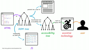
So, using semantics is important for a structure, for the rotor, for navigation et cetera, but it also ensures that the user gets a clear idea of the elements on the page, what they are, what each one does and how they can interact with them by means of an accessibility tree.
The accessibility tree is one of the most important concepts that you need to be familiar with if you're going to build things accessibly. The accessibility tree is a structure parallel to the DOM tree.
For every meaningful, emphasis on meaningful DOM element, an accessibility object is created and exposed to the user. The reason I'm emphasising meaningful is that not every HTML element is meaningful, in particular we have two elements that have no meaning, and no semantics, the div and the span.
Those elements are not going to get any objects in the accessibility tree.
So for every meaningful DOM element, an accessibility object is created and exposed to the user. Assistive technologies are going to use the accessibility tree to expose the content and information to the user.
So you have your application, you have your DOM, from your DOM, you're creating an accessibility tree, and then assistive technologies are going to use that tree to expose your content to the user.
Usually it looks something like this.
So the HTML that you write, left, is used to generate the DOM tree, the DOM tree is then translated into the primary visual representation on the page, on top, and in parallel to the accessibility tree.
But not everything presented visually is presented to screen readers.
Sometimes you hide elements with CSS and entice them from screen readers and sometimes it's the other way around.
So the accessibility tree is a subset of the DOM tree and it is affected by both the markup that you write and the styles that are applied to it.
Native HTML elements, emphasis, native HTML elements are implicitly mapped to accessibility API's. The reason I'm saying native elements is because you have native elements that come by default and then you have the custom elements, if you're creating your own custom elements. So native elements are implicitly mapped to accessibility API's.
For example, an image element will automatically be mapped to an accessibility node or object with a roll of image and a label or an accessible name based on the alt attribute if present, and it should always be present. So, this is the accessible object, it has properties, the first property is the role, it says that this is actually an image and then it has an accessible name and the name is inferred or you get that name from the alt attribute which should always, always be present, even if you leave it empty. Now similarly, other semantic native elements are exposed altogether forming an accessibility tree that looks something like this.
So you can think of the accessibility tree as a tree of objects, an object is created for every meaningful HTML element and that object may expose the name of the element, it always does.
What it is, is it the role? I mean, is it a button, is it a checkbox? What it's current value is, what it's current state is, so you have states as well, a checkbox can be checked or not checked, or indetermined, and how it can be interacted with, because when you create or when you use a native HTML element, the user, as soon as the role of that element is announced, such as button, the user has certain expectations, they know that they should be able to press the space key and the enter key in order to press that button. They should be able to use both.
Now, your mark up informs the objects that are created. That's why using appropriate elements for content is extremely important to convey information to screen reader users.
Now, we can check how our elements are being translated by inspecting the accessibility tree and the dev tools. For example, a simple button with a piece of text inside of the tools, show up in the dev tools, this is the Chrome Dev Tools accessibility pannel, my favourite one.
This button is going to show up as an object with a name inferred from the contents of the text and role of button.
Role button name, the name is the accessible name or the title of your object, in this case it's using the contents of that button, where the arrow shows, to use that as a title for your button.
There are other ways to provide an accessible name, we'll talk about those shortly as well.
Now the only reason this button has a meaningful button role is because we use the button element, but if you were to use a div element, that div has no meaning, it has no semantic, it has no semantics so it would not say role button, it would not use the contents of the div for a title and the user, as far as the screen reader user is concerned, there is no button.
Now when you have a simple button with a piece of text it is exposed to screen reader users using the text as a name, and this is VoiceOver on Mac, yes, VoiceOver on Mac, Mac OS.
So, this is voiceover, it's going to announce that button, saying, send message button.
So first the title of the button, the name, is exposed and then the role, and then you can expose other things.
Now in this section I want to talk about a specific kind of buttons, icon buttons, and there is a reason, because when you talk about icon buttons, in order to create accessible icon buttons, they look something like this.
So, an icon button is an icon that triggers some sort of action on the page.
More accurately, technically speaking, an icon button is a button that contains an icon and no visually visible accompanying text.
Now, the reason icon buttons are very important, the reason I'm talking about them is because in order to create them you need to be familiar with two very important concepts of an accessibility.
How to hide elements accessibility, because there are different ways that you can hide elements. So how do you hide them while making sure that they're accessible, and how do you label elements? We saw an example before using ARIA labelled by, but there are also other ways.
Now, these buttons can be found at the majority of app and UI interfaces today.
In an icon button there is no text.
So the icon alone is supposed to convey meaning. And that's function for sighted users and whether or not that's a good idea is completely outside the scope of this talk. So, just like with a screen reader only headings, we can provide text for screen readers only to use as an accessible name for the button. We had that text visually and make it accessible to screen readers.
So the main reason that I want to cover this section again is because we will talk about hiding elements first, and then labelling them.
So, there are currently four different ways to hide elements, to hide content using CSS, using the clip path property with the value of inset 100%, using opacity, using visibility hidden, and using display none.
These four properties are going to hide your elements from the screen.
Both visibility hidden and display none will remove the element, remember this, visibility hidden and display none will remove the element that they hide from the DOM and the accessibility tree thus making them completely inaccessible.
So if you set display none or visibility hidden on any element, including a piece of text or interactive element, et cetera, it's going to be an accessible.
Now in addition to the CSS properties we also have HTML attributes that allow us to hide content without needing CSS.
One of them is the hidden attribute.
The hidden attribute is the HTML equivalent of CSS is displayed none, which means that the content is hidden both visually and from assistive technologies, and it's useful for hiding content when CSS is disabled. So for example in reader modes and Mandy, she's speaking tomorrow, she wrote a series of articles, fantastic ones, about how your semantics are going to affect how your website or UI is going to show up in reader modes.
Basically when you're using a reader mode or a reading application, that application is not going to use your own CSS to display the content. It's your content but they're not going to be using your CSS.
So if you have an element, a piece of text or any kind of other interactive element that you want to hide at all times, even when your CSS is disabled, using the hidden attribute is a good idea.
Now, similar to the hidden attribute, is the ARIA hidden attribute.
ARIA hidden determines whether an element is hidden from accessibility API's, so if ARIA hidden is true, it's hidden from screen readers, it's not exposed. If ARIA hidden is false, it's not hidden.
It's useful for hiding the creative or duplicative content such as a decorative icon sitting next to text.
So ARIA hidden can be used to hide any kind of content that would be irrelevant, or too redundant for as far as screen readers are concerned. So if you have a button that looks something like this where you have a piece of text, and an icon sitting next to it, it doesn't have to be just a button, anywhere you have a piece of text with an icon and that icon is not really serving any function because the text is there, that icon is going to be irrelevant and redundant so you don't want it to be announced to screen readers. In this case, this button contains a piece of text, which says menu, and as we say before the screen reader is going to automatically use that piece of text, the word menu, as an accessible name for the button.
So the icon itself is pretty useless.
So you can hide that button from screen readers while keeping it visually visible using the ARIA hidden attribute.
If you set it to true, it's going to hide it from screen readers but it's not going to affect it visually.
Now something else that I have here is next to the ARIA hidden, I have focusable false.
Focusable false is very important if you have an inline, specifically an inline SVG inside of a button. Because an IE and all the versions of edge, if you tab to the button, you're using the tab key, you focus the button.
If you tab again, you expect to move to the next focusable element on the page, but instead in IE and edge, the focus moves to the SVG, to the inline SVG inside of the button, and you don't want that.
So in order to avoid having the button get to tab stops, you use focusable false on the SVG to prevent it from the receiving focus.
So ARIA hidden can be used to hide content from screen readers while keeping them visually accessible. What if you want to do the opposite? What if you only want to hide something visually similar to what we did with the heading before? Most of the times this happens with text.
We'll get to that.
Now when you need to provide text first to screen readers only, you'll want to hide it visually. For text, emphasis, for text only, the most common way to do so is to use a utility class that I used before.
I borrowed this from my friends called O'Hara. He's an accessibility expert, he does real testing with real users, screen readers, et cetera.
So this utility class is essentially shrinking an elements into a one pixel square, hiding any overflow and absolutely positioning the element to remove any traces of it from the normal content flow. So, it's not visually there anymore, but as far as screen readers are concerned, it's still accessible.
So we can hide elements visually only, we can hide elements from screen readers only, and we can hide elements from both.
Let's see how these techniques can be used to create our components.
So, there are five different ways that you can create accessible icon buttons, two of them have inconsistency across the screen readers and browser, so I'm not going to talk about them now. These are the three main consistent cross browser and screen reader ways.
The first one is, you would have a button, inside of that button I would have an inline SVG. The best way to make sure that your icons are fully accessible across every possible scenario, including windows high contrast mode and many others, is to use inline SVG.
So I have an inline SVG and then I have a piece of text. I want that piece of text to be there for screen readers but I don't want it to show up visually, so I'm hiding it using the screen reader only utility class. Now when I inspect this, I need to know what the accessible object of this button looks like, I use the dev tools and this is what it looks like. So it has the role button because I'm using the button element, and it's using the contents which is menu, which is exposed to screen readers, it's using that as a title for my button.
Again, because I have a piece of text for my screen readers, the button, the SVG, I mean the SVG itself is not really relevant for them anymore, so I don't need it to be announced.
So, I have menu, and then I'm hiding using the SVG using ARIA hidden, unfocusable false.
Actually I'm hiding it using ARIA hidden but focusable false is also there.
Now another way you can do it is, instead of providing the label or the accessible name inside of the button, you can use the ARIA label attribute.
So ARIA labelled by is used to tell the screen reader that this element is labelled by another element. ARIA label does a very similar thing, almost exactly the same thing, but instead of using another element as a label you provide that label, whatever it is, as a value as a string inside of the ARIA label attribute. So in this case my buttons should say menu, so I have menu inside of ARIA label.
And again, because I already have an accessible name, my SVG is redundant, I'm hiding it using ARIA hidden. And a quick note here is that from the majority of screen readers, ARIA label is going to override any content inside of your button.
So if I have inside of my button, if I have my SVG and I have a piece of text that says banana, my screen reader is not going to see that banana part, it's going to use, well actually might see it, so that's a different thing. It's not going to use that banana as an accessible name, instead it's going to use whatever I have inside of my ARIA label.
This is one of the most popular ways to add labels to buttons and a lot of interactive elements and the accessibility tree now looks something like this. It has role button and the dev tools is telling me that the accessible name, I got that from the ARIA label attribute.
The third way and this is probably my favourite one. It combines both the first one and the second one. So I have a piece of text, again, inside of my button, I'm not using ARIA label.
And I'm hiding that piece of text using the hidden attribute.
What's the problem with this? Exactly.
So screen readers, did you say they will or not? (laughs) So, if you use the hidden attributes, hidden is the HTML equivalent of display none, and display none hides it visually and from screen readers. And yet, I am using that piece of text for screen readers. So, even though I'm using the hidden attribute which hides an element from screen readers, you can still re expose that this is very useful, I'm going to show you why in the next section. If you have any piece of text, content, that is not by default exposed to screen readers you can force exposing it, you can still get it announced if you reference that element using ARIA labelled by. So I have a piece of text inside of my button, I am hiding it visually, instead of using the SR only class name, I'm using the hidden attribute.
The reason I love this technique is because I don't need CSS.
So even if in reader mode that menu, the word menu is not going to show up.
So, I'm hiding it using the hidden attribute and then I'm telling the screen reader to still expose that word menu using ARIA labelled by, by referencing it.
So it has an ID, and I'm telling the screen reader that that word, that menu, that span, is the accessible name of my button.
And again, because I already provide an accessible name, my SVG is hidden from screen readers.
Using the accessibility DEV tools, it now tells me that the name menu, it's getting it from ARIA labelled by, which is referencing a span which has an ID button label and Content menu.
Now, when all three of these techniques, the SVG itself was hidden and I was providing an accessible name using a different way.
You could also still use the SVG itself to provide an accessible name, but those are pretty inconsistent across browsers and screen readers.
I have this article which lists all five different techniques, in this article you will find a link to an article by my friend Scott O'Hara who did all of the actual testing with screen readers, and he tells you, he has a long article, all kinds of tests and test results, showing you which browser, screen reader combinations do not support that SVG accessible name thing, so. You have all these options depending on the screen reader support that you need, you can choose whichever one that you want. Now the ability to use the hidden content and expose that information to screen readers, even if it's hidden, can be used in very different scenarios and i love that. So I want to talk just a little bit about data visualisations.
Data visualisations are great way to make information stand out and sometimes a lot easier to pass and understand, but they also come with their own accessibility problems that we need to be aware of.
When providing information, any kind of information, you want to make sure that that information is available to all your users regardless of how they consume your content.
This is the sensible thing to do.
And when it comes to data visualisations on the web, these visualisations are usually created and presented using SVG.
SVG is perfect for creating data visualisations because it comes with all of the elements that are needed to create the elements of the data visualisations.
We have circles, we have rectangles, we have polylines and lines and paths and complex shapes that you can create.
And oftentimes these images, these visualisations are also interactive and animated.
And SVG is also perfect for that because it can animate the contents of an SVG using CSS or using JavaScript, mainly JavaScript for visualisations.
But SVG visualisations are at the end of the day, SVG images.
So, which means that when a screen reader comes across one of these visualisations, it will announce it as an image, it's not going to automatically present the information within that image to the user. So if you have an image, and the screen reader announces it, it never really announced what's inside of that image, it only announces it as an image, and whatever extra information that you give it. So presenting the information to the user is part of our responsibility.
Now although being a perfect candidate for visually representing information, SVG is not equipped with the semantics needed to convey the content of that information to the user. So we have all the elements, we are able to create data visualisations visually in a very good way, we have all of the tools, but the content of that visualisation is not really accessible, because SVG does not have the semantics to convey them. Now this code is from an article by Leonie Watson in which she talks about how you can kind of turn a bar chart into a table inside of an SVG using ARIA roles.
So ARIA attributes can be used to do many things. One of those things is changing the semantics that can be used to add semantics if you don't have any, and they can be used to change or modify existing semantics. Now since the table is an appropriate alternative way to represent the information in this particular graph, she was able to use ARIA roles such as role table, role row, et cetera, to announce the graph as a table to screen reader users and because the screen reader now sees a table it is going to automatically announced the contents of that table to their user.
So the graph, was announced as a table with the help of ARIA roles.
She's pretty useful.
But the state of SVG accessibility support in browsers and screen readers is still highly inconsistent, even when ARIA attributes are used to polyfill semantic information.
Which means you don't have to read all of this. It's a good idea to provide an alternative view for the information and all cases, all the times. So general rule, if you have data visualisations, if you want to make sure that the information inside of them is accessible, provide an alternative view of that information.
Now, I recently worked with Don Mall and the team at Super Friendly to build the 2018 Khan Academy annual report.
It's a small website with a big message and I'm really happy that I got to work on it. The annual report is a report, which means that it contains a lot of information and data about Khan Academy's users across, the globe, their impact, their financial information and much more.
So the site contained quite a bunch of data visualisations and charts, especially on the second page that says levelling the playing field.
Every chart presented a specific piece or amount of information about a specific topic related to Khan Academy's usage, and each chart is an SVG. I was working with Don, and with Scott Cook, both designers and they both provided me with the SVG as they created these SVG's visually inside of Illustrator or, yeah, they did use illustrator, which is the best tool for SVG by the way.
So, I got a bunch of SVG's and the first thing that I needed to do is to implement them, and the first thing that I need to think about when I'm implementing SVG is which embedding techniques to choose.
So there are currently seven ways, seven ways to embed an SVG on a web page.
One of them is the embed element which nobody uses anymore. So we are left with six main ways.
You can use an element as a background image in CSS, you can embed it using an image tag, the picture, which is the modern image, the picture has an advantage over the image tag alone and that allows you to provide a fallback for your SVG, can use an iframe, I never use that, you can use object element, one of my favourites, and you can just put the SVG inline on your web page. Each one of these has its pros and cons.
So, I choose which one, which technique to use depending on the requirements of the project. I asked myself a set of questions like what kind of fallback do I need? Is the SVG animated or not? Is the animation important? What kind of animation is it? Can I do that animation cross browser using CSS only or do I need JavaScript? If I need JavaScript I know that I cannot use image picture or background image in CSS so I'm left with the other three. Object is pretty much the same as iframe, and I prefer object because I don't like iframe, so I never use iframe, which leaves me with object and SVM inline SVG's.
And for charts usually the decision is easy. We were going to animate the SVG's if we had enough time for the project so that needed to be an option. So I needed to choose between object and SVG, because every chart was really big, and we had a lot of charts, I did not want to just put those inline side of my markup because they would pull you the mark up, and they will not be cached unless the entire page is cached.
So generally speaking for data visualisations and infographics and this kind of stuff, I always, always use the object element.
It's references and SVG externally, which means that it gets cached, which makes the page faster for subsequent visits. It can be interactive and animated using JavaScript, so you can access the SVG inside of an object from the main JavaScript file.
And my favourite part is that anything that you put between the opening and closing object tags is going to be used as a fallback, is going to be used as a fallback when your SVG fails to load or if SVG is not supported at all.
And this is very important.
So the initial implementation looks something like this. I had an object element.
It comes with the type attribute the data attributes, the data is where you reference your SVG and then between the opening and closing object tags for every one of those visualisations we provided a text alternative.
That was enough.
Sometimes you need to provide a table or a lot of content as an alternative view of your data.
For all of our visualisations providing one, two, three paragraphs was more than enough.
So this is just one example.
Now the one thing that I always try to do is make sure that I test my components before I get to the finishing part because if you have to worry about accessibility after all the work is done, it's going to just look like you have a long list of todo's and you probably don't want to do it. So try to incorporate accessibility and testing as early in your process as possible. So I was curious enough to see how a screen reader's going to announce this. I realised that this is an image, it doesn't really have an old attribute, I'm not providing an accessible name anyways so I know that the name is going to be messed up. But I wasn't sure how the object element was going to be announced because it was my first time using an object element ever since I started working with accessibility. So, when I used a voiceover on Mac OS, I realised that this markup was announced as a frame, so object was being announced as a frame, and it was using the file name as an accessible name. Ew.
So the first thing that I did is I want this to be announced as an image, not as a frame because it is an image, and I need to provide an accessible name for it. So my markups look something like this.
If you use the role attribute, you change the semantics of your element, instead of being announced as a frame, now it's going to be announced as an image. I provide an accessible name using ARIA label. So it has to be short and succinct.
Khan Academy Math usage level at Long Beach. And now if I use the screen reader again it's going to announce this as Khan Academy Math usage level at Long Beach image.
Okay, that's better.
But the screen reader was still not picking up the alternative description of that image.
So it was being announced as an image but the information inside of that image, a non sighted user is not able to get that. And we want them to because this is a report and that's where the meat of the report was, inside of those charts.
So, I was really curious, again, because this was the first time using object ever since accessibility.
So I thought, the first thing that I thought of is, I already have an alternative view of my information between the opening and closing object tags.
I was curious if the screen reader would be able to pick that content up and announce it somehow, but it didn't.
So I had a piece of text but it was hidden from screen readers but I still wanted to expose it, how do I do that? Exactly.
But if you use ARIA labelled by, it's going to use the entire paragraph, sometimes two, three paragraphs, as an accessible name for my image and name should be short and succinct.
That's one, so this should not be used as an accessible name, and I already have an accessible name because I'm using ARIA label.
But I still want that information to be exposed. You can do that using ARIA described by.
So just like ARIA labelled by, it's going to expose that piece of content to my screen reader even if it's initially hidden from it. But the difference between ARIA labelled by and described by is that ARIA labelled by is used to provide accessible label, we don't need that here, whereas ARIA described by is used to provide a description, and the main important, the most important difference between these two for me and my opinion is, is in the way they are announced.
So a label is announced before the kind of the image. So it says title, image, and then it announces the description.
And what I really like about this is that there's a short pause.
So it says, Khan Academy Math Usage level in Long Beach, image, short pause, and then it starts listing that piece of information, the description. Which makes a lot more sense.
Now.
Outside of the scope of this talk, sorry, sometimes I just like to talk more about stuff. Now, when the description is announced, it's announced after the element with a short pause after it and that's the main difference between the two. Longer descriptions should be descriptions and labels and names should be short and succinct. So the quick takeaways from this section are, in order to create accessible data charts, you need to provide an accessible name or a label for the graph, provide an alternative view of the information or provide a succinct text description of the chart or the graph where appropriate or possible. Now, always, always test your components using a screen reader and using keyboard as well. So, whenever I built a components and I implemented it, I would test the whole page using a keyboard, and while I was tabbing through the page, I realised that my tab was getting, it would disappear, basically, and I was using a focus dial because you should always use a focus dial. But my tab was disappear, I didn't know what was happening. So after a little bit of investigation I realised that an object is technically kind of like an iframe, so as soon as an object received focus it was trapping that focus, and I didn't want it to, so added tab index minus one. Tab index minus one is used to remove an element from the tab order of the page.
And this is very important anyway because it's an image and why would I want an image to be focusable? It should not be focusable.
So test with a screen reader, test with a keyboard. I have only five minutes to cover something very important. This is a very specific topic, styling native checkboxes excessively, but the concept that I'm going to cover, which is a very simple, it's a very short one actually, this applies to any interactive element, if you have any kind of native interactive elements, a button, a checkbox, file inputs, et cetera and you need to style them while making sure that they remain accessible, there's one important thing you need to keep in mind. So this is the old way that we used to style check boxes, because you cannot style the native check box itself, we usually used to hide it.
I'm really ashamed of this code, but it's like five years old, so it's okay. So you would hide the checkbox using display none, which makes it inaccessible, which is something that I only recently learned, in the last year.
So, you remove that checkbox as far as the screen reader's concerned it's not there anymore so even if you put something else on the page visually, a screen reader is not really pick it up, and there is no checkbox for them.
Now, the modern accessible way to do this, it looks something more like this.
I always like to put my inputs inside of my labels because it increases the tap area.
I have an input type checkbox, I'm going to hide that visually later.
And then I have an SVG, again in line.
It's going to replace my checkbox visually and then I have the actual label text that says to do list item, should be something more useful. So I need to hide the native checkbox and styling this whole thing the SVG visual is pretty easy, sort of, it is actually easy.
So I give it a width and height to make sure, width and height using AMS mixing, make sure that when the text resizes so does the icon because the size of the icons relative to the size of the text.
Add a transition so that when I change the values the fill colour inside of the SVG, it's transitions really nicely et cetera.
And then, you never want to forget the focus style, so when my custom checkbox, which is, no, when the input type checkbox, my actual checkbox, receives focus, I select the SVG which comes after it using the start sibling selector. I select my SVG and I provide an outline for that SVG because the native checkbox is going to be hidden and when the user, again, always test with a keyboard, when the user tabs to my SVG, the new visual SVG, the new visual checkbox which is my SVG, they should be able to see the focus styles. So when the native check box receives focus, which is currently hidden, I want to show that focus on my SVG.
Now when you hide the checkbox, there's something very important to keep in mind and this applies to all kinds of interactive elements. Apparently, touch interfaces screen readers allow users to run their finger over the screen to hear what is directly underneath.
This provides the user with a quick sense of an entire interface.
In other words, your mobile phones, they are touch interfaces, all of your mobile phones, when you're using a screen reader, they allow the screen reader user to navigate the page using touch.
A screen reader user can literally move their finger across the screen and then when they come across an interactive element, that interactive element is going to be announced. Now the way you hide your checkbox determines whether or not they will be able to explore it by touch.
So one of the suggestions, our two main suggestion that I usually get when I ask workshop attendees, how would you hide the checkbox? One would always say, move it off canvas.
But if you move it off canvas, someone navigating by touch is not going to find it anymore because it's not on the canvas anymore, which makes it inaccessible.
And someone else also says and I see this in a lot of articles online. They use the SR only class name, the utility class to hide the checkbox.
That class name should only be used to hide text. If you use that class name on that checkbox it's going to shrink that checkbox to a one pixel thing, which also makes it inaccessible to touch users. So when you want to hide a native interactive element accessibly, you don't want to remove it off canvas and you don't want to hide it in a way that makes it non explorable by touch, so how do you do that instead? You do that by, quick, how much time to I have? So, I position the checkbox absolutely because I want to remove it from the page flow. I test after each step to make sure that it still works. I give it a width and a height, by the way the width and the height only changes in Chrome, which is pretty cool.
And then I set the opacity to zero.
That's all.
You don't move it off Canvas, you don't shrink it, you don't do anything, and the most important thing that happened here is that the native checkbox was positioned on top of the element that was visually replacing it. So a sighted user knows that this is my checkbox, but a non sighted user is going to expect that checkbox to also be positioned here.
So when you hide an element, an interactive element, you want to make sure that it's still accessible. Do not move it off Canvas, do not use the utility class. It's enough to remove it from the page flow with position absolute, set the opacity to zero, and always position it on top of whatever is visually replacing it.
You never want to forget the focus styles, of course, so when the native check box receives focus, you apply the focus.
Because my check box is still there as far as a screen reader is concerned, it's still there, the SVG which is visually replacing it, is again, an icon redundant, not really useful for them, so again, I'm using ARIA hidden to hide it from screen readers, and the general rule to hide interactive elements accessible looks something like this.
So remove it from the flow, hide it visually, and position it any way you need.
Sometimes you need to use Z index to put it on top of whatever is visually replacing it.
Thank you.
(audience applauds) (upbeat music)
As front-end developers, we are tasked with building the *front* end of a Web site or application — in other words, we are building the *user’s* end of an interface. This is why it is crucial that we ensure that the front-end foundations that we build are as inclusive of and accessible to as many users as possible. To do that, we must build with accessibility in mind from the get-go. This, in turn, means that the way we approach writing HTML, CSS, SVG and JavaScript *might* need to change as we take into consideration many factors that affect how (in)accessible our UIs are.
This talk is a practical one, chock-full of tips for creating more accessible front-end foundations. If writing HTML, CSS, SVG and JavaScript is part of your job, then this talk is for you.
In this session — a series of macro case studies from real client projects — Sara shares some frustrations, many lessons learned, and a lot of practical tips and tricks for building accessible front-end foundations that you can take and apply in your own projects right away.