(quirky instrumental music) - Good day, Melbourne.
This morning actually, while I was meant to be rehearsing this talk here.
I just made this little thing and I thought it would be fun, so that's me and Vitali.
Then you can see this is me here.
I wanted actually to do this on my phone, so that I could take a photo with you.
If I click this here, well, that's not a good one.
Hang on.
(audience laughing) All right, okay, there it is, all right.
That's better.
Now I go back to my slides.
Hey! So we got a photo together with my phone, but like get user media.
It doesn't work on HGTVS, so it didn't work. So I was doing this instead of practising my slides. (audience laughing) But yeah, it was fun.
So yeah, good day Melbourne.
Now, I should do the introduction actually.
I'm Mike.
I'm a web developer from here in Australia. I'm living in Sydney now.
As John said, I just spent a bit of time overseas. I've got my blog there if anyone wants to read about any of the techniques and I've also got my Twitter there.
If you want to ask me any questions, you can find me on either of those channels. Of course I'm also here, so if anyone wants to talk to me, like at this event, please feel free to.
I really love talking about this stuff and that's why I'm here.
The title of my talk is Advanced Fluid Typography and I've also got a little and more there and the reason for that is that a lot of the techniques that I'm going to be talking to relate to more than just typography in particular. Some of the concepts, they apply more broadly to how we approach responsive design and that's something that I want people to pay particular attention to cause those are the kind of discussions I love having and I'd love to hear what your opinions are on those.
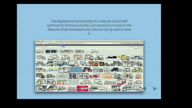
So essentially I'm talking about an alternative approach to responsive design and I'm going to be asking you to put media queries and breakpoints largely aside and we're gonna have a think about what viewport units and calc expressions can do, just as one example as an alternative to what we do with media queries. That might sound a little bit strange to some of you, and if it does, I encourage you to stick with me and I promise by the end, you will be convinced. If not, you know where to reach me.
So, I'd like to acknowledge that although we like to think that it's not the case, we all still very much still think in pixels. It's a widely known secret that all the unit types we regularly use are just an abstraction of a base font size and we normally know that this is 16 pixels. So it's not a difficult calculation to work out what the actual font size of something is gonna be. It doesn't matter whether you use em's, rem's, percentages. You just do these kind of things.
I'm not gonna read all of those, but whether you write those sums down as they're written on the slide there, or anything like that, or you just keep a running tally in your head of a rough idea of what the current font size is in pixels, this is something that we all do in one way or another, right? But of course who doesn't love correcting someone on the Internet and this is kind of the Internet life, so there's at least one person there in the audience at the moment with a smug grin on their face and they're thinking to themselves, "Well, actually Mike, "a percentage width is relative to the parent element, "not to the base font size." So, enter that person.
Yeah, you got me, but let's be honest.
Wherever this happens, we try to control it with media queries, containers, grids, and other things to make sure that our responsive components play safe within their pixel boundaries.
Of course this panda is meant to be a metaphor for a responsive component trying to escape the grid system's layers or somewhat whatever else we put in place.
I know you're thinking, "That's a bit of a stretch of a metaphor, Mike," and yes it is, but I hope you'll agree, it was totally worth it to get this guy on a slide. (audience laughing) So yeah, anyway, the point that I'm not getting to is that while relative units like percentages might change, 20% is always 20%, right? They're linear.
Whether it's on a smart phone or a desktop, 20% is 20%, and we've come to accept that this is how it should be. If I wanted to change from 20% on a small screen to 50% on a large screen, I couldn't do this, not without a breakpoint. Of course, what would I define that breakpoint in? Pixels or some abstraction of pixels.
So it doesn't matter what we do.
In one way or another, we're always tied back to using these absolute values and I think that these limitations shape our thinking. So in the world around us, these linear scales, they're not really the norm.
In fact, they tend to be the exception, being the web and computing.
It tends to often be how it is and we accept that that's how it is and when we get to that point, I think that we can become close to new ways of thinking and sometimes fail to see better options.
Now I don't know if anyone's seen this before. But if you draw a circle on the ground, the cat has a tendency to want to come and sit inside it and I think that as designers and developers, we do that as well.
We draw our own circles and we sit in them. But we know that these might not be real limitations. If you watch some of the early TV news broadcasts and things like that, you'll see that a lot of the techniques that they use where adaptations from radio.
They have like clear pronunciations of words and often redundant descriptions of sets and things like that. That trend continued with the influence of theatre and film, and film and animation, and so on, and I think this holds true on the web as well. It's easy to see the influence of print design embedded in our typography and visual design best practises. But it's also there in the technical architecture and metalanguage of the web.
We can't really escape it.
So it's something that we do on large scales as well as small and it's common to carry over perceptions of how something should work based on our understanding of our past technologies. We falsely assume that new technologies will work in a similar way, solve similar problems, and have similar constraints to those that we've already experienced, but usually this is not the case.
Each time it takes time and and experimentation to discover the innate potential of any new technology or any new media.
What if we could do this better in web development? What if we could have something that wasn't as influenced by our past experience? Something that starts off at 20% on a small screen, for example, and fluidly transitions to 50% on a large screen? I'm not talking about 150 break points.
I'm talking about a real fluid transition.
This example here was recorded in a browser, so it turns out you can do this stuff.
I'm gonna show you how you can do things like this, along with min and max font sizes, fluid modular scale headings, some events, typography techniques, and a lot more as well. But before we can get to that, I think first we have to get a little bit of context and that means a little bit of a better understanding of how unit types and values are understood by the browsers.
I can pretty much see everyone looking at me like this now, but it's not gonna be that bad.
We're just gonna start with a little quiz, right? So can you just yell out the answer, how many unit types are there in CSS, everyone? Not one person (chuckles). (audience laughing)
John? - [John] I forget.
- Yeah, you've seen it.
- [Man] 36.
(audience chattering) - [Man] 27.
- It is, it's 27.
Well, so yes, 27 different unit types in CSS. Now normally the answer to that I get is around like five, or 10, or something, and that's what I thought initially too.
I think that this begs the question of what is the unit potential of those other 23 elements, sorry, 23 unit types that we're not regularly using. The next question I have for you is how many do you use? Anyone? I think that if anyone's saying more than four, that chances are they're probably lying.
I know I only use three or four, in any one project at least.
Another question that I often ask myself is, how is it that a browser understands something like this. This here is a valid CSS value and there's all sorts of things there.
There's like units, functions, keywords, percentages, fruit-based colours.
The browser has to make sense of all of these things and know where to place them and know how to render something on the page. It turns out that there's a very specific process that it goes through for understanding this. I just want to go quickly go through that to give you some context.
So the first step in that process is the specified value. Now the specified value is pretty much what we write in our CSS there.
So some of these things here may be broken down into their short form properties instead of the, sorry, to the long form instead of the shorthand properties, but it's pretty much what you write in your CSS. The next step in that process is the computed value. Spoiler alert for anyone who hasn't read it, but the spec describes it, the computer value as resolving the specified value as far as possible without laying out the page or performing expensive hard-to-parallelize operations, et cetera, et cetera. So what that basically means is there's some things that it can resolve early on, but there are some other things that it can't know without laying out the page.
In this computed step it resolves like inherited values.
It uses a single representation of length internally and things like that, so there's a lot of steps that it can do there. But for complex things like Flexbox, maybe grid and other situations, and also some situations where we use calc, interestingly enough, this means that those things can't be computed until we've started laying out the page, and that's the used value.
It's typically what you'll see in the computed stars tab of your dev tools, so I just want you to keep that in mind as we go through some of these other stuff. So the dangerously oversimplified edition to understanding how browsers interpret unit types and values: Specified value, what we write in our CSS, Computed value, the calculations resolved by the browser, and the Used value is the final rendering on the page. And with that we can now get a little bit of a better understanding of calc.
So who's used calc in the last year? About half of you? Every time I ask that question, it's more and more people. I think early on there was some initial reactions to using calc.
A lot of people felt like it was dirty, or it was like, wrong, or it had performance issues, and a lot of those argument, it really didn't except for in a few like edge cases. A lot of those bugs and things are resolved by browser vendors very quickly as they optimise for newer technologies, newer features. So whenever you here that argument, just consider whether that might be the case. So calc's all right.
There's four rules that I want you to understand about calc and I've condensed these down into two.
The first rule that I want you to understand about calc is that you can add and subtract units with a similar type, and by type, I mean things like length units. You don't need to understand what all these are, like it's kind of intuitive, but there are a whole bunch of internal unit types in browsers.
There are things like length, time, colour, frequency. You'll have an intuitive idea of what these are. You don't have to memorise them, but for the most part, we're gonna be talking about length values. So we can add and subtract units with a similar type, so we can see that these are both length values: 10 pixels plus two rem.
So we know that the base font size is 16 pixels, so we know that two rem is going to be 32 pixels. If we add 10 pixels to that, we've got 42 pixels. The answer to life, the universe, and everything. The obligatory nerd example, right? So they're pretty simple and that's fairly straightforward. We couldn't do one rem minus five, but we can do one rem minus five pixels.
Now when we multiply and divide, it's kind of the opposite. So we can multiply and divide real numbers with CSS units.
So three times two rem, we know that two rem is a 32 pixels, so that'll be 96 pixels.
The same here, 300 pixels divided by three would be 100 pixels each. So I couldn't do 300 pixels divided by three rem, right, cause that doesn't make sense.
So it's pretty forward.
That's all you need to know.
Who here thinks that they get calc now? Everyone, hopefully? All right, so Vitali had a game show before. I wanna do my only game show.
It's called, Is That Valid? Are you ready to be tested on this? No.
All right (chuckles).
(classic mid-tempo brass music) Okay.
So basically I'm just gonna look at one of these and I'm gonna ask you a question, is that valid? And I want you to shout out yes or no.
Yes? All right, well, I gotta ask the question first or it's not a game show. Is that valid? - [Audience] Yes.
- Yes, all right, well done.
Two rem times three, is that valid? - [Audience] Yes.
- Yes, wow, enthusiasm's waning very quickly. Two rem divided by five, is that valid? - [Audience] Yes.
- Yes, all right.
10 pixels minus three, is that valid? - [Audience] No.
- No, well done, all right.
Two rem times three rem, is that valid? - [Audience] No.
- Did someone say yes? No.
(chuckles) And the final one, two rem divided by yellow, is that valid? - [Audience] No.
- Yeah? (audience laughing) Well it's not that much more ridiculous than the one above right? So yeah, I think you'll get that, right, so I'm just gonna move on and quickly look at that slide and have a quick read if you're not fully up on that. So with that, I think that now we've got a bit of an understanding of this we can move into the fun stuff which is responsive typography.
So this is kind of my bold slide, although it's kind of more of a semi-bold, but existing responsive typography techniques are not ideal. I think that that's controversial, right? The problem that I have with techniques like this is that they're clunky, require multiple media queries, and they don't necessarily scale in relation to anything else on the page.
This means that they can trigger overflow, jump out of containers, and potentially cause all kinds of mess if we're not doing it correctly.
Frankly I don't know why we've persisted with this type of responsive typography for as long as we have, not when we have better options available.
So viewport units are different, right? Who has used viewport units, everyone now? Nearly everyone? So unlike all the other unit types that I've been talking about, viewport units are not relative to that base font size. They're relative to the viewport.
One VW is relative to 1% of the viewport width. One VH is relative to 1% of the viewport height, and we also have V min and V max, which are relative to the viewport width or height, whichever is larger or the viewport within height, whichever is smaller.
Now they've been around for a fair while, since 2012, and IE was even an early mover on these, so that means they're supported as far back as IE9 with some slight differences in syntax and a few bugs in some of the early implementations.
But for the large part, you can pretty much use them everywhere today. So I don't know what the reluctance to these has been. I think it's sorta similar to calc.
This is what viewport units look like, and as you can see, it scales smoothly.
None of that text reflows.
It's almost like we're resizing an image and it'll go all the way up and all the way down. In this example, I've only declared one viewport unit declaration on the HTML element, which changes the root em and therefore everything else is relative to that root em and then it will scale accordingly.
But now you can say that viewport units too aren't without limitations, right.
When it gets down to a really small screen size, I don't know about you, but I can't read that. So even viewport units have limitations, all right? So (sighs) everything has limitations, but some of these are perceived limitations, right? So this example here takes user calc questions.
It says a font size of 18 pixels and then add three viewport widths to that, so that means at a viewport width of zero, the font size will be exactly 18 pixels and from there it will scale at the rate of three viewport widths.
So there we have min font size with calc.
That's pretty easy.
But those of you paying particular attention will realise, yeah, there's limits here too, right? More often than not, we want to set a minimum font size at a viewport resolution other than zero, so, again, more limitations.
Or are these more perceived limitations because it turns out with using media queries we can set a fixed font size to begin with and then above that media query, you can set the font size to three viewpoint widths. So we've got min font size with media queries. Turns out that if we do the calculations right, we can work out the exact point where three viewport widths is going to equal out 18 pixels so that there's no jump between a fixed and a fluid value, and it's just that there.
It's the font size divided by the number of viewport units, divided by 100.
Take note of the parentheses there.
So 18 divided by three, divided by 100, gives us 600, and that's exactly where we placed that media queries so there's no jump between fixed and fluid value. So once again, those of you paying particular attention will have thought, "Well, we could do this for a max font size as well," and that's correct.
So if we set a fluid font size to begin with and then we do the same sum, so 24 divided by three, divided by 100, gives us 800, and then above that we set it back to a fixed value.
So now we've got a max font size with media queries there.
So that's all pretty good.
We got min and max font size pretty much where we want, no jump between those fixed and fluid values. When I'm doing this, I often like to look at a table like this.
This can help you visualise the rate at which viewport units change.
So down that side of it, I've got the screen size, and across the top, I've got the different viewport units, and I can decide what to use, right? But again those of you paying particular attention, will have realised that there's still some constraints here. Essentially you can find the one column of this table or in other words, we can't control the rate at which viewport units change. It turns out that this too is a perceived limitation and that brings us to the next slide about advanced fluid typography.
I wanna show you some of these techniques.
We're going to create a simple function with CSS. But I wanna show you a really simple example first before we get to some of the advanced typography techniques.
So here we've got a calc equation that sets the font size to three viewport height plus three viewport widths, divided by two.
So now we've got a font size that has a relationship to the area of the container and it's an interesting result.
So you can see that as it gets wider, the font size gets larger.
But also as it gets taller and narrow, the font size is affected too.
Now that's not directly equivalent to area, but it's sort of like loosely equivalent area, so it's not perfect in all situations.
But I think you can all understand how that one there works.
With that I want to want to this one.
So this is the equation that with media queries and calc together in this.
We can get font sizes at scale between specific pixel values over a specific viewport range, meaning they start and stop scaling exactly where you want. The way this works is that it takes a value within a range and works out what the new value would be if it was applied to a different range.
So I've had the value of 50 in a range of one to 100 and I want to apply this to a new range between say one and 200, my new value would be 100 because both of those are right in the middle of the respective range.
So we're just doing this with viewport sizes and font sizes. The method here works well with em's, rem's, and other unit types.
The reason that I have been giving examples in pixels is because we all think in pixels and they're easy to understand.
But in fact, it's not a bad idea to use em's or rem's for this. Like any function, this can be simplified, right? I know that looked pretty scary before, but really it's not that long.
In fact this is a function that might be familiar to anyone who does some JavaScript, or math, or things like that. It's a linear interpolation, and this is what it looks like.
So as you can see, it gets down to a particular size and then it stop scaling and as we go up, the font size stops getting any larger once we reach about now.
And again, there's not much text flow there, free flow. It's just scaling smoothly.
Now, you might be working with the CMS or something and you might want to selectively turn this off. So the example before was applying it to the root em, like I said, one calc declaration, and then I'm using rem's all throughout my document or just using the browser defaults.
But if I'm changing the HTML element, there might be some containers that like maybe you've got sort of menus, or advertising, or things like that that you need to deal with, and in that case you can make a class for a fixed container.
Declare a fixed font size and then inside that, you can use em's inside that container and then they'll all be relative to that fixed container. It's not the preferred option.
But if you have to do it, you might get away with that. That looks something like this.
So as you can see, I've got this little like callout thing, a little like figure text and the rest of the fonts are scaling, but this particular container here is staying fixed, so that means it's roughly equivalent on mobile. But like where there's more room, I'm making the font size larger and it becomes little bit of an aside, some less important information. Perhaps not the best design, maybe you can do better than that.
I'd love to see that, but I think you get the idea. Again those of you paying particular attention will have gone, "Well we can do the reverse of that "and set a fixed font size to begin with "or just the default rem to begin with, even better, "and then we can set a fluid "value inside of a container and use em's inside "for everything inside that container "and then they'll all be relative to that container." So that means we have a container that scales where the rest of our site remains fixed, and that look something like this.
That paragraph there, I want to emphasise it where we've got space available. I bet on a mobile device or smaller screen, I'm just making it like slightly more bold. So, again, you can do a better design treatment than that, show me and I'll put it in my slides, but you get the idea there.
So is anyone feeling like this? Mike, I want to use a fluid typography but, I don't want to remember stuff.
This is confusing.
So I just figured everything I told you and let's just use Sass, all right? So cheating with Sass.
Of course, it's not cheating.
This is exactly how I use it.
There's a whole lot of different mixins out there, whether it's Sass, or Less, or Stylist, or post-CSS, or whatever you want to use.
You'll be able to find an example of this.
You can Google for it.
I'm gonna put some slides at the end where you can find some examples.
Failing all that, just ping me on Twitter and I'll point you in the right direction, but you be able to find plenty of examples. So you just declare your variables as you like and put them straight into a mixin, something like this, where you're saying I want the font size to have those values and it will do those calculations for you and write the CSS.
That brings me to this which is my favourite implementation of this technique and that is Fluid Modular Scale.
So does anyone know what I mean when I say modular scales? A few people are using them? So modular scales are something that's kind of, well, it's best described visually actually. Each of the headings in this example is 1.2 times the size of the previous heading. So that means as they get larger, their variation in size also gets larger.
This particular one's called the minor third, but there's other scales.
You might've heard of The Golden ratio.
That can be used as a modular scale.
Some people say that modular scales are naturally, aesthetically pleasing.
They're found in nature and all sorts of stuff. Other people say that's bullish it.
(audience laughing) Either way, I don't really mind.
Present example aside, it's not a bad baseline to sort of set things. But if you want to modify the values sort of slightly off a modular scale, that's gonna work as well.
So if you're not into modular scales, you can still use these techniques.
I use it as a guide for sort of my typography because I'm not very good at setting those things. So typically I pick a more uniform scale for a small screen and a more varied scale for a large screen, so I've got two examples there.
You can pick whatever scales you like and you can do the reverse of this if you'd like to. So calculating a modular scale is really easy. We work at what scale we want to use, like from that previous example, and then we times that by the base font size to go up the scale and we do that again and again with subsequent answers and we divide to go down the scale, so that's really easy.
But of course who has time for that, right? So just go to typescale.com or modularscale.com. Pick a size that you like for a large screen and pick a size that you like for a small screen, and then write down each of those numbers there on the left-hand side and then you're going to write a table up like this, next to each of the elements that you want to put your modular scales on.
Then you're going to put them in the mixin like this and that goes straight into your style sheet, and the results looks something like this.
So, as you can see, it's got a more varied scale to begin with. But as the screen size gets smaller, they become more uniform.
Now when I first did this, this immediately solved so many problem's I was having with typography because the body copy tends to be more forgiving.
But on larger screens, if I adjusted things, it only took a few pixels before, like all of my headings were sort of wrapping on multiple lines and things like that. So I was forever tweaking headings and this didn't solve everything, but it's solved a lot of things really quickly. So this is by far my favourite technique.
I'm well aware that people don't sit there twizzling the screen like that, and that's not really the point.
The point is that they come in at any particular screen size and it's looking good for them.
So before we go on, I wanna mention quickly just what's the browser support, what bugs do I need to be aware of them, what's the state of accessibility.
So browser support, pretty much across the board, 97 or 8% of browsers or something like that at the moment. There are some bugs in some older versions of IE and in mobile Safari.
That means that when you come in, it will calculate it initially like at the computed value stage, but not do the recalculation layer, which means that if someone does resize their window, it won't resize.
I don't do anything for that particular bug because, like I said, not many people really do that, and it's kind of acceptable if they have a font size that's not entirely perfect.
It's non-breaking.
So that's really good.
It means that this technique is naturally progressively enhanced.
If it's not at all supported, it's just gonna use the default font sizes and you can declare your own default before using this technique so that you can have even more control over that. Accessibility wise, I would avoid using pixels just for all the same reasons that many of us do that already.
If you declare pixels, there are some cases where it disables (mumbles) certain devices and process.
So I would look to use rem's and I would look to use it on the root em, if possible. It tends to be the best technique for doing that. If you're using calc in general, you should also like consider mixing values. Like if you're going to use viewport units for font sizes, you're better off using that earlier technique where I said use like one rem plus two viewport units because the em or rem portion of that will scale, whereas the viewport portion won't scale.
So by mixing them together, we can kind of bake accessibility into viewport units, which is a good thing to do.
So it's not just typography that we can use these techniques for.
I've been talking a lot about typography, but I want to show you some other examples. So hoo-hi hasn't struggled for the perfect implementation, a very responsive tomato. (audience laughing)
The reason I'm showing this technique is because I want to show that you can resize the width and height.
This isn't an icon font or anything like that. It works on other CSS properties.
If you already have a whole lot of typography rules that you follow, things like baseline grids, vertical rhythm, these techniques work with Fluid values as well. You just have to rethink a little bit of how you approach it.
There's some blogs and things out there that will help you get started on this.
Once again, you can ping me if you can't find examples of that. This example here is doing a lot of things. The images are resizing from like 16 by nine to one by one.
There's a lot of spacing sort of changing, both inside the containers and outside of the containers. The typography is fluid.
I just wanted to see what we could do with layer and once again, I'm not sure this is the best example, but it demonstrates sort of a scrapbook-y type layout on a large screen and a boxy Instagram-y type layout on a small screen. I'm interested to see what else we could do outside of just typography, but this might open up some options for different layout techniques, along with things like Flexbox and CSS grid. In this final example, I'm not telling any of you to do this.
I can think of no reason why colour should be relative to the viewport.
Although a few people have said to me like shouldn't we change the contrast on like smaller screens so you can have like a higher contrast on small screen and less contrast on a large screen.
I'm not sure that you can universally tell the small screen is being used sort of like on a device and things like that. Yeah, maybe don't do it, but I'm really glad that you can do it and I love things like this.
So you probably noticed at this point that a lot of what we've been talking about has to do with interpolation in design.
Now that you've seen some of what we can do, I want you to consider your relationship with media queries and I want to go back to my earlier point about how limitations shape our thinking.
That chances are as designers or implementers of design, you have two primary screen sizes in mind, right, the small screen and the large screen, the device and the desktop.
I know that you think about more than just these two, but these two are particularly important because they represent the upper and lower bounds of your design. When you modify things at or between these two values, what you are doing is like interpolation.
So we interpolate values regularly in design, albeit manually and often unknowingly.
We do this often at fixed points.
As the screen size gets smaller, there comes a point where the design comes under pressure from constraints such as the limited screen real estate and a breakpoint represents where that design can no longer withstand that pressure.
So the appropriate response is to adjust something, and we do this.
Designers choose breakpoints carefully.
They probably have in mind where constraints like screen size start to impact on a design and how quickly this affects the overall quality. So media queries might be the best tool for alleviating this pressure, but in some ways they are compromised to technology. We know that immediately before and after that breakpoint, the design is still under pressure.
I've got a little graph there that attempts to demonstrate that.
I think it's feasible to say that the best experience for some aspects of design should vary directly in relation to the viewport, not only at fixed points.
To show you what I mean I've built a tool that scientifically measures the amount of pressure on a design and I'd like to show you how it changes in relation to viewports, viewport widths.
So you might recognise this as the Web Directions Respond site from this here. Now John's done a lot of work on this, but I got to it before he did that.
So you can see that here the needle is up in the green zone there.
There's no particular pressure on this design at the moment. It's performing pretty much as expected.
This is 1280 pixels, so close to what you might consider an ideal desktop state. However, if we reduce the screen down to around 900 pixels, you can see the design begins to come under pressure. Brisbane has jumped up above some of the other text there and if we scroll down the page a little bit, we'll see that the Brisbane has come out of some pressure, come on. We'll see that...
Is that video not playing.
Okay.
So some of the other text merged and some of the boxes were no longer maintaining equal height.
If you go down back to the next ideal screen state, the ideal mobile state, we see that a lot of those signs of pressure are now gone. Once again, it's performing largely as expected. But if we take this down to a very small mobile state, once again we see some signs of pressure.
You can see that the text there has dropped down one line, as well as that, we can see that some of the the major objects, the text is wrapping under the profile images. It's a similar story if we go up closer to the breakpoint as well.
You can see that there's possibly a bit more spacing here than was intended.
Although I love that John is using viewport units for the sticky header there, it wasn't capped using any of those max font size examples that we used for, which means that near the breakpoint, it's starting to maybe dominate some of the other headlines on the side.
So none of this is intended to be critical of this site and it's meant to be used as like for a point in time, right? It's not particularly useful after today.
So it just serves to demonstrate that all sites have signs of pressure, the closer you get to the breakpoints or the further away you get from those ideal states. That brings me to this (sighs), the future of fluid typography.
So media queries are gonna remain an important tool in our arsenal, but they're just one tool.
A whole bunch of smart people are working on something at the moment for variable typography. I don't know if anyone's seen this.
This is an example by Eric vin-glock-lin and it shows some of what will be possible. With variable fonts we'll be able to set axes of variation, and that looks like this.
So what this means is that we'll be able to find the limits of boldness in our italics: weight, width, all sorts of other things.
In fact, font designers will have control over these axes and we'll be able to define them.
We'll be able to modify them on the front end. If you're interested in learning more about that, Andrew Johnson wrote a really nice article for A list Apart on Live Font Interpolation on the Web and I strongly recommend that you check that out. I'm really interested in this, but I'm also worried that we might be taking a little bit of a step back once we take a step forwards because a lot of the examples that I've been showing you today relate to length values in CSS and as you might know, a lot of font properties are not length values, things like line height, weight, they tend to be unit-less values and none of the calc equations that I've shown you work with those.
So that's why I'm proposing that we get a native interpolation function in CSS.
Now I just made this up, so nobody sort of try that. I don't know how likely we are to get this. But if you're interested, there's a GitHub issue on the W3C's working group where you can contribute to that discussion. But it would be nice to use existing things like animation timing functions so that we can have non-(mumbles) linear interpolation and easing between different font sizes as well. I think that would be really interesting in all the tools existing in CSS already.
So I'm worried that whilst we're gonna get these really cool things, we might be stuck with some limitations of the past. But as I've demonstrated, there's always limitations, right? All right, so this is my final slide and it's kind of cheesy, but it references like the conference title, so that's cool.
I wanna say, be wary of perceived limitations, especially those that we place on ourselves. Remember that you carry over your perceived perceptions from past experience and assume new technologies will work and solve similar problems in a similar way and have those similar constraints to those that you have previously experienced. Generally they don't and I've seen people approach SVG this way.
They treat it like any other standard image format. I've also seen it with people's slow uptake of calc and viewport units and I think this is gonna happen as well with CSS grid, but it doesn't have to.
We don't have to all make these mistakes, although I do believe that many people will. What can you do to avoid that? You can think about your design and UX intentions first and then think how you're going to achieve those goals and think about what tools you have available to help achieve those goals, but remember that the tools like media queries are the solution, not the objective, so stop designing, if you can, for fixed breakpoints. Today we've just explored the limits of Fluid typography, but that's just one really small area of the web. I've mentioned things like Flexbox, things like grid, and I'm seeing some really fantastic examples of what people are doing combining some technologies like that and that's exactly what we've done with calc and viewport units.
So as you approach these new things, I want you to keep all of this in mind and I'm really interested to see what you come up with. So for more examples, you can go to my site there. Thank you very much.
(audience clapping) (quirky instrumental music)