The colorful future of CSS
Hello, my name is Alvaro, and I'm going to talk about a topic that I really enjoy.
That is CSS.
And in particular, I'm going to talk about the colors in CSS.
The language is boiling with changes, new definitions, new standards, new features, new drafts, and the colors are front and center of those changes.
It's a really exciting time to talk about colors in CSS.
In particular, in this presentation, we're going to focus on the color level four and five modules that introduce new ways of writing colors and new functions that can become real game-changers for web development.
We're going to start the presentation by talking about ways of writing colors, and I'm going to divide it in two parts, the present and the future.
The present are ways of writing colors that are already available and they are supported by all browsers or most of them.
And the future includes new functions and new definitions from the color level four module that are not yet supported by most of the browsers.
Although some of them support it like Safari.
Finally, I'm going to talk about those exciting functions that I mentioned before, that really, they are going to revolutionize how we do web development and how we see colors.
So let's start talking about the present.
The colors that we can use right now on the browser or anywhere with CSS.
And to start with that, let's start with RGB.
RGB stands for red, green, blue.
And it's a way of defining a color by the different channels, red, green, and blue, that compose it.
In CSS, we have the RGB and the RGBa functions, that get three parameters for the channels.
And then an alpha.
You may notice that I'm using a different notation with a space, separating the values instead of commas.
This is a new thing that came up as part of the color module 4.
And I'm going to do all the notation like this because all the new ways of writing colors use this syntax.
So the sooner we adopt it the better, because the new methods do not support the comma separated syntax.
Anyway.
Another way of writing colors is hex-hexadecimal.
It's also an RGB way because we're defining the red, green, and blue composition of the color.
And we use hexadecimal that goes from zero to F and it can have three or six digits.
And a new theme is that we can also write them with four or eight digits.
In the four version the last digit is for alpha.
That is the opacity of the color.
And in the eight digit version, the last two digits is the alpha.
Finally, we can talk about HSL that is widely supported.
And it's a really interesting color format because it's widely spread mainly also for tehming and a white labeling, because it's really convenient for creating swatches and, and different shadess of one color.
That's because the HSL that it stands for a hue, saturation and lightness, it's really easy to define a color using the hue.
That is the degree within a color wheel.
The saturation, that is how vibrant the color is going to be.
The lower the value the greyish it is, the higher, the more vibrant, the more, the brighter it is.
And then the lightness is how dark or light the color is.
A good thing about HSL again, is that we can combine it with CSS custom properties, and then we can create a whole experience and a design system with it.
But soon, we're going to see that there are new ways of doing things that will make this way obsolete.
So, as I mentioned before, there's a new notation.
There's a space separated notation, a functional notation that is used for both RGB and HSL.
And what we do is that we separate the values for the different channels, with a space instead of a comma.
And the alpha is with a forward slash instead of A comma too.
And also a change that we have is that there's no need for RGBa or HSLa, RGB and HSL functions became aliases of those ones.
And you can pass the alpha optionally at the end.
So there's no need for HSLa.
You just use HSL for everything for example.
Another difference is that before, HSL had to have the hue as a number that was in degrees, and now you can use different units, you can specify degrees as the unit.
You can specify radians, you can specify turn.
And in the case of RGB, it doesn't have to be from zero to 255.
It can be with percentages from zero to a hundred.
Zero will be zero, a hundred will be a hundred percent will be 255.
And all the numbers will be proportional to that.
But we need to be careful because we use one way or the other, we cannot combine it.
So for example, we can do 255, 255, 255, to say white, but we cannot do a hundred percent 255, 255.
It needs to be all numbers or all percentages, but not combine them because then the color will be invalid.
Now that we have seen this new notation, let's talk about other colors that sometimes people forget, that are the named colors.
These are colors are written in plain English, like red, blue, green, and that the definition has changed, there's new color added in the color level 4 module.
Like for example, Rebecca Purple.
And we also have system colors that allow us to, to create for example, we're creating a button and we wanted to have this same color as the system button.
What we would do is that we can use the system color for the button.
A good thing about them is that they come in pairs for background and text, and we know that they're going to be accessible because they're going to have more contrast or enough contrast.
Finally, we have some color keywords, but as far as I know, they haven't changed in the past definition, so in the last module.
So let's talk about the future.
Let's talk about the exciting things, new ways of writing colors.
Let's start with lab.
Lab is a color space that was designed the seventies by the international commission of illumination and it's based on how we perceive colors.
That means for example HSL is more an absolute way of seeing colors, RGBs are an absolute way, it's more, let's say machine oriented.
Lab is more of how the human sees, how humans see colors.
So it's better for represent colors than the other methods.
It's based on three value-lightness, the L, A and B.
The lightness again is the perceived value of lightness.
It's different from the lightness from HSL for example.
Then we have A, that is a value between minus 160 and 160, and it goes from green to red.
And then we have B, and that goes from blue to yellow, also 160 to minus 160.
Another color that is related to lab is LCH.
It's also, it was also designed by the CIE.
And in this case, what we do is that we define the lightness, the chroma, that is how vibrant the color is going to be, and the hue-that is the degree in the color wheel again.
And here we need to be careful because it's tempting to think that LCH and HSL are related because they share two letters, but nothing further from the truth, to be honest, because the hue in LCH, is different from the hue or the color wheel in HSL.
Also, the lightness in HSL is absolute, as I was mentioned before, and the lightness in LCH is the perceived lightness.
So it's a more natural fit, it's something that is more human.
It's easier to see.
And to notice.
If two colors have the same lightness in HSL, one may look really dark and the other one may look really light, but in the case of LCH, if two colors have the same lightness or perceived lightness, they're going to look more or less the same.
Then we're going to talk about HWB.
HWB stands for hue, whiteness, blackness.
It's a different way of writing colors that is closer to HSL because they serve the same color wheel for the hue.
And then we give the whiteness.
That is the amount of white that we need to add to the color, and blackness, the amount of black that we will add to the color to end up with with a new color, again, a new color definition.
CMYK is an interesting new color because it's a device dependent.
This may ring a bell, if you notice the colors, cyan, magenta, yellow, and key-that is black they look familiar no?
It's because they are the same colors of the printer cartridges.
And that's what this color was designed for-for printing.
So what we're telling the color is what percentage does it need to take from each color?
You know, from cyan, magenta, yellow, or black to generate the, the new color that you want.
This again, is a color that the colors in CMYK are going to be a little bit more limited.
But it's an interesting one and it was introduced also as part of the color level four module.
Now we're going to talk about something exciting because this is new, new.
OKLAB and OKLCH.
So, and now we're getting to OKLAB an OKLCH.
These are interesting color spaces because they are relatively new.
They were designed in December, 2020, and the beginning of 2021 and they serve the same syntax as LAB and LCH.
But the difference is that they are easier to use and they predict the colors in a nicer way.
And in an easier way.
And that's why their name, OKLAB and OKLCH, because they are okay versions of LAB and LCH.
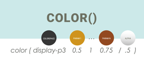
And finally we have a new function, `color` function.
So this function is interesting because we have a lot of color spaces to use.
RGB, HSL LAB, LCH, OKLAB, OKLCH, HWB, eh CMYK but maybe we want to use our own color space.
So what we can do is define that color space and pass it to CSS, and we can define our colors based on that custom color space.
These open the door to writing colors in any possible way.
And if you don't know how to define a color or how to design a color, a color space, don't worry because the browser comes or the definition comes with its own predefined color spaces.
We call the color function.
We specify the color space that we want to use.
We can define our own again, or use one of the predefined ones.
And then we pass the parameters for that color space.
In general there has to be at least one parameter.
All the predefined values have three parameters.
So we have SRGB, that is the standard RGB.
XYC, rec2020.
Those are predefine color spaces.
Rec 2020 is really convenient for broadcasting and video.
And I think it's the standard for broadcasting.
ProPhoto is a really interesting color space for digital pictures and photos.
display-p3 is really good with a high definition screens.
So we can define many colors in many different color spaces with the color function.
And potentially we have unlimited ways because we can define our own color space.
In the past this function in the earlier definitions of this function, there was a fallback value, but it has been removed for simplicity.
I think it was cool to have it because you know, if you delcare a color, that was not valid within that color space, it would take the fallback, but that has been removed.
And as a fun fact if we take into account all the different functional methods to write a color, there's over 90 ways that one color can be written in CSS.
That is really interesting.
90 is a big number, which can raise a, an interesting question.
That is why?
Why do we need 90 ways to write the same color in CSS?
Is that really needed?
And the answer is, is yes.
Like while many people be okay, would be okay with RGB, just RGB for web development, CSS has many other uses-it can be used in SVG for images.
It can be used for printing either the image or a webpage.
It can be using different media.
And also having a color space with multiple colors, many colors, more colors than RGB provides better ways of, of creating gradients for example.
So RGB was great when it was defined, but it hasn't kept up with the times.
That's why things like LAB, LCH or p-3 are really interesting now, especially when we have monitors that are 4k 8K, support billions of colors and RGB is really limited in that way.
So yes, that's why we need the new color spaces.
And here I'm going to show an example.
This is a demo that Adam Argyl shared on Twitter a few months ago, or a few weeks ago that shows different color spaces and how they represent colors.
And again, LAB and OKlab are things that are more based on how we perceive colors as humans.
So the result of those gradients in general are better than HSL.
Like, for example, we wouldn't expect between blue and red to have a pink.
I would expect it to be a purple or a nicer transition.
That's why we need color spaces.
I know the difference is, you can see the black and white.
How the different values change depending on if it's RGB, LAB, , OKLAB.
Another interesting thing.
This is a capture from Safari.
I find this screenshot really amazing.
This is a color that is defined with the color function using p-3, and you can see how Safari is showing this line here.
You see it, and this line is the limit of RGB.
And all these colors above and to the right of this line are not reachable on RGB.
That means that this vibrant red is not available.
This is something that p-3 offers.
And now let's talk about the color functions.
These are new functions, introduced as part of the color level 5 module.
And that, as I said, they're really exciting.
And I think that they're going to revolutionize the way that we see colors and that we use colors in web development.
Let's start with the color-mix.
The color-mix, you can imagine it...you remember when you were growing up and you got paint and you decided like to mix different colors to see what happened and you got blue and red and you made purple, you got red and yellow and made orange?
color-mix works kind of in that way.
What it does is that you pass two colors and it will combine them into one.
The, the syntax for the function is `color-mix`.
Then you need to specify `in`, the colorspace of choice, and then two colors.
These colors can have a percentage or not as we're going to see here.
So you see, for example, we can say `in sRGB, red blue`, if it doesn't have any percentage, both colors go 50%.
If one of them have a percentage, but the other one doesn't then one that doesn't is a hundred percent minus the percentage of the other one.
And then we can use variables again.
Or if they add up to more than a hundred percent, then they value will be proportionally reduced until both get to a hundred percent.
And this example shows how important the color spaces are too.
As you can see, RGB is more limited than HSL, LAB or LCH.
So mixing red and blue is going to provide different results depending on the color space that you use.
LAB has more reds and more blues, definitely more blues and greens than, than RGB.
So mixing those two colors is going to provide a completely different result.
And that's why it's important presenting the color-space.
Another function that is really important is `color-contrast`.
color-contrast is a really exciting function.
At least I find it really exciting because I do web accessibility and I have been following webAIM and their million report that is an analysis of the top 1 million websites.
And they find always the same accessibility issue.
That is that there's not enough contrast between the text and the background.
And that has been the top accessibility issue for years.
This function, color-contrast is going to end that.
What it does is that it gets a base color, a background color, and a list of, of colors that we want to assign.
And it's going to return the first color in that list that has enough contrast against the base color that we pass in as the first parameter.
It sounds complicated, but let's see how it works.
Like for example, here, we have two examples at the bottom.
We're doing color-contrast of black against a dark gray, a light gray, and yellow.
In this case, because we are not passing the, the goal of, of the function, it's going to return the value that has the most contrast-in this case, yellow.
In the next line we have black, dark gray, light, gray, and yellow again, but we're specifying a contrast goal that is AA `to AA`.
In that case it's going to analyze the, the color contrast of all the colors in the list against the base.
And it's going to return the first one that fulfills the requirement.
The goal.
In this case, the light grey.
So you see the same functions with the same color list can have different results depending on which one is the goal that we're providing.
If we don't provide any goal, it's going to be the top value.
If we provide a goal, it's going to be the first value that fulfills it.
And again, we can use it with a custom properties, also known as the CSS variables, and we can create a complex system for our design system or for or theme and talking about theme.
We need to look at this function from beyond accessibility.
Because it has a theming projection-let's say it that way.
We could create, for example, a dark mode and a light mode by simply setting a variable and then using color contrast to help pick which value has enough contrast against the base.
So for example, we would set the background of the body to be black or white.
And in the color contrast function we would have the different options for the color-dark gray or light gray or whatever.
One important thing that to note is that in theory, if no color fulfills the requirement, the last two are white and black and you don't need to write them.
They are automatically there.
That way, we ensure that there's always going to be an accessible color.
And while talking about theming, we need to talk about relative colors.
These may be the most important feature coming out of the color level five module.
And that's saying a lot for a person that just said that the color contrast is the best thing since sliced bread.
But in this case it's really true.
Relative colors is going to change how we handle colors in CSS.
It's going to change the whole concept of theming-how we do theming.
Right now, we have to do really complicated things, to be honest.
We have to like, I've seen HSL.
We use HSL colors and then we use custom properties to change the lighness or the hue to create a new palette.
Or we use function within Sass or Less like darken, lighten.
Or in extreme cases, what we do is we, we go to colorJS or other color libraries in JavaScript.
We send the color up, we change it, transform it, modify it and send it back to CSS.
If that doesn't sound complicated.
Okay.
But I think it's really too much and CSS has the power to handle that.
And that's what relative colors do.
That's what they do.
That's what they're here for.
And the syntax is really easy to use.
You don't need to learn new libraries.
It's really simple as we're going to see.
It starts with a color that is your color function of choice.
You know, you can use the RGB, HSL LAB, OKLAB, whichever, all of the ones that we have seen before.
Then, you use the keyword `from`, and you specify a color that is going to be the original or the base color.
And what the function does is that it transforms that color into the color space that you want.
So for example, the first line takes the HSL color and transforms it into RGB.
Then, and this is interesting, it breaks the color into the different channels.
It's like the destructuring concept in JavaScript.
It destructures the channels and it provides it to us so we can make changes.
And that's what is really amazing about that.
So as we can see in the first line, we take the HSL color.
We turn into RGB and we get three parameters: R, G and B, and we can do whatever we want with them.
In this case, we're keeping R and G the same and we're modifying B to be 255, the absolute value, 255.
So, what it's going to do is the HSL 180, 50%, 50% is going to turn into RGB and it's going to change the blue to max it up.
We can combine it with many different things.
Like for example, the second row is getting a color in RGB, is turning it into HSL and it's keeping all the H, S an L values the same.
What is changing is the opacity.
And this is important.
If you don't specify an opacity, it's not going to be a hundred percent as when you create a new color.
In the case of the relative colors, it's going to be the opacity of the original color, of the base color.
So that is something to take into account if you use this function.
You can use it with variables, with custom properties.
That's what is going to make it super powerful and super convenient for creating things.
And finally one super interesting thing is that you don't need to use the just values as is.
You can operate on them.
You can use `calc` and take the value for example the LCH, we break the color into L, C and H, and then we say, "Hey, I don't want the L, I won't half the lightness for this one".
And that opens a lot of doors that were before close.
And again, this is going to potentially take some color libraries and some JavaScript libraries that were built along the weakness-and let's say that way-of CSS and it's going to make them obsolete because CSS can do a job that before it was delegated to JavaScript.
And if you don't think that that's like [makes explosion sound], I mean, for me, it's like mind blowing.
An important thing to take into account is that the relative colors are only going to work with the new fashion notation.
That's with this space separated colors.
If you use the comma it's not going to work.
So that's another reason to jump into this new space separated notation.
CSS is evolving and the colors are front and center in this revolution.
There's new drafts, and new additions, new features, new things coming out every few weeks.
It is a really interesting time to be learning about all this and to be working with this technology.
One thing is for certain, the future of CSS is really colorful.
CSS has evolved considerably over the years, and some of the most exciting recent changes are coming from the color specification. Long gone are the days of just using RGB or HSL. Instead, there are new color formats, a new notation, new functions, and so much more.
We’ll dive into the most recent CSS Color Module Level: review what’s coming, show examples of the latest function definitions and explore the relative colors and how they can revolutionize white-labeling.