Focus Visible, At Last!
Hey, thanks for coming to my talk.
The agenda today is going to be threefold.
First.
I'm going to talk about focus history, a brief overview of how browsers show a visible focus indicator for currently active elements.
Unfortunately, also how a lot of websites have messed that up over the years.
Second, we're going to talk about focus-visible, awesome new CSS feature in modern browsers, which helps webpages customize or remove the focus indicator only when it's okay to do so.
And lastly, third, we're going to talk about some quick tips and tricks for focus and accessibility in general, for your pages.
Let's dive in.
Focus history, how a lot of websites got focused wrong over the years.
To start an element can receive focus when the user clicks or tabbed over to it.
That is focus in a browser.
We often call this the currently active elements in the document.
By default browsers typically render an outline that is a dark blue or black little visual indicator around an active element on the page.
That active element indicator, the focus outline, is really important and helpful for a lot of users.
Folks who are navigating with something like a keyboard rather than a mouse really care that they could see what is the currently active element on the page.
You can customize that behavior by using CSS, the :focus selector, or even in JavaScript by querying document.active elements.
We should note that there is at most one element focused on the page at a time just by browser behavior.
Now, while this indicator is important, some pages, some designers have found that they don't like having that big black or dark blue indicator around an element.
So they use this CSS- :focus, outline: none.
Alernately, :focus, outline: 0.
This removes the selector.
Which is nice if you're going for visual purity, but is really bad for users who care about it.
Users who maybe don't know now when they're navigating with the keyboard, whether they've selected the X or the submit or the cancel on of form.
And triggering the wrong one of those can be quite harmful, disastrous for them.
So when you see this CSS, this colon focus outline none or zero, know that it means remove the visual outline for all focused elements, even if the user need 'em, which is really bad.
That's a red flag.
Zero out of 10.
Do not want, please don't do this on your webpage.
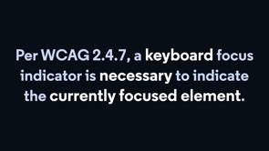
Now the not doing this is codified in the web content accessibility guidelines section 2.4.7, "a keyboard focus indicator is necessary to indicate the currently focused elements".
Meaning some indication must exist visually on the screen to indicate what elements a user has navigated over to, if they're using a keyboard.
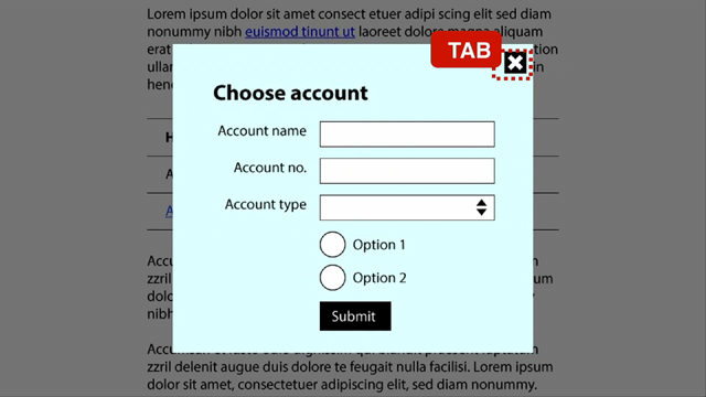
And I'm just going to show you a quick demo of what it's like to not have that indicator on this code sandbox.
In the CSS, I have said :focus outline: none.
In the HTML, we have a default input, type = text, and a button.
When I click with a mouse, we don't see the default black outline, which is nice.
But if we tab and shift tab around with our keyboard, which is what I'm doing, we don't see any visual indicator that we've selected the default styles button.
You might be able to see if you squint kind of hard that I'm pressing space, but that's it.
So that's bad for someone who relies on knowing what they've selected with their keyboard, not being able to see it as quite annoying and disastrous for using the site.
Now a couple of good reasons.
For starters, WICAG is legally required.
In America, we have the Americans with disabilities act, ADA, many countries have equivalents and being legally mandated to something is a good reason to do it, but personally I am slightly more motivated by the morality of it.
It is the right thing to do to be accessible.
If someone can't use your website because you've made it difficult to impossible for someone using their input modality to use the website, that's kind of crappy.
That's a bad thing to do.
So please, if the morality clause doesn't motivate you, I hope that the least illegality one does.
Unfortunately, this leaves us with kind of a pickle.
On the one hand, we want to be able to show the legally and morally required thing, the visible focus indicator for keyboards.
But on the other hand, it's kind of nice to remove it for mouse users, cause it's a little bit of a visual splotch on the page.
Bit of a conundrum and if we lived in a beautiful and perfect universe, I would love to be able to tell you that for years developers have thought hard on this and figured it out, and all websites do this the right way where they only remove the visible focus indicator from mouse only users.
Unfortunately, the world we live in is that most developers will mostly use what's easy before what's right.
Instead of figuring out how to get this right for the type of user using the sites, developers just often do that easy thing.
They remove focus for all users because they're not familiar with accessibility guidelines.
And that's pretty common in industry.
There are a bajillion things that developers need to understand.
JavaScript, CSS, HTML, accessibility, performance, security, all these various shenanigans.
And they're all important.
Using the right is key, but we don't have time the brainwidth, the bandwidth, the mental capacity to really do all of them right, and really become experts.
So oftentimes, unless the platform gives us an easy way to do the right thing, we mess it up.
Speaking of which let's talk about focus, visible, how modern web standards do make it easy to do the right thing for focus visual shenanigans.
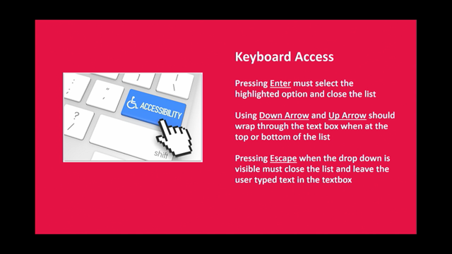
Now, while the focus selector selects the focused element no matter what, the focus-visible CSS selector is a new version of it that applies and selects only if the browser thinks the user input mode needs it, which generally means only if the user has used something other than a mouse to interact with the page.
If the user has used a keyboard to interact with the page that indicates to a browser "Hey, I need to show the focus visible selector".
So when you do something like :focus:not focus-visible, you are saying, remove the visual outline for focused elements only if the user doesn't need it.
Which is much better.
Now we are still saying focus, outline zero.
If we don't need to show focus, if we don't need focus visible.
But if we do need to show, focus visible, we add back the outline.
We remove the removal of it.
I'm going to show you a quick little demo to explain my excitement over it.
Here we have another similar CSS page here we have :focus:not focus-visible gets, outlined none.
And then just to make it clear, what's going on, I've also added focus-visible with the magenta outline.
Here, when I'm using the mouse, you can see that as I click on the input type equals text, the browser thinks we should have a focus-visible outline around it, which makes sense, if it's a text input, you generally are doing some sort of typing into it, but this button does not get the focus visible while I'm using just my mouse.
The button does not show focus visible when you only use a mouse.
However, I'm switching to the keyboard now, you can see the mouse is moving, but I'm switching selection.
When you use your keyboard focus-visible does kick in for all input types.
And thus, we get the nice magenta outline around the button.
Hooray focus-visible.
Yay.
I'm also going to show another slightly more in-depth demo.
This is on the MDN or Mozilla developer network page.
Here we have six elements, ultimating input type equals text button.
Again, the first two are with default styles.
The second to show a focus outline on :focus and the last to show focus-visible and outline, which is orange.
When we're using just the mouse we see that we do get a focus outline around the button and the input type equals text.
By default, we only get one around the text.
When we do focus-visible only we now, again, only get it around the type equals text, but if we switched to using the keyboard, we see by default, we get the black outline everywhere.
Under :focus, we again get the black line everywhere and with focus-visible abecause we're using the keyboard voila, we get the orange outline.
Never in my life have I been so excited to show off a 4px, dashed, dark orange outline, great stuff.
A little bit of version availability information, because this is important back in 2018 Chrome and Chromium browsers enabled a user flag for this.
So you could use it if you enabled a flag for your own browser, self user in Edge, Chromium, similar they did enable it for all users in 2020.
Firefox has actually had an equivalent of this since 2011 with the moz-focus-ring selector that was made available under focus-visible for all users last year in 2021.
Safari lagged behind for a little while, which was a little upsetting, but they came in clutch at the end.with a Safari technical preview release in this year, in 2022.
So hopefully by the end of the year, the latest versions of all major browsers, Edge through Safari will have focus-visible.
Now because it's not available yet in all major browsers and longer support windows for older browsers, won't have it completely covered for another couple of years, you do need a polyfill.
Which is a small piece of code, generally JavaScript that is added to your webpage to add in support for a newer feature.
And the focus visible polyfill is on GitHub.
Under WICG/focus-visible.
It adds in an attribute to the currently focus-visible-d elements, [data-focus-visible-added].
So instead of focus, not focus visible, you can do this equivalent code and it works the same way.
So hooray web standards and modern what features you can still use them even though not all browsers have gotten it out yet.
And that's focus-visible.
I'd like to end with a few general tips and tricks for focused visualization and general accessibility management in your webpage.
To start, specifically for focus.
It also needs to adhere to general color contrast guidelines.
In WCAG 2.1, you need to have a contrast ratio of at least three to one for graphics and user interface components such as form input borders.
WICAG 2.1 is a version of the accessibility guidelines for web content.
If you look at the image on the right we can see a submit button on a white background with a light blue focus indicator, someone who has, let's say limited vision or attention deficit disorder, so it's hard for them to focus on new elements or let's just say they just have a bad monitor, when that focus indicator appears, it's going to be hard for those types of users to see it.
So this is an accessibility violation.
It's hard to see it's as if it doesn't get.
On the left.
However, we have this beautiful blue focus outline on a white background.
It's very easy to see.
It's crisp.
It's clear.
That's accessibility.
Love it.
In general, taking a step back from focus specifics, highly recommend using a design system.
On the right you have four buttons that have been implemented in subtly different ways, which it honestly is quite common in industry, people get designs or create designs that accidentally have subtle differences in buttons or other elements.
And then you end up with a website with all sorts of different shenanigans going.
And there are a few problems with reimplementing the same thing repeatedly.
For starters, a lot of extra work.
It's a pain.
Also, if you have small issues, they tend to exist in some, but not all of them.
For example, these four or one to two of them have color contrast issues.
What the general good practice to do instead is to create a design system, which is a collection of known good components, colors, color, combos, topography, et cetera, that you reuse across your website.
It means you only have one thing to maintain, one thing to build, and it looks a lot more consistent for your users, such as in this left image with four identical buttons.
Beautiful.
Generally for accessibility, I highly recommend running a tool such as aXe.
aXe takes a look at a webpage and detects what accessibility issues it can.
In general, in my experience, aXe can catch around a third of a page's issues, they claim up to half give or take.
It's pretty good.
It's very embeddable, very plug and playable.
This code snippet is an example of what a test might look like that's been configured in an environment that can inject aXe onto a page after visiting the page, and then checking a11y or accessibility on the page.
Highly recommend run this as part of your end-to-end tests.
At the very least block builds go into production on aXe issues.
You don't want to knowingly ship accessibility problems to users.
That's kind of rude.
And likely illegal.
aXe also comes in excellent browser extensions.
I ran aXe on this one webpage, accessiBe, and it found several dozen issues along with a couple hundred that it wanted me to check out for it.
aXe issues are very well-documented on the bottom right you can see there's a highlight button, that'll show visually the element in question.
There's an inspect button, which will show in the elements > dev tools where the element is.
It has a 'more info' button as well, which gives you a very nice documentation page, explaining the issue and what to do about it.
Highly recommend, if you're curious about any website, yours, someone else's, run the aXe dev tools-you can tell which websites have been made with accessibility in mind, just by looking at how many hundreds of issues are on them.
This website in particular is something I wanted to bring up as well.
Accessibe is a web overlay, which is a tool that claims to make your website accessible by layering stuff on top.
That sounds too good to be true because it is.
In general, accessibility overlays do not work.
I know of at least one lawsuit made by accessiblity professionals against accessibile in particular.
The only way to really know and become accessible, know that you are accessible, is to have dedicated accessibility testers verifying that what you're doing is correct.
Giving you feedback on what works and doesn't work.
I highly recommend this.
If you are a larger, more well-funded company, it would be great if you could make a dedicated accessibility team.
But if you don't have the bandwidth or time for that, you can hire external contractors.
There are services that can give you accessibility testers on demand, independent consultants.
There are a lot of different things, a lot of different nuances that go into accessibility, accessibility for blind or low vision users, for people with limited or no mobility, for cognitive impairments, all sorts of different things.
And if you don't know all these various issues, it can be very difficult to get them all right.
So please, have dedicated accessibility testers and put real effort into your accessibility, whether it's focus-visible or some other shenanigans.
It's important.
So let's recap what we talked about and learned today.
For starters, I went over focus history, a little bit about how browsers show a visual indicator of focus, and unfortunately, why a lot of websites mess it up.
I talked about focus visible, which is an awesome new CSS feature that browsers are starting to have-makes it a lot easier to tinker with focus in only the right ways.
And I gave some general tips and tricks around focus: around having good color contrast and accessibility management.
I'd like to end today with some good technical resources.
WCAG has a section on w3.org, which includes a really good explainer about focus-visible.
I also really like the documents on webaim.org-in particular, they have a great color contrast checker tool, which also has links to more resources.
You can find the aXe browser extensions on deque.com.
Deque's the company that makes aXe they're great.
And if you're curious about design systems, you can check out one in the wild at gamut.codeacademy.com.
That is the gamut, a design system.
It's code academies designs.
Anyway, thank you again, you can find me on Twitter @JoshuaKGoldberg and on my website at JoshuaKGoldberg.com Much love and thanks and appreciation to this conference for hosting me.
Cheers.
:focus-visible is the CSS selector of your accessible focus management dreams! It targets elements that receive focus only when the user appears to be using an input modality that would benefit from a visual. This talk will cover the history of bad :focus behavior, how :focus-visible fixes things, and general tips for focus visualizations and management in your CSS and HTML.