Practical Uses For Container Queries
Hi, everyone.
I'm pleased to share with you practical uses for container queries.
So what our container query is anyway?
Well, simply put, container queries enable styling elements based on available space.
You may be familiar with responsive design and creating layouts like this that respond to the viewport.
In viewport responsive design, a popular technique is to tie a layout grid to break points.
Those break points usually tie to device sizes as seen here, such as mobile, tablet and desktop.
Importantly, these break points are not considerate of individual elements and components on the screen, but moreso how components flow iinto the predefined grid.
Sometimes larger components like navigation will morph separate from the grid, but typically use the global breakpoints.
Let's contrast viewport responsive design to container responsive design.
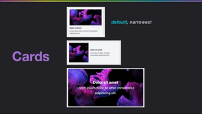
Here's a variation of a card component.
These three variations are rendered using container queries, which are completely independent of the viewport.
Instead, the card styles are adjusted based on available space.
That's okay if the difference is not quite clear yet, as today's goal is to learn by practical example of using container queries.
So let's get to it.
First let's learn the syntax to create container queries.
The first step is to designate that an element is a container by using the `container-type` property.
The most fundamental and currently best supported value is `inline-size`, which equates to the element's width.
So this definition means that we expect a query based on the element's width.
Now that we have a container, we'll create the actual container query using the container at-rule.
Importantly, the rules we place within the container query will not affect the container itself, but its children.
This means you may not style a containing element itself, unless it has an ancestor that is also a containing element.
As this notice says, the spec is still in progress and the syntax is subject to change.
In fact, the CSS working group considered an alternate syntax that would require designating a container query as based on size properties or style properties.
So at the time of preparing this presentation, Chrome Canary version 96+ required designating size, and you'll see that used in the demos.
Speaking of support, you'll be able to view the demos from this presentation later in Chrome Canary with the experiment flag enabled or other browsers as well, thanks to the polyfill, which we'll discuss more later.
All right.
So let's learn how to use container queries.
Here are three card variations, which you might recognize from an earlier slide.
Now, if we were building these without container queries, we might make the top one our default, which we'll simply call "card".
Then we build up variations by way of modifier classes.
And perhaps those modifiers would even be tied to break points, where if the card had the modifier, then it would be allowed to change when the viewport was within that breakpoint.
Instead, let's switch our perspective and think how we would handle these card variations using container queries.
We'll still make the top the default, which really means it will apply at the narrowest widths.
And if the polyfill wasn't in use or not supported, this would also be the fallback version, which is an important state to consider until container queries have reached support maturity.
For the middle size with the horizontal orientation we'll direct that layout to occur when the container is greater than 350 pixels wide.
Finally we'll have the card layout use its image as the background, when the container is greater than 600 pixels wide.
This creates a card element that is adaptive to container queries.
I'd like to give motion warning before I play this video clip, which will show resizing this card layout and the cards moving around the screen.
Based on the cards containing element this demonstrates the types of layout mutations we'll see, given the cards are within a Flexbox grid.
This particular use of a Flexbox grid brings up an important point that also applies to elements contained in a CSS grid layout.
Remember that a container query allows styling its children, not the container itself, and we need to be able to change the layout of our card.
So in order to respond to the width of the flex or grid item, we need to nest our card as a child inside of a containing elements.
For this demonstrated layout that means we've tested our card as a div inside of the list item.
Then the list item is defined as the container.
This enables the card to respond to the width of an individual list item, which is changing due to the flex behavior.
Keeping our card example a little longer, we can push it further by introducing container-based fluid topography.
As noted, we'll be swapping out viewport units for container units.
Previously, you may have tried this fluid topography technique using the VW or viewport width unit.
Instead this rule is affecting the base card font size by using clamp where the middle value is 'qi' or 'query inline'.
Once again, a note that the spec is in progress and in particular, the spec knows that these container relative units should be prefixed with 'c'.
So this example would change to 'cqi'.
At present that syntax was not supported in Chrome Canary.
In this video clip, watch the headlines and body text to see them adjust in size, proportionate to the cards width.
It might seem quite bold to say, but container queries offer the possibility of building once to deploy anywhere.
As a design systems engineer, This really appeals to me, in consideration of being able to ship design system components with built-in layout and style variants.
To demonstrate this idea, here's a subscription form.
Container queries have been applied and the component is shown in a full width area within the narrower space of the sidebar and at the medium width within the content area.
CSS grid is an excellent companion for composing these variants.
Using grid template areas, we're able to rearrange the sections without the need for extra markup.
In this subscription form component, I've identified three grid areas- legend, field, and submit.
The overlays added here show how the layout changes across the variants.
Looking at the code composing the subscription form we are setting the form element, which has the class 'subscription-form' to be the container.
A nested div with the class of 'form-content' is what our container queries will then modify.
At the narrowest default width, the form is a simple grid stack with gap applied.
The first container query for the mid-size layout is doing the heavy lifting of creating the grid template and assigning all of the elements to the grid areas.
The second, and final container query then only has to adjust the grid-template-areas definition to align the areas.
Only one additional tweak is needed, which is to realign the submit button to the end position, which visually aligns it to the email input.
This video clip shows the subscription form layout adjusting as the width is reduced.
Let's move beyond rearranging layouts and consider using container queries to coordinate visibility, to create variations.
Here is a pagination component showing previous and next page links and a pagination list.
The nav element that contains this pagination will be our container and we'll be modifying the visibility of the child elements as it reduces in width, as seen in these other variations.
As with the queries we've created so far, we'll create our narrowest version as the default, which displays a label of the pagination status instead of individual links.
Our first container query will be responsible for making the text for previous and next labels visible.
And the second query we'll swap the simple label for the list of page links.
In the corresponding code, our default state removes the pagination list from display, but inclusively hides the previous and next labels so that they remain accessible for identifying what appears as icon buttons at this stage.
Then the first container query simply brings those labels into view again.
Finally, the second and last container query sets the display property of the pagination list to `grid` and hides away its simple label.
In this video clip, the pagination shrinks through each stage of container queries and the coordinated visibility results in a flexible, extensible pagination component.
We can extend this idea of coordinating visibility by using multiple named containers for maximum flexibility.
A product site navigation is an excellent component to demonstrate this concept.
We'll be defining two containers and using the second available container property of `container-name` to be more explicit about attaching query styles.
The outer elements will be a container named 'navigation'.
And the page navigation list area will be a container named 'menu'.
This will enable us to switch the navigation list to a button that will trigger a dropdown on a reduced width, based on the menu container, and on our narrowest width, we'll reduce the company brand to just the logomark.
In our code we assign both the container-type, and the container-name where the container-name is an unquoted string.
Now, to enable the menu container to have an independent variable width it's been placed within a grid column with a width of 1fr.
This means it will take up all available remaining space in the nav.
The result is that it will be able to adjust separately from the outer navigation container.
Not shown in this snippet is the hiding of the brand name, but we use the same technique we looked at for pagination to inclusively hide it.
So it remains an accessible label.
Then we can assign two container queries, where each is scoped to the name of the container it pertains to.
First we create a query against the navigation container to make the brand name visible when there is enough space.
Second we define the menu container query, which hides the button responsible for the dropdown and displays the navigation list instead.
This video clip showcases each phase of the navigation, starting from the widest variation with all parts visible, then the reduction of the menu area to the dropdown button, and finally the removal of the brandname.
Now as opposed to viewport media queries, this method means that the navigation will automatically be flexible across these states.
If a longer brand name is in place or more actions besides login and sign up are added, and it will also assist in addressing issues that can arise due to translations, which may increase word length.
Although further adjustment may be necessary.
We can use the `container` shorthand property to define both the container name and the type.
The name means to be listed first with a forward slash, which is used as a separator from the container type.
Now, this might surprise you, but contain queries can help improve accessibility.
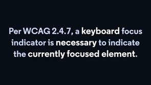
Container queries will enable independent components to better adapt to reflow, which is WICAG criterion 1.4.10.
Reflow is the term for supporting desktop zoom up to 400% where the criterion and expectation is that large areas of content should reflow into a single column and critical functionality should not be lost.
The key for testing this is to know that on a 1,280 pixel wide resolution at 400% zoom, the viewport content width is equal to 320 CSS pixels wide.
Now there is not a zoom related query, but because the zoom level really registers at that reduced pixel count somewhere around 320, both media and container queries will have an impact.
Using our navigation component, let's see how it adapts across some levels up to 400%.
As you can see, the container a queries allow the component to gracefully adjust and meet the criterion.
Contrast this to a common issue with viewport media queries, which is that due to being orchestrated at a page level, intermediate issues that occur outside of break points, aren't always addressed.
This can cause overflow and overlap issues, which result in failing this criterion.
Let's review a couple of other future container query features.
These features are drafted in the spec, but are not quite yet available in browser preview releases.
The first one is that we will be able to query based on style features of a container.
This means querying based on things like a custom property or a specific property value.
Note that in this syntax, we will need to add the extra style designation.
I'm excited for the possibility style queries will bring.
Second is the media queries level five `range` syntax, which will apply to both media and container queries.
As noted an example of the old syntax might be based on min-width.
Whereas the complimentary range syntax will be the width property and the mathematic greater than or equals two designation followed by the value.
For container queries, this range syntax may be available within the style queries we just reviewed as well.
I hope you're hyped about container queries and the good news is you can start using them today.
Google Chrome labs developed a container queries polyfill which covers the essential uses.
Currently supported are queries with, and without that size designation, although be aware that not using it may have the unexpected result of not working in Chrome Canary, depending on your version.
The polyfill also only supports queries is defined in pixels, which is more limiting than full featured native container queries.
It also supports the range syntax, which again, may not be supported in your version of Chrome Canary.
The polyfill does not support style queries.
And it also presently has an issue with class names that include "container-", but a bug is filed and a resolution will hopefully come soon.
Lastly, it unfortunately does not have support for container relative units.
Meaning the fluid topography technique we reviewed may only be explored within Chrome Canary.
I'd like to thank the crew from Web Directions Hover for inviting me to present.
I hope you're excited about container curries and I'd love to hear from you about ways you're looking forward to using them.
All of the demos can be reviewed at moderncss.dev/hover22.
Thanks again, and enjoy the rest of Hover.
Container queries are on the horizon, and a polyfill means they are available now as a progressive enhancement. See how you can improve your responsive layouts by learning how container queries work through exploring practical use cases.