Ditch the Media Queries: Modern CSS Replacements for Better Responsive Code
Hey there.
Today I want to dive into a topic that I love-responsive CSS.
The way we write CSS has changed a lot in the last devade.
Heck, even just in the last few years and one of the most noticeable places where we can see that change is in the humble media query.
In the old days of web development, if we wanted to create websites and applications that were responsive, it meant writing a series of media queries based around specific device breakpoints, and then reworking our content for each of those sizes.
And yes, before someone says that the truly old days of web dev were table based layouts, I do remember those and they sucked too.
CSS frameworks stepped in to try and ease the device breakpoint painpoint.
We saw things like bootstrap, skeleton and more, because writing all of those media queries was really a lot of work.
Slowly we saw the best practices around writing media queries shift, by necessity from device-based break points to content based break points, as more and more devices came out in all shapes and sizes.
Now with screens available in pretty much any size that you can imagine, it's time for us to shift our approach once again.
The era of breakpoints is over and the era of fluid design is here.
Rather than hitting a point and snapping to a new layout, our content should always be adjusting based on the amount of space available.
Thankfully CSS has come a long way since then as well.
But a lot of us just kind of got used to throwing in a media query, or five, or 10, to make things responsive, and then we never quite broke that habit.
Now that we have modern CSS features like grid, flexbox, calc, clamp, aspect-ratio, and so many more, in 2022 it is finally time for us to ditch the media queries.
Today, we're going to start at the top and work our way down, from the big picture display for adding, all the way to the smallest units.
And as for your old style.
Don't worry.
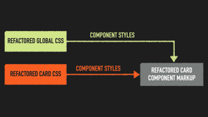
We can refactor.
We have the technology.
Let's go ahead and start with some of the most popular, responsive display options-grid, and Flexbox.
They've been around for a minute, with grid hitting full browser support in 2017 and Flexbox in 2013, but a lot of folks still don't fully understand the difference between them or when they should use one or the other, or even both.
Many people assume a false equivalency between the two, and that can create a really misguided either or approach to choosing a tool, when in reality, grid and flex not only have very different use cases, but also can and should be used together to compliment each other.
For our purposes, though, let's focus on how they work and how you can use them to handle the layout of elements on your page in a way that allows for natural wrapping and responsive adjustment without the use of media queries.
Grid is primarily focused on, well, creating a grid.
A grid with multiple rows and columns that you can then populate with elements.
You do this by creating a container grid element, which we'll then fill with child elements.
There's a great number of customizations that you can make to the grid rows, columns and cells, which allow you to create grids as simple or complex as you can imagine.
But for our goal of creating simple, responsive designs, let's take a look at some of the most relevant features.
Grid comes with the ability to repeat columns or rows automatically as well as auto-fit, which will automatically size your columns to the available space.
For example, the code example that we have here: in this situation, the grid will turn your content into columns, which naturally fit in the space that you have, with each column, having a min width of at least 300 pixels and a max width of no more than 100fr.
The one fr is a new CSS unit and it stands for fraction.
It tells the browser to divide the space evenly and give each column one fraction of the available space.
In this case, we'll create three equal columns that each take up one third of available space, but never gets smaller than 300 pixels.
Were we to add another div or take one away here, the grid would automatically handle the calculation, and adjust the display.
And if the screen is too small to fit all the columns side by side at the same time, it will automatically wrap the remaining columns down to the next row.
If you're looking to create a more complex grid layout, here are a few of my all-time favorite reference resources.
First is a complete guide to grid, which offers a fantastic breakdown of all the ways you can customize your grid, including creating columns of varying width, setting template areas, setting the gap between your grid cells and so much more.
Next on the list is grid by example.
Grid by example is my favorite place to start, when I'm looking for a jumping off point on creating a new grid structure.
It has lots of really practical grid code examples that you can borrow, tweak and play with to create your own grid-a much better alternative than just starting from scratch every single time.
And finally, if you're looking for a real world example of a more complex grid, then check out the frame dot SCSS file in the Kendo demo app where CSS grid was used extensively to create the menu frame used on every single page.
Next let's take a peak at Flexbox.
Flexbox takes a similar, but not quite the same approach to helping you lay out your elements on the page, and then adjust them automatically as needed.
Rather than creating a full grid with multiple rows and columns, Flexbox is focused on one single row or column.
It's about the positioning of child elements relative to each other within the parent element.
Basically, if you need to work in two directions at once, rows and columns, then you're going to want grid.
If you need to focus on just a single direction, one row or one column, Flexbox is the tool for you.
Again, there is lots to look at with Flexbox in terms of what it can do, differences of applications, but let's leave that for another time, if we were to focus on it today, it would be all we could talk about.
Today I just want to focus on how Flexbox handles responsiveness so that you can ditch that unnecessary media query.
The main point of interest for this is the flex-wrap property.
Flex will start by attempting to fit everything that you have written into one row or column.
But if that isn't going to work, you can tell flex to allow wrapping by setting flex-wrap, to `wrap`.
If flex-wrap isn't specified, flex will squish your elements in order to keep them all on the same line, if no min-width has been specified for those child elements, or it will overflow them and wrap them to the next line out of view, if min-width has been specified.
Basically with both grid and flex, you really just have to decide whether you want your content to squish or to wrap, and then set your properties accordingly.
Both are really good tools to have in your toolbox for creating responsive UIs, depending on how much content you're trying to create, and whether you're thinking in just single rows or columns or multiples.
If you're looking for some good resources to master flexbox, here are a few of my favorites.
First is Flexbox froggy.
It's a really cute game that will help you master all the different properties of Flexbox using some adorable frog illustrations.
You'll help place frogs in order, help them move from lilypad to lilypad, using flex layout.
Once you make it through, I promise you will have all those flex properties drilled in, set in your head forever.
FLEX on the other hand is a really simple visual cheat sheet for you to reference as you work.
So when you're typing and you're like.
What was the syntax for that again?
What was that property called?
Is it justify: center or align: center or align: content or whatever?" FLEX is there for you.
It's super practical and super handy.
Next, let's take a look at the middle man.
Those guys that are kind of in between.
Once we've got our general layout in place, it's time to set some specific properties on our elements.
And good news, we don't need media queries here either.
First off aspect-ration.
Did you know that there's a CSS property specifically designed for aspect ratios?
This is going to be a lifesaver for you if you're dealing with videos or big hero images at the top of webpages, were keeping the correct aspect ratio is crucial.
There's a really great deep dive on this on CSS tricks, but in general, it's actually pretty easy to apply.
All you need is the one line that we have here.
It's worth noting that if you set a specific width value along with aspect-ratio, it will use that as a basis and then automatically generate the height to match, or vice versa.
However, if you declare both a width and a height, it will honor those over your aspect ratio.
So be careful.
Next min-height, max-height, min-width and max-width.
Although min and max-height and width properties can often be replaced in a great deal of use cases with the `clamp` function, which we're going to take a look at next, these are still valid CSS and really good tools to have in your pocket.
They're also easy.
I mean, they pretty much do exactly what they say on the tin and how much more can you ask than that?
Here, in our example, we have an image that we're telling first and foremost to take up as much space as it has available up to the max width so that we default to the largest image size possible.
Then we're going to put some guardrails on.
We don't want it to take up more than half of the parent container, but we also want to make sure that it's larger than a postage stamp.
So we're going to set a min-width of 200 pixels wide.
In this case, we set an absolute value only on the small end because we know exactly how small this image can get before it becomes unrecognizable.
Now, no matter how the browser is resized, we know our image will always be as big as it can be without being either ridiculously giant or unreadably small.
Next let's take a peek at the math functions.
Math functions are a newer addition to CSS and they are incredibly powerful.
They fill a void that CSS developers had been complaining about for ages, the ability to compute values within style sheets and set ranges for properties.
The sooner you can master them and put them to use in your code, the more you'll benefit.
So let's begin with clamp.
Clamp allows us to set a base value for a property along with upper and lower caps to kind of contain it as it adjusts.
This is one of our best tools to ditch the media queries, as it allows us to set those responsive limits without needing to use break points to do so.
Here we have an updated version of our last example, the image with the min and max widths.
Only now we're doing it in just one line using clamp, by telling the image to take up a hundred percent of the available space, but never larger than the container size or smaller than 200 pixels wide.
Now, if you have ever looked at CSS and wished that it had more math-first off, I don't really understand you, but second, you are going to love.`calc`.
Calc allows us to do simple arithmetic with CSS units, right in the style sheet.
This is great for when we need to base something off a unit that is not absolute.
You can also use CSS variables in those computations, which makes it super flexible and incredibly useful.
Let's say we want to create columns that are evenly divided based on the current width of the browser.
In our example, here, we've gone ahead and set one third widths.
Setting one third widths is something that used to be kind of difficult using the percentage units.
Cause you ended up in that whole like 0.33333 repeating situation.
But now we can just say, "you know what?
CSS you handle it".
Here we've taken the full window width, divided it by three and used calc to set that as the width property of our child element.
Next min and max.
If you are a fan of having your style sheets handle as many decisions as possible for you-enter min and max.
They work actually incredibly similarly to clamp, but rather than setting a range in both directions, it focuses on just one at a time allowing us to set the smallest or the largest value, depending on how the math works out.
Again, this is super, super handy for setting non-fixed values, which is one of those things that you just have to do a lot when you're making something responsive.
In this example, we're setting the widths for two different images.
One that we'd like to keep small.
And the other that we want to be large.
min will evaluate whether 200 pixels is greater or lesser than 30% of the current container.
And then choose whichever value is the smallest.
Max on the other hand, will make that same comparison between 50vh and 800px and automatically go with the larger instead.
It's really handy and a nice way to kind of give yourself some wiggle room when you're designing and coding.
Now it's time to talk about the little guys, the CSS units.
It's all well and good to think about things from a bird's eye view, the way that we need to when we're laying out those elements on our page.
But we can't forget about the units that specify size for all of our various properties.
When we set everything in hard units like pixels, we have to go in and adjust it manually.
Each time you need to resize it.
But when we work in responsive units, we can let them do the work for us.
So it's a really good habit to build.
Two of my favorite and most used responsive CSS units are vh and vw, viewport width, and viewport height.
Although there's no percentage sign, vh and vw are really kind of a percentage based measurement.
One vw is 1% of the viewpoint's width.
Gone are the days, thankfully when viewport measurements had to be obtained by a window.innerwidth or window.innerlength.
Again, dark times.
Now we can get that data automatically right in our CSS styles.
They'll also automatically update as a user resizes the window.
So there's no hoops to jump through there, either.
vh is especially useful for those times when you want to center something vertically or stick something along the bottom of your viewport, like a footer or some kind of a chat pop-up.
So to create a container element, that's always the exact height and width of the user's current browser, all you need is the code that we have here.
Now time for REM and EM.
If you are still defining font sizes in pixels, then please let me be the one to introduce you to the beauty of REM and EM.
The name EM actually comes from old type of graphic standards of measurement, based on the width of the letter, 'M' in the font, when it was all in like a metal block printing.
That's also, by the way, where the words emdash endash come from-dash is equal to the size of the width of the M or N characters.
Em units are a way of defining your font sizes relative to the font size of a parent element.
So you could do something like the code we have here that will set your h2 headers to 2.5 times the size of the body font in the parent element.
REM on the other hand allows you to declare your font size relative to the root font size of the entire page.
In fact, that is what the 'R' stands for-root.
Both REM and EM work in the same general kind of way.
The difference is what they're using as their base size and what they're scaling based upon.
In general, I lean towards REM over EM because I really like the consistency that it creates.
However, sometimes you will find yourself in a situation where you need to create a specific design in one area that differs from the overall style.
And in that case, EM is the one that you will want to reach for.
If you're looking for a really neat trick, you can combine VW with REM and clamp to create a completely fluid typography system for your application in just one line of code.
Here we've set the base font size to 2.5 VW.
Remembering that one VW is equal to 1% of the viewport width.
Then we set min and max values on either side to ensure that we don't end up in a situation where the text becomes unreadably small or a situation where the text just keeps getting bigger.
It's a really handy trick.
And if you really want to impress someone, pull that one out.
Finally last, but certainly not least, we cannot talk about responsive design without talking about the humble percentage unit.
If you're going to be setting widths by hand for almost any reason as opposed to using a layout tools like grid or flex, then you will definitely want to reach for the percentage unit instead of any kind of absolute measurement unit.
This probably isn't one that you needed an example for, but just to be thorough, here, we have an element that we're setting to be one quarter of the width of its parent.
As the parent with changes, this element will automatically adjust as well.
It's simple, yes, but foundational for building responsive UIs.
Next we have to talk about exceptions.
When we're talking only about responsive design, then it's pretty safe to say that you can ditch those media queries.
However, there are still some situations not related to responsiveness where media queries are still the way to go.
So before you throw them out entirely, let's talk through a couple examples where your old friend media is going to be your best bet.
A big one for this is accessibilty.
When it comes to ensuring that your app or site is accessible, media queries will play an important role, especially when it comes to the preferred media features.
The most widely used of these are prefers-reduced-motion and prefers-color-scheme.
Although there are still a few others that are in the experimental phase, like prefers-reduced-transparency and prefers-contrast.
With the user preference media features, we can adjust our content based on the user's system level settings.
In order to adjust our layouts to be more accessible and more user-friendly.
These are especially important because they don't require the user to load an inaccessible page first, in order to change their settings.
For example, if a user has already enabled dark mode in their operating system settings, and we're using prefers-color-scheme, the user doesn't have to load our application in light mode and then go change the settings in our preference menu.
prefers-color-scheme will just detect that.
To a user, it feels intuitive and automatic and just super, super clean.
Next, changing how elements work.
If we need to completely change how an element looks or works or just remove it entirely, there's still no better tool than media queries.
A great example of this is that switch from like a list-based nav menu to the hamburger menu on small screens.
Because we actually need to hide and show various elements as part of the switch, like hiding that hamburger menu when the screen is large, we still need to use media queries here to handle that display: none.
Next formatting for print.
If you have never had to worry about styling something on your website or in your application for the purposes of being printed, let me be the first to say congratulations.
And also I am so jealous.
It is really a difficult thing to take something that is intended for screen-based responsive viewing and reformat that for paper.
But when it's a task that we have to handle, media queries are there for us.
By specifying the print media query, we can write a whole new set of styles that will only be applied to the layout when the user chooses to print the page.
And yeah, sure, it's not exactly cutting edge, super cool technology.
But if you're working on an application that provides the kind of information that users will need when they're away from their computer, away from their phones, it's something that we can offer them that really improves the user experience.
It shows that we've thought through how they're using the information in their day to day life, and we're making it as easy as possible for them to print it and have something that makes sense, without any of the like header and footer content or anything, that's really screen specific.
It's just, it's just a nice touch.
So if you are still relying primarily on media queries to ensure that your site or app is fully responsive, it might be a time to take a look at everything CSS has to offer.
See if you can swap some of those old fashioned break points out for new fluid approaches to styling, working to create a fully fluid layout means less drastic changes for your users when they move between mobile, desktop and anything in between.
It also means less maintenance work for you.
And isn't that really the goal, right?
You don't have to go through and update a whole bunch of media queries every time your design changes.
Leverage these adaptive approaches to styling and get ready to just sit back and go with the flow.
Here's to building great stuff for all of our users at all of their screen sizes.
Happy coding.
Thankfully, CSS has come a long way since the days when device-based breakpoints were the norm, but a lot of us got used to just throwing in a media query (or twelve) to make things responsive, and never quite broke the habit. Now that we have modern CSS features like grid, flexbox, calc, clamp, aspect-ratio, and more – in 2022, it’s finally time to ditch the media queries in your responsive code. Today, we’re going to start at the top and work our way down: from the big-picture display formatting all the way to the smallest CSS units. And as for your old stylesheets, don’t worry too much…we can refactor. We have the technology


